Обзор лучших ресурсов по разработке бренда, разработке упаковки
contact us | ok@ohmycode.ru
contact us | ok@ohmycode.ru
Established in 2006 (originally as Museu Nacional Honestino Guimarães in honor of the activist who was president of the Federation of Students of the University of Brasília and was arrested four times, disappearing after the last), Museu Nacional da República is a public art museum in Brasília, the federal capital of Brazil, administered by the government and devoted to promoting Brazilian culture and artists. The building is part of the Complexo Cultural da República (“Cultural Complex of the Republic” in Portuguese) along with the National Library building, both of which were designed by Oscar Niemeyer, considered to be one of the key figures in the development of modern architecture. Looking to increase visitation, collaborations, and profitability, the museum introduced a new identity late last year designed by Brooklyn, NY-based Porto Rocha who were commissioned by Brasília and São Paulo, Brazil-based Manufatura.
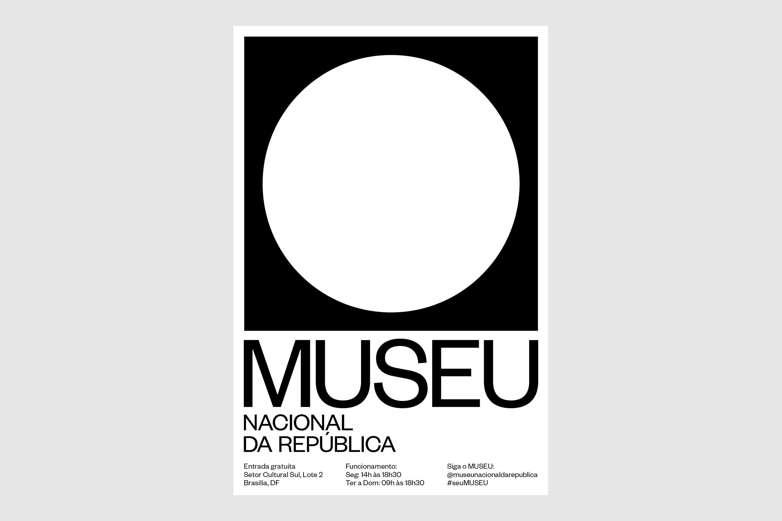
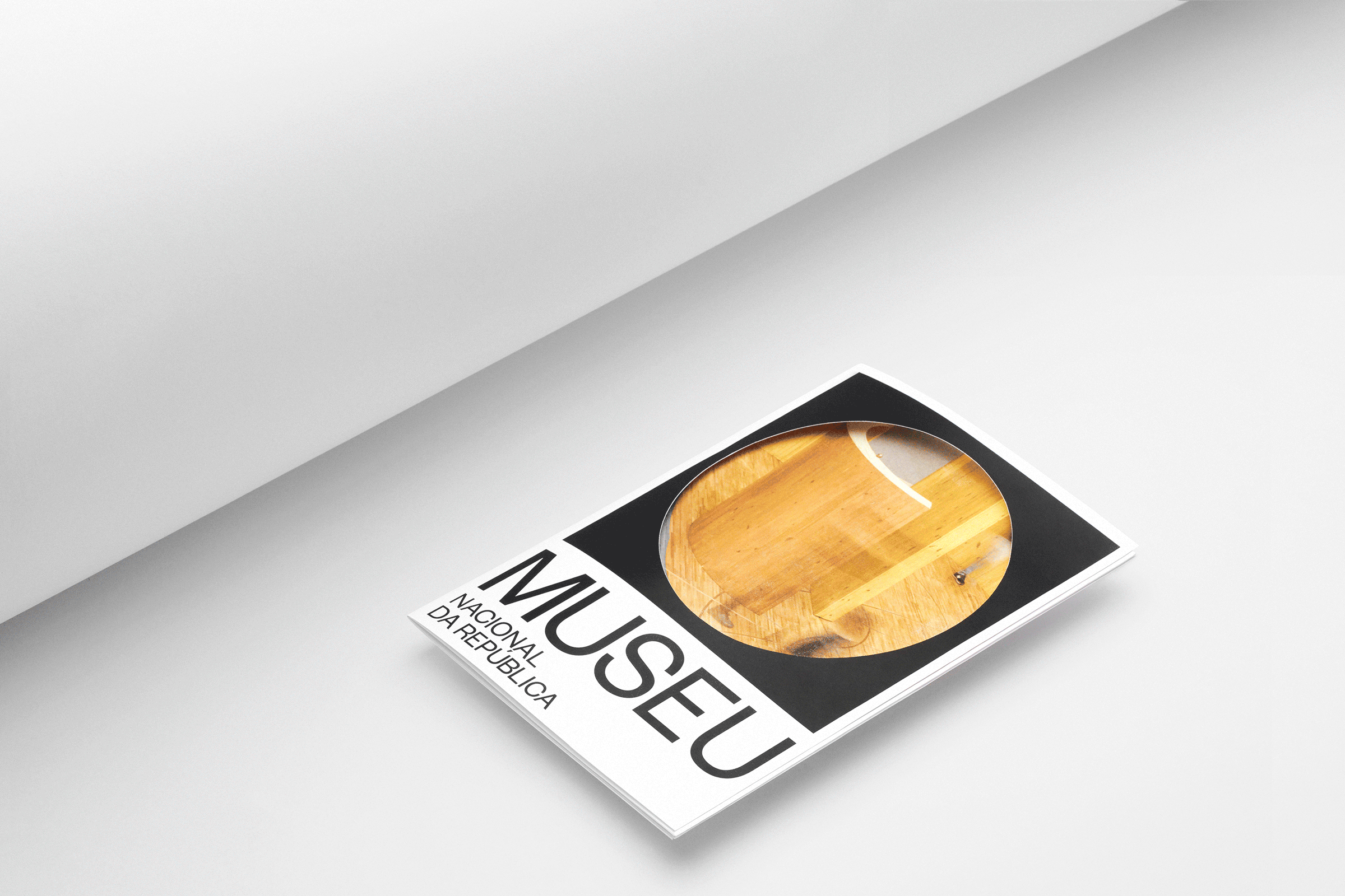
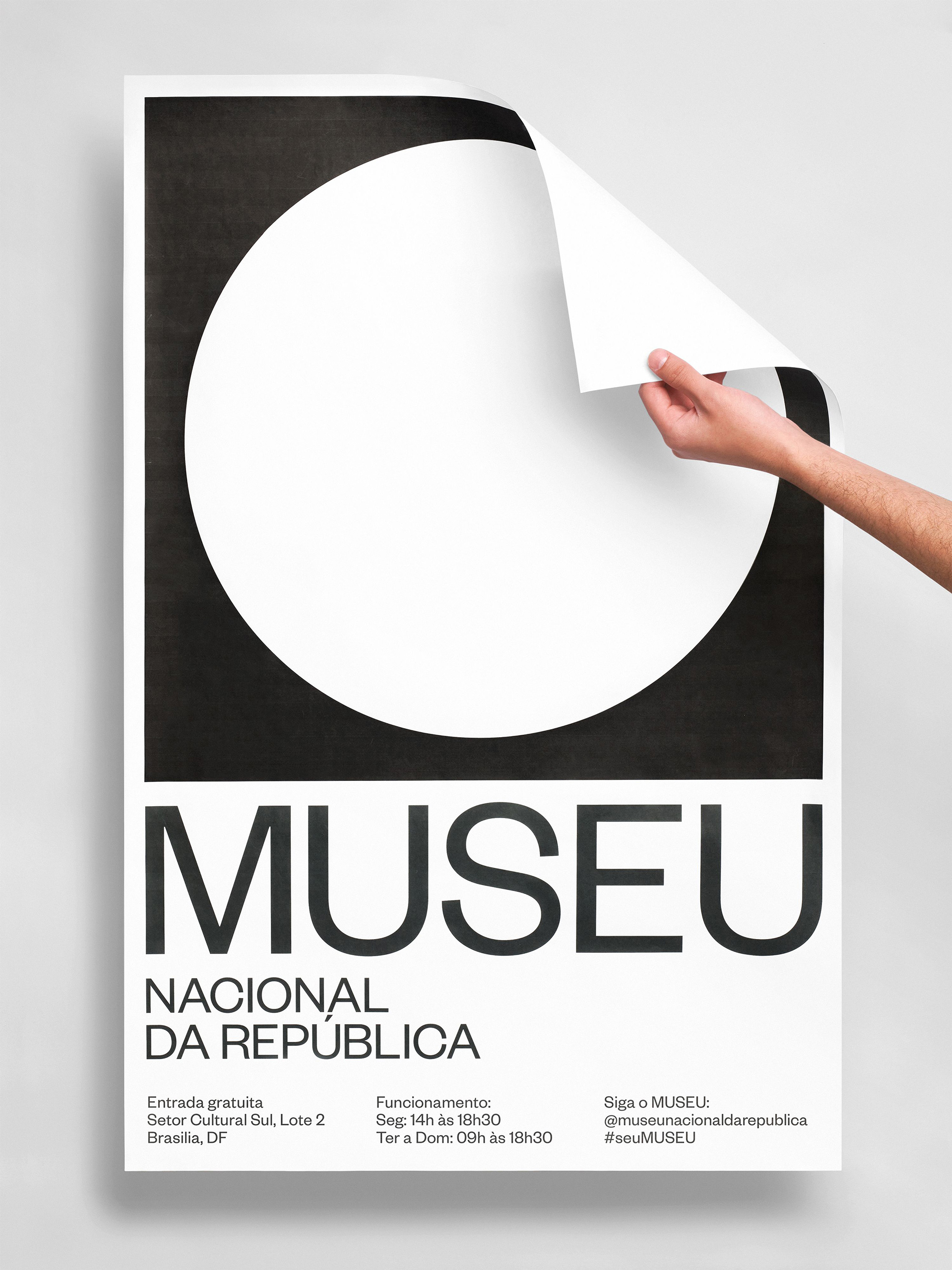
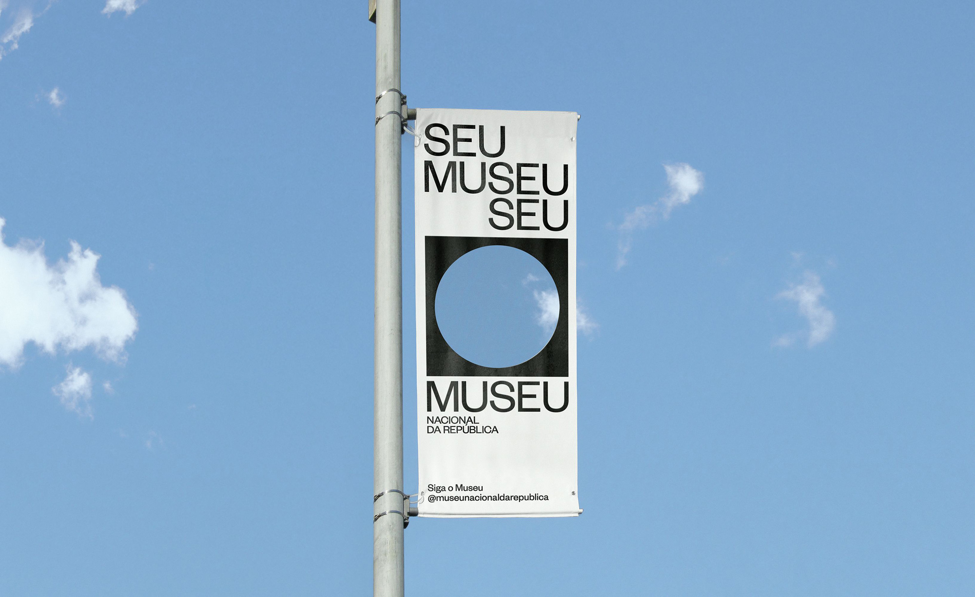
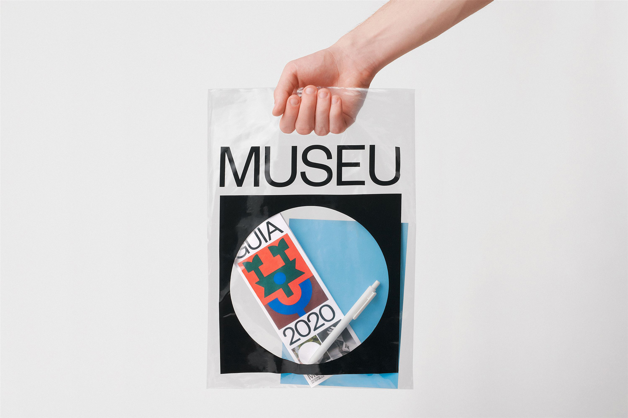
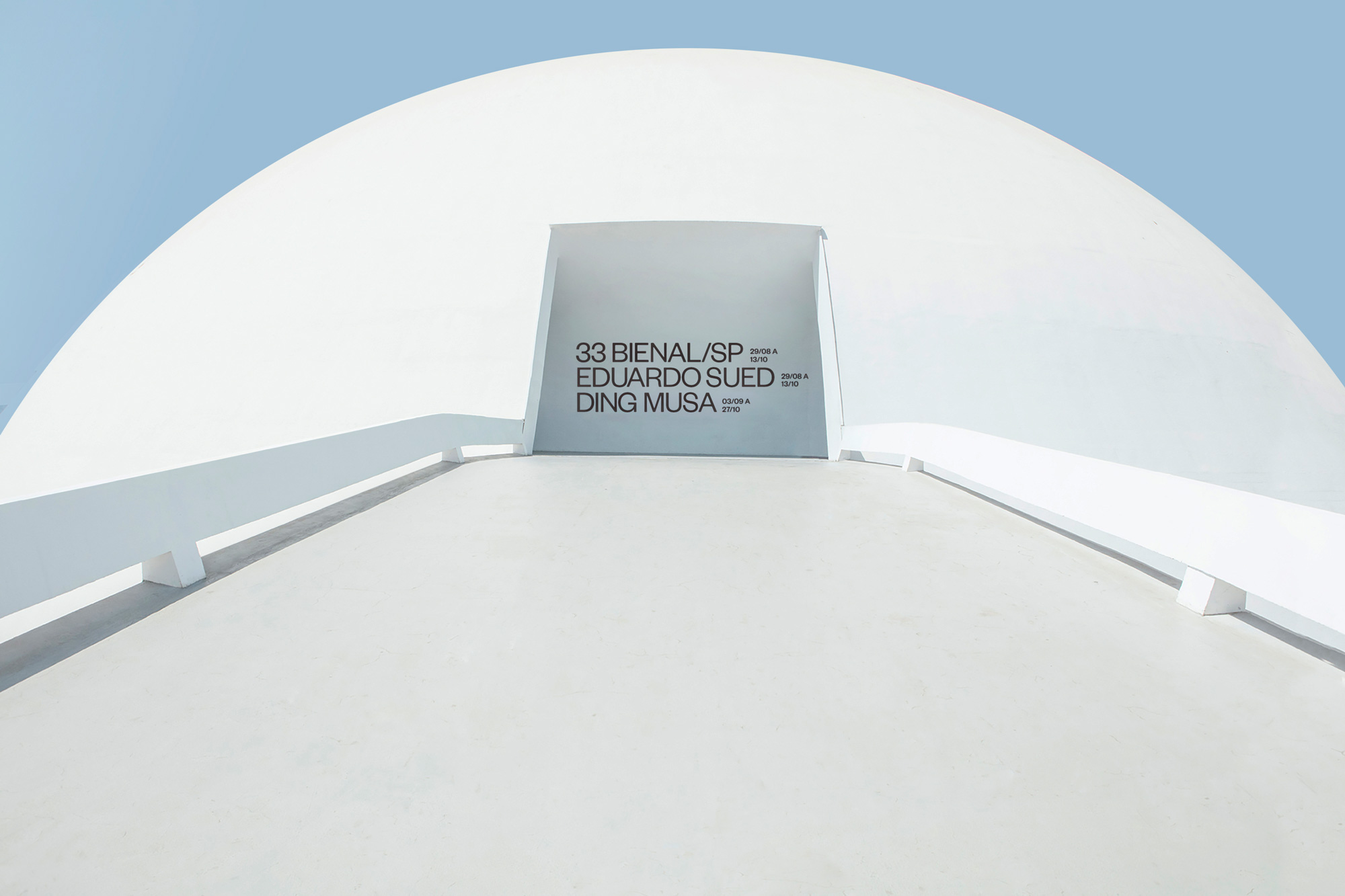
The circle and square join together to create a modern symbol for Museu Nacional. As a central feature of the identity, it represents the aerial view of Niemeyer’s dome while establishing the idea of “inside and outside”, contrasting the relationship between these two spaces. More than what it encloses, the surrounding area of the museum acts as a bustling social hub where citizens congregate, musicians perform, activists protest, others practice yoga and so on. Like a portal, the circle also functions as a graphic device that contains different imagery, be it photography, architecture, art or video, connecting and juxtaposing these two spaces in a constant state of dialogue and tension. A contemporary take on a traditionally modern typographic style, the use of Founders Grotesk recalls the visual language employed during Brasília’s early urban development while its circular letterforms allude to the museum’s infinitely curved walls.
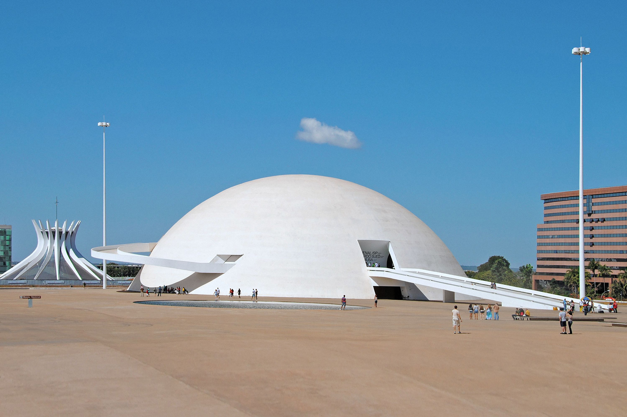
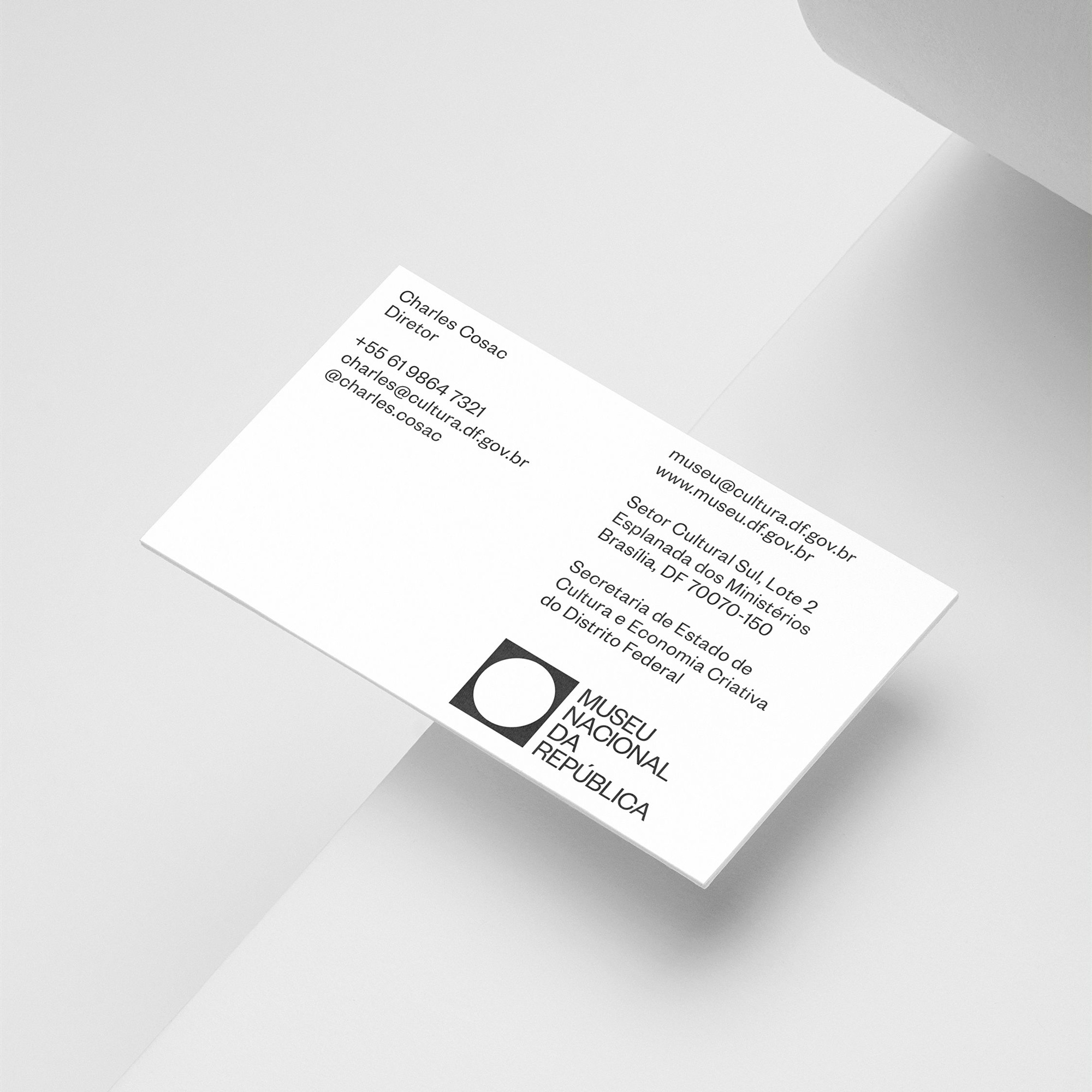
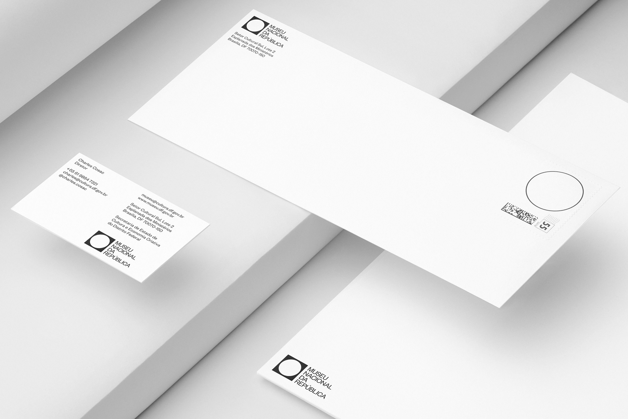
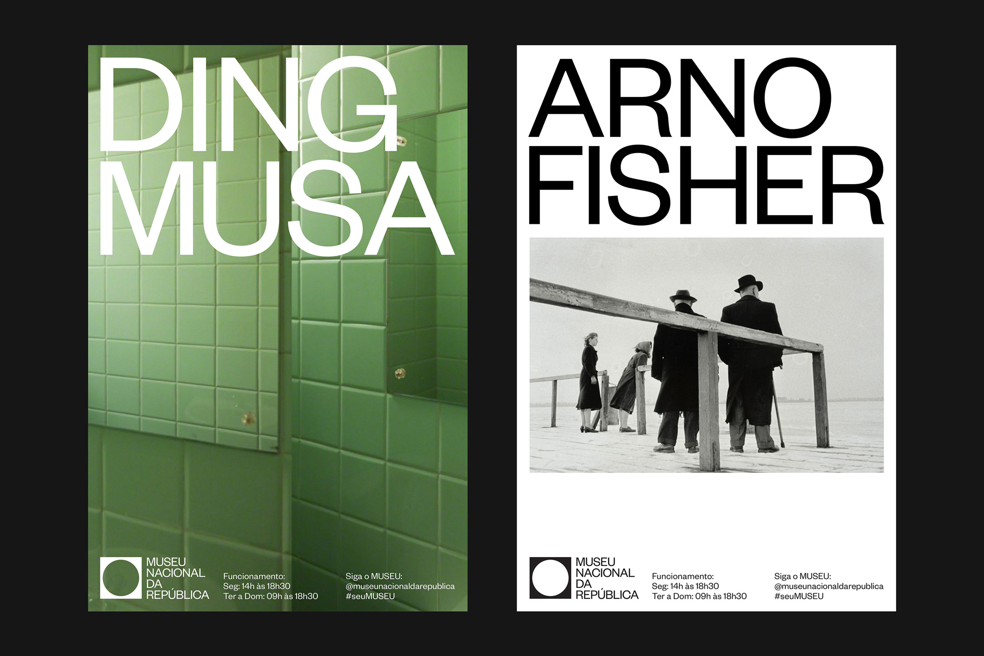
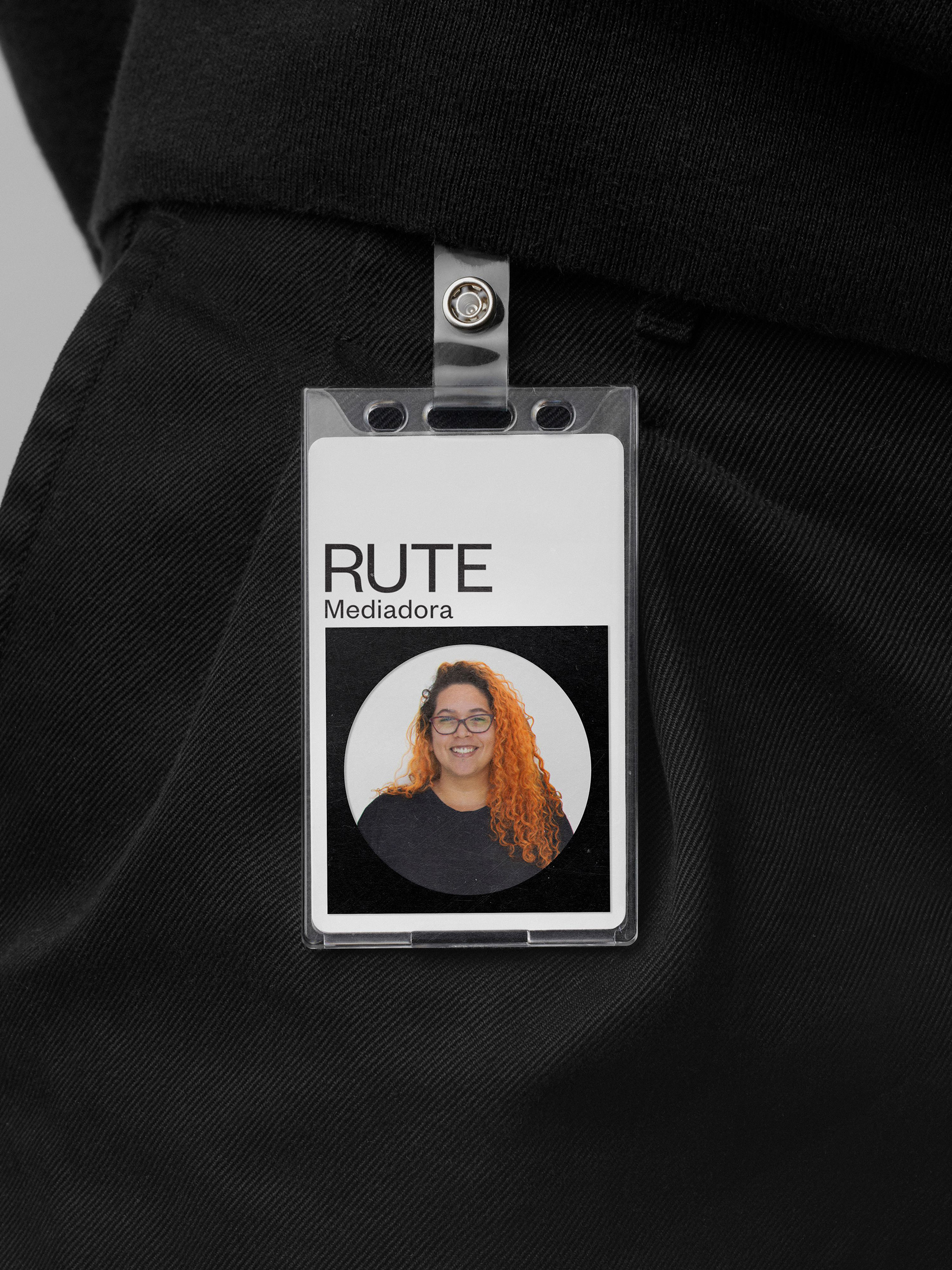
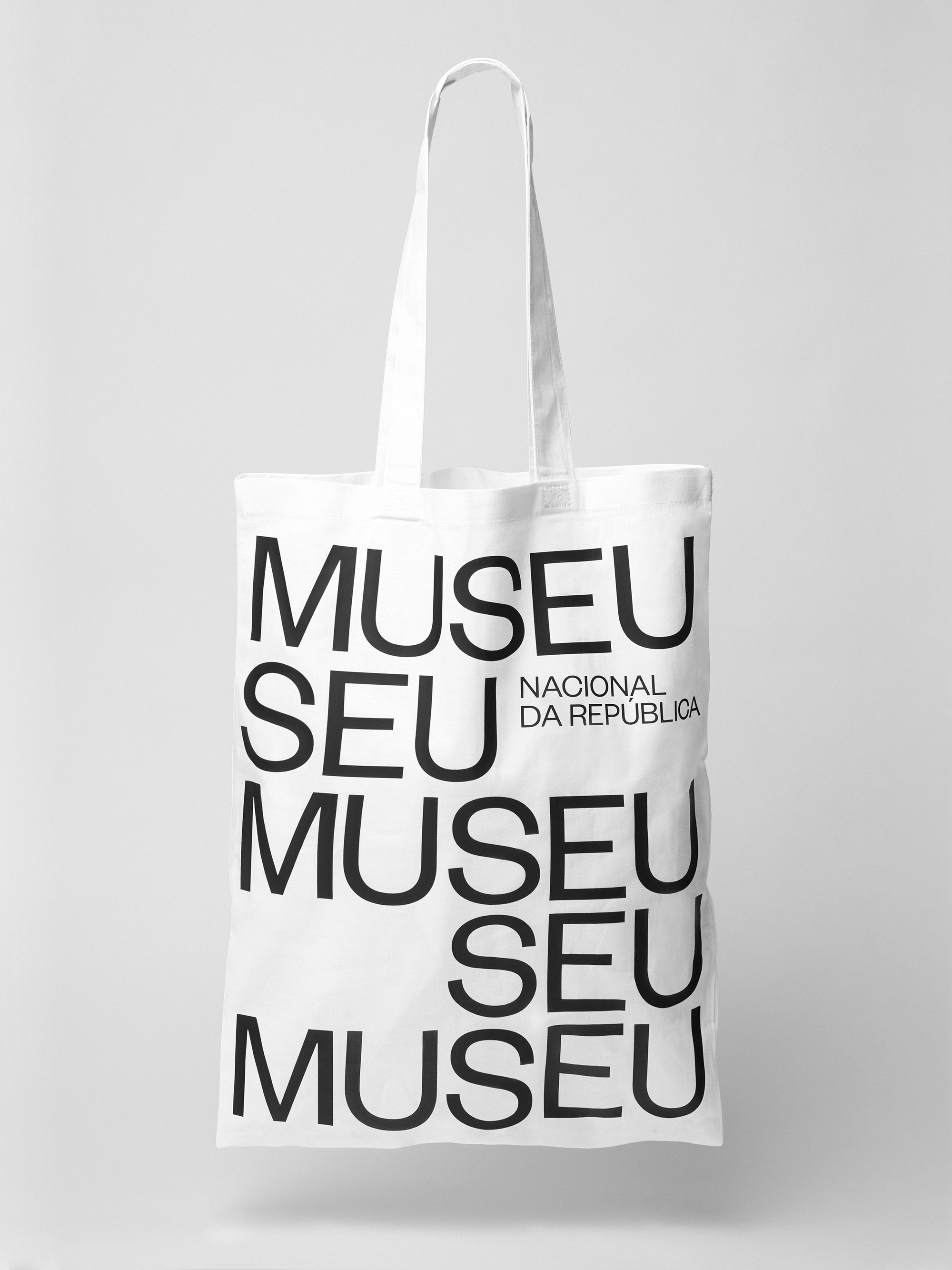
I probably don’t have to tell you that that the old logo was… not good. A ground-level view drawing of the museum was a good idea but the execution was downright baffling and as if I didn’t dislike Gill Sans enough already, seeing it stretched at least 200% wider than it is, is doubly offensive. The new logo shifts the view of the building to be seen from above and translates it into an abstract, Modernist- and Minimalist-satisfying black square with a white circle. Typically, this could come across as gratuitous Modernism/Minimalism from a museum identity but, in this case, it’s perfectly appropriate as it not only aptly represents the physical space and context of the museum but reflects the building’s Modernist origin. It also looks kind of bad-ass in its confidence. The wordmark emphasizes “Museu” as, reportedly, that’s how locals refer to the museum, rather than by its long name, and the uppercase setting yields a very nice block of type that aligns, again, so satisfyingly, with the icon above. The “NACIONAL DA REPÚBLICA” underneath may be a tad tiny, perhaps allowing it to occupy 75% of the width instead of 50% would have been a nice gesture. The logo also includes a horizontal version (seen below) where all the type is the same size and broken into lines, which is fine but loses the really nice balance of the stacked logo.
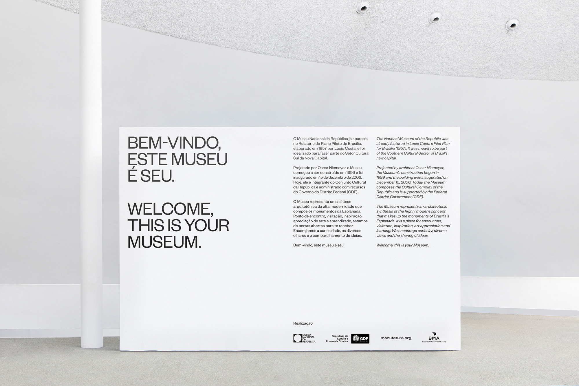
Though the museum operates upon inclusive values that seek to provide free access to contemporary art and culture, the museum (and fine art itself) can feel intimidating and elitist. With this in mind, our utilitarian visual language paired with a warm tone of voice work together to strengthen the relationship between the museum and the people. This sentiment is reinforced through the wordplay of “SEU MUSEU”, an anagram created by Manufatura meaning “YOUR MUSEUM”, which highlights each individual’s role within Museu Nacional’s dynamic ecosystem, fostered by its contributors, crew and visitors.
It is the balance between the identity’s modernist rigor and the otherwise inviting tone of voice that creates a uniquely modern-Brazilian sensibility referencing both the country’s significant contributions to modernist architecture and the warm energy of its people. Much like the symbiotic relationship between the museum’s interior and exterior, each component of this identity comes together to form a similar notion of universality that surrounds the museum: a place for everyone.
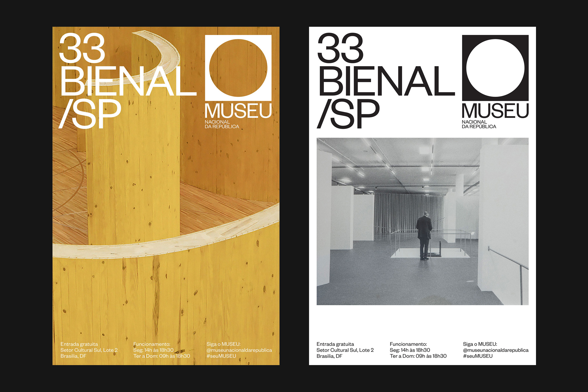
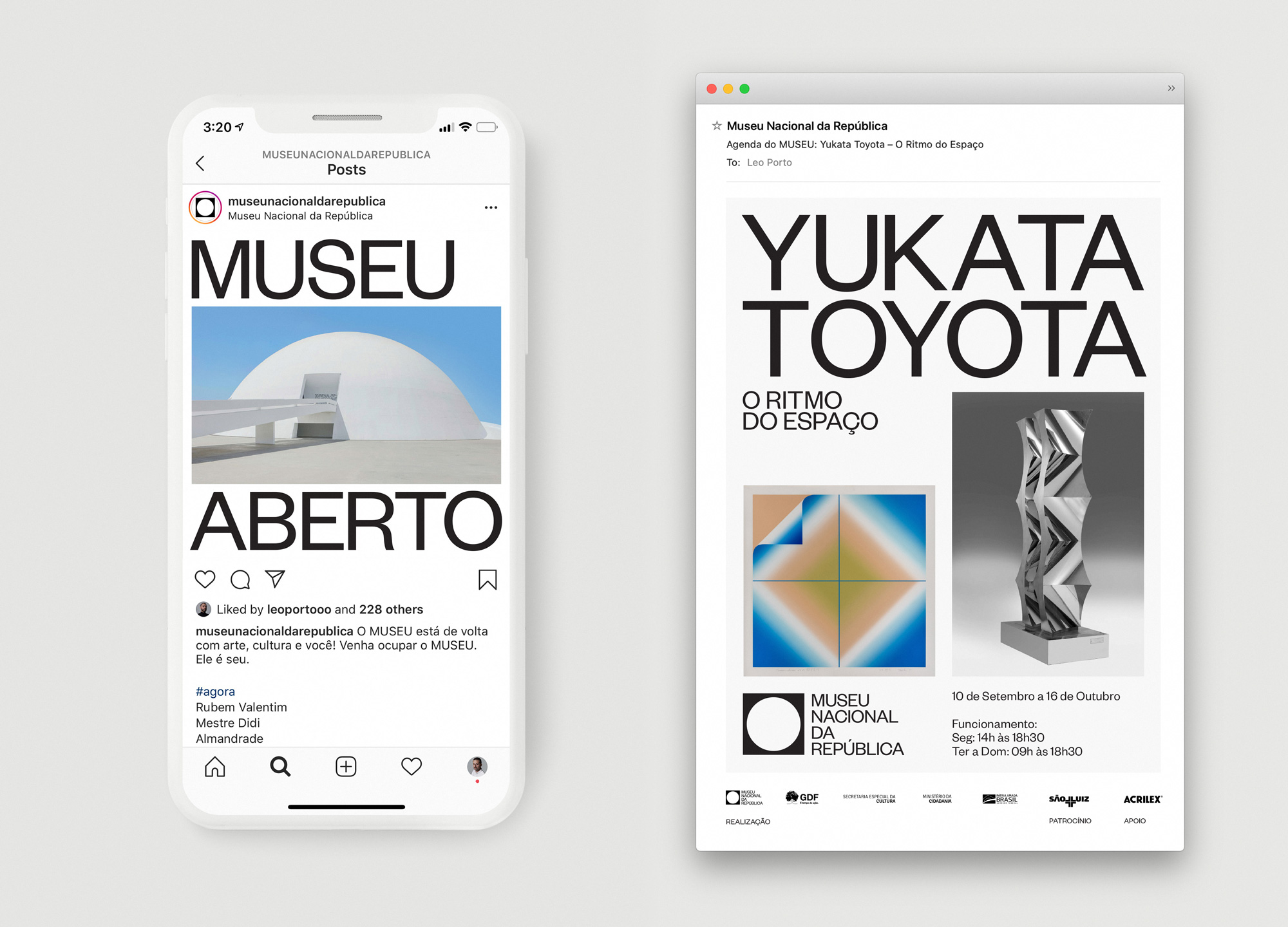
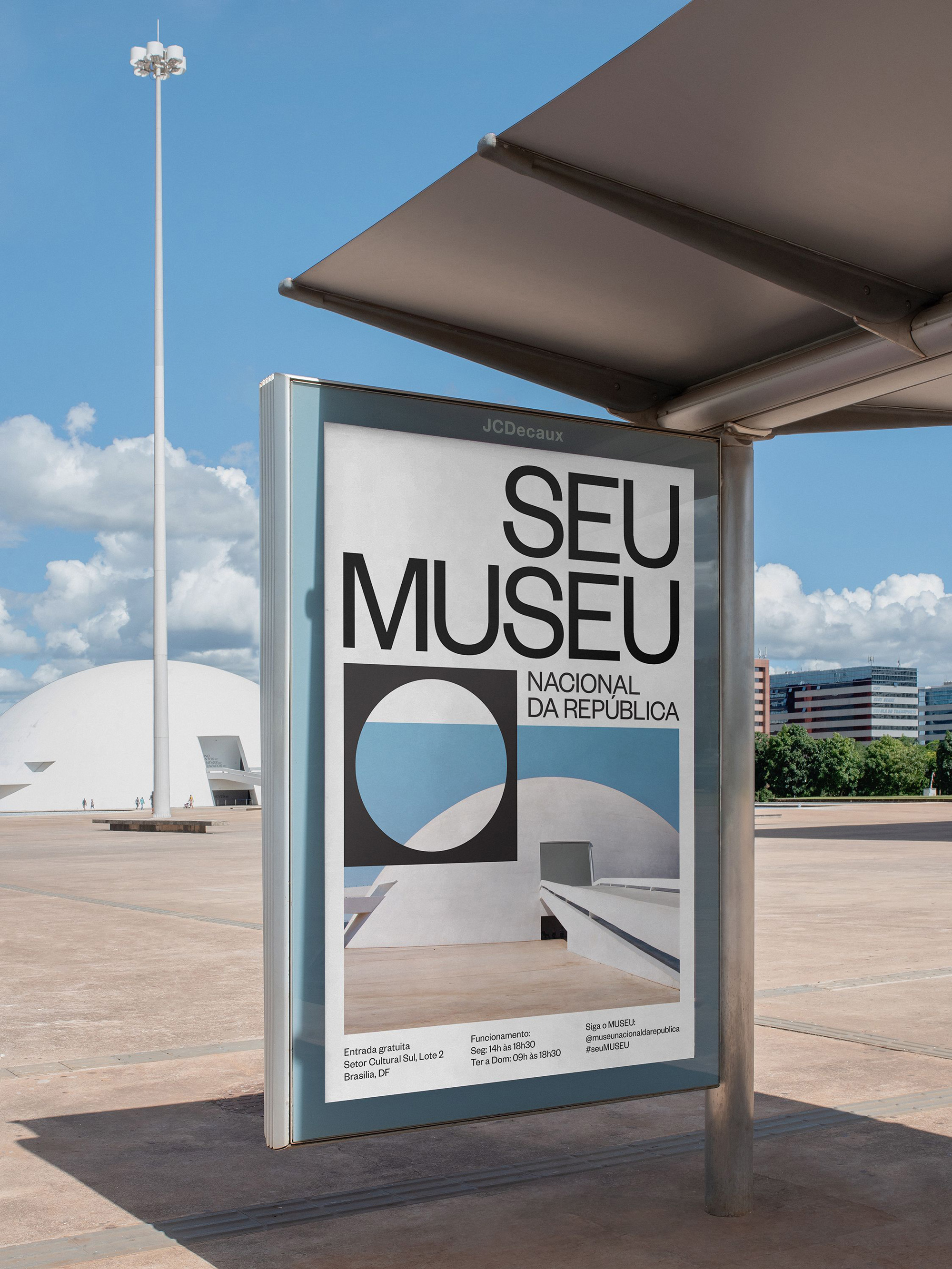
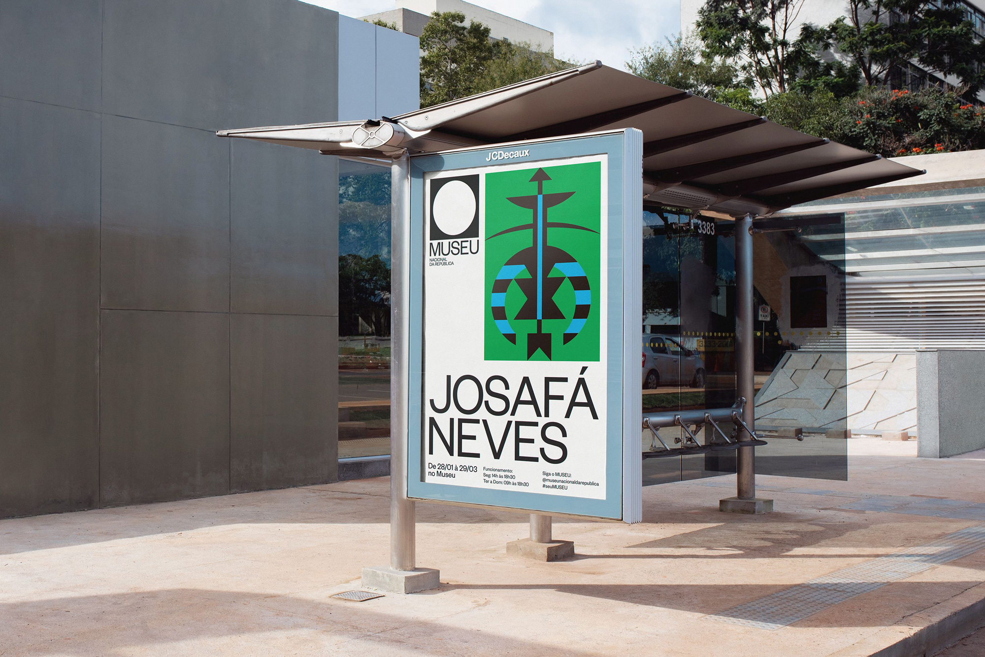
The applications are all quite nice but definitely operate within the Brutalist-lite style that is a year or two too late. Perhaps it’s unfair to raise the comparison as I do think the design approach makes perfect sense in this identity and I enjoy it but there is a strong sense of Been There Done That. One great detail that I would love to see more of is in the first shelter ad above where the icon is placed over a photograph for a hollow effect, which is also exaggerated in the ambitious banner shown below — if that ever became real, it would win application of the year.
Overall, this is perfectly executed and even though for us Brand New folk the style may seem repetitive this is highly appropriate for the museum, presenting it in an elevated aesthetic that should, in turn, help elevate the status of the museum.
 each year since publication began in 2006

 Новости Союза дизайнеров
Все о дизайне в Санкт-Петербурге.
Новости Союза дизайнеров
Все о дизайне в Санкт-Петербурге.