Обзор лучших ресурсов по разработке бренда, разработке упаковки
contact us | ok@ohmycode.ru
contact us | ok@ohmycode.ru
Founded in 1894, Bristol City Football Club is a professional football club based in Bristol, England, that plays in the EFL Championship, the second tier of English football, which they rejoined in the 2015 - 16 season, after two seasons being in the third tier. Nicknamed “The Robins”, the team plays at the 27,000-capacity Ashton Gate, and with the longest unbeaten streak of 13 games this season (currently in 5th place in the league, though), they have their aim on moving on the Premier League. Last month, Bristol City FC introduced a new logo designed by local firm Mr B & Friends.
City Vice-Chairman Jon Lansdown said: “The robin has long been a symbol of Bristol City and has historically been part of our history through imagery, words and song. It is important that the club has an instantly recognisable crest that reflects the club and we want to fully own this symbolic part of our identity.
“The Robin was first used on our kit as far back as 1949 and has been used on the white away shirt which has been incredibly popular with supporters. From now on it will appear on all our kit and be a fundamental part of our identity.”
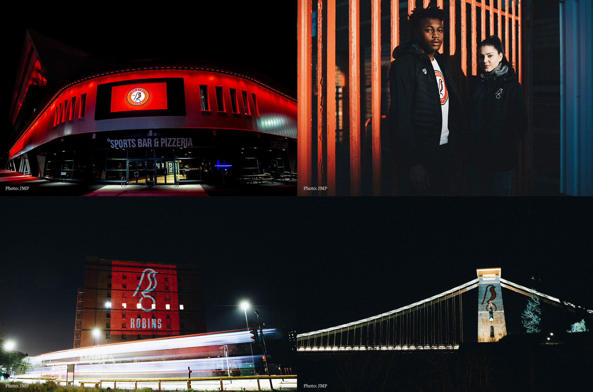
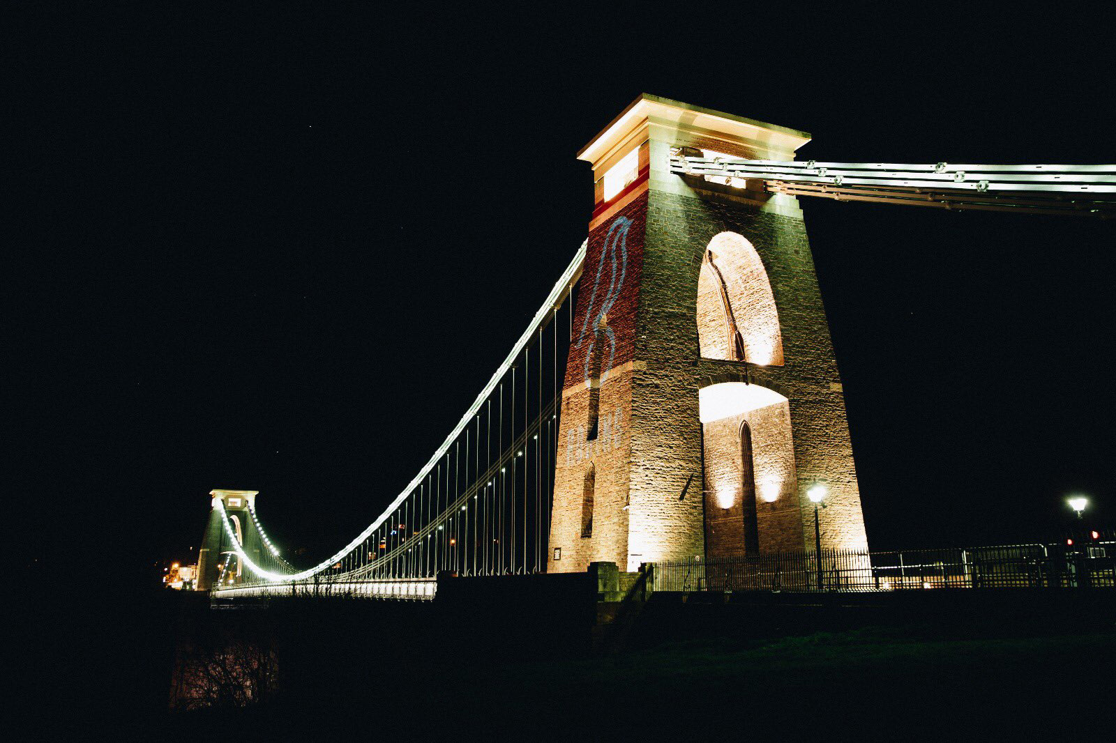
The new crest follows a consultation process that saw more than 3,350 responses received in a survey as well as a focus group which represented a cross-section of supporters. Having explored a variety of creative options and styles, the final concept of a simple, graphic robin sat atop a football was chosen. Designed to be proud and iconic, the new crest brings a renewed sense of identity to the club.
The old logo wasn’t so much a logo as it was a really competent Microsoft Paint rendition of Bristol’s coat of arms. Other than acknowledging the city they are from, the old logo had no significance for the football club. The new logo formally places the robin as the main identifier for the team — which has been used on and off since 1949 but never like this. The new robin drawing is simple and bold, with a strong pose and plenty of attitude even without any facial features — it looks like a bird that you would go “Shoo!” at and it would not shoo. I’m not entirely crazy about how it sits on a ball but it does ground it appropriately, both visually and metaphorically. The typography in the circle could be a little more interesting but for the most part it’s fine. I like the “1894” in there, even if it’s a little gratuitous. The resulting logo has more of an MLS vibe than an English league vibe which I am sure will upset some that this doesn’t evoke the tradition, legacy, and history of the sport but the 1800s called and they are okay with us moving on.
The 3D variations are a little SomeOne-esque but still nice to look at.
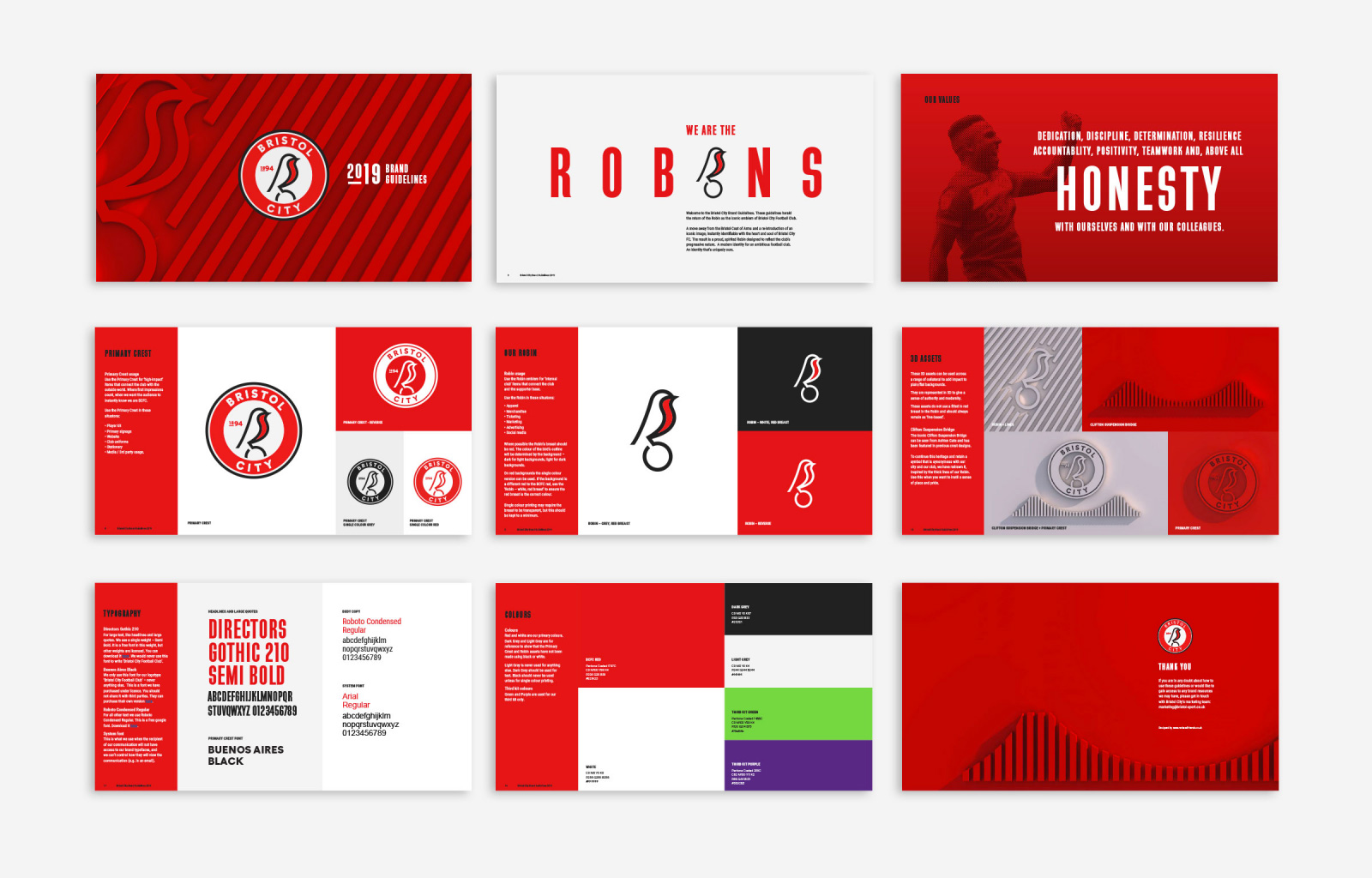
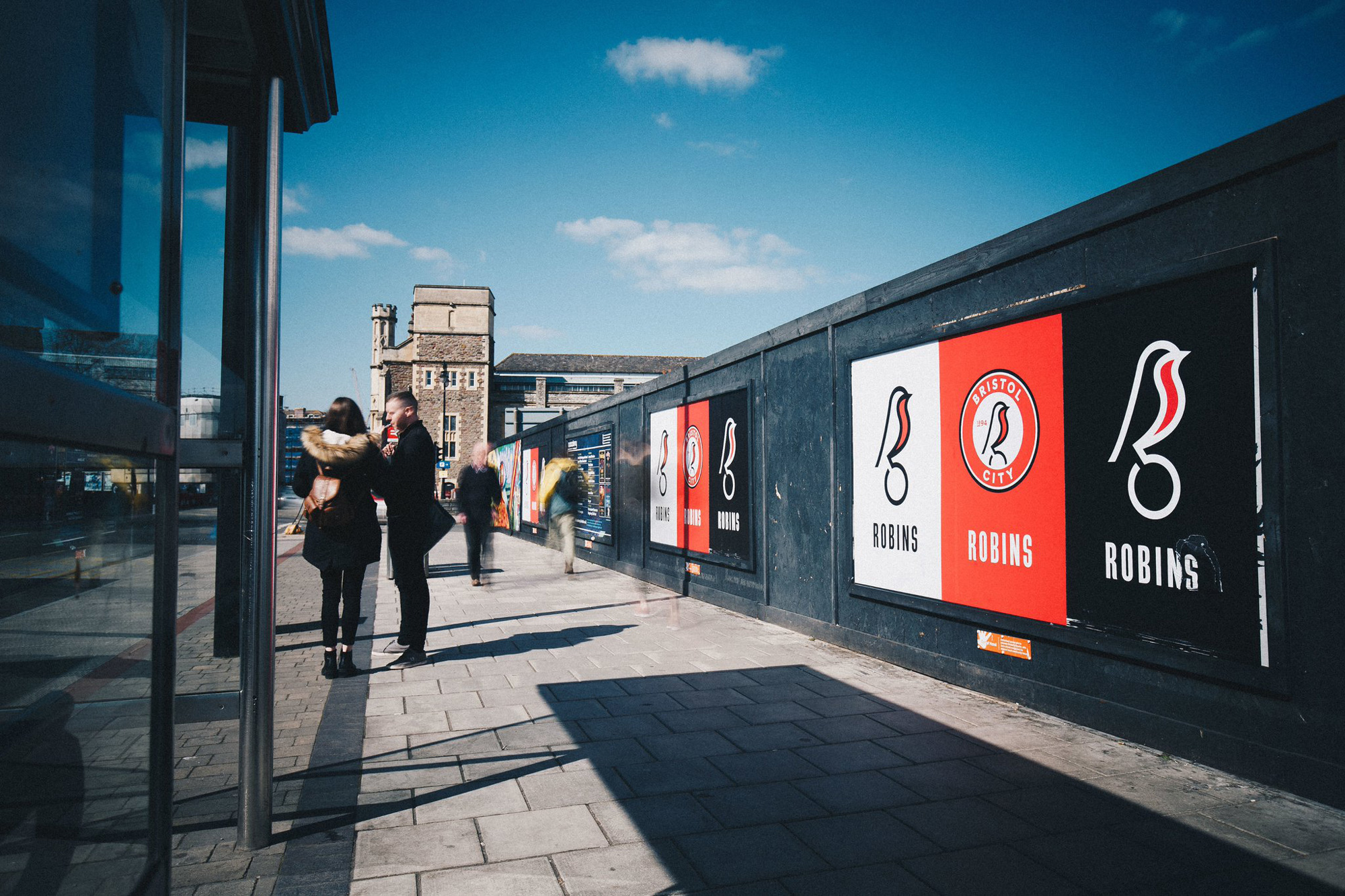
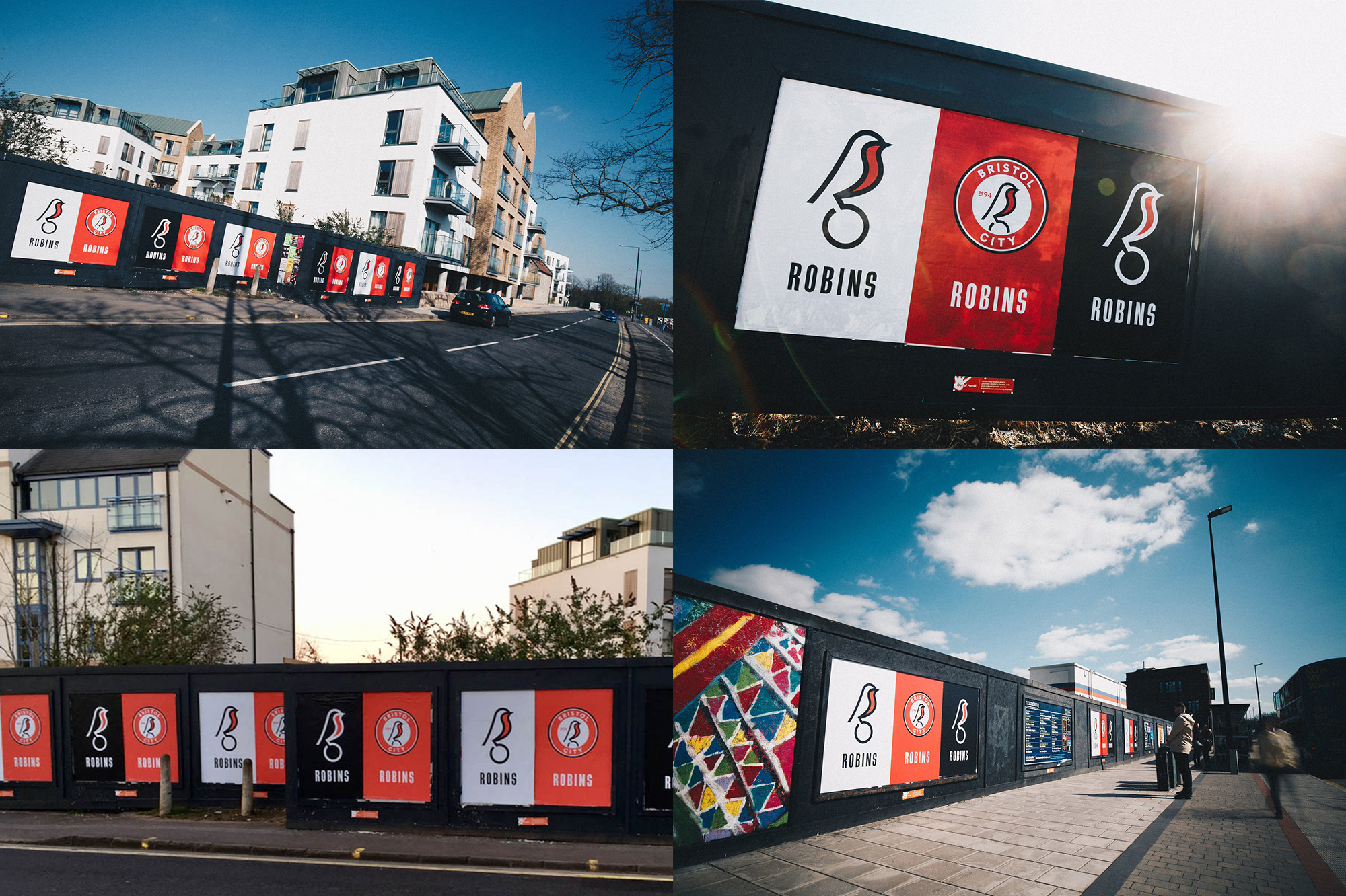
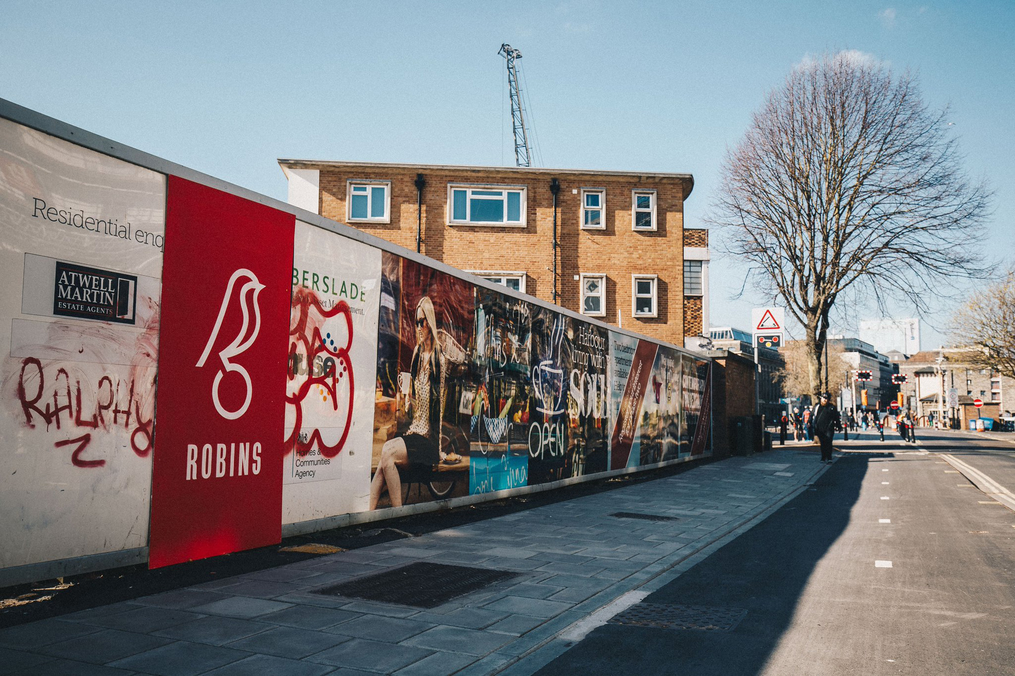
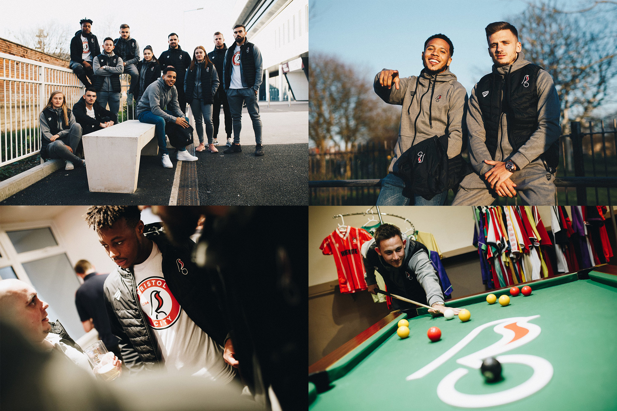
The secondary application with the bird out of the roundel and paired with a condensed wordmark is pretty cool and gives the team a much more contemporary and slightly urban aesthetic that works really well with the black-red-white color palette.
Overall, this is a really nice redesign that gives the team a highly recognizable (and merchandisable) icon that is sure to stand out against the rest of its league’s competing logos.

 Новости Союза дизайнеров
Все о дизайне в Санкт-Петербурге.
Новости Союза дизайнеров
Все о дизайне в Санкт-Петербурге.