Обзор лучших ресурсов по разработке бренда, разработке упаковки
contact us | ok@ohmycode.ru
contact us | ok@ohmycode.ru
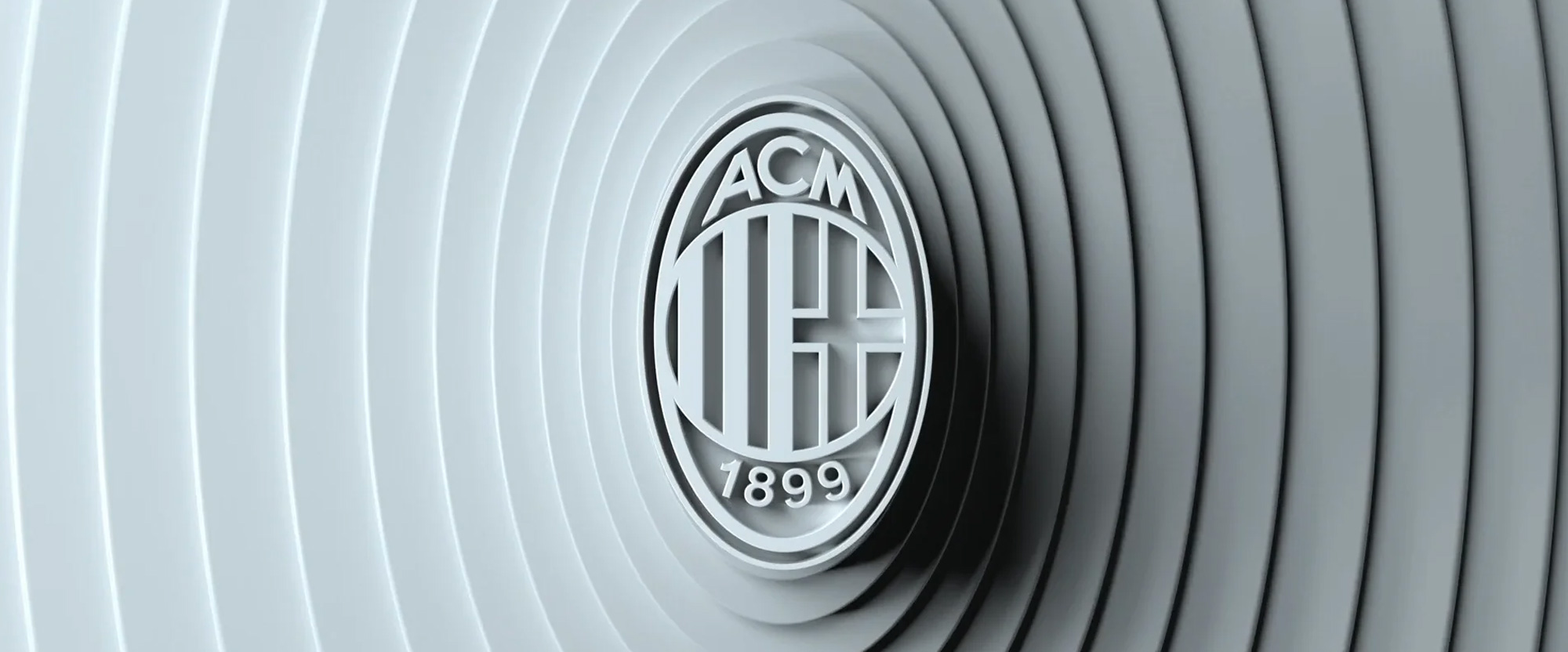
Established in 1899, A.C. Milan is one of the most popular and successful football teams not just in Italy but abroad. Among its accolades are 18 titles in Serie A, the top league of Italian football, and 18 combined FIFA and UEFA trophies for continental and international competitions. A.C. Milan plays their home games in San Siro, aka Stadio Giuseppe Meazza, the largest stadium in Italy, with a capacity of 80,000 people. Recently, the team introduced a new identity designed by London, UK-based DixonBaxi.
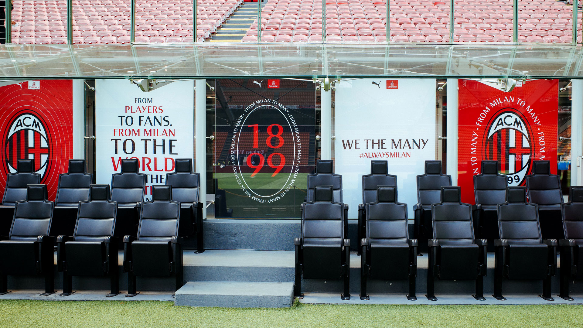
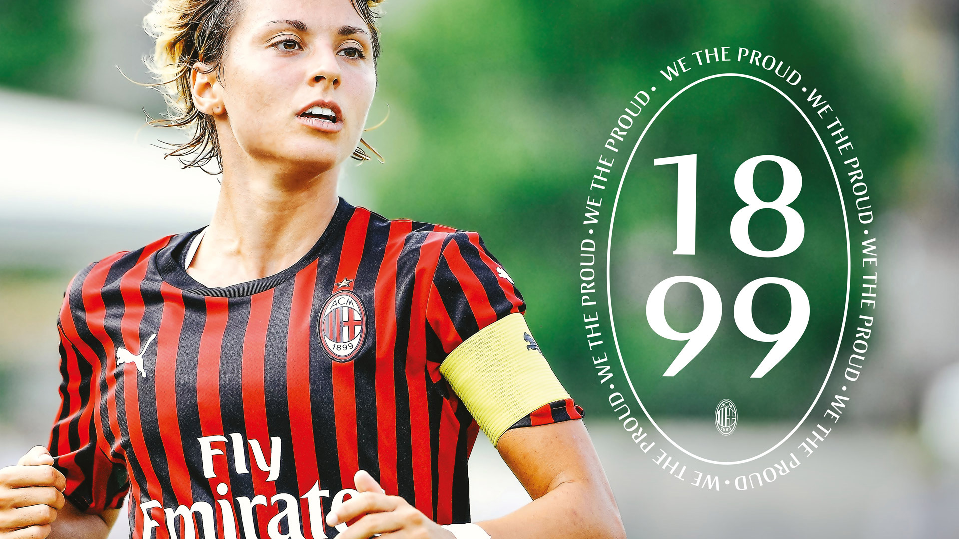
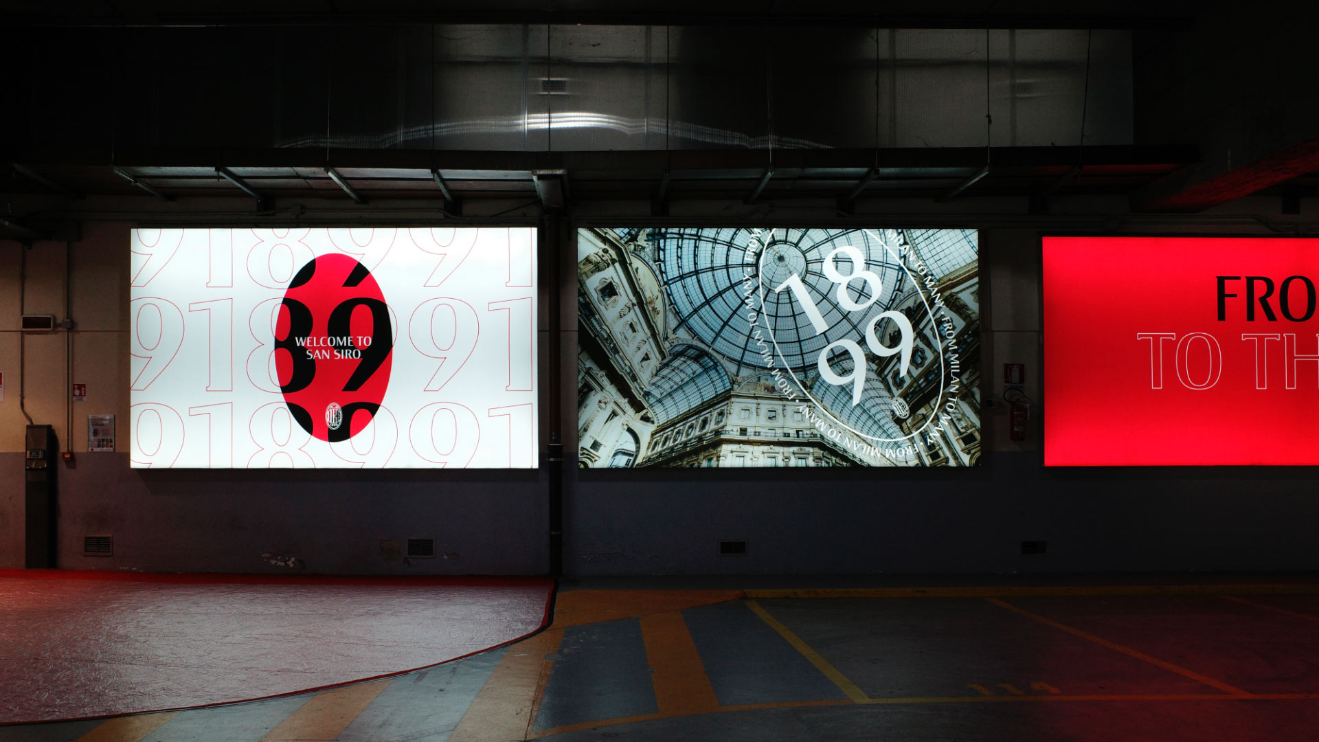
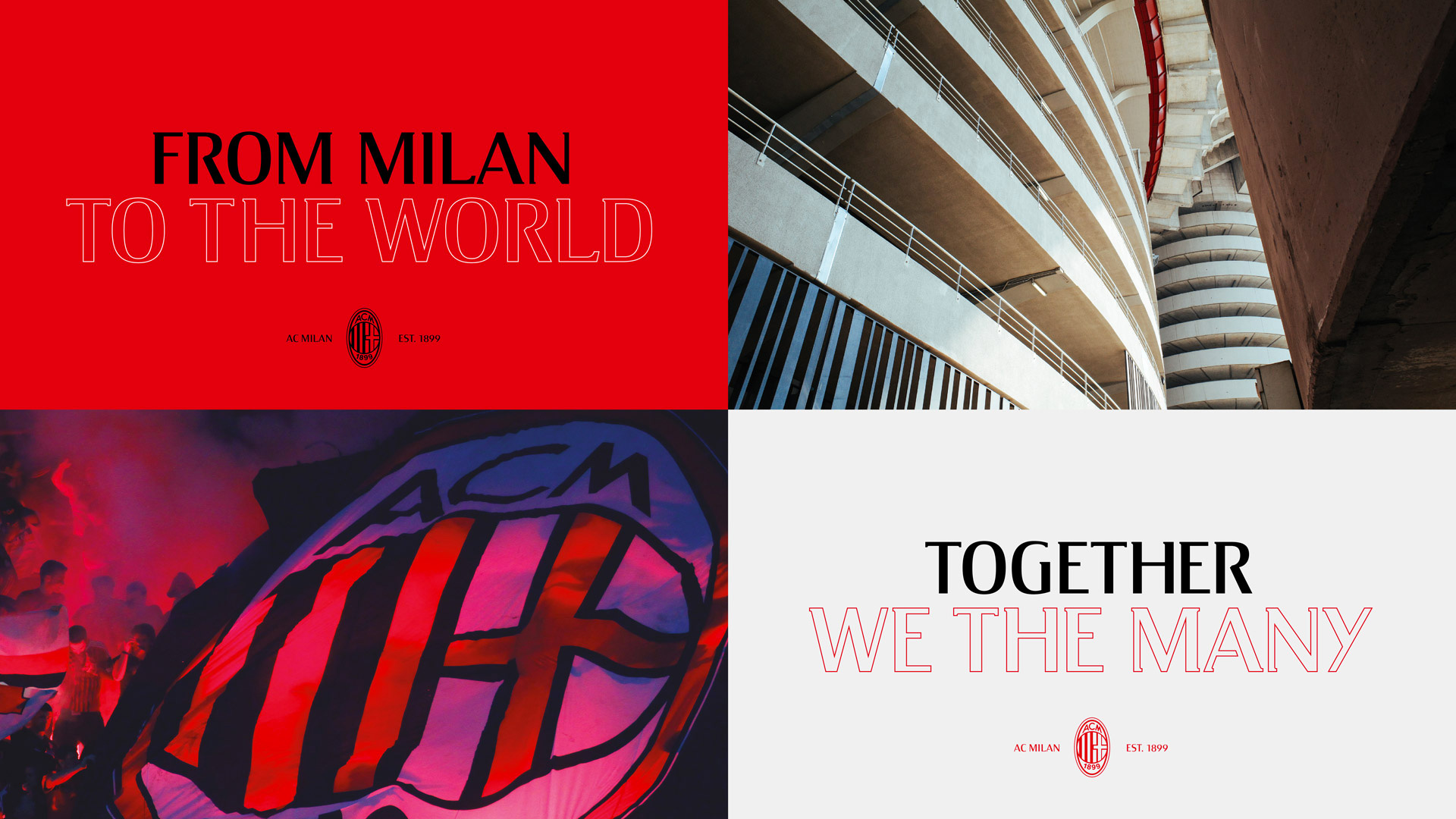
The identity celebrates the club’s iconic badge as a symbol of unity - a beating heart that connects millions. Fans and footballing gods have been kissing the club’s famous badge for a century. Respecting this heritage, we left the design untouched and used the iconic oval shape to tell powerful stories.
As much as it would have benefitted from some minor tweaks — I count at least 58 different stroke thicknesses (I also kid) — it was probably a good idea to leave it untouched and not ignite the ire of fans unnecessarily. It’s also a way of implying that they don’t need to pull a Juventus and change their logo dramatically to something more commercial and can instead build on the team’s heritage. Nonetheless, I would have loved to see some technical improvements to it. Nonetheless to the previous nonetheless, the either client-imposed or self-imposed limitation on the badge update led to a great new visual language that amplifies the equity of the shape.
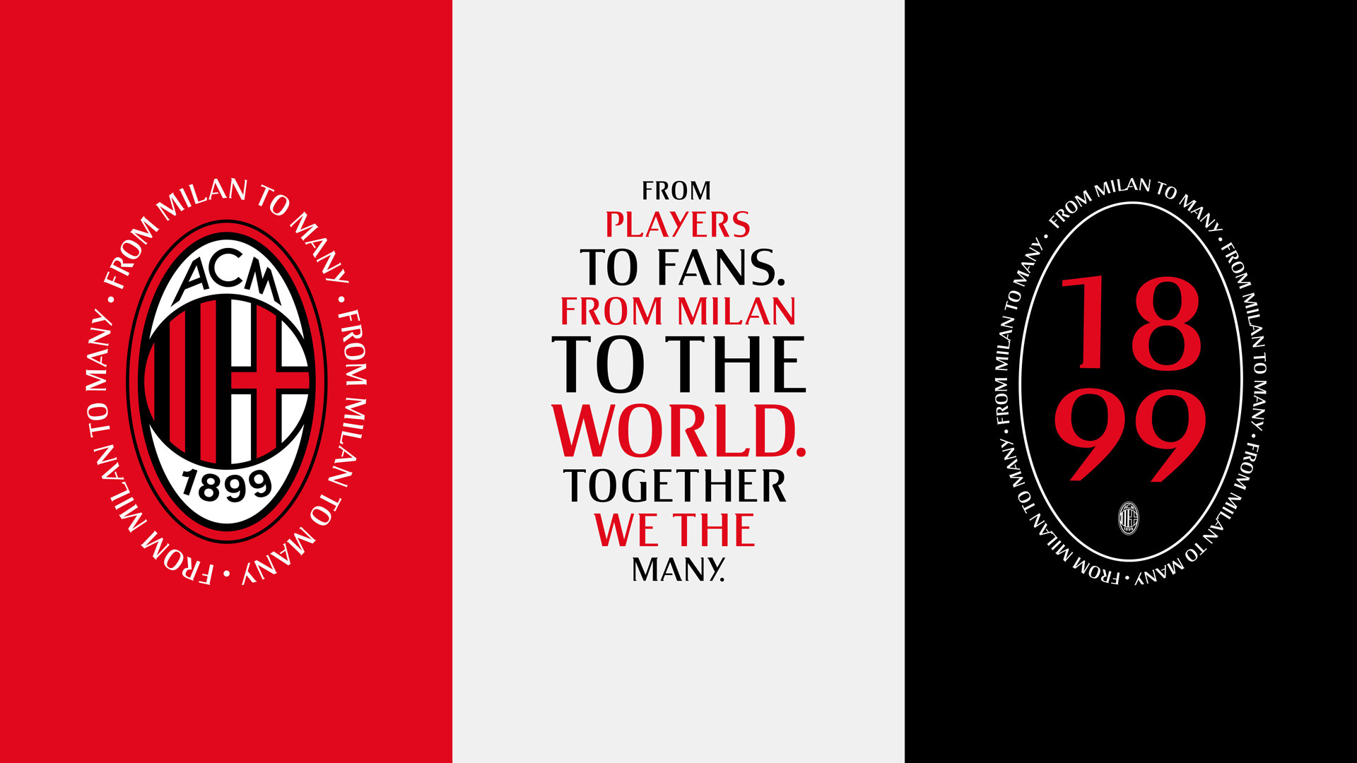
Inspired by this illustrious past but focused on future glory, we designed an AC Milan for a new, diverse generation of proud Rossoneri. Confident yet refined, the graphic language balances elegance and passion. Equally at home online, in the San Siro or plastered across the city, the consistent graphic language gives the club a strong voice to connect with fans.
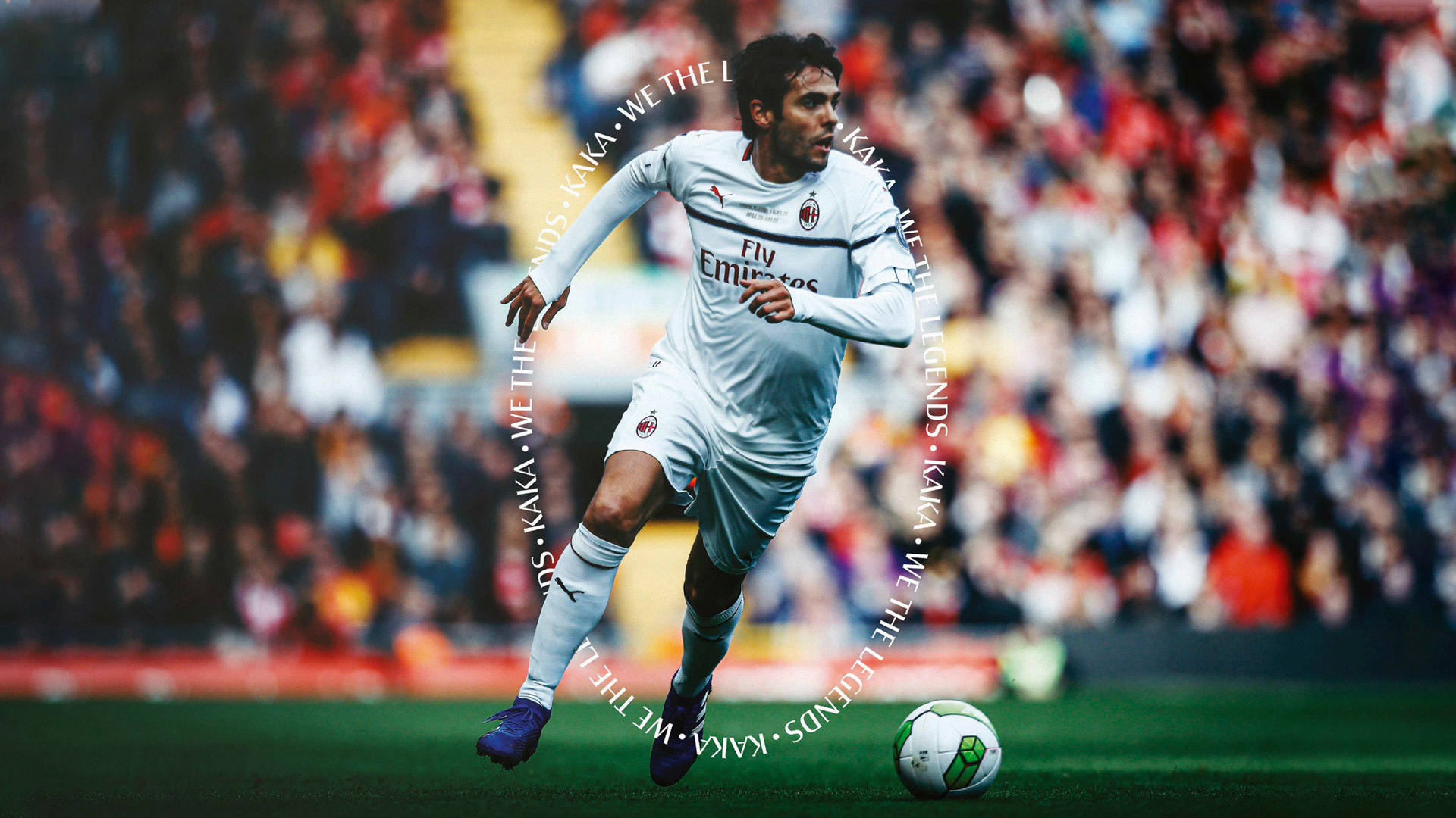
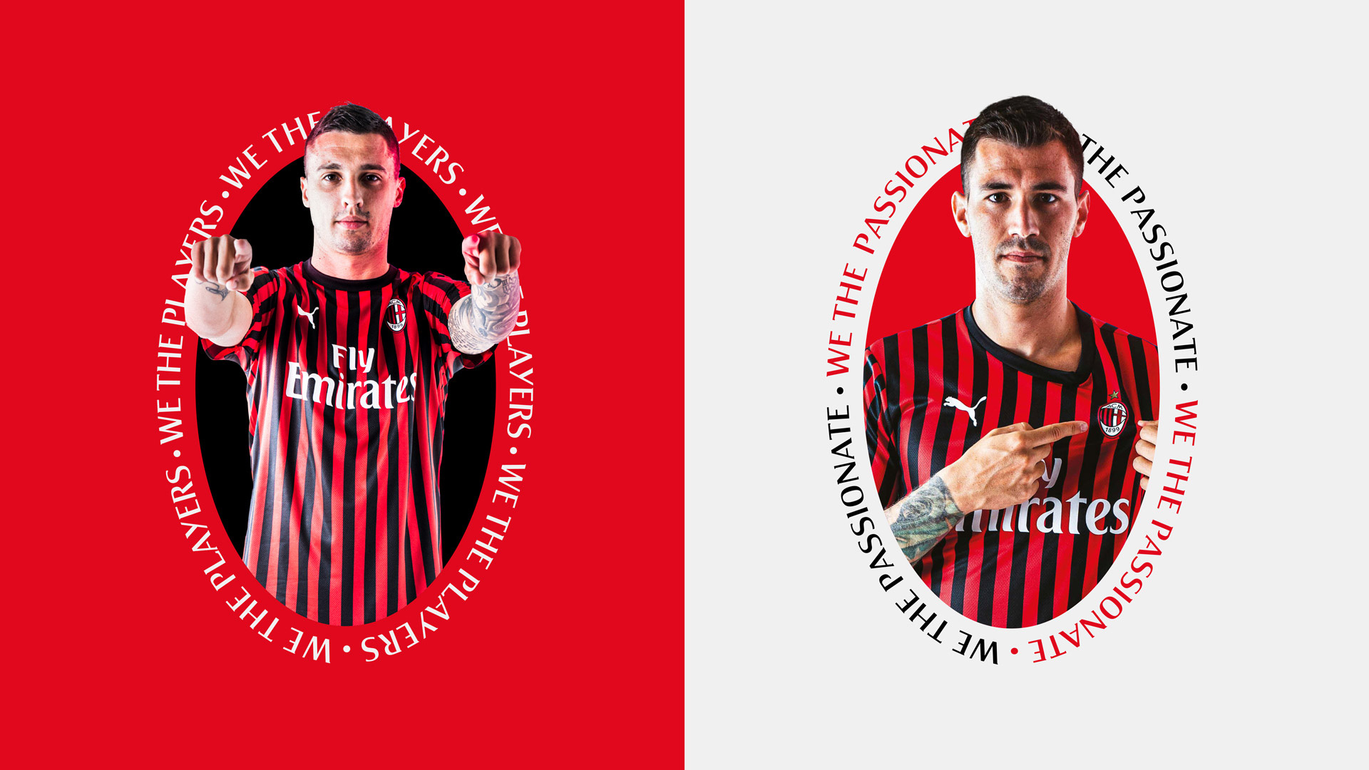
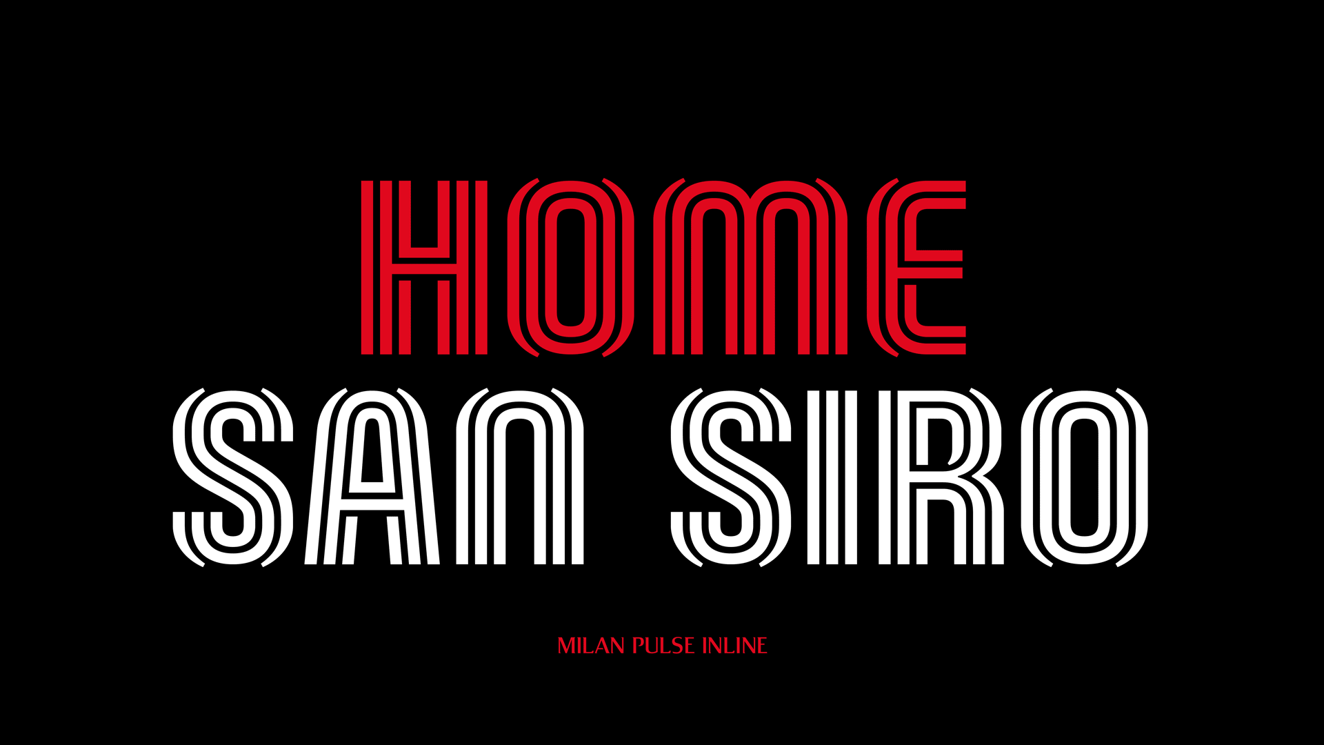
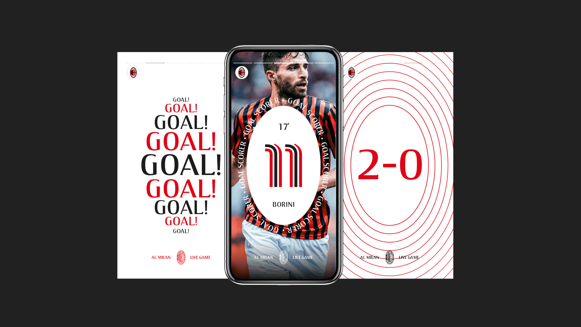
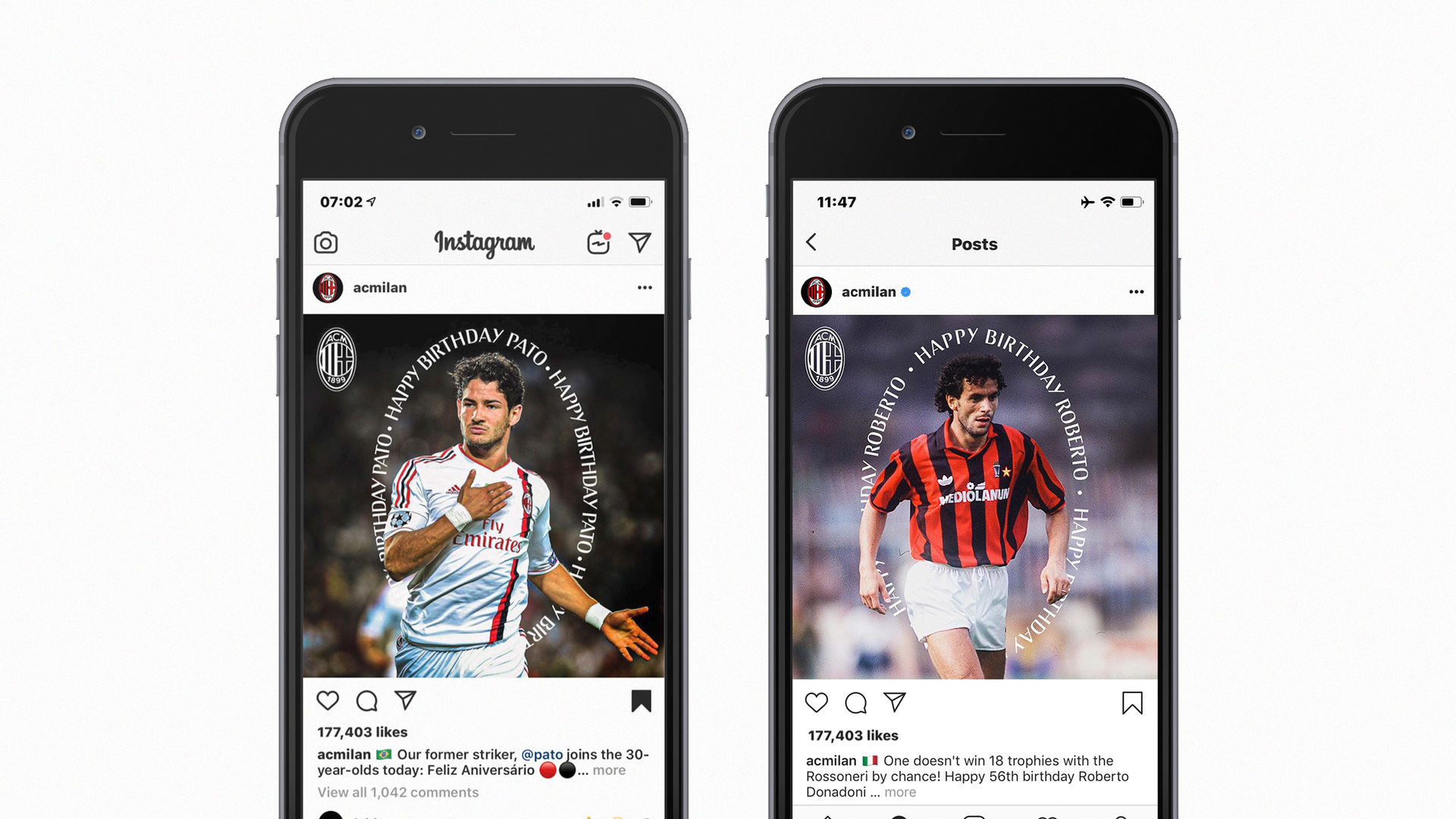
Using the existing A.C. Milan custom typeface — I am not sure exactly how long it has been in use — DixonBaxi has devised a great system built literally around the oval in a way that feels classic (as in inscriptions on stone) and contemporary. I personally dislike the existing custom typeface and I am amazed that they were able to make it look good. Even the treatment where words go from small to big to small to form an oval, which exposes the awkwardness of the typeface, manages to look quite nice, but the best treat in this is when the type is smaller, set along the oval, and layered with player contours.
Introducing a dynamic new typeface inspired by the shared heartbeat of our fans.
Taking cues from fashion, lifestyle brands and Italian culture, we created a bold yet elegant typographic system. Instantly recognisable, it captures the passion Milan fans have for their club.
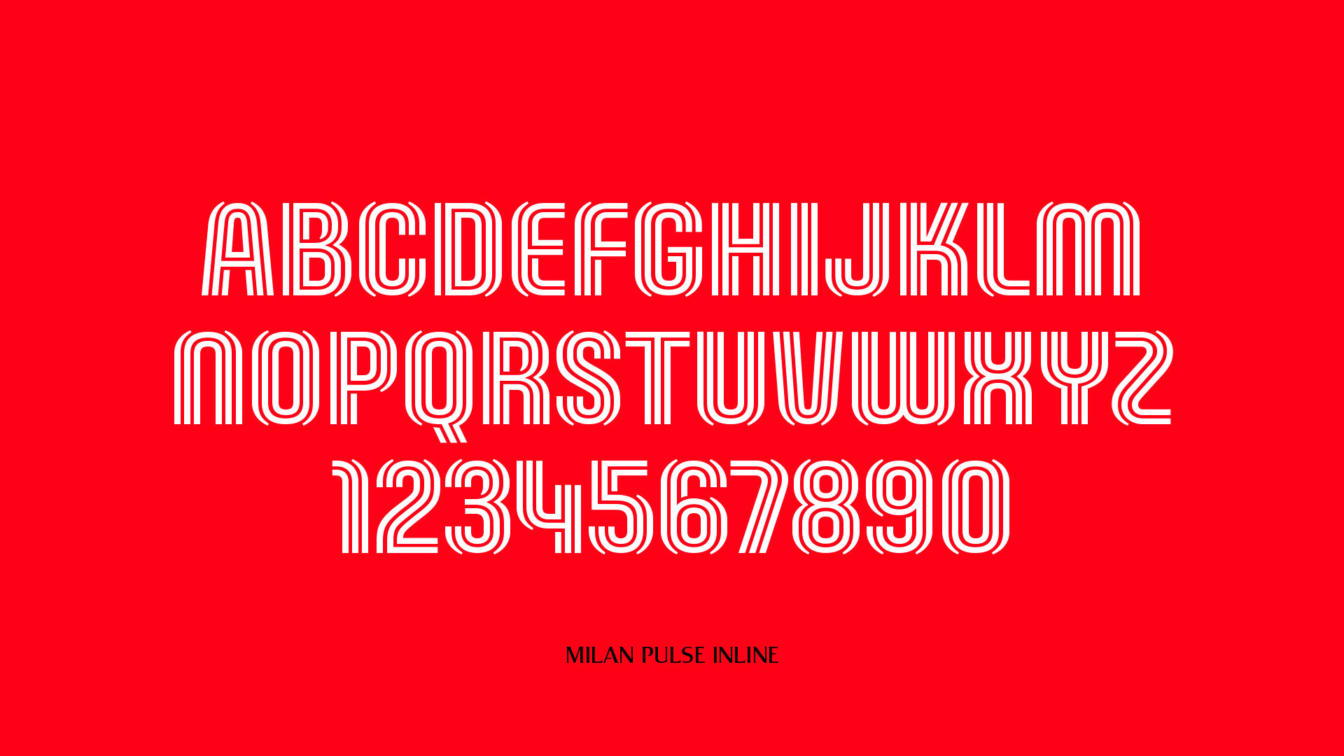
I’m not really sure what relationship there is between the new custom typeface and anything else on the identity but I sure do like it. I mean, there is some oval-ness to it with the kind of parentheses effect, but it feels a little like a whim which, hey, if you can pull it off, why not?
As is to be expected from DixonBaxi, the motion component of this is awesome and makes any grievances moot, even the opening radial line animations on the badge which are not as sophisticated as the rest of the 99% of this.
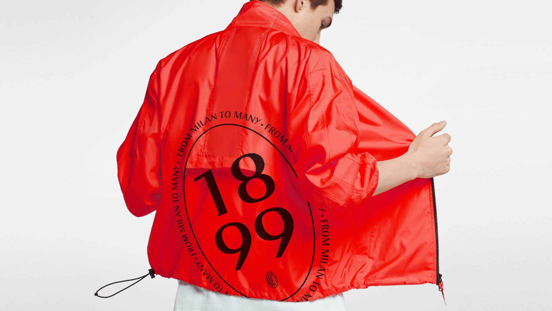
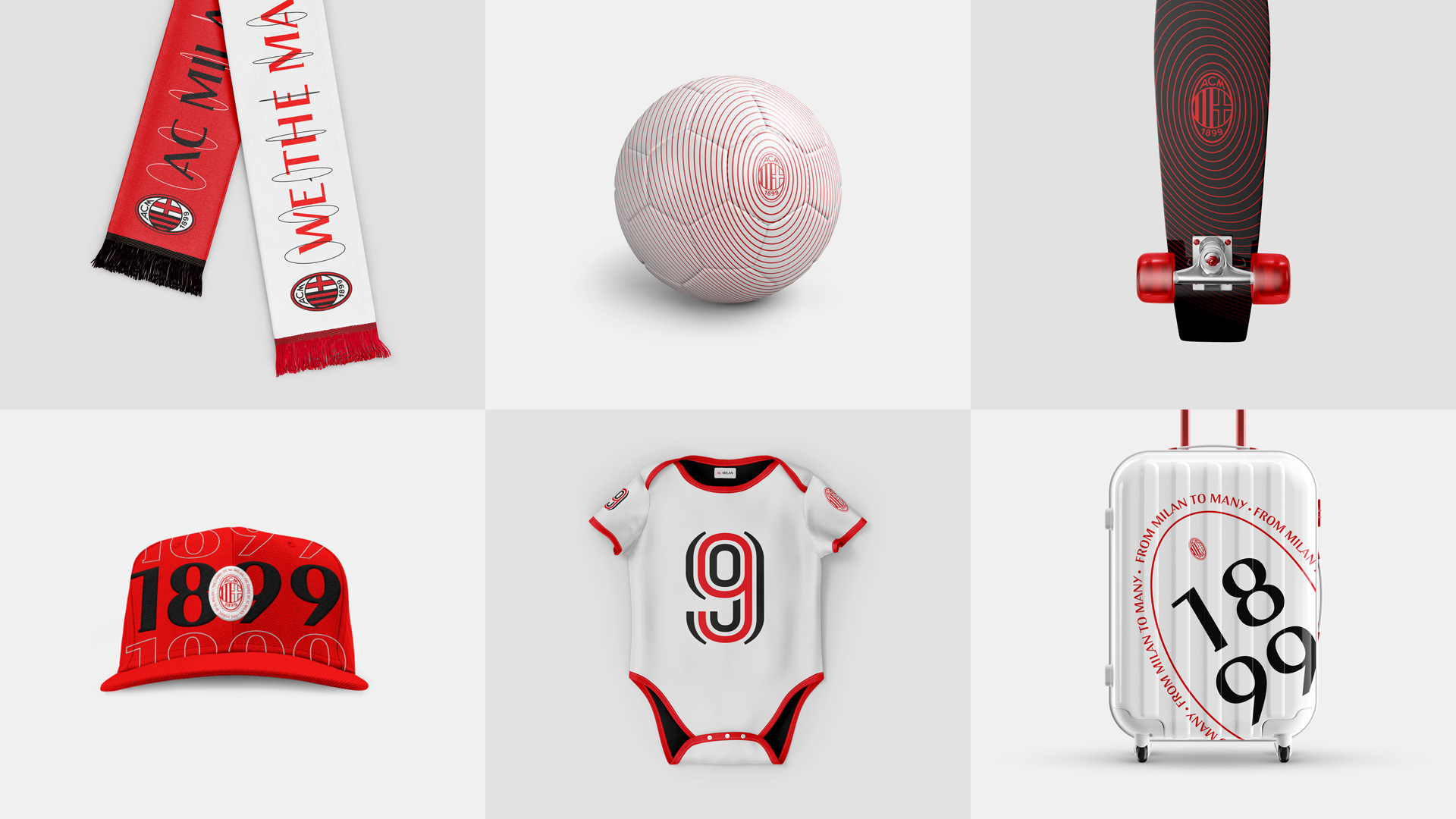
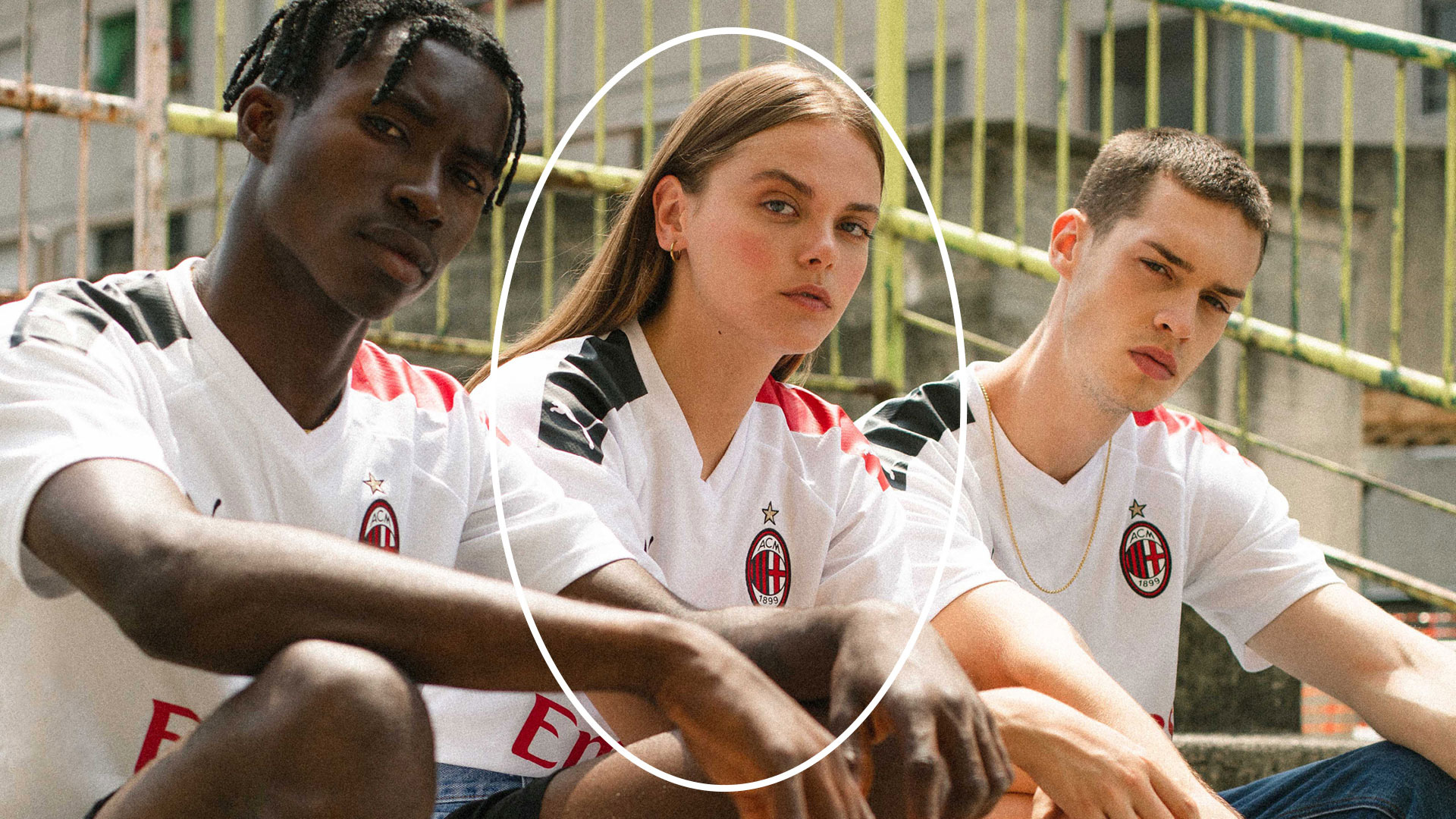
Like most big football teams, A.C. Milan is trying to make its brand feel like a fashion street/lifestyle brand which, financially and merchandising-ly, I get but it can come across as an annoying flex. Still, I wouldn’t mind adding that red jacket to my collection of design stuff.
Overall, this is a great update that infuses a lot of new energy into the team’s identity in a way that honors its history and heritage without any distracting and useless fan backlash.
 each year since publication began in 2006

 Новости Союза дизайнеров
Все о дизайне в Санкт-Петербурге.
Новости Союза дизайнеров
Все о дизайне в Санкт-Петербурге.