Обзор лучших ресурсов по разработке бренда, разработке упаковки
contact us | ok@ohmycode.ru
contact us | ok@ohmycode.ru
Established in 1947 (and previously known as Australian Hearing), Hearing Australia is a Government-funded provider of hearing services to eligible people including children under 26, pensioners, veterans, adults with complex communication needs, and Aboriginal and Torres Strait Islander people over 50. With over 600 locations around the nation, Hearing Australia assesses patients’ hearing, selects and fits hearing devices for them, and provides ongoing hearing health and technical care. This past July, along with their name change, Hearing Australia introduced a new identity designed by the Sydney, Australia, office of Landor.
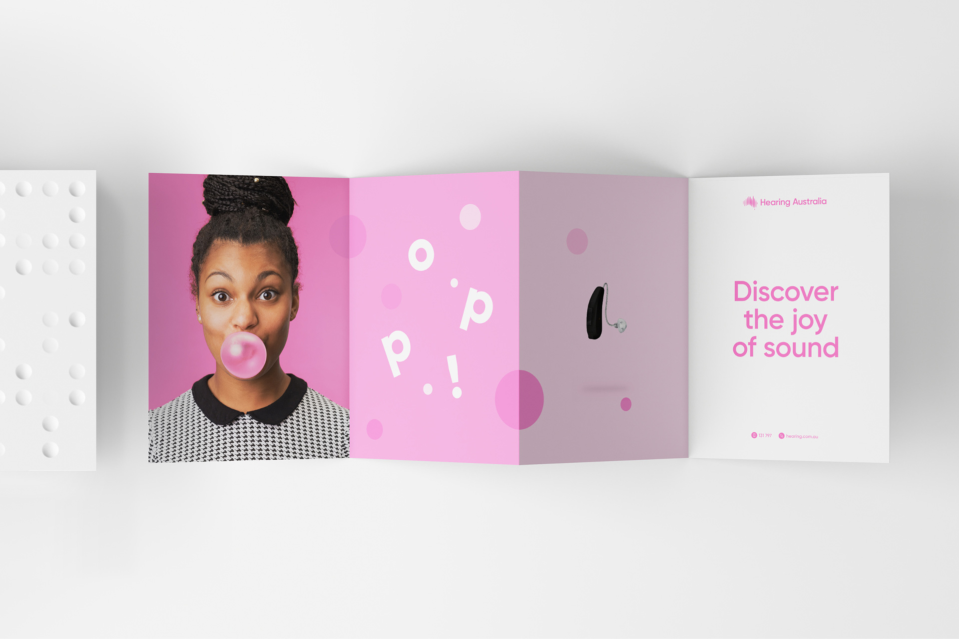
We developed a brand strategy and identity focused on ‘Celebrating Sound’. Working closely with Hearing Australia, we used this idea to inspire every aspect of our brand. A brand where you could hear, see and feel the sound. A brand built by sound.
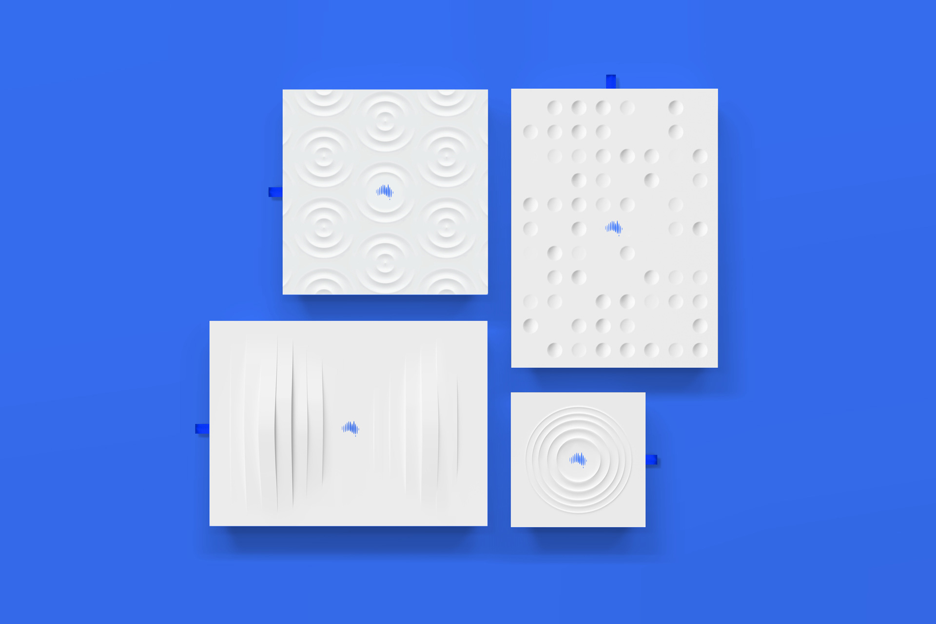
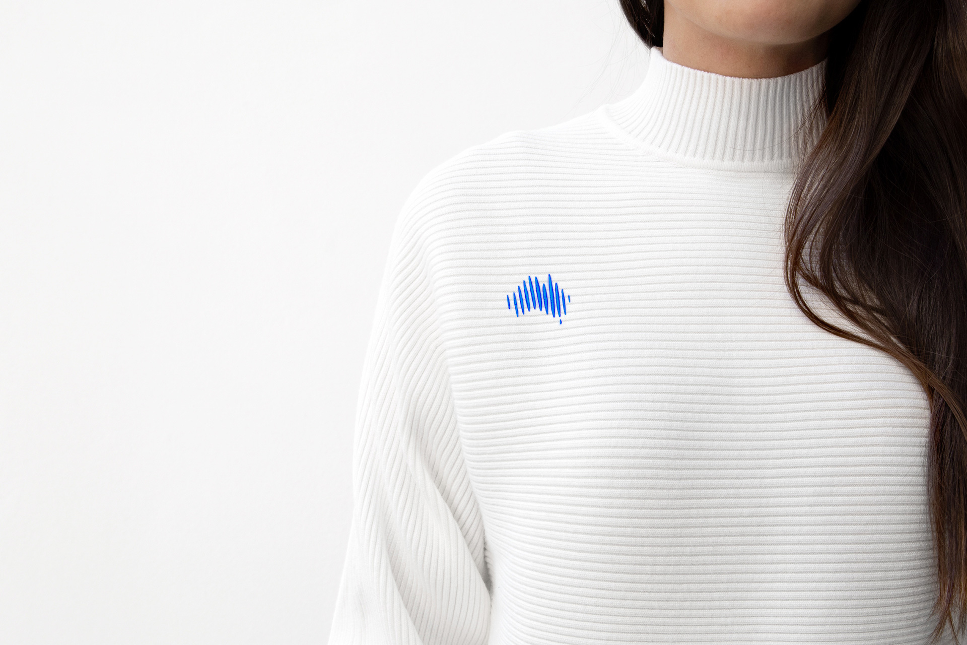
Sound inspires a suite of two and three dimensional motion forms. Sound can be seen in our photography and illustrations. Sound informs the materials in our centres and the texture of our uniforms. Sound is at the heart of every decision we’ve made.
The old logo meant well but unfortunately it wasn’t very good. The human figure drawing, perhaps meant to have an aboriginal art aesthetic, looked weird, especially with the emanating audio lines (which nowadays are more easily interpreted as Wi-Fi signal) and the italic typography was too much italic-ness for one logo. What it did do well, was look like a government health initiative, which is not quite a compliment but a generalization of how bad government health initiative logos usually are. The new logo, by contrast, is very slick and goes to the other end of the spectrum in looking like a privately-owned, high-end clinic. Before I wrote the introduction about the organization and based on the new logo and identity I totally thought this was a publicly-traded corporation doing heavy-duty R&D and manufacturing top of the line hearing devices. I would have never guessed it was a government-funded program. All this is a long way of saying that the new logo and identity might be too nice.
But let’s talk about its execution for now: I like it… I did immediately make the connection that the icon had to do with sound, which is not, in any way, proof that I’m smart but that the logo is an instant trigger of association to the organization’s subject matter. Obviously, having the name next to it, spelling out what it is, helps but, still, it’s an effective, nicely done icon. I do know there is a segment of the Brand New population that is tired of Australia maps being used for Australian companies but when your country is as easily identifiable as a maple leaf is for Canada, what you gonna do? The wordmark is fine and expected. I think the trendy blue color is what could have been changed to make this look less slick and techie and more welcoming instead.
The idea of visualizing sound is great, not novel but relevant. The execution further pushes the identity into high-end territory with tone-on-tone 3D graphics that, yeah, look awesome and are beautifully done, but feel a little out of place. The 2D animations are not very good and look like a knock-off of Google’s or IBM’s design language things while also looking nothing like the 3D stuff.
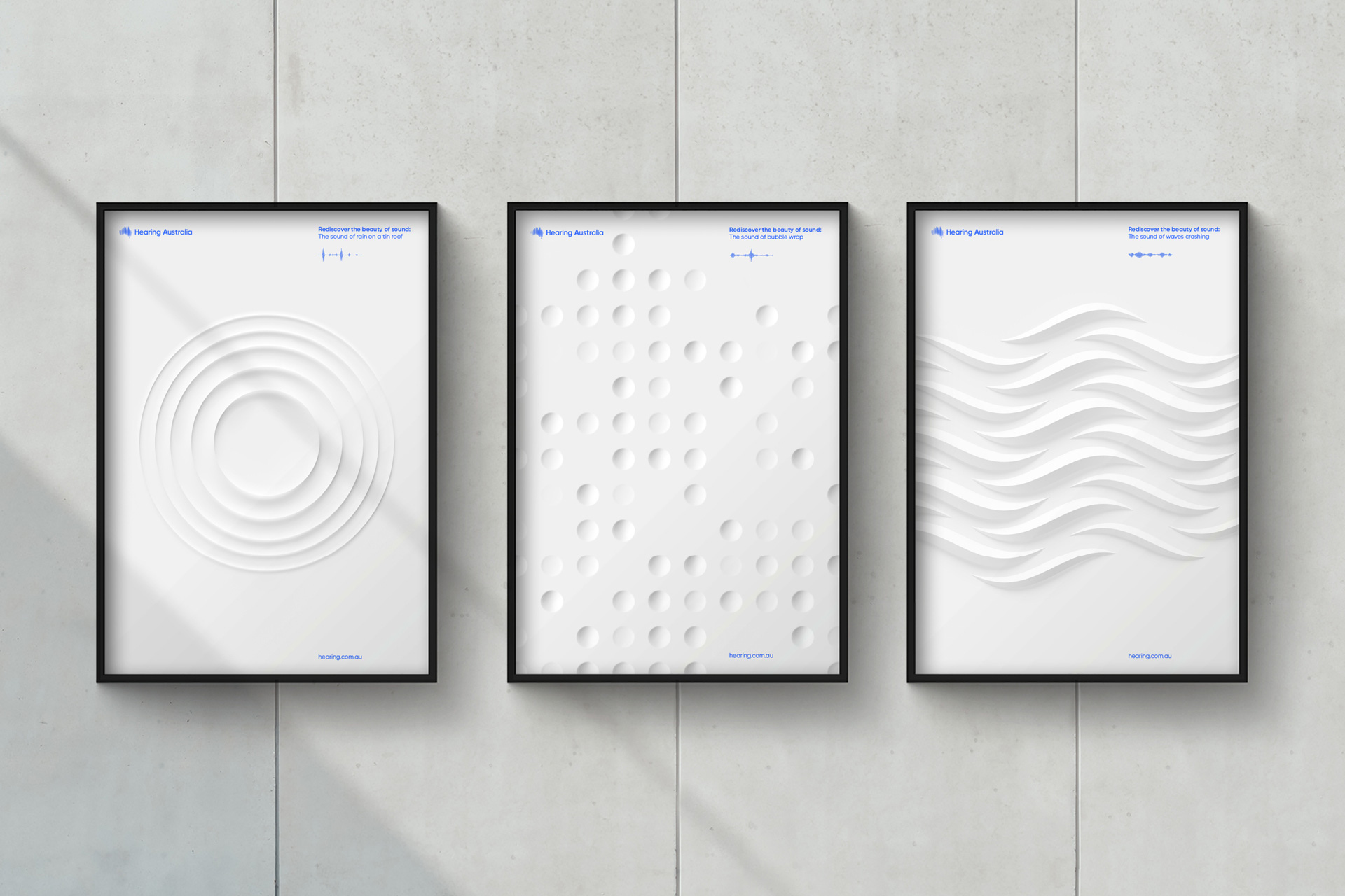
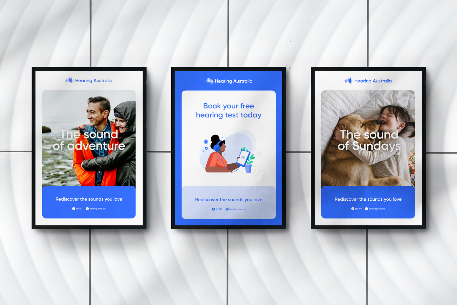
The first set of posters look like a museum exhibition… again, super nice, but if I saw them I wouldn’t think “Great, just what I was looking for: hearing services for grandma” and I realize part of the brief was to change expectations and preconceptions about their service but this might too much. The second set of posters is more effective, looking more grounded. The rounded corner boxes are nice and soft and there is a good hierarchy to the layouts. You’ll notice the middle poster that has a faceless human fun illustration so, yes, there is some of that thrown in into the mix. As usual, they are nice to look at but it does feel like we’ve looked at them so many times now.
Overall — and I think by now you know how I’m going to end this — this is a very polished identity, with some great moments of restrained graphic flair but it feels too polished. I think most of the elements could work but with a warmer, more approachable tone instead of looking like fintech company.
Thanks to Ritesh Gupta for the tip.
 each year since publication began in 2006

 Новости Союза дизайнеров
Все о дизайне в Санкт-Петербурге.
Новости Союза дизайнеров
Все о дизайне в Санкт-Петербурге.