Обзор лучших ресурсов по разработке бренда, разработке упаковки
contact us | ok@ohmycode.ru
contact us | ok@ohmycode.ru
Established in 2009, Uber needs little introduction for good and bad reasons. It was the first ride-share and ride-hail company, becoming the default verb and noun for the industry in the same way Google did for search engines — even if you are taking a Lyft, you are Uber-ing. The past couple of years, though, have been pretty darn horrible for Uber with bad press resulting from its business practices, culture, and overall appreciation that made some people riding Uber feel complicit in their bad behavior. (I, for one, switched to Lyft and I’m not a huge protester of corporations but Uber felt particularly icky.) With the ousting of its CEO, Travis Kalanick, over a year ago, Uber has been on a transition phase to become a respectable company under the leadership of Dara Khosrowshahi as it grapples with its immense growth over its nearly ten years of existence. Uber has 16,000 employees; 3 million drivers; 75 million riders; and completes over 15 million trips each day in more than 600 cities in 65 countries. The numbers are quite overwhelming. Last week, Uber introduced a new identity designed by Wolff Olins in collaboration with Uber’s Brand Team.
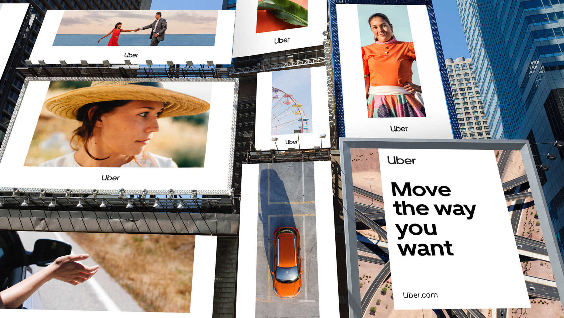
Uber operates in 660+ cities globally. The brand needed to work around the world. Its highest growth areas are in regions outside of the US, such as Latin America and India, where Wolff Olins has a considerable depth of experience. Instead of pursuing a complex identity system, localized through color and pattern, we moved towards a universal ‘beyond-simple’ global brand. Teams in diverse markets can make it relevant to their audiences with culturally specific content.
Our logo is approachable, easy to read, and takes full advantage of our name recognition. Optical kerning, refined weight, and defined clear space, as well as well delineated placement in relation to other content, all help to make it as instantly recognizable as possible.
As you may remember, Uber’s old logo is not that old: it was introduced in February of 2016. As you may remember as well, it was a complete train wreck. Possibly one of the worst redesigns in the history of misguided redesigns. I considered wrapping that previous statement in some form of sarcastic sentence but, for the record, it should be clear as day that the previous logo and everything that came with it was, quite literally, the worst. Coinciding with that redesign was also the start of Uber’s problems, which made that redesign exercise seem like one more manifestation of the internal problems. This new design is the most clear-cut example in recent memory of a company introducing a new logo to signal change and move away from very recent, very scandalous press. Most redesigns we have seen in recent years are part of positive momentum and while Uber surely has some of that going in its favor, this logo’s primary job is try to get as many people as possible to put as much of Uber’s past in the past.
It’s not even worth going into the weaknesses of the old wordmark and “bit” icon because there were so many not just graphically but conceptually. The new logo is a definite line in the sand that moves Uber into a more positive and accessible aesthetic that puts functionality and practicality first and eschews trying to make any bold statements that could be misinterpreted at a point where anything the company does would come under scrutiny. At first glance, the new logo is… nothing. It is the most bare-bones rendition possible of a company name. It barely registers as a logo. It makes Google’s logo feel like Times Square on New Year’s Eve. This new logo also marks the apex of the extreme simplification trend in logos that we’ve been seeing in the past year or two and manages to take it to the farthest end of that spectrum. You might disagree with me: but it’s actually perfect.
It’s not a perfect logo. It’s a perfect logo for Uber — now. To me, one of its biggest achievements, especially in the U.S. market, is that it’s the opposite of Lyft. It draws a clear distinction and establishes Uber as the more professional, robust, and straightforward option of the two. It may potentially also communicate an unwelcome coldness that contrasts negatively from the warmth and friendliness implied in the Lyft brand and its drivers but, as long as Uber and its drivers stay on the straight and narrow, the associations should become positive.
The new logo does away with any decoration, with any implication, with any hint at taking a side, and simply states the name of the company in a way that is as generally accessible as possible for as many people as possible in as many cities as possible. It’s a logo for everyone and no one. In its four-letter simplicity and shortness — assuming they stick with it for more than two years — the logo has the potential to be as recognizable, at small and large sizes, as the Nike swoosh. It may not be as cool, not by any means, but, more importantly, it may be as easy to identify. And once you get over the shocking level of simplicity, the logo is actually quite nice and as masterfully done in this realm as possible. Giving the uppercase “U” a lowercase design with a stem is a quiet but interesting detail that pairs quite well with the “b” to its right and the “r” at the end, while the “b” and “e” provide two strong circular shapes in the center. I know this logo is very difficult to digest without sarcasm but, if you are able to, there is good deal of craftsmanship at work here that will serve this logo well in the long run.
One of the best decisions in this redesign is NOT introducing a “U” monogram AND getting rid of the meaningless icon introduced in 2016 as the app icon and social media avatars. This is ultimately what will cement the new logo in people’s minds. Take a moment to update your phone’s apps if they haven’t updated automatically, and seriously judge the new logo in that environment. It looks damn great. Don’t judge my app selection but look at the immediate contrast the new logo generates next to all the other app icons that are trying to fill every pixel available. It’s easy to spot and it sits there with a new sense of sophistication that Uber never had.
With a new wave of leadership at Uber came a renewed commitment to safety. So far, that safety focus has been product-driven. We knew the brand needed to speak equally to riders, drivers, and employees, so we took a step back and asked, “What does safety mean for different people at different times?” We introduced Safety Blue to the color palette. It’s unique to Uber and meant to be used sparingly to indicate important moments of support, care, or connection between the user and the brand.
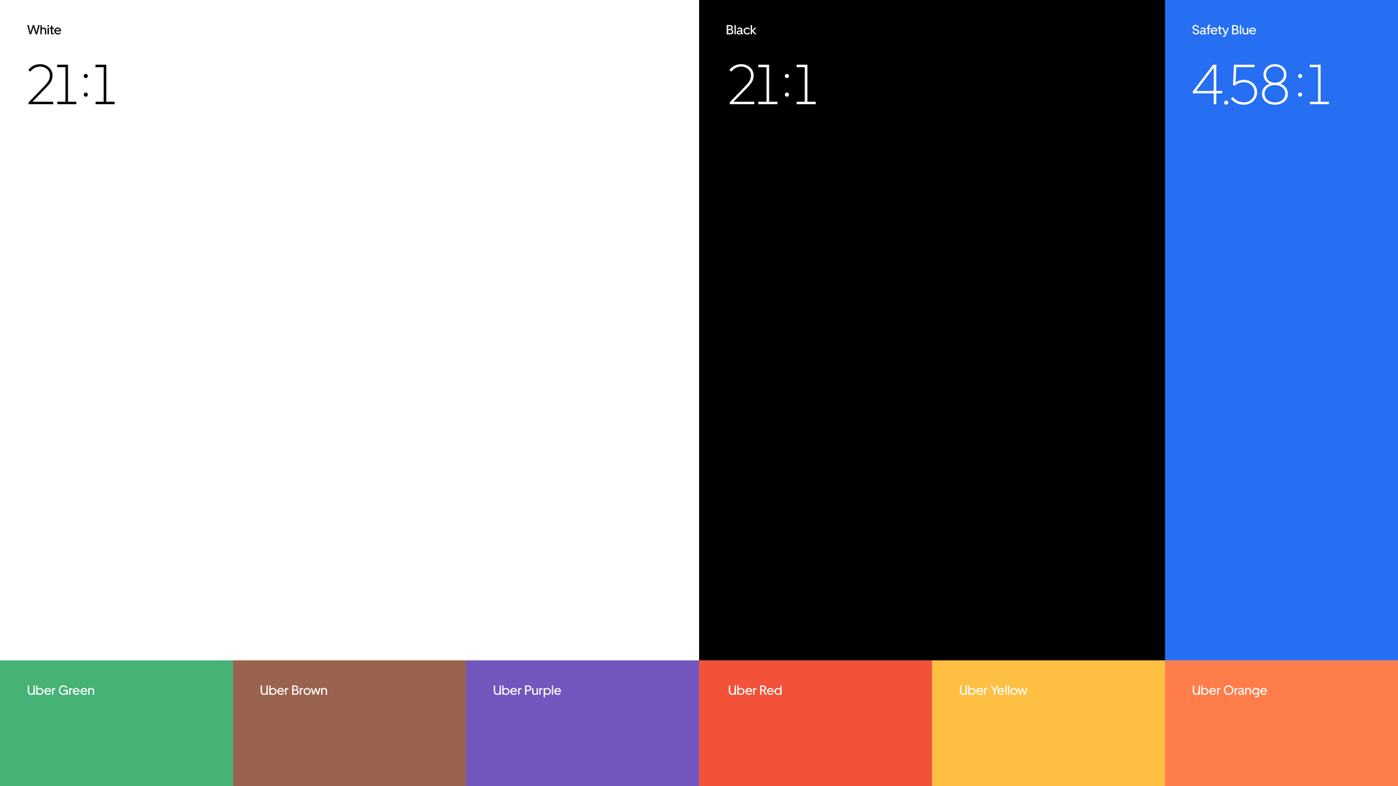
Safety blue is unique to Uber. We use it sparingly to call out moments of support, assurance, and other important interactions between a user and the brand.
Sticking to black may seem like a strange move given that black is generally seen as too aggressive in corporate identity but, again, as a differentiator from Lyft and other more colorful competitors around the world, doubling down on black makes Uber stand out visually while also establishing it as the more premium option in certain markets. Adding the burst of blue seems like a good choice. Nothing about it stands out too positively or negatively and, mostly, it contrasts well with either black or white. Let’s celebrate they didn’t go with an every-color-in-the-rainbow approach.
Our typography is as unique and easy to use as we are. Inspired by the world’s best used transportation examples, it was designed to maximize its impact across all applications while keeping it easy to read, ownable, and highly recognizable.
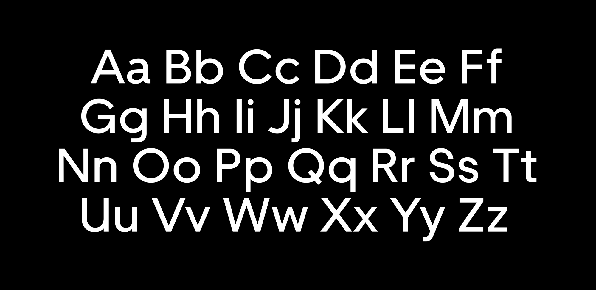
The new custom type family by MCKL Type is nice and quite nicely done but it definitely blends in with the other three hundred or so custom sans serif type families that have been developed in the last year or two. This is not meant to belittle the effort but as a true point of differentiation for Uber, it’s not a huge deal. It is, however, a great, functional tool, especially as a multi-language family that will help communicate consistently across countries and cultures.
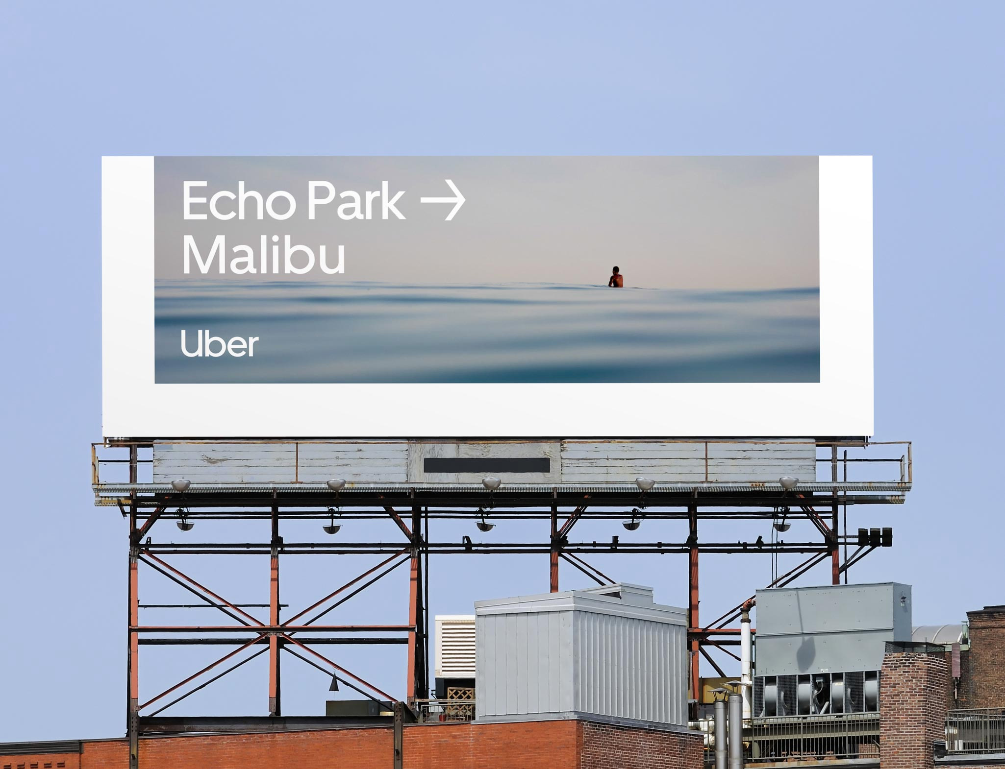
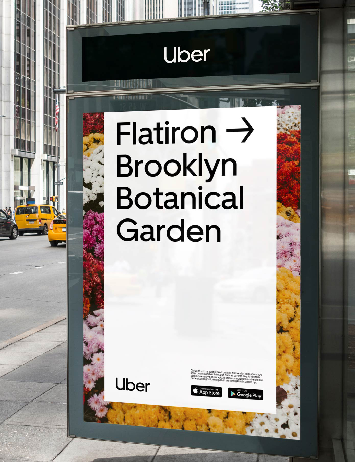
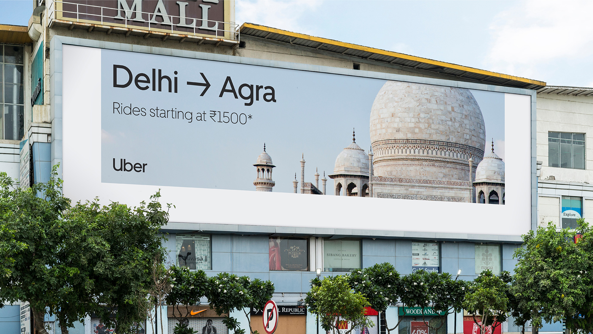
The decentralized nature of Uber’s operations meant the company needed a system that could be easily implemented by a wide range of practitioners around the world in a broad spectrum of digital and physical applications. The system isn’t just for marketing designers, but for product teams, customer service, and beyond. Its success depends on how useful teams find it.
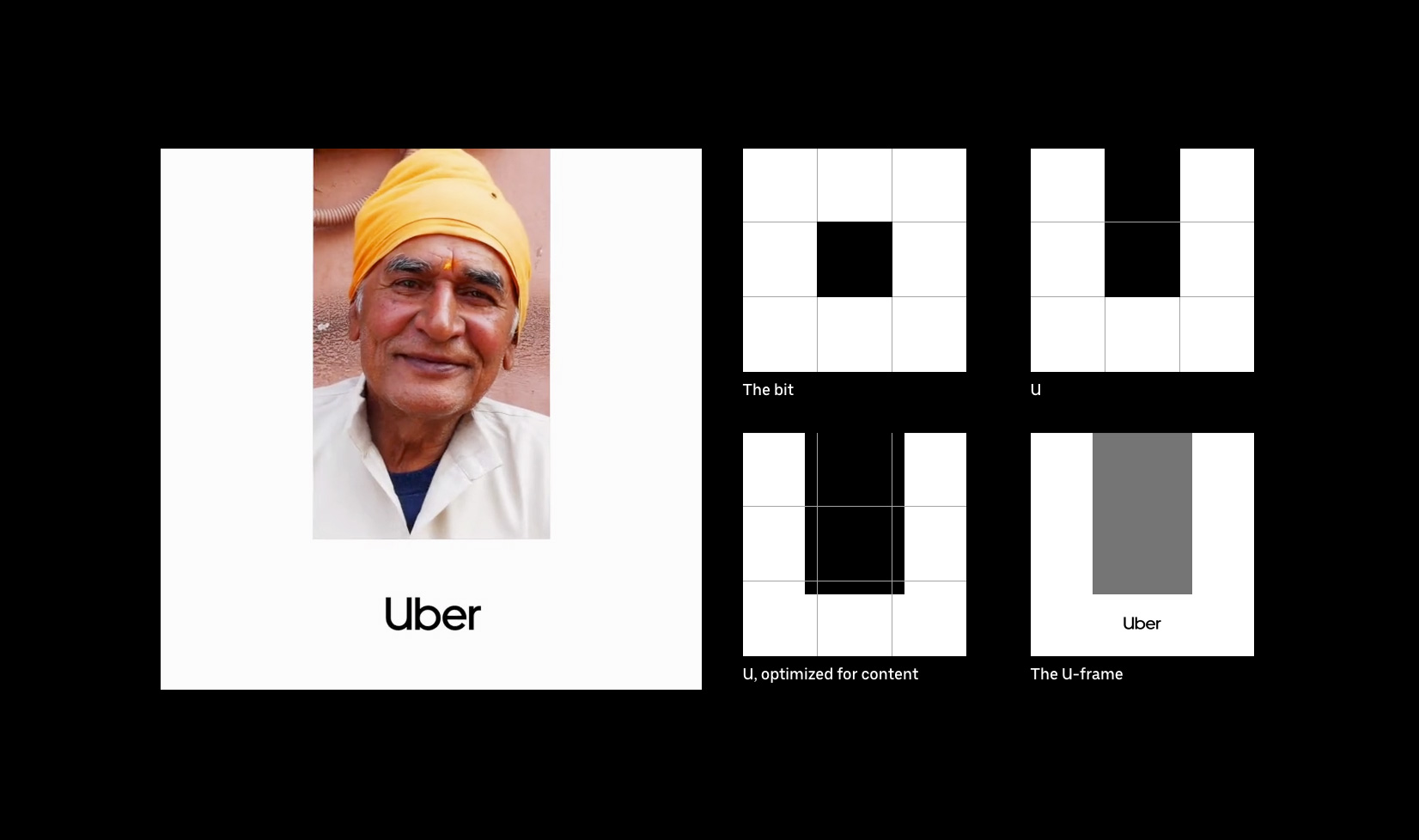
Our composition system is elegant in its sheer simplicity of use — plus, it creates a subtle “U” wherever it appears. By defining the grid based on the logo the system stays flexible and beyond easy to apply.

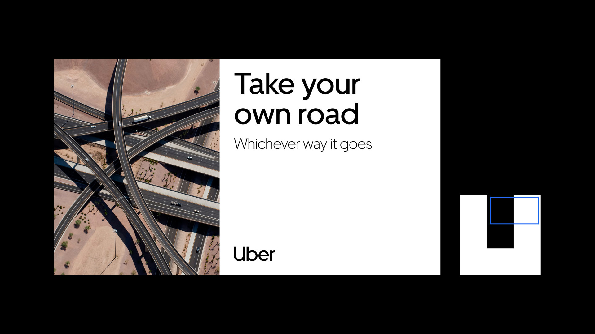
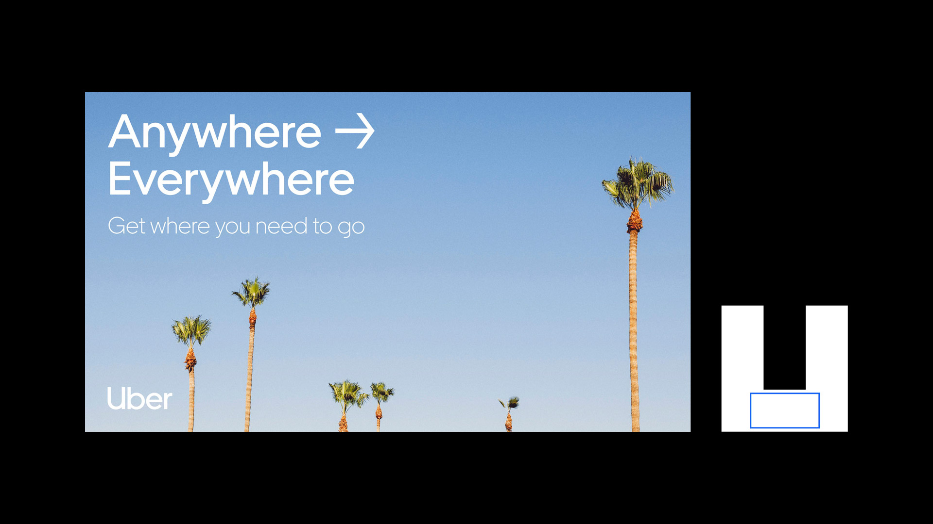
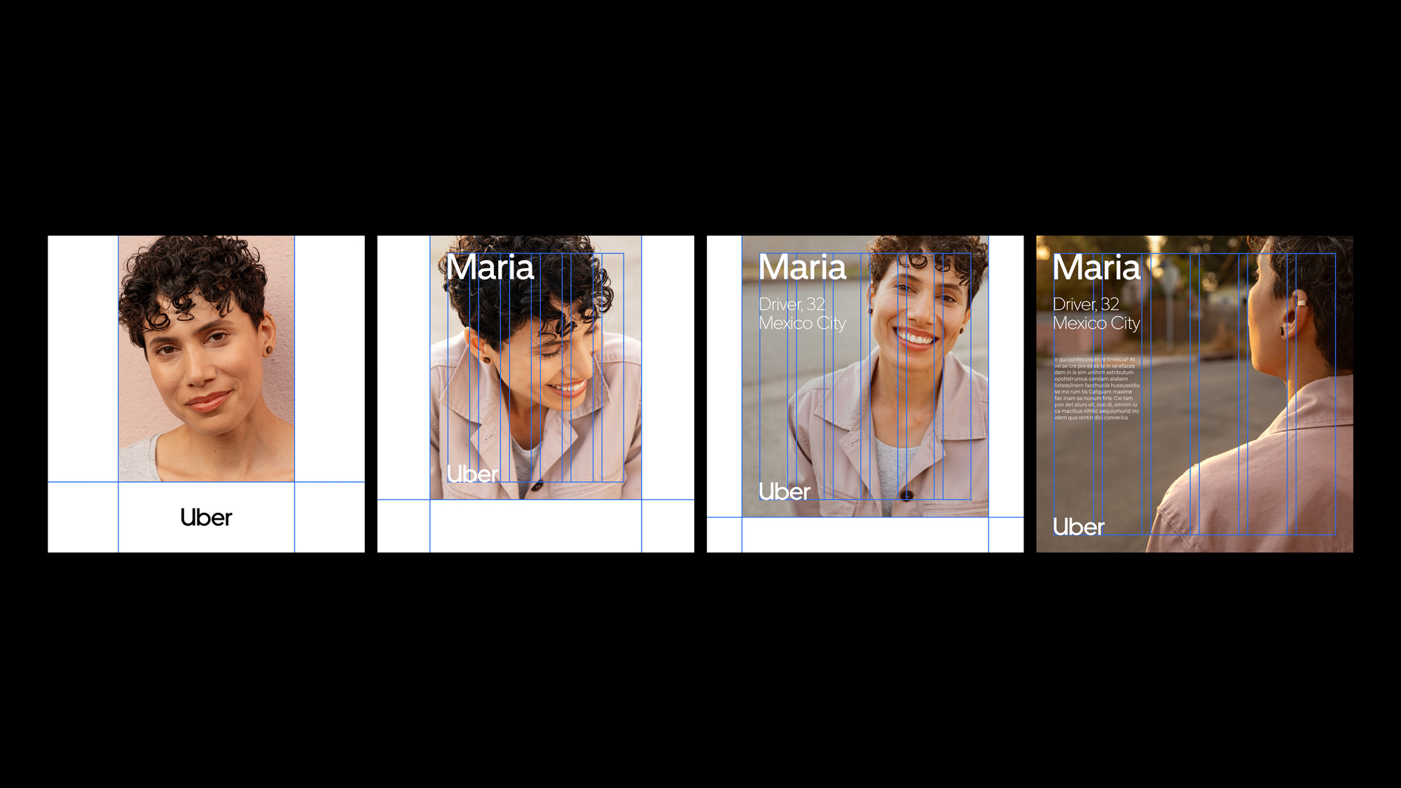
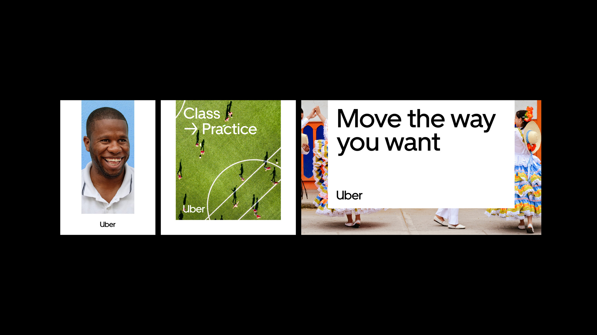
The application system has a fantastic simplicity that is both globally functional and visually striking. I know that that may be too much praise to bestow upon layouts with three thick margins but when you think about the expanse of people that will deploy this identity, maintaining this level of simplicity is necessary. That it also happens to look bold, with the potential to become recognizable as a corporate identity system, and have the ability to include local culture imagery in such a broad way, is a remarkable achievement. The fact that this came from the conceptually infuriating “bit” of the 2016 redesign makes it all the more commendable.
I am guessing that this is not the negative review most people expected. I understand the gut reaction of seeing the new logo and thinking “Seriously? That’s it?”. I had that reaction, no doubt, and, in the annals of logo design this doesn’t even rank nor does it make the cut in any way as an exciting, industry-shifting identity but as public-facing manifestation of a company attempting a drastic change to be perceived as safe and trustworthy, as universally accessible, and as a seamless part of literally millions of people’s lives and livelihoods this has the potential — AS LONG AS UBER DELIVERS ON THE PROMISE OF POSITIVE CHANGE — to become one of the most significant identity redesign and corporate rebrand case studies we will discuss 20 years from now. For now, though, I’m still summoning Lyfts but I wouldn’t be surprised if my default switches back to Uber in the next year.

 Новости Союза дизайнеров
Все о дизайне в Санкт-Петербурге.
Новости Союза дизайнеров
Все о дизайне в Санкт-Петербурге.