Обзор лучших ресурсов по разработке бренда, разработке упаковки
contact us | ok@ohmycode.ru
contact us | ok@ohmycode.ru
Established in 2010, Raaka (which means “raw” in Finnish) is a chocolate maker based in Brooklyn, New York. They source their cacao beans from cooperatives and grower-centered organizations that focus on quality and sustainability that in turn work with the farmers themselves and come from countries like Peru, Dominican Republic, and Tanzania. One big difference with Raaka chocolates is that they skip the roasting process, going from bean to bar, which allows the final product to be less Milky Way and more true to the cacao and its origins. (To better understand their process and ogle at some chocolate-making photos see here.) Their finished product is available in stores around New York and Whole Foods nationwide. Recently, Raaka introduced a new identity and packaging designed by Brooklyn-based Andrea Trabucco-Campos and San Francisco, CA-based Simon Blockley.
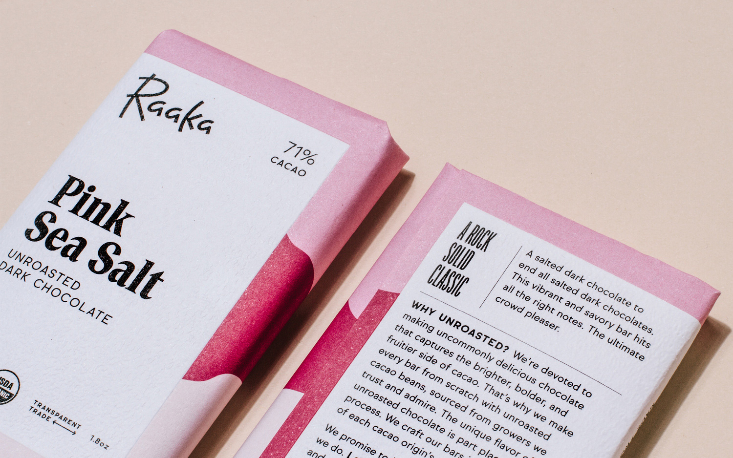
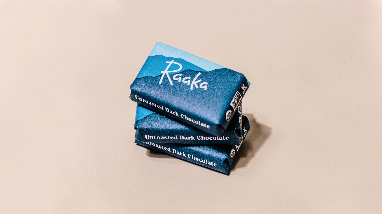
The old logo had the right intention by adopting an organic, unfinished, and raw aesthetic but it may have leaned too hard into it, looking more like a scribble from the opening titles of Se7en than a tantalizing logo for delicious chocolate. The new logo maintains the basic structure of the old one but is beautifully rendered in a contemporary, single-thickness, script-like style that looks great. I would typically advocate for slight differences in repeating characters when it comes to script logos but, in this case, keeping the “a”s the same makes the logo stronger and more interesting as they yield a consistent rhythm. I also like how it almost looks like a font (and would pay good money to use it myself).
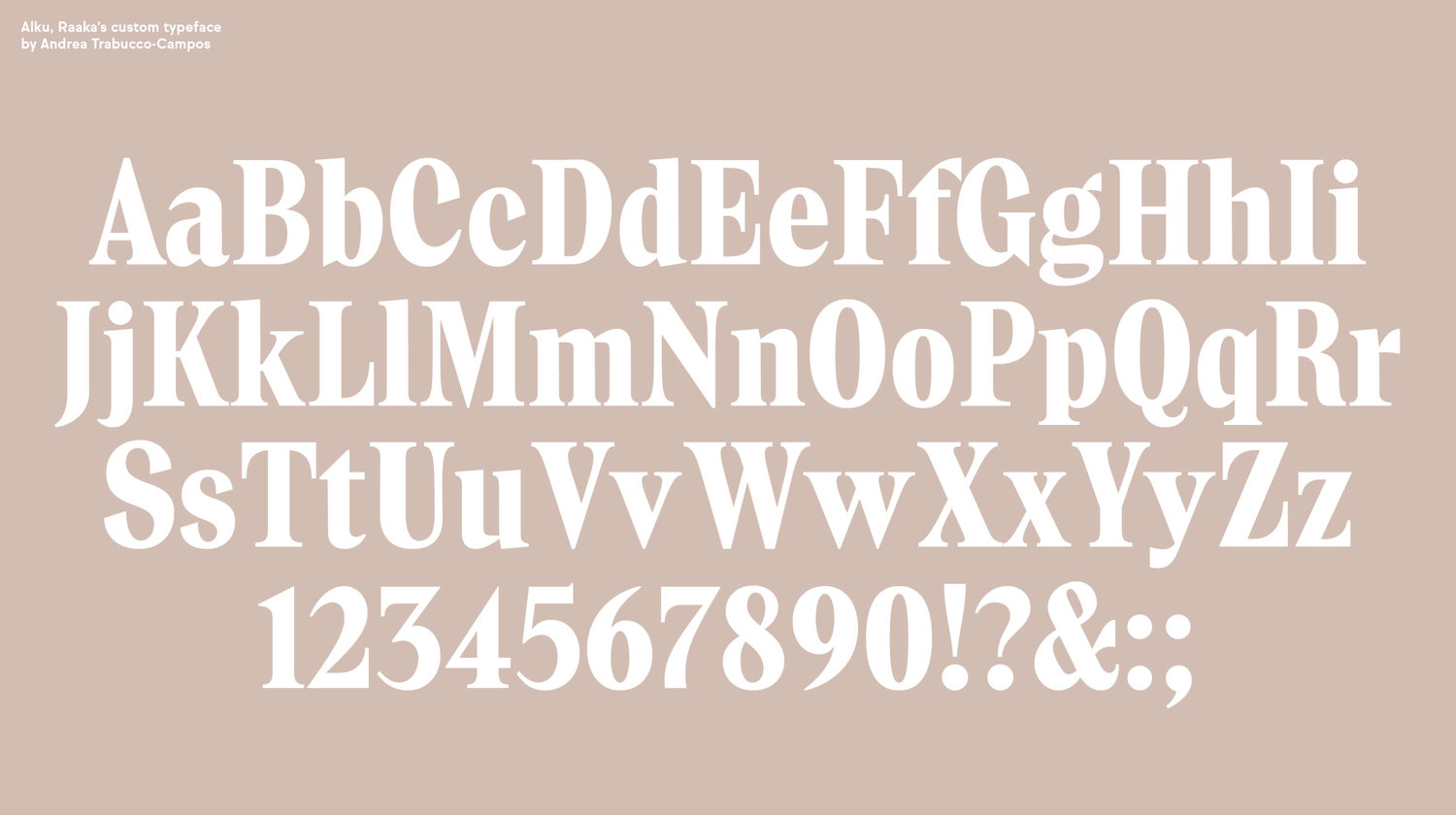
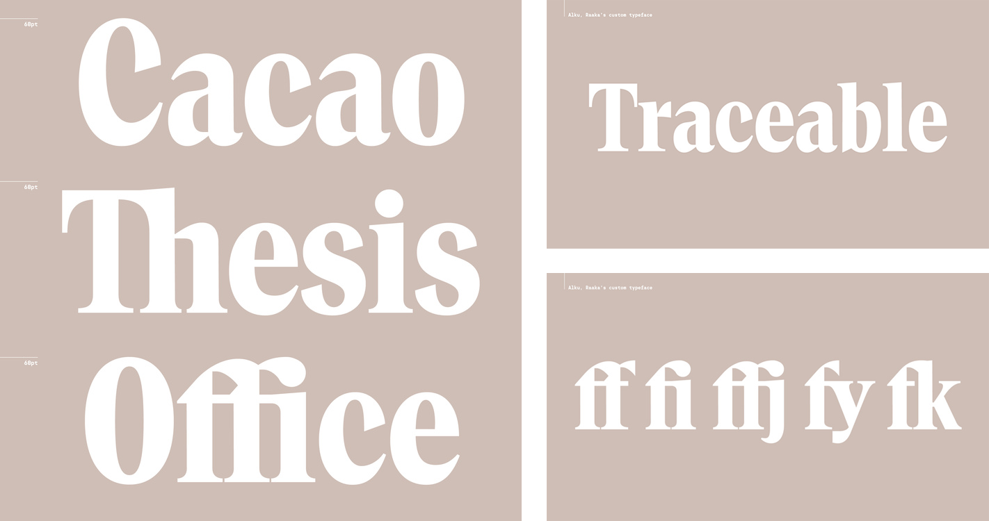

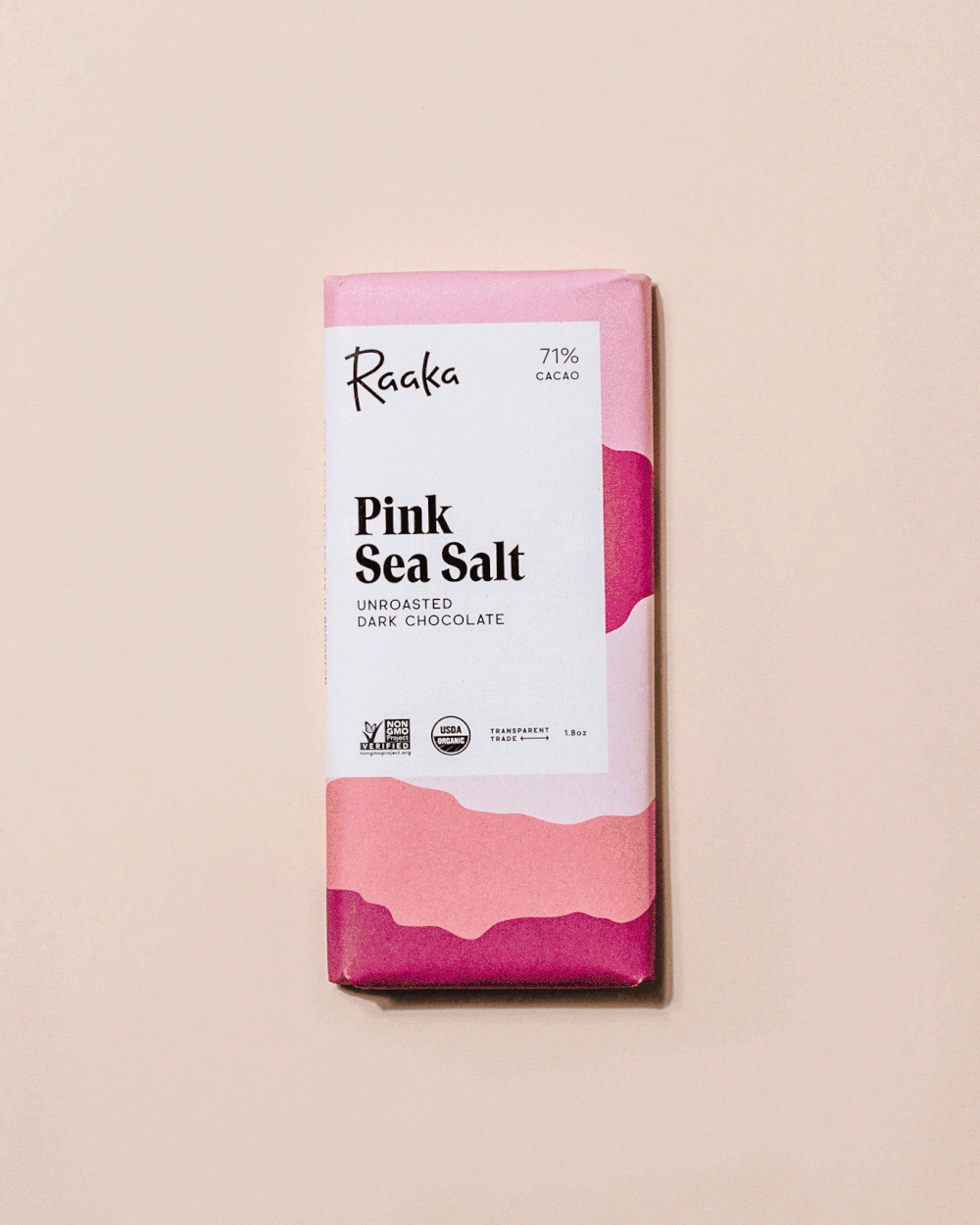
The custom serif is also great, building on the growing use of bold serifs while giving this one a unique flair in some of the characters. It’s as if Chobani and The Guardian had a baby.
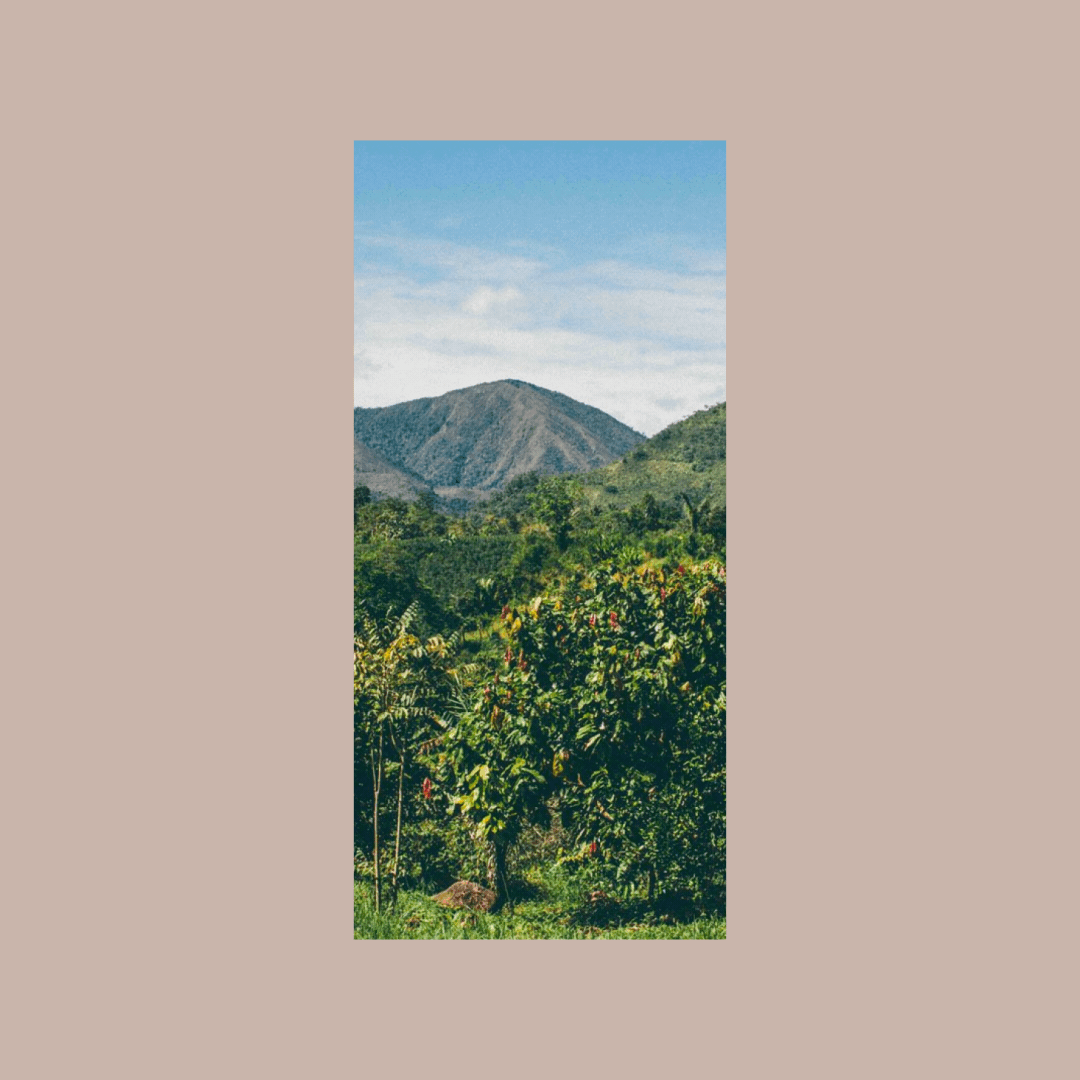
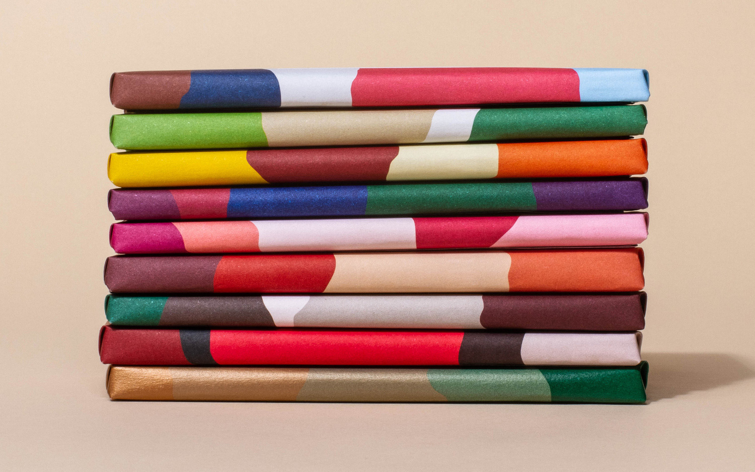
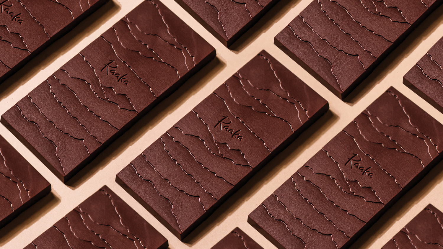
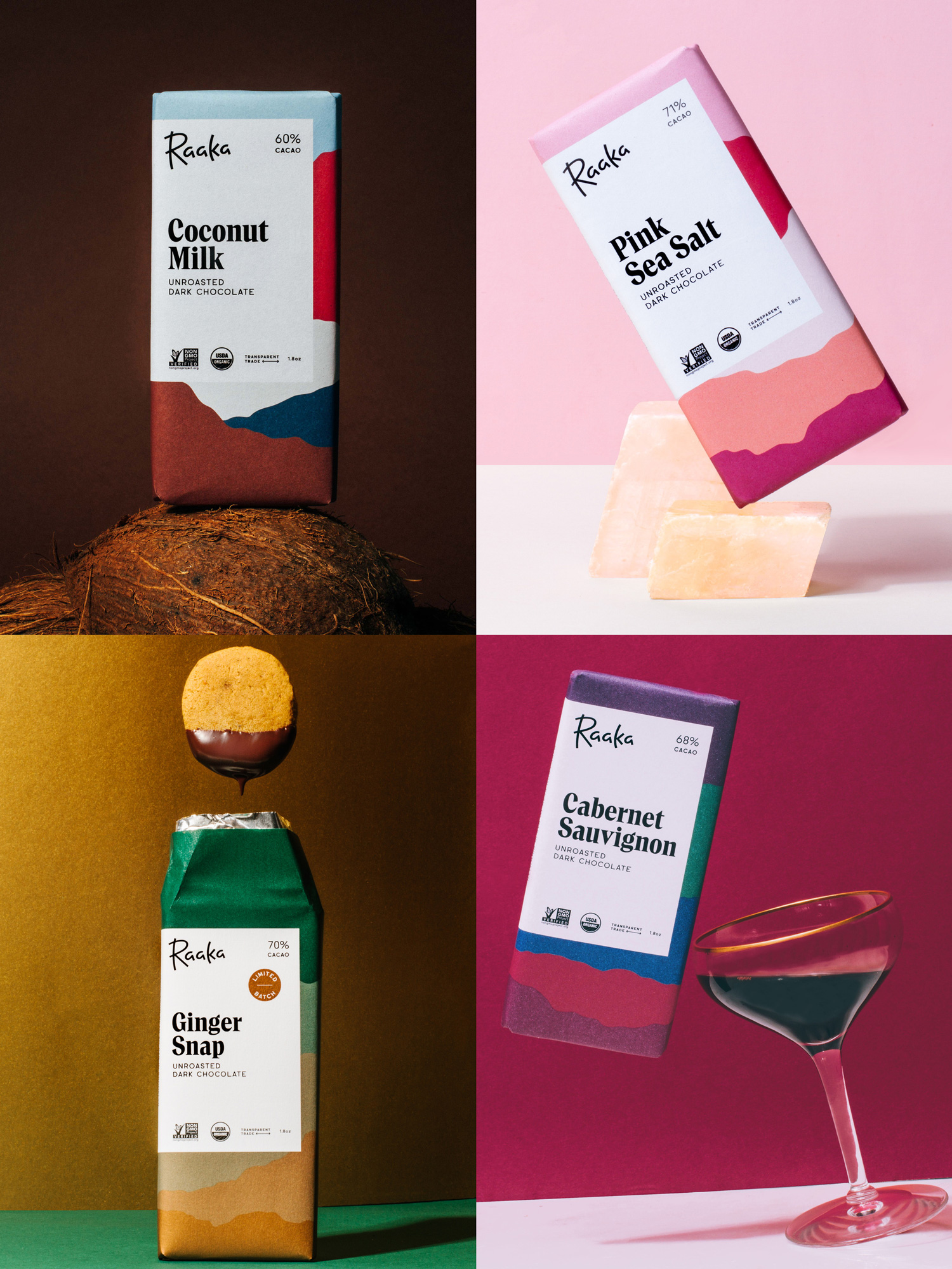
Taking influence from the tasting experience of Raaka’s chocolate, the rebrand establishes a world of intrigue and discovery with flavorful colors, origin-inspired landscapes and a new custom typeface.
Early in the project we found issues with Raaka’s current label placement—often being obstructed by shelf displays. While maintaining an asymmetrical structure, we repositioned the label for better on-shelf impact.
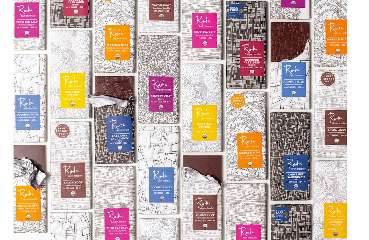
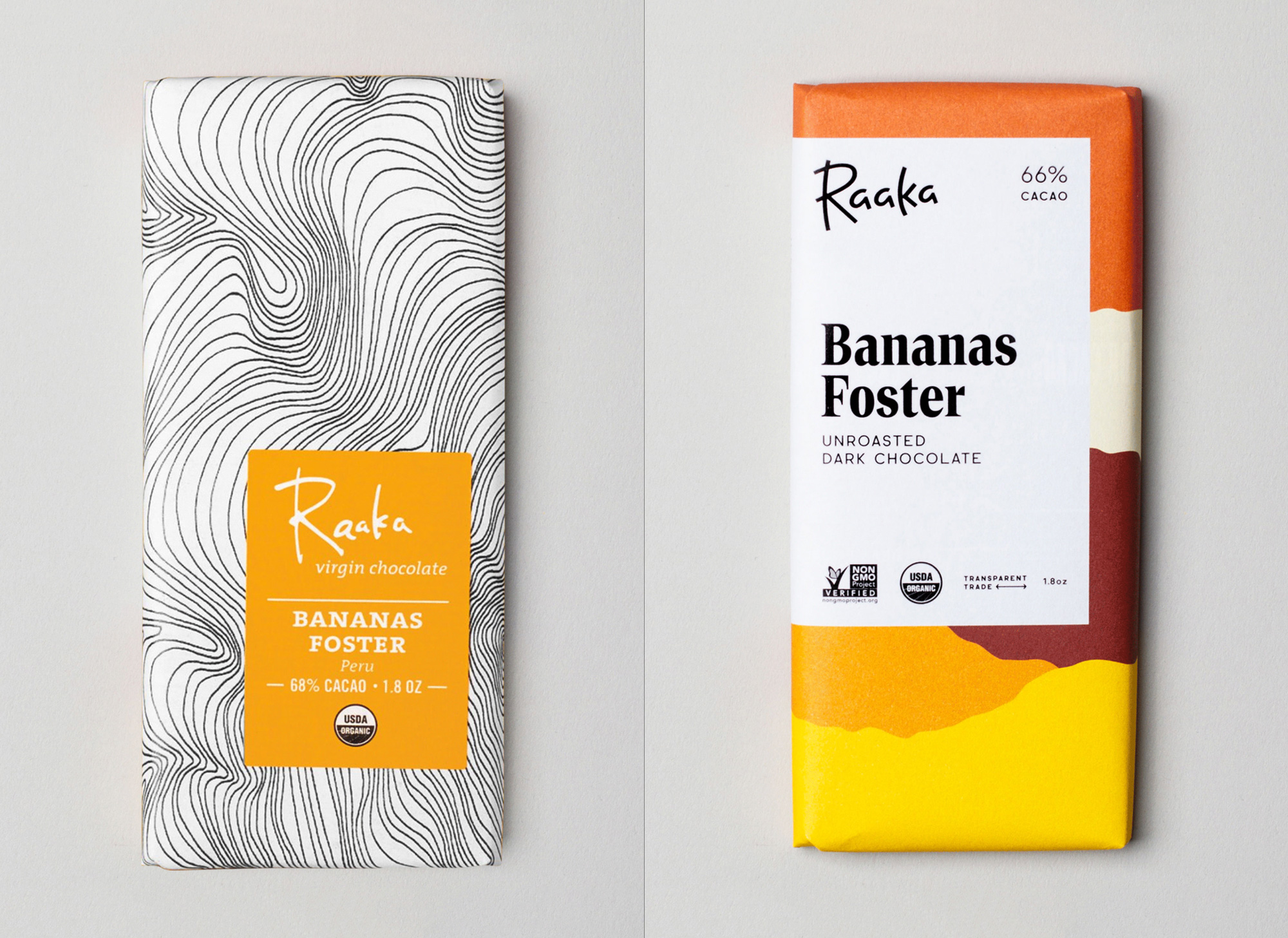
The old packaging was mostly fine and par for the course when it comes to boutique-y chocolate — the single-color abstract illustrations were kind of cool — but it was all over the place in terms of font choices and typographic hierarchy when it came to the details. The new packaging places much more importance on the details, making it more functional on the shelves, while still packing a punch with the bold patterns in the back.
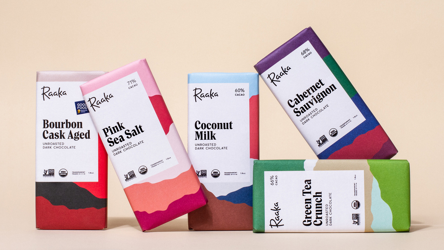
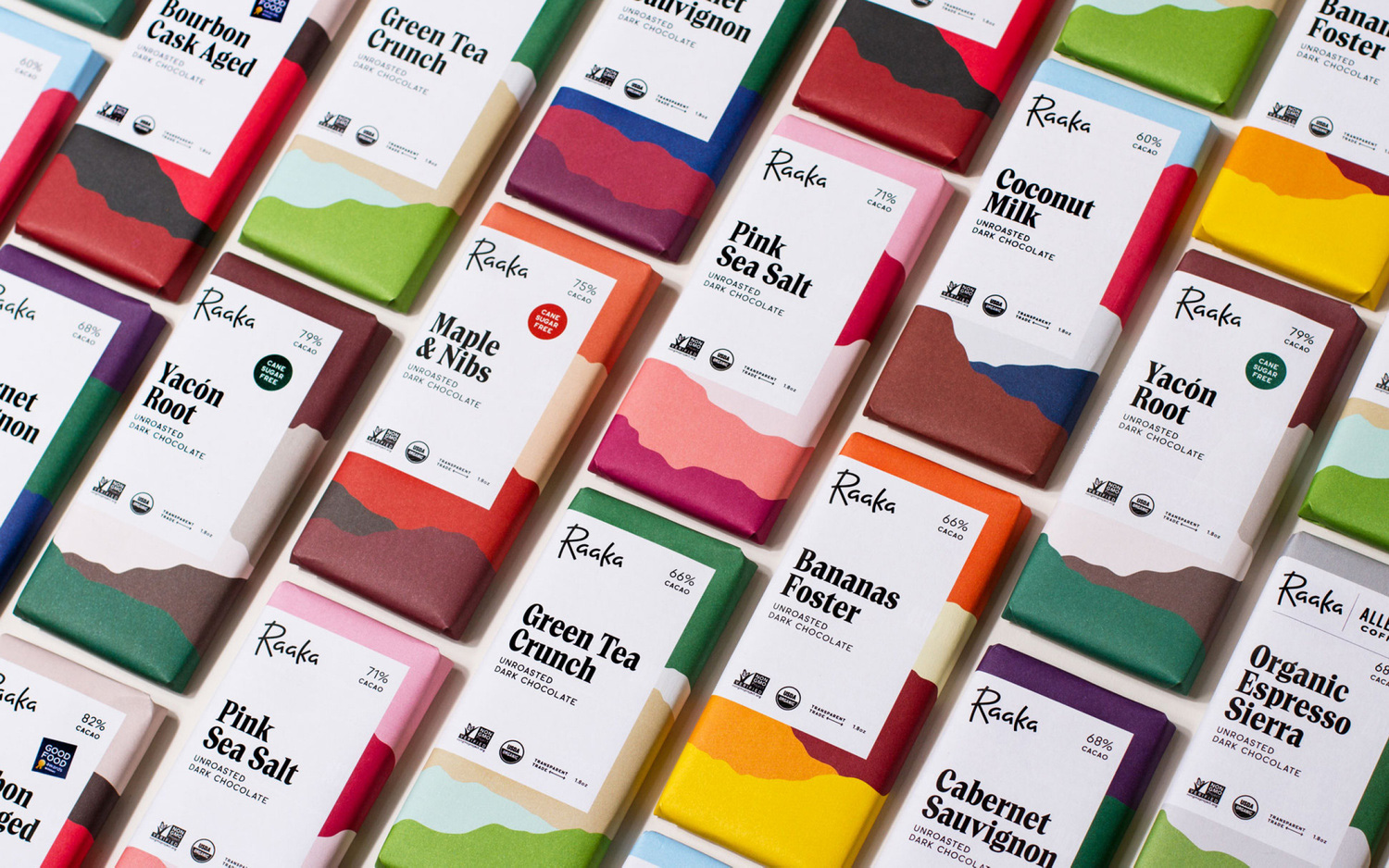
The logo works great with the bold serif, creating and unexpectedly satisfying combination while the simple sans serif does a solid job with the secondary information. The flavors of each bar stand out just the right amount and the varying color palettes for each are all beautifully balanced on their own and as a group.
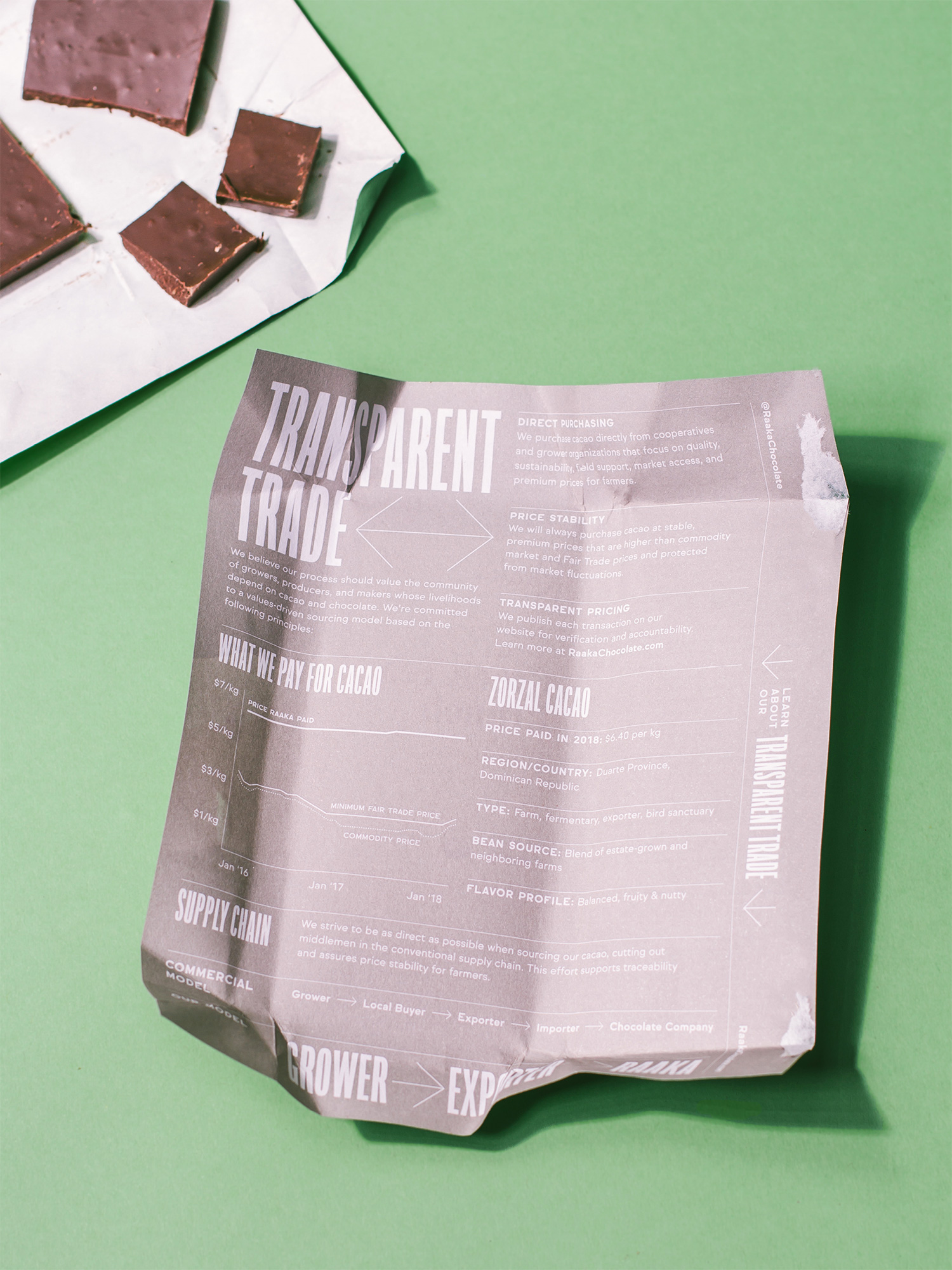
The story of our bars cannot be told without the story of the producers we work with. As a bean-to-bar maker, we’re able to purchase cacao directly from farmer-owned cooperatives and grower centric organizations and establish meaningful, collaborative relationships with each one. But these relationships don’t fit the conventional certifications that most chocolate-loving folks are a familiar with, which can make telling, and therefore visualizing and contextualizing this story pretty challenging.
Lucky for us, Andrea and Simon were up for the challenge. They worked patiently and diligently with us to bring our new Transparent Trade model to life on the inside of every wrapper. Now, when someone opens up any Raaka bar, they can learn about the cacao producer we sourced the beans from, what we paid for them, how that stacks up against market prices, and what the supply chain between us and each grower looks like. We believe that the more we can educate customers about the cacao and chocolate supply chain and processes, the more we can create a positive, progressive, and equitable industry for all. That starts with transparency. That starts with us.
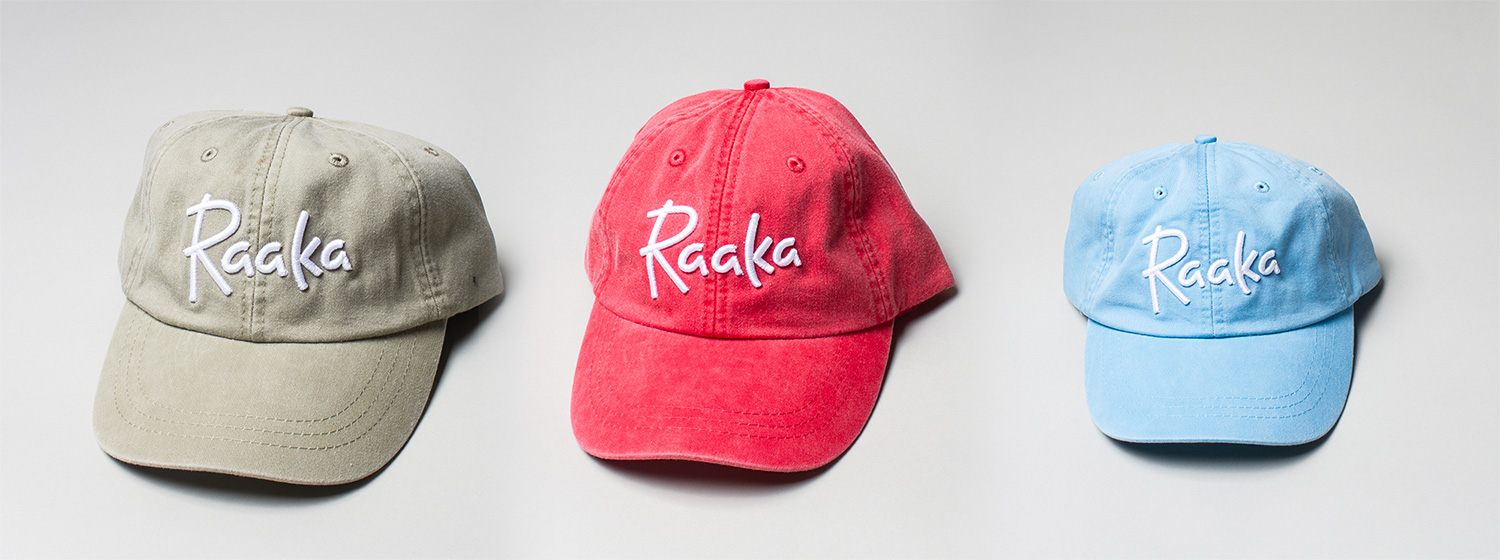
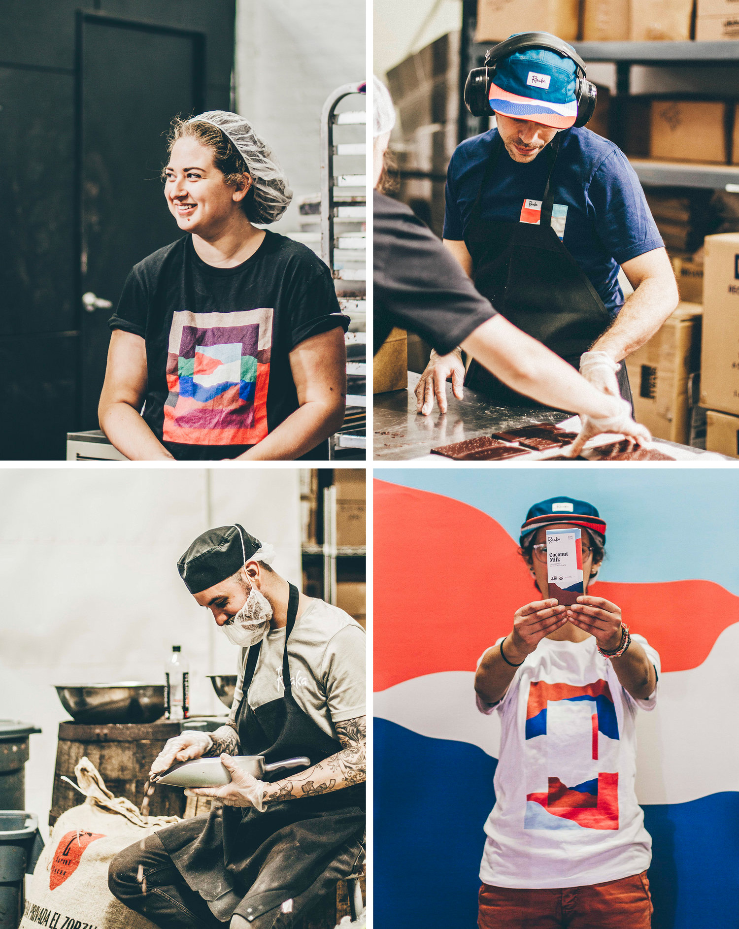
The t-shirts and hats for the staff are fantastic too. Overall, this is small-batch, craft-y design at its best: nuanced, considerate, and beautifully executed in a way that celebrates the product itself without pretense or fake-ness.
Thanks to Jack Curry for the tip.

 Новости Союза дизайнеров
Все о дизайне в Санкт-Петербурге.
Новости Союза дизайнеров
Все о дизайне в Санкт-Петербурге.