Обзор лучших ресурсов по разработке бренда, разработке упаковки
contact us | ok@ohmycode.ru
contact us | ok@ohmycode.ru
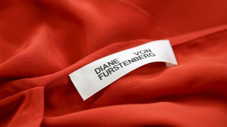
(Est. 1972) “Diane von Furstenberg founded her eponymous line in 1972. It has since become a global luxury fashion brand celebrated for its bold and creative approach to color and print, and admired for its sensual femininity. Renowned for its iconic wrap dress and signature prints, DVF now offers a full collection of ready-to-wear and accessories, and has established itself as a leader of creativity in the fashion industry. In May 2016, Jonathan Saunders joined DVF as the brand’s Chief Creative Officer, overseeing all design and creative. Founder Diane remains Chairman of DVF, and continues to devote much of her time to her many philanthropic endeavors.Headquartered in New York City, DVF has a global distribution network in over 55 countries and 1500 points of sale including 148 DVF owned and partnered stores throughout North and South America, Europe, the Middle East, and Asia Pacific.”
Jonny Lu Studio (London, UK)
Fashionista story
2011 Brand New post
The old logo was a nice DVF monogram that used a high-contrast serif like other fashion labels and brands. Nothing great, nothing not-great… although the "V" striking through the "D" is a little unnerving. I was surprised to see that the redesign version we covered in 2011 was altered to remove the white covering in the overlap. The new logo coincides with Jonathan Saunders taking on the creative direction of the label from Diane von Furstenberg, so maybe either subconsciously or consciously someone said thin serif = woman, medium sans serif = man. Or maybe that's what I'm reading into it, subconsciously or consciously. Regardless, the new logo is a kind of path of least resistance to coolness: default-looking sans serif, uppercase, justified. To its credit, yes, it's kind of cool. On their website, on top of a fashion photo, it looks pretty convincing — although why they paired it with Futura is beyond me. Overall, the change makes it feel more street-style than fashion-magazine-style, if that makes any sense.
Thanks to Cherlyn Russo for the tip.

 Новости Союза дизайнеров
Все о дизайне в Санкт-Петербурге.
Новости Союза дизайнеров
Все о дизайне в Санкт-Петербурге.