Обзор лучших ресурсов по разработке бренда, разработке упаковки
contact us | ok@ohmycode.ru
contact us | ok@ohmycode.ru
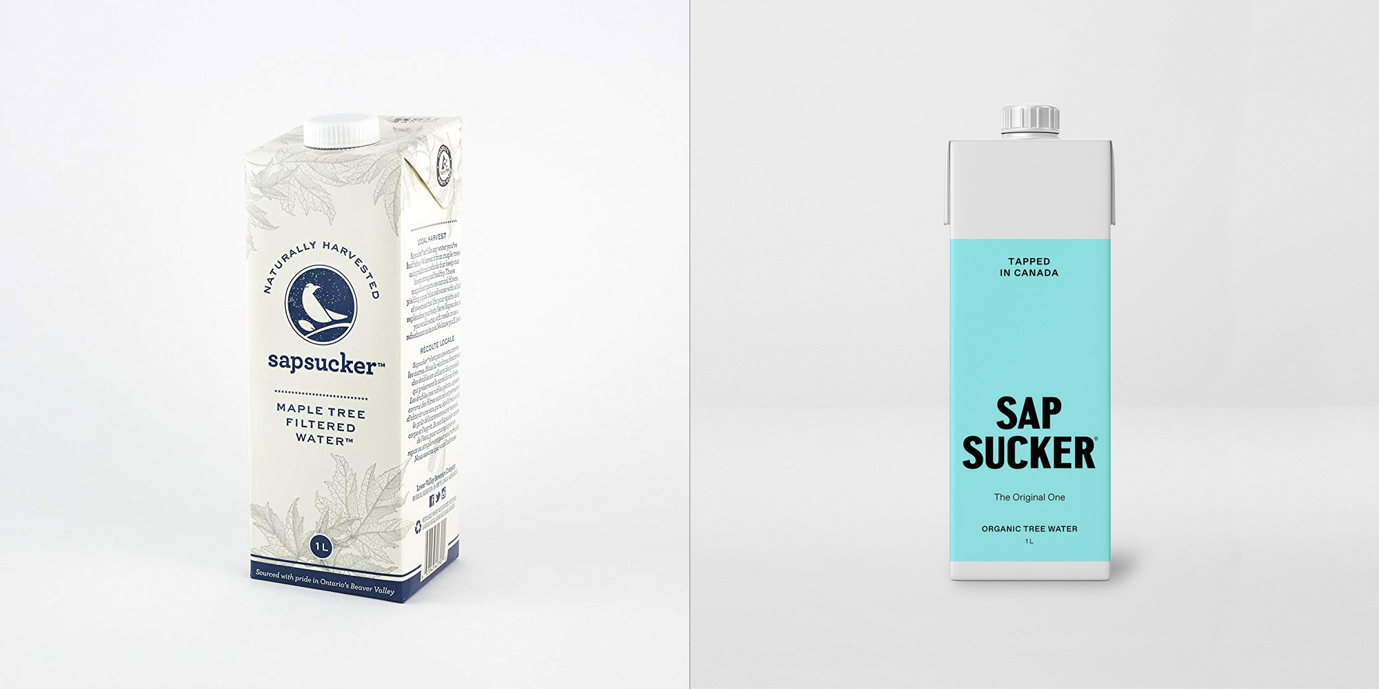
Launched in 2014, Sapsucker is the flagship brand of the Lower Valley Beverage Company, located in Flesherton, ON (close to Toronto). Named after a type of woodpecker that primarily feeds of the sap of trees, Sapsucker is a certified organic, plant-based, all-natural drink made from the sap of mature maple trees. Harvested responsibly from maple tree forests, the sap taken from the trees is bottled within 48 hours as is, only pasteurized for safe consumption. Originally available only in flat form, the company has introduced a new lineup of three lightly carbonated variations along with a new identity and packaging designed by Toronto-based Vanderbrand.
Friday Note: I do realize Fridays are for Friday Likes but this week I was not able to find three projects to showcase, so we have a Friday-Like-ish full post today instead.
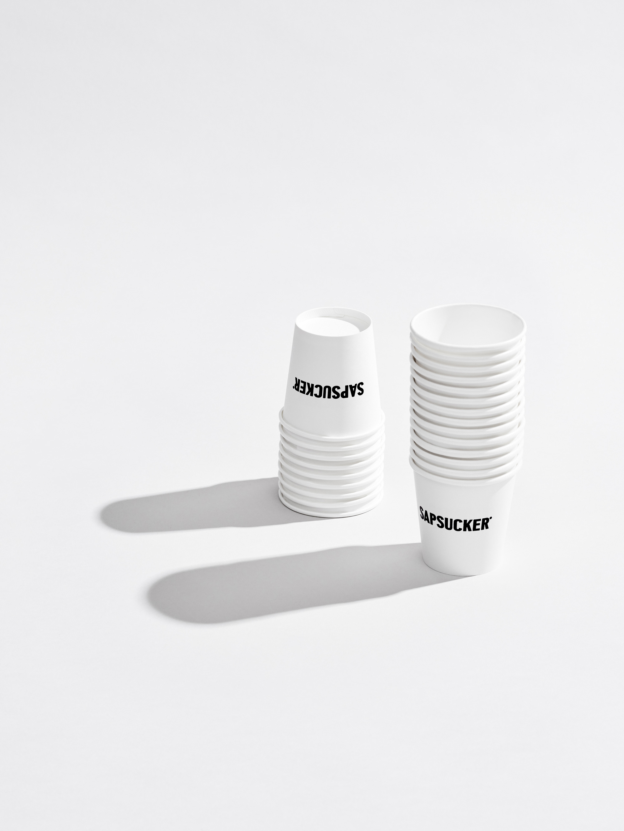
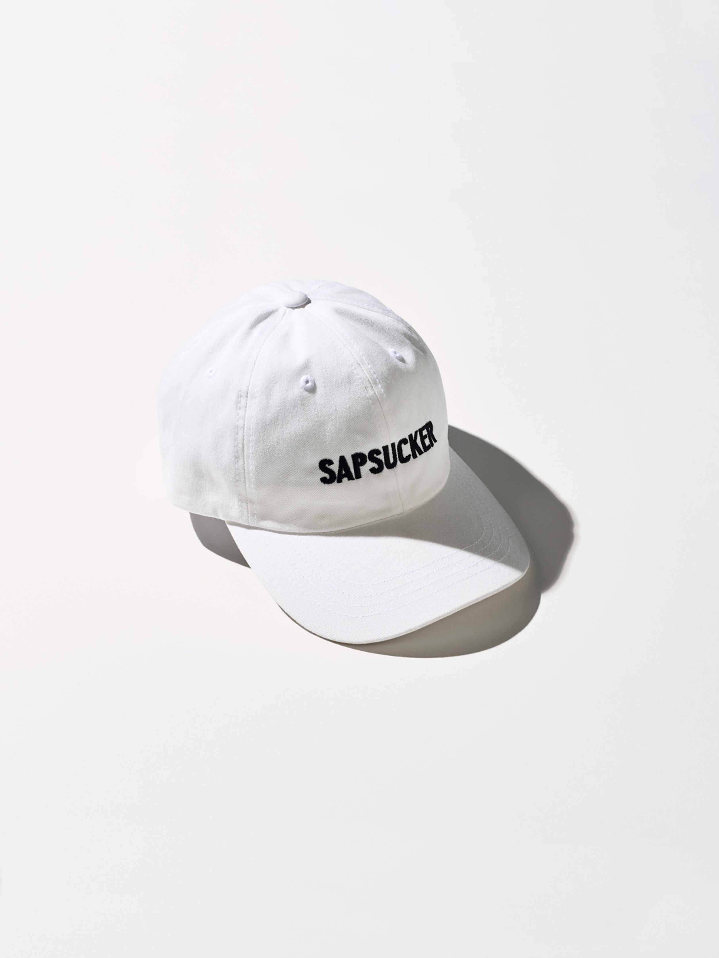
Vanderbrand worked closely with LVBC to create an unexpected Canadian product from every angle; a holistic brand with a clear and consistent approach across the brand identity, product naming, packaging, copywriting, digital applications, social media, and art direction.
Vanderbrand worked closely with LVBC to create an unexpected Canadian product from every angle; a holistic brand with a clear and consistent approach across the brand identity, product naming, packaging, copywriting, digital applications, social media, and art direction.
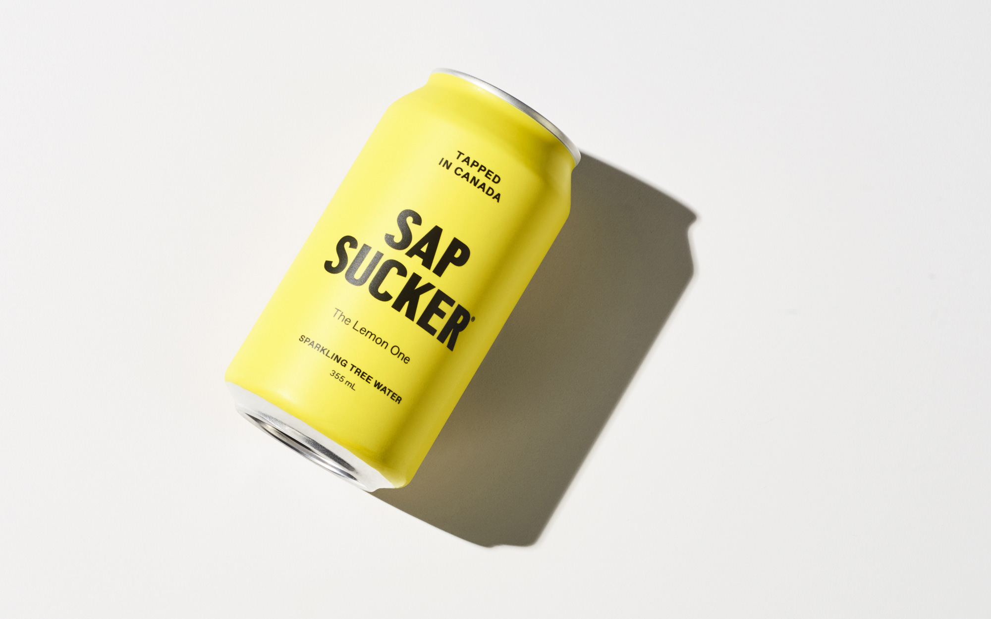
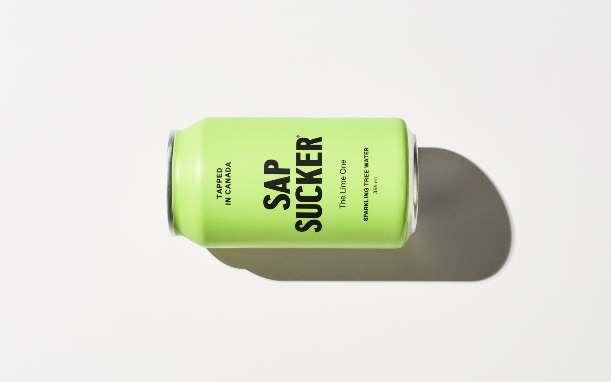
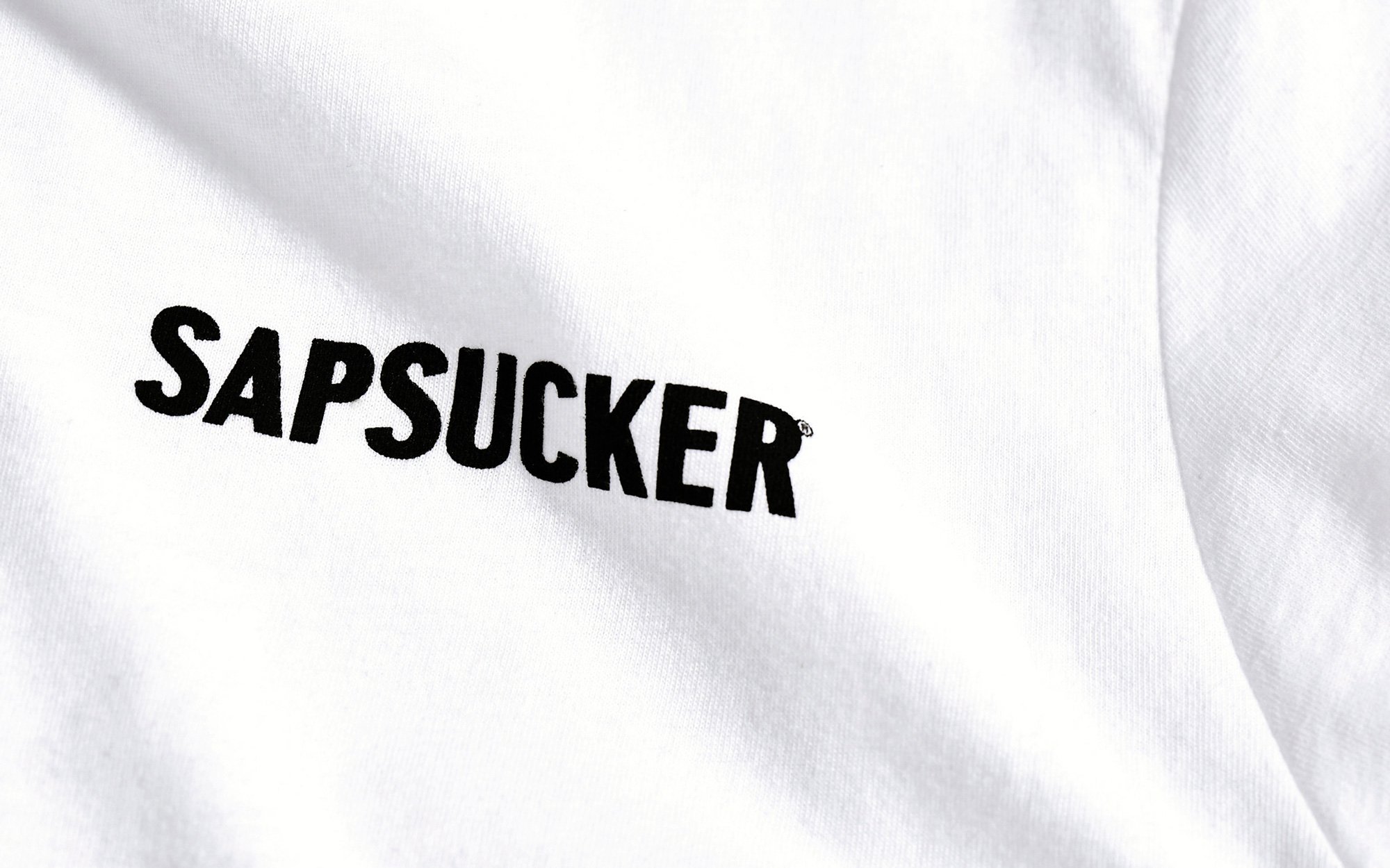
The old logo, aside from the single-outward-pointing slab serifs in some of the letters, was technically fine and somewhat endearing with an abstract woodpecker drawing. It did a good job in looking home-y and organic but, along with the old packaging (below), it also looked like an alternative to an alternative of water for those who enjoy more earthy products. In other words, I think its old logo really limited its audience and it wasn’t very exciting. Going in an opposite direction, the new logo has a hipper vibe with a deadpan logo in an unexpected typeface, Colophon’s Central Avenue, that gives it a bolder, more fashion-forward personality… which is not something one often says about water pulled from trees. I really like the typeface, so I’m predisposed to like the logo but I can see how it would be off-putting for some as a logo to represent an organic beverage but I’m digging it.
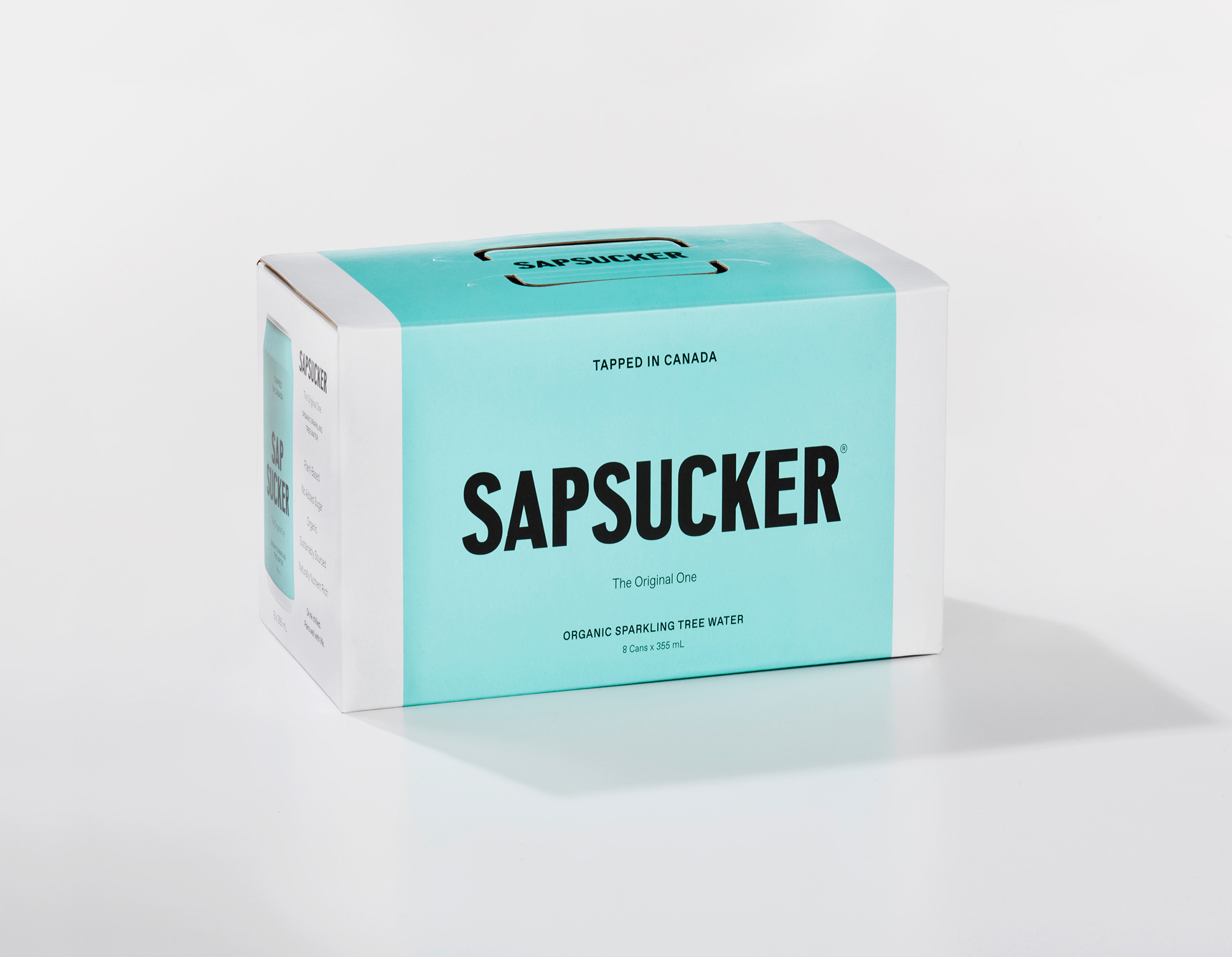
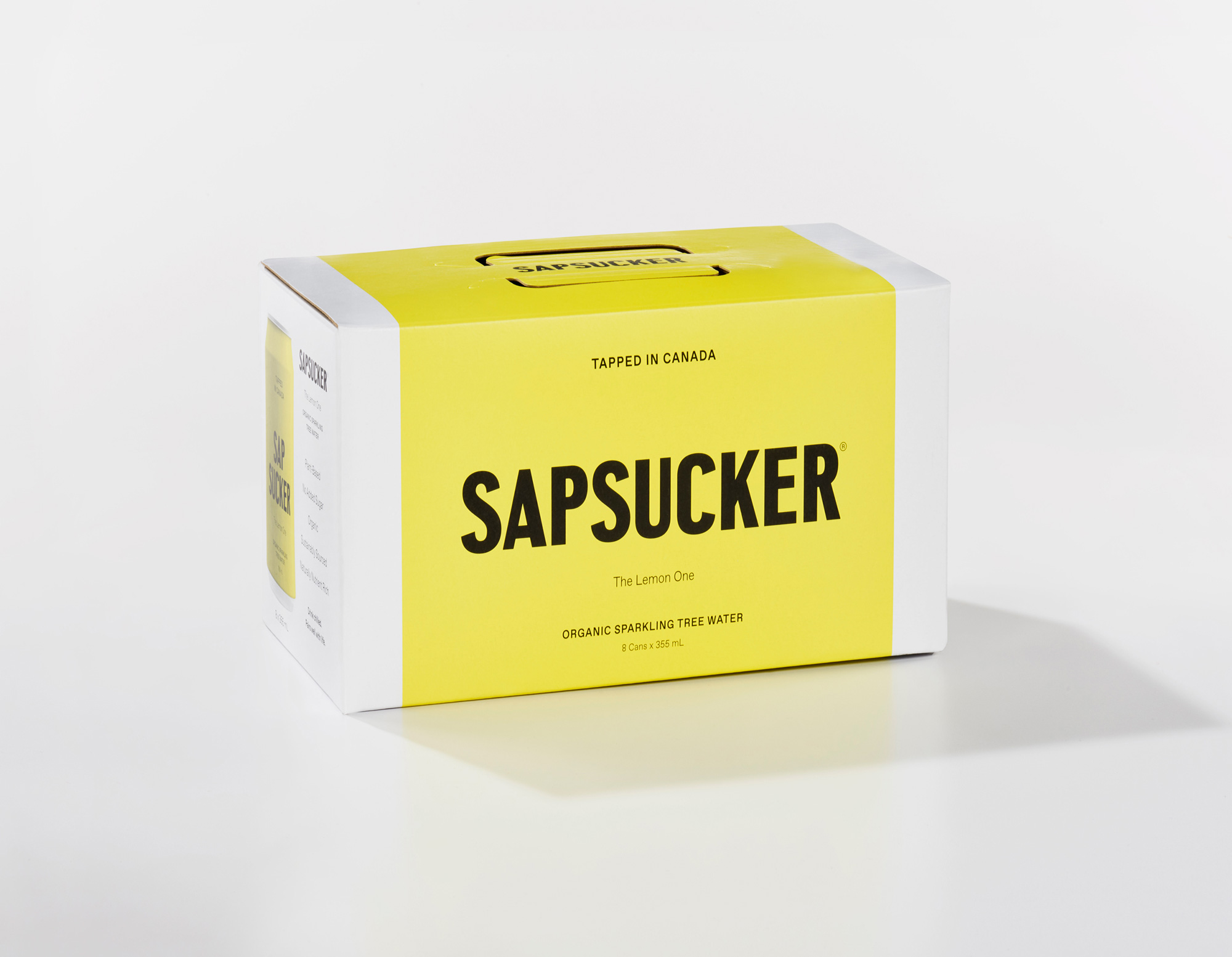
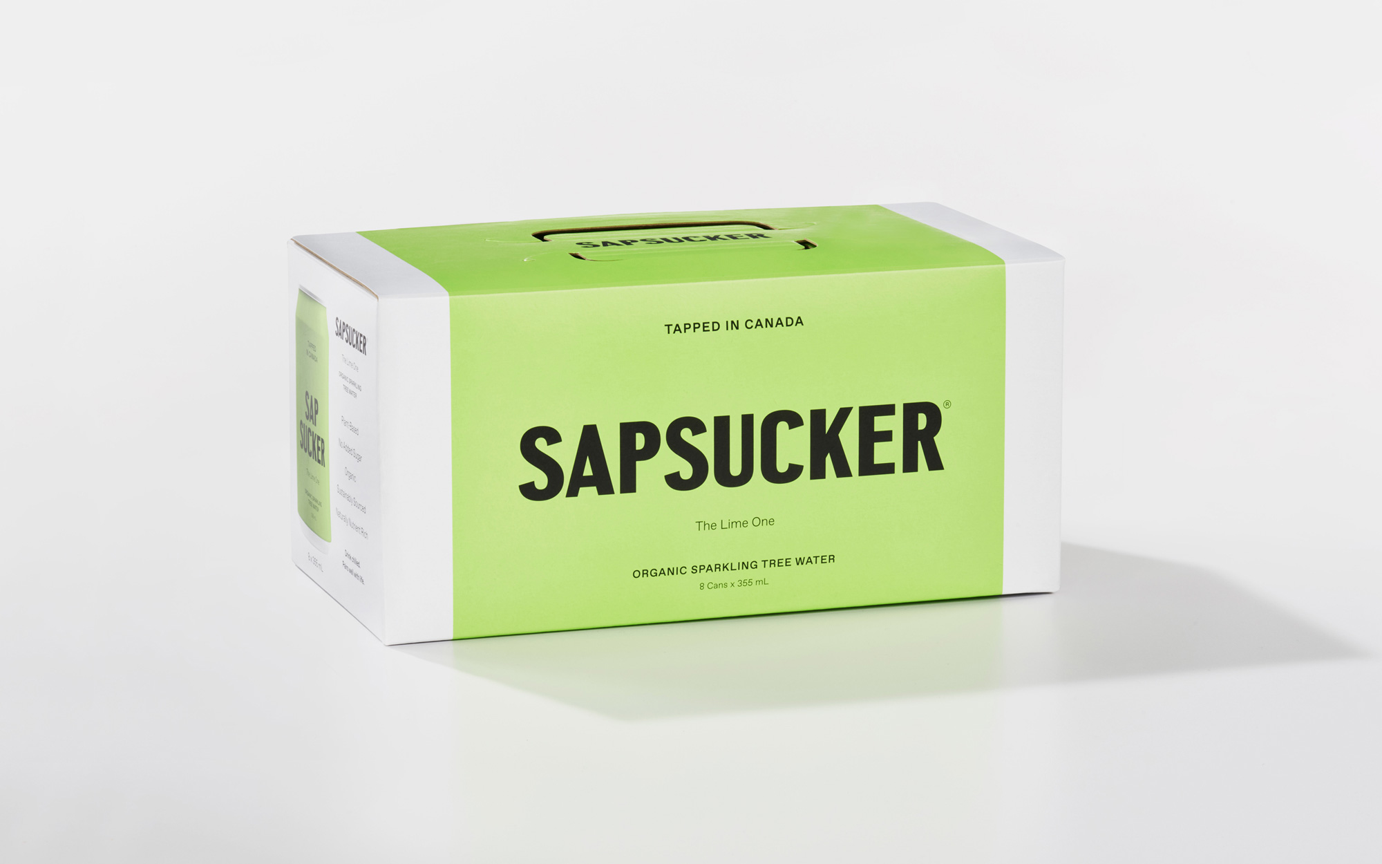
Vanderbrand designed a brand system that considers every touchpoint, including the functionality of the packaging and its shelf presence. An unboxing experience was created to highlight Sapsucker’s mandate to maintain sustainable processes for the planet, which is also a requirement for the knowledgeable and curious consumer. A custom 8-pack foldable carrier was developed with minimal adhesive making it more recyclable than the average carrier.
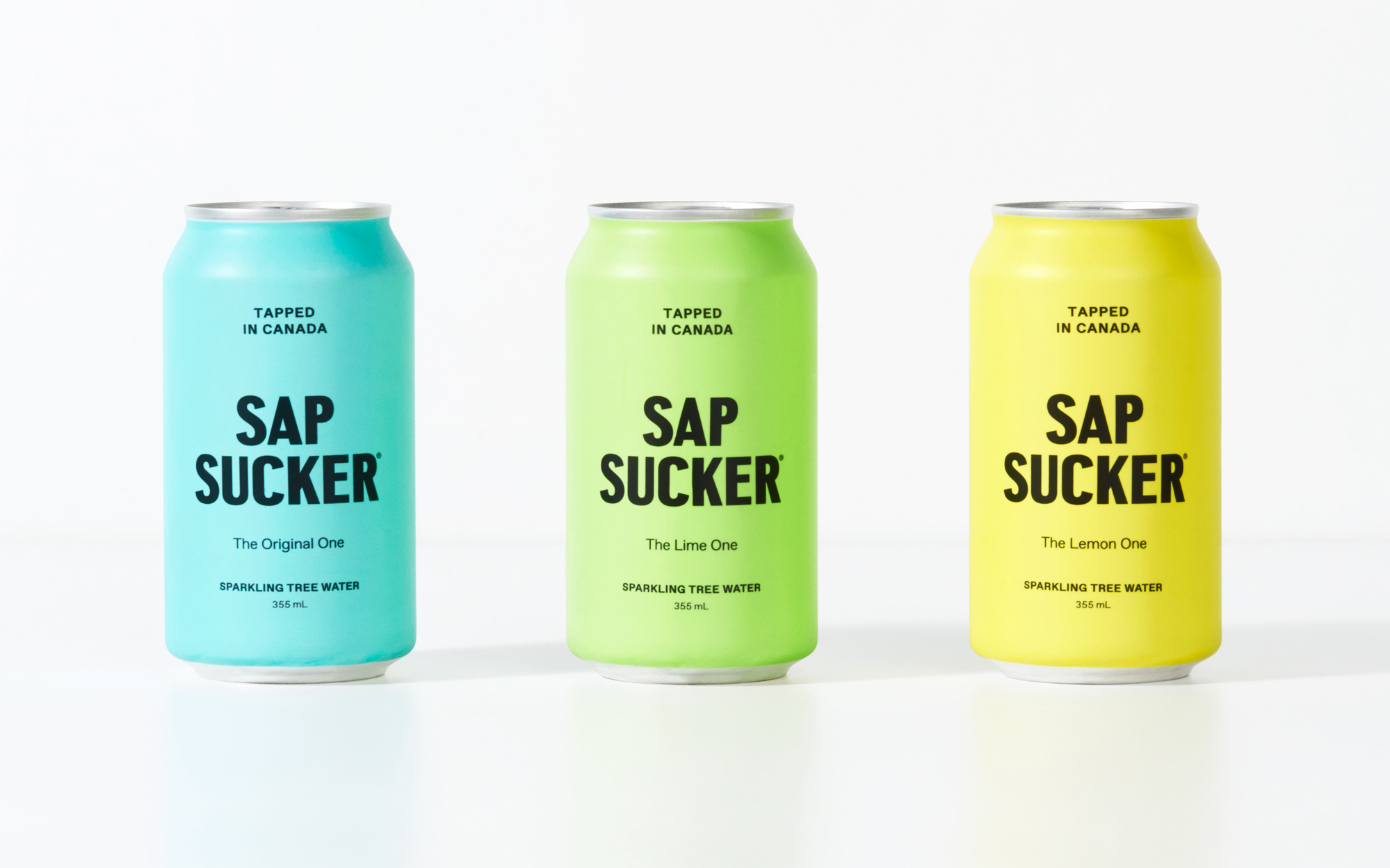
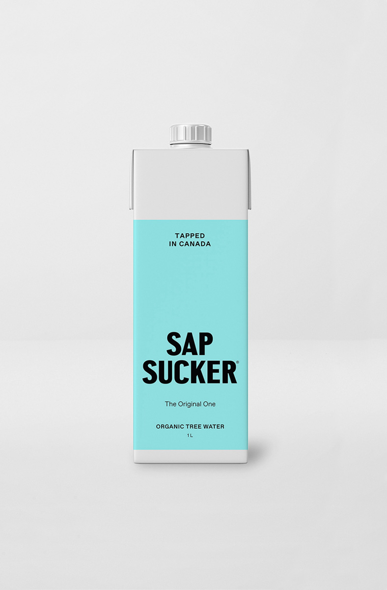
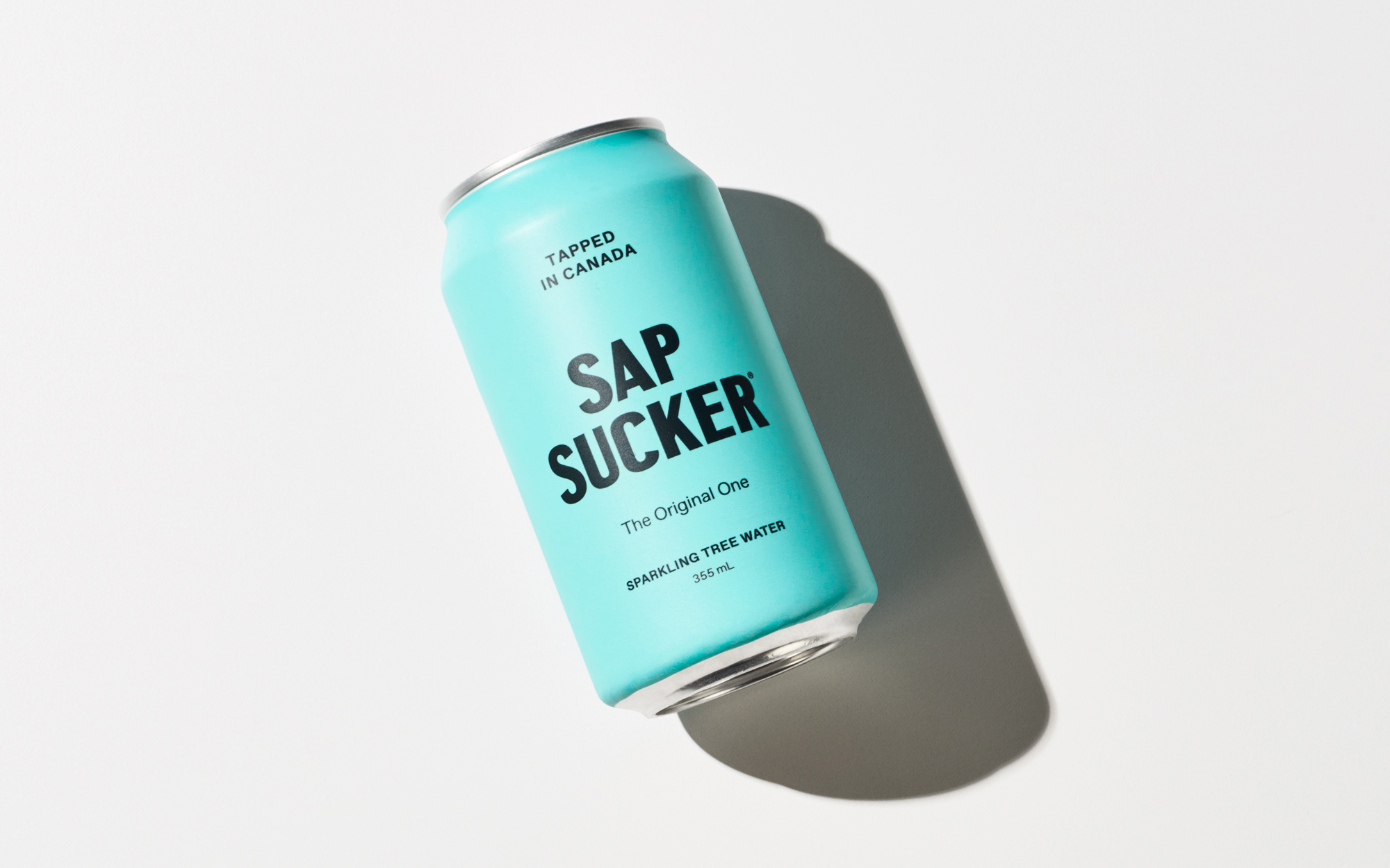
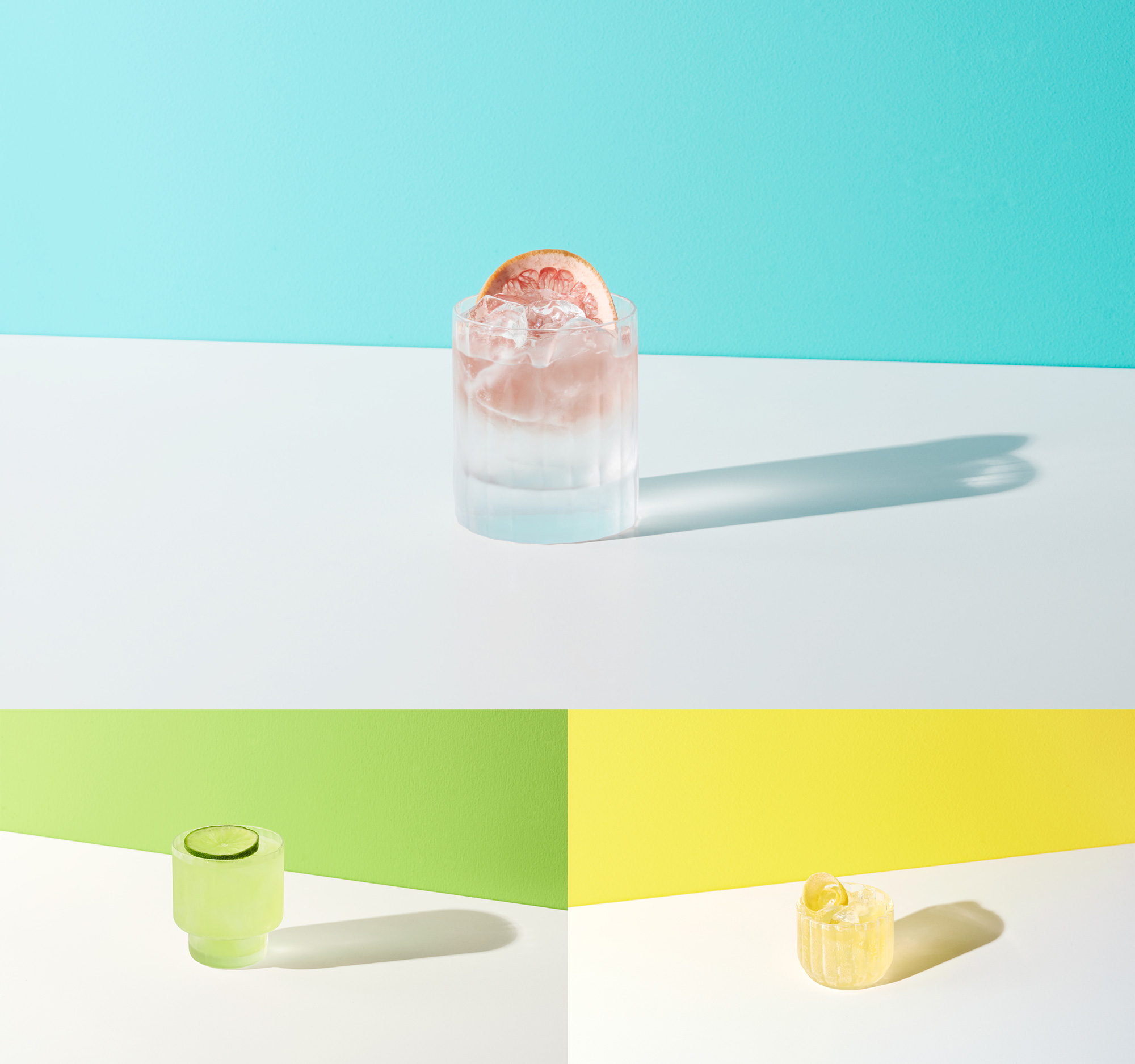
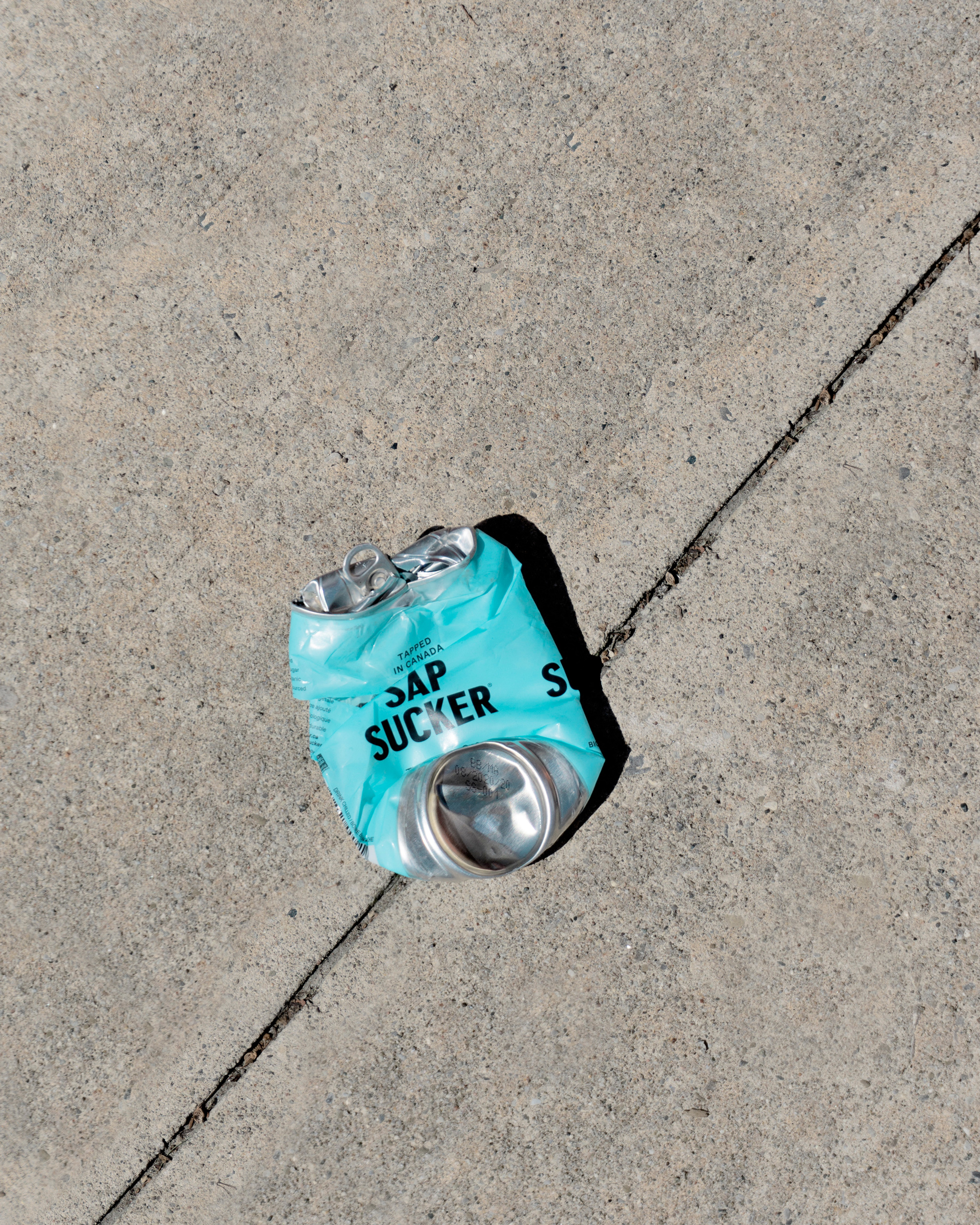
Like the logo, the new packaging takes a deadpan approach to the new cans (and the new tetra pack higher up) with the bare minimum amount of elements and no additional decoration whatsoever. The centered typography looks great and has just the right hierarchy among the five lines of text that pop nicely from the bright colors in a matte finish. Also like the logo, the cans might be too hipster-y for some but, again, I’m digging it.
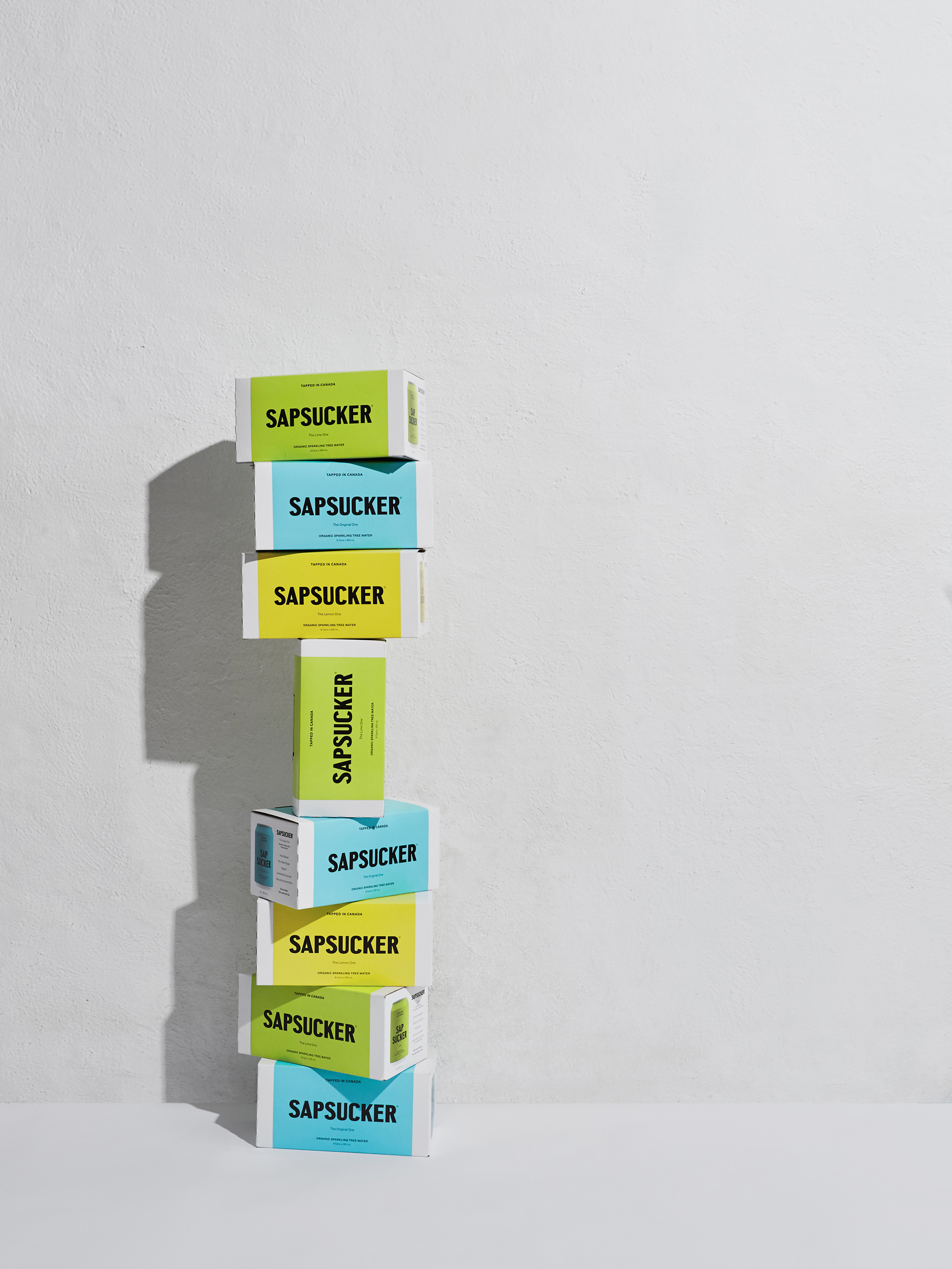
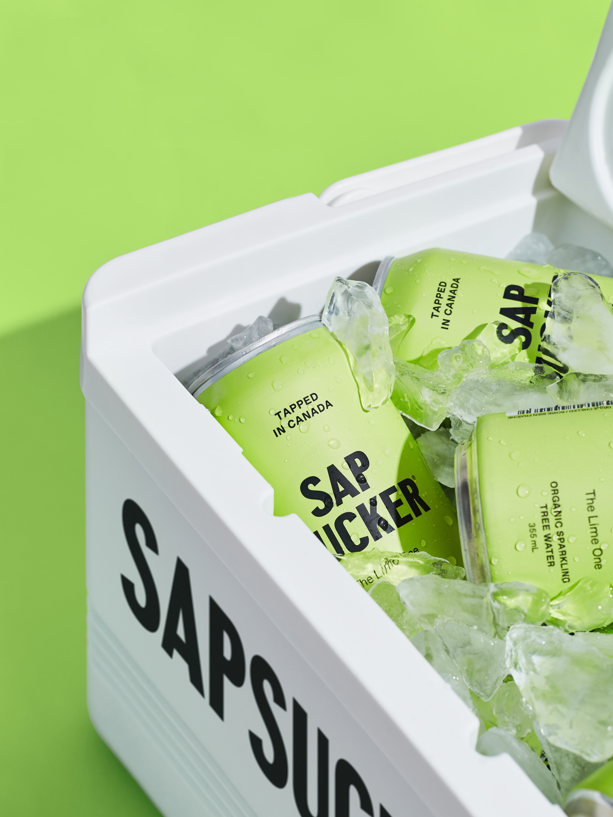
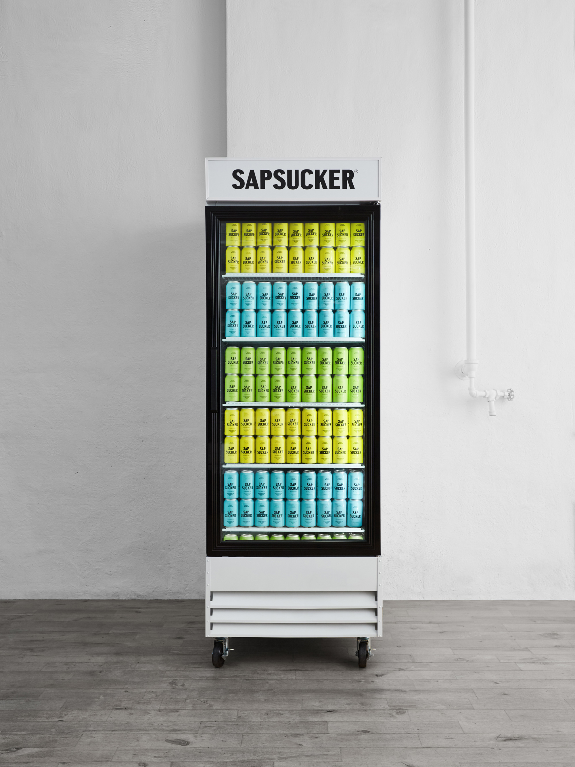
Overall, what this redesign does best, is position Sapsucker as a drink you want to have at house parties… a can you want to tote around and place confidently on a table in public… something with a little more street cred that makes drinking and buying it as much a health and taste choice as it is a lifestyle choice.
 each year since publication began in 2006

 Новости Союза дизайнеров
Все о дизайне в Санкт-Петербурге.
Новости Союза дизайнеров
Все о дизайне в Санкт-Петербурге.