Обзор лучших ресурсов по разработке бренда, разработке упаковки
contact us | ok@ohmycode.ru
contact us | ok@ohmycode.ru
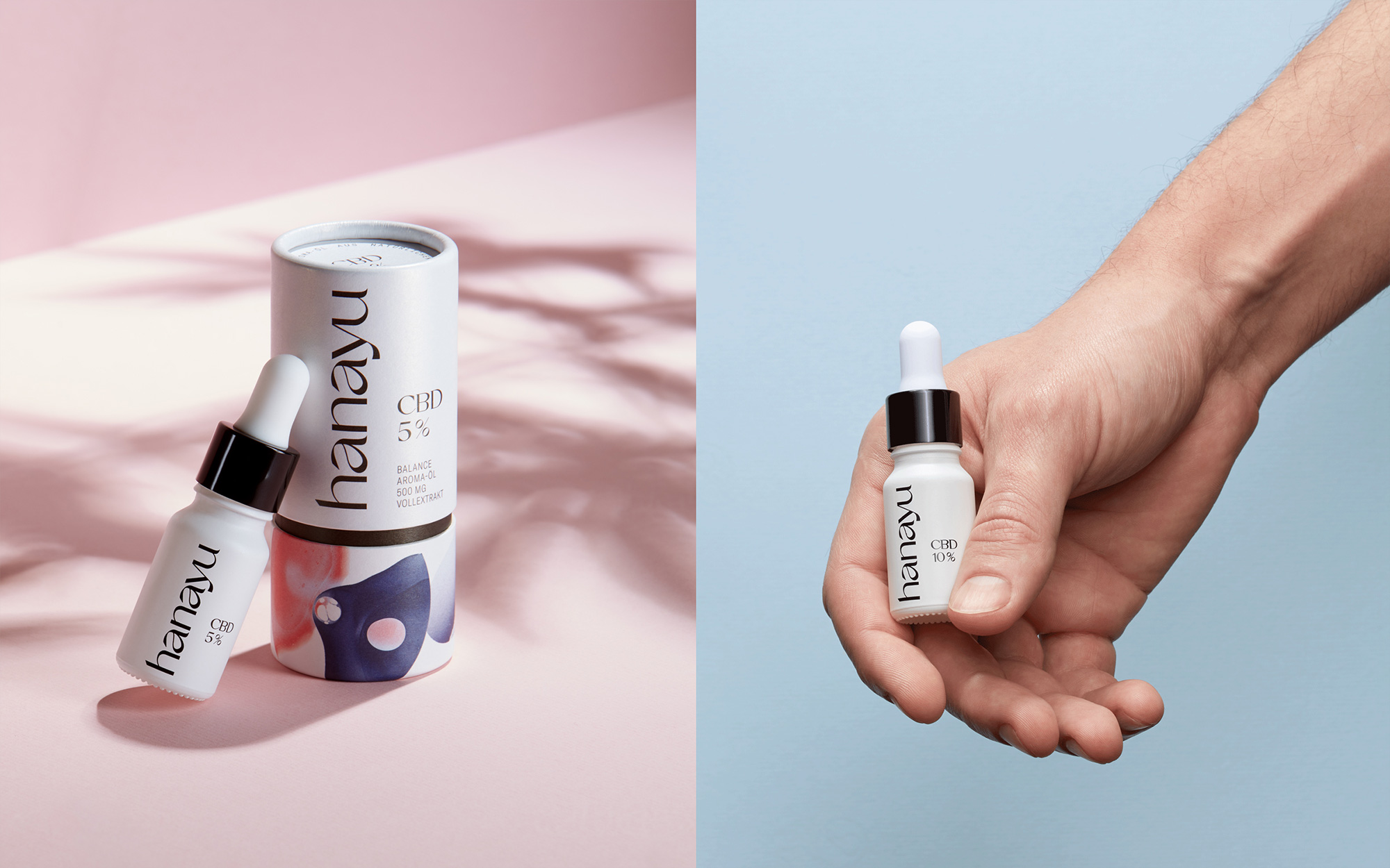
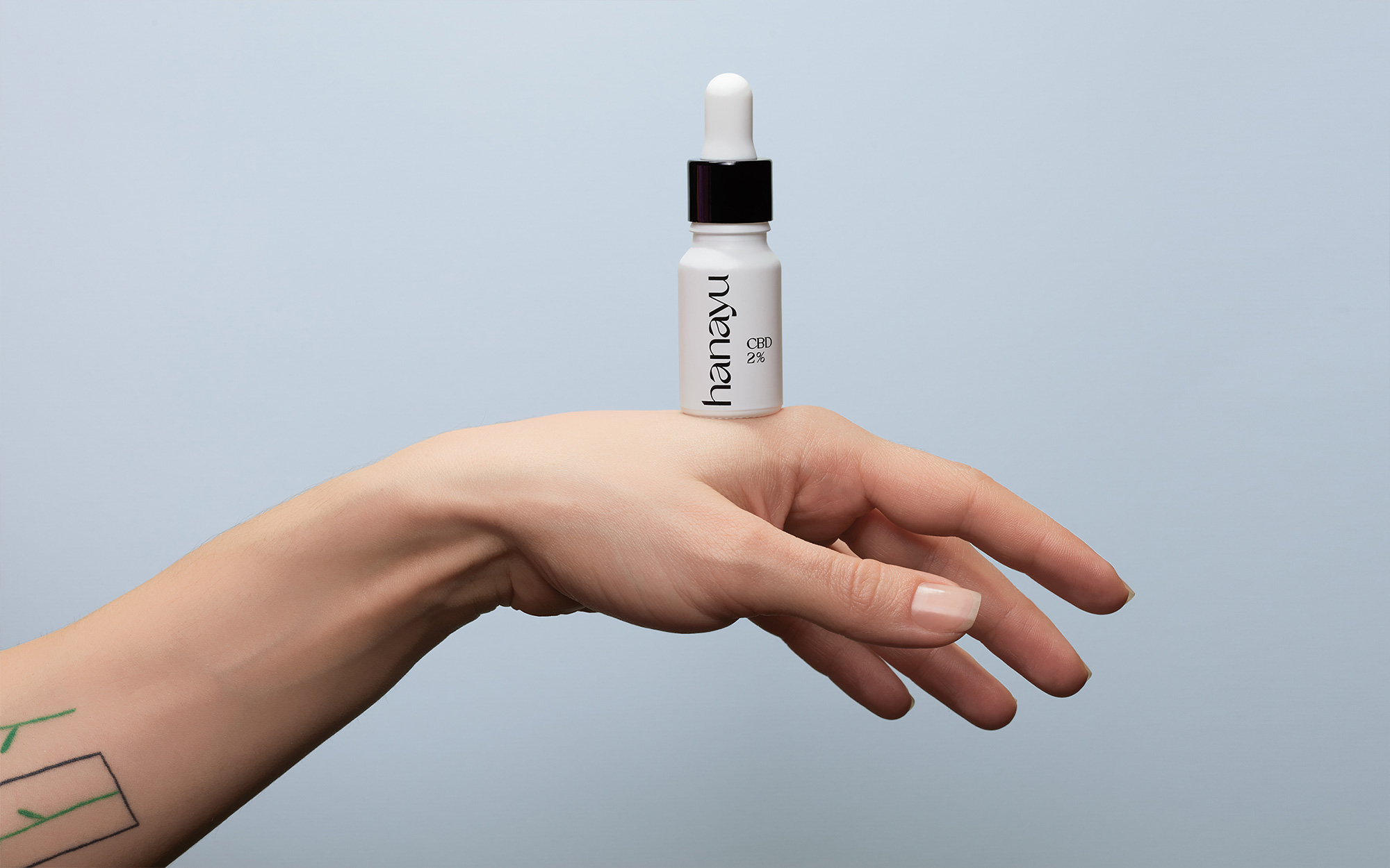
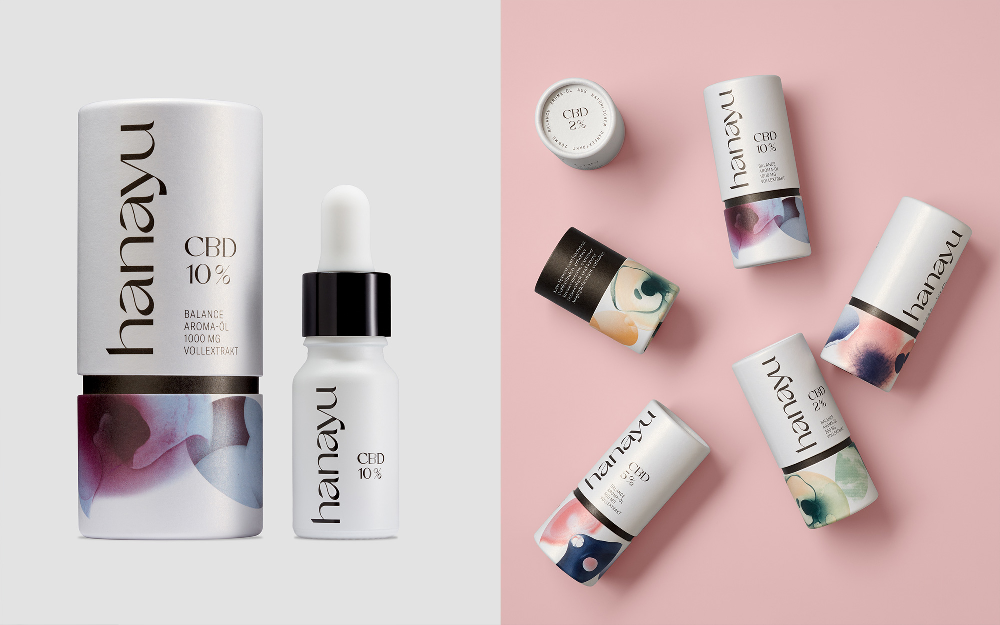
Launched this year, Hanayu is a brand of CBD oil in Germany started by three friends. Available in three sizes — from the more typical 200mg bottle to a hulking (relatively speaking) 1000mg — Hanayu’s oil is balanced for “energy and focus for your day, inner peace and relaxation for the night” within the allotted 0.2% THC limit in Germany. Using a specially developed and patented low pressure process, their oils are made in Germany and Austria and, for now, sold only online. Hanayu’s identity and packaging have been designed by Hamburg, Germany-based EIGA.
While full-on, high-inducing cannabis products and retailers have been getting high-end design treatments, CBD oil has, for the most part, lived in a design purgatory where the various logos and packaging for the hundreds of brands out there try to portray the product as both cannabis-esque and pharma-esque, landing in a weird pastiche of marijuana visuals and apothecary vibes. All that to say that Hanayu is more straightly positioned as a lifestyle, feel-good brand more in tune with the growing trend of finely-presented cannabis products with a logo that could easily be for a fashion brand. I take that back because most fashion brands now are bland sans serifs and this is a fairly exotic high-contrast sans with some exaggerated shapes and sharp edges that, well, give the brand an edge. I really like the wordmark but I wonder if, like in yesterday’s Ably post, the “y” would have benefitted from being more like the “u” as the angled letterform creates the few odd moments in the wordmark, like how it touches the “u”. Still, it’s pretty nice and it has personality.
The hanayu brand design uses striking, abstract elements to present the brand messages consistently across all channels while ensuring a clear differentiation from other CBD brands. Conceptual visuals illustrate the topic of “finding focus” and offer the opportunity to create a strong series of key visuals for packaging and social media. The photographic style and choice of motifs create a concise visual identity and emphasize the concept of “serenity”.
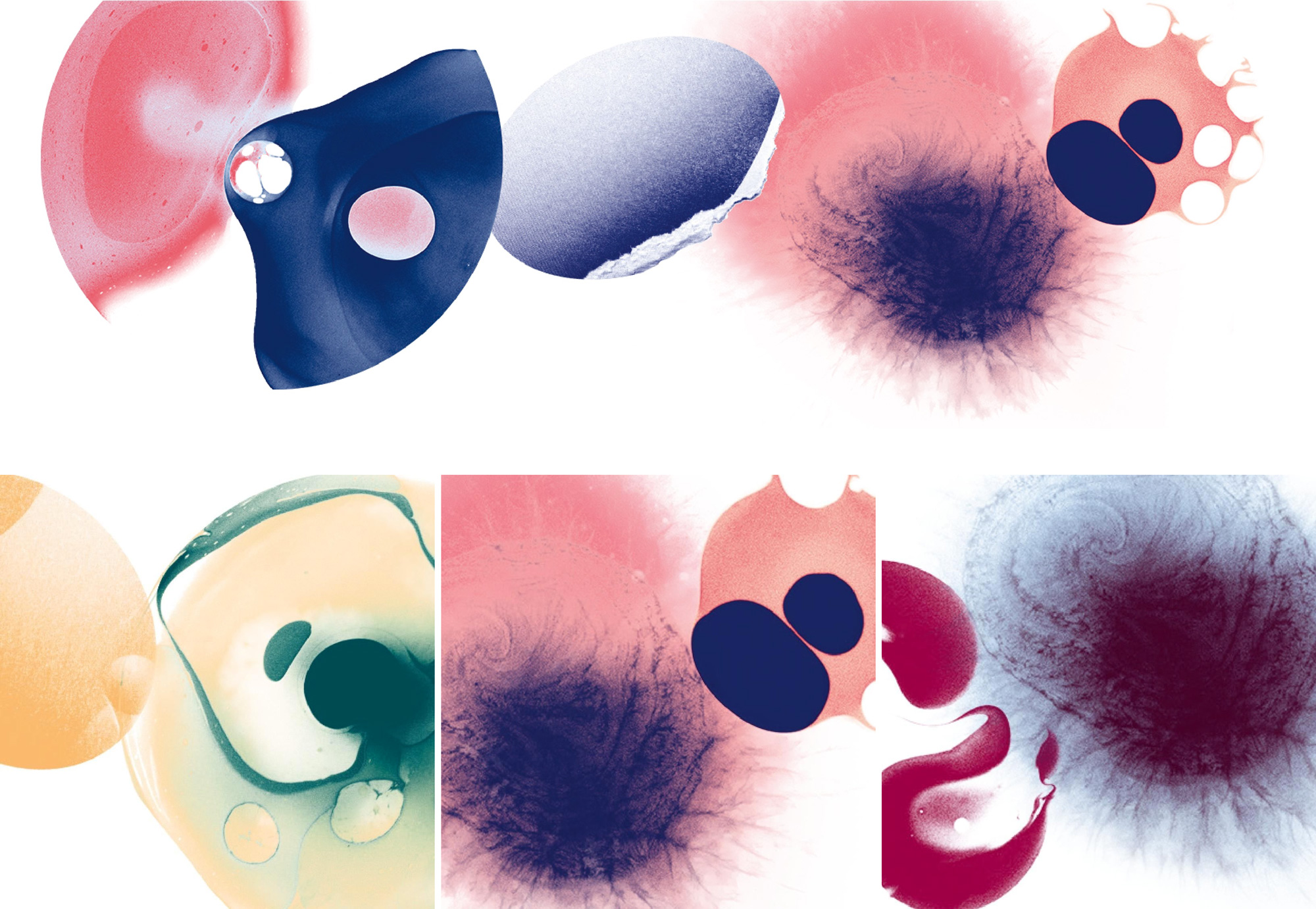
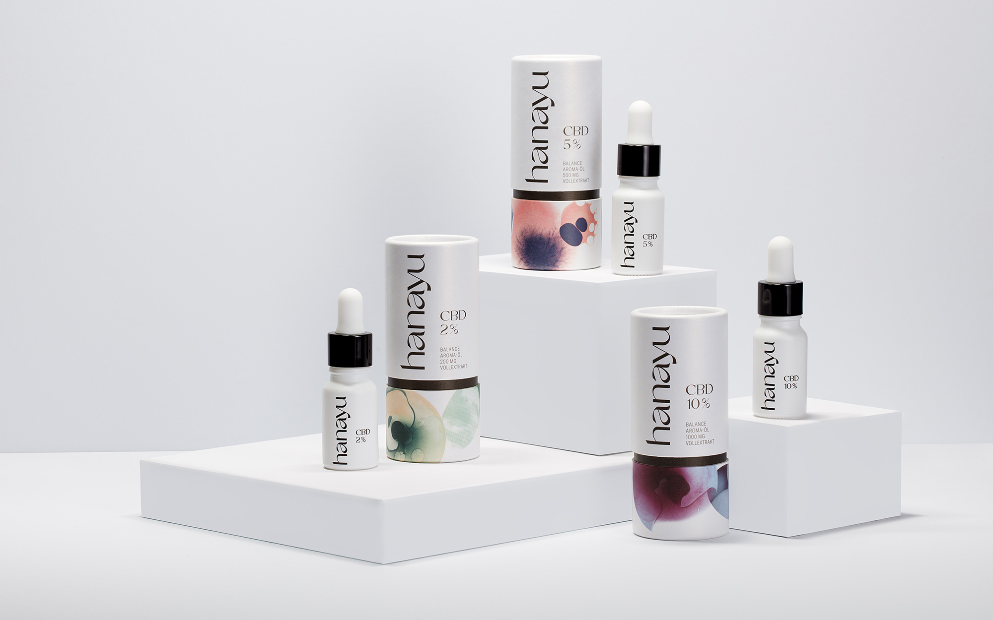
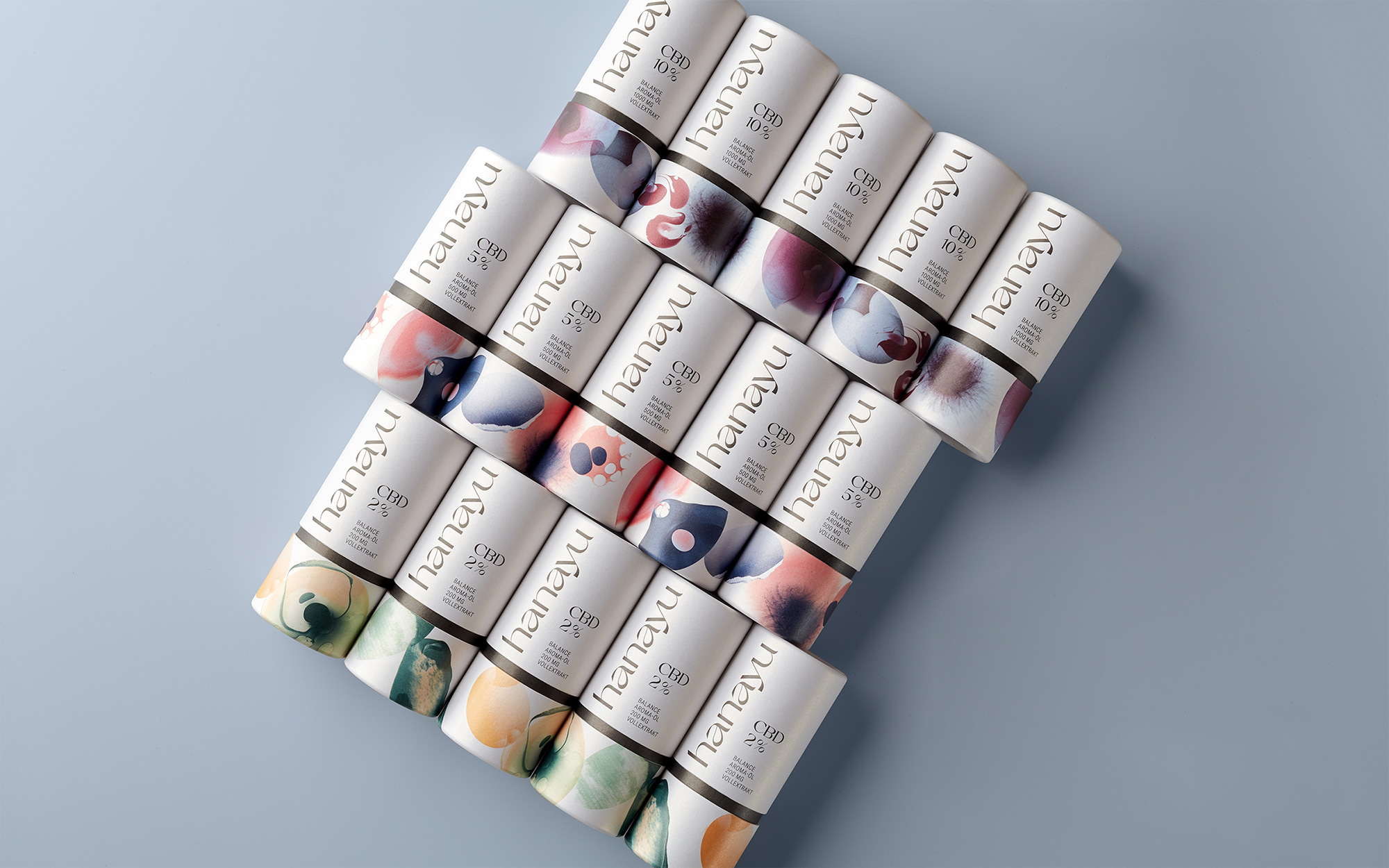
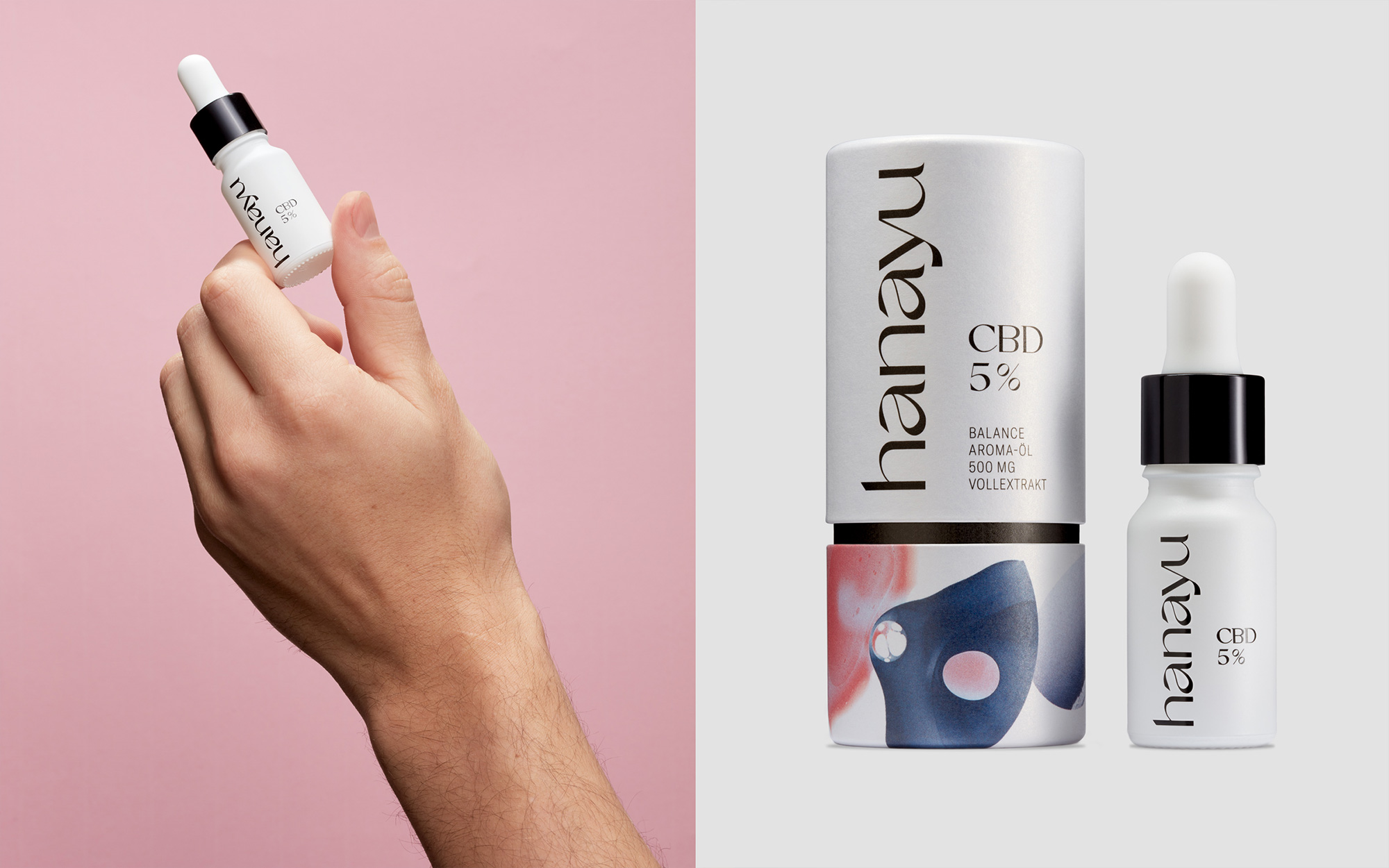
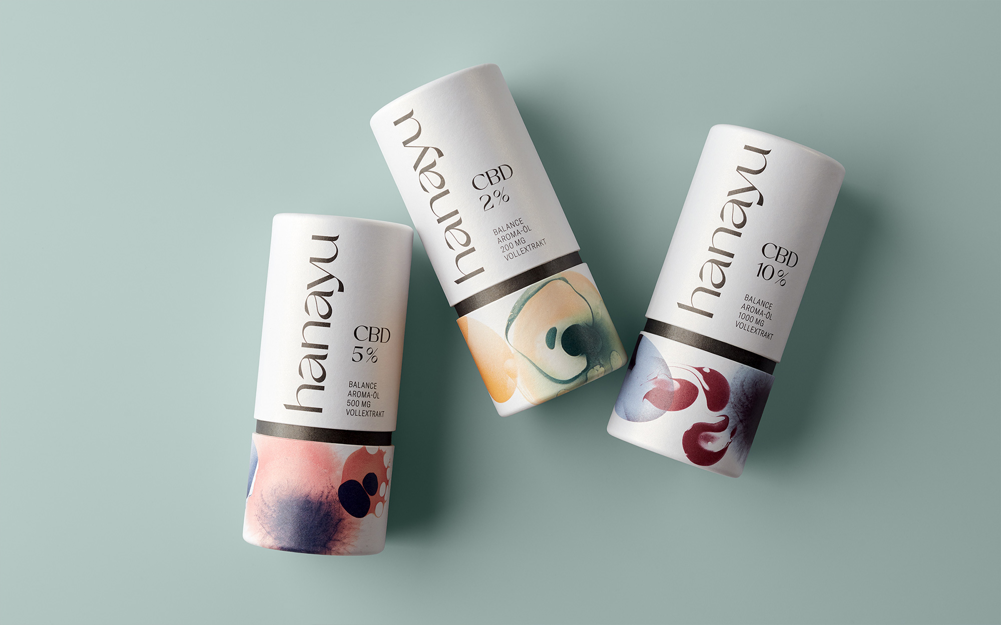
The packaging has zero marijuana leave visuals on it and it’s a CBD oil miracle. Instead, it features some abstract illustrations that are quite trippy and, if stared at too long on their own at large sizes, a little disturbing but the way they are used in the cylindrical boxes, taking up a very limited area and serving more as accents, they look beautiful and the structural thick black line that crops them feels very elegant, with the rest of the package in a minimalist approach. The tiny bottles inside could perhaps use a touch of something, like a spark of color somewhere as they feel a little too bare but, again, mostly I’m grateful there isn’t green foliage on it.
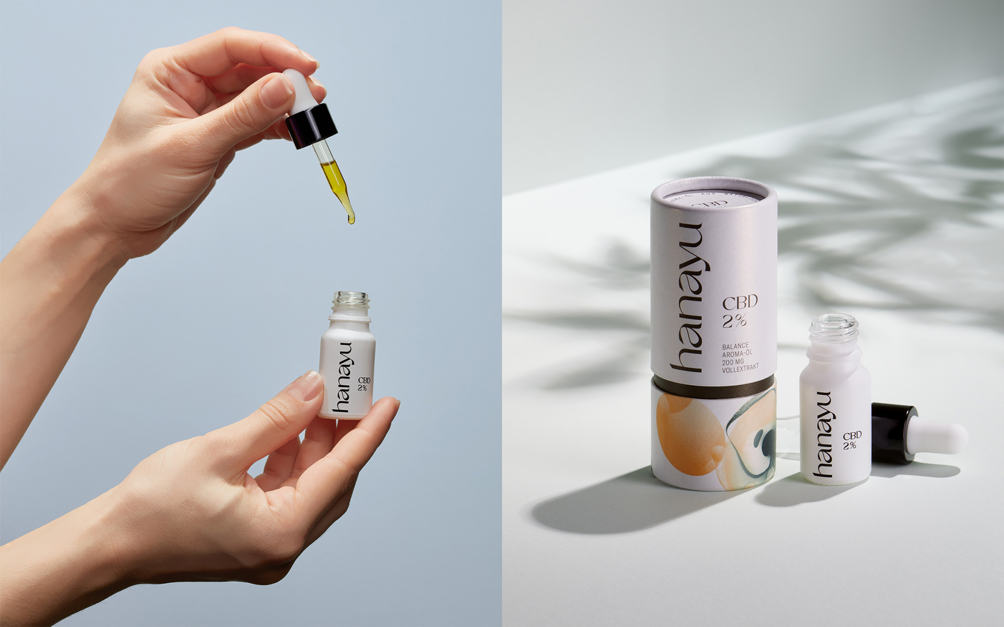
Overall, this is definitely on the creative end of the spectrum and it can probably afford to be that way as it’s not meant to be a mass market CBD oil product which has to rely on those quick, easily-absorbable (pun!) marijuana references to sell more efficiently but it’s usually niché products like this that slowly seep (pun!) into the mainstream for better overall design options and that should provide some inner peace for us design snobs.
 each year since publication began in 2006

 Новости Союза дизайнеров
Все о дизайне в Санкт-Петербурге.
Новости Союза дизайнеров
Все о дизайне в Санкт-Петербурге.