Обзор лучших ресурсов по разработке бренда, разработке упаковки
contact us | ok@ohmycode.ru
contact us | ok@ohmycode.ru
(Est. 2000) “Digital Reasoning is a leader in cognitive computing. We build software that understands human communication - in many languages, across many domains, and at enormous scale. We help people see the world more clearly so they can make a positive difference for humanity. Synthesys, our award-winning cognitive computing platform, can rapidly read data from any source, resolve what’s valuable and what’s not, and reason using a dynamic knowledge graph, which helps enterprises, financial services institutions, government agencies and healthcare organizations reveal concealed relationships, risks and opportunities. Digital Reasoning is headquartered in Nashville, Tennessee, with offices in Washington, D.C., New York and London.”
Golden Spiral (Nashville, TN)
Golden Spiral project page
Digital Reasoning blog post
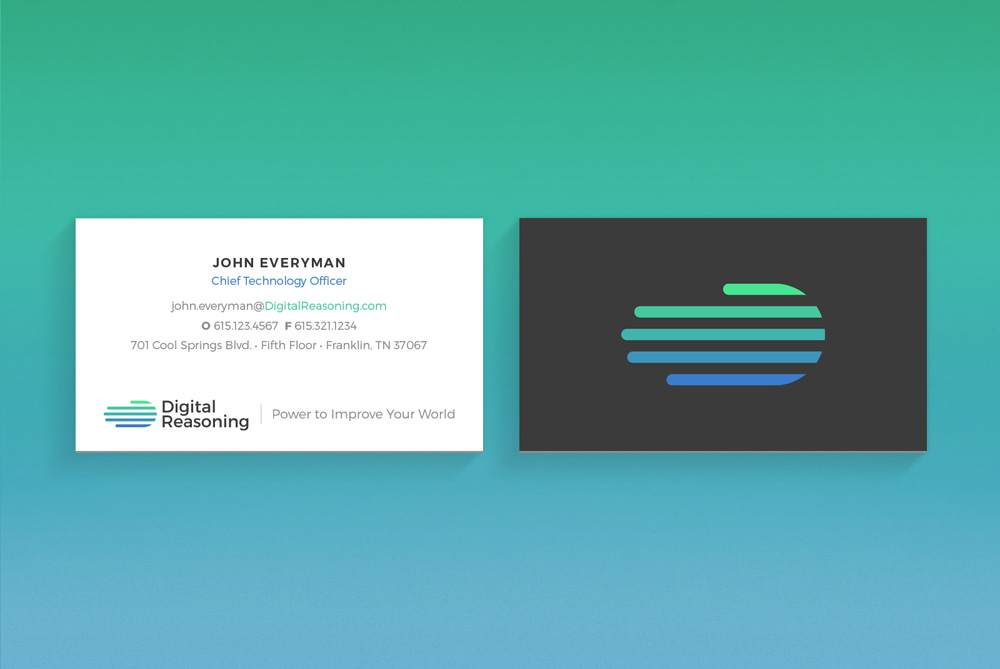
The theme for our new brand is articulated in a new tagline: The Power to Improve Your World™. It encapsulates the meaning of what we do for others, distilling our values – integrity, excellence, teamwork, innovation, customer focus – into our mission to enlighten others about what is possible and be a partner in their achievements. Our new logo continues to evoke our global impact, but also implies the humanizing force that lies behind it. Positive, vibrant and colorful, it’s five shapes echo our values, the world and the human hand.
The old logo was a corporate disco ball that hinted at being a globe, which is kind of a hard thing to achieve if that were a brief. The Helvetica-ish wordmark and the black color made it look like the evil artificial intelligence company of a movi… nay, a 1990s TV show. The new icon maintains the globe-ness but mashes it up with a hand (which also looks like very polite paint splattering around the globe) for a fairly interesting icon that provides some room for interpretation from its audience. The "fingers" feel a little long but I can appreciate that, as a whole, it's the dimension of two circles. The wordmark is fine and unassuming but perfectly lined up with the icon. On the set of icons, the same multi-color approach doesn't work nearly as well, making them feel cartoonish. Nonetheless, a great improvement.

 Новости Союза дизайнеров
Все о дизайне в Санкт-Петербурге.
Новости Союза дизайнеров
Все о дизайне в Санкт-Петербурге.