Обзор лучших ресурсов по разработке бренда, разработке упаковки
contact us | ok@ohmycode.ru
contact us | ok@ohmycode.ru
Established in 1936, Aer Lingus is the flag carrier airline of Ireland. Transporting over 12 million passengers a year, it is the second largest airline in the country behind Ryanair (which has a massive 400-plane fleet compared to Aer Lingus’ 67) and flies to more than 100 destinations in the UK and Europe plus 17 direct routes to North America. Based in Dublin Airport, Aer Lingus is a member of International Airlines Group (IAG). As part of its strategy to become the leading value carrier across the North Atlantic, increasing its fleet from 17 to 30 by 2023, Aer Lingus introduced a new identity designed by Lippincott.
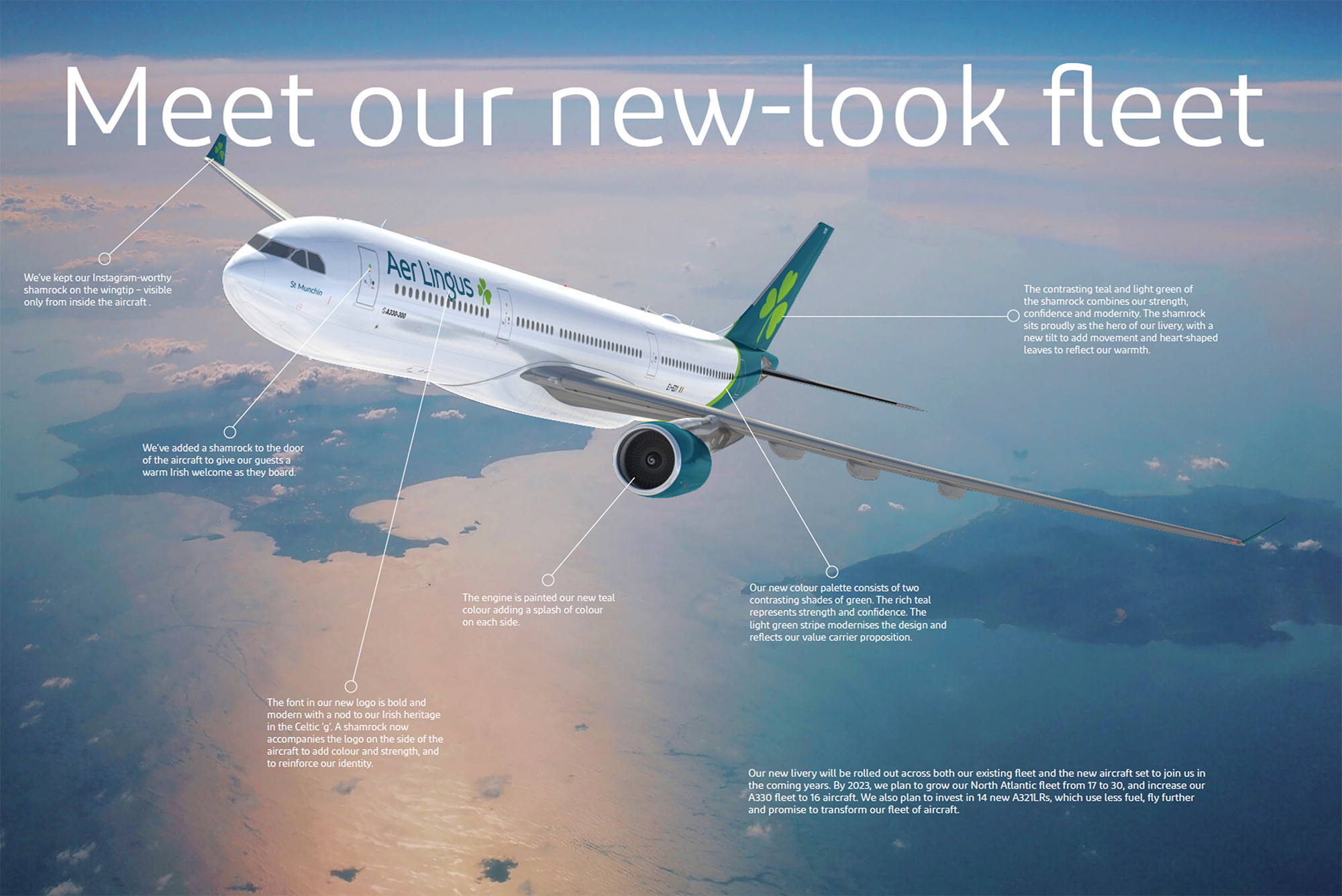
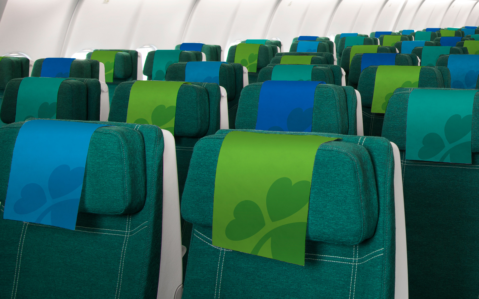
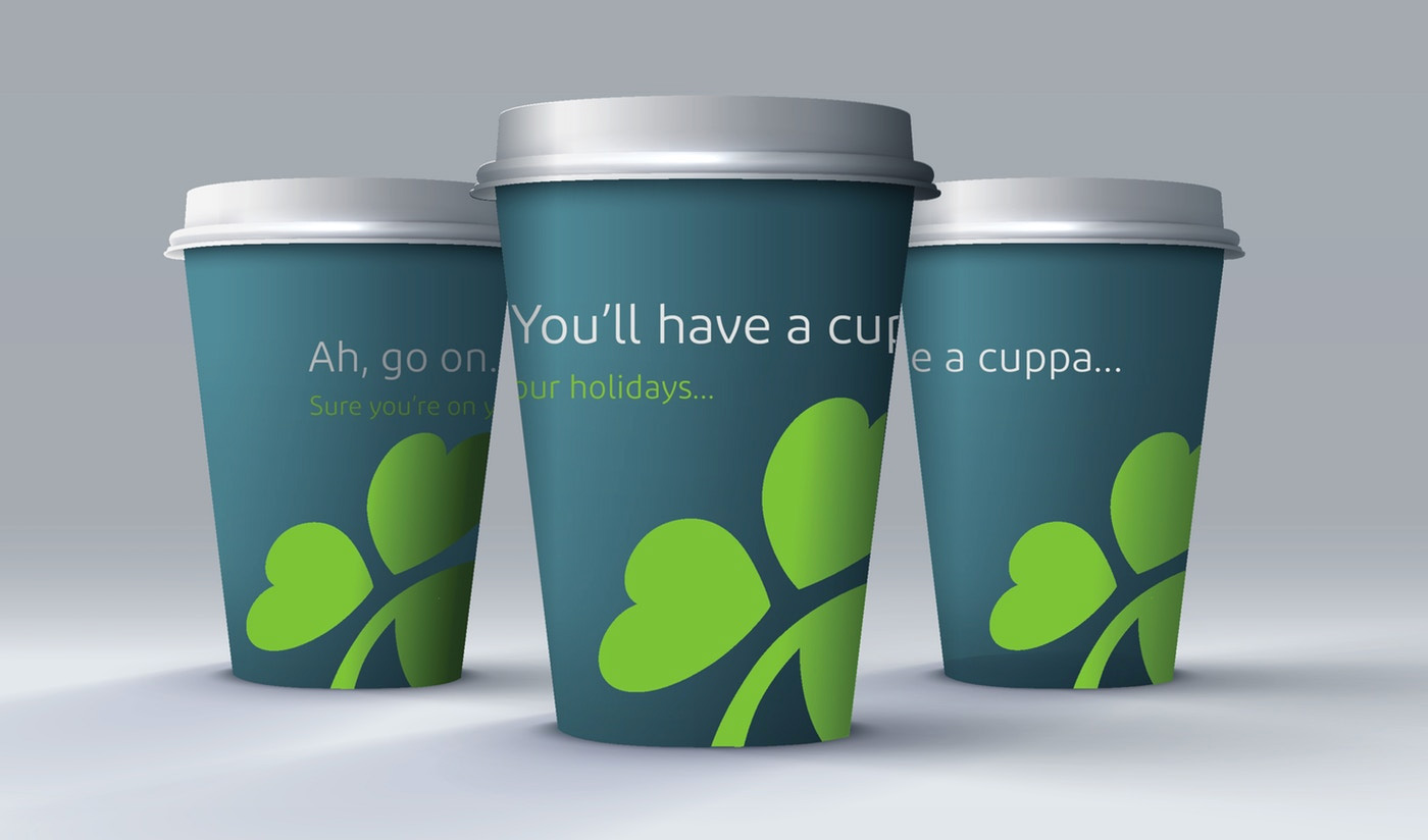
The new logo retains but restyles the iconic shamrock, adding a tilt to symbolise dynamism and speed, with heart-shaped leaves reflecting the warmth and hospitality of the brand. The Aer Lingus logo font has changed to ‘Diodrum’ and the dominant colour is teal.
The old logo hovered somewhere between fine and bad… there was nothing visually offensive about it but the type choice and clover execution were pretty boring and underwhelming. The new logo looks more like a modern-day airline logo with the wider wordmark, which is based on Diodrum, a spurless sans (which is my least favorite font category) that has been customized to have a wider “e” and “s” as well as a Gaelic-ish “g”. I really like that last detail as a concept and in the shape of the “g” but amidst the rest of the letters it stands out weirdly, in part because all of the letters have been each slightly customized and don’t quite gel together — the “s” in particular looks like it belongs in a Saul Bass airline logo, not here. The new shamrock is quite nice. I like how they kept the asymmetry and angle while softening the leaf shapes. Maybe it’s a little corny they are heart shapes but it still reads as a shamrock first. The shading, especially on the stem is a little confusing though and (as you’ll see in the last few images) I think the icon works well in a single color.
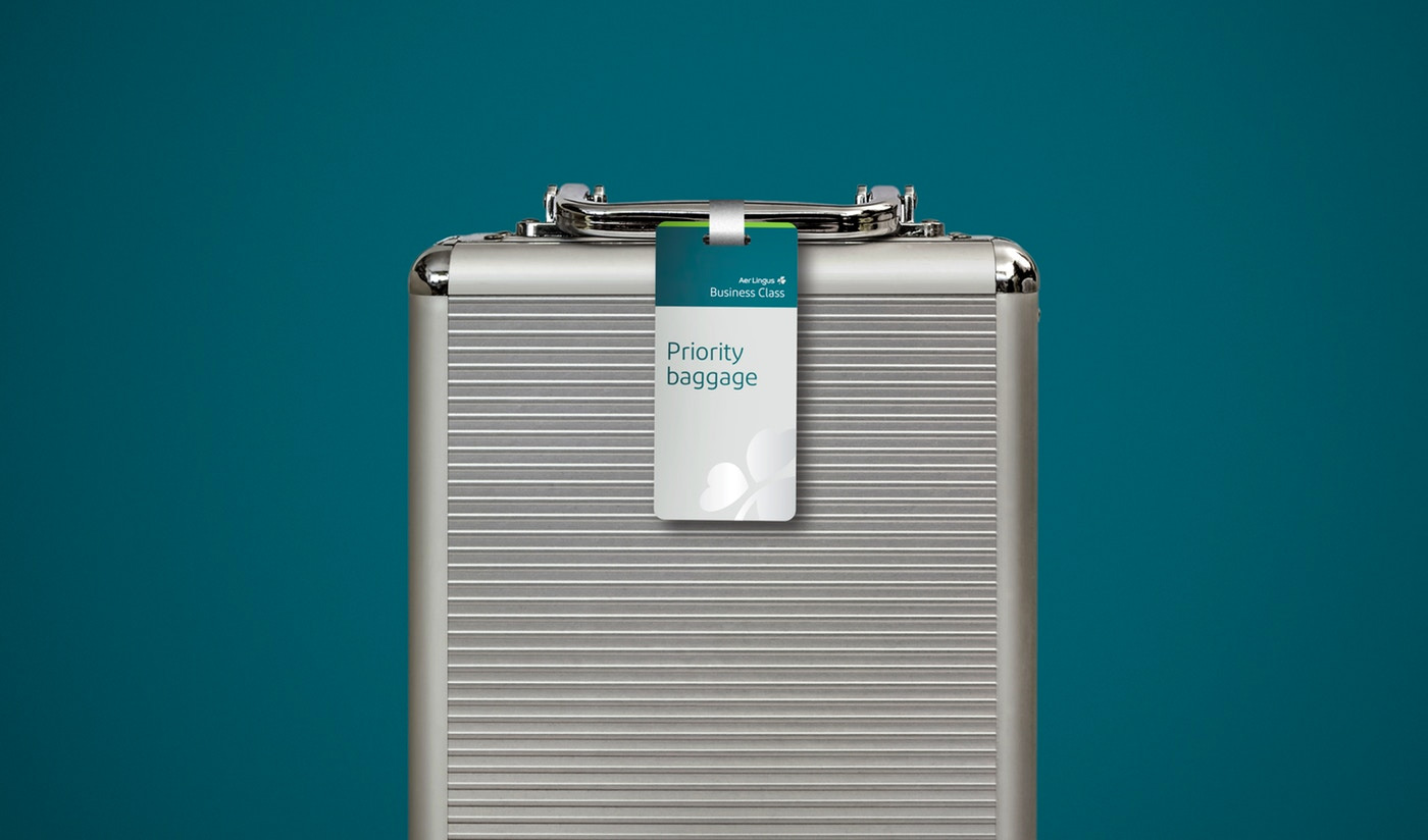
The iron shamrock for business class, unfortunately, needs a complete redo. This is a very strange rendering that has a weird logic and combination of shadows and highlights. Also, when pairing the customized Diodrum wordmark with Diodrum out of the box, it makes for an odd couple.
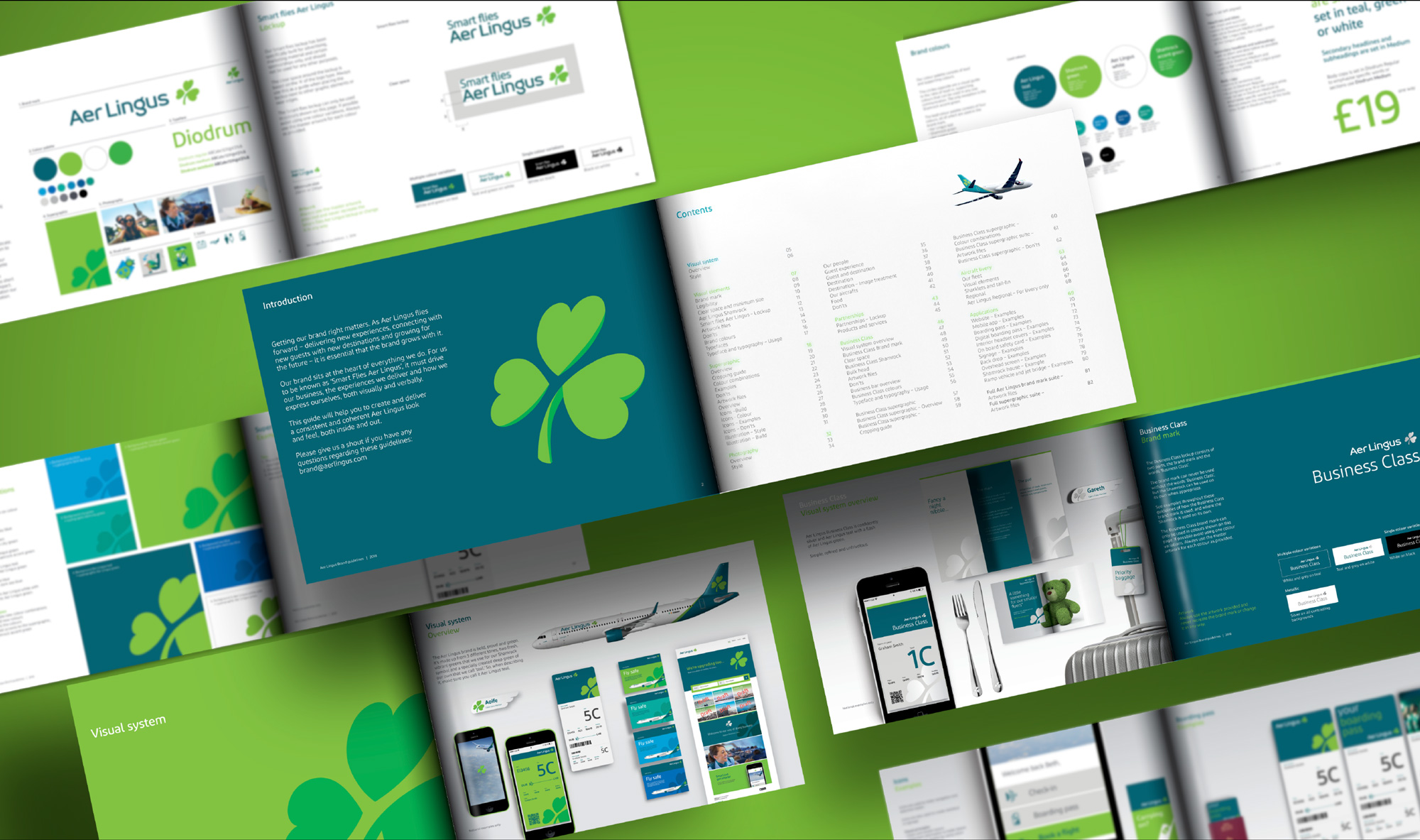
Not much in terms of application… lots of Diodrum based on the guidelines. Things seem to look okay from afar.
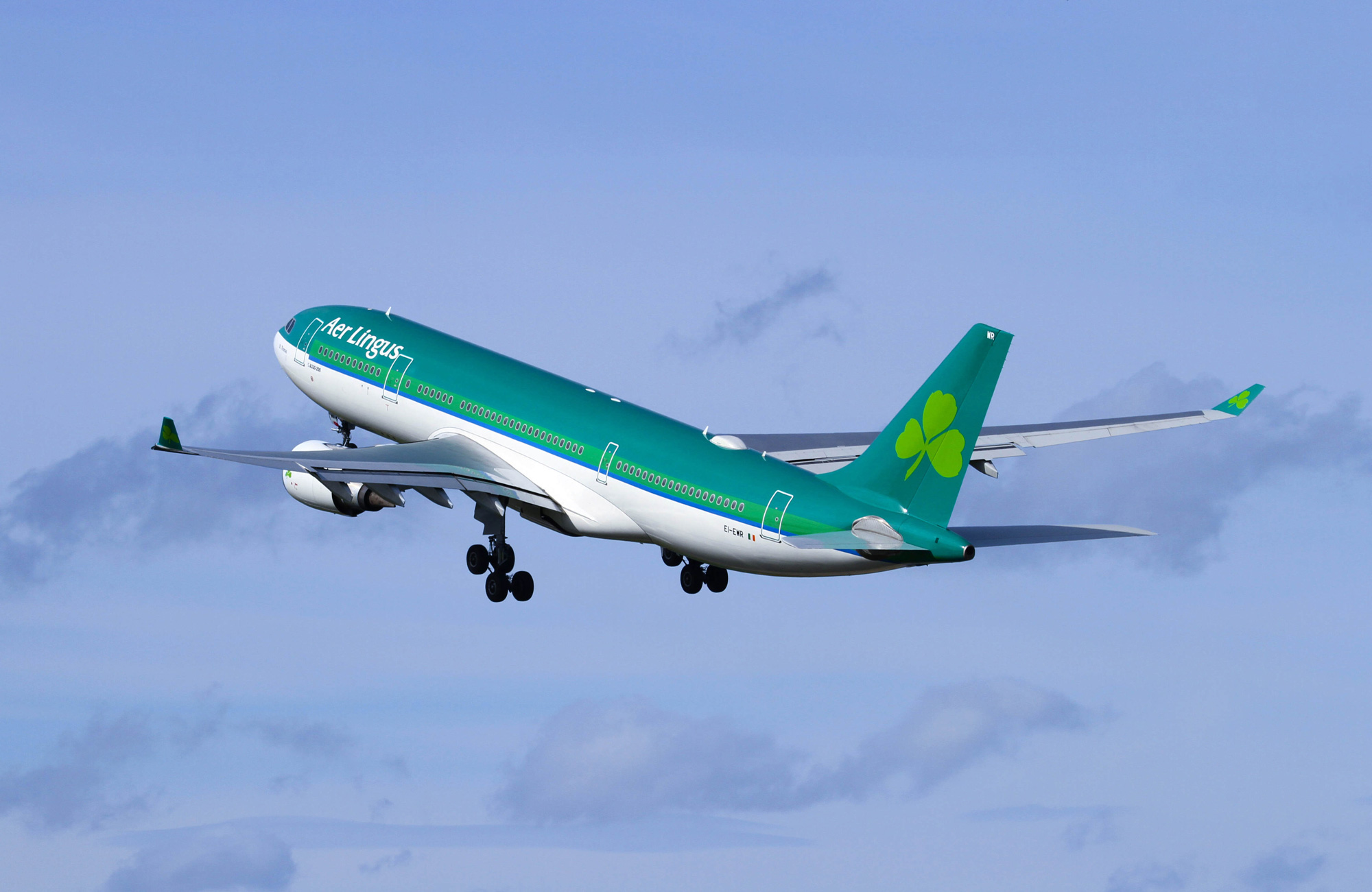
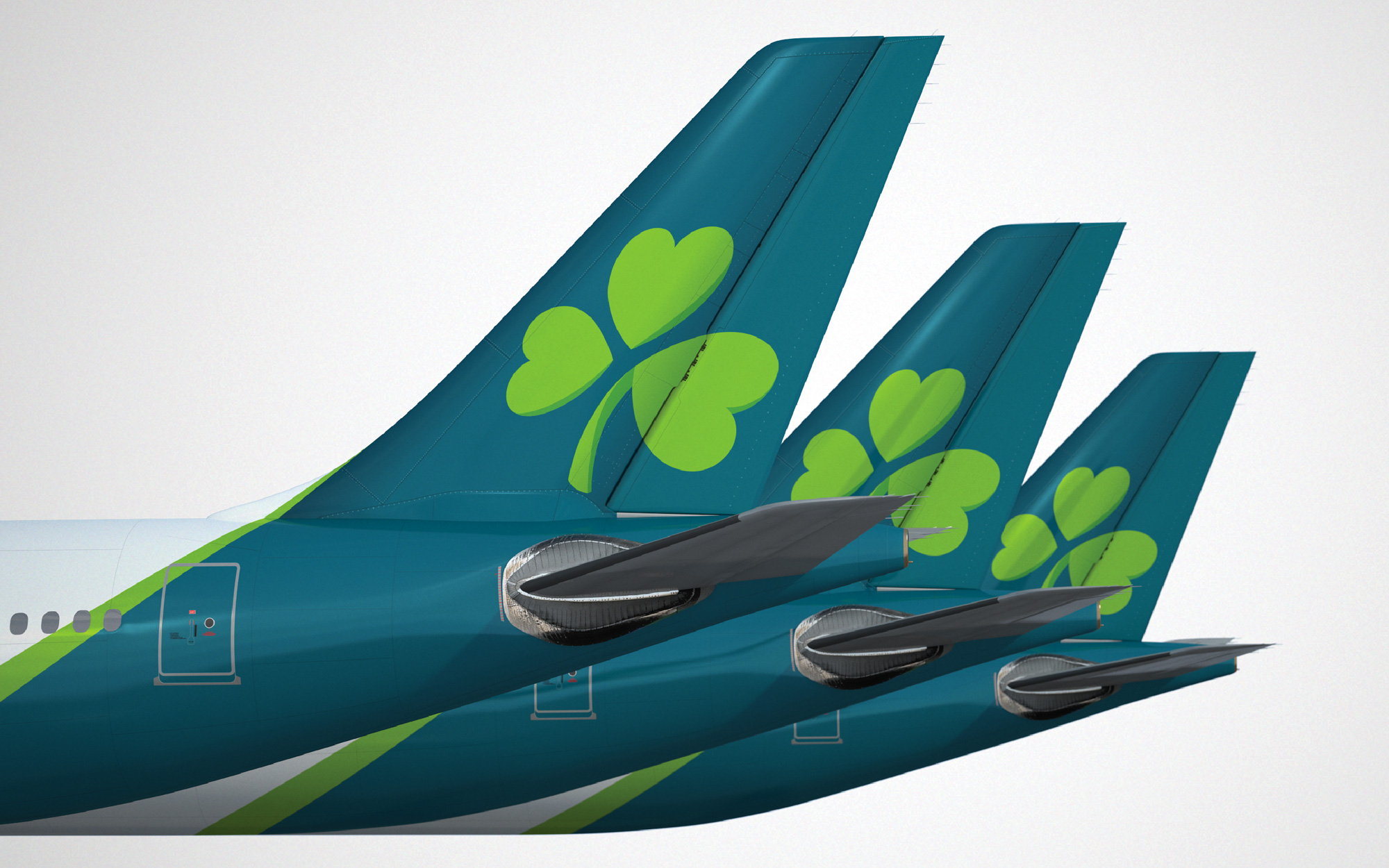
Guests will see four shamrocks on the new Aer Lingus aircraft livery. The first is within the new logo, the second sits on the tailfin, a third welcomes guests at the door, and a final surprise on the wingtip is in prime position for capturing on social media. The body of the new look Aer Lingus aircraft will be white with a teal-coloured tail and engines, bringing a sleek, contemporary feel to the design. The teal undercarriage means that Aer Lingus will be instantly recognisable to those on the ground.
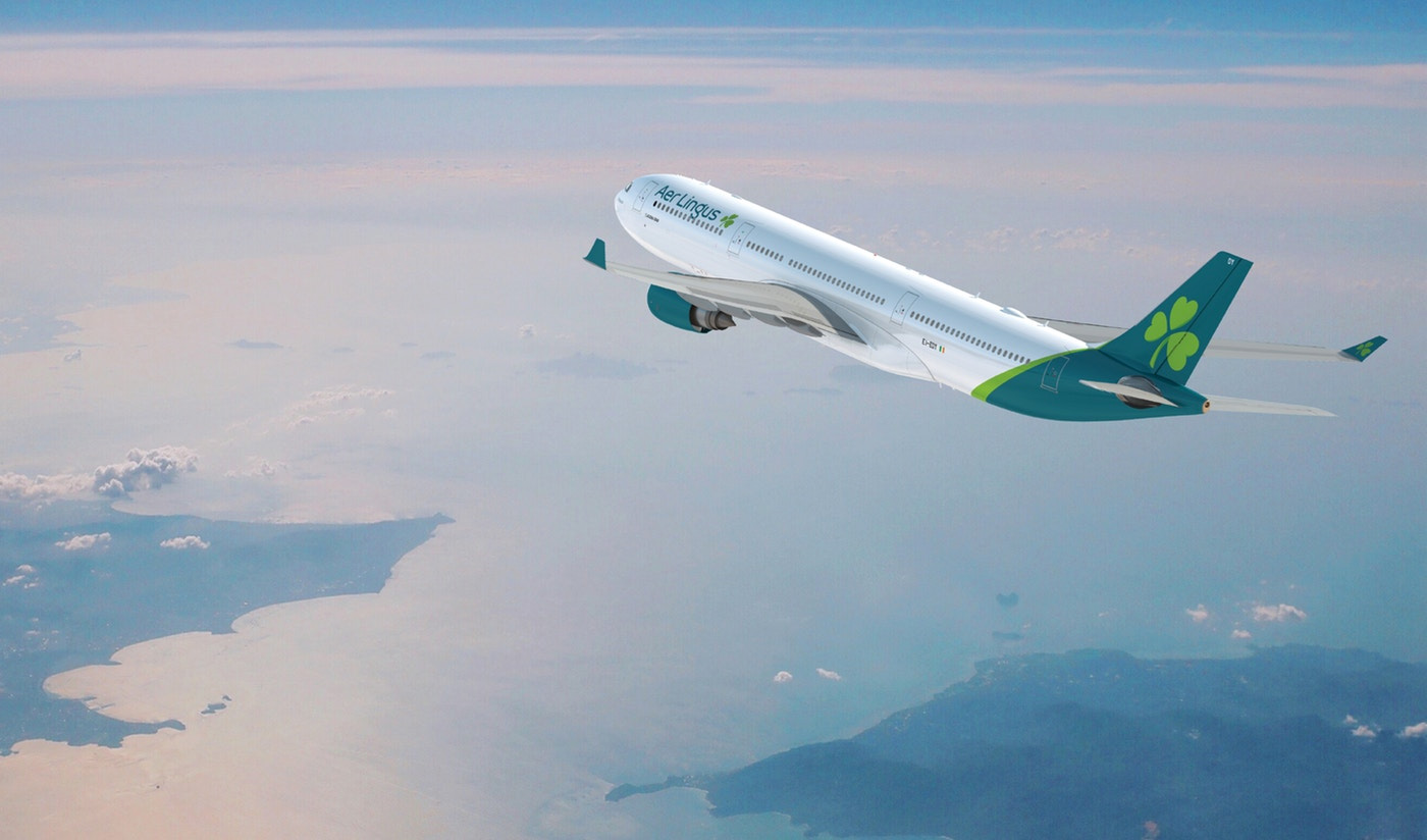
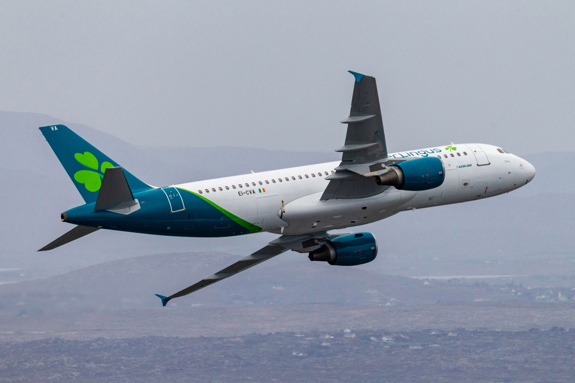
The old livery felt very heavy with the whole upper half of the plane painted teal. The new one is better balanced and more in tune with today’s white-heavy fuselages and angled tail design. It’s not a show-stopping livery but it’s an improvement. The teal engines are a nice touch.
Overall, I feel like if if they had doubled down on the approach they took with the “g” and created a more customized font with Gaelic script details to use throughout the applications it would have yielded a more unique identity but this is a fine and decent evolution that was much needed in order to bring Aer Lingus into this century.

 Новости Союза дизайнеров
Все о дизайне в Санкт-Петербурге.
Новости Союза дизайнеров
Все о дизайне в Санкт-Петербурге.