contact us | ok@ohmycode.ru
contact us | ok@ohmycode.ru
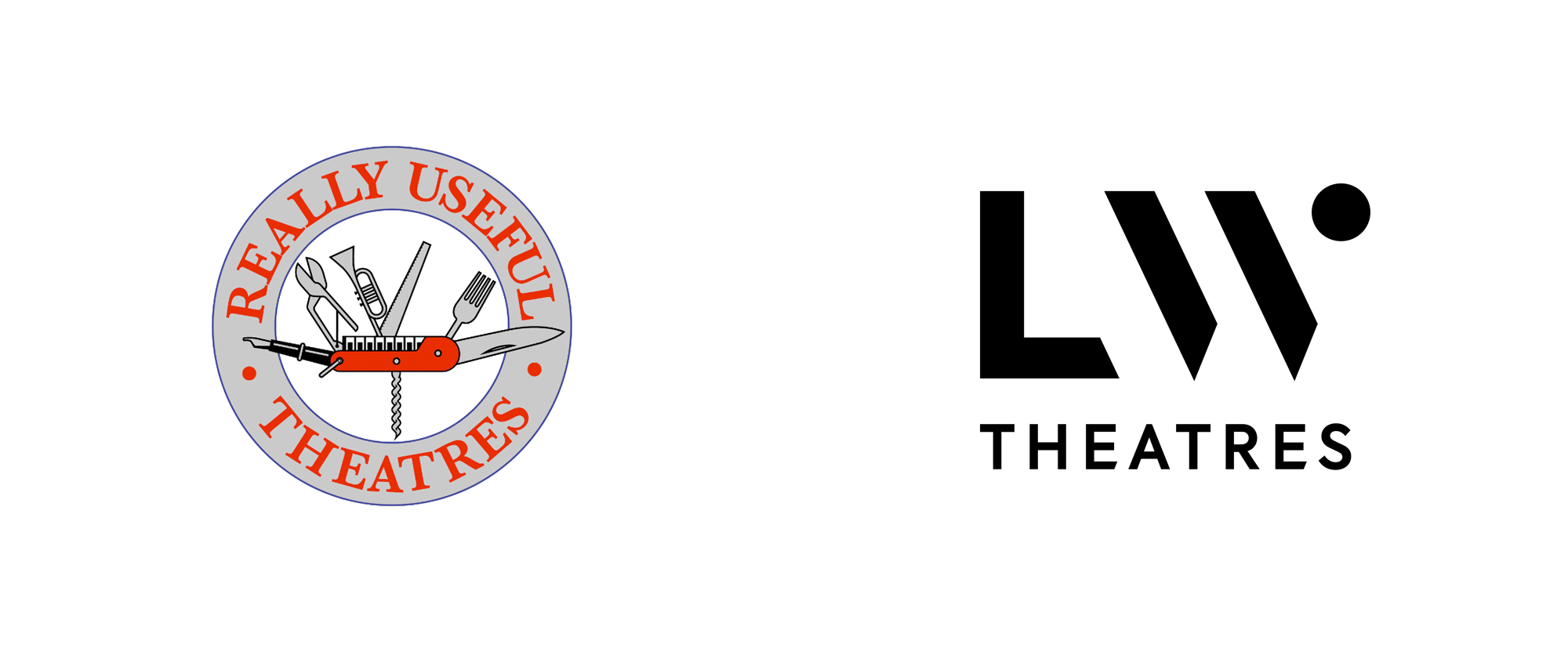
As part of Andrew Lloyd Webber’s Really Useful Group, established in 1977, LW Theatres (previously Really Useful Theatres) owns and manages six West End theaters in London, UK. Their diverse family of iconic and historic theaters includes Theatre Royal Drury Lane, The London Palladium, Cambridge Theatre, Adelphi Theatre (co-owned with the Nederlander Group), Gillian Lynne Theatre, and Her Majesty’s Theatre. They state that one in three audience members at a London musical every night is at one of their venues. Along with a recent name change, LW Theatres introduced a new identity designed by Elmwood.
The new identity needed to celebrate the artistry of its owner, and affirm LW Theatres’ purpose to ignite imaginations, inspire creativity and bring joy to everyone who walks through its iconic theatre doors.
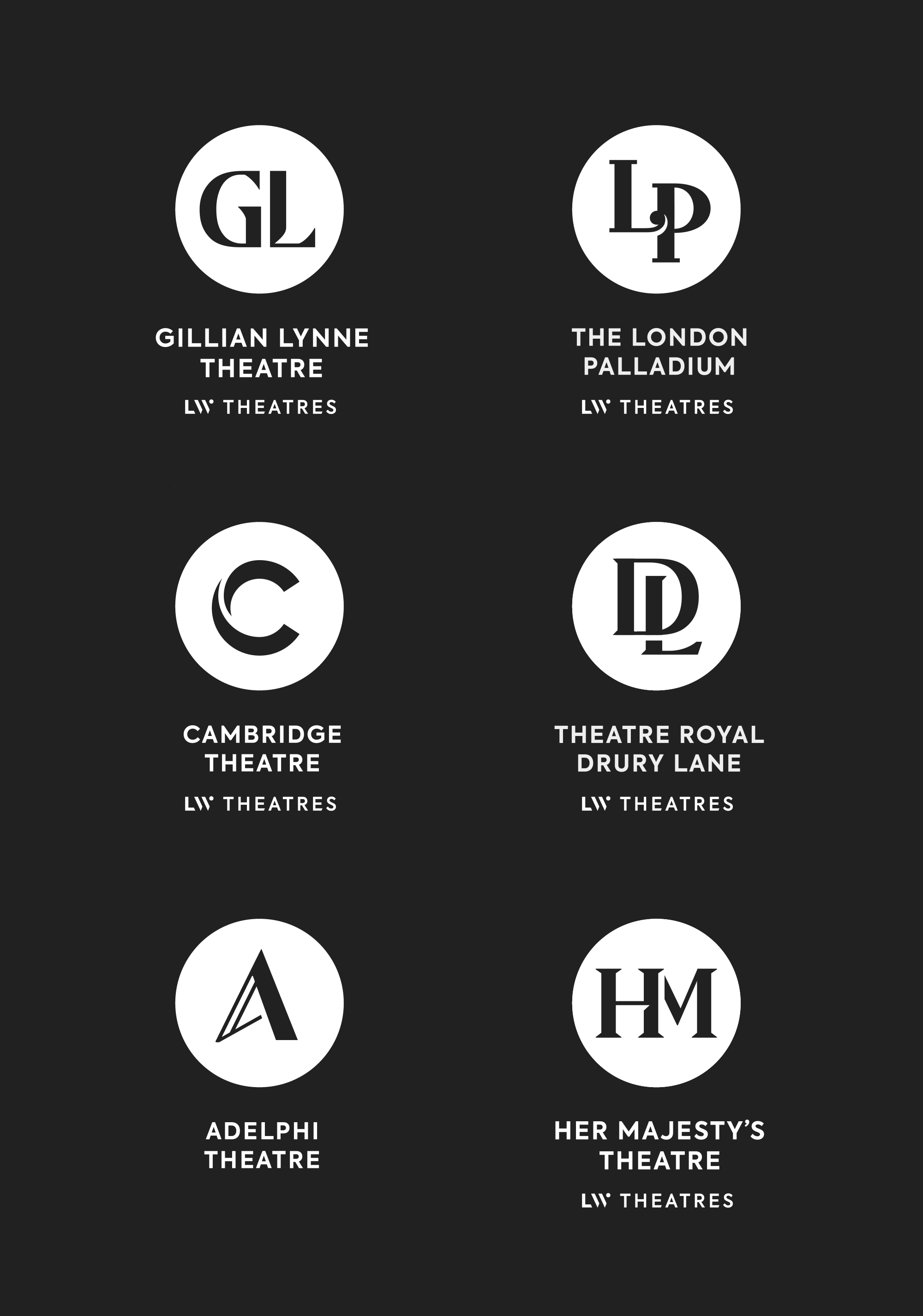
In order to create truly unforgettable experiences, we developed the brand positioning ‘Staging the Extraordinary’ - an idea dedicated to making the ordinary extraordinary. We brought it to life visually with a branding system inspired by a spotlight and stage concept that we developed across the new brand identity. Based on the spotlight and stage, we carefully crafted a series of monograms that draw inspiration from each theatre’s unique architectural features and styling - to maintain the character of this much-loved family of individuals.
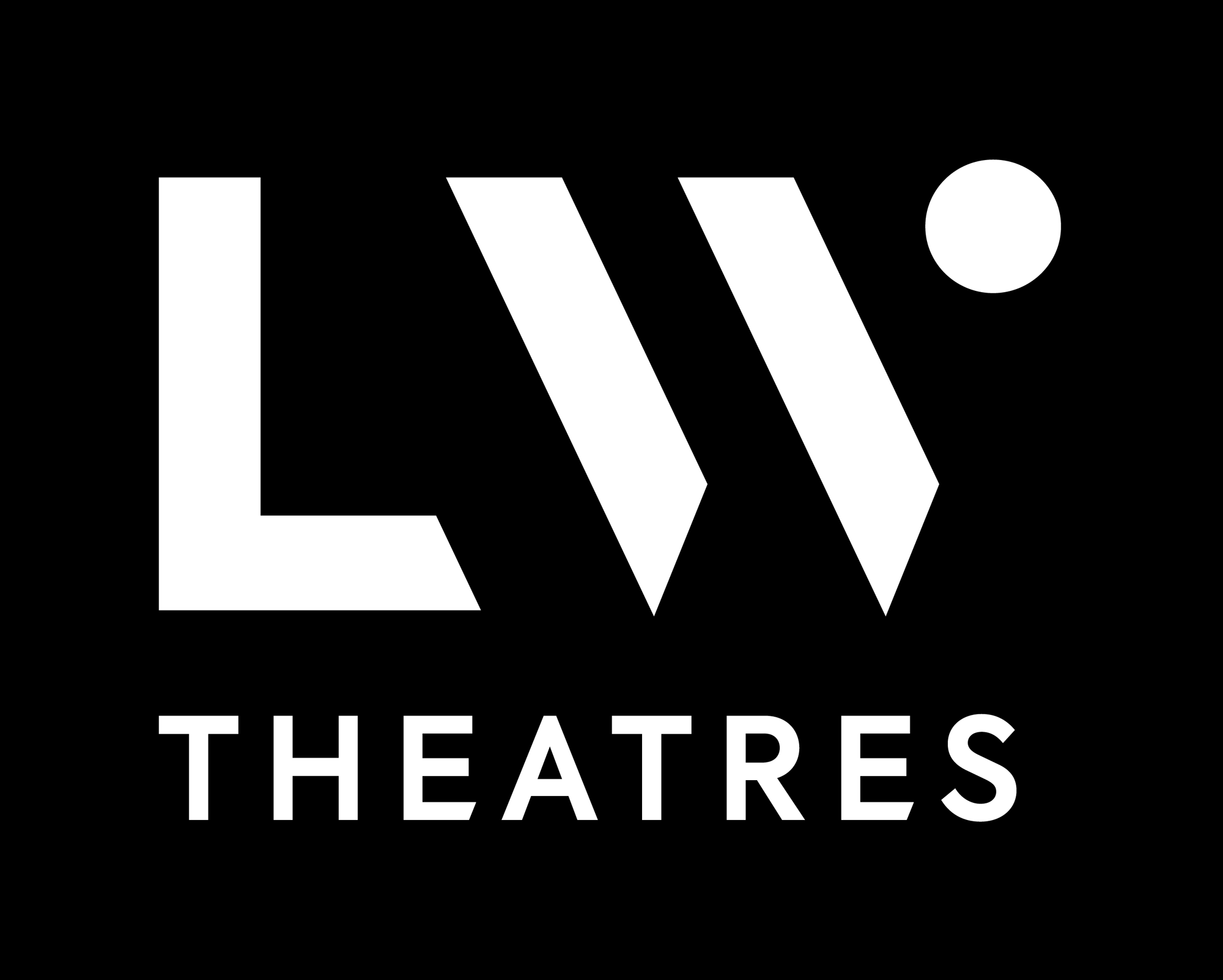
The old logo was — is, as it’s still in use for the Really Useful Group — kind of charming with its Swiss Army knife that includes a fountain pen representing playwrights and a number of instruments for musical theater. The typography around it was not great though but more importantly, the logo wasn’t entirely appropriate for these historical theaters. According to the video, the new logo is meant to represent the stage and the spotlight but that’s really a stretch of a connection to make for anyone that sees the logo without the explanation. The good thing is that it’s a handsome logo that looks elegant. I’m not saying it’s a great logo but it fits the role as a kind of black-tuxedo-ed host, presenting an upscale aesthetic to unify all these grand theaters.
The six theater logos are all nice and work well as a group. I like how they are integrated, to different degrees of success, through a negative space element that breaks into the letters, with the “LP” and “DL” being the most successful, the “C” and “A” being alright, and the “HM” being the least. In these logos, the concept of the spotlight is a little more evident than in the primary logo.
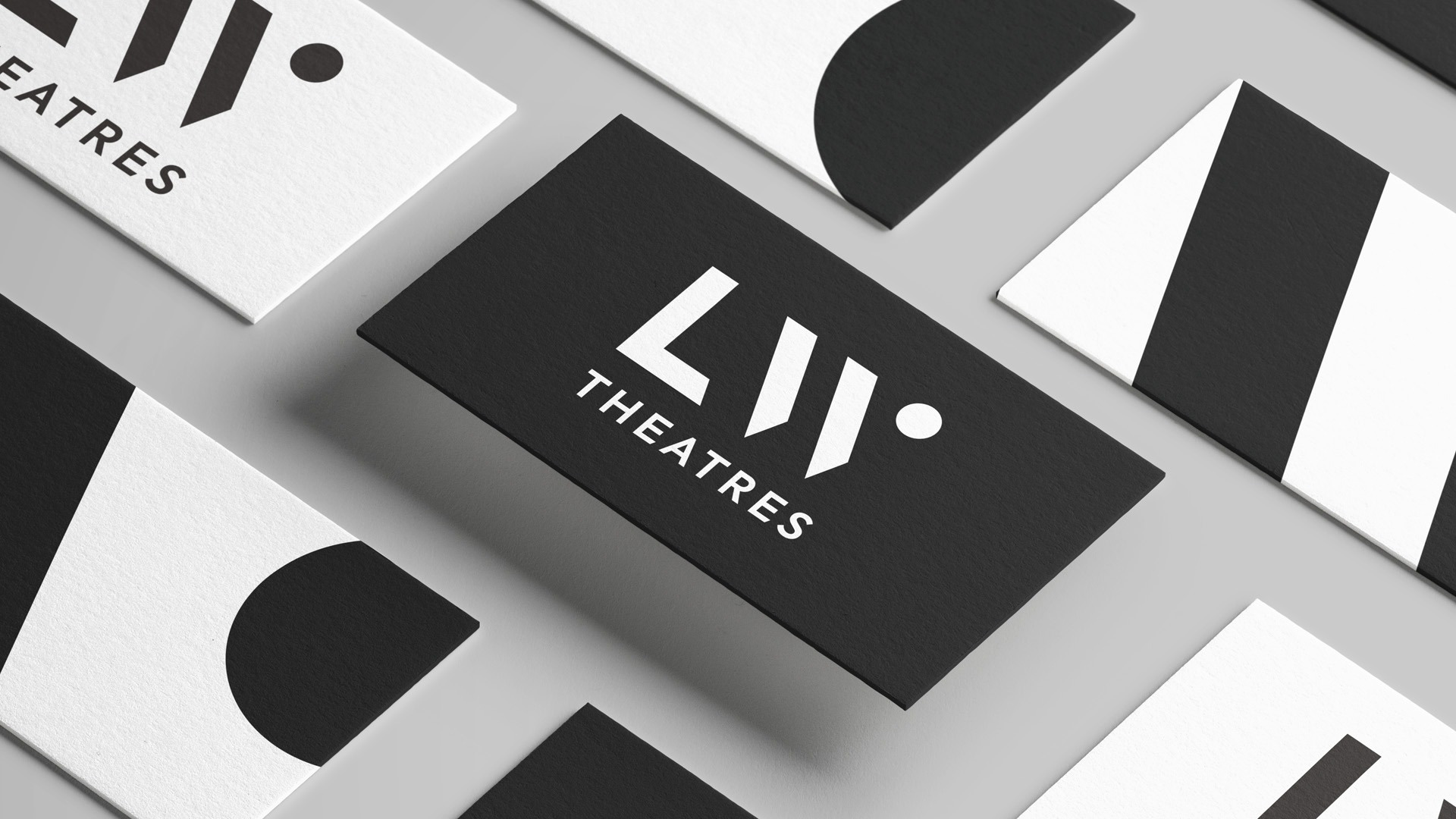
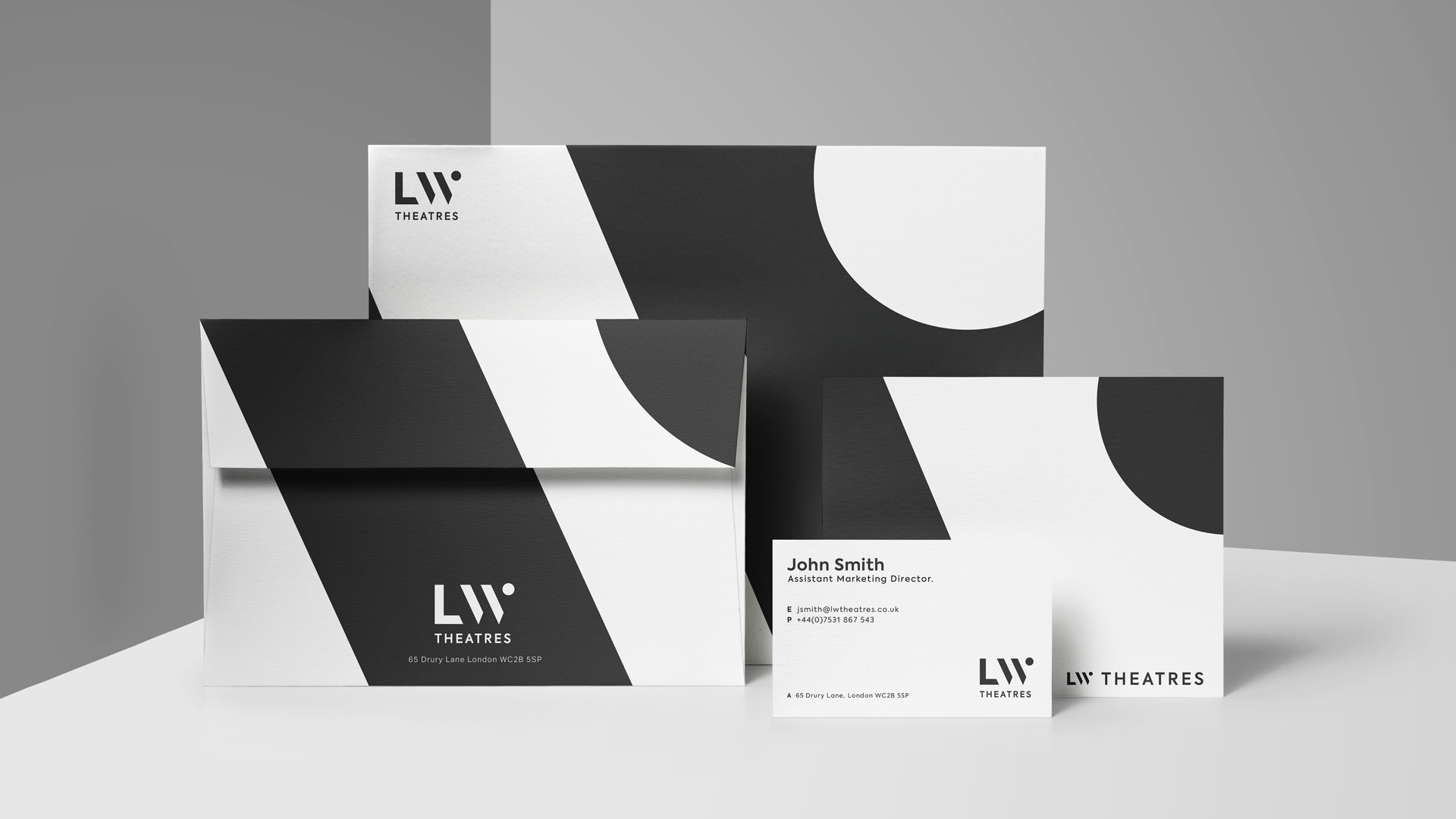
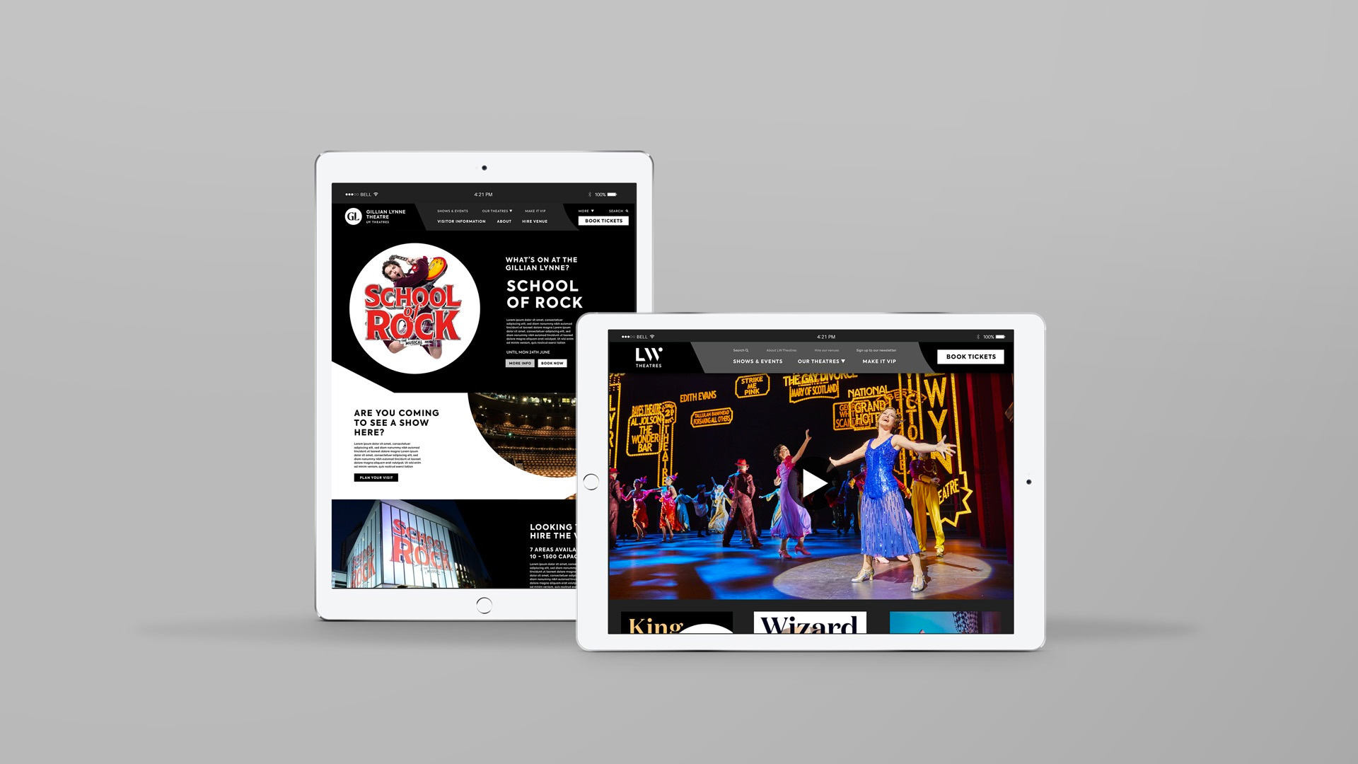
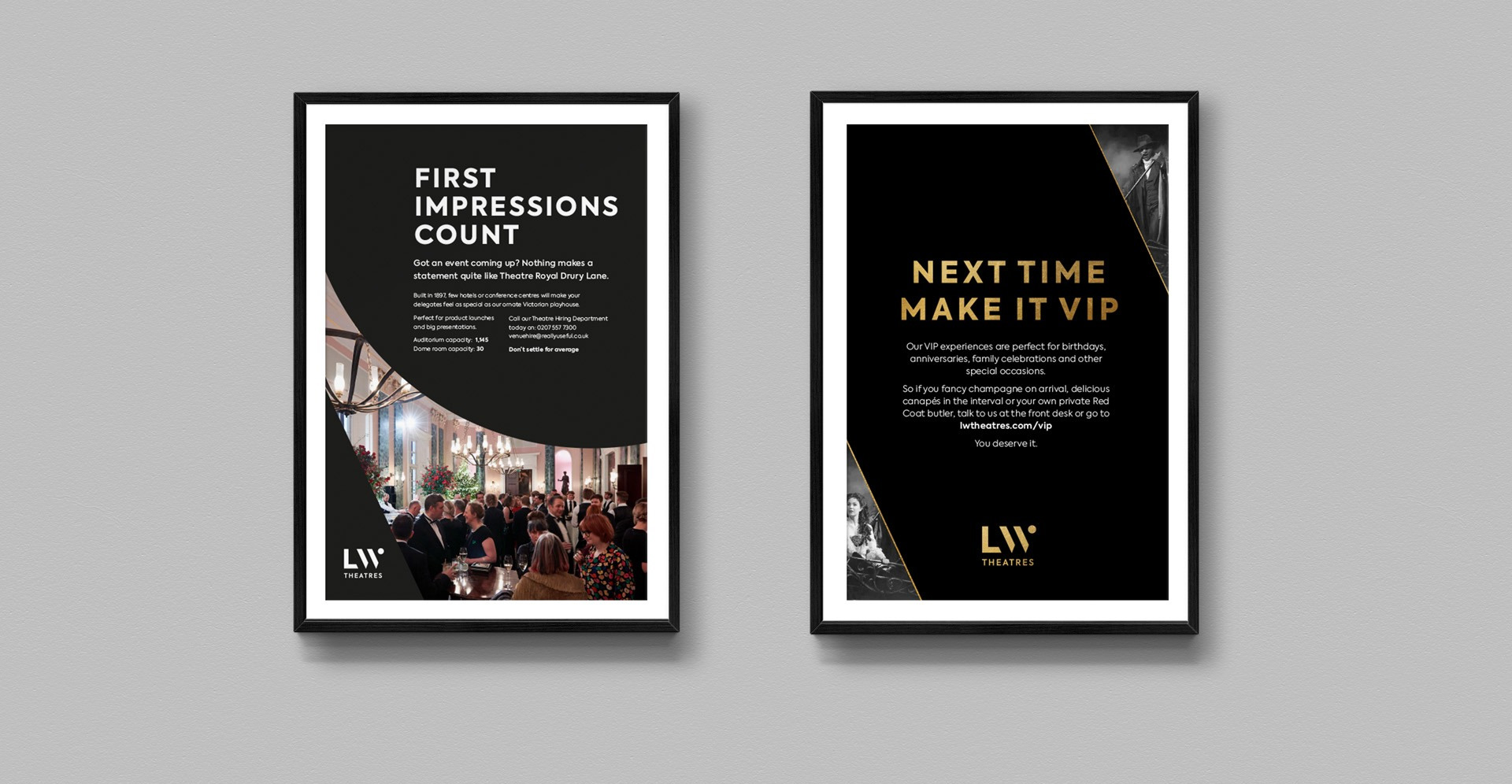
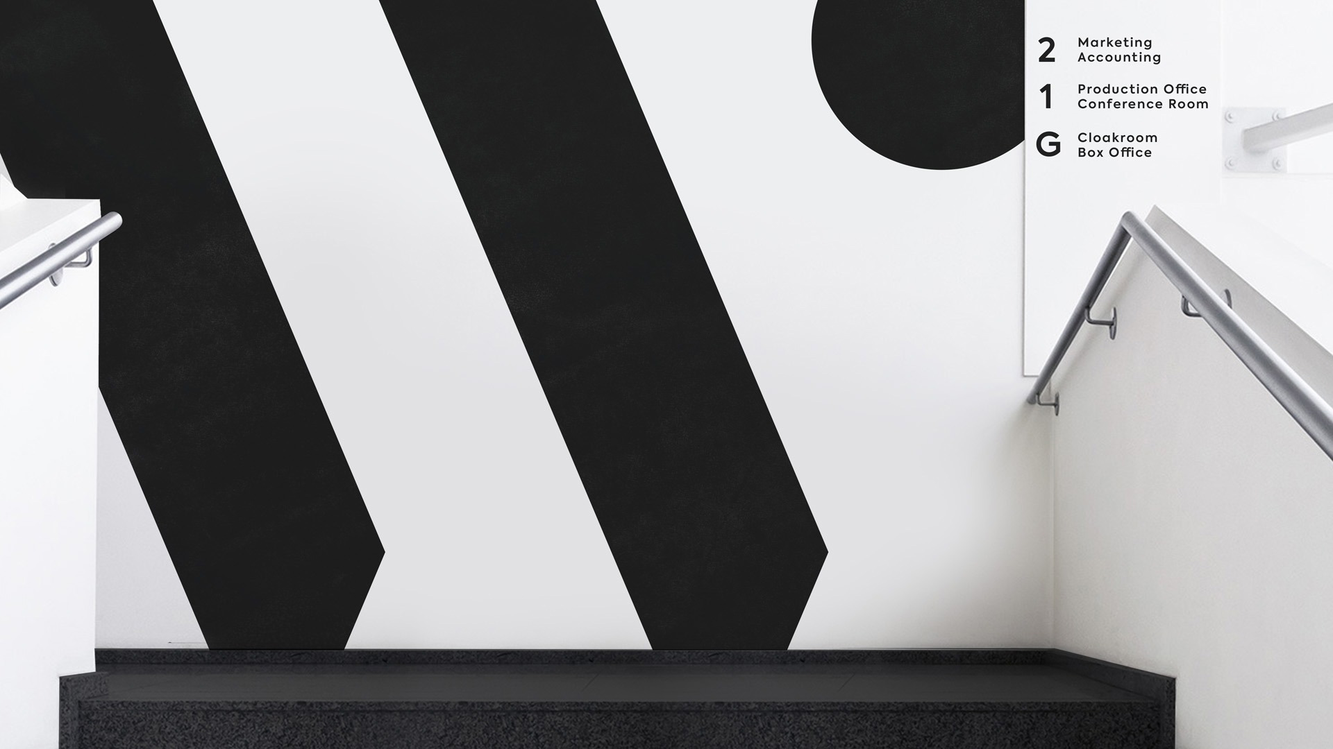
The applications are good, using the “LW” monogram extra large as either an abstract element or a framing device. The heavy use of black along with the spaced out sans serif create an elegant personality.
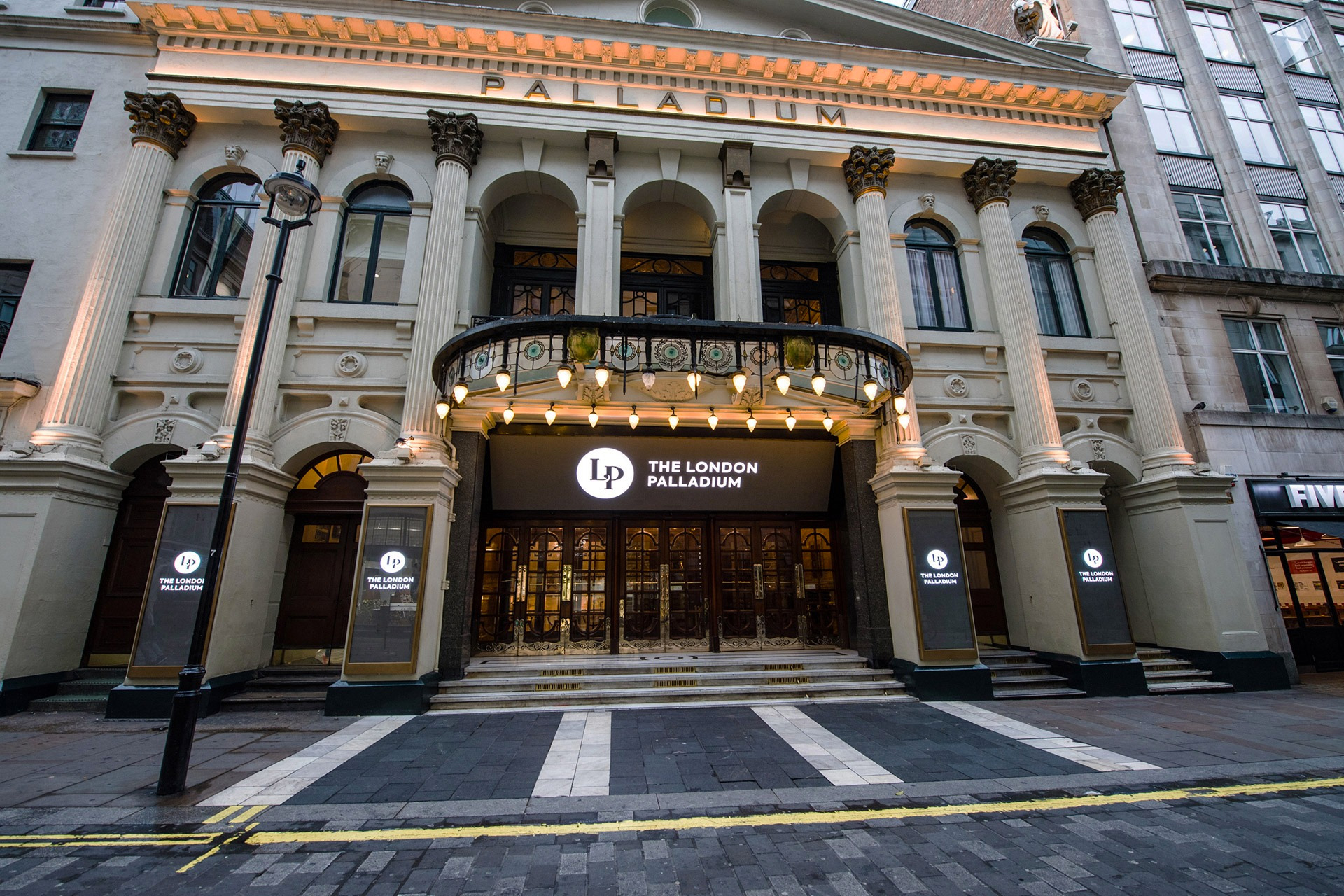
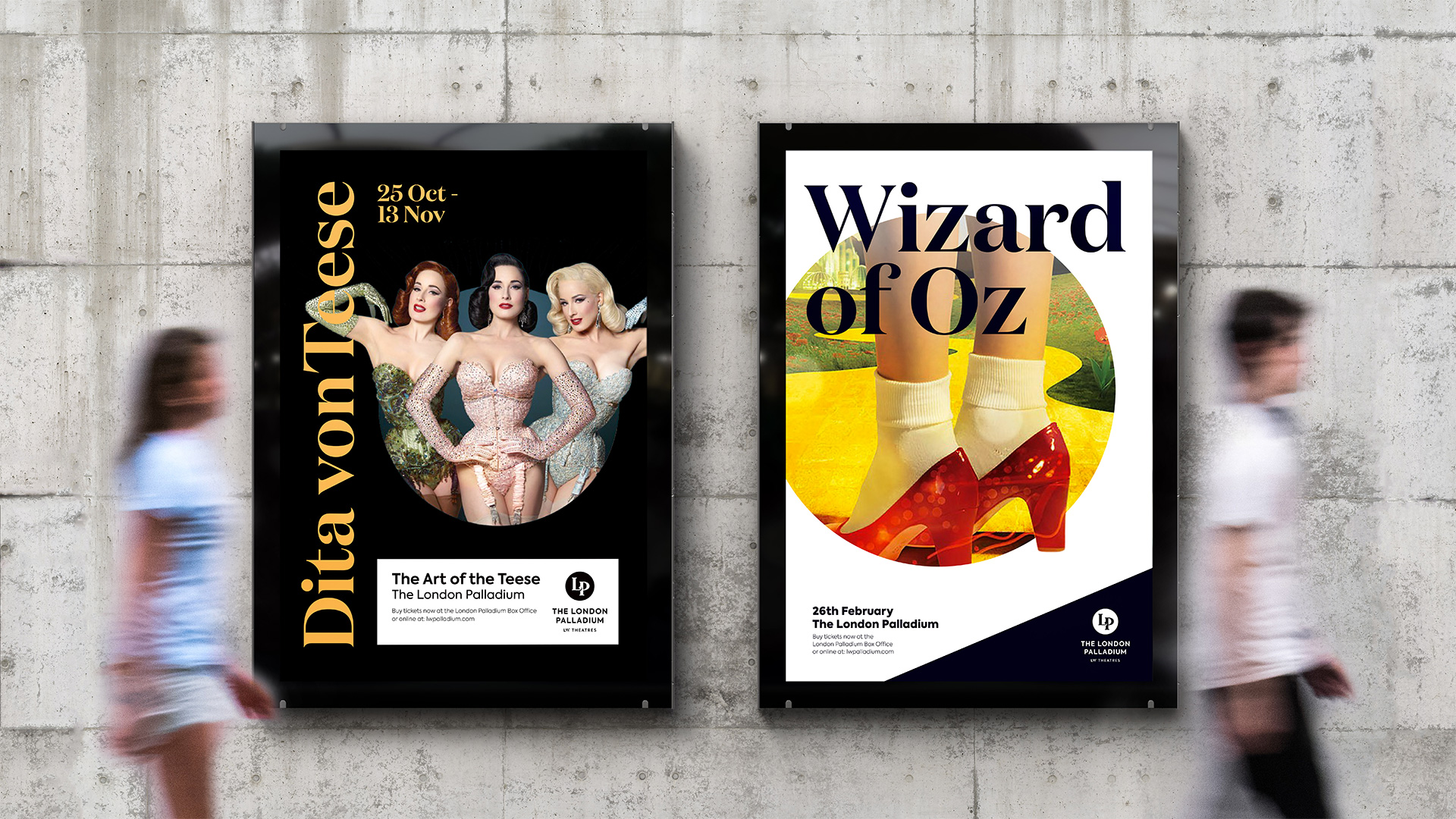
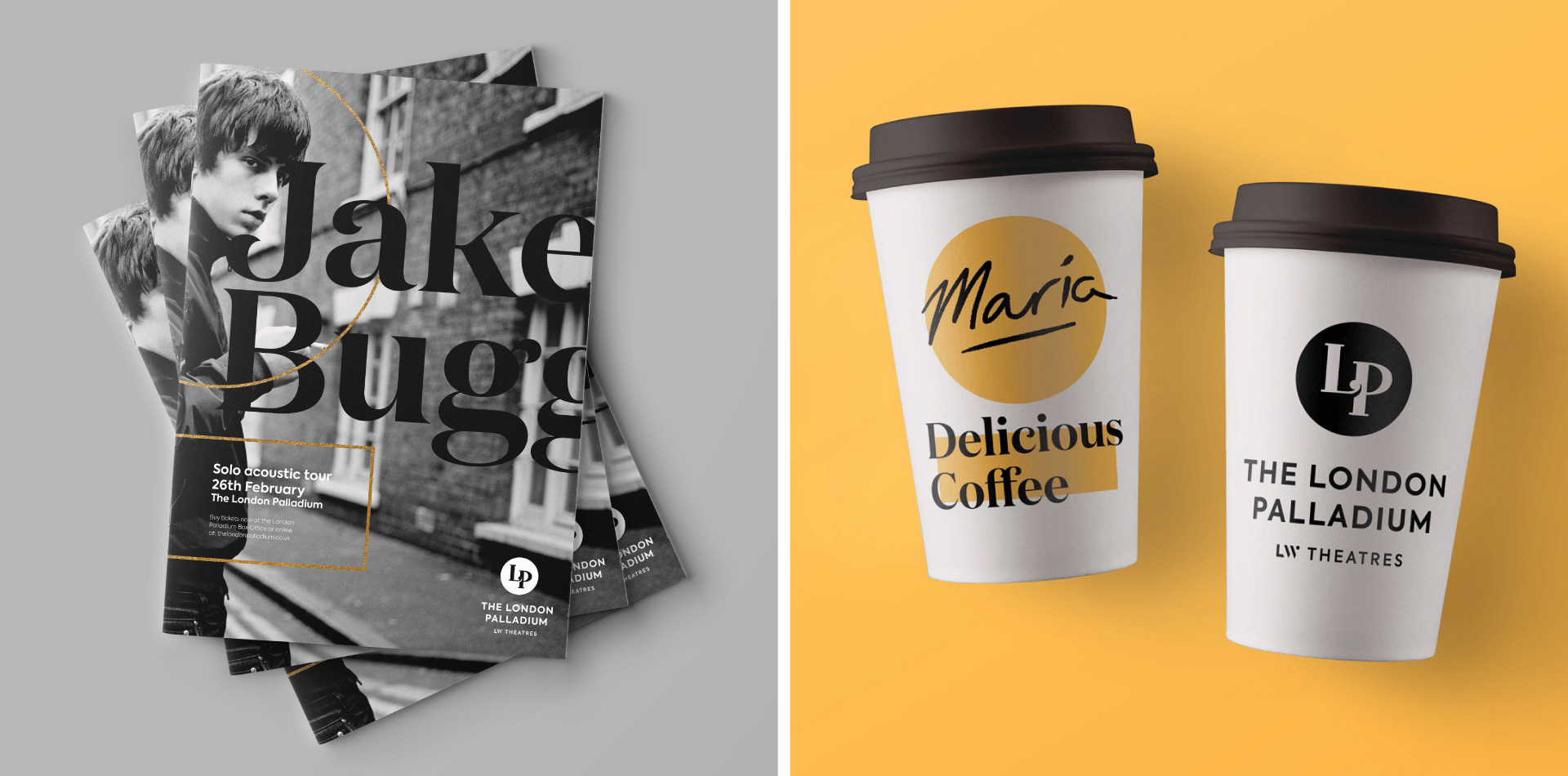
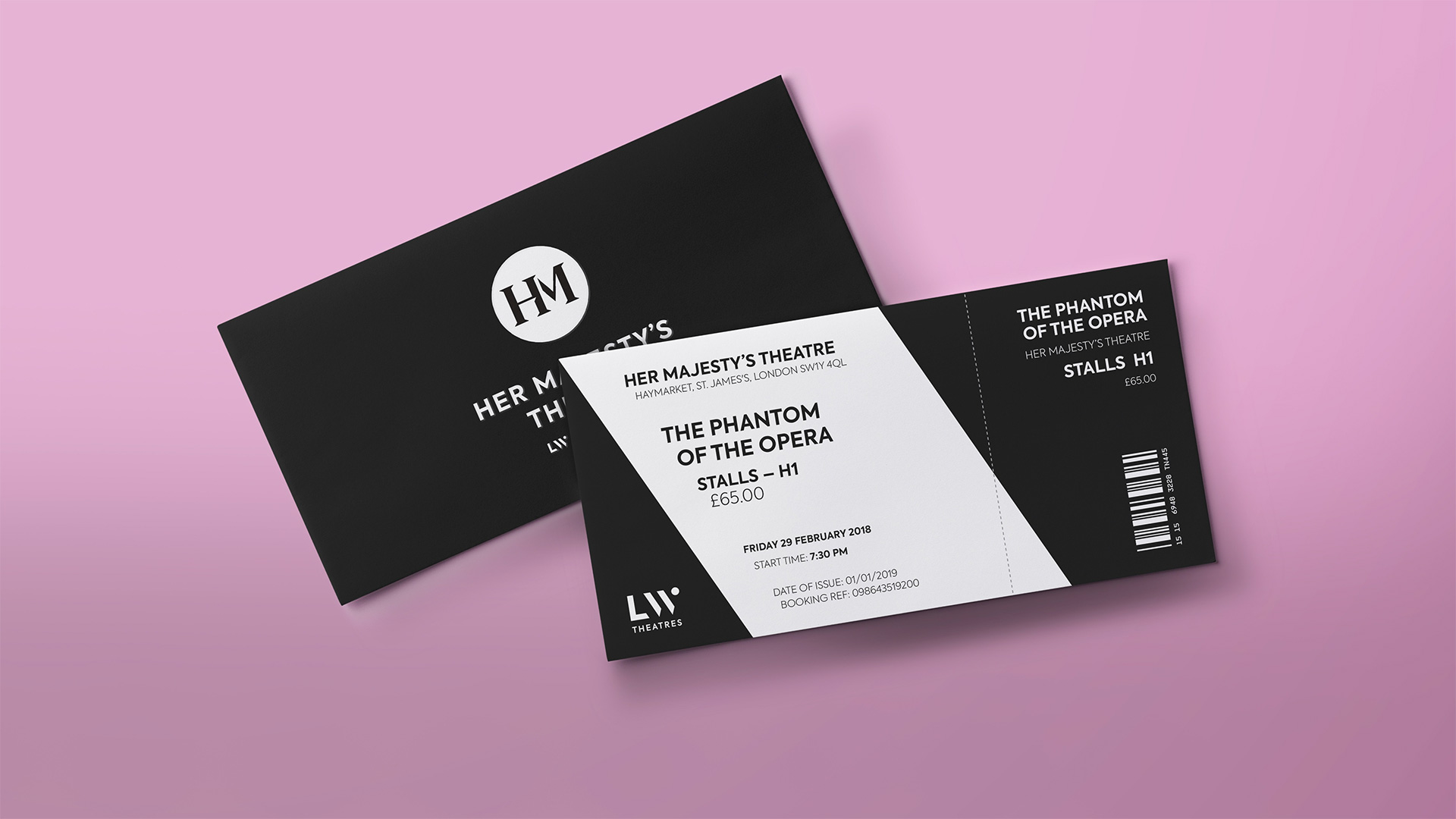
Overall, the design is very appropriate for this group of West End theaters, adding a level of sophistication that the old logo could just not achieve. The system of logos also increases the awareness amongst the audience that all these great places are owned by the same company, giving it more prestige, especially now that their logos don’t have tweezers, a nail filer, and scissors.

 Новости Союза дизайнеров
Все о дизайне в Санкт-Петербурге.