Обзор лучших ресурсов по разработке бренда, разработке упаковки
contact us | ok@ohmycode.ru
contact us | ok@ohmycode.ru
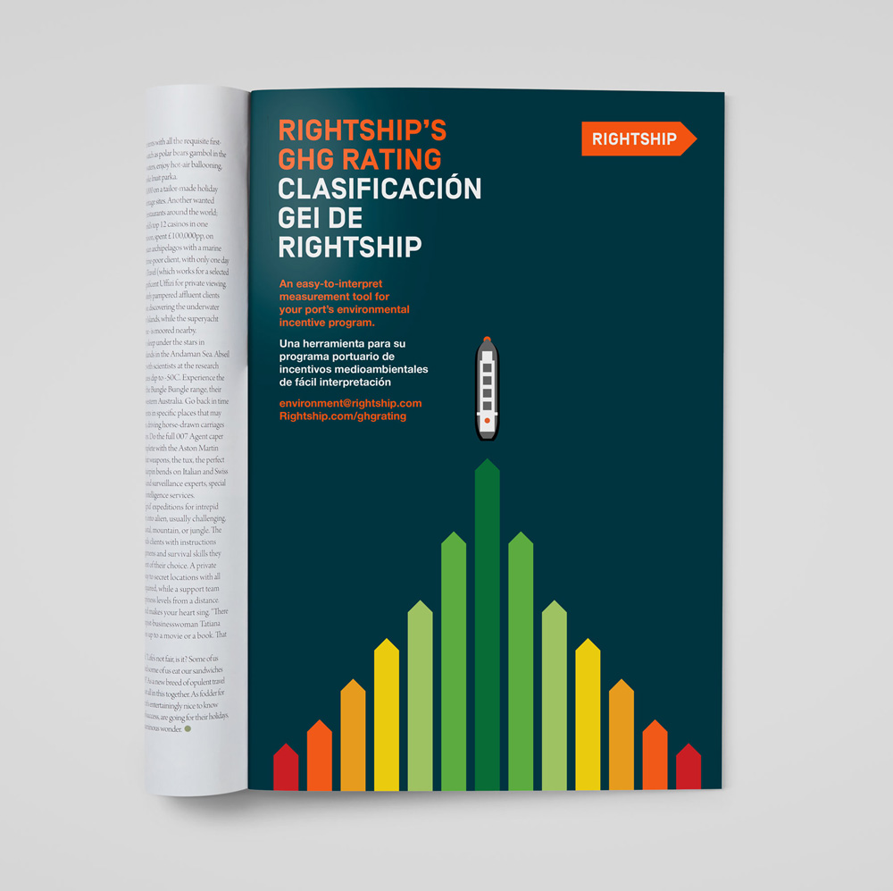
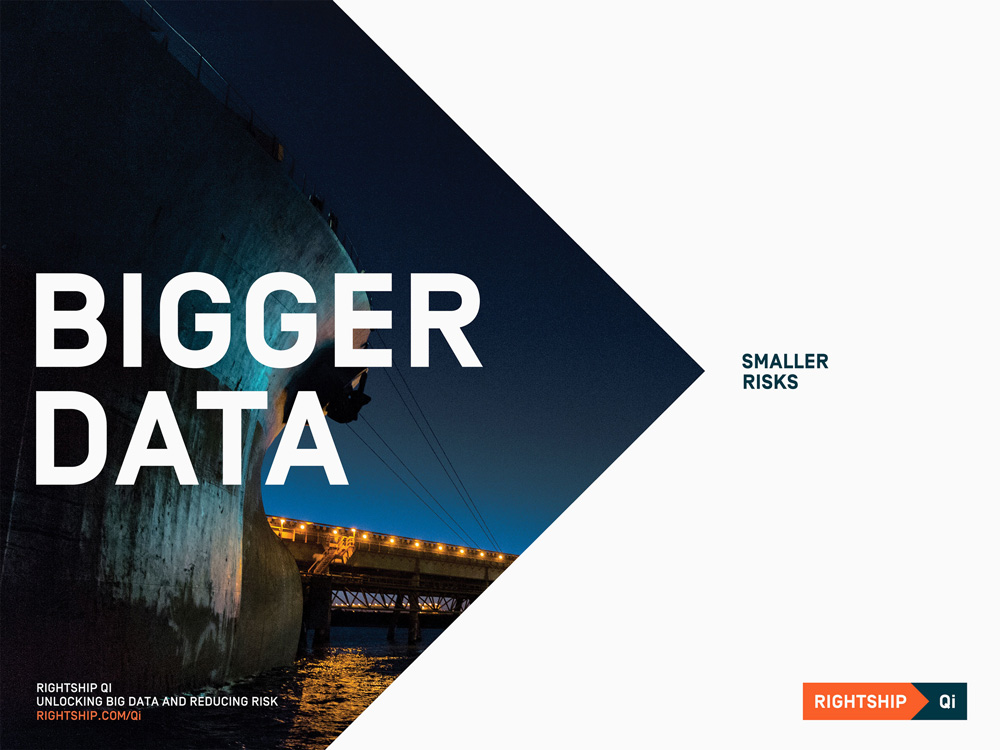
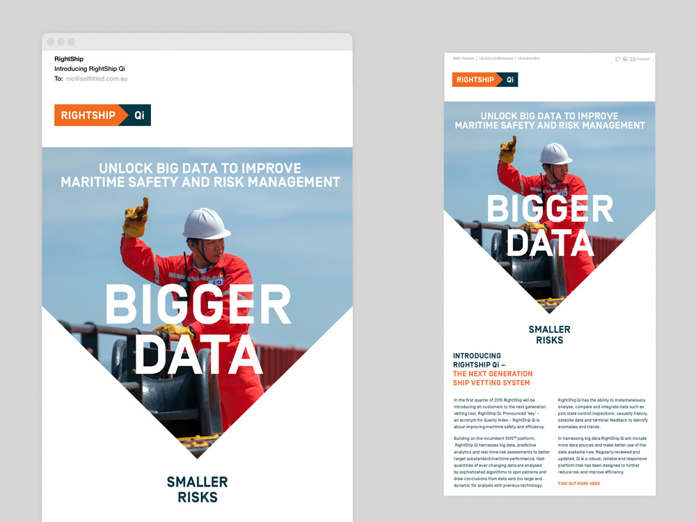
Established in 2001, RightShip is one of the leading maritime risk management and environmental assessment organizations globally. With offices in London, Melbourne, and Houston, its main product is RightShip Qi, a predictive online ship-vetting platform that utilizes big data and predictive analytics to help its customers manage marine risk by identifying and eliminating substandard ships from their supply chain. In other words, it helps customers choose the right ship to move stuff through the ocean. Recently, RightShip introduced a new identity designed by Prahran, Australia-based Self-titled.
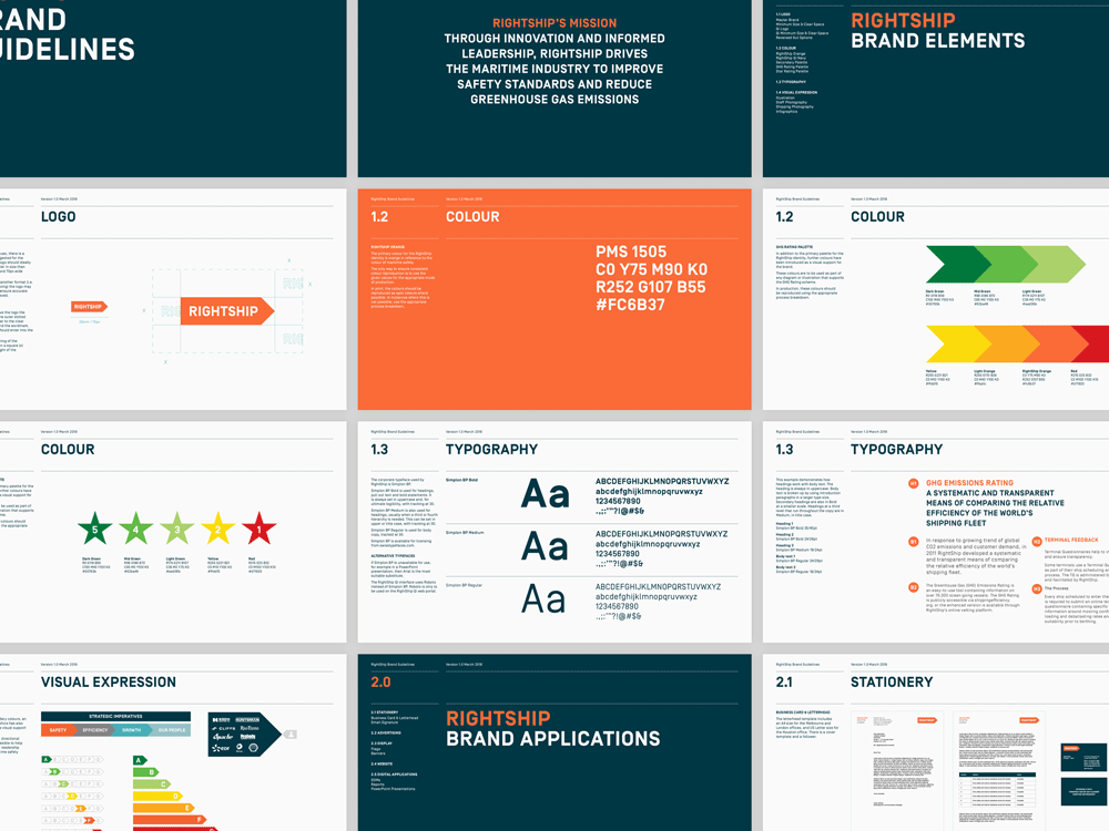
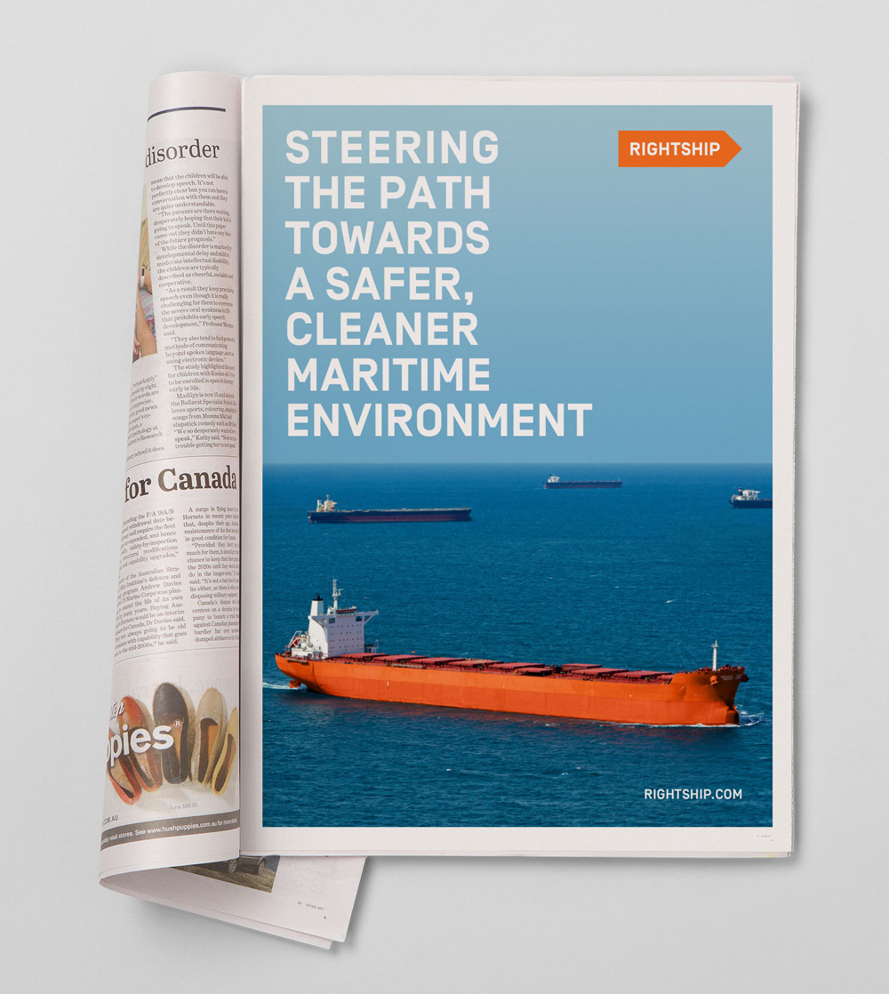
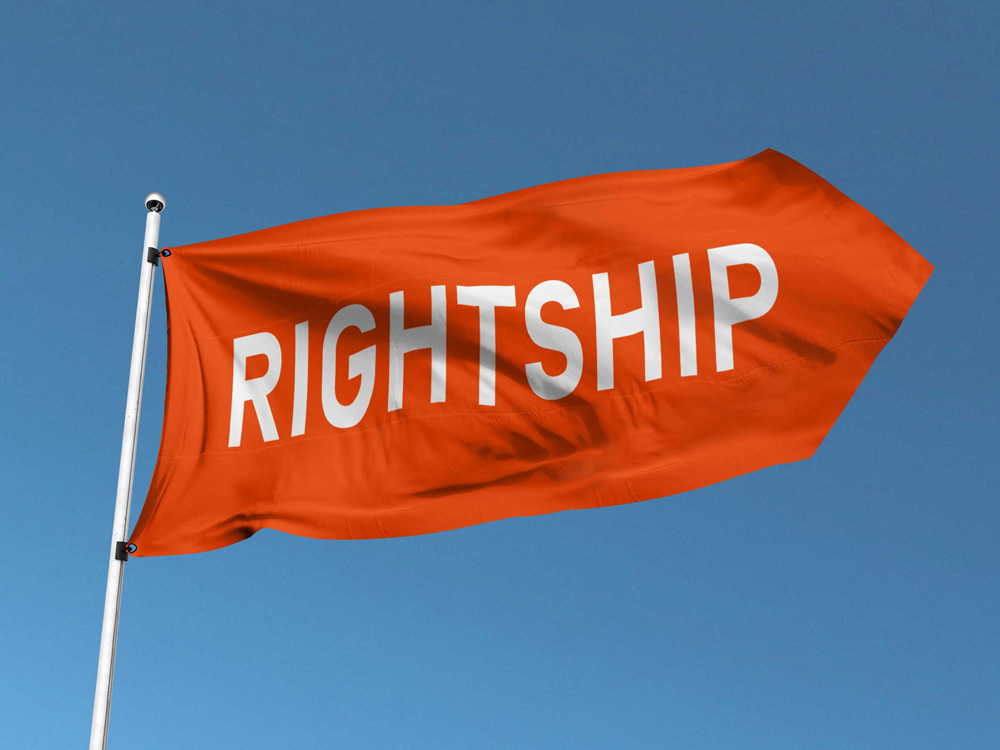
An evolved brand identity single-mindedly reinforces RightShip’s driving commitment to safety through both a forward focussed arrow and signature orange - a colour synonymous with maritime safety.
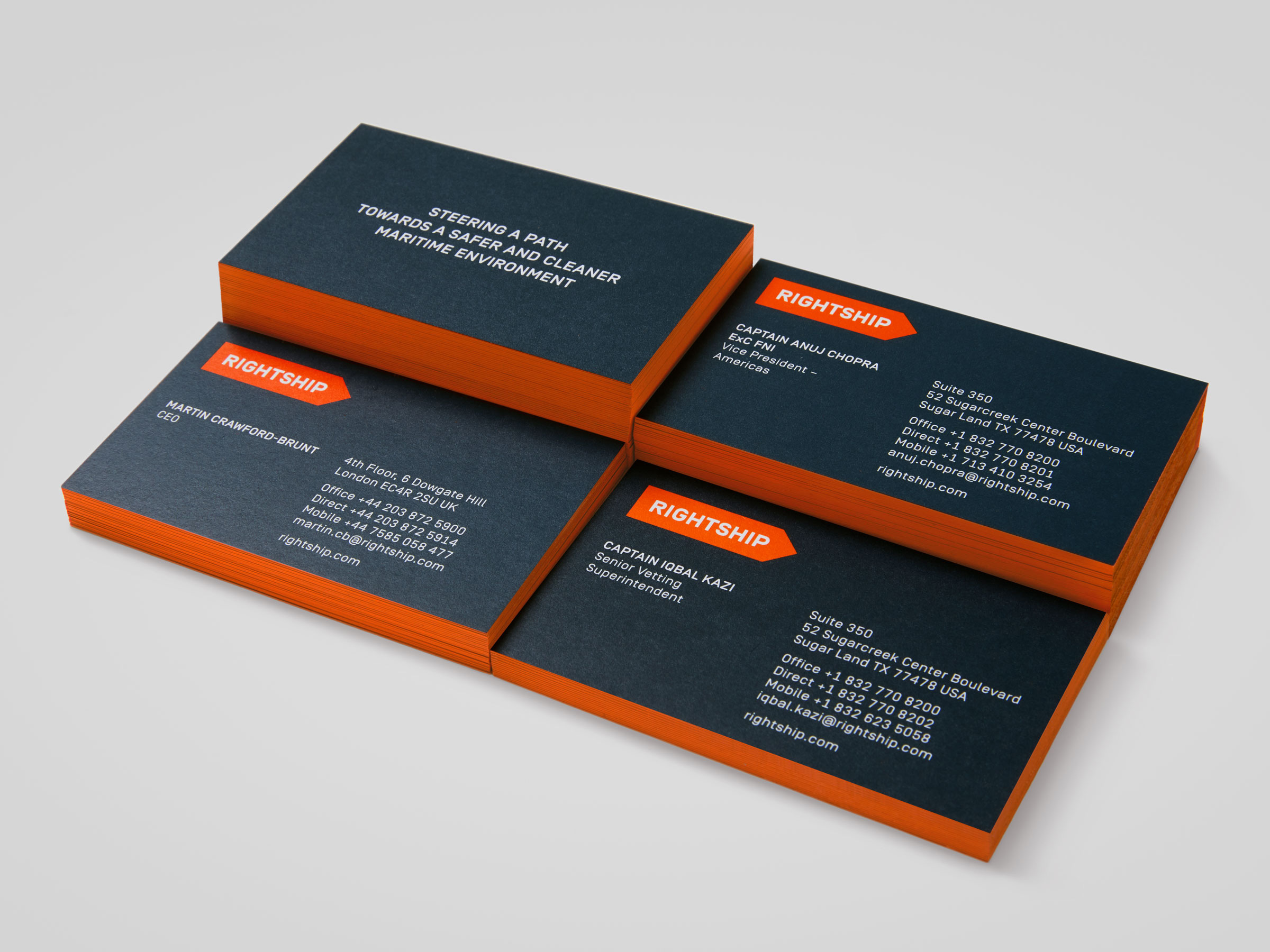
The old logo had the right idea of referencing nautical signaling flags and keeping the design simple. Its main problem was the awkward white space that left the ribbon graphic floating. Also, the old identity around the logo wasn’t very good. The new logo may not look like much or come across as overly exciting but it works really well for this company. For one, and my favorite part about it, the logo looks like a ship from above. It also manages to maintain a reference to the nautical flags as pointy triangles are a big part of that language. The use of orange — big in the maritime world — is probably not surprisin’ but it definitely looks bitchin’. And, lastly, the typography inside the arrow is perfectly right; a condensed, no nonsense sans serif — Simplon from Swiss Typefaces — that isn’t trying to be trendy or approachable but instead looks trusted and efficient.
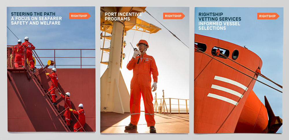
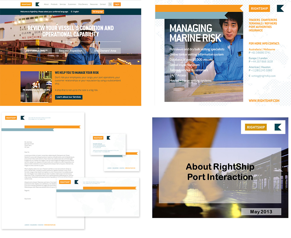
The applications, like the logo, are pretty straightforward but the simplicity and boldness of the logo works great to accentuate the simple layouts that use the same font as the logo on top of cool pictures of ships doing ship things.
In 2016, RightShip developed Qi - this predictive online platform harnesses big data, predictive analytics and real-time risk assessments in order to improve maritime safety and efficiency.
Self-titled created the name, branding and campaign language for this industry leading tool. Pronounced ‘key’, the name is an acronym for Qualitative Index and works as an addition to the master brand arrow.
Overall, this might not win Most Inspiring Identity of the Year but I think it’s a really well crafted identity that fits the client and the customers of the client while adding a bit of sophistication to an industry that probably doesn’t see much good graphic design sail its way.

 Новости Союза дизайнеров
Все о дизайне в Санкт-Петербурге.
Новости Союза дизайнеров
Все о дизайне в Санкт-Петербурге.