Обзор лучших ресурсов по разработке бренда, разработке упаковки
contact us | ok@ohmycode.ru
contact us | ok@ohmycode.ru
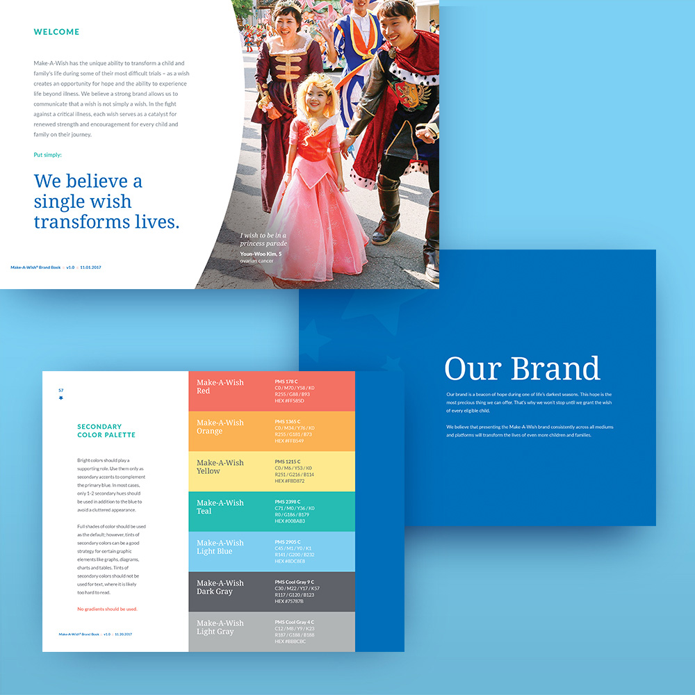
Established in 1980, Make-A-Wish is a nonprofit organization that grants the wish of children — between the ages of 2 and 18 — diagnosed with a critical illness. Headquartered in Phoenix, AZ, Make-A-Wish has 62 chapters across the U.S., fueled by more than 33,000 active volunteers. The organization also operates in 45 other countries, collectively granting more than 415,000 wishes worldwide. Last week, Make-A-Wish introduced a new identity designed by Geneva, IL-based Rule29.
The new logo aimed to create a strong presence for the brand, while also maintaining the sincerity and imaginative appeal of the old logo. The serif type used signals a credible organization with established longevity, without appearing dated. It also gives the logotype a weightiness that presents Make-A-Wish’s message with a powerful, dynamic presence. “Make-A-Wish” is converted to sentence-case for increased legibility. Using the smaller, lowercase letterforms also imbues the logo with a casual, approachable feeling.
Now, the elongated swirl ending in the star represents a star shooting across the sky, matching the bright optimism a wish brings to wish kids, their families and the community at large. Additionally, the new swirl and star placement also creates a flat baseline along the bottom of the logo which allows us to place chapter and affiliate names closer to the logo, visually representing that our local chapters and affiliates serve as the foundation of the organization. The five-pointed star is an update to Make-A-Wish’s iconic star, now featuring softened points and curves that reference the soft, fluid curves of the lowercase letterforms, building a sense of cohesion between all the logo’s various elements.
The old logo had the right idea and, for the most part, a decent execution with its main drawback being the use of what appears to be Trajan bold made bolder by adding a stroke. I did like the more hand-drawn aesthetic of the trail behind the shooting star and even the little diamonds instead of the hyphens were a good substitution, adding up to a logo with a slight fairytale look. The new logo improves the typography dramatically, making it infinitely more readable and less Trajan-esque (which is always a good thing unless you are the Trajan column). The serif used has a nice freshness to it and its curviness makes it feel friendly and accessible. It was probably explored but I think I would have liked to see the texture of the old swirl carried into this new logo… although maybe that would have been terrible too. But there is a diminished burst of energy in the new swirl and star — the old one felt like a firework bursting in the sky. This one is a lot more subdued and the star, being smaller, makes less of an impact. As a whole, though, all the elements look cohesive and it makes for a nice unit that maintains the visual cues of the old one.
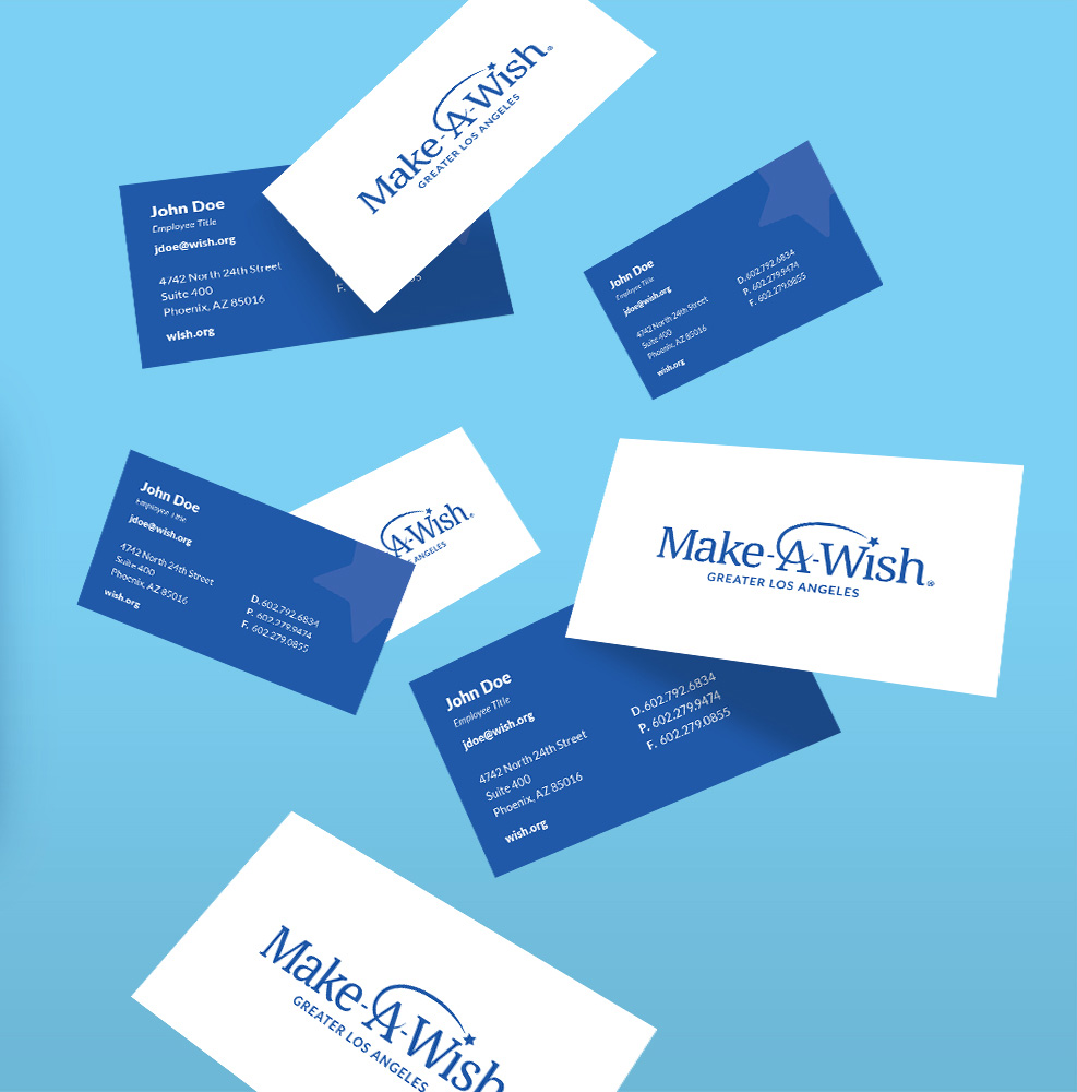
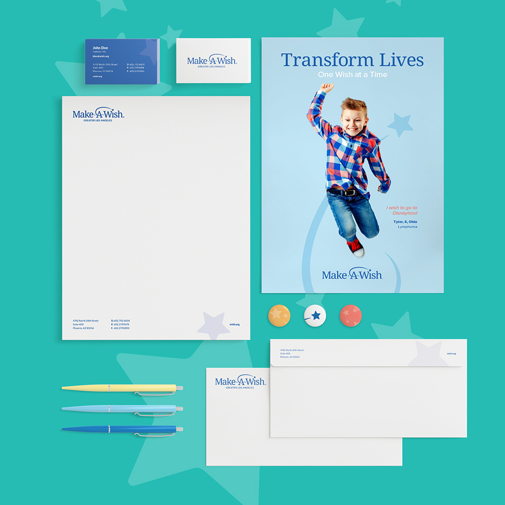
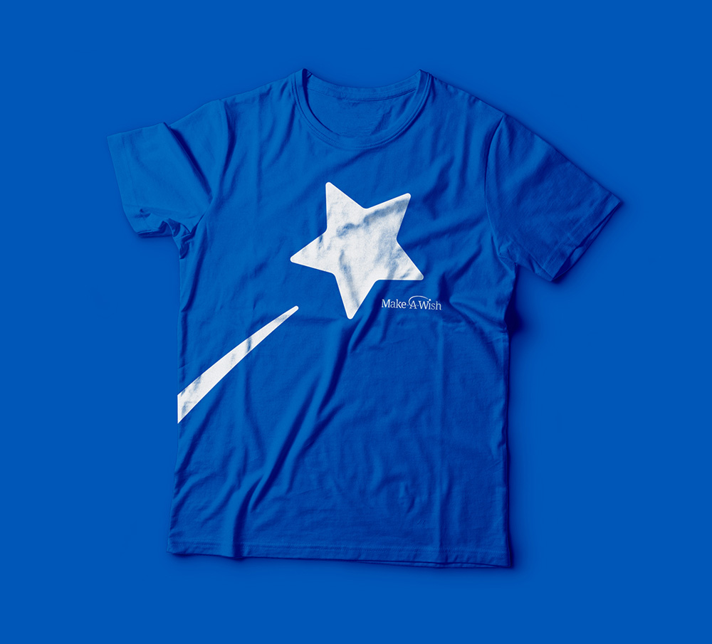
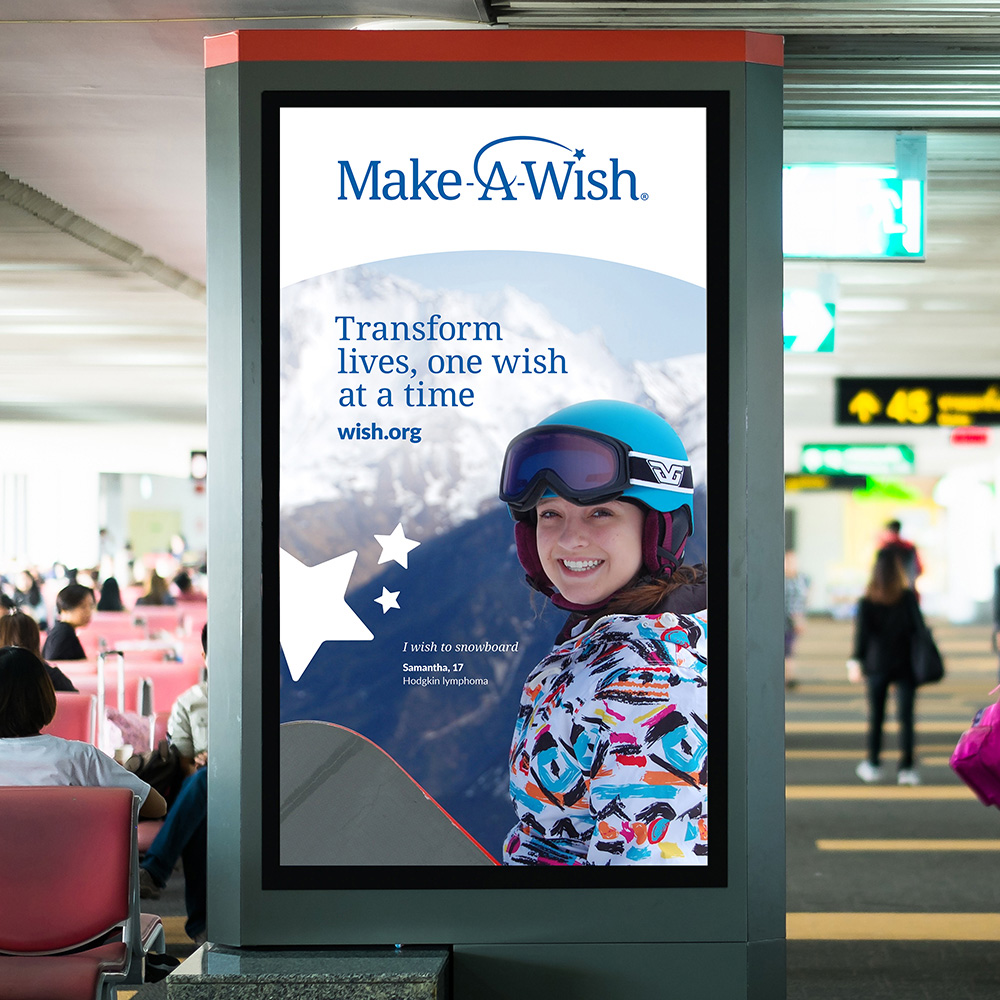
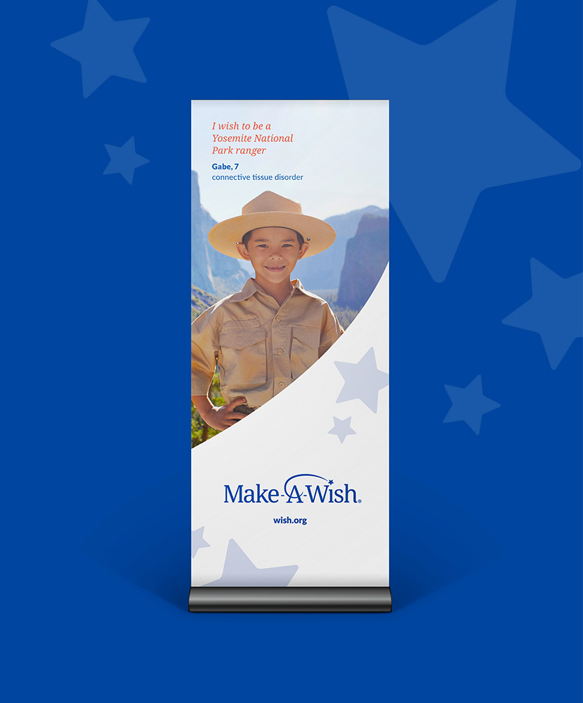
The applications are fairly straightforward, with the main visual hook being the swirl-and-star of the logo pulled out on their own and used in the background or, in probably the best expression of the identity, as a bold graphic as seen on the t-shirt with the logo tucked underneath. But, in this case, I think the identity and applications are more on the functional side, to help the organization communicate efficiently, as opposed to showpieces meant to excite a bunch of designers huddled around a blog. Overall, the evolution keeps the equity of the old logo, updating it to be more functional and expandable but perhaps at the expense of losing some sense of magic that the old logo had, even if it was on the cheesy end of the taste spectrum.

 Новости Союза дизайнеров
Все о дизайне в Санкт-Петербурге.
Новости Союза дизайнеров
Все о дизайне в Санкт-Петербурге.