Обзор лучших ресурсов по разработке бренда, разработке упаковки
contact us | ok@ohmycode.ru
contact us | ok@ohmycode.ru
Established in 1820, the Royal Astronomical Society (RAS) is an academic society and registered charity in the UK that “encourages and promotes the study of astronomy, solar-system science, geophysics and closely related branches of science” with 4,000 members that consists of primarily professional astronomers and geophysicists. The RAS achieves its mission by organizing scientific meetings, publishing research and review journals, awarding medals and prizes, supporting education through grants, and representing UK astronomy nationally and internationally. Last month, RAS introduced a new identity designed by London-based Johnson Banks.
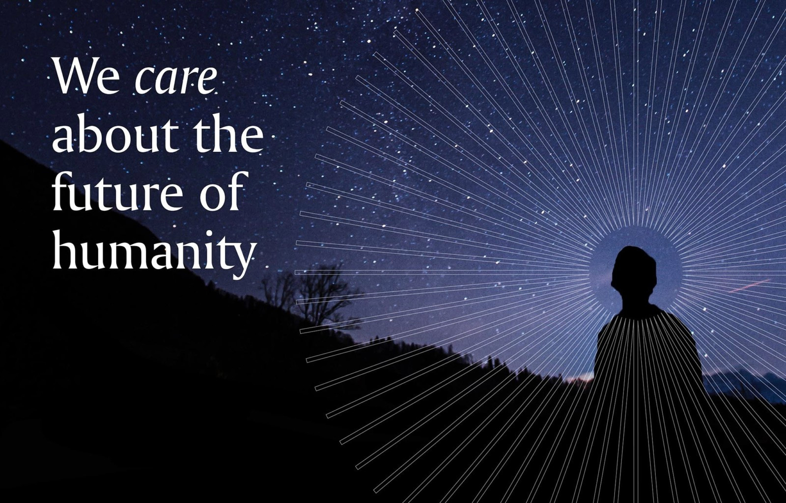
Their new symbol takes its inspiration from several sources: the Society’s motto ‘Let whatever shines be observed’; the vision and discovery that characterises two centuries of study; and its work with both astronomers and geophysicists.
Stepped spokes are repeated and rotated to form a symbol that can be interpreted in multiple ways - a stylised eye or planet with an orbiting moon - reflecting the many different sides of the Society’s work. It is also turned 23.5 degrees to reflect the Earth’s angle of tilt from the plane of its orbit around the sun.
The old logo was an engraving of the telescope designed by the RAS’s first president so while there was a nice backstory to it, it didn’t quite translate well as a modern-day (or any-day) logo and neither the typography inside the roundel nor the one outside of it was beneficial. The new logo takes what I see as an extended telescope to establish the “spoke” element that is then rotated around an epicenter to create a kind of abstract celestial-yet-technical body with a great deal of depth achieved by such a simple element’s repetition and the clever inversion of it at the halfway point. The bonus negative space circle that floats above seals the deal in terms of alluding to astronomy without needing to be too specific about what exactly it is or what’s it doing — for May the 4th, they could add another negative space circle to their logo in honor of Tatooine. Or not. I digress. The wordmark is a lovely flared serif with a semi condensed structure that helps make the extra long “Astronomical” word a little less long. The lock-up in the animation above and in most of the applications below is great, with the icon aligning unconventionally to the right, making it look like it’s floating on top of the wordmark. In general, the logo manages to look royal, astronomical, and like it belongs to a society, so mission accomplished.
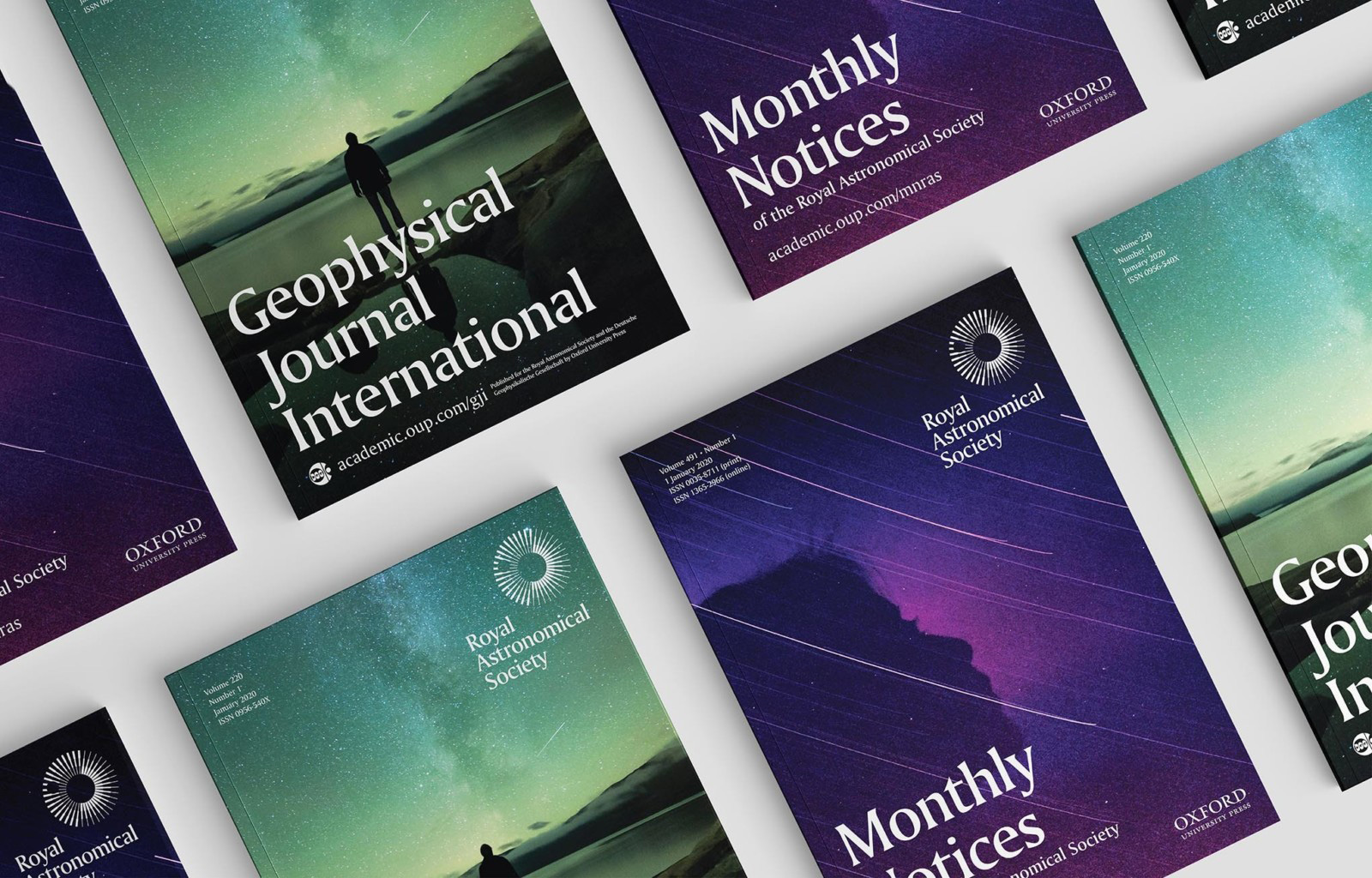
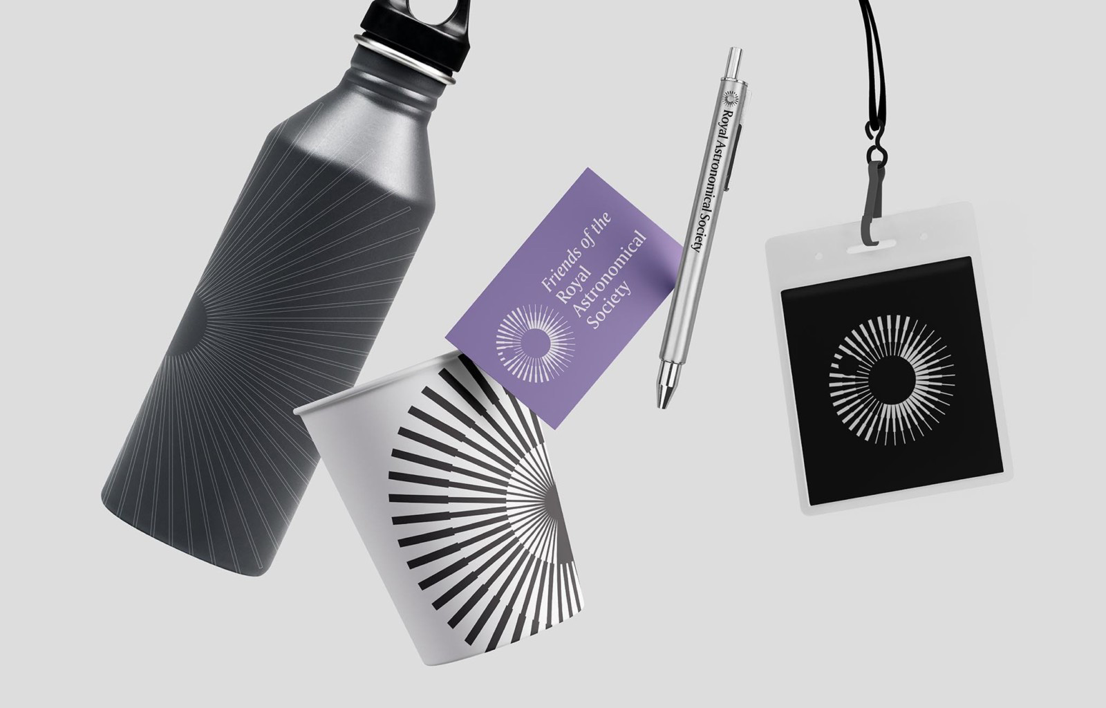
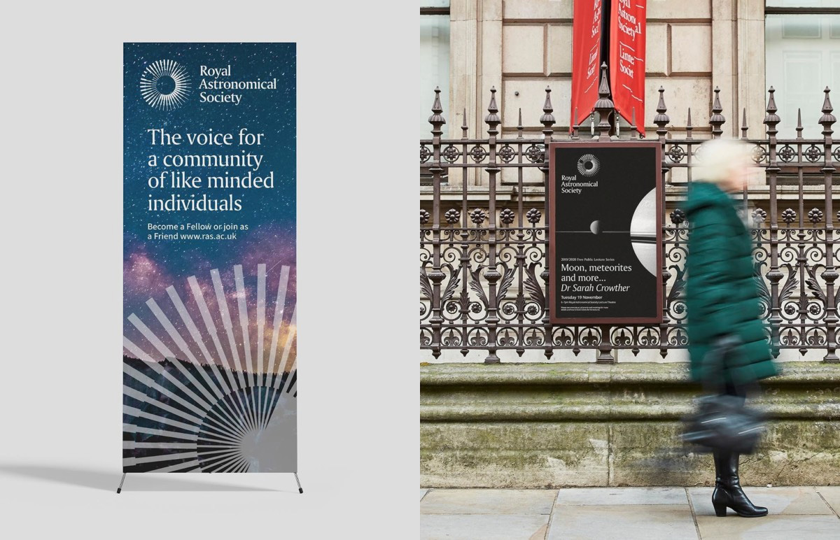
Not a lot in application but the few samples, especially the covers, are great with the logo knocked out on moody sky photographs and a solid use of the serif for headlines. I’m not crazy about the icon being used big (as in the standing banner) and/or stroked but that’s a minor quibble in an otherwise on-point identity that portrays RAS as a leading academic organization fit for its Royal Charter status.
 each year since publication began in 2006

 Новости Союза дизайнеров
Все о дизайне в Санкт-Петербурге.
Новости Союза дизайнеров
Все о дизайне в Санкт-Петербурге.