Обзор лучших ресурсов по разработке бренда, разработке упаковки
contact us | ok@ohmycode.ru
contact us | ok@ohmycode.ru
Established in 1979 but developed in years prior, Makaton is a language system that combines speech with signs (gestures) and symbols (pictures) to help people with learning or speaking difficulties to provide a means of communication. The name comes from the first letters of the three speech and language therapists that developed the language: Margaret Walker, Katharine Johnston, and Tony Cornforth. In 2007 the Makaton Charity was established to provide training, develop resources, share information, provide advice and support, and inform others about the language. Last year, Makaton Charity introduced a new logo and identity designed by London, UK-based MultiAdaptor.
[It] became apparent that the previous brand name, ‘The Makaton Charity’, sent a confusing message. The primary audience aren’t donating to Makaton, they are the end-users: people start benefiting as soon as they start talking Makaton.
Our insights led us to define three key strategic principles to deliver on the brief: Position Makaton as an officially recognised way of communicating; create a personality that conveys the simple joy of communication; and focus the organisation around a newly defined purpose to ‘give everyone a voice’.
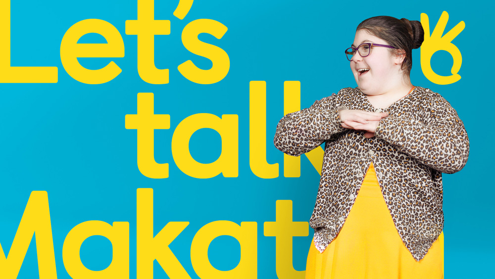
Just like Makaton does with language, we combined speaking and signing in one icon, with a hidden speech bubble created between the thumb and forefinger. It’s a logo that anyone can sign, whether they know Makaton or not.
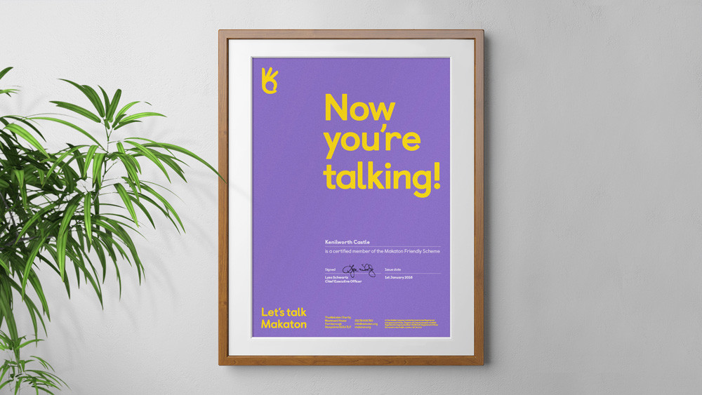
Designed to work as a universal seal of approval, the logo acts as kitemark for officially qualified teachers, certified trainers and accredited learning materials. And a proud positive symbol that recognises association for engaged advocates and everyday users.
Before writing this post I was not aware of the Makaton language so when I first saw the old logo I thought it was a charity for getting kids to run… the green color and the wordmark that looked like a track gave me that notion. It was a decent logo… but for something else. As noted in the first quote, one of the key aspects for the new logo was dropping “charity” in exchange for “Let’s talk”, which instantly changes the first impression and understanding of the logo from a general charity for who-knows-what to something that has to do with communication.
The new icon is quite great as it includes a speech bubble inside an “okay” hand gesture. It’s the one time that the cliché of a speech bubble works perfectly for the concept and in the execution. The thumb and index finger are way longer than in real life, yes, but concept trumps anatomy in this case and that’s perfectly appropriate. The wordmark is fine and shows how conveniently “Let’s talk” and “Makaton” are in length to set nicely justified.
The identity communicates the positive energy and empowerment that Makaton enables. But also how fun and easy it is to get started. A conversational and active tone-of-voice captures this and reinforces the idea of getting people talking.
Simple typography puts language first; while expressive, authentic human imagery celebrates the Makaton community and their stories. A flexible colour palette, tied together with a distinctive yellow ‘pop’, gives the brand an uplifting, playful feel.
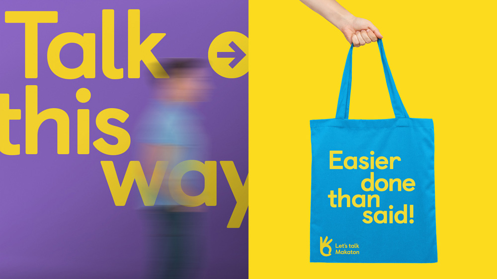
The identity makes good use of language and typography to activate the messaging of the charity and the benefits of Makaton through a simple visual system of bold typography and bright yellow.
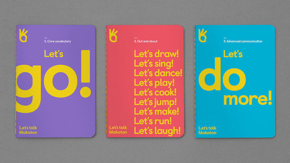
To complete the toolkit, we decided to put Makaton’s very own signing library to work. By applying pre-existing drawings of core vocabulary to merchandise and business stationery, the brand is made accessible to end-users too, while also encouraging people to get talking at every touchpoint.
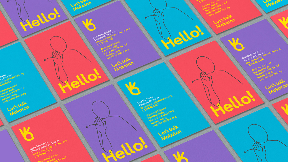
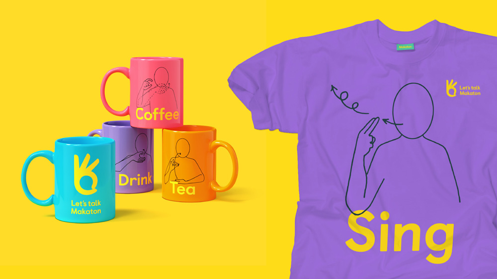
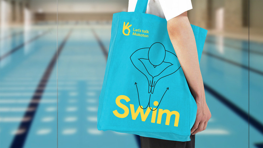
Some of the applications include the diagrams used to teach the gestures which make for charming products and the “Hello” diagram on the business card is just too good. Overall, this is a smart and appropriate redesign that really takes into consideration the need of the charity to communicate what it does and employ every brand touchpoint to get that message across, all while doing it with a crisp and to-the-point visual language.

 Новости Союза дизайнеров
Все о дизайне в Санкт-Петербурге.
Новости Союза дизайнеров
Все о дизайне в Санкт-Петербурге.