Обзор лучших ресурсов по разработке бренда, разработке упаковки
contact us | ok@ohmycode.ru
contact us | ok@ohmycode.ru
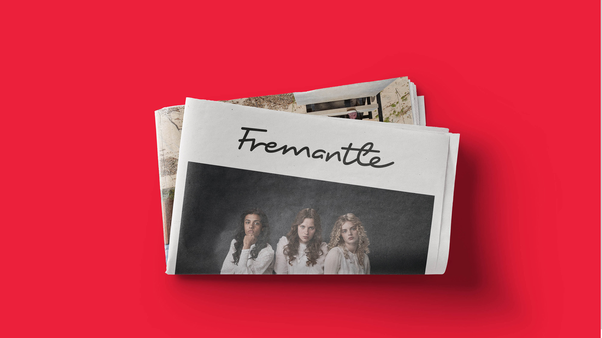
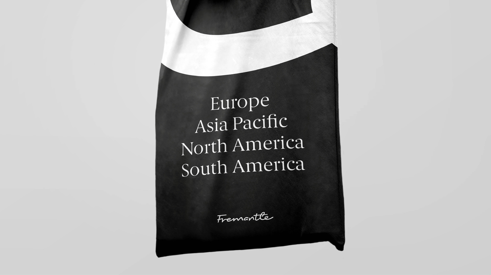
Established in 2001, Fremantle (formerly FremantleMedia) is one the largest creators, producers, and distributors of scripted and unscripted content in the world through an international network of production teams, companies, and labels in over 30 countries. One of their biggest hits is American Idol; they hold the rights to shows like Let’s Make a Deal, Family Feud, and Press Your Luck; and current in-house productions include The Price Is Right and Family Feud plus more heady gems like American Gods and The Young Pope. In aggregate, they produce over 12,000 hours of original programming and distribute over 20,000 hours of content in more than 200 territories. Recently Fremantle introduced a new identity designed by London, UK-based venturethree.
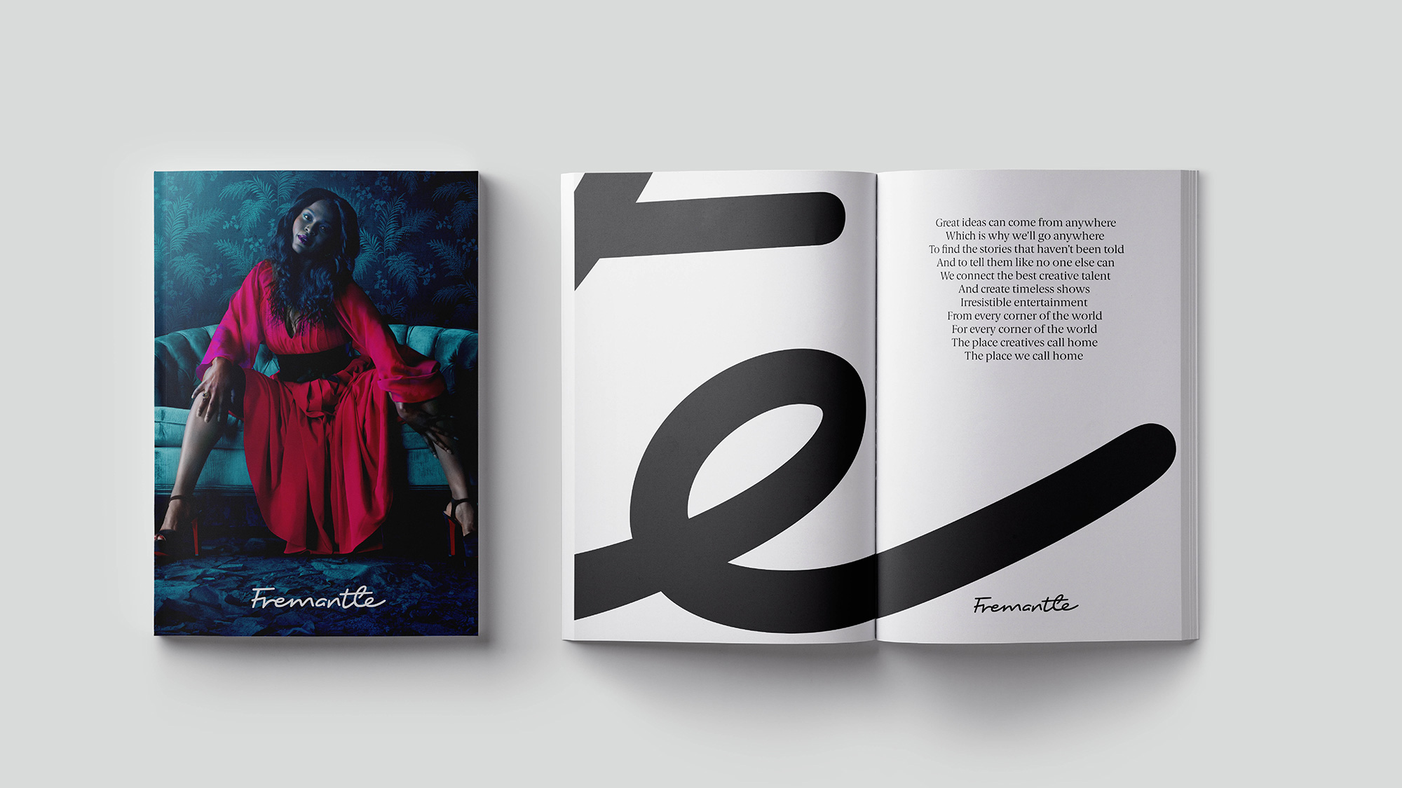
The new brand, created in collaboration with brand agency venturethree, represents the creative signature of the global Fremantle family. It has been designed to embody the passion and pride of the Fremantle creatives who make over 12,000 hours of original programming, 60 formats and 450 programmes every year worldwide.
Grant Dickson, Creative Director, venturethree said: “When we started working with Fremantle, we learnt that creativity was at the heart of everything they do. They don’t just want to do the best work, they want to be the ‘home’ for the best creative talent.
We wanted to capture that ambition with a brand identity that is human, brave and confident. Conceived as a creative signature, the new identity sits comfortably alongside cutting-edge content, reminding us of the quality and imagination of the people behind it.”
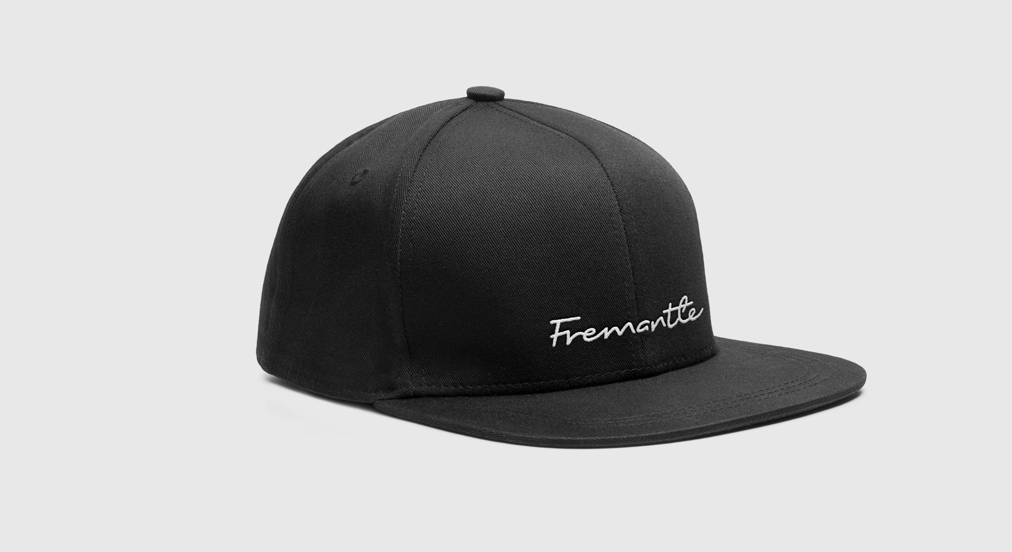
The old logo was pretty good or maybe it’s the association of seeing it at the end of enjoyable hours of watching television that makes me think it’s good. But, no, I do think there was something cool about the paint-drippy rendition of a globe or galaxy or whatever that composition may have been. The wordmark wasn’t anything special but it held its own as a supporting device to deliver the icon. The new logo drops the globe/galaxy icon and transfers the hand-drawn aesthetic to a standalone wordmark rendered as a signature. It’s a very good looking piece of lettering; it has a nice rhythm, good flow, and a very well executed low x-height structure that contrasts nicely with the tall ascenders. The only questionable element is joining the “F” with the “r” as it doesn’t seem like a natural stroke to make if you were writing it but everything else is pretty tight. Conceptually, I guess it’s fine; I’m not sure if it’s trying to force a “human” touch into something that might be better served with a more corporate sign-off but, on the other hand, it’s not a bad thing at all to soften the appearance.
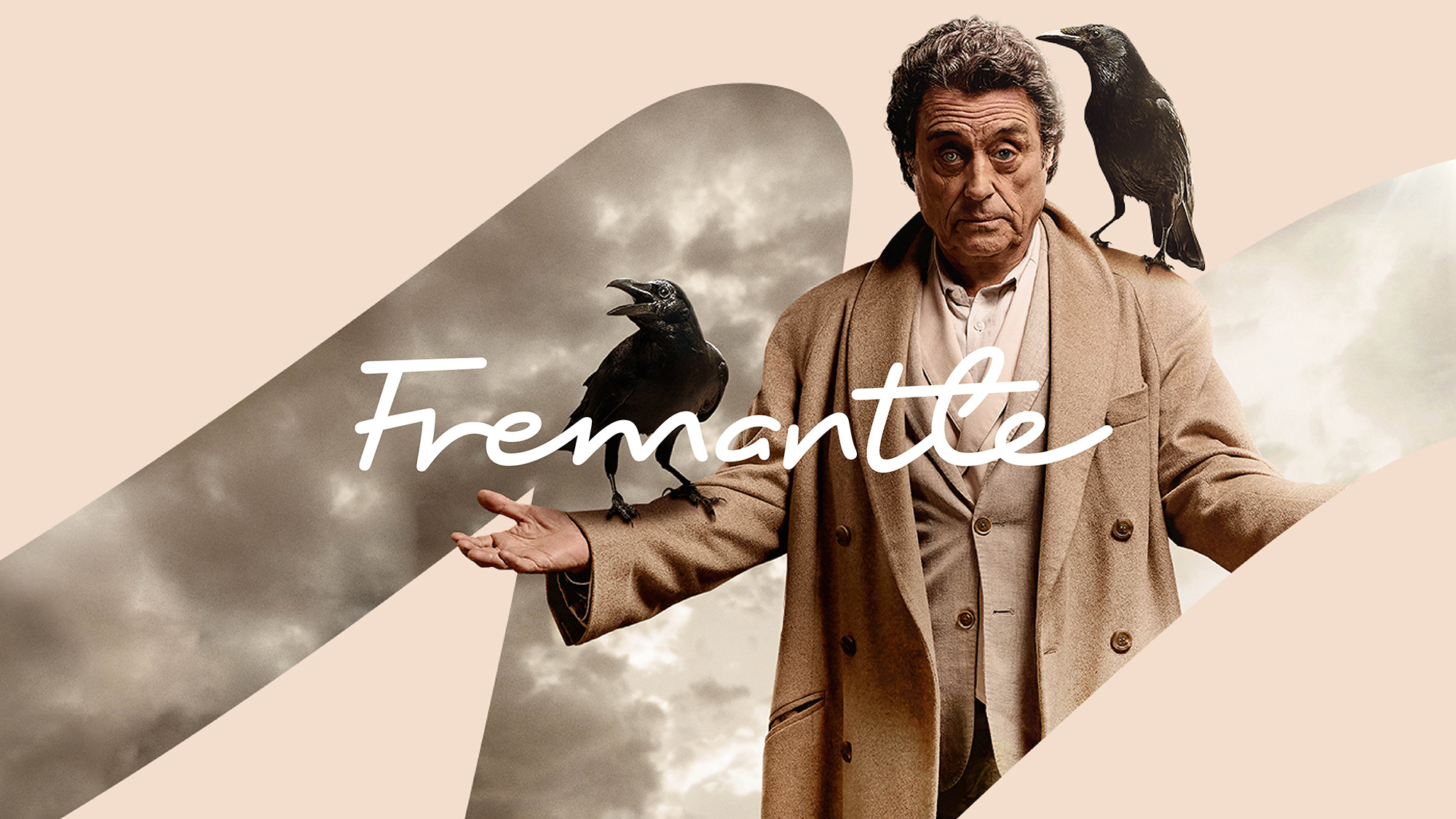
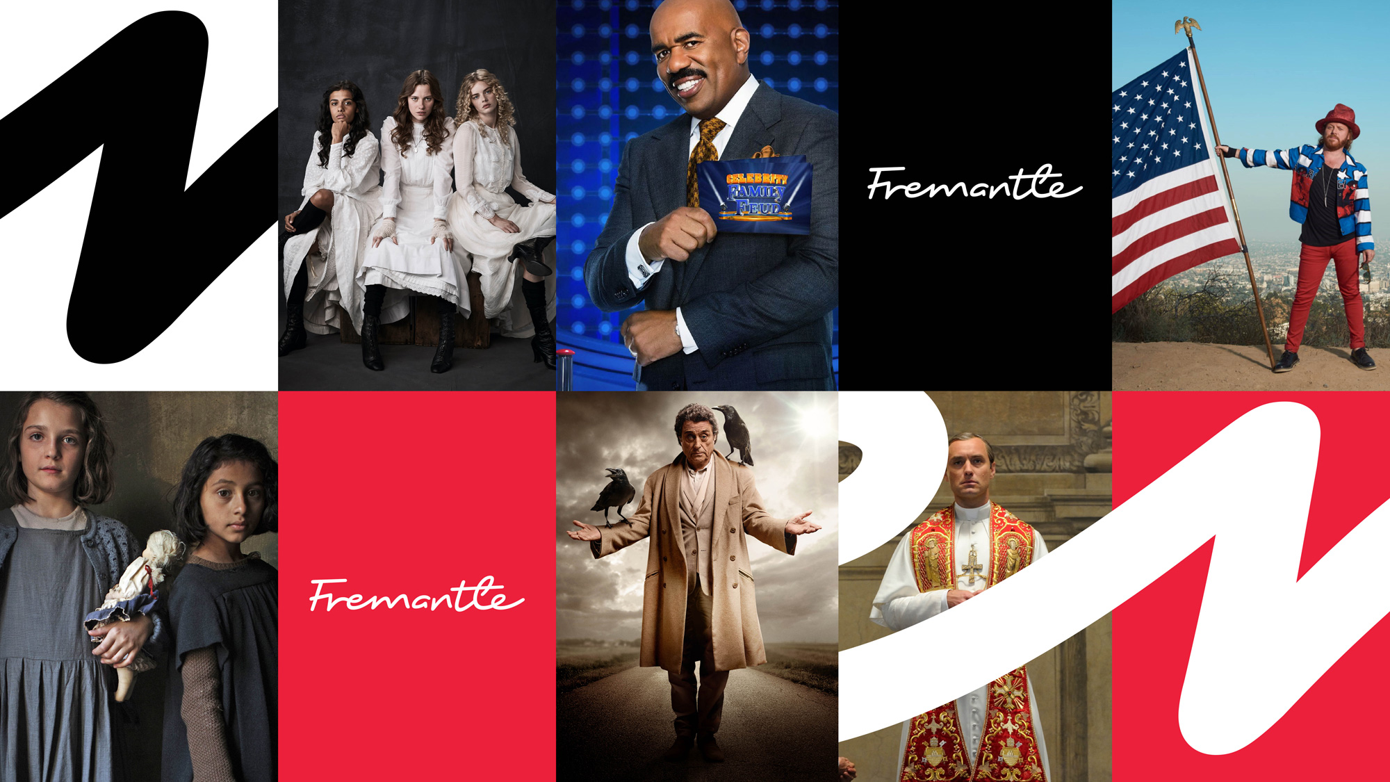
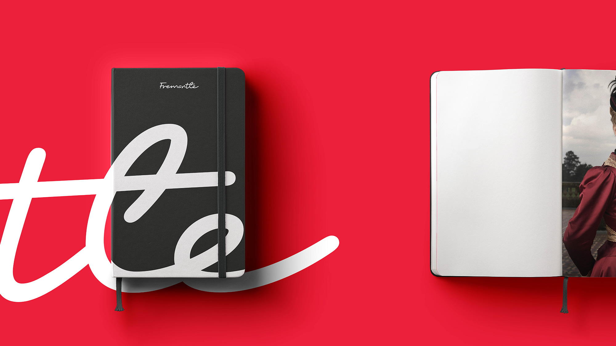
In application, very tight and large crops of the logo are used on their own or in combination with talent imagery. The smooth curves of the logo work nicely at this scale and when used as a window (as in the American Gods, the one with the ravens) it nicely introduces some texture and layering that adds some variety to the applications. The identity introduces a serif, Berlingske Serif, as a secondary font, which is mostly fine expect for the distracting “r” that has a dot for a curve and demands way more attention than any “r” should.
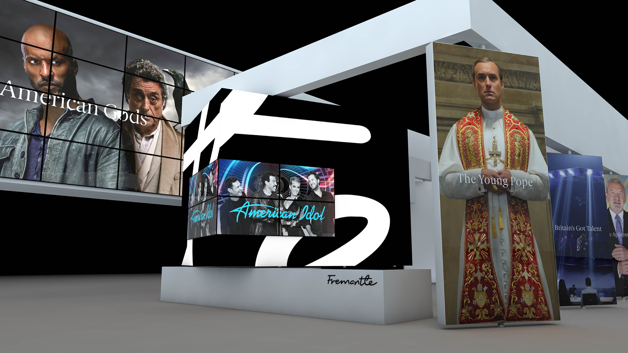
Overall, this is a classy evolution visually that makes Fremantle look more like a high-end production company that is trying to align itself more closely with its higher prestige shows as opposed to the more mainstream shows. Perhaps this might happen but I think the logo could have one “happier” visual style as it signs off from American Idol and a “gloomier” one as it signs off from American Gods as opposed to trying to force the same approach on two such different offerings but, I digress, as that’s not my job. The signature approach might be a little generic in the sense that it could easily be for a fashion label, dietary supplement, or something as corporate as News Corp so the applications need to turn up the dial on the company’s television-ness, which they do at the outset but could go up to, if not 11, at least 9.
Thanks to Shaun Daubney for the tip.

 Новости Союза дизайнеров
Все о дизайне в Санкт-Петербурге.
Новости Союза дизайнеров
Все о дизайне в Санкт-Петербурге.