Обзор лучших ресурсов по разработке бренда, разработке упаковки
contact us | ok@ohmycode.ru
contact us | ok@ohmycode.ru
Established in 2013, Truly is a marketplace that offers a wide range of mostly luxury experiences to be given as gifts. For example: For $78, you can gift the man in your life a signature full service at John Allan’s (grooming) in New York or for $21,775, a private destination picnic with seaplane from NYC; for the woman in your life it could be a $1,907 haircut with celebrity hairstylist Ted Gibson or a $18,900 exclusive hire of Château Bouffémont in France. Each gift is delivered in a custom gift box. Last month, Truly introduced a new identity designed by London-based Proxy with logo design by Rob Clarke.
There’s a bespoke, tailored spirit that is evident throughout the company, from the experiences on offer, to the customer service/concierge. Everything is handpicked and carefully curated - the brand should reflect this.
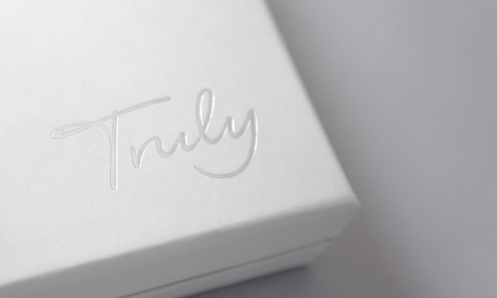
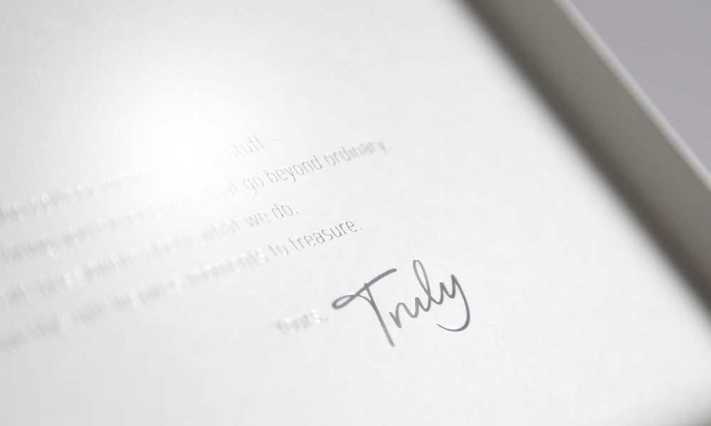
A signature is proof of authenticity, quality and personalisation - this seemed a natural starting point. We collaborated with the lettering artist Rob Clarke, and used the early stages to test a number of hand writing styles. The brand was deployed with a colour palette of warm greys and a punctuating bright yellow. It was important that the end result felt refined and informed-modern, not ‘old school luxury.
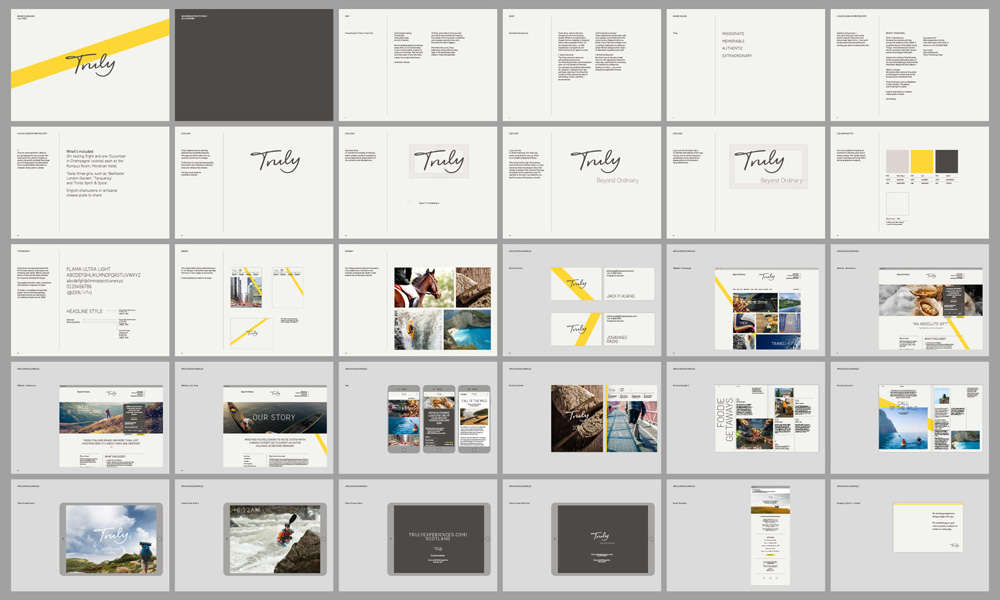
The old logo wasn’t visually offensive in any way but it was too bland and ordinary to be the bearer of $20,000-worth gifts. To its credit, the diamonds aligned right in the center of the “T” and “Y”, so someone was paying attention; it just wasn’t a truly unique logo. The new logo goes for the signature approach which isn’t novel in general but it is here as it’s an approach usually used for names (like, say, Jenny Craig). The result is quite stellar. Even after vectorizing and smoothing it out, it retains a very organic feel through the proper modulation of thicks and thins. It has a great forward, energetic motion with the slight tilt and ascending flow. And it looks genuinely human. As it relates to the brand, it perfectly hits notes of personalization and luxury without it feeling pretentious.
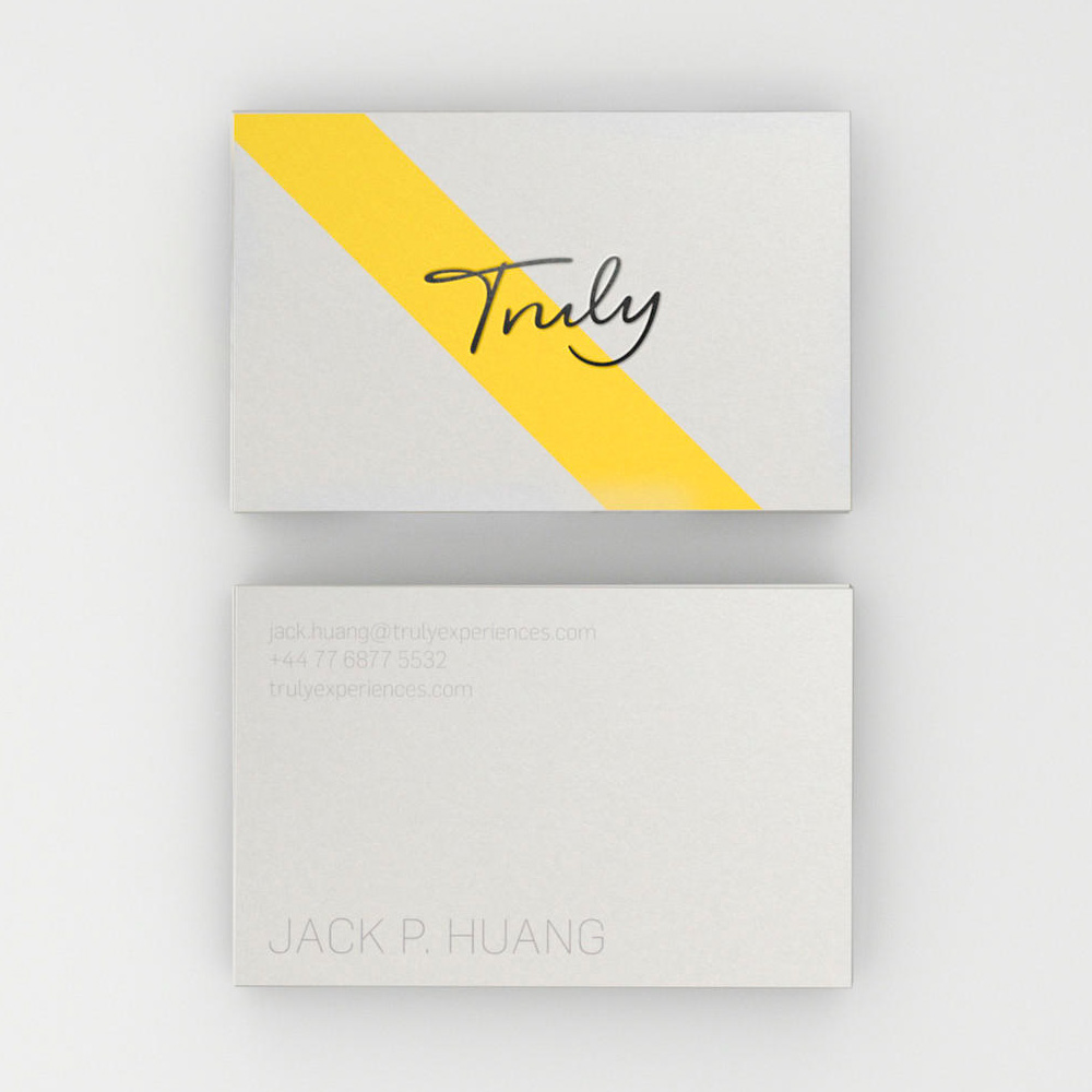
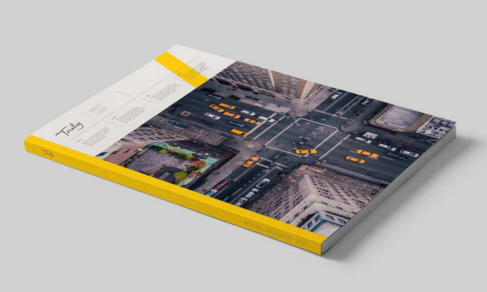
The identity is applied in subtle off-white tones, grays, and metallics in print but every now and then, there is a giant yellow slash that cuts behind. At first, it’s like “Whoah, dude!” but it helps break what otherwise would be a monotonous identity and takes it away from a purely luxurious aesthetic to something a little more adventurous.
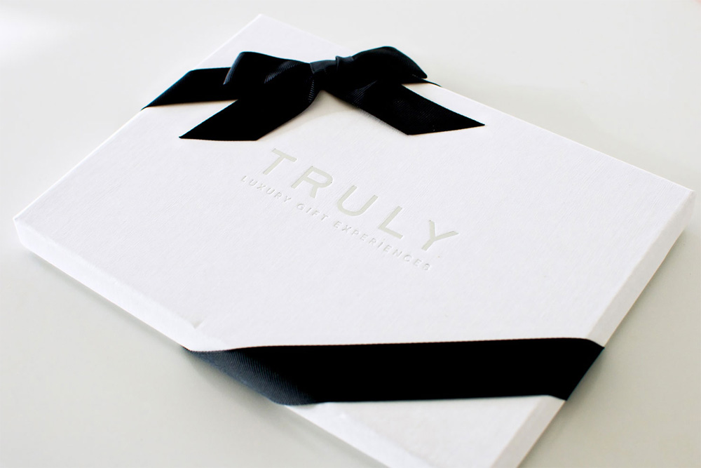
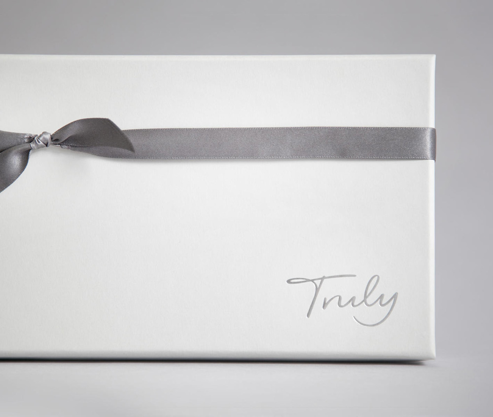
The logo looks amazing on the box and it really (truly!) feels special. This service may not be for all of us and there is a certain cringy-ness to it but, undoubtedly, this redesign manages to convey luxury with a certain warmth to it that doesn’t make you completely resent it.

 Новости Союза дизайнеров
Все о дизайне в Санкт-Петербурге.
Новости Союза дизайнеров
Все о дизайне в Санкт-Петербурге.