Обзор лучших ресурсов по разработке бренда, разработке упаковки
contact us | ok@ohmycode.ru
contact us | ok@ohmycode.ru
Established in 1952 (as Heart and Stroke Foundation of Canada), Heart & Stroke (as it’s now named) is a registered Canadian charity (and one of the country’s largest) dedicated to fighting heart disease and stroke. Through advocacy and education, the charity aims to build healthier lifestyles for people at risk and through their fundraising, they have invested more than $1.3 billion in heart and stroke research over the last 60 years. This week, the organization introduced a new identity designed by New York, NY-based Pentagram partner Paula Scher.
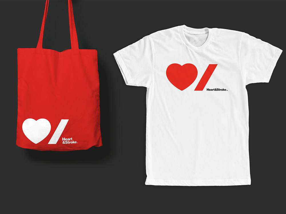
The identity centers on a bold, modern logo that uses the simple icons of international symbols to create a friendly, accessible and democratic visual personality. The logo pairs the graphic icons of a heart and a stroke, which also reflects the new focus on the organization’s more commonly used name, Heart & Stroke. One of the challenges of the identity was fulfilling the official bilingualism requirements of the country. The symbols transcend language, and while the stroke symbol does not translate as directly to the French word for stroke as per English, it represents a feeling anyone who has been impacted by a heart attack or stroke has felt—an abrupt punctuation, exactly how stroke interrupts life suddenly. The new system also easily accommodates both English and French by stacking the words in a lockup with the logo.
The old logo, despite its relative simplicity, was a difficult read with a torch layered on top of a maple leaf layered on top of a heart, making it look messy. The type wasn’t great but it wasn’t bad either. Nonetheless, the message was there: keep a light lit at the end of the tunnel for Canadians’ hearts. The new logo first does the nearly impossible job of not showing a maple leaf, especially when there was a clear precedent of there being a maple leaf, so that alone is a win. Having a heart is pretty much a given and representing “stroke” is not easy but the slash or strike character pairing is both a smart solution and a strong visual complement for the heart. It might not — it probably does not — read as “heart” and “stroke” as literally as, say, the way the Eye Bee M rebus reads as IBM but once you know (or read for the first time) the name of the organization it’s a little triumph to make the connection of the slash as a cutting/interrupting symbol trying to give visual form to “stroke”.
Another unexpected win is the size relationship between icon and name, where the name is about 20% the height of the icon, putting the bulk of the communication responsibility on the icon. I’m not a fan of Helvetica but I will always support the use, as is the case here, of Neue Haas Grotesk and here it pairs perfectly with the universal-like symbols. Neue Haas Grotesk and red also put it in a similar look to the Red Cross logo which conveys a sense of urgency and alert.
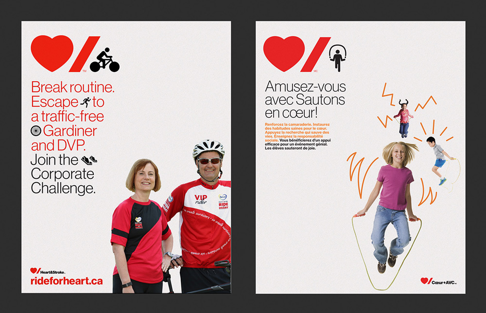
Heart & Stroke presents many different mission and fundraising programs, from research and prevention initiatives to its popular Big Bike and Jump Rope for Heart events. However, the organization found that inconsistent branding meant they weren’t always getting credit as the force behind these programs. In the new system, the elements of the logo are used as a consistent framework that can anchor various divisions such as community events, corporate sponsorships, gifts and the lottery, and more. These sub-brands can be represented with graphic icons or a type signature.
The icon pairs really well with pretty much anything you throw at it, either type or iconography. The brand extensions are particularly good looking. The active icons… I get the connection to the ubiquitous male/female universal symbol signs but I’m not so convinced as my initial connection is to Olympic icons and while, yes, the organization puts together some exercising events, the look is maybe too event-ish or official, if that makes sense.
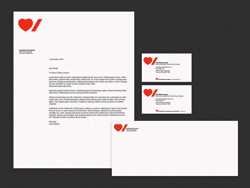
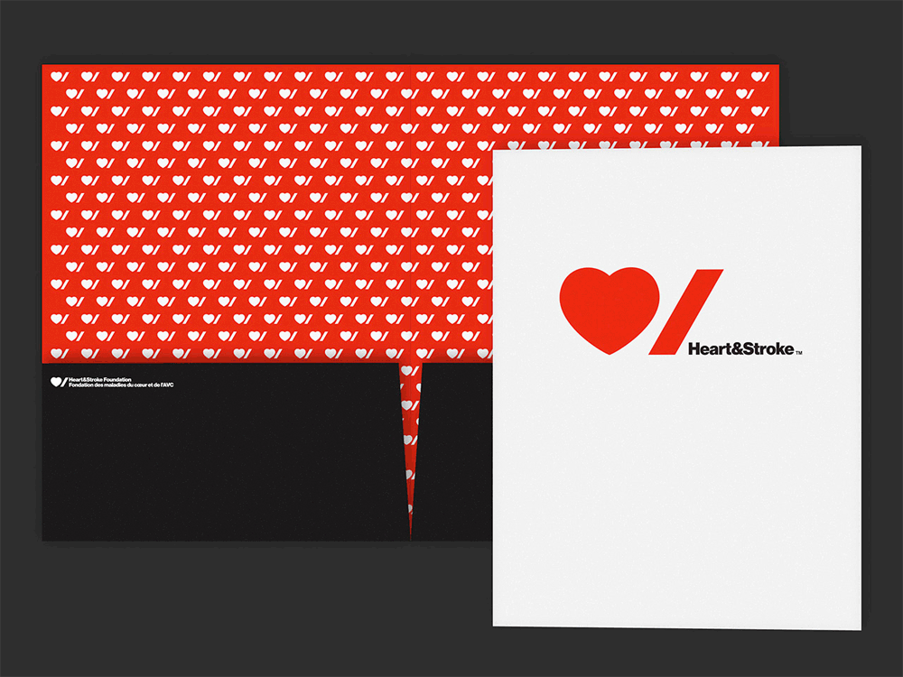
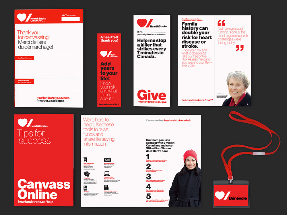
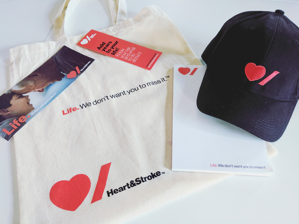
In application, I love the dominance of the icon, especially in the stationery. It looks strong and confident. The image with the various applications shows a nice consistency and flexibility… although, for me, that’s when it gets to be too much Helvetica-ness and maybe starts to feel a little cold and distant, as if everything was a form you had to fill in. Overall, a powerfully simple icon with a sense of urgency and a strong (maybe a tad limiting in its humanist sans serifness) system for the hundreds of pieces of communication the organization must put out regularly.

 Новости Союза дизайнеров
Все о дизайне в Санкт-Петербурге.
Новости Союза дизайнеров
Все о дизайне в Санкт-Петербурге.