Обзор лучших ресурсов по разработке бренда, разработке упаковки
contact us | ok@ohmycode.ru
contact us | ok@ohmycode.ru
Established in 1994, Barcelona Televisió (BTV for short) was launched as a Catalan-language, local, municipal television channel encouraging citizen participation. Over the years, BTV has changed its programming direction and its most recent incarnation has a mix of local news, documentaries, public service, cultural segments, and a sprinkling of Monty Python’s Flying Circus. BTV has relaunched this week with a new-ish name that vocalizes its acronym as betevé — the equivalent of renaming NBC as “enbeecee” — and a new identity by Barcelona-based Folch.
(All project photography and materials taken by Leo García Mendez.)
We considered that the problem of verbalisation that BTV / Barcelona Televisió is experiencing not only lies in the difficulty of the citizen to identify the brand, but inevitably links the chain to the concept of Television and limits it to a closed and concrete territorial area. It is precisely the verbalisation of the acronym that helps us to solve doubly the problem: on the one hand it becomes a word with its own entity, and on the other it eliminates the implicit ideas of television and localism.
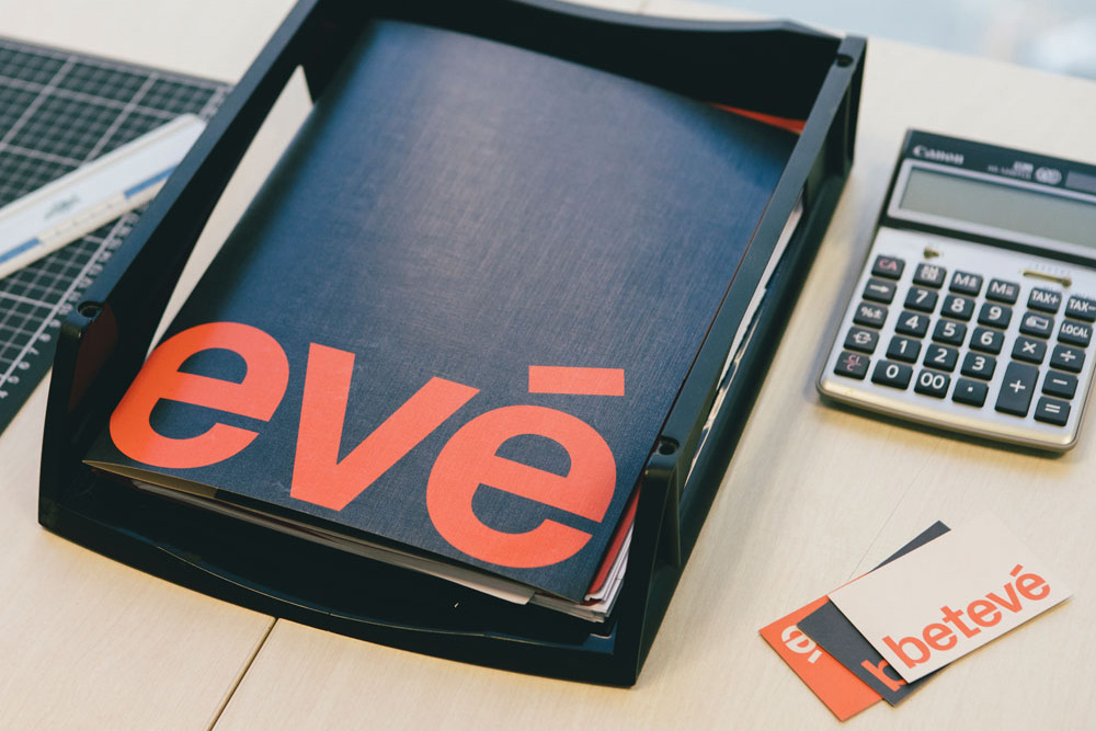
Understanding the use of the lower case as a brand statement, an important gesture that helps to link the brand with the user, and which implies a series of values that will, from now on, identify betevé.
The objective has been to find a typography sufficiently characteristic to be a differentiating element, but at the same time consistent and suitable to be used exclusively in all applications of identity. Its approach takes advantage of technological limitations as a pretext to impart a series of details that makes it unique. Px Grotesk by Nicolas Eigenheer is conceived as a bridge between the most classic ways of writing and the new digital environment.
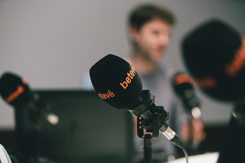
Although the radical change of betevé, we wanted to maintain an emotional bond with the hearing. A less aggressive red, less strident, warmer, closer, more earthy supported by a white and a black slightly lowered of intensity completed the colour palette, without great artifices.
The old logo was fairly good, with a big bold “B” inside (an admittedly cliché) speech bubble with a crisp and differentiating wordmark. Not amazing but not bad either. Everything about the new identity signals major change, starting with the name… Since not all languages are as phonetically confusing as English, it’s super easy to spell out how letters are meant to sound and when everyone already sounds out the name of the channel as B (beh), T (teh), V (veh) renaming it to betevé both makes sense and is kind of awesome. The new logo is typeset in Px Grotesk, which is an uncommon typeface that I would personally overlook because of its flat horizontals that would drive me crazy but, here, as a logo, its quirks are what make it stand out and come across as contemporary and hip without feeling like it’s trying too hard. It pulls off rather convincingly its alternative TV vibe. The one thing I’m not a huge fan of is the computer-cursor-typing thing… seems like an odd choice to put focus on, especially when the font does not seem like something you would type in regularly.
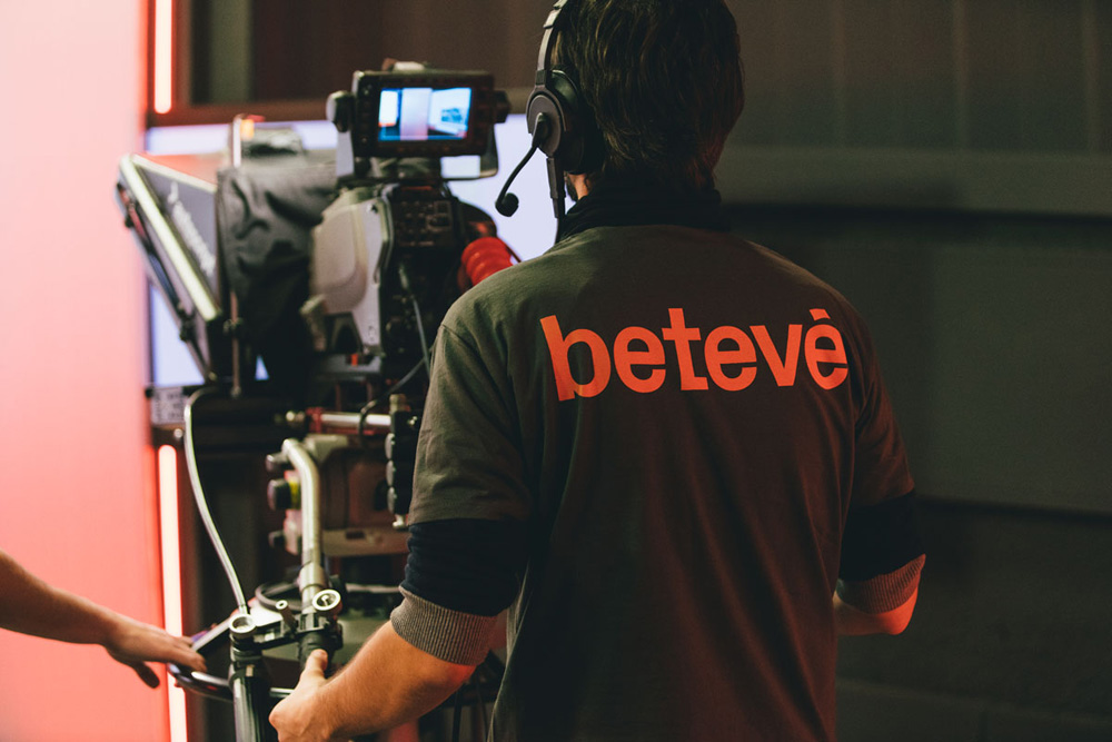
The applications look really nice with the logo used as large as possible in most instances and a spot-on color palette of tan, dark gray, and the key coral-reddish color. The simplicity, anchored by Px Grotesk, makes it look like a less fuck-you version of Viceland.
Going back to the initial force behind the rebirth of the brand -the urge to shift the archetype of the city- we had to find a tone of imagery that could portray the reality and environment that surrounds the citizens and in this way manifest and bring the channel closer to the audience. The direction of art and strategic content creation became the fundamental tool to achieve a style and tone of their own when creating their image library and short pieces of self-promotion.
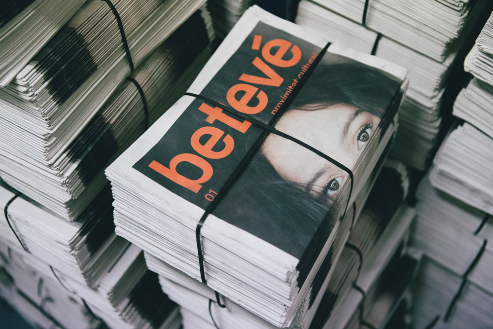
Leo García Mendez had the important role of building up the stock library , during months he has captured the essence of the 73 neighbourhoods of Barcelona. A plentiful number of 2.800 photos of numerous of sport activities including football games in Camp Nou to surf in Barceloneta. Covering all the cultural events such as theatre, concerts and dance, governmental spaces, politician headquarters, public services among other important factors which define our city.
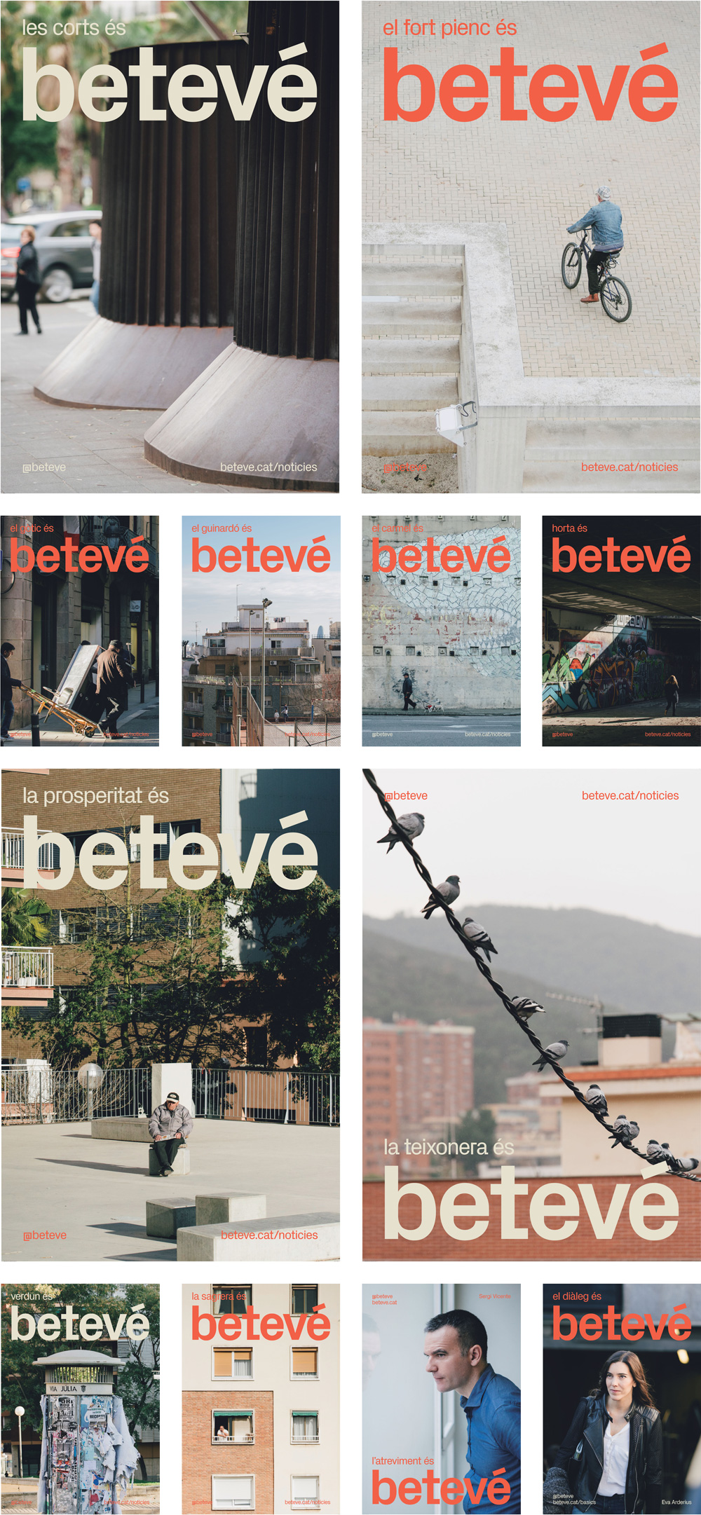
La Mirada Imperfecta (“Imperfect Look”) is representing the wish to change the perception of the city by avoiding glorified landmarks and iconic elements and instead giving recognition to the distinguishing features, the reality, the normality, the beauty of the everyday life in each neighbourhood.
A big part of the identity, that plays out in both print and idents, is the hyper-local photo library by Leo García Mendez, all shot in slightly muted tones and framing that captures the environments while focusing on specific characters or things in the city. The idents are like little moments of Catalan zen.
Setting the movement of betevé requires an understanding of a myriad of devices, their functions and interfaces. Vertical and horizontal displacements, so called “swipes”, zooms to enlarging an reducing the content, the imitation of digital writing, adaptability and the folding and overlaying of images were the key movements to apply to the brand.
In motion, the behavior and styles are oddly… soothing. Most on-air reels and approaches we see here are so in your face and like Transformers movie trailers that it’s nice to see one with a slow pace, soft music (by composer Nil Ciuró), and cuts that don’t make your heart stop. Overall, this is a really nice, well thought-out identity that completely repositions betevé as a cultural hub on teevee, online, and in radio.

 Новости Союза дизайнеров
Все о дизайне в Санкт-Петербурге.
Новости Союза дизайнеров
Все о дизайне в Санкт-Петербурге.