Обзор лучших ресурсов по разработке бренда, разработке упаковки
contact us | ok@ohmycode.ru
contact us | ok@ohmycode.ru
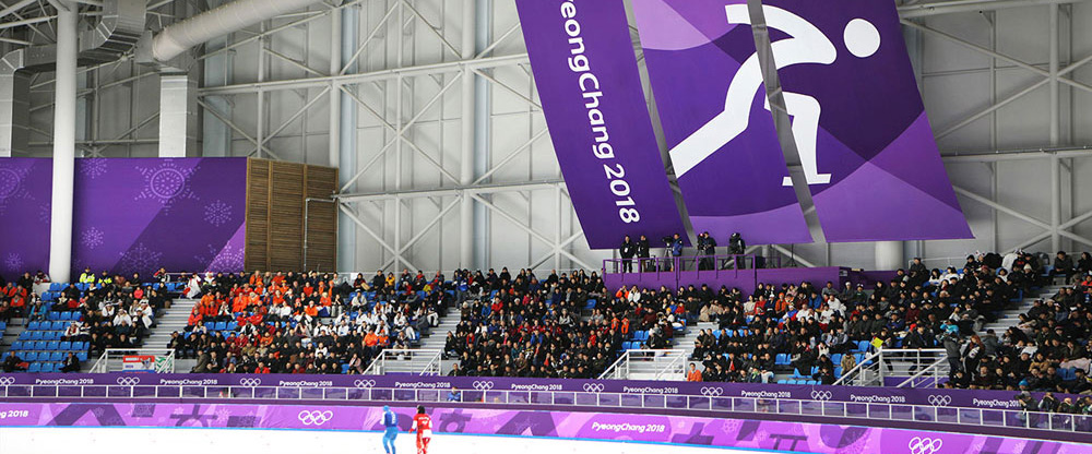
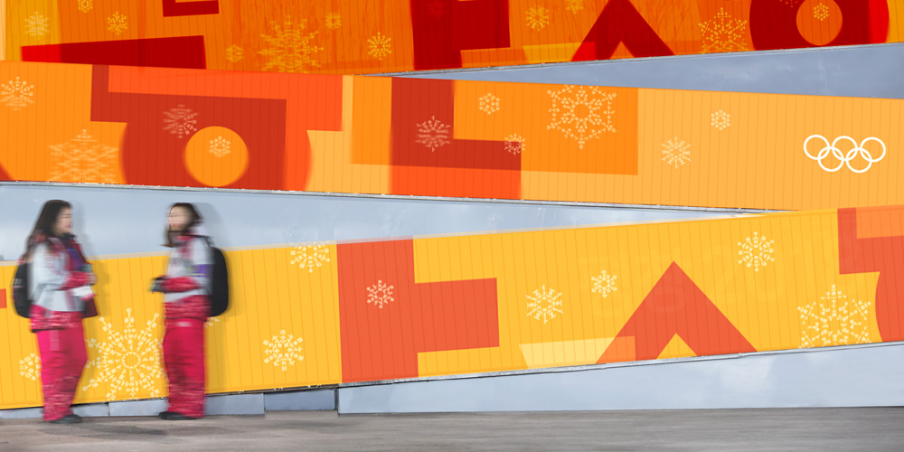
Needing little explanation since you are probably watching it right now, the XXIII Olympic Winter Games have been held for nearly two weeks, ending this Sunday, in PyeongChang, Gangwon Province, the Republic of Korea. In the background of all the action is the Look of the Games, which was designed by the Seoul office of Interbrand.
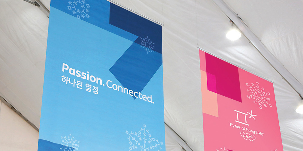
Elements of [the Hangul alphabet, which was created in the 15th century by Sejong the Great to promote widespread literacy] are woven throughout the identity, drawing on Korean national heritage to tell a unifying—and igniting—story. A historical study of Hangul typography informed geometric designs that contain keywords representing the harmony of audiences and athletes at the games. Shapes and colors created by the overlap of letters signify the interplay of cultures, and the opening up of new possibilities. Implicit in all this is the “Passion.Connected.” tagline, created to convey the spirit shared by all those connected to the Games.
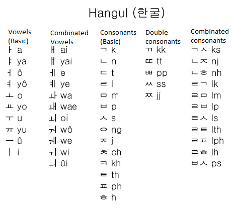


The concept of using the Hangul alphabet is probably not the most groundbreaking idea but when it’s such an important part of the host country — October 9 is Hangul Day, a holiday celebrating the invention and the proclamation of it as the alphabet of the Korean language — and it has such distinctive forms that, to most viewers, will look as graphics rather than letters, it’s an appropriate idea to build upon and infuse the applications with the culture of the host country.
The alphabet is executed in what would be the equivalent of a geometric sans serif and it’s the only trait that links the Look back to the logo, which I still think is a weird Olympics logo.
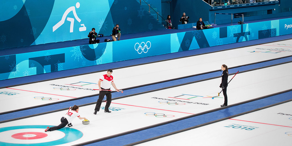
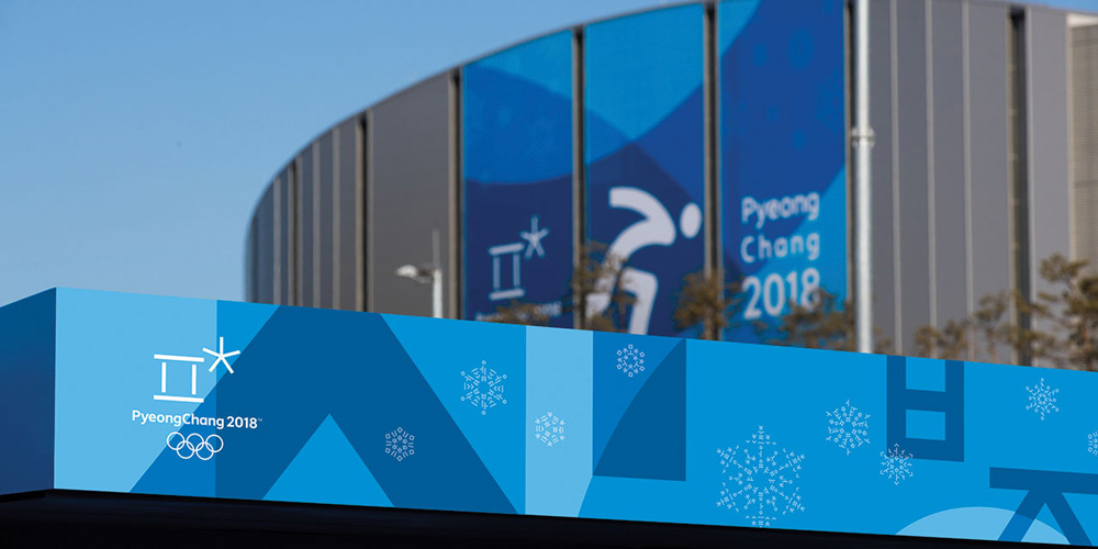
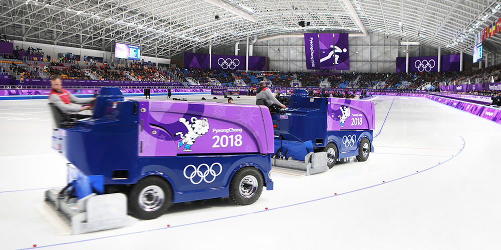
The Look of the Games passes almost unperceived, which could be considered a good thing — viewers tune in to watch people do amazing things not graphics do amazing things — but it’s almost like a non-Look. It’s mostly attractive once you notice it… the overlays are nicely handled, the snowflakes add some texture, and the color palette is pleasant but, ultimately, there isn’t a clear or exciting statement, which may be the statement itself — to be subtle. One thing that does bother me is the lack of connection between the Look and the pictograms, a synergy that was really well handled in Rio but the devil’s advocate view is that not everything can look exactly the same.
Overall, a strong effort and an effective application in what has to be one of the most difficult projects but compared to the exciting and energetic Looks of Winter Olympics like Sochi or Vancouver, it didn’t make a strong impression.

 Новости Союза дизайнеров
Все о дизайне в Санкт-Петербурге.
Новости Союза дизайнеров
Все о дизайне в Санкт-Петербурге.