Обзор лучших ресурсов по разработке бренда, разработке упаковки
contact us | ok@ohmycode.ru
contact us | ok@ohmycode.ru
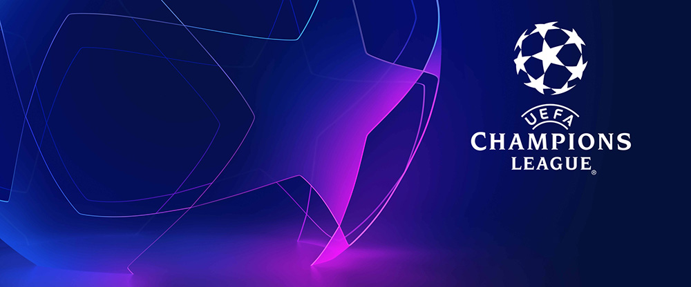
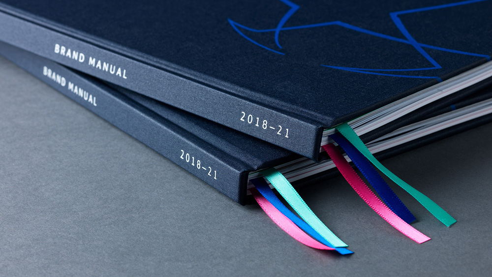
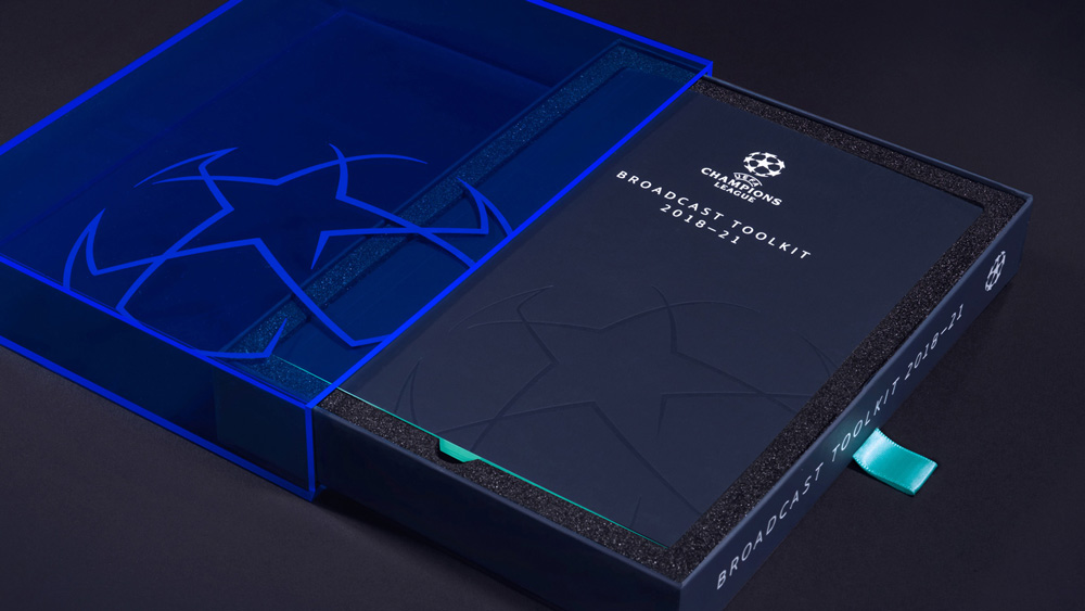
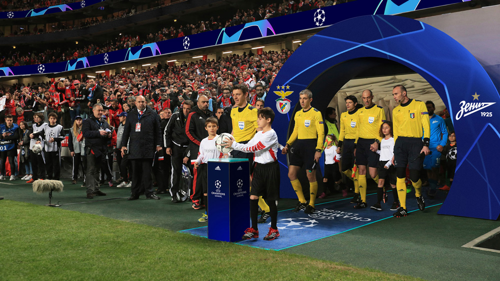
First played in 1955 (then known as the European Cup), UEFA Champions League is the top-tier annual football competition in Europe with the top clubs of each European league competing for the ultimate European bragging rights. 22 teams qualify in advance — if they won or finished in the top three or four in their own league — while about 50 others play to earn the 10 remaining spots in the group phase that kicks off the tournament. Spain’s Real Madrid is the current champion and the team that has won the most titles in the League’s history. For the 2018 - 19 season and planned through 2021, UEFA Champions League is introducing a new identity designed by DesignStudio.
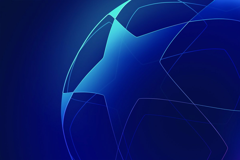
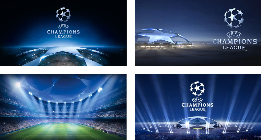
Crafted from light, the new starball is the centrepiece of the brand identity.
It frames and illuminates the spectacular moments that transcend sport - allowing the brand to scale from the artful flick of a player’s ankle, to a pulsating stadium.
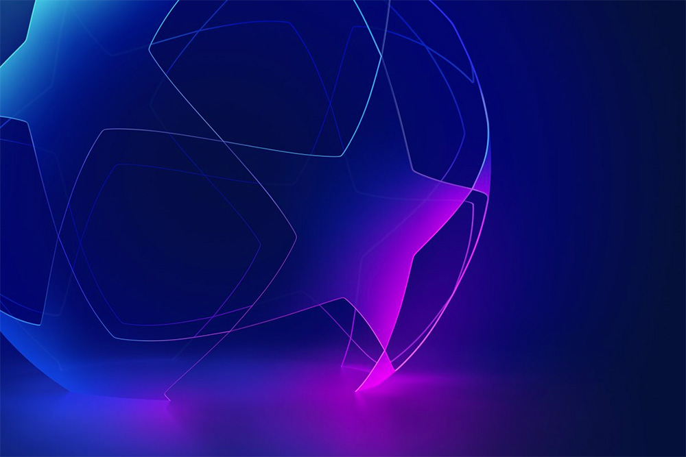
To capture and immortalise the action, the movement of the starball is inspired by iconic moments and thrilling performances, such as Mario Mandžukić’s overhead goal from the 2017 final.
Like yesterday’s post about the UEFA Europa League, I’ll start off by saying that I have never watched this so there is no point of reference to what has come before but if I had to choose whether to start watching or not based on this new look, the answer would be 100% yes. The new identity revolves — literally and metaphorically — around a new rendition of the League’s “starball” icon that was introduced way back in 1991 and that remains unchanged as the logo proper. The new starball — like yesterday’s wave graphic — drives the identity and this one does so in a beautiful way, with a super thin, translucent, spherical interpretation of the icon that can rotate slowly on its own or burst along with slow motion highlights. What I love the most about the animation is how the star shapes shift from being translucent to slightly opaque as they rotate. It’s a great bit of animation.
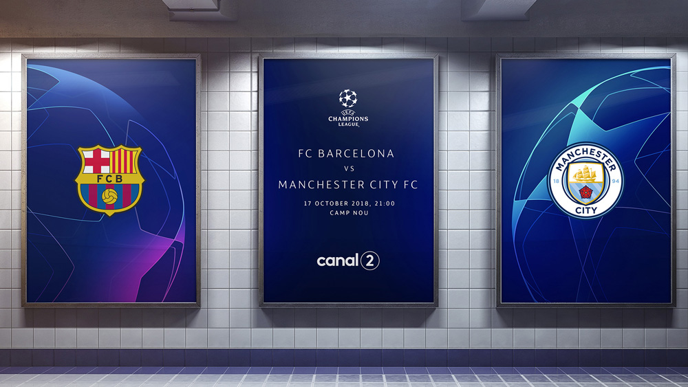
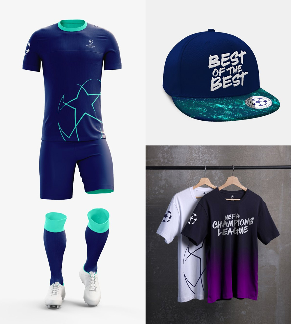
Evening matches mean that a dark blue palette was already a distinguishing feature of the brand. We added contemporary, vivid highlights inspired by the shifting tones of a European night sky.
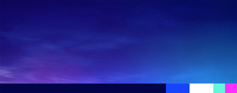
The color palette plays a big role in making the identity feel “premium” and like an elite competition, almost like an expensive Formula 1 event but less douchey. In static and in motion the identity does a great job in keeping an overall dark blue presence and infusing it subtly with sparks of the bright colors in the palette.
In collaboration with Fontsmith, we created a new light weight font of the brand’s existing typeface. The new lighter weight reflects the precision and skill of elite club football.
We use centred typography with an emphasis on wide tracking, to express the grandeur and scale of the competition.
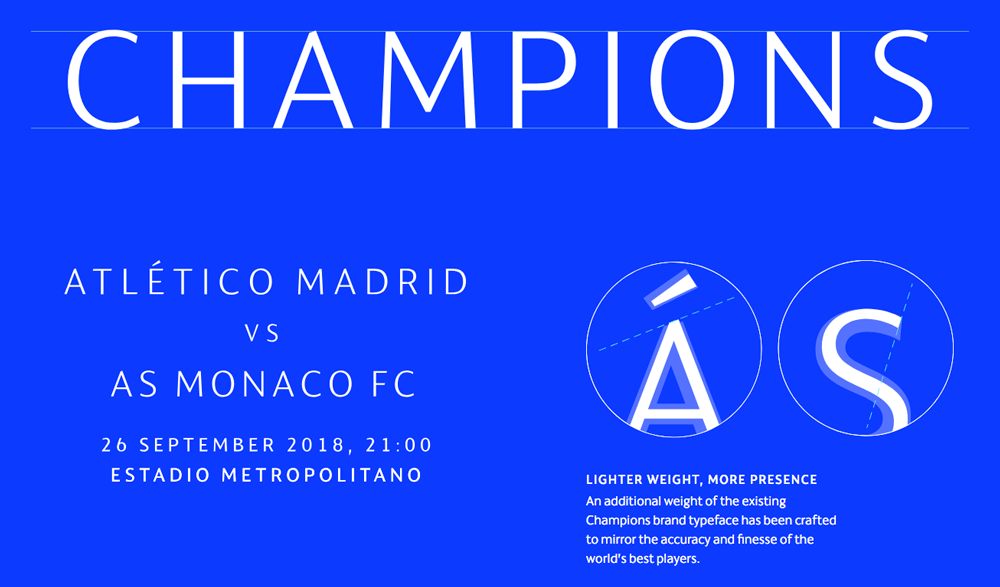
Unlike yesterday’s slab-spike-bonanza font, this is a lovely and elegant sans serif with a lot of great little details, like the slightly tapered “M” and that “6”. The light contrast in thicks and thins could have been terrible but the balance is perfectly crafted.
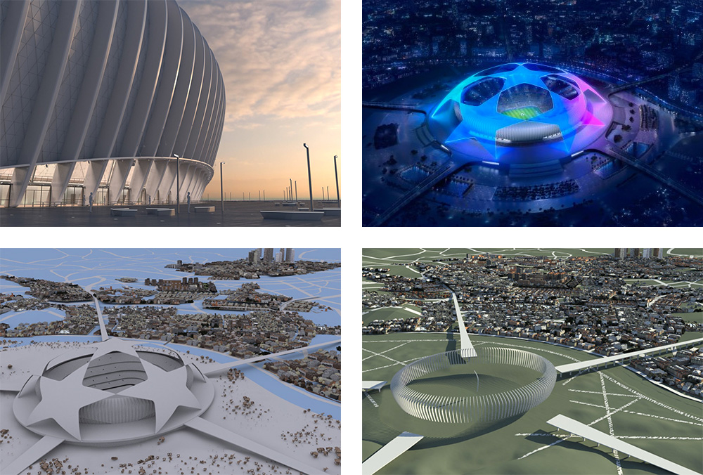
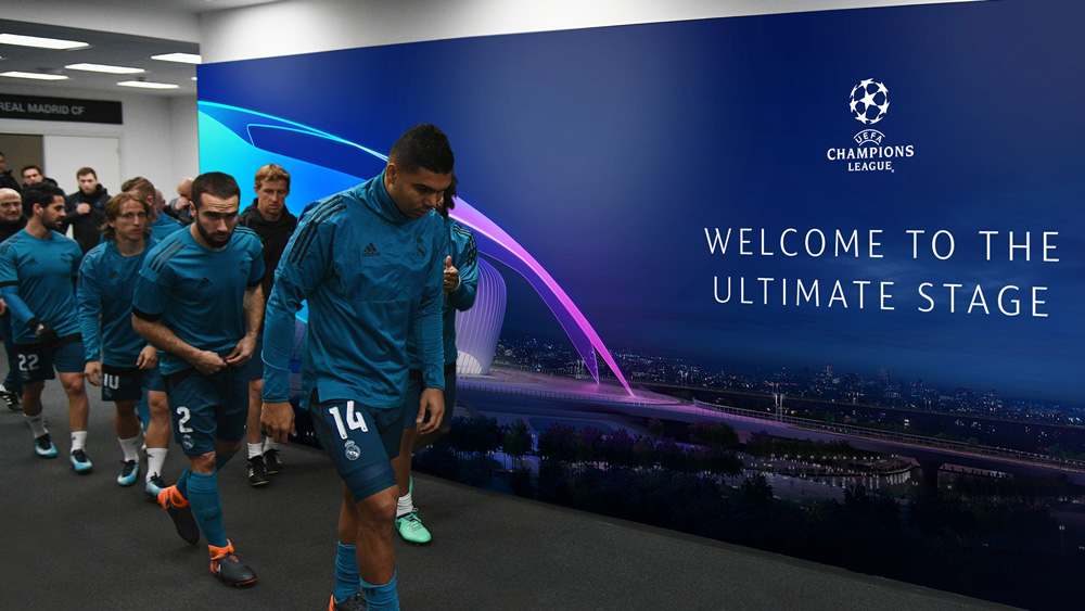
In collaboration with our CGI partners, we designed and built a bespoke stadium and sprawling metropolis that takes inspiration from the European cities that host the competition.
The stadium walkways are drawn from a five-pointed star, and the architectural features are inspired by the iconic curves of the trophy handle.
The previous starball-stadium graphics were already ambitious but this new one is like a Luc Besson world from Valerian. The attention to detail is crazy — check the moving vehicles in the animation — and the resulting graphics are kind of epic.
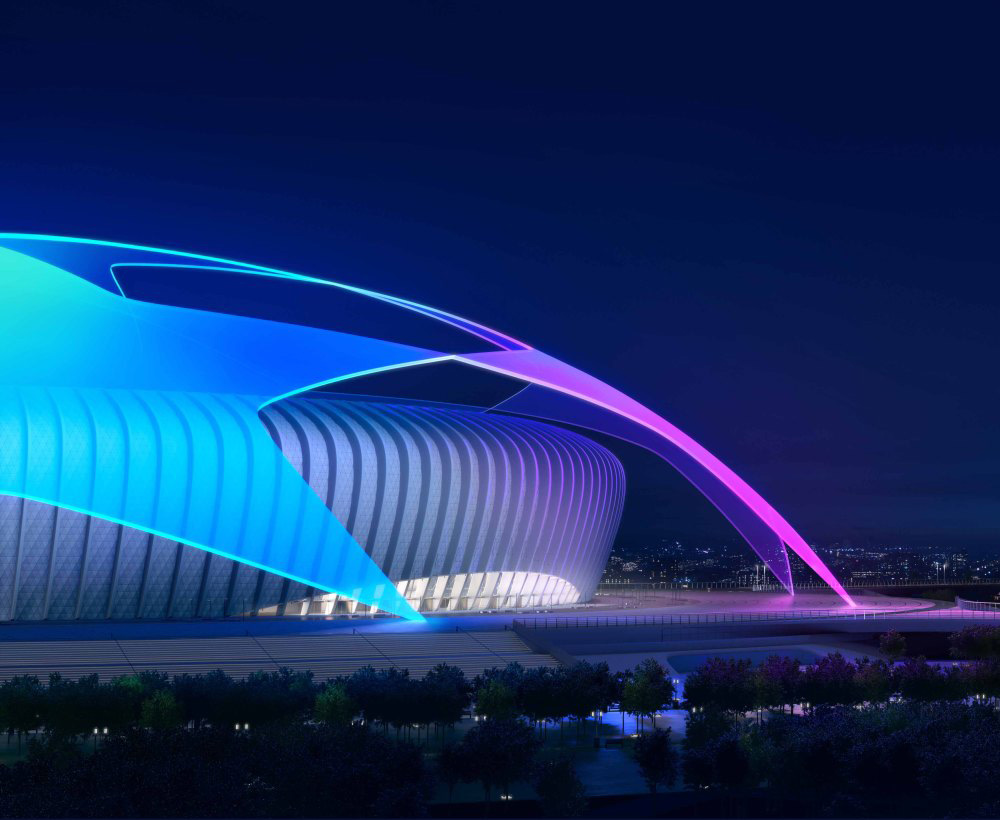
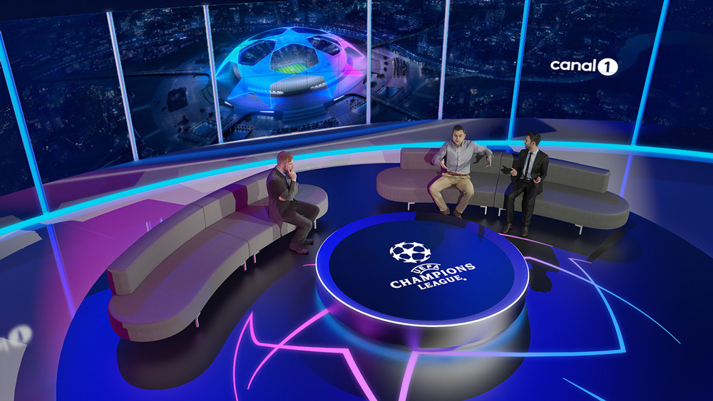
The static and print applications are quite nice too, although I wonder if the stadium renders and starball crops will yield fatigue by 2021. For now, though, it all looks good, exciting, sophisticated, and well thought-out as an identity that needs to live everywhere from print ads to broadcast graphics on YouTube on a phone.

 Новости Союза дизайнеров
Все о дизайне в Санкт-Петербурге.
Новости Союза дизайнеров
Все о дизайне в Санкт-Петербурге.