Обзор лучших ресурсов по разработке бренда, разработке упаковки
contact us | ok@ohmycode.ru
contact us | ok@ohmycode.ru
Established in 1971, Český Volejbalový Svaz (Czech Volleyball Association in English, CSV for short) is the governing body of the sport of volleyball and beach volleyball in the Czech Republic. The association oversees all volleyball matters, from the country’s men and women teams competing in the Olympics to promotion of the sport to organization of events. Recently, CSV introduced a new identity designed by Prague-based Dynamo design.
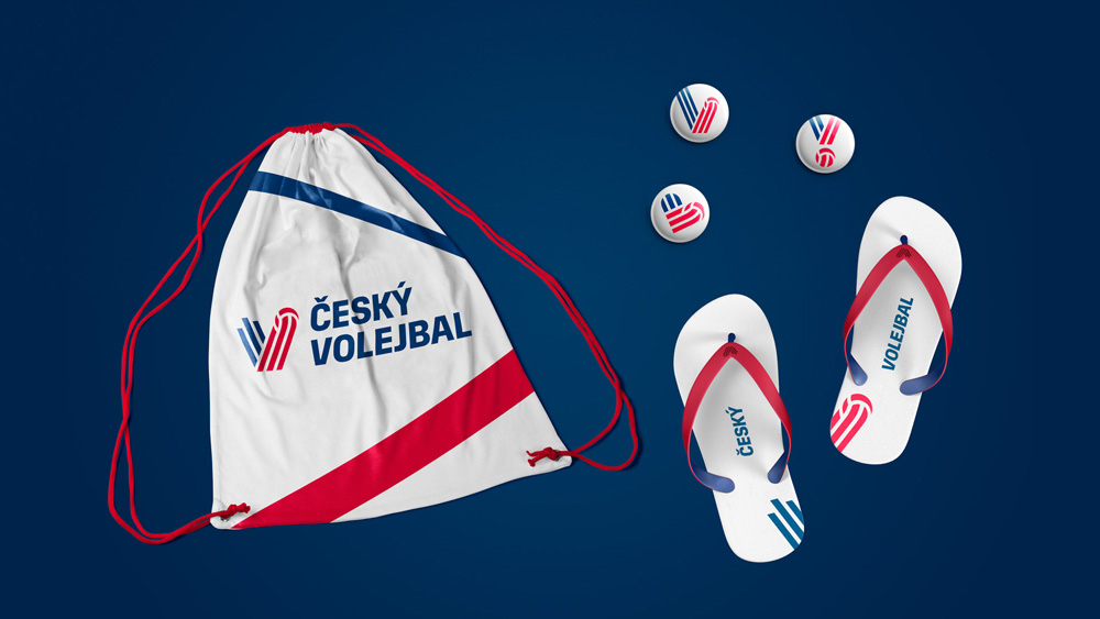
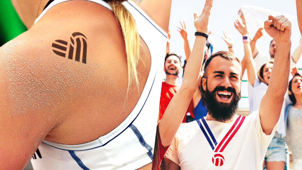
The main motive of the new logo is the reflected volleyball ball, which renders the letter V. Its reflection symbolizes the smash and the point obtained. The letter V refers to the words “volleyball” and “victory”. The chosen coloring strengthens the perception of Czech volleyball as a shielding national organization for this sport. Its typical dynamics is enhanced by the asymmetry in the symbol, the typographic typing, the photos of the players in typical poses, and the red-blue streaks passing through the different applications in the new visual identity.
The old logo had the right idea, building the Czech flag, a net, and a “V”-accentuated type into a shield, which was based on the association’s original logo…
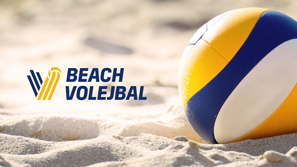
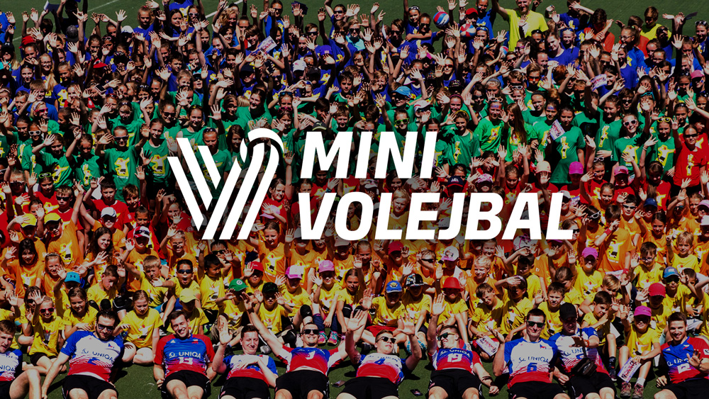
…which was pretty bad-ass and I would have loved to see a modern-day rendition of that, which is what the previous logo tried to do in 2015 but failed in its execution. The new logo is quite good though, building a “V” monogram/icon out of a ball being spiked. While any volleyball-related entity could use a “V” and a spike, in this case it works particularly well for the Czech Republic because the “V” shape echoes the diagonal shape in its flag. The use of only three stripes to make the icon and ball is very pleasing and yields and icon with a lot of flexibility and that’s easy to reproduce. Wordmark is alright. The color variations for beach, snow, and mini (youth) are fine too (although I wonder why the last two stripes in the icon of mini are the same color).
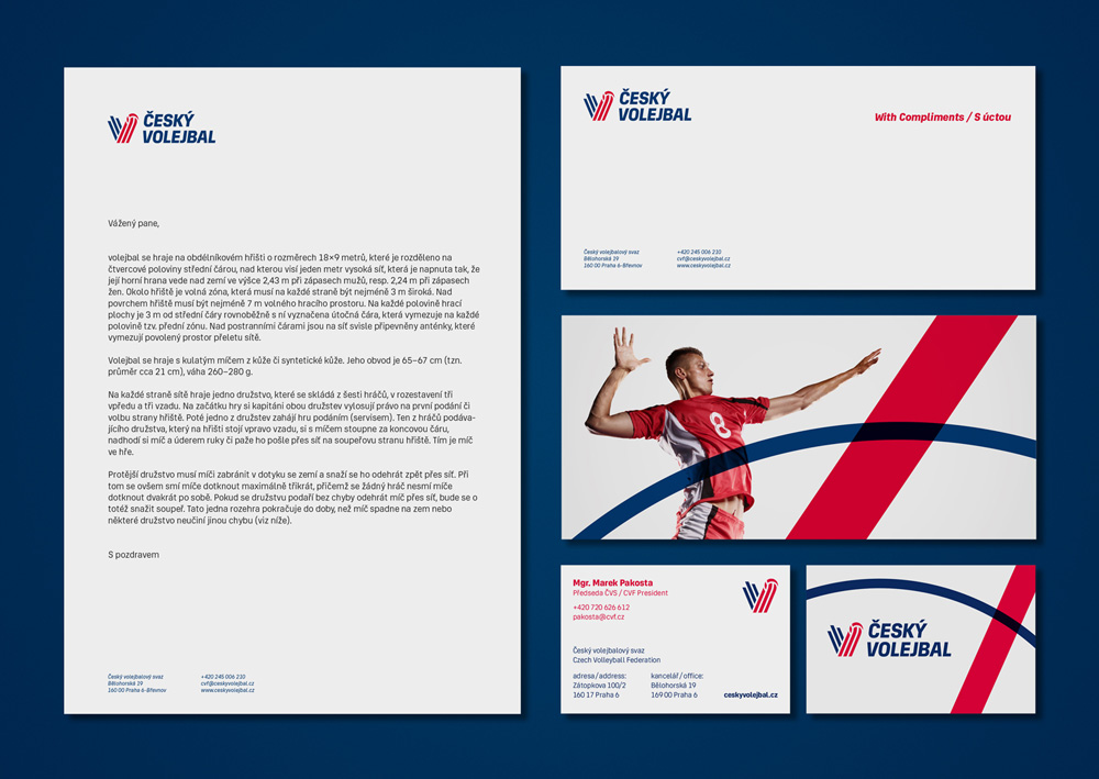
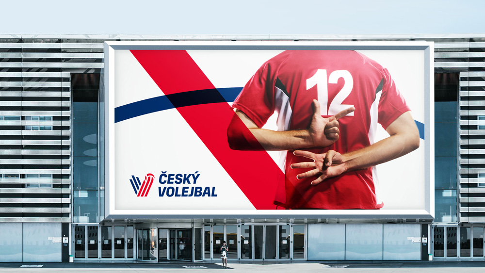
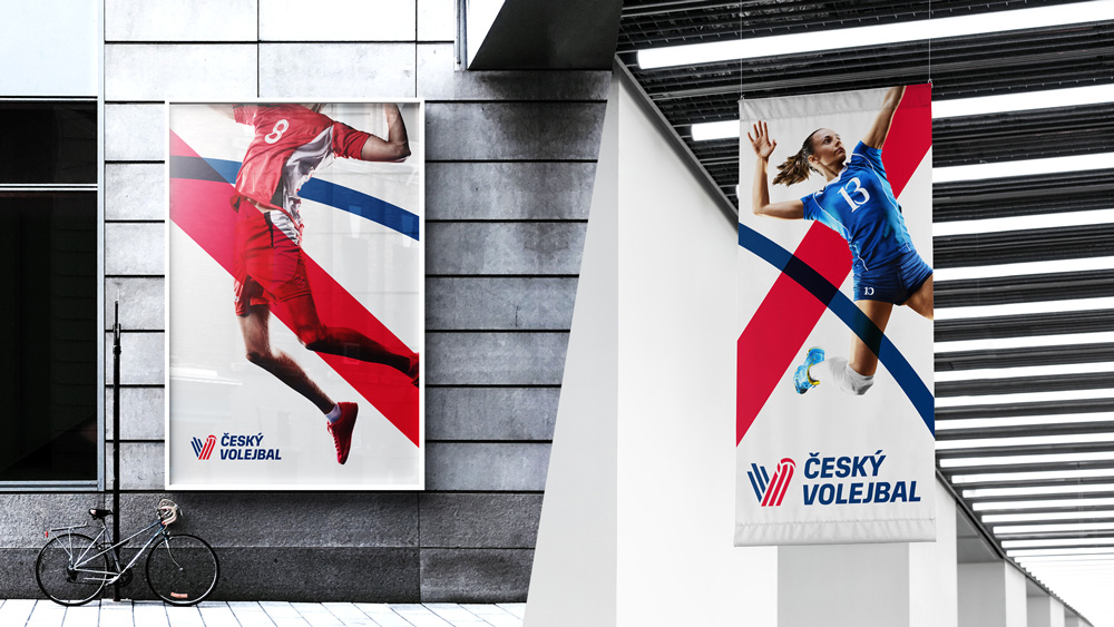
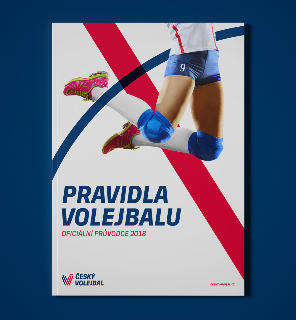
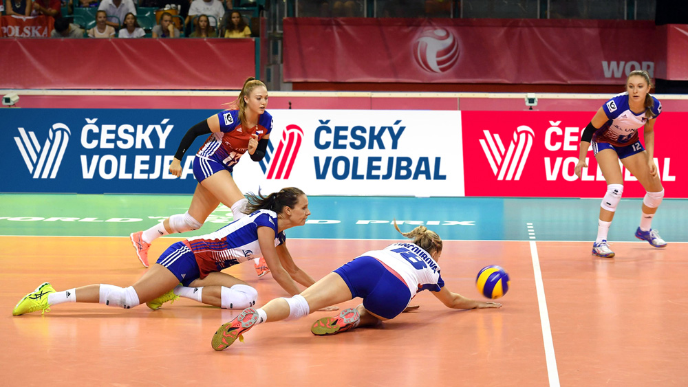
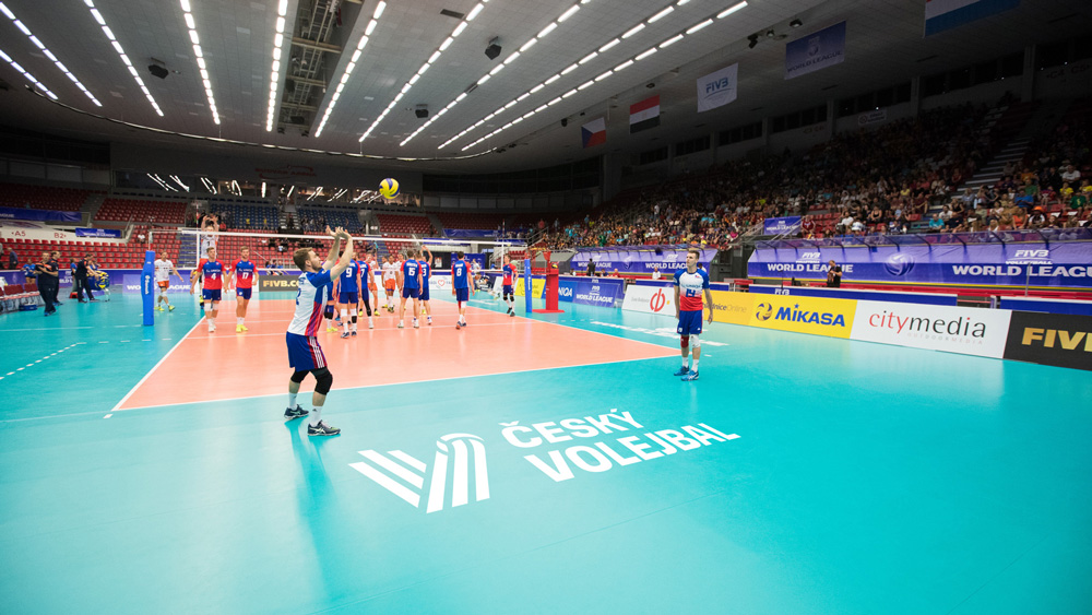
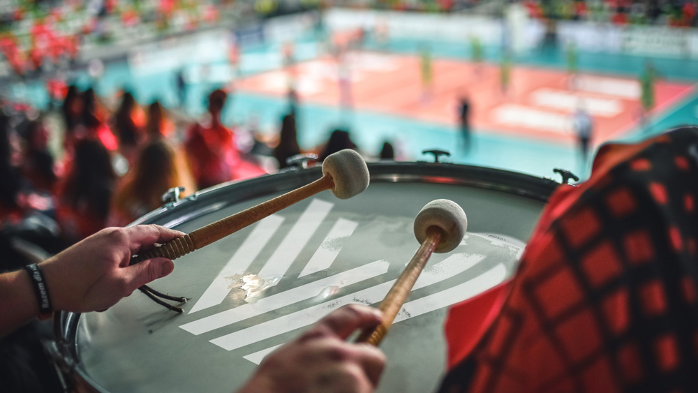
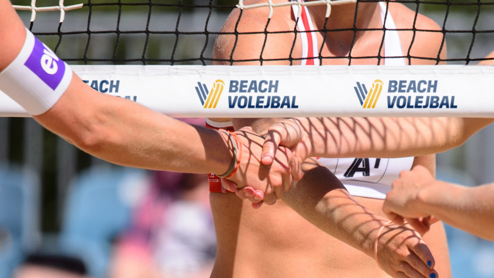
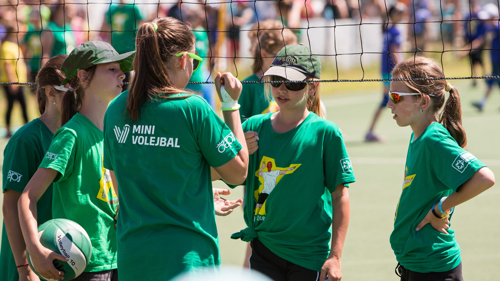
The applications are good… nothing too exciting but the right amount of energy and the photos of the players are well done and engagingly integrated with some bonus lines darting across layouts.
Overall, this manages to feel both classy and sporty, with a logo apt for the seriousness of a governing body as well as for the team-spirit of fans.
Thanks to F. S. for the tip.

 Новости Союза дизайнеров
Все о дизайне в Санкт-Петербурге.
Новости Союза дизайнеров
Все о дизайне в Санкт-Петербурге.