Обзор лучших ресурсов по разработке бренда, разработке упаковки
contact us | ok@ohmycode.ru
contact us | ok@ohmycode.ru
Opening its first location in the Summer of 2019 in New York, NY, Equinox Hotels is a new brand of luxury hotels — rooms start at around $700 — from, as its name implies, the brand that turned going to the gym into a luxury lifestyle choice, Equinox. While Equinox isn’t the biggest fitness club, with only 83 locations, it does have one of the biggest and most alluring (for some) personalities with its ultra sexy photography and all-black fashion style. Dialing down the ripped-body, fitness focus of the clubs, the hotel is more about the indulgence of chilling out in tricked out digs after working out. Equinox Hotels is already planning hotels in Houston, Chicago, and Los Angeles, with possible locations in London, and Hawaii. The identity has been designed by New York- and San Francisco, CA-based COLLINS.
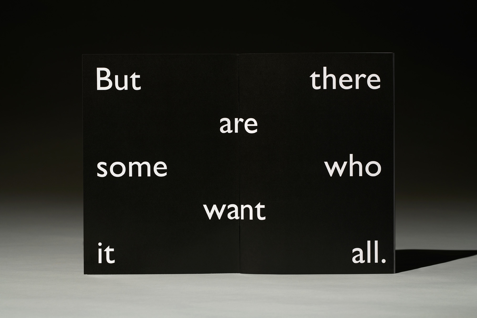
We defined the Equinox audience as those who are constantly striving to be better than who they were yesterday. It’s through this pursuit that they are lead to opposing extremes: Discipline and indulgence. Relentlessness and relaxation. Excess and absence.
They want it all. They go after it all. And they want a place that shares their appreciation for these collisions. For the all and the nothing.
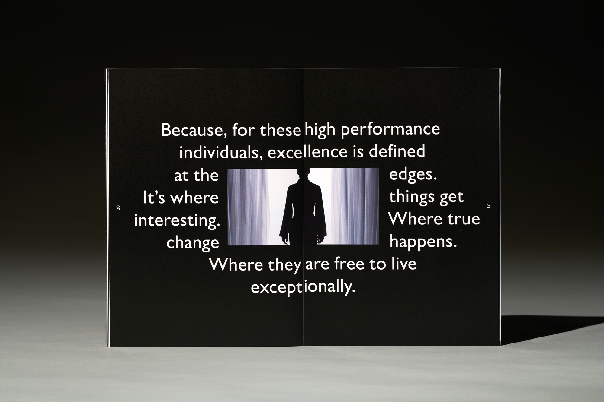
Apart from the price, getting a glimpse into who Equinox Hotels wants its audience to be (more here) is a pretty good indicator of whether staying at an Equinox Hotel is right for you. Spoiler: It’s not for me. However as not-for-me as it is and given the slightly douchey (for me, at least) way that Equinox markets its fitness clubs, the approach for the hotel brand, while still grandiose, is relatively restrained and even inviting.
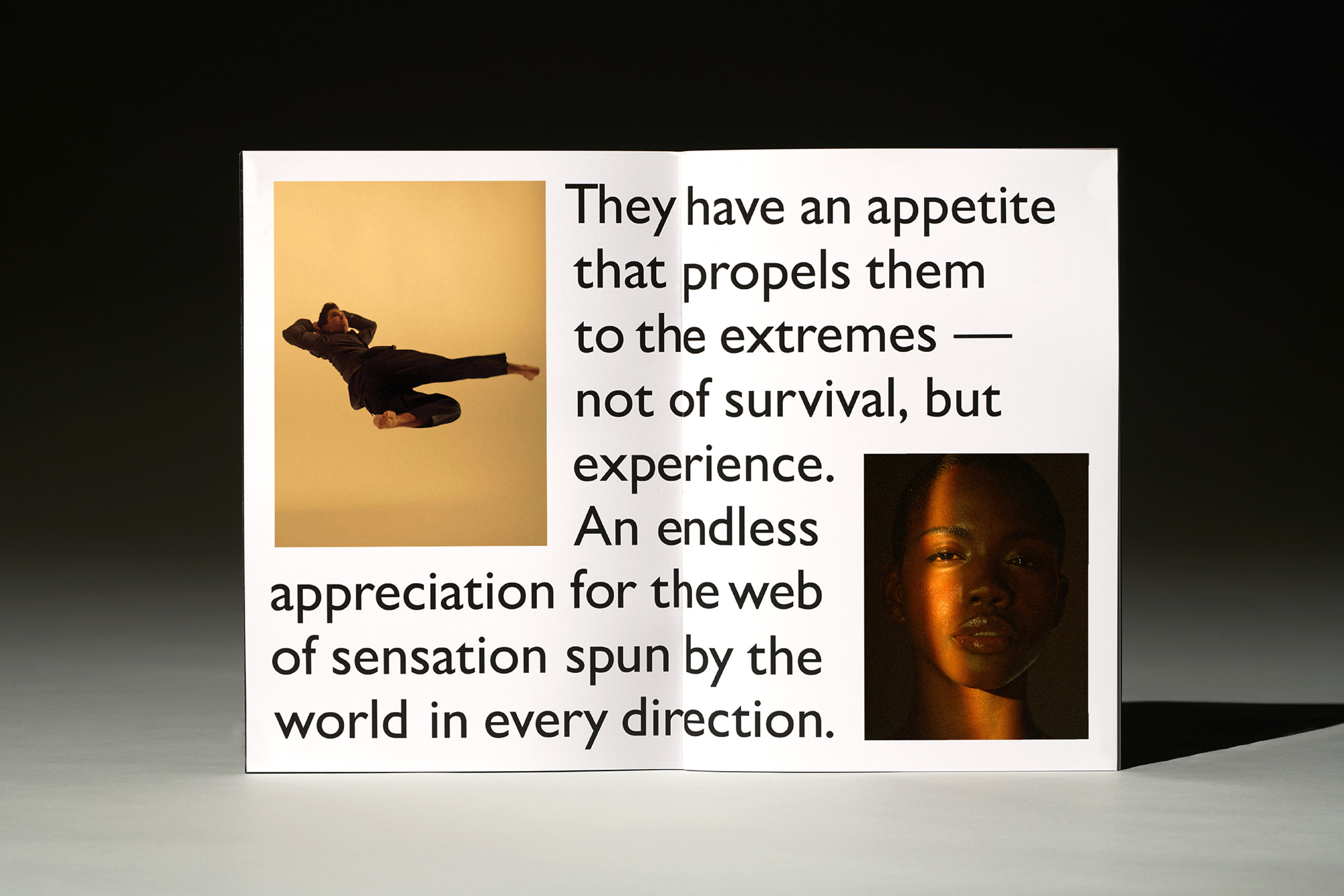
We believed these dualities could complement each other. By crafting an uncommonly disciplined brand — rooted in the idea of extremes — we embraced this philosophy. Light and dark. Warm and cool. Hard and soft. Up and down. Black and white. Near and far. These extremes define the new brand of Equinox Hotels.
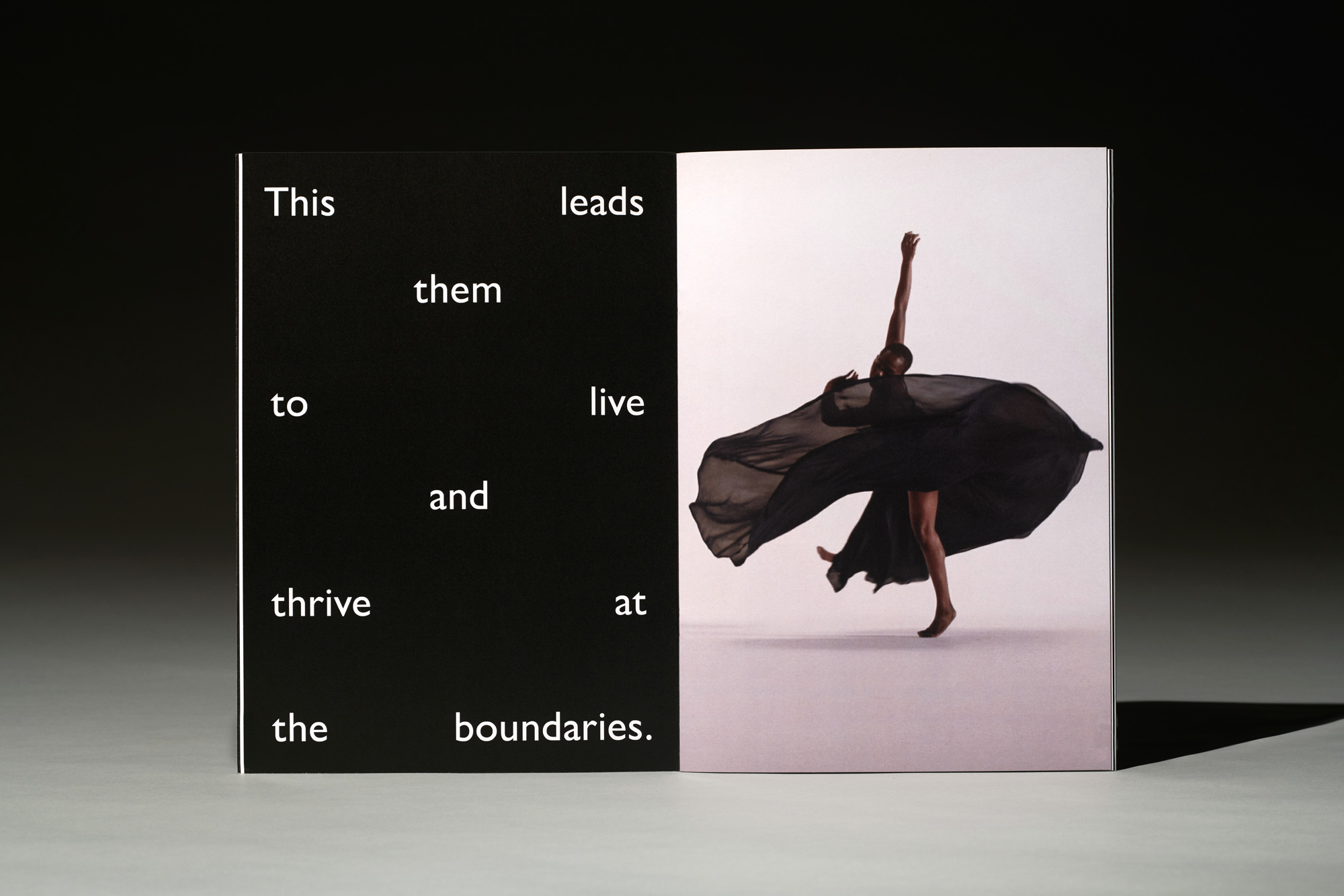
We looked to amplify the relevant equities built into the existing Equinox brand, yet elevate and evolve them. By taking a familiar graphic element from the original Equinox wordmark, for example, we could imbue it with new meaning and tell a new story. Now, in addition to inviting guests to work out with Equinox for a few hours, they are invited to stay for days. By embracing a tone of purposeful design restraint, we expand from the power of physical movement to the art of regeneration.
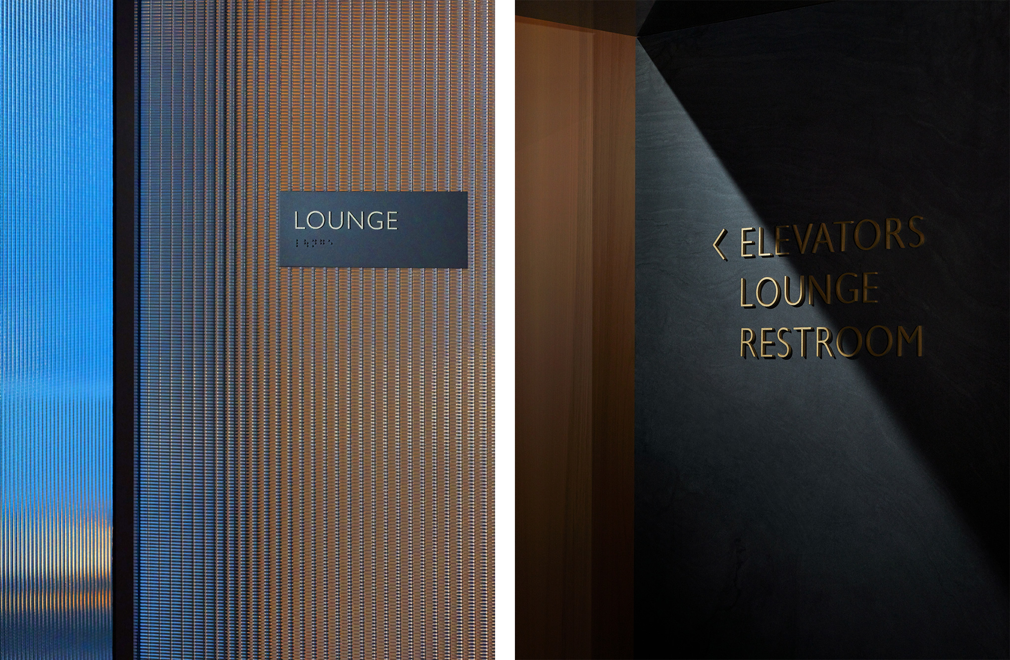
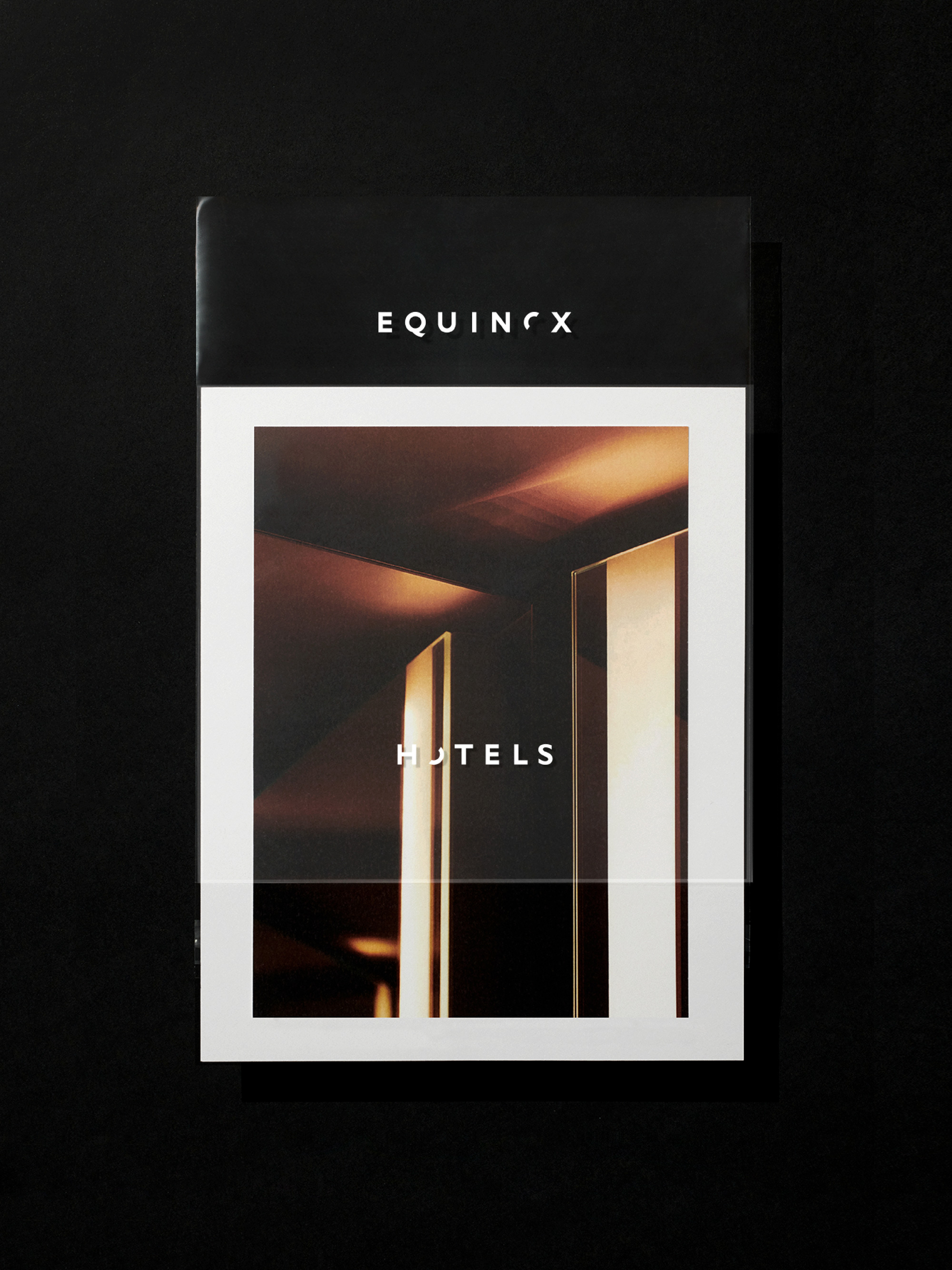
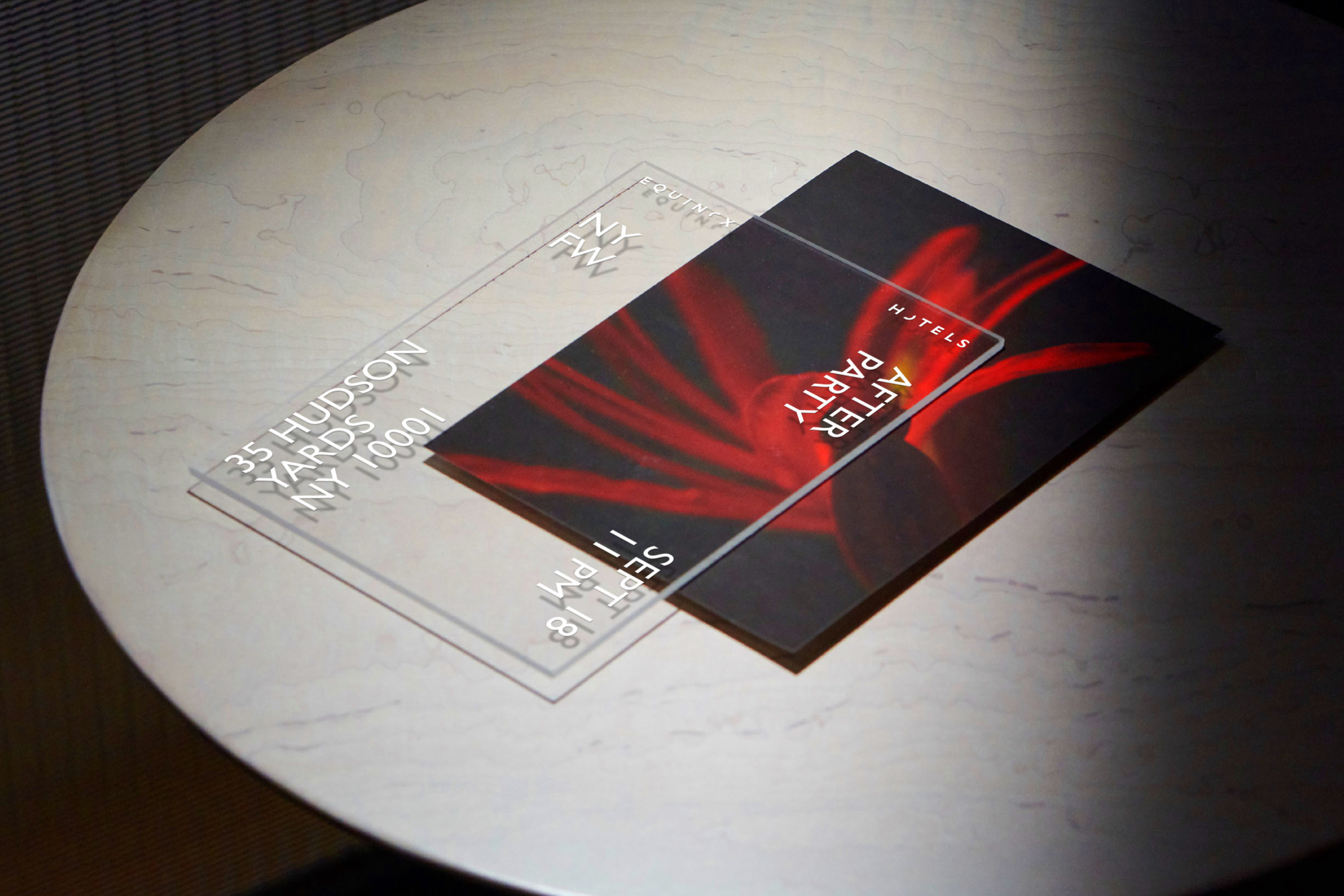
The logo is a really great and clever extension of the well-known Equinox logo, taking the stenciled “O” and splitting each of its halves amongst the two words, creating an abstraction of night and day, sun and moon, all while establishing an elegant and sophisticated wordmark. Not a whole lot else to say about the logo as it’s quite straightforward and very appropriate in its minimalism.
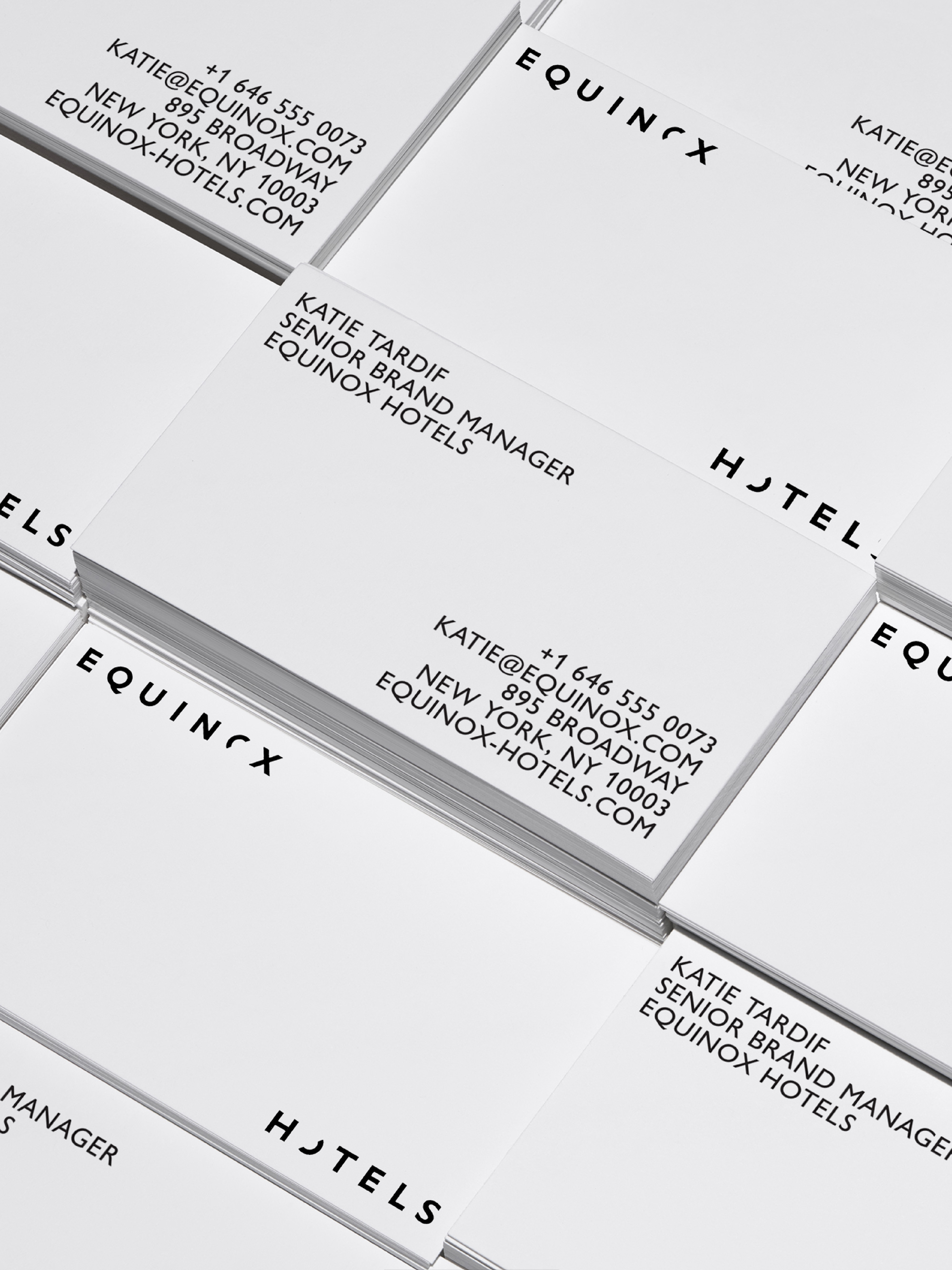
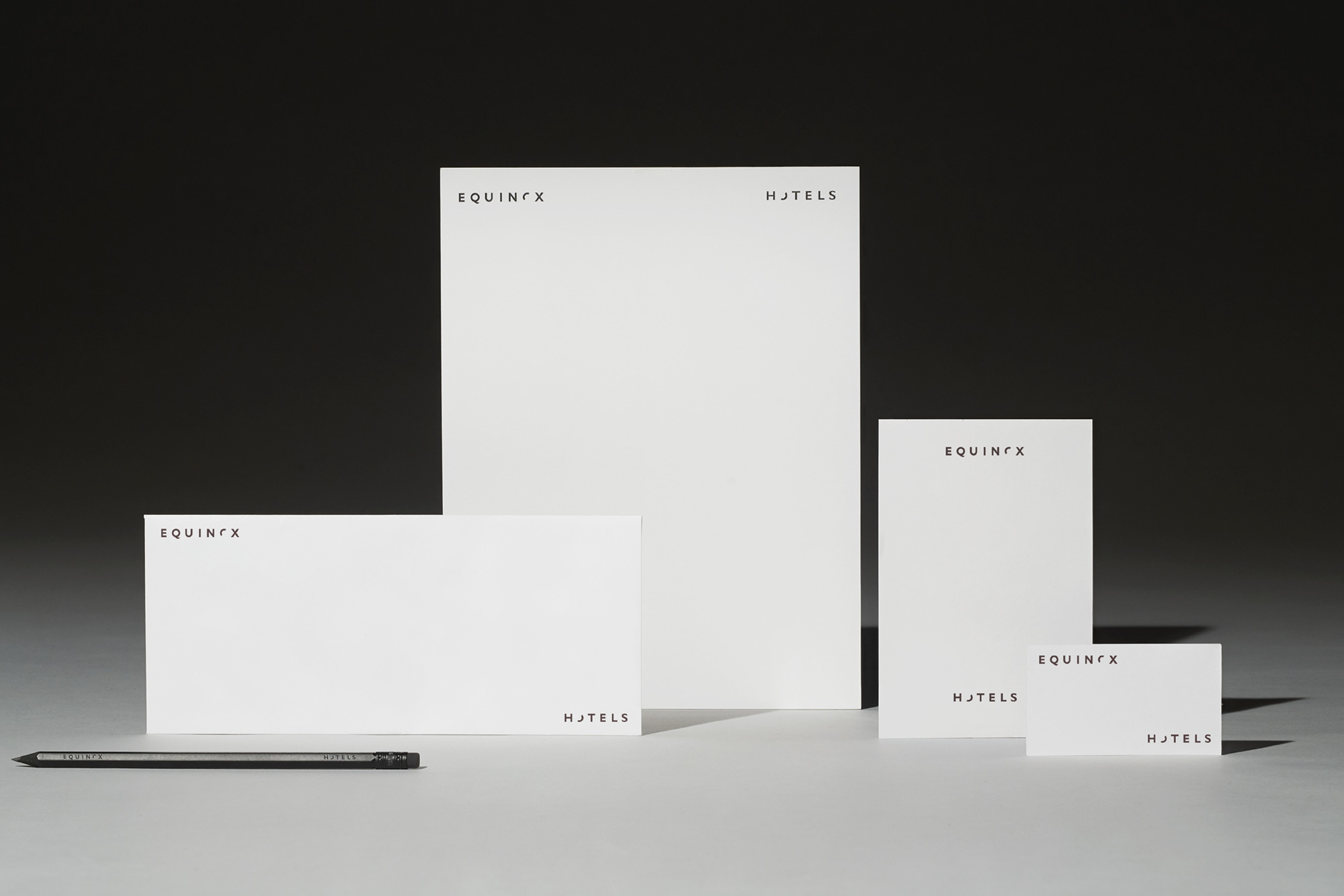


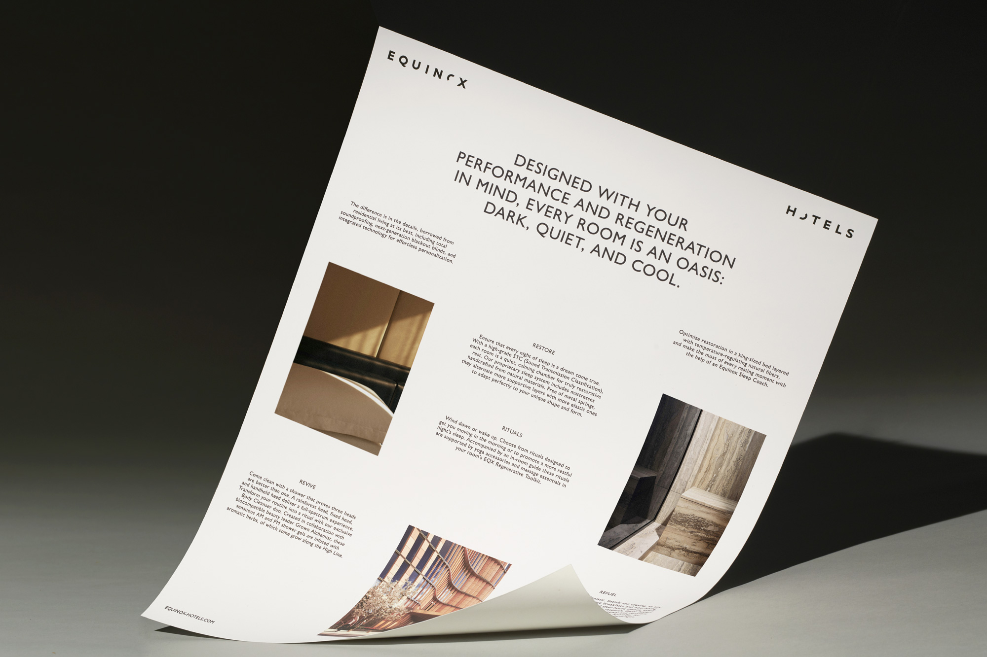
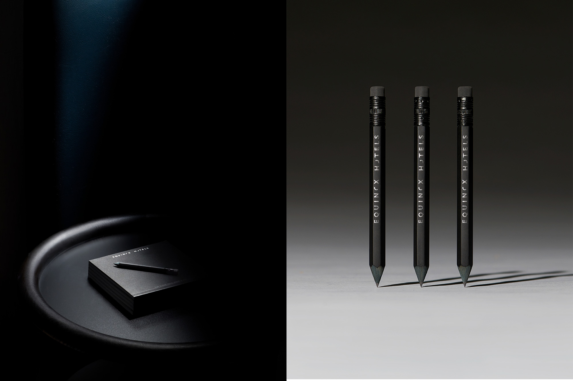
The applications are as restrained as the logo, with the bare minimum of design elements and a single weight of Gill Sans Nova used for the limited amount of additional copywriting and information. If you have read Brand New for more than a year, you have probably heard me diss Gill Sans but this application, in all uppercase and in one of the thinner weights, is Gill Sans at its best. Some of the photography and slow motion video is a little on the irritating side but, again, I’m not the target audience.
The brand is built to embrace the distinct tones of each location, acting as a framework for the unique qualities of each city. The first Equinox hotel launched in New York City’s Hudson Yards, with plans to open doors in several cities across the globe.


Overall, this is a perfect embodiment of the Equinox brand properly adapted to luxury hospitality — whether it’s your cup of tea or not, that’s another issue and you can always sip that cup of tea at a Holiday Inn… with me.
 each year since publication began in 2006

 Новости Союза дизайнеров
Все о дизайне в Санкт-Петербурге.
Новости Союза дизайнеров
Все о дизайне в Санкт-Петербурге.