Обзор лучших ресурсов по разработке бренда, разработке упаковки
contact us | ok@ohmycode.ru
contact us | ok@ohmycode.ru
Opened this month (June 2019 for future readers), Saint Kate is a new arts hotel in downtown Milwaukee, WI. Named after Saint Catherine of Bologna, patron saint of artists, the 219-room hotel features not only the necessary artist-designed rooms — like this leopard-spot-filled room by Lon Michels — to be deemed an arts hotel but takes things further by having a black box theater with its own resident theater troupe as well as a 1,700-square-foot outpost of the Museum of Wisconsin Art. The identity for Saint Kate has been designed by Chicago, IL-based One Design Company.
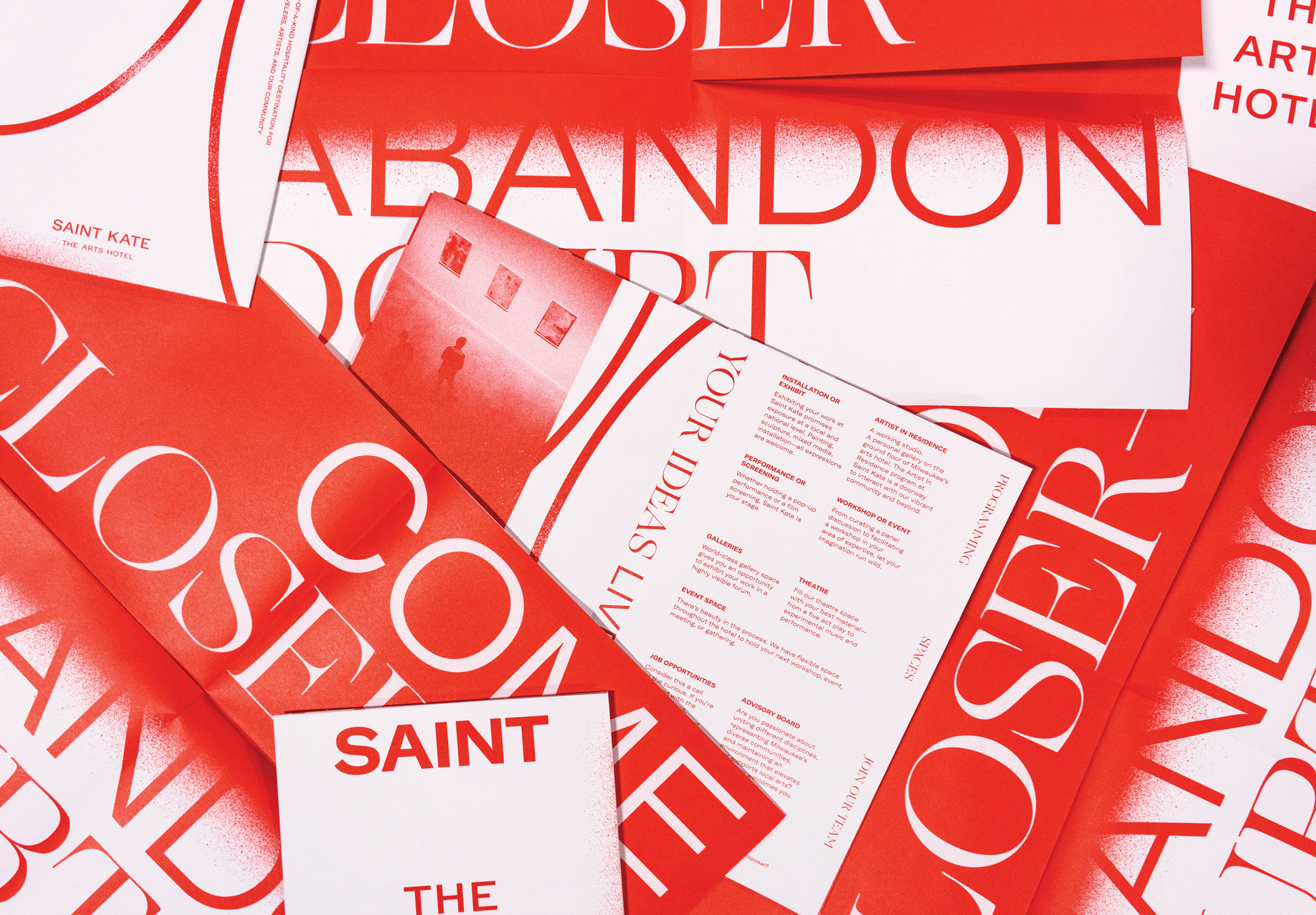
The Saint Kate brand hinges on programming—from visual artwork to performance. It’s a living, breathing, evolving space. Far from an ordinary hotel with a static white box gallery, Saint Kate celebrates the process of creative exploration and craft. Guests—from travelers to event-goers to local makers—are encouraged to participate in the thrilling, often messy, and always unexpected process of exploration and creation. Rotating shows, programming partnerships, a formal artist-in-residence program, pop-up performances, and regular classes and workshops bring this promise to life.
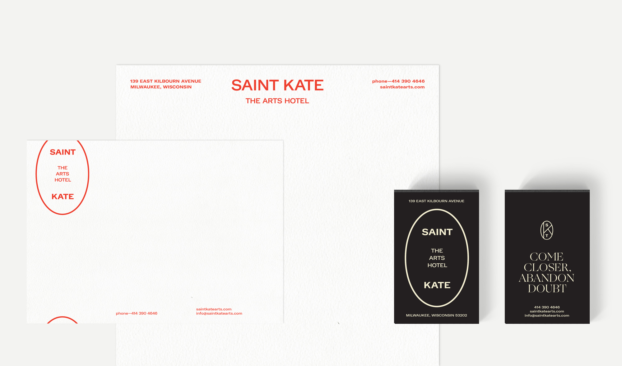
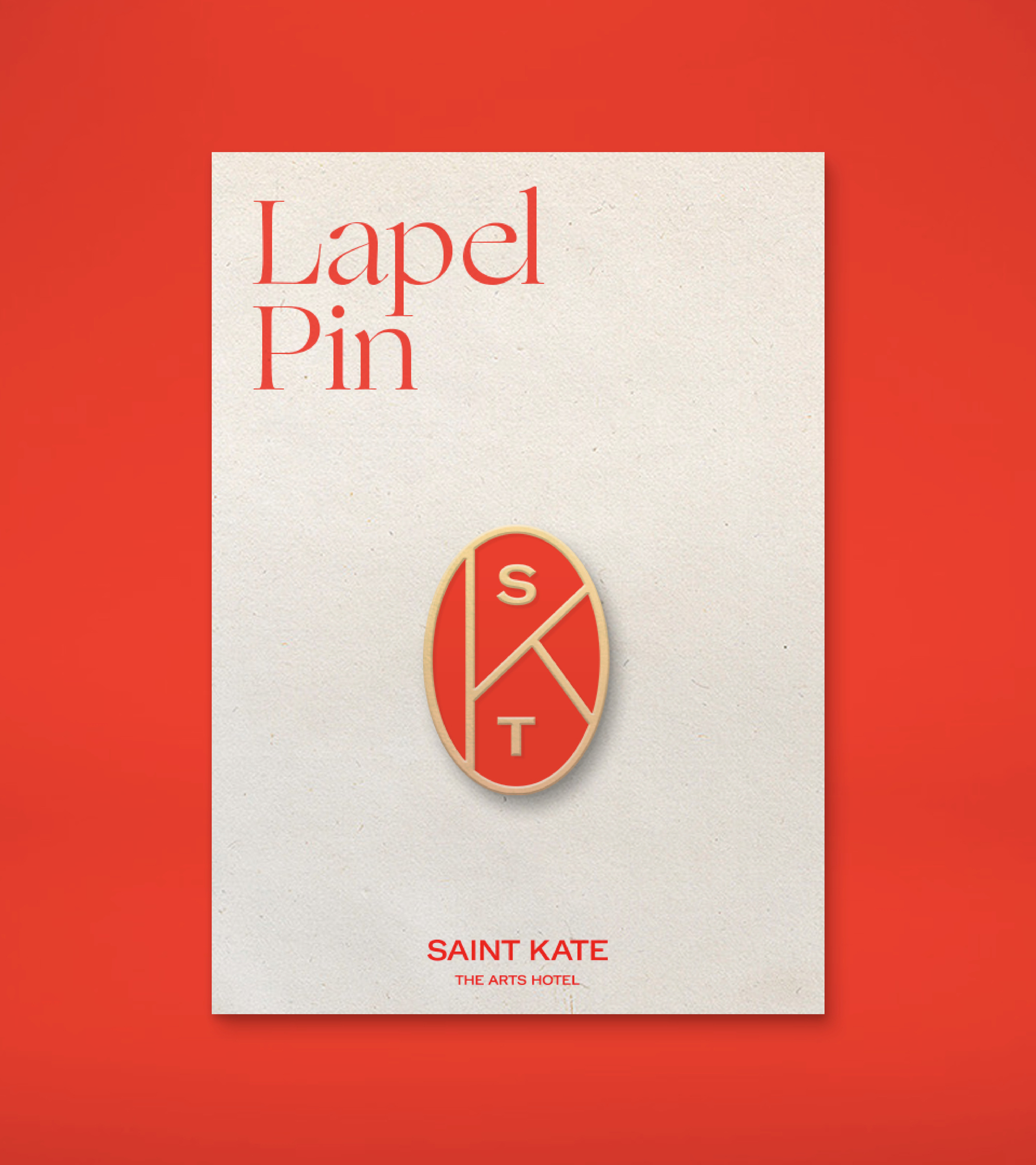
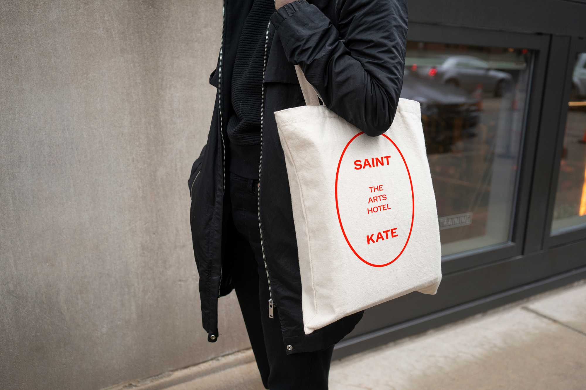
The oval of the mark—a formal nod to printer seals, crests, and vignettes of the past— represents a frame or a lens: a window leading to a new perspective; a portal to an unexpected experience.
While the logo follows a certain trend — somewhere between deadpan fashion and too-hip-to-care fashion — with an aloof uppercase sans serif, GT America Extended in this case, the composition inside a vertical oval is a relatively surprising twist, in the sense that it’s not a square composition designed to fit into social media avatars by default, that makes it different and a little more engaging. The name, Saint Kate, being so widely separated vertically, creates good tension in the logo and the designation as “The Arts Hotel” stands out quite well within that space. It seems elementary but deserves praise as it’s a common occurrence to the contrary: I like how the stroke of the oval matches the thickness of the typography. The additional logo things are all okay, if a little too precious — the “SKT” monogram is interesting, looking almost like a stained glass composition, but the other encased things are maybe a little gratuitous. Still, a flexible suite of stuff that does get put to use throughout the identity. The all-red approach is cool, perhaps a little on the aggressive side, but the airiness of the identity softens it.
The Saint Kate identity balances two functions simultaneously: it’s a supportive visual framework for artistic expression, as well as a vibrant and memorable voice for the hotel itself. The typography-driven design language is the foundation for a system that can be dialed up or down as needed for appropriate and exciting solutions in any given situation.
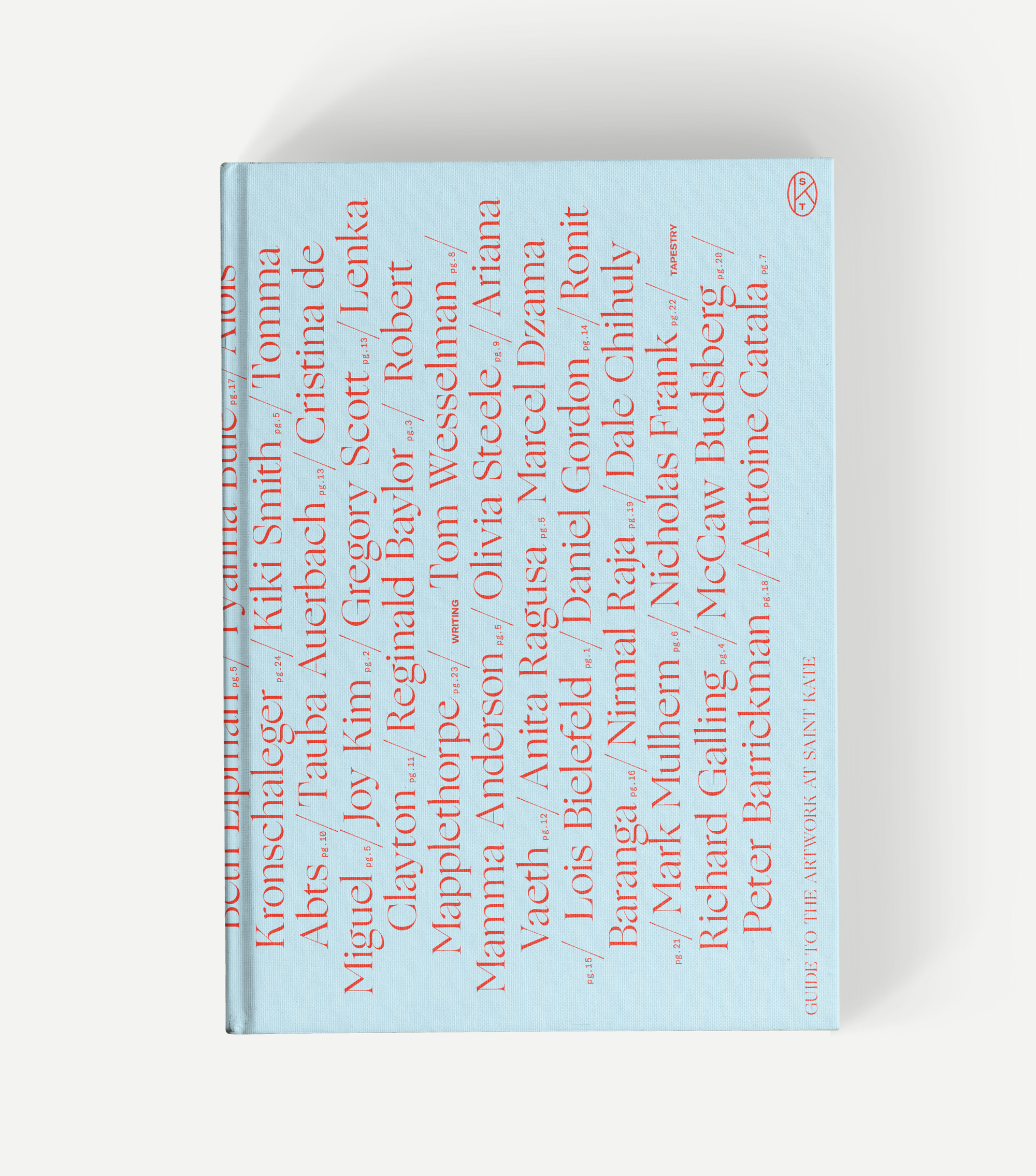
Saint Kate’s visual language is a study in flexibility and contrast, breathing life into a wide range of touchpoints from the guest rooms to the public space: environmental signage, collateral, gallery guides, a regular publication, hotel amenities, the website, and more are all united through a consistent thread of design expression.
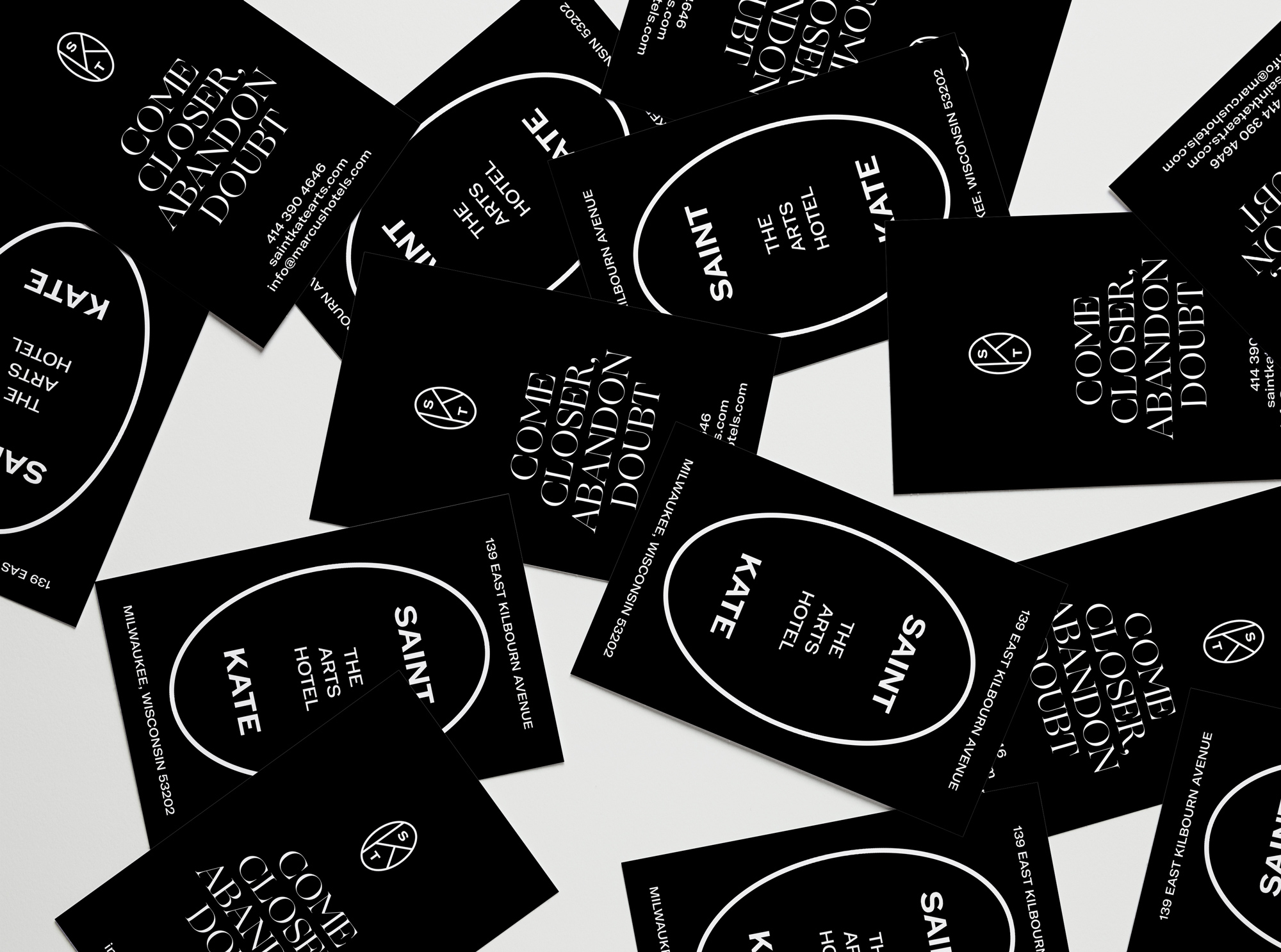
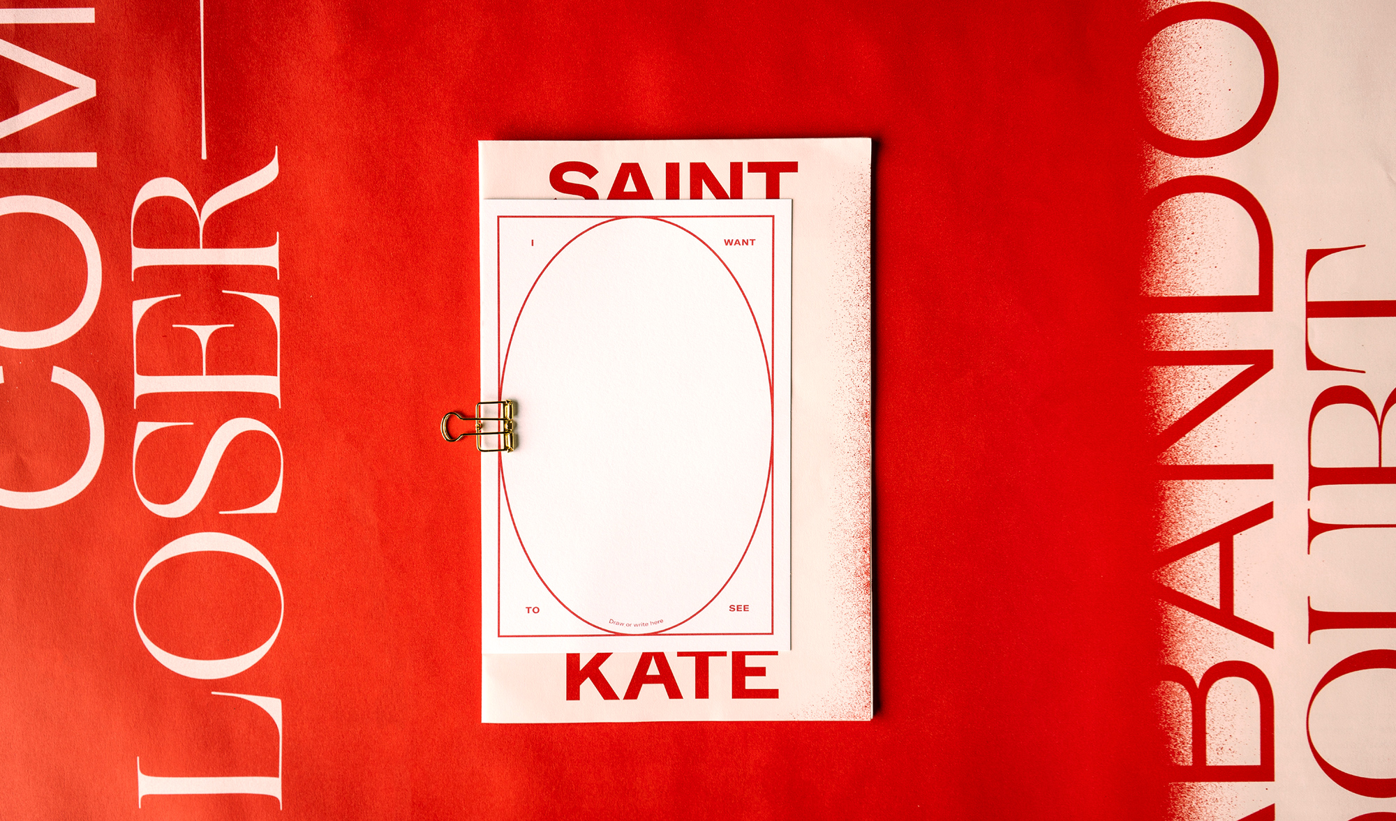

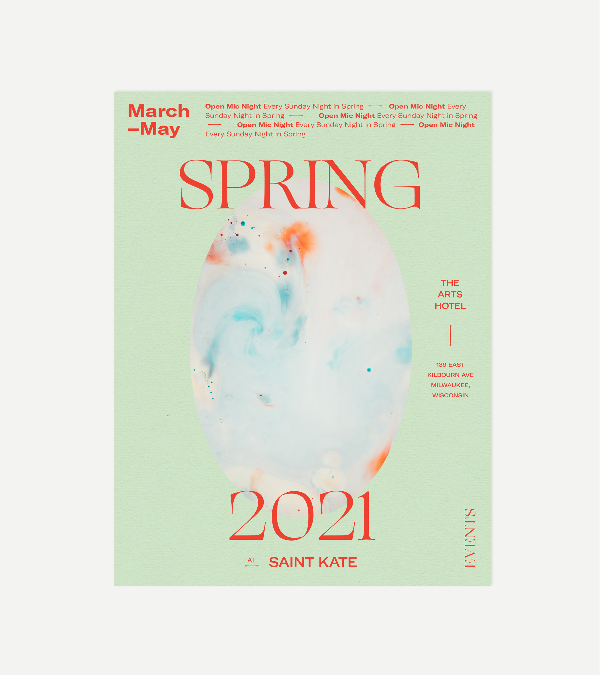
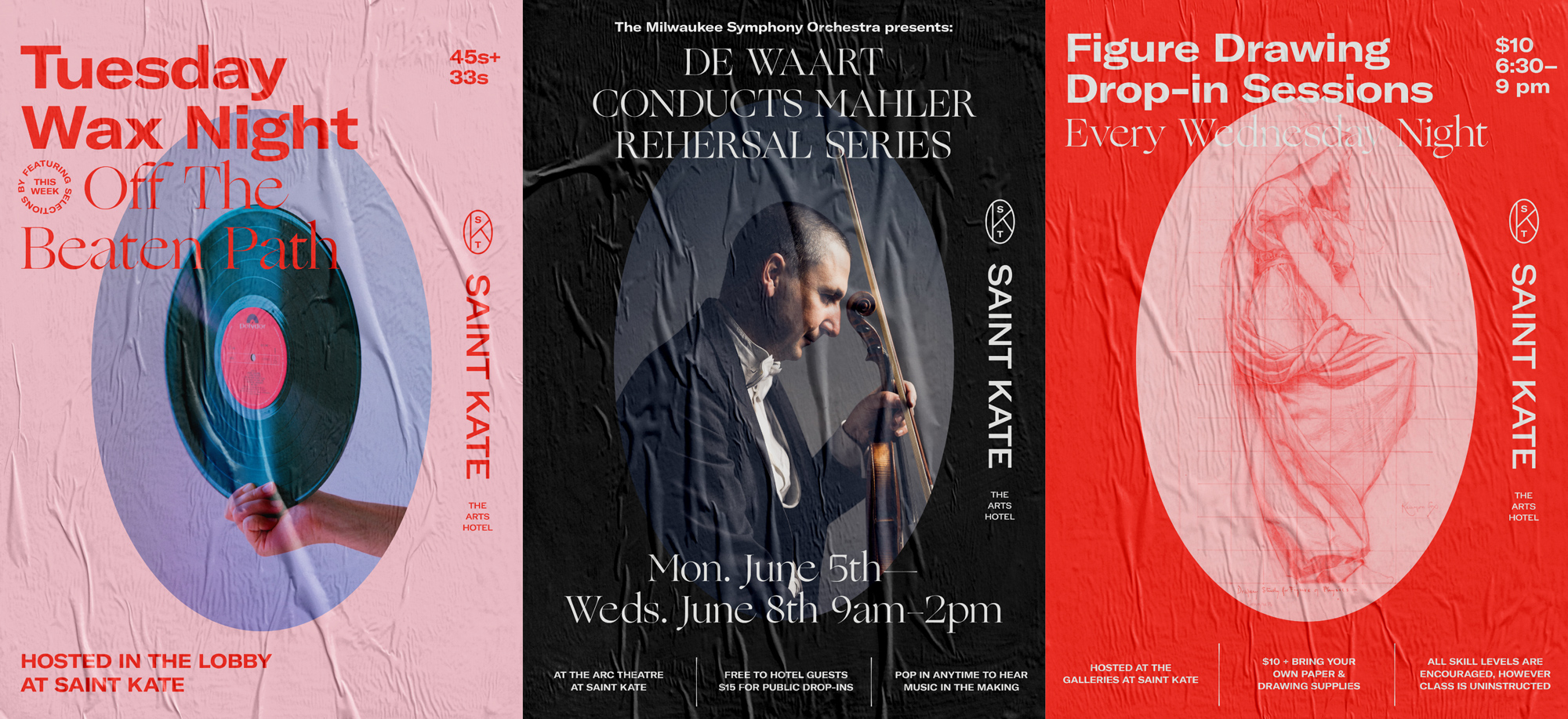
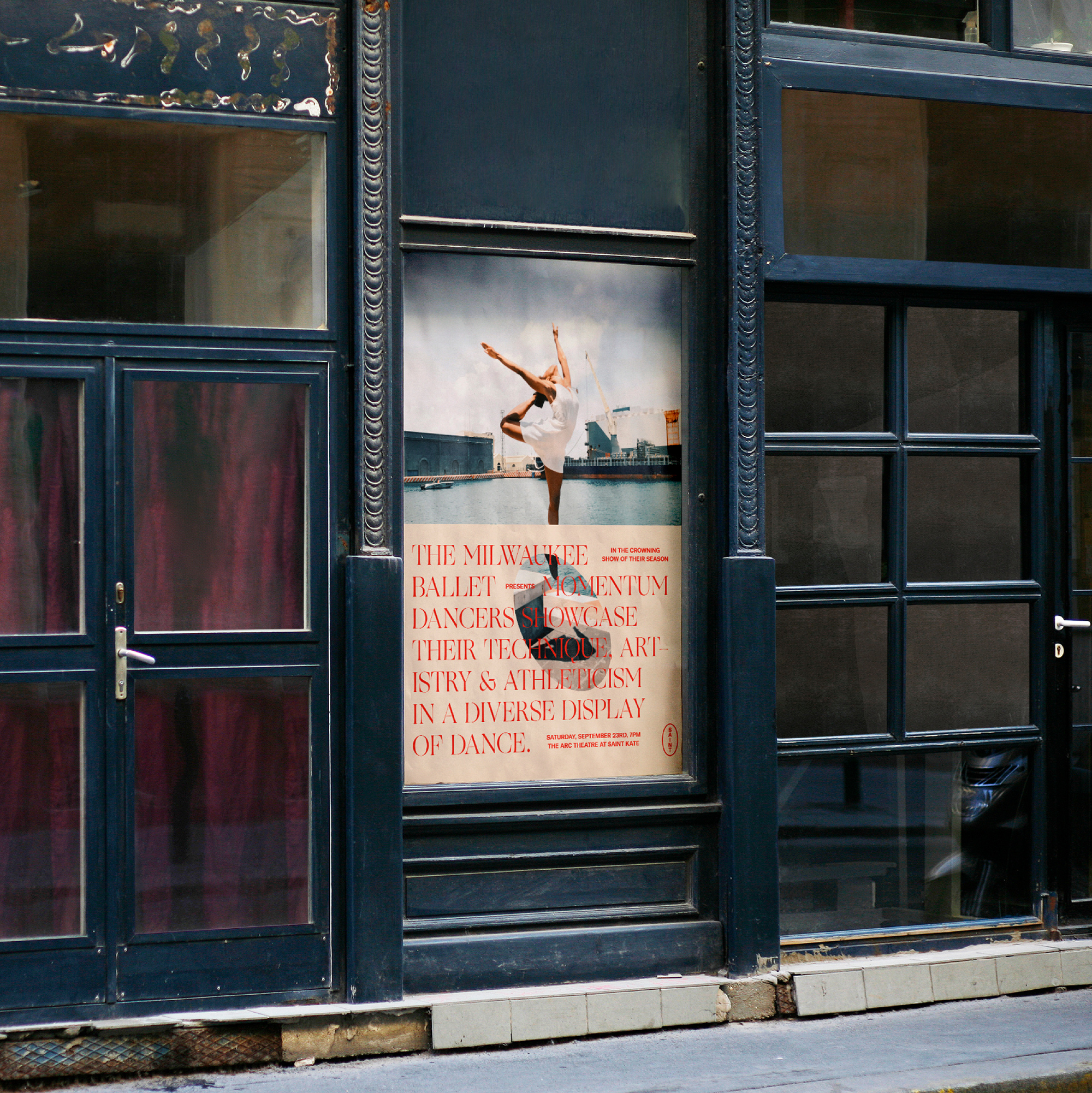
In application, the identity throws Sharp Type’s Ogg into the mix, which adds a quirky, artsy ingredient that, in its lightness, pairs very well with GT America. The subtle use of the oval as a window is very nicely handled (as seen in the posters one image up) by creating a recurring motif but without being too overbearing. The overall vibe of the compositions is a little Hipster/Brutalist but stops a few degrees short of being too much.
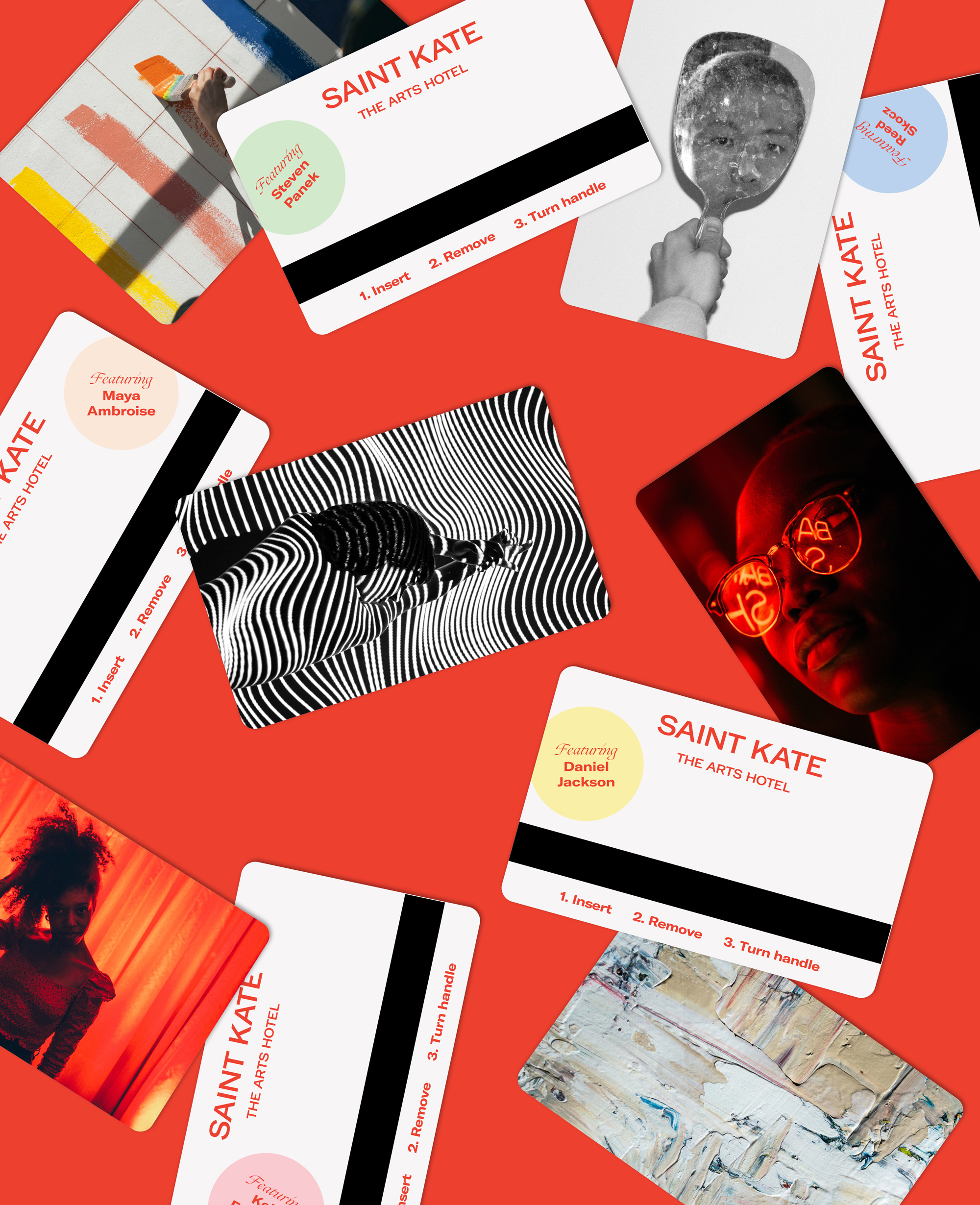
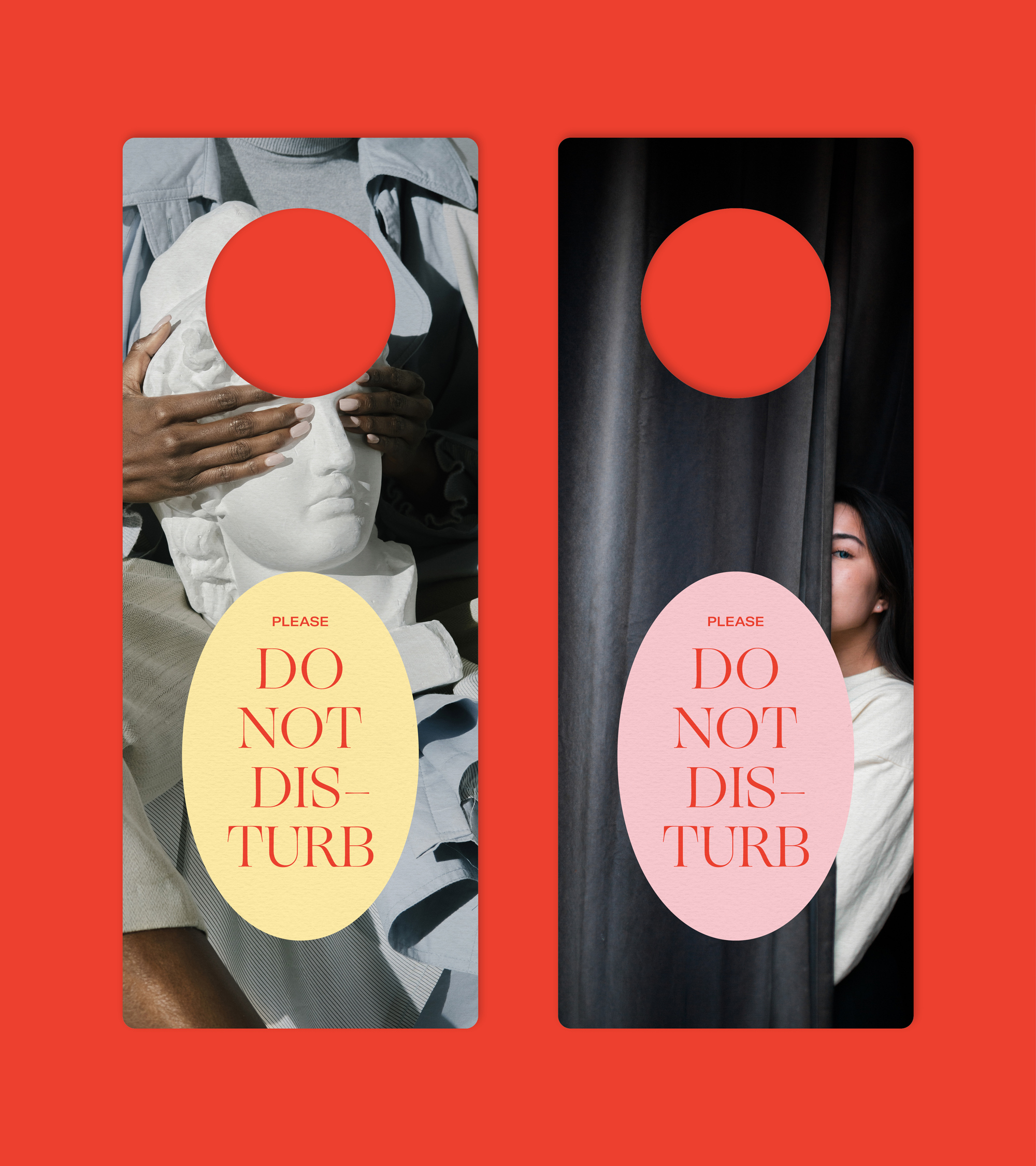
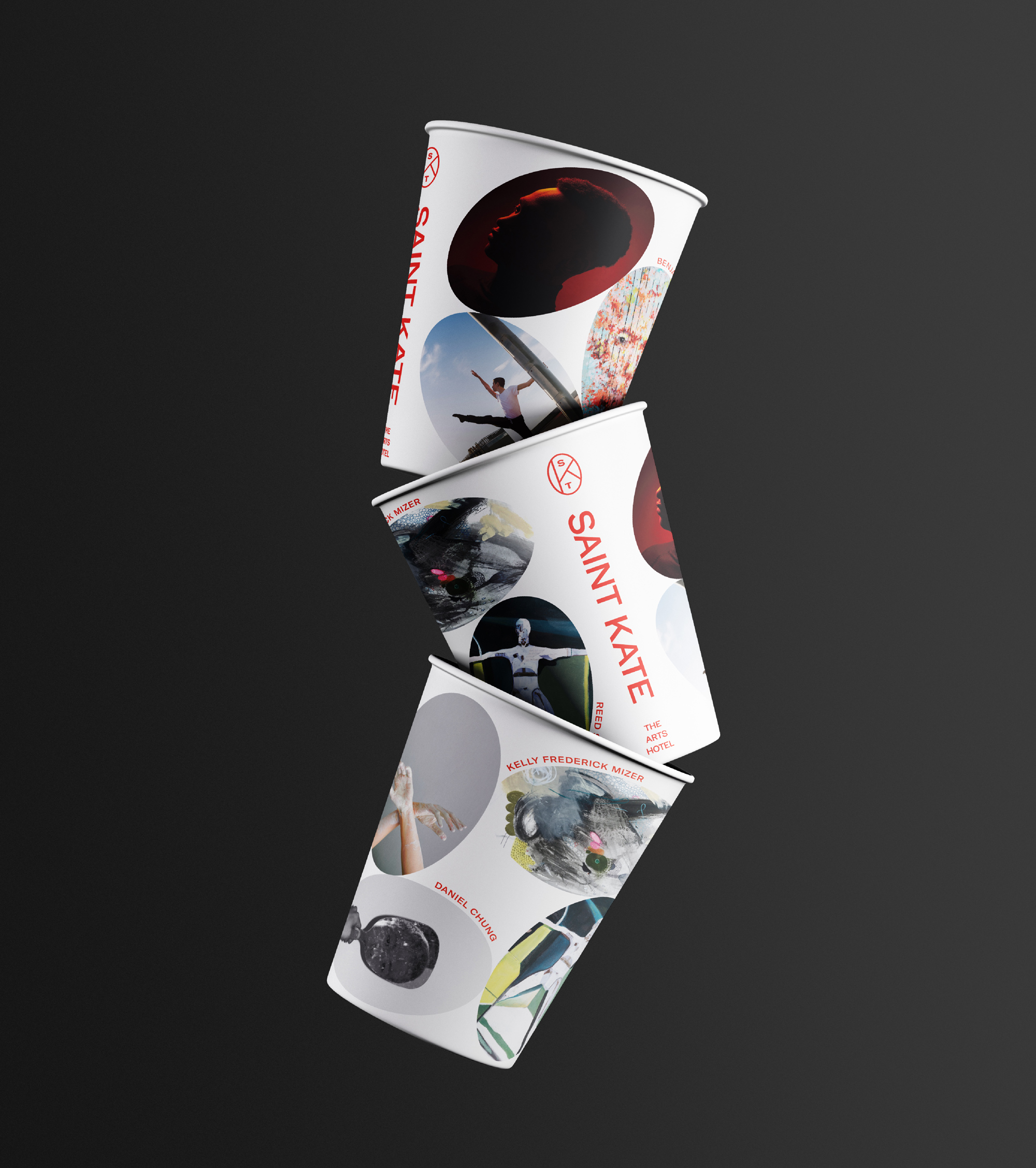
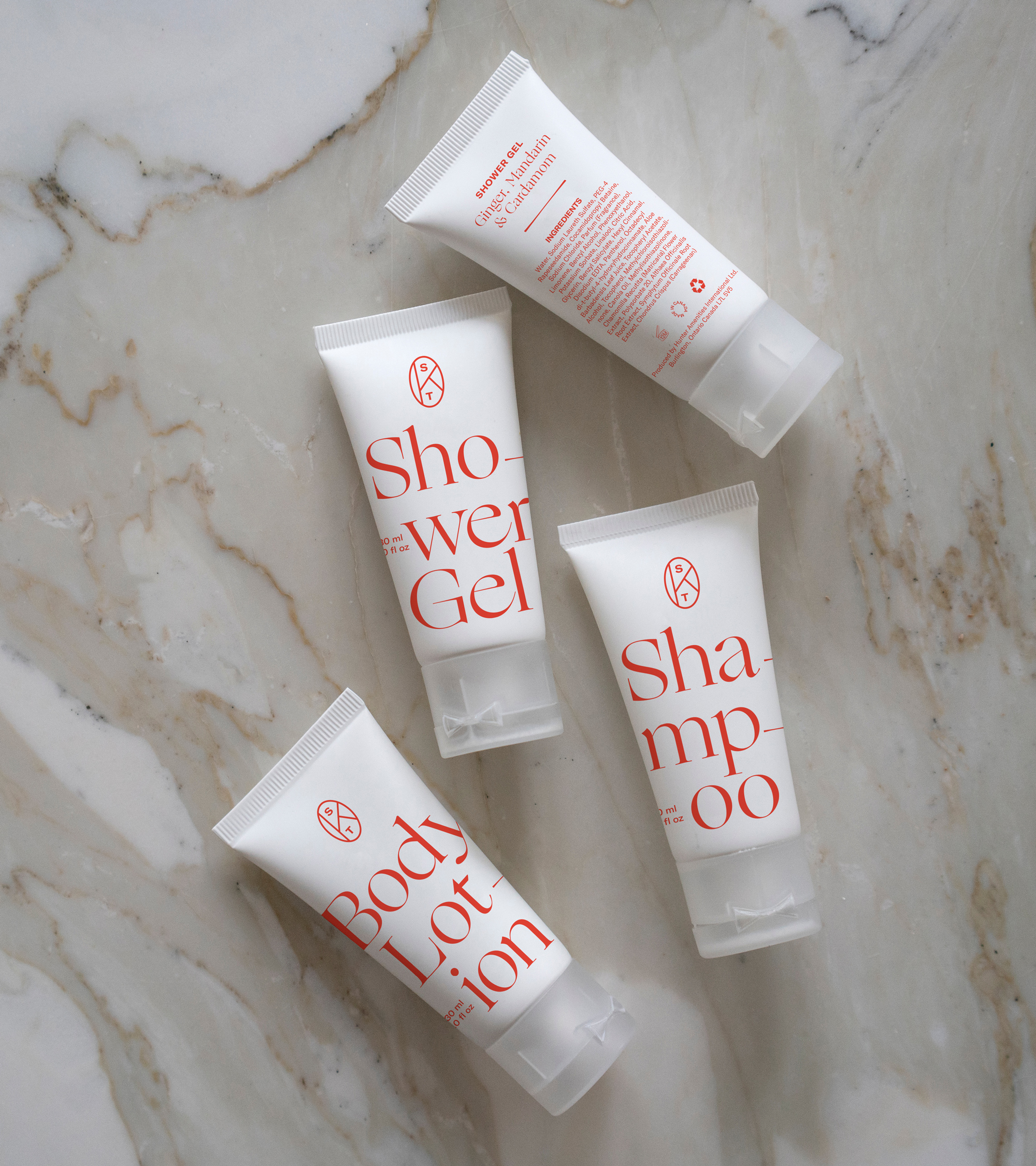
The hotel accoutrements are all quite nice as well and I like how they mix photography in relatively unexpected places like the keycards and coffee cups. Speaking of the latte-r (haha, get it?) I also enjoy the secondary use of the ovals, where many can be stacked at different angles — it creates a bold and fun alternate but still related aesthetic that’s very interesting. And the tiny shampoo bottles are killing it.
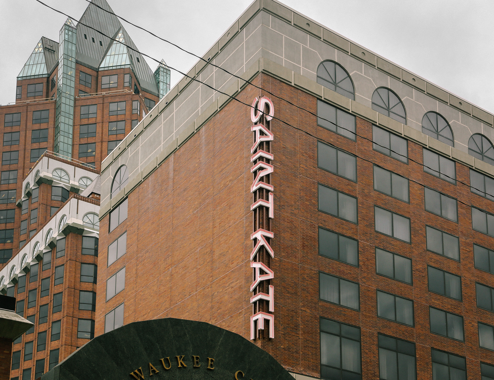
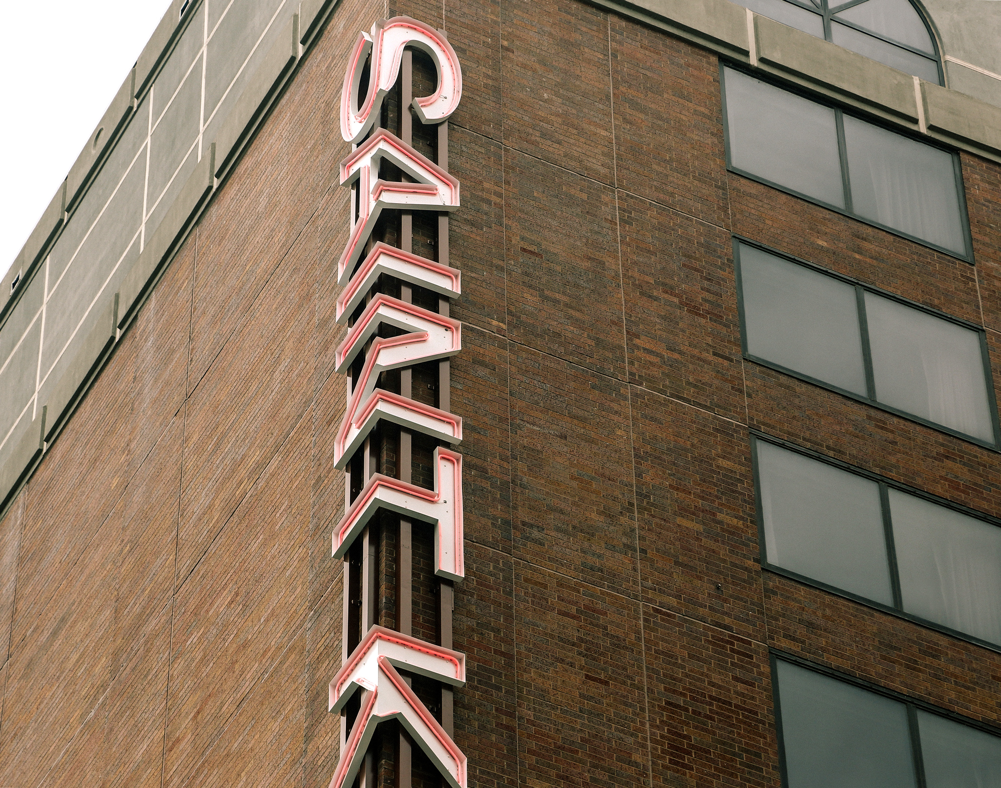
As cool as the sign is, it’s the one thing that somehow feels off, with the heavy division down the middle of the word, which is not something that happens in the applications. Still, as a beacon for the hotel, it’s hot. Overall, the identity fits very well with the arts mission of the hotel and the language used to present it — at times causing a bit of eye-rolling to be honest (e.g. “Saint Kate is more than a hotel. This is a venue—a platform for exploration, connection and expression.”… it’s a hotel, folks) — and it certainly commits to a specific personality and delivers on it across the board.

 Новости Союза дизайнеров
Все о дизайне в Санкт-Петербурге.
Новости Союза дизайнеров
Все о дизайне в Санкт-Петербурге.