Обзор лучших ресурсов по разработке бренда, разработке упаковки
contact us | ok@ohmycode.ru
contact us | ok@ohmycode.ru
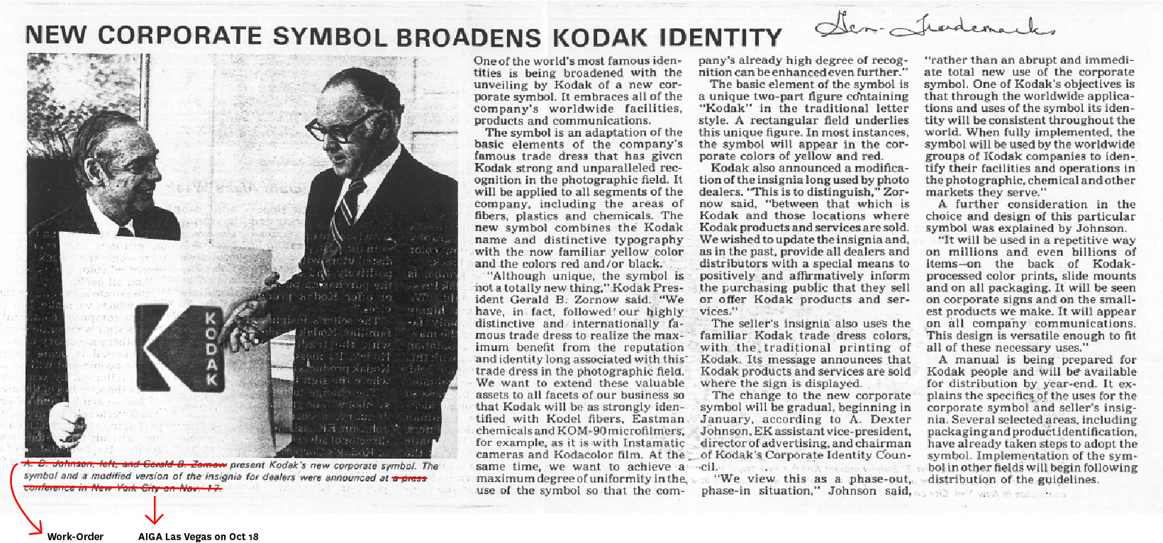
Established in 1888, Kodak is a technology company focused on imaging. Long associated with consumer cameras, film, and waiting days before you could see your crummy vacation pictures, Kodak has been more relevant at the professional and business level with print systems and other enterprise solutions. Officially, it now offers “hardware, software, consumables and services to customers in graphic arts, commercial print, publishing, packaging, electronic displays, entertainment and commercial films, and consumer products markets.” Getting back into the consumer market, Kodak recently released the Ektra, a photography-first smartphone, and at CES this year announced the return of the Super 8 camera and film. To gradually coincide with this return as a more general consumer brand, Kodak has reinstated its iconic logo with a typographic and identity update by New York, NY-based Work-Order.
“I don’t think of what we’re doing as ‘bringing back’ the iconic identity of Kodak, because in people’s hearts and minds, I don’t think it really went away. It’s simply logical to keep one of the world’s most famous brand marks at the forefront of the company’s image and identity.
We did need to make some updates to the identity design to distinguish it from former eras of Kodak. The latest iteration needed to feel fresh, yet classic, yet sit harmoniously alongside a range of logos that you still see on signage and packaging around the world. Our goal is to amplify what is already memorable and resonant around the world.”
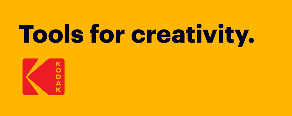
Our goal: to reinstate Kodak’s Trade Dress colors and the Kodak K symbol, update the logotype and provide a simple system based on the colors, the logo and the typeface Graphik.
Rollout strategy: We want the logo to be part of the organic structure of corporate rebuilding, appearing on new initiatives and informing future decisions. We don’t see this as a big branding announcement. Instead, we seek a dialogue about honoring a legacy and letting a company rebuild with integrity and dignity.
The old logo was a drastic change when it came out in 2006 as it was a very adamant retiring of the camera-shutter icon introduced 35 years before and one of the most identifiable logos ever. I never quite liked the “a” in that logo but to its credit it preceded the geometric sans trend by about eight years. Returning to the classic icon makes sense as it doesn’t feel like an ashamed-undo but rather an acknowledgment that this logo has a place in people’s minds and that it has the strength to re-establish a confident, history-rich consumer brand.
The new typographic treatment that accompanies the icon is a great way to indicate that this is the trusted Kodak people know but that it comes with, if not all, at least one gun blazing to reinstate its coolness. Doing vertically-stacked type is not easy and pretty much every client in the world will say no to a solution like that so that alone signifies a willingness to stand out. It’s a great way to modernize the icon and offer a fresh take on what it can do. The visual presence of the name inside the icon is less in volume than the original but that allows the icon to have more elbow room and better highlights the name as well as giving more the impression of a digital projection. It’s also super refreshing to NOT see a geometric sans here, which would have been the obvious solution, and instead we have a lovely, slightly wider sans that fills that space better. Ultimately, what this logo achieves successfully is establishing a revival of the old through a contemporary approach.
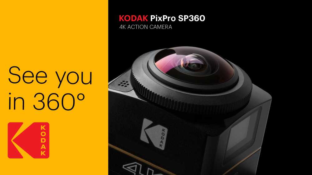
The new identity will rely on Commercial Type’s Graphik and will follow a more hierarchical approach (as seen in the brand extensions) to consolidate all the different offerings and promotional messages.
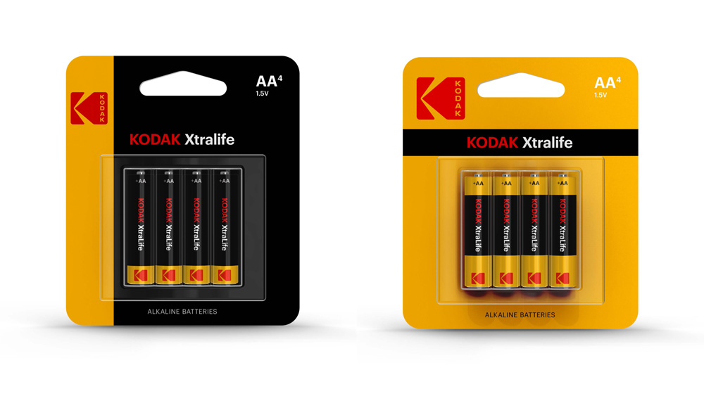
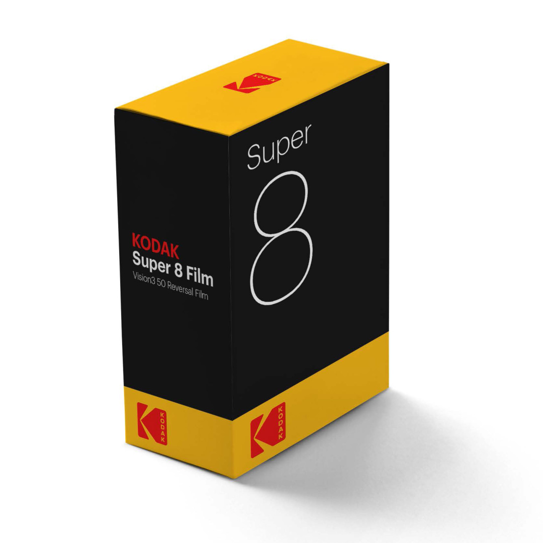

The packaging prototypes, still in proof-of-concept phase, have a minimalist and elegant aesthetic that, if carried through to market as is, will have a lovely shelf presence and put it on par with Apple’s packaging. I say “if” because the type of Kodak stuff that’s currently on the market looks like this once all the guarantees and promises and compatibilities are added to the otherwise pristine comps. Nonetheless, the hope and strong design foundation are there.
Overall, this is a great redesign or reboot or restart or whichever way this wants to be positioned. It capitalizes on the current acceptance of nostalgia by bringing back a classic icon and it builds on it with a simple, confident aesthetic.

 Новости Союза дизайнеров
Все о дизайне в Санкт-Петербурге.
Новости Союза дизайнеров
Все о дизайне в Санкт-Петербурге.