Обзор лучших ресурсов по разработке бренда, разработке упаковки
contact us | ok@ohmycode.ru
contact us | ok@ohmycode.ru
(Est. 1881) “Woodbine Entertainment Group, Inc. operates horse racing tracks in Canada. It also operates off-track wagering at its Champions teletheatres; and remote wagering through HBIbet, the company’s telephone, Internet, and mobile account wagering service. The company also operates HPItv, a CRTC licensed digital television channel that broadcasts its racing product into homes in Canada. Woodbine Entertainment Group, Inc. was formerly known as Ontario Jockey Club and changed its name to Woodbine Entertainment Group, Inc. in June 2001. The company was founded in 1881 and is based in Toronto, Canada.”
Concrete (Toronto, Canada)
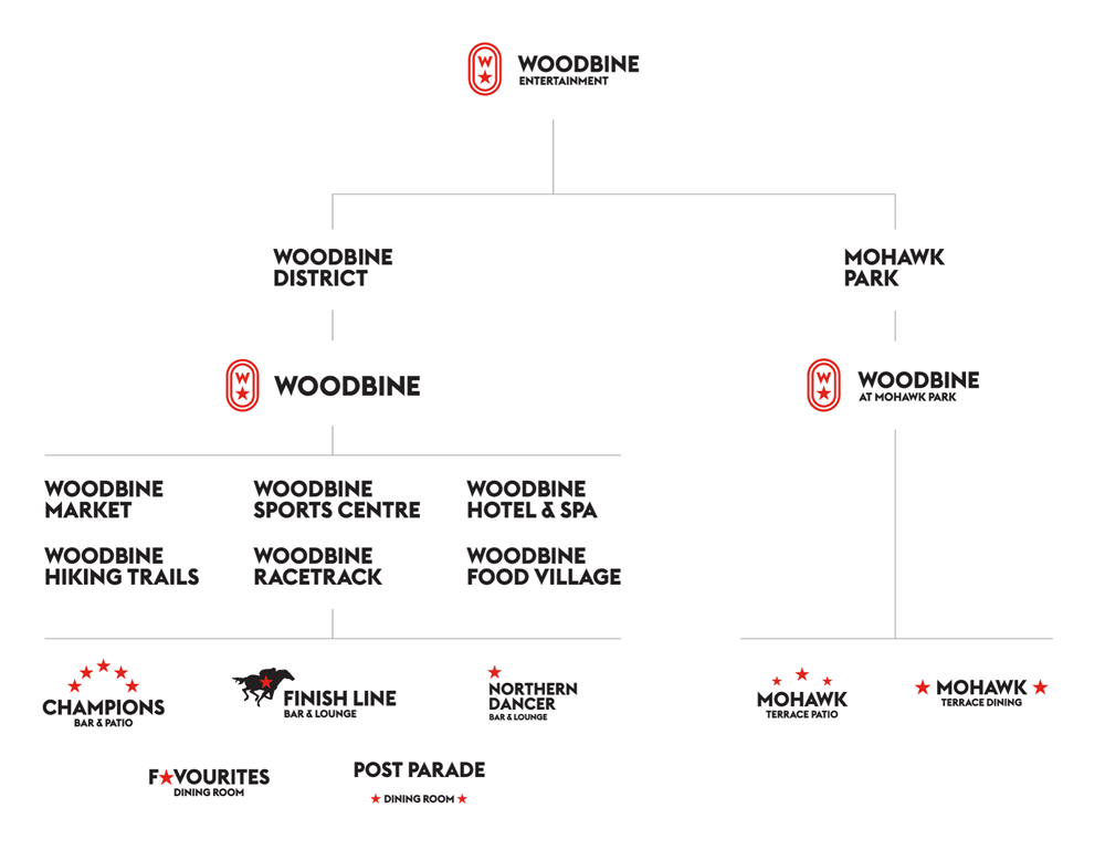
Woodbine recently announced a masterplan to transform its 684 acre site into a broader entertainment experience integrating new expanded entertainment and cultural offerings, food and dining, hotel, shopping, post-secondary education, recreation, health, wellness, and urban residential living. The organization needed to revitalize its brand identity to reflect this transformation.
The core issue that needed to be resolved in the rebrand was to respect the heritage of horse racing which is the essence of Woodbine and its reason-for-being, and balance this with the need reflect a broader and more diverse entertainment offering. The identity also needed to appeal to a more diverse audience – women, families and millennials.
The solution started with a shift in positioning and supporting tag line that alludes the organization’s heritage, while suggesting a broader offering. The visual solution involved abandoning the literal use of the “horse” in the logo. Instead, the identity utilizes the abstraction of the “track” as a symbol of racing, along with “star” that is both a symbol of “entertainment” as well as alluding to the graphic heritage of horse racing “silks” – the colour jerseys jockeys wear to identify horse ownership. The resulting icon provided the flexibility to be used for a variety of future Woodbine venues, as well as creating a visual form that allows for dynamic graphic expression.
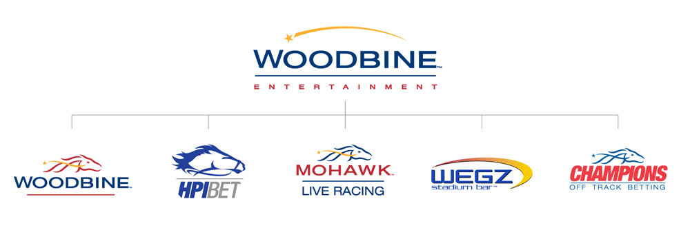
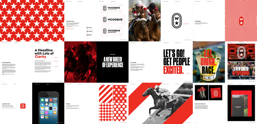


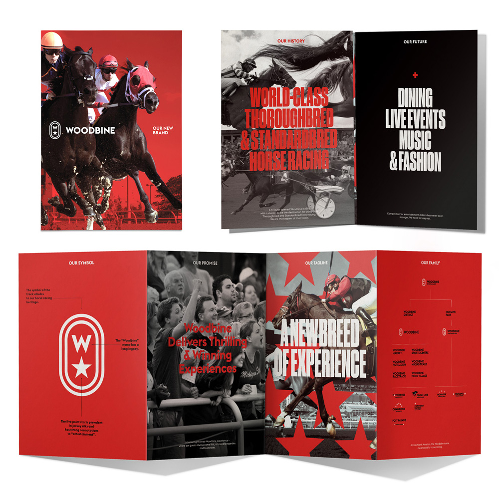
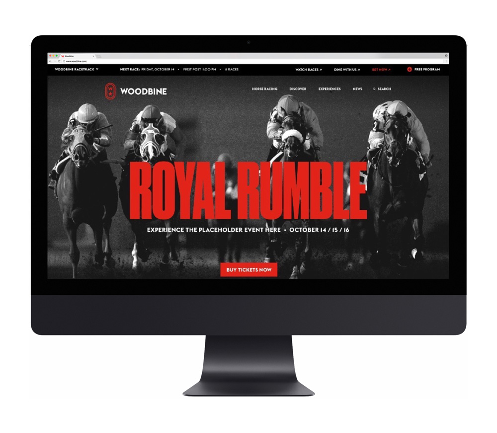
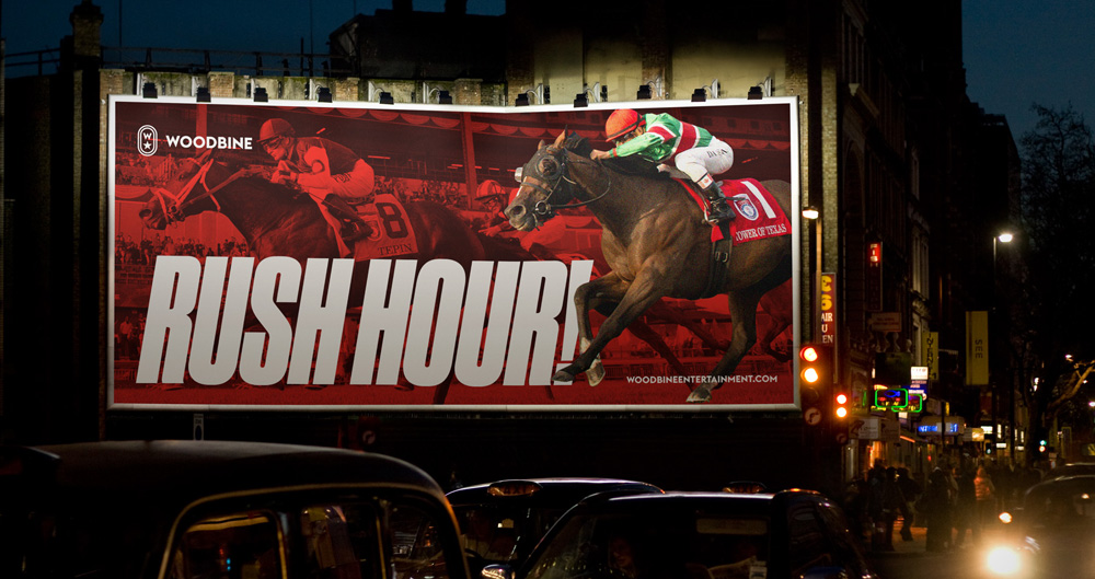
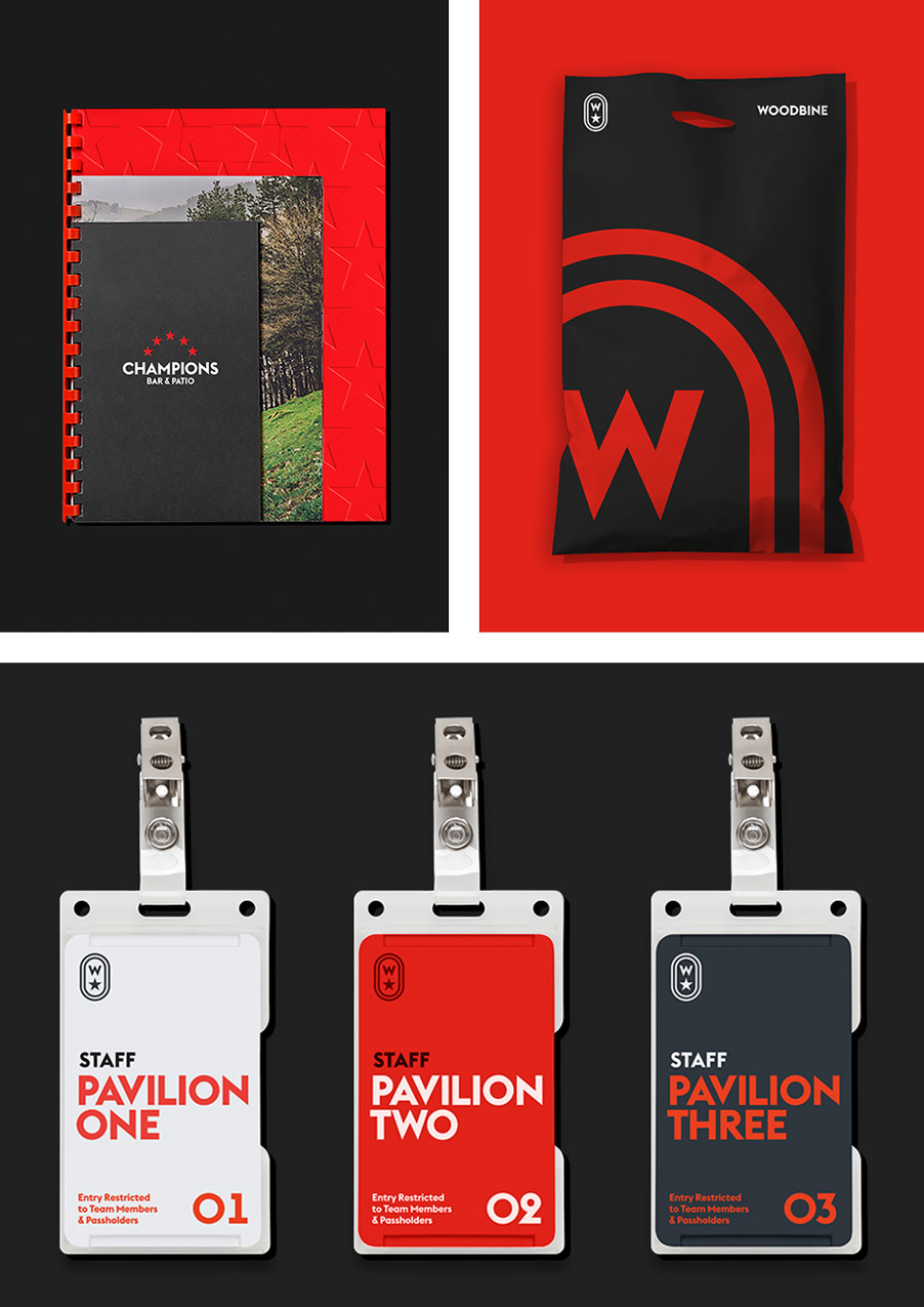
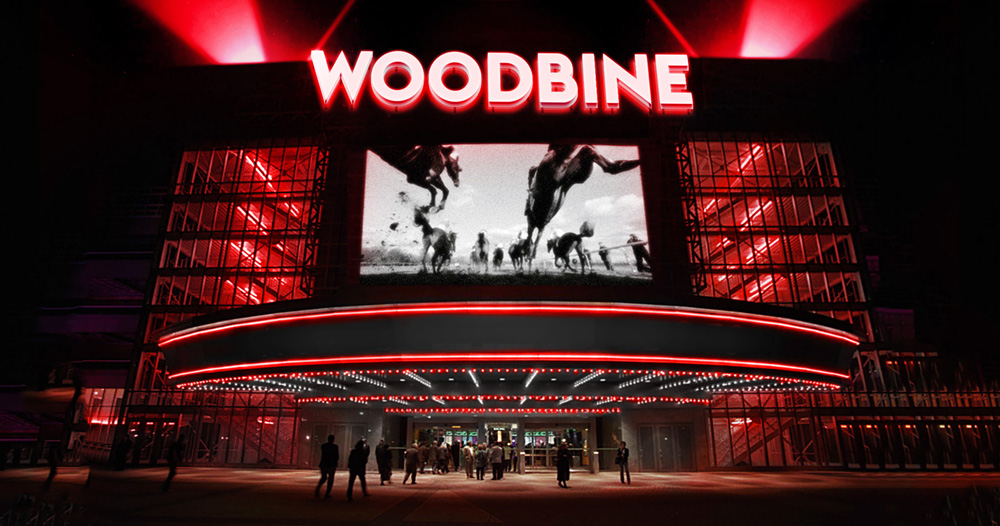
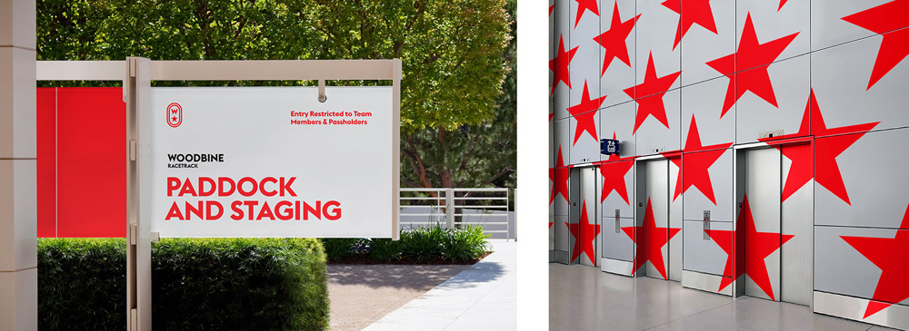
The old logo, oh dear, was so bad and it may be the first reverse-swoosh-shooting-star graphic I’ve ever seen. The consumer-facing logos weren’t any better either; all of them with subpar typography and cheesy horse drawings. The new logo is such a huge improvement and doesn’t feel even remotely as sleazy as before, especially as you go down the brand architecture. The new racetrack-star-W monogram is a beautiful, strong mark that has its conceptual ground in horse racing imagery but comes across as a general entertainment brand that will allow the company to branch out. The wordmark is quite nice too, perfectly executed, and has a good retro vibe. The font doesn’t trickle as effectively going down the brand architecture as everything starts to look like an old lodge somewhere… perhaps a secondary typeface would have been beneficial, especially in that second to last tier. Still, it’s all nice and effective. The applications have a great energy, with the condensed (sometimes italic) headlines and the bold patterns. Overall, a pretty great update that makes the brand much more accessible and attractive.

 Новости Союза дизайнеров
Все о дизайне в Санкт-Петербурге.
Новости Союза дизайнеров
Все о дизайне в Санкт-Петербурге.