Обзор лучших ресурсов по разработке бренда, разработке упаковки
contact us | ok@ohmycode.ru
contact us | ok@ohmycode.ru
(Est. 2006) “North Carolina Football Club (NCFC, formerly the Carolina RailHawks) are an American professional soccer team based in Cary, North Carolina. Founded in 2006, the team plays in the North American Soccer League (NASL). NCFC plays their home games at WakeMed Soccer Park, where they have played since 2007.”
N/A
North Carolina FC press release
North Carolina FC "About our Brand"
The white five-point star sits at the peak of NCFC’s crest and is a stark symbol of the star on the North Carolina state flag. The star embodies North Carolina as a whole and represents the state’s admission as the 12th US state. Each point comes together to form a united team and club.
The lower right point of the NCFC star, in the shape of the geographical Triangle area, stands alone to place emphasis on the club’s location. The Triangle is the well-known central region of North Carolina anchored by the cities of Raleigh, Durham and Chapel Hill…
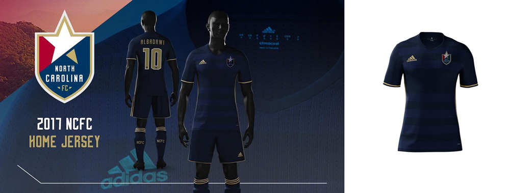
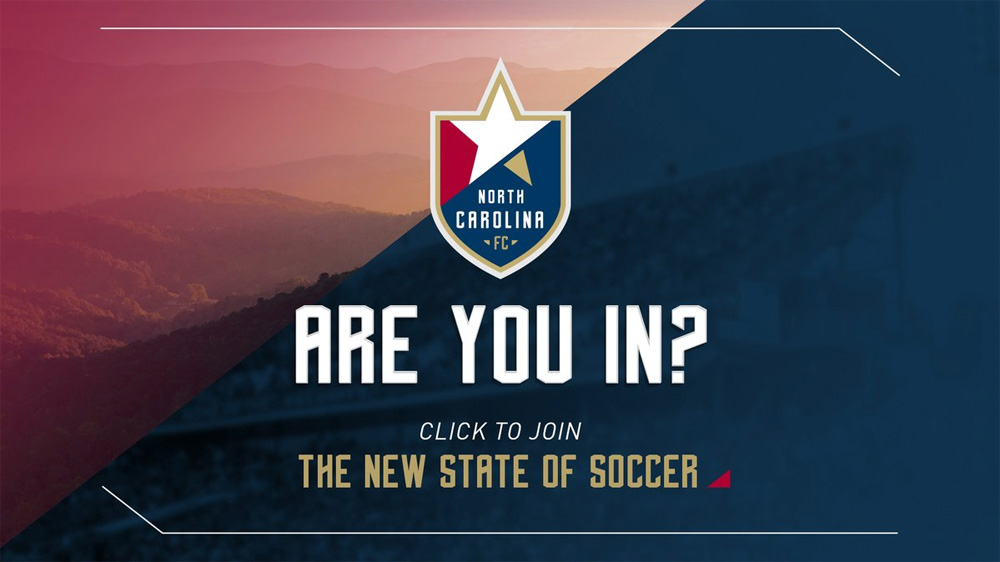
The old logo was a literal visualization of the old name: a hawk over a train rail with a soccer ball. It was angry, pointy, and multi-stroked, so it was perfectly suited. The new name and logo — with ambitions to make it into the MLS as an expansion team in the next season or two — are clearly designed to set up the team to match the gravitas of joining the major leagues. It's not a perfect logo but it definitely succeeds, especially if you compare it against other NASL teams, standing out for its simplicity. There is A LOT of rationalization behind every element, perhaps too much, but even if it makes you eye-roll a little bit, it all makes sense. The star makes for a strong core element and is nicely integrated into the shield — I also like how the angle of the star drives some of the applications by establishing a strong diagonal that can have contrasting colors and images. The typography is almost okay… when it spells "NORTH CAROLINA" it works fine but other words and sentences look wonky. The super extra dark uniform is baffling; at first I thought it was a teaser image for a full reveal later on but, nope, it's as dark as Voldemort. The "New State of Soccer" tagline is super pretentious and it would be nice if they took it down a notch… after all, it's still a minor league soccer team… in Cary, North Carolina. (No offense to Carynians.)
Thanks to Kevin Parker for the tip.

 Новости Союза дизайнеров
Все о дизайне в Санкт-Петербурге.
Новости Союза дизайнеров
Все о дизайне в Санкт-Петербурге.