Обзор лучших ресурсов по разработке бренда, разработке упаковки
contact us | ok@ohmycode.ru
contact us | ok@ohmycode.ru
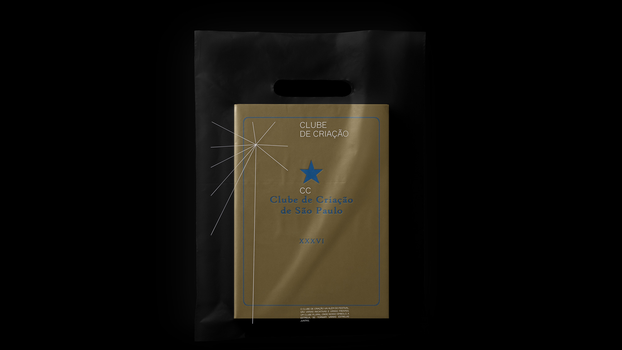
Established in 1975, Clube de Criação (The Creative Club in English) is a non-profit organization founded by advertising professionals in São Paulo, Brazil, to celebrate and promote the work of the industry. Its two main initiatives have been the publication of a printed yearbook, showcasing work selected by a jury; and a 3-day creativity festival. As it expands into new initiatives, the club is introducing a new identity designed by the local office of Wieden+Kennedy.
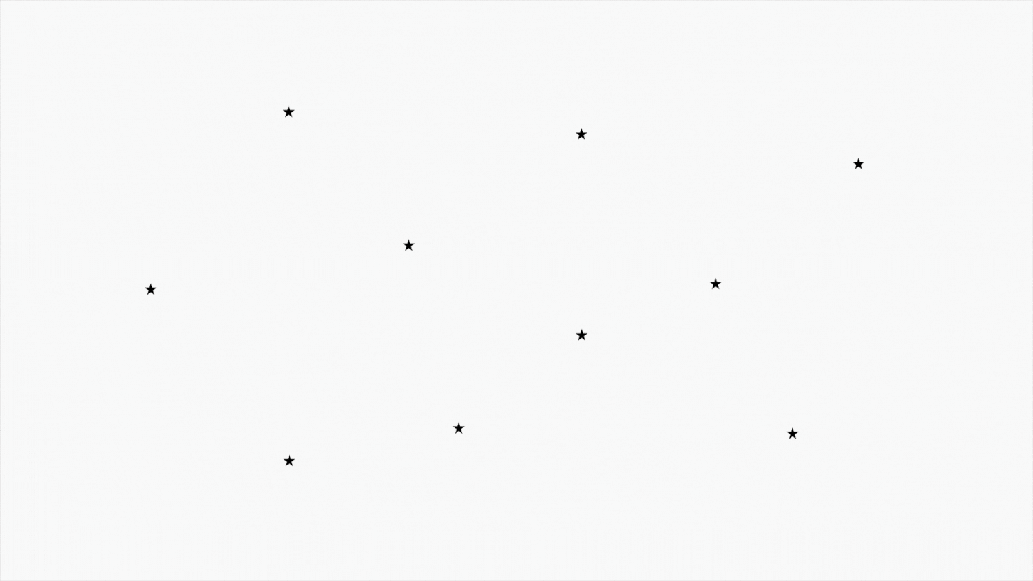
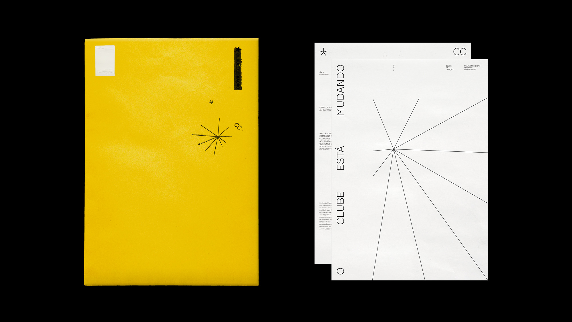
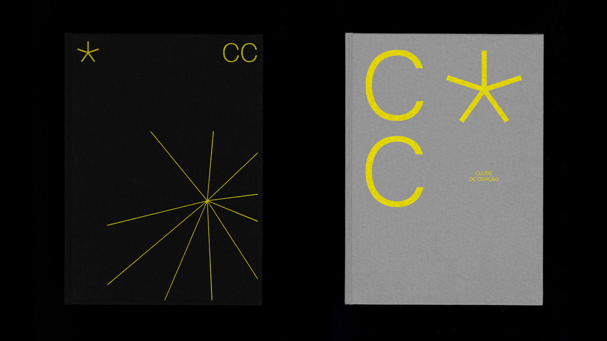
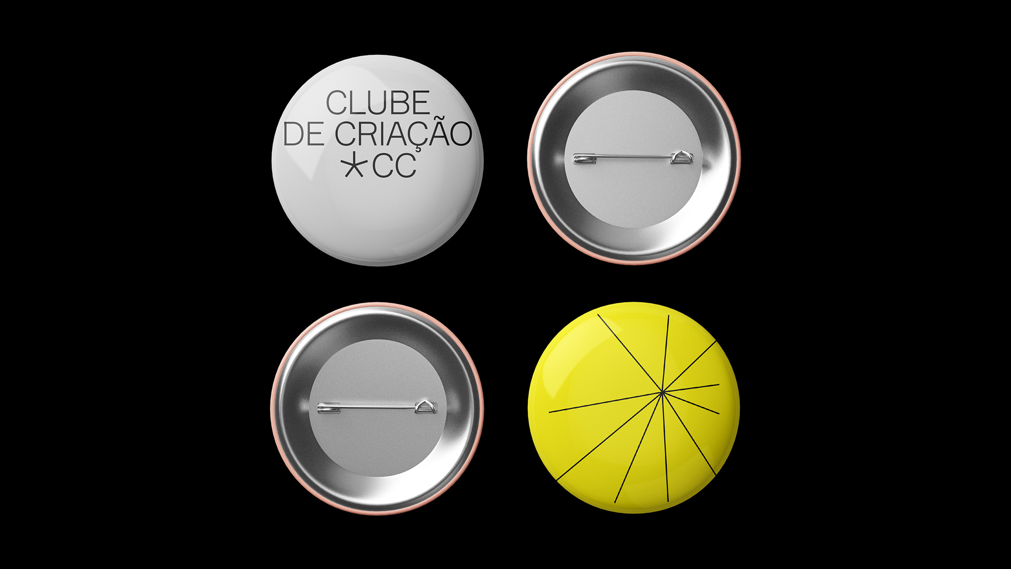
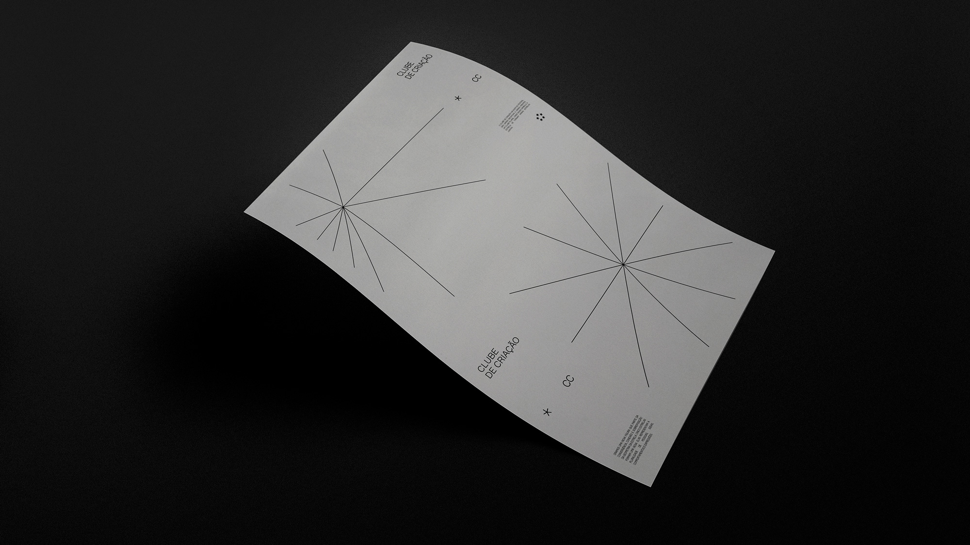
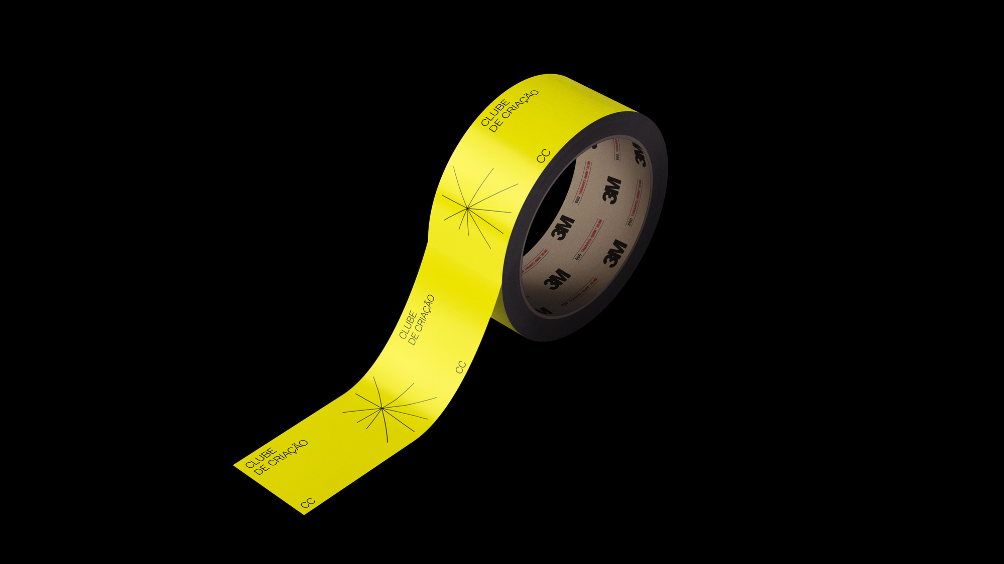
The Creative Club (“Clube de Criação” in Portuguese) is the most important organization of its kind in Brazil, and is easily recognized by its symbol: a star. This year, the club decided to diversify and expand its activities and in order to communicate this new era in its history and show how the Creative Club is embracing change, Wieden+Kennedy São Paulo created a completely new visual identity for the club, reinterpreting the star to make it more modern and versatile.
According to Joanna Monteiro, advertising professional and President of the Creative Club, “the new identity evidences our greater goal: to be more than a Festival, but an inclusive Club with many activities throughout the year, for everyone who enjoys, works with and celebrates creativity.”
The old logo was fine, I guess. Nothing overly annoying and it was decently put together but also very generic. The new logo has literally shed its weight by transforming the bold star into a thin asterisk and un-bolding all words in the name. It certainly has that too-cool, deadpan simplicity aesthetic that’s trendy and could easily by dismissed but I think there is something energizing about this new logo and its variations with all three elements (the star, the “CC”, and the full name) sharing the same thickness and able to reconfigure into relatively interesting lock-ups. I wouldn’t defend the logo with my honor but I like it.
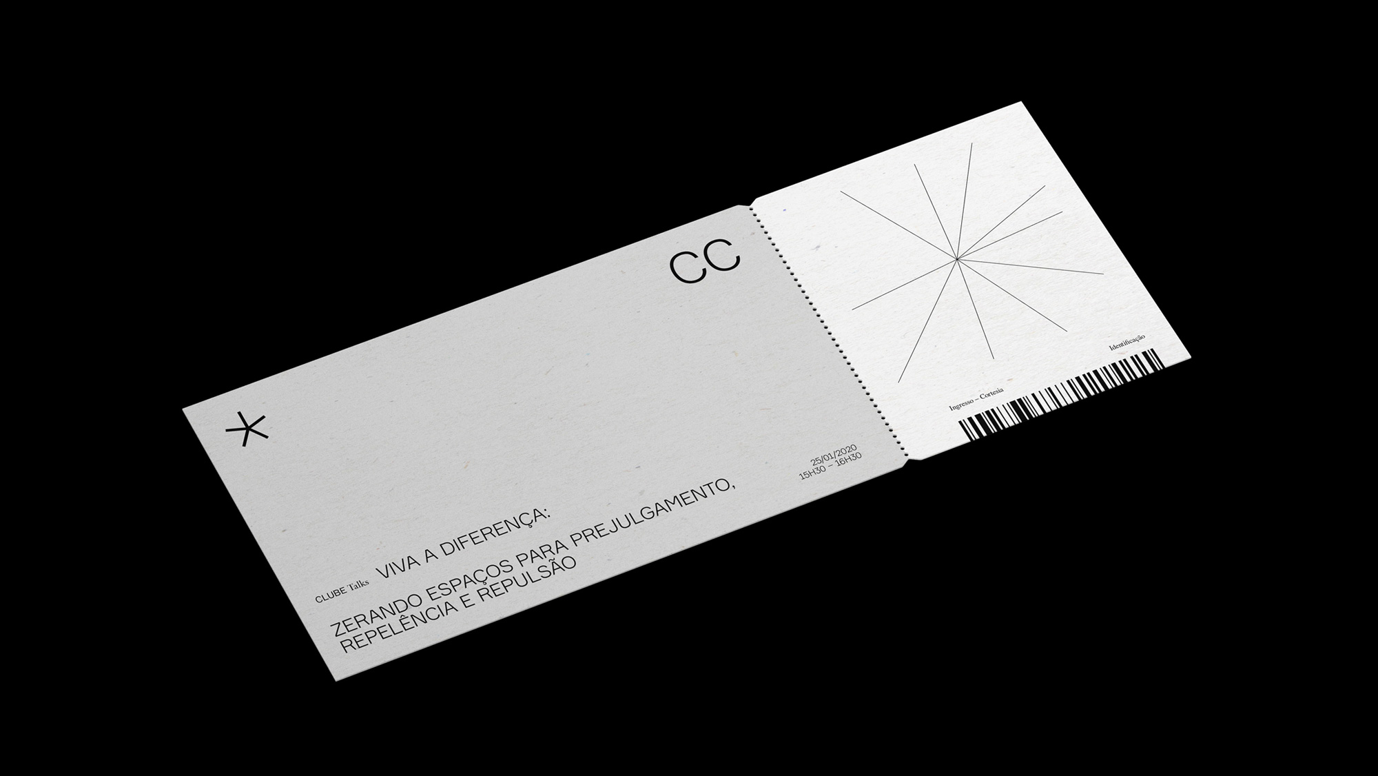
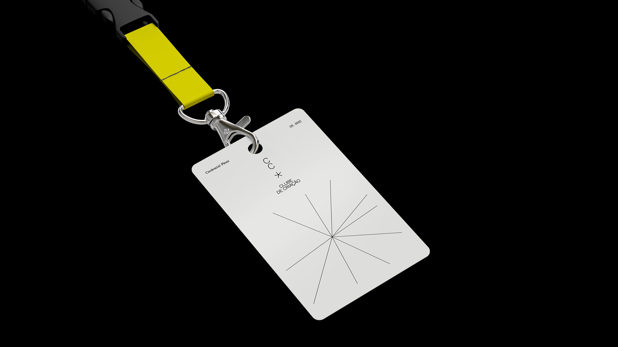
For that reason, the five-pointed star that has always been a symbol for the Creative Club has gained a new, lighter version that moves, adapts, and can have as many points as it wants. Bruno Oppido, Creative Director and Head of Art at Wieden+Kennedy São Paulo, says that “Updating an icon is always a huge challenge, but when we find solutions that are simple and strong, we reap the benefits immediately.”
Eduardo Lima, the agency’s Executive Creative Director, complements: “This new icon represents the cross-over of all the new attitudes, of all this plurality that the Creative Club is now embracing. Welcome to the next phase of the Creative Club.”
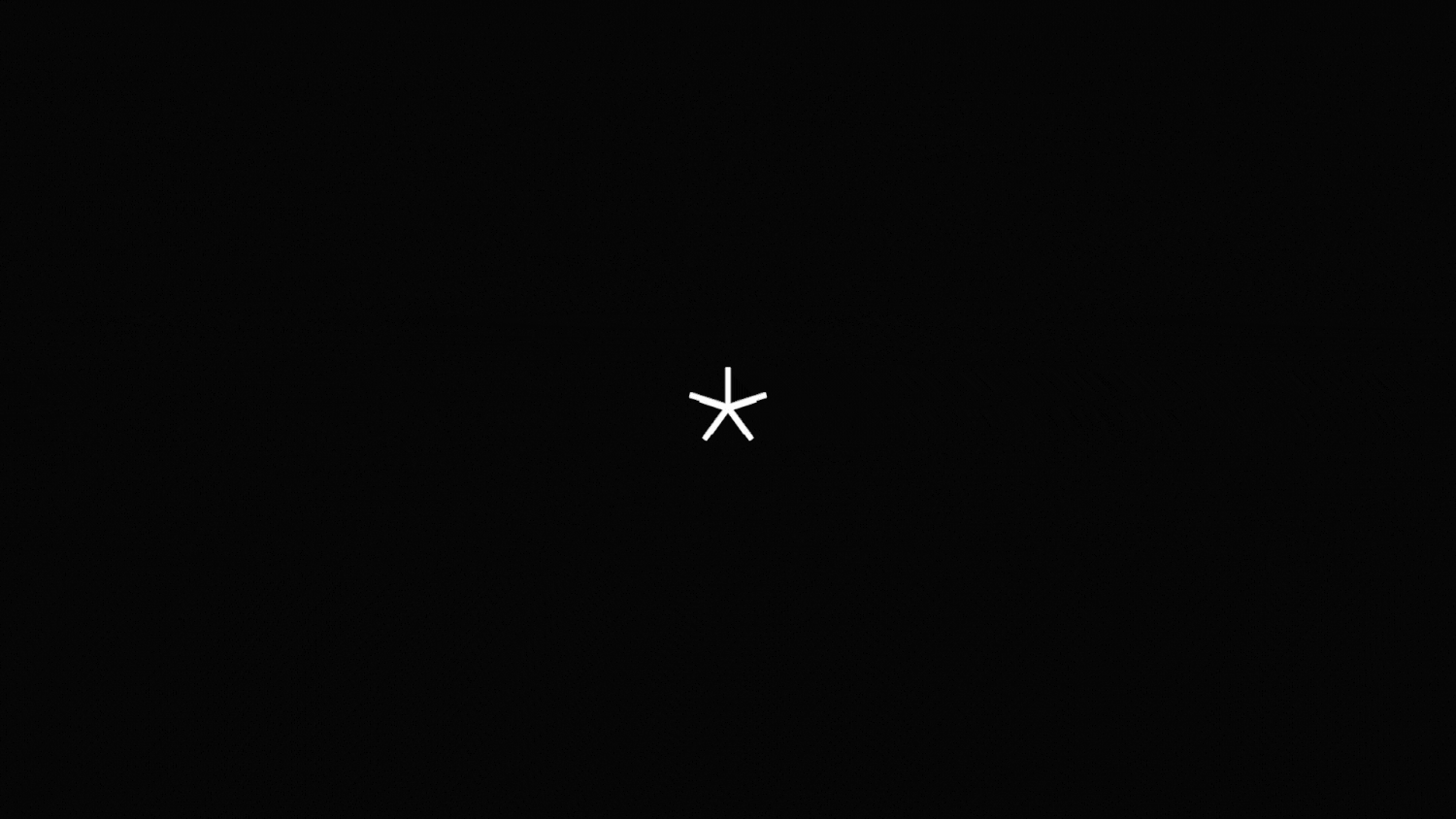
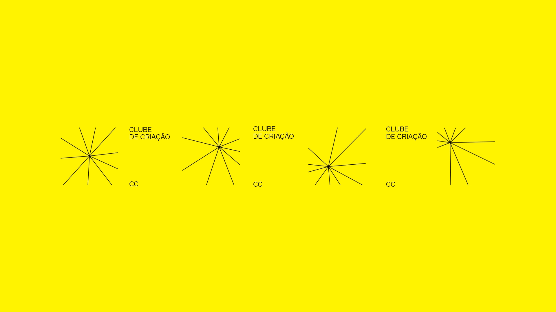
The star then expands into a burst-like element in the identity that can be used large or small, in the background or the foreground, and with its lines going in as many directions as desired.
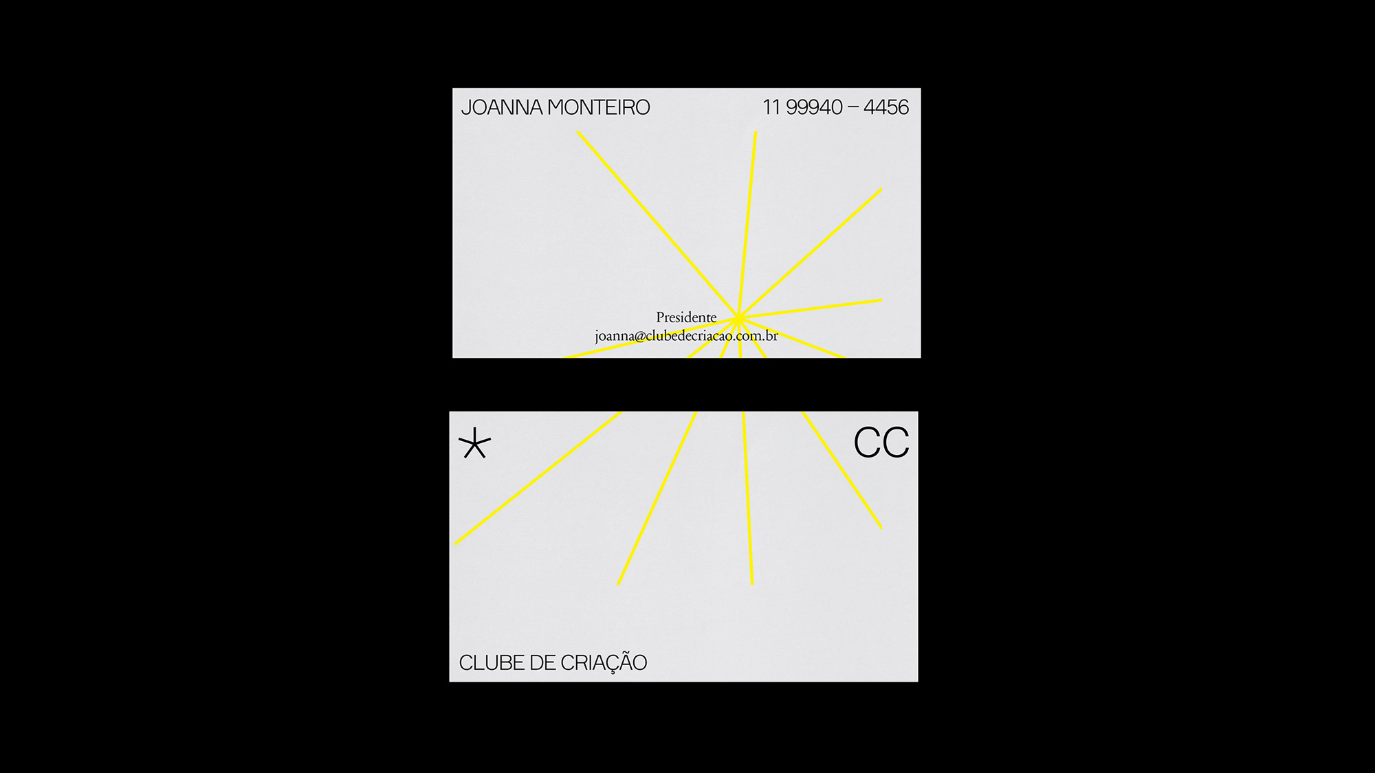
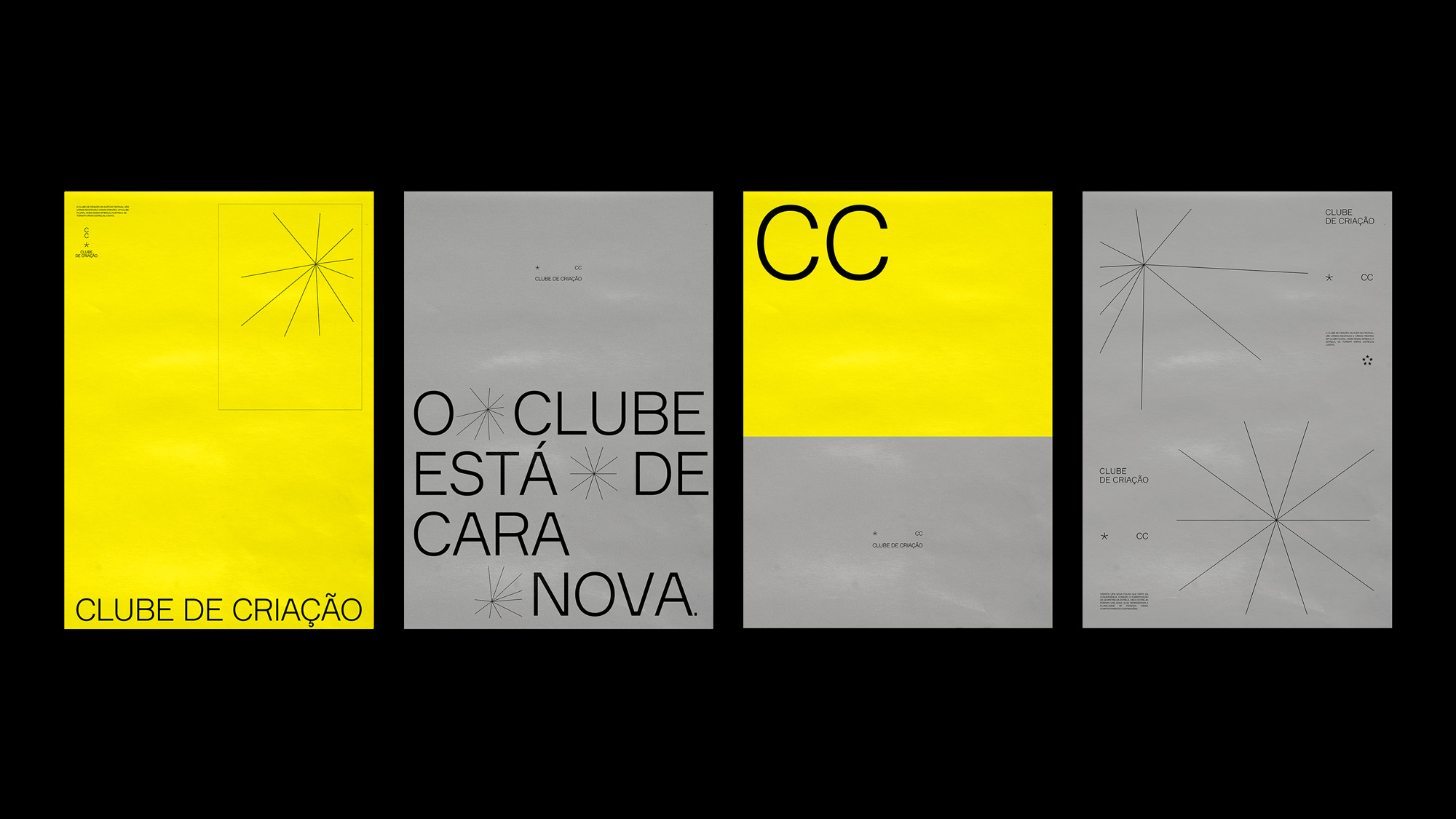
The applications are quite nice and with a surprising variety given the simplicity of the elements. I wonder if the system might feel tired too quickly though? I would love to see how this would implement photography or illustration to expand its variety beyond Brutalist-lite layouts, which I always enjoy, sure, but since we have reached the saturation point on those, perhaps it’s not impolite to ask for a creative organization to show a new way forward.
Overall, there is plenty to like here and the design aesthetic, although already played out, adds a touch of design-iness to the advertising bent of the organization.
PS. This week is Spring Break for our state. We had a family trip to Paris but obviously that didn’t happen. I mention that to say that there were going to be no posts this week but since we are all grounded and could use some distractions, I figured I would at least do posts for the Reviewed category. There will be nothing in Noted, Linked, or Spotted until next week.
 each year since publication began in 2006

 Новости Союза дизайнеров
Все о дизайне в Санкт-Петербурге.
Новости Союза дизайнеров
Все о дизайне в Санкт-Петербурге.