Обзор лучших ресурсов по разработке бренда, разработке упаковки
contact us | ok@ohmycode.ru
contact us | ok@ohmycode.ru
(Est. 1991) “With over 20 years of experience, the IULIUS Company is the only developer and operator of mixed-use projects in Romania. IULIUS revolutionized the local real estate market, being a visionary company that implemented premiering concepts in Romania: the first mall outside the capital city, Bucharest, and the first mixed-use urban ensemble. IULIUS developed over 260,000 sqm of retail premises and other 80,000 sqm of class A office spaces. The company projects include the PALAS IASI mixed-use urban ensemble, the IULIUS MALL national network and the UNITED BUSINESS CENTER office building network, which became urban and economic landmarks for the cities where they were developed.”
Innerpride (Iasi, Romania)
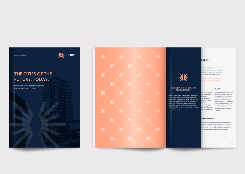
For the symbol, we chose from the work of the international acclaimed Brancusi, a Romanian born trendsetting sculptor, and his endless column. As we wanted a discrete reference we’ve modeled it in the negative space of a sun like symbol. The result is a simple yet powerful icon standing for a company always reaching new heights.
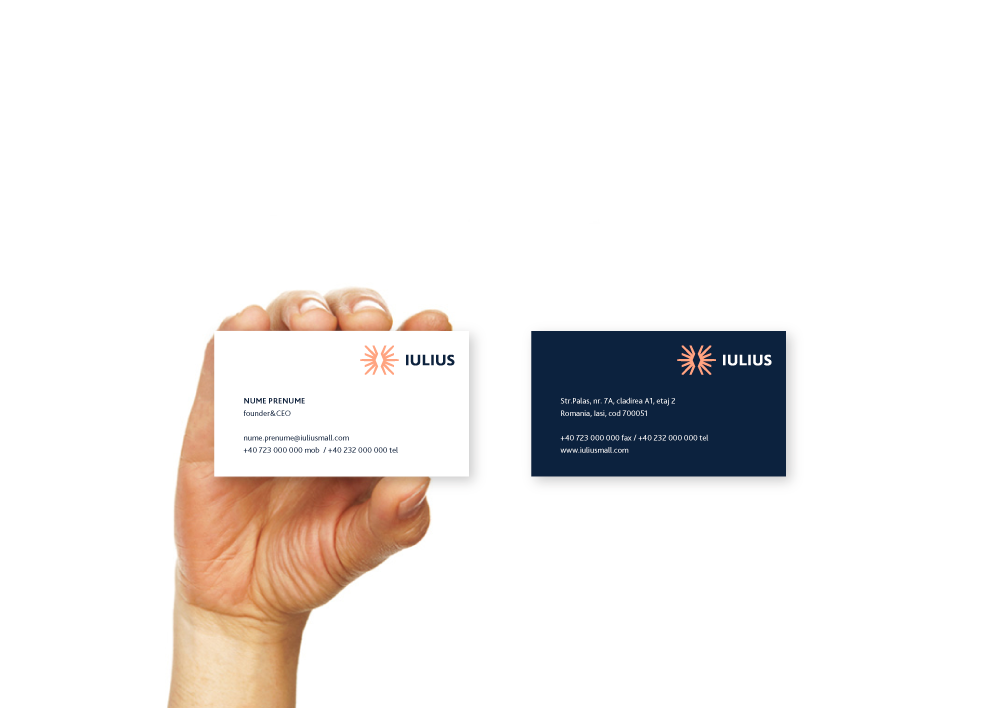
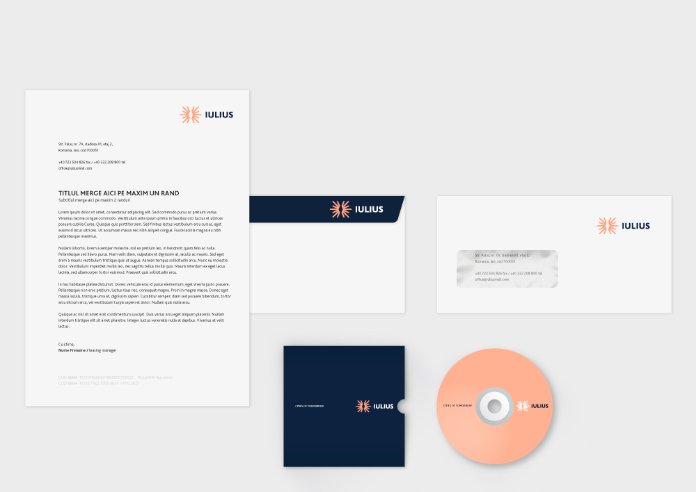
As the largest real estate developer in Romania, the old logo didn't do it much justice, looking more like some kind of small research center inside a university. The execution of the acronym was terrible too, with a triple-threat ligature that yielded an unpleasant whole. The new logo's focus is a shining icon that — if you don't know it's based on Constantin Brâncuși's endless column — looks like a radiating diamond, which is not a bad metaphor for a real estate developer. It's not the most fantastic icon but it has a simplicity and an angular starkness that indicates they mean business and quality. The wordmark is fine. The color palette is a little weird… the flesh tone is not the most flattering; perhaps a more salmon-esque color would have worked with the dark blue. Applications are fine too; nothing too extravagant in the stationery but some more interesting things in the brochure like the repeating pattern. Overall, an improvement that makes the company look much more legit and professional.

 Новости Союза дизайнеров
Все о дизайне в Санкт-Петербурге.
Новости Союза дизайнеров
Все о дизайне в Санкт-Петербурге.