contact us | ok@ohmycode.ru
contact us | ok@ohmycode.ru
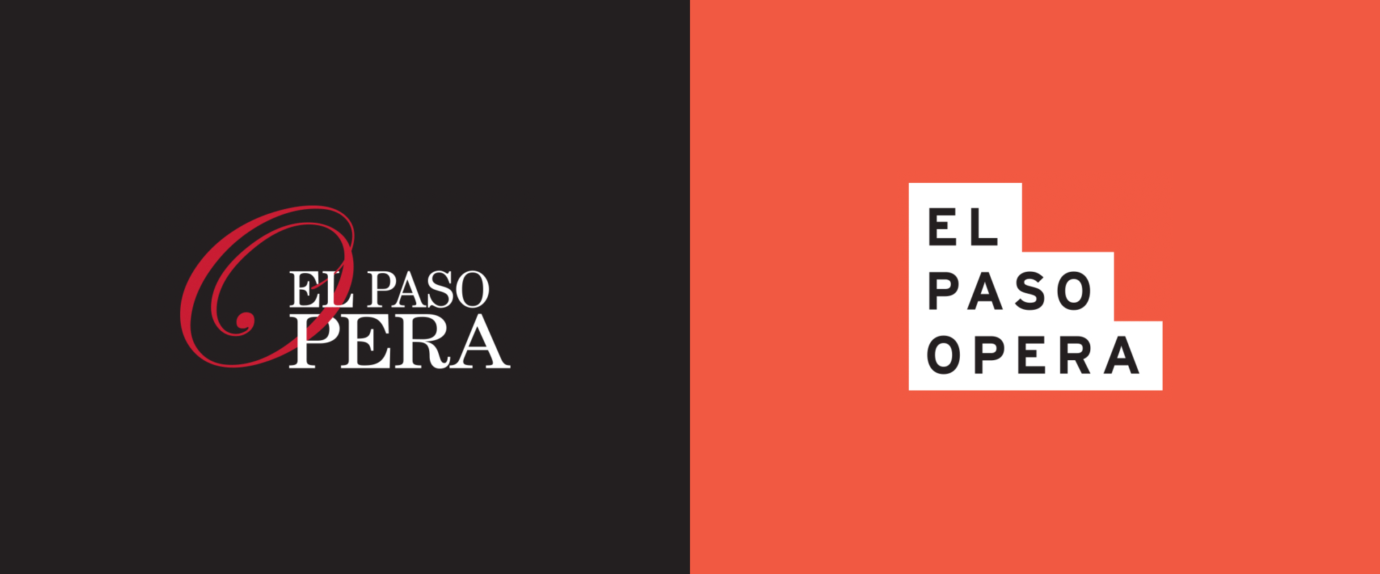
Established in 1992, El Paso Opera produces fully-staged, complete operatic productions in El Paso, TX. Its mission is to “bring professional opera productions that are understandable, accessible, and enjoyable” to its residents, producing a handful of shows each season, reinterpreting classics as well as more contemporary ones. Late last year, El Paso Opera introduced a new identity designed by Denver, CO-based Mast.
The landscape and architecture of El Paso was the inspiration for the pattern system. Creating a mix of hard lines and organic forms to create a cohesive pattern that felt as exciting and diverse as the city and its people.
This pattern can flex, change, and scale with each new application. Allowing it to easily be applied to physical collateral and digital collateral alike.

Much like the palette and pattern, the symbol finds its inspiration in the surrounding region. However, it also finds inspiration in the construction of the theater. The “steps” allude to the interaction between the crowd and the stage. Allowing the people of El Paso to take one step closer to the show. This duality can be seen in the construction of the mark itself, combining a traditional symbol with a wordmark to create a strong shape that will quickly be legible and recognizable.
We created two different versions of the mark—solid and outlined—ensuring that no matter how the mark was used, it would be easily recognizable. We chose to build the “steps” to extend up and over the type. Creating optical alignment rather than traditional spacing, producing a more grand scale within the mark; resembling the mountains that surround the city and removing tension.
The old logo was what you would expect from an opera organization, looking like a black-tie-not-optional affair with a swooping, grand “O” and relatively elegant serif typography. Given the more relaxed attitude of the El Paso Opera it was too classic of a look. The new logo feels infinitely more accessible and less pretentious, making many more people comfortable with attending an opera performance and not making it feel like it’s an exclusive, high-end attraction. Graphically, it’s a fun, bold logo in a deadpan sans serif housed inside a funky three-step shape. I keep getting more New Mexico than Texas vibes but given the proximity to the other state it’s not so off the mark. More relevant though is that the logo also references the building where many of its productions take place. The building’s entrance has three sets of steps, one of 3 steps, one of 5 steps, and one of 7 steps — so steps are a thing. The logo looks equally nice in both fill and stroke configurations.
We used the landscape and bright colors of the city as the inspiration for the identity. Allowing the city to breathe life into the Opera. We combined patterning, modern type, and the palette of the area. Bringing together playfulness, seriousness, and the vibrancy of the area to create an identity that would be engaging to all.
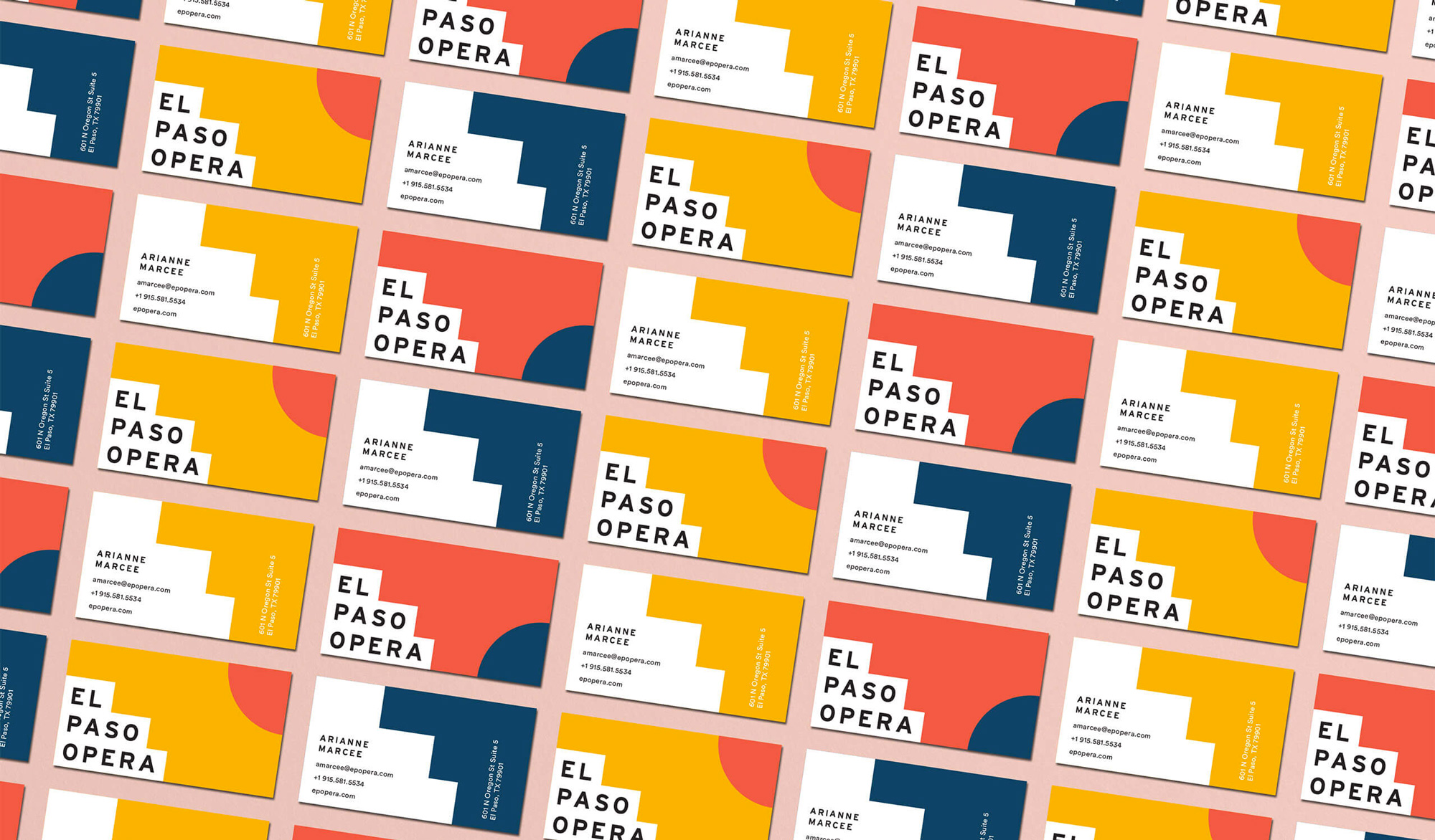
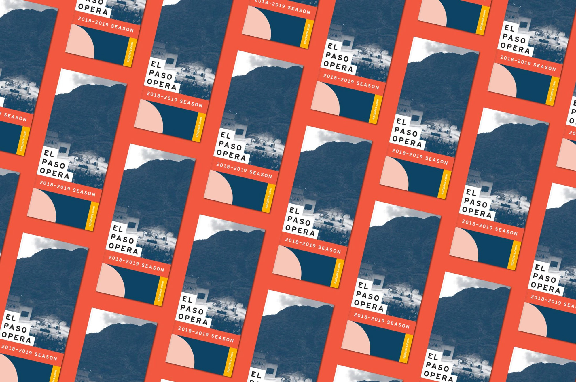
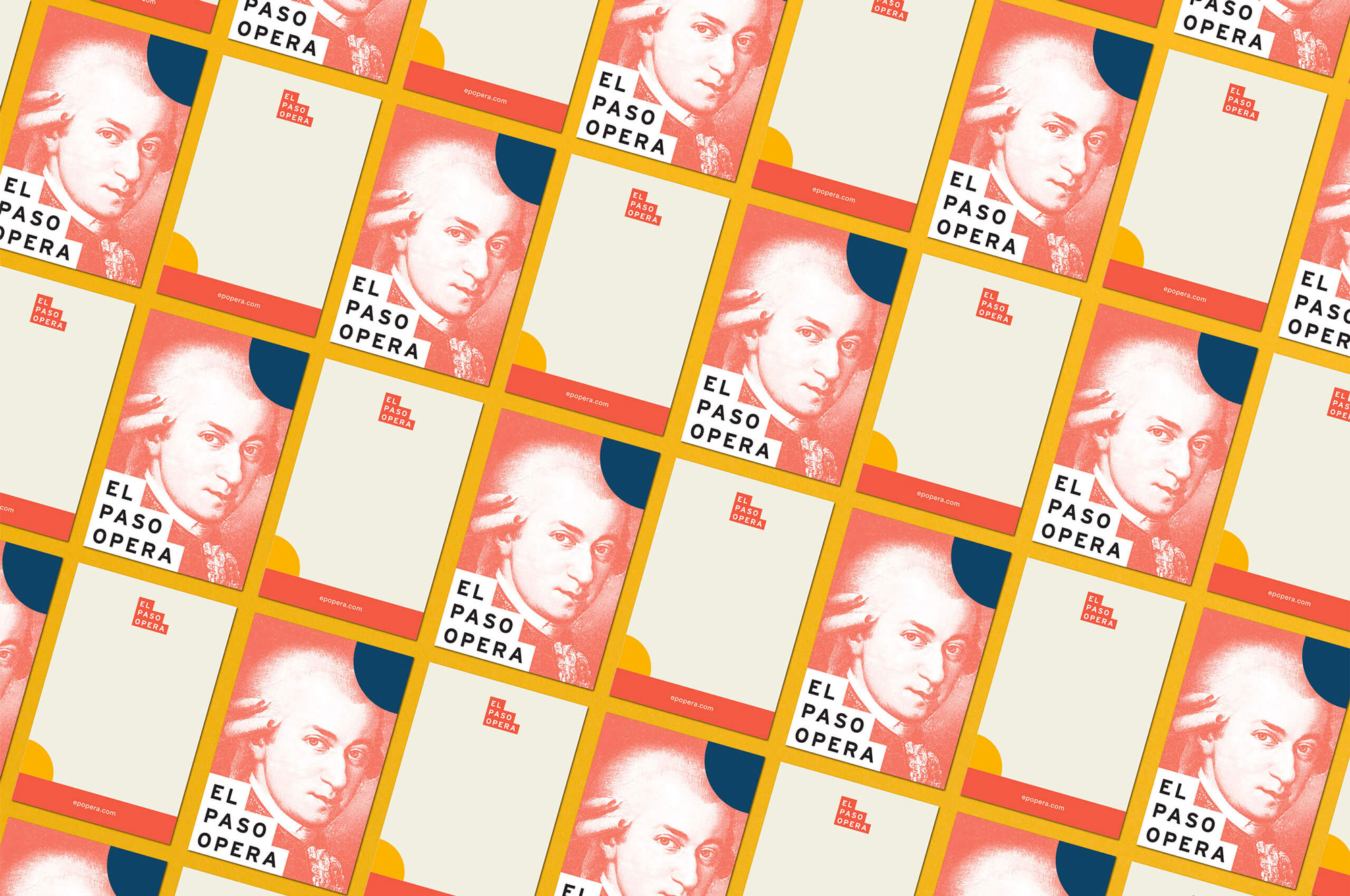
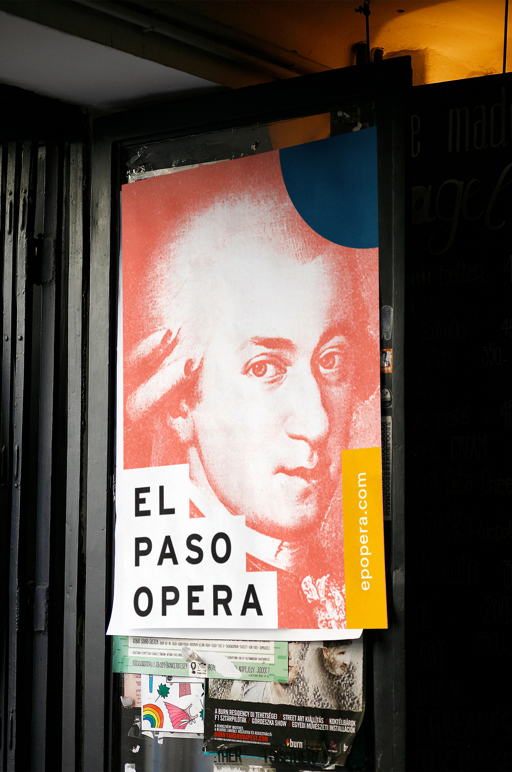
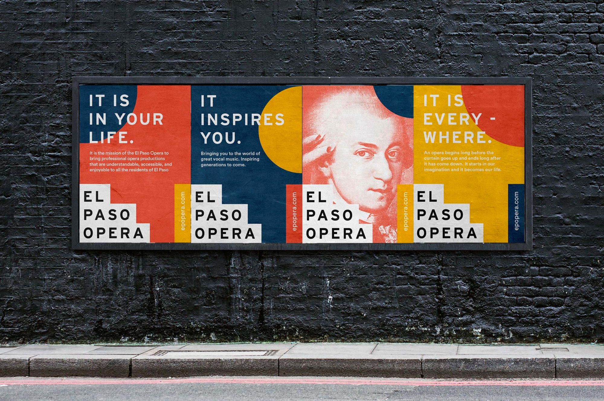
The core identity is bold and energetic with large blocks of shapes in the background and the logo anchoring all the layouts, sitting neatly in the bottom left corner. The dark orange, yellow, and blue color palette looks great and the monotone approach allows different kind of images to be used effectively.
It was important for the show-specific artwork to have its own personality. If the core brand palette was used every time, it could clash with the color palettes of the artwork.
To combat this, we developed a system that allows the color to be changed depending on each show. By allowing the colors to be taken from show-specific artwork, we’ve ensured that each show will have a fresh palette that won’t compete. This also ensures that the palettes won’t feel stale over time, creating excitement and intrigue with each new production.
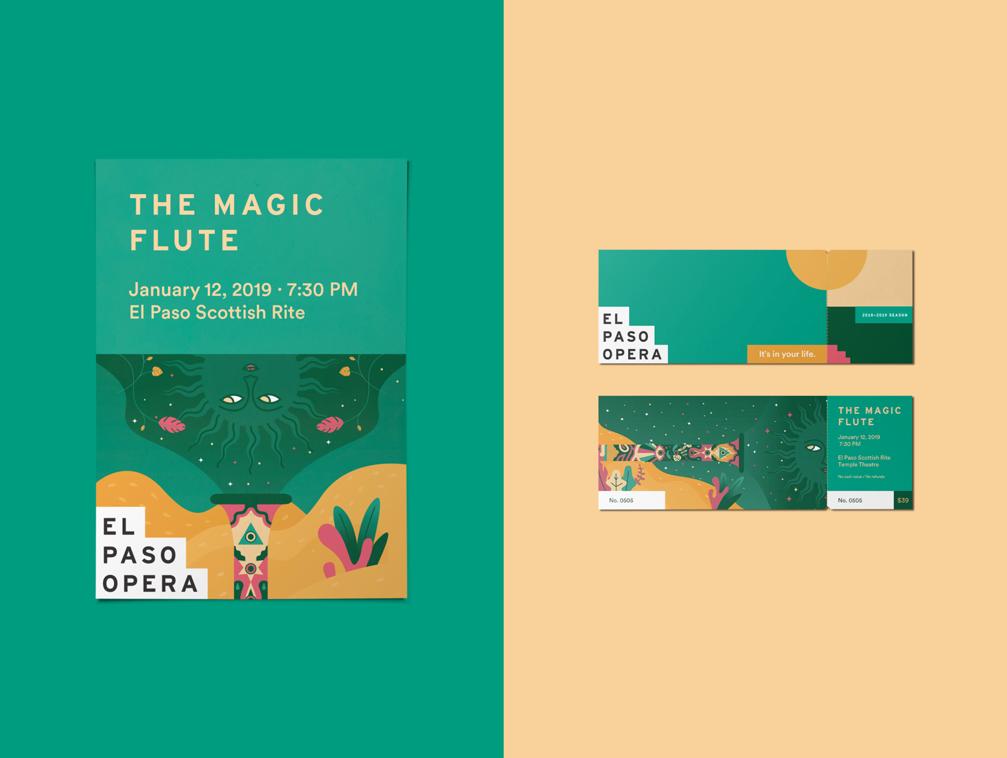
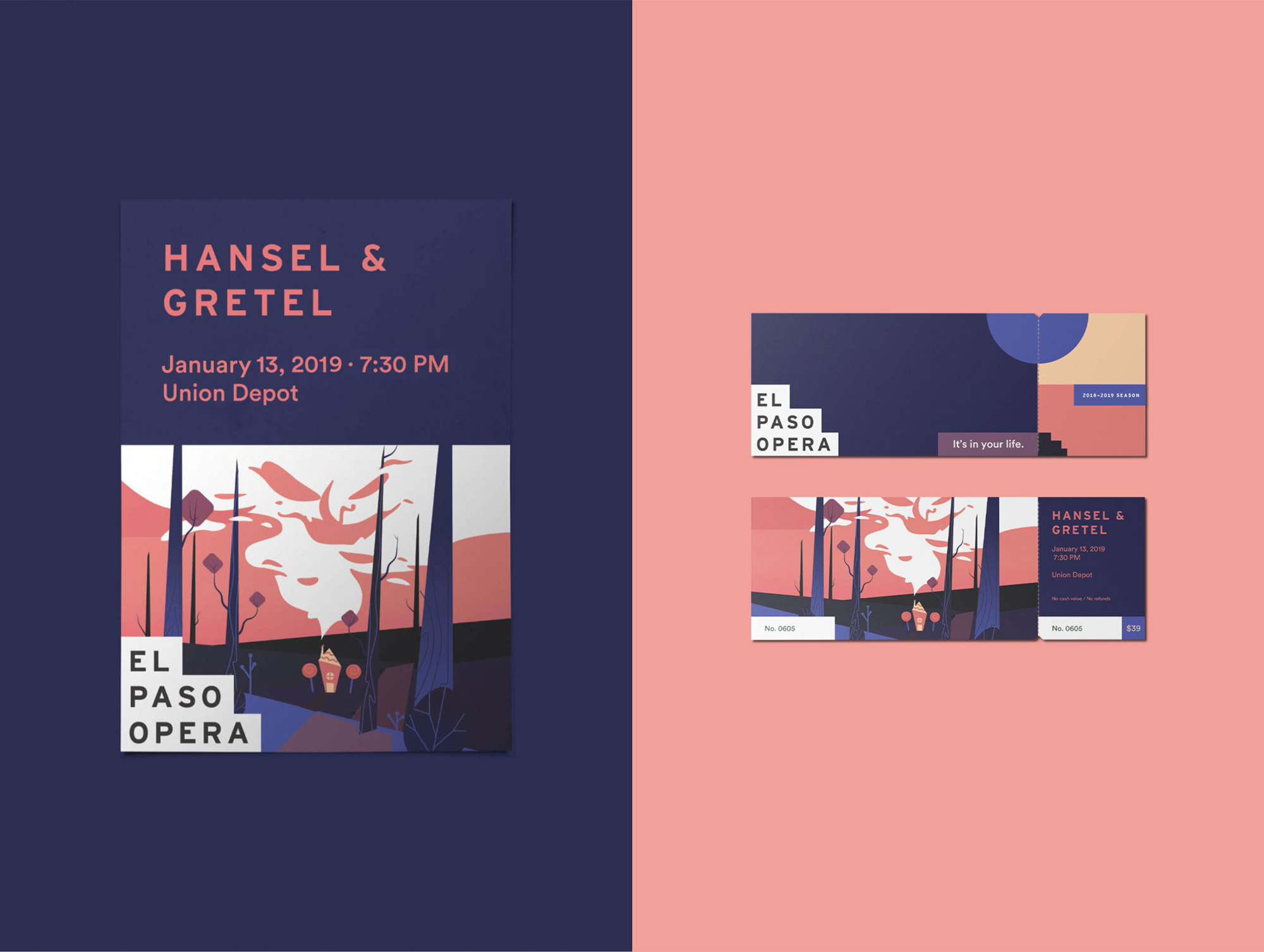
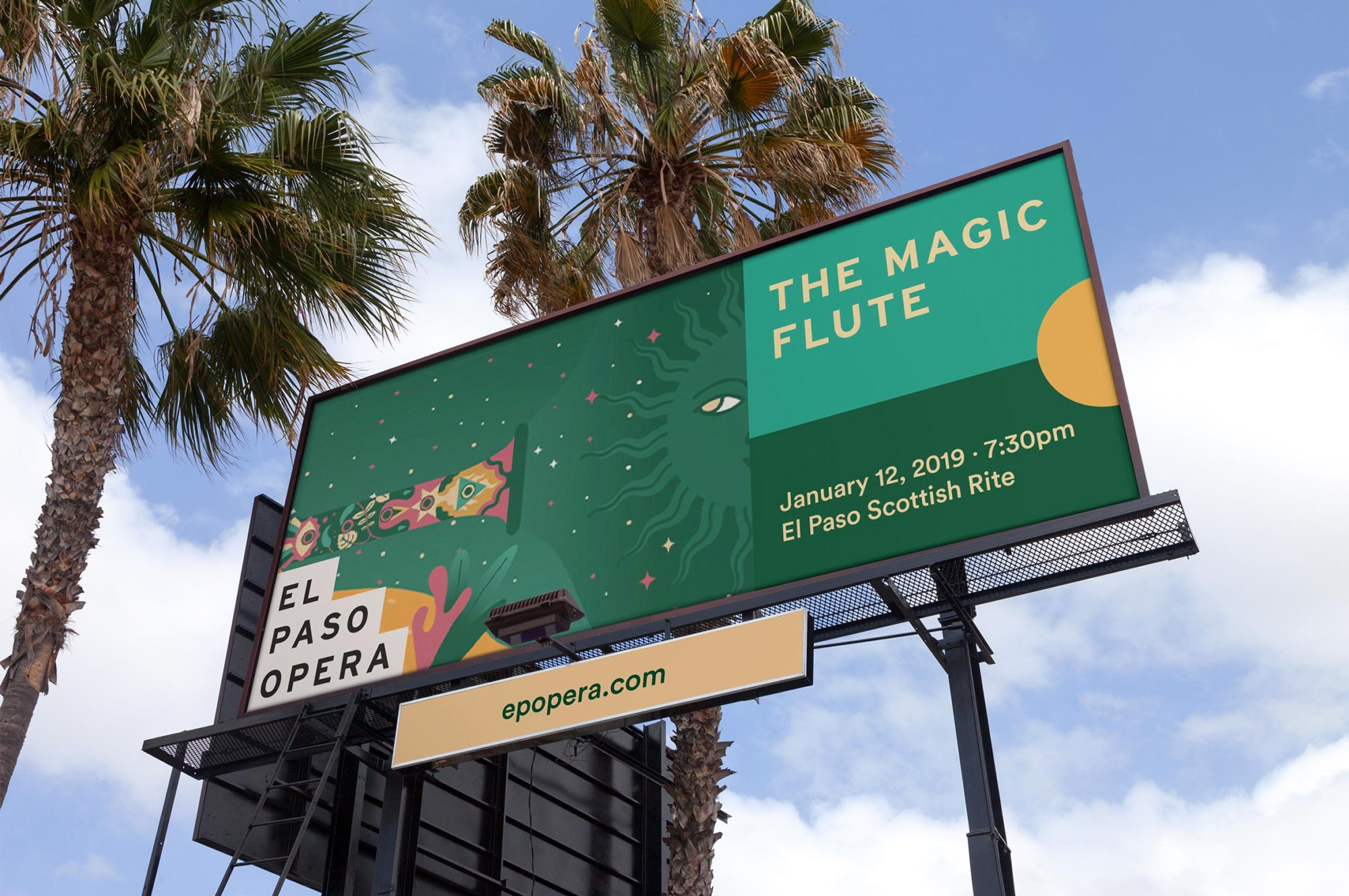
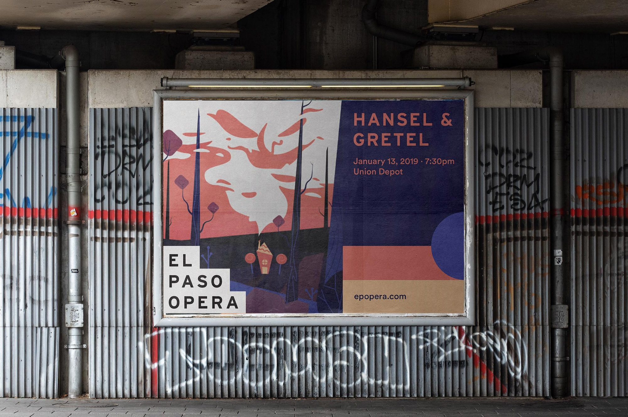

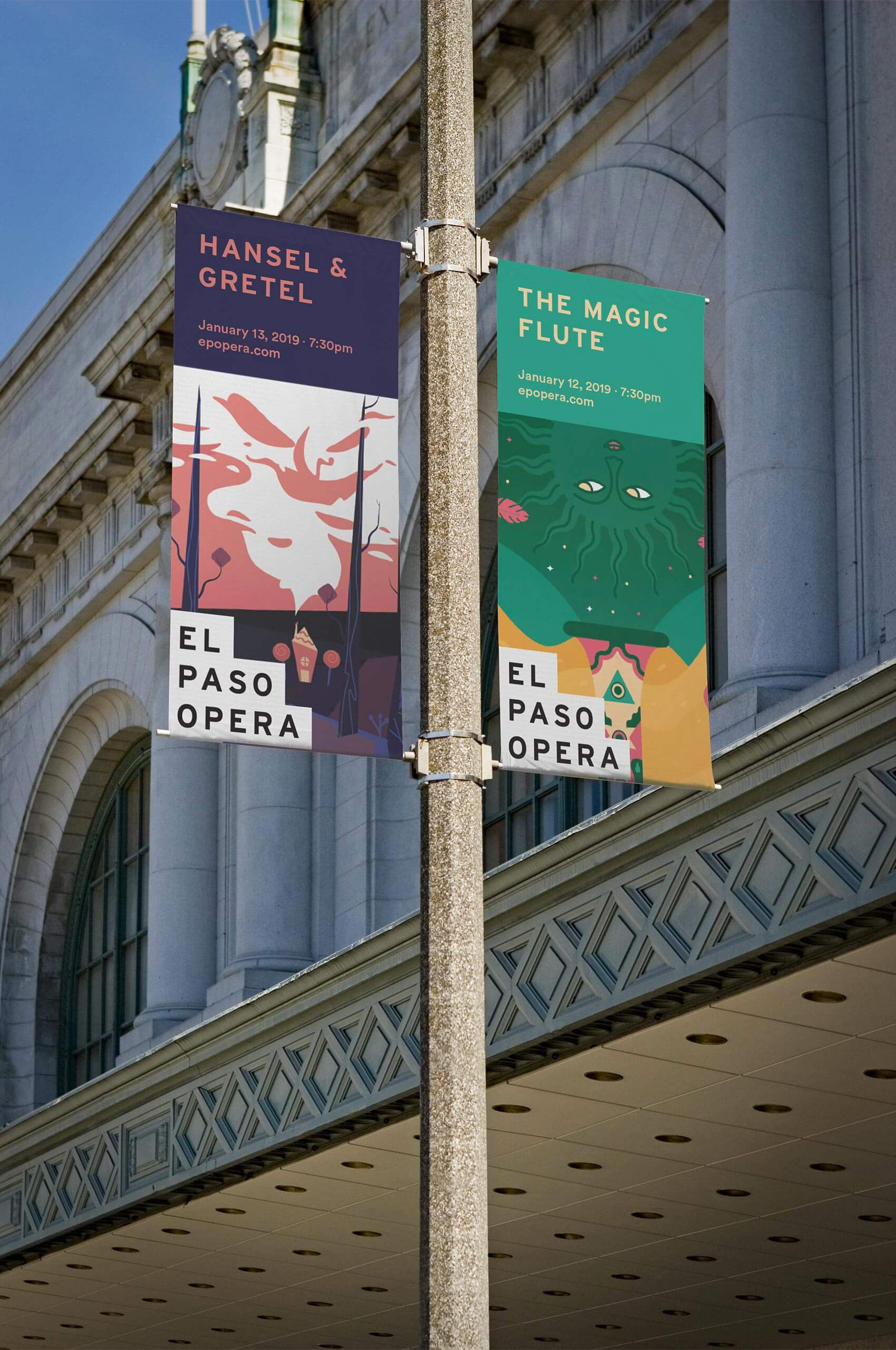
The system adapts quite nicely to specific shows with the big shapes taking on the colors of the illustration or imagery and the step logo making the different shows easily recognizable as being an El Paso Opera production.
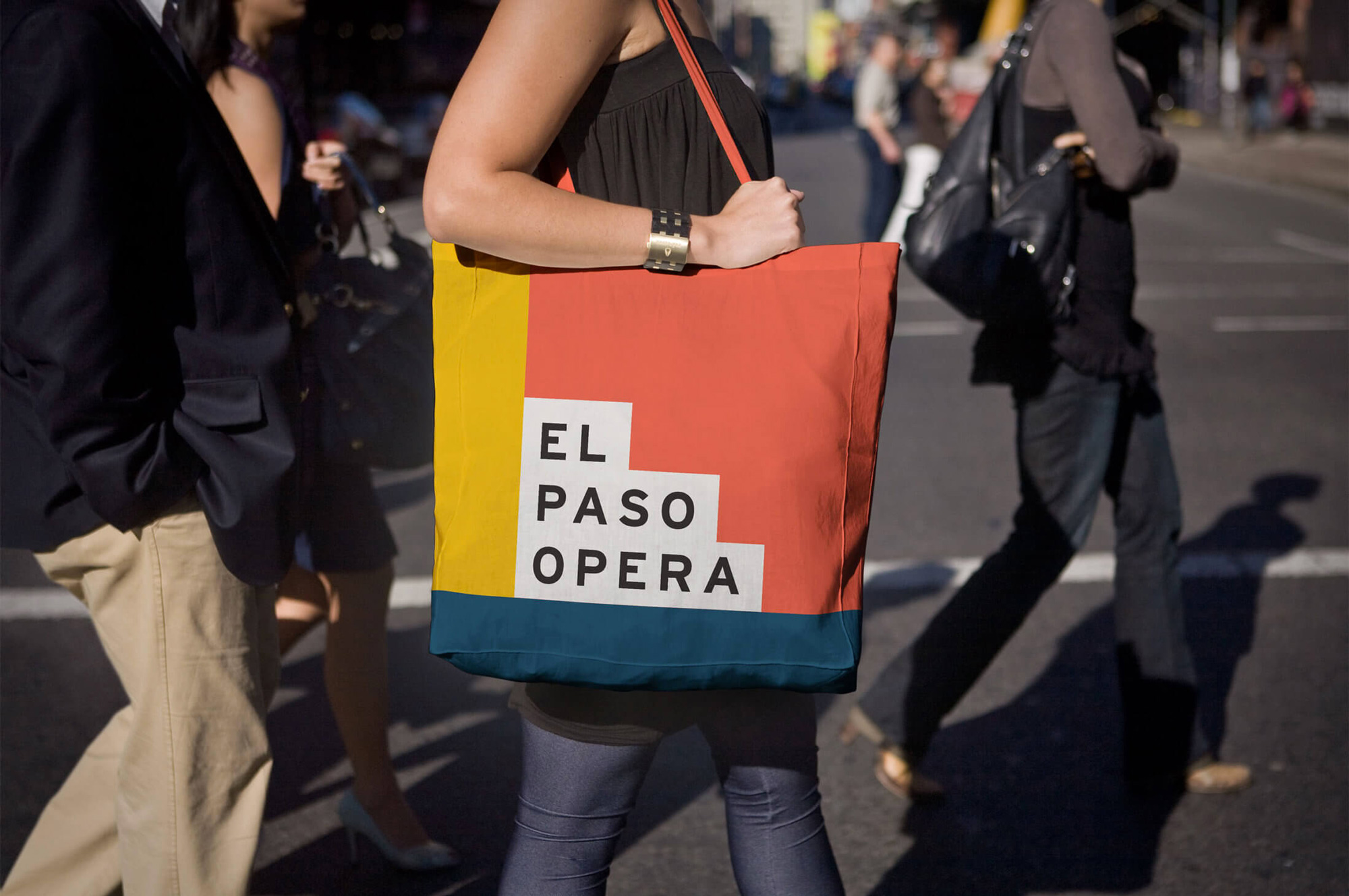

Overall, this is a great redesign that helps change the perception of opera from a stodgy, snobby attraction to one that is not that and positions it as more of an engaging cultural celebration that anyone can enjoy.

 Новости Союза дизайнеров
Все о дизайне в Санкт-Петербурге.