Обзор лучших ресурсов по разработке бренда, разработке упаковки
contact us | ok@ohmycode.ru
contact us | ok@ohmycode.ru
Established in 1897, Juventus F.C. — or Juventus, or Juve, or I Bianconeri (the black-and-white) — is a professional Italian football club based in Turin and, arguably, one of the most famous and successful teams in soccer history. (My older brother — in the 1980s, in Mexico City — was an ardent fan.) Juventus is the second oldest (and still active) team in the country — Genoa is the oldest — and has won 61 national and international official titles. Yesterday, the team introduced a new logo and identity designed by the Milan office of Interbrand.
Built upon heritage-founded principles of confidence, determination, and uncompromising conviction, Juventus has crafted a revolutionary growth plan—launched during the inaugural “Black and White and More” event and sustained by a new brand strategy and identity. Juventus aims to distil its essence into far-reaching experiences which can appeal to the football fan while being highly relevant to entertainment enthusiasts who are further away from football as a sport. The new logo is iconic and universal. It’s bold enough to make a statement, but flexible enough to appear alongside a wide range of new experiences—in the stadium and beyond. By leaving the team’s defining black-and-white stripes untouched, Juventus is bringing the illustrious legacy and spirit of one of Italy’s preeminent teams to new audiences and die-hard fans alike.
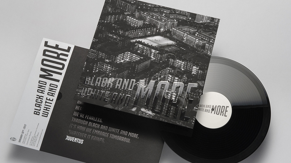
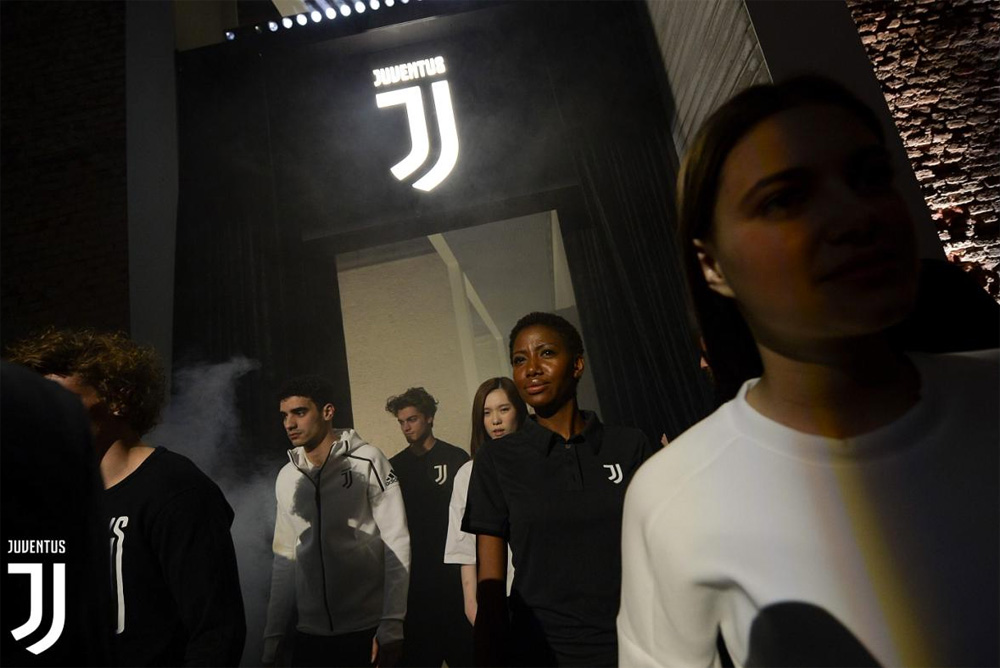
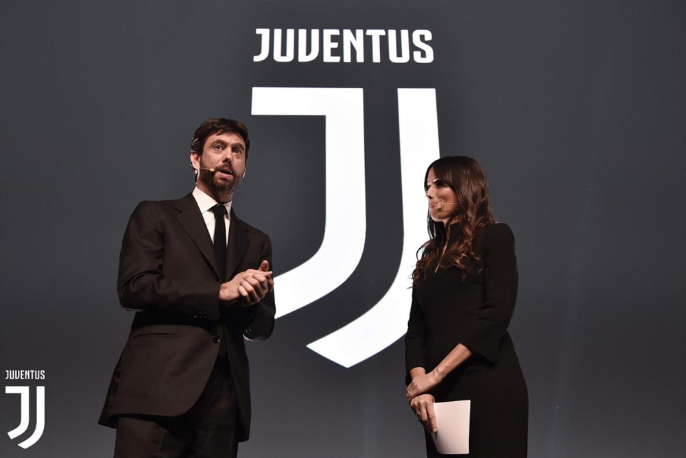
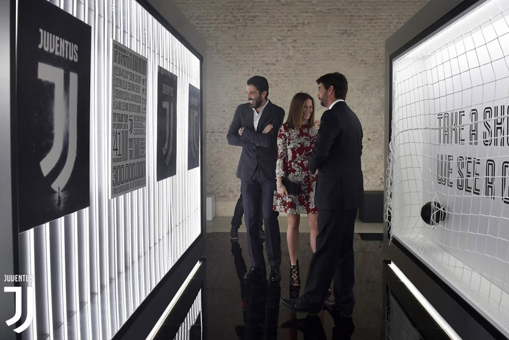
The new identity launched in Milan on January 16, 2017, the first of many premier, immersive Juventus events. The new identity will then follow the team to showcase future digital, social, and retail experiences to loyal supporters, soccer enthusiasts, business partners, and entertainment enthusiasts. Juventus’s move is unprecedented—to become recognized for more than their performance on the field, but as a universal symbol for perseverance, ambition, and premium Italian style.
If you managed to get through the video without rolling your eyes multiple times or wanting to punch the movie-trailer-style narrator in his probably perfectly-trimmed bearded face, there is a lot more to see with lesser degrees of pretentiousness.
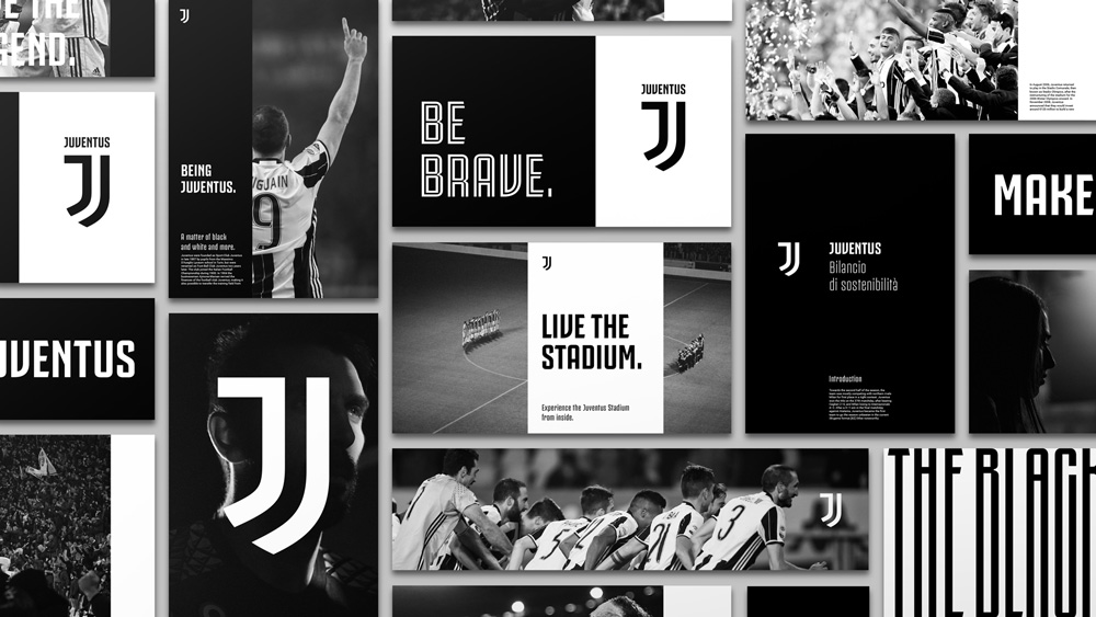
The transformation also encompasses a brand-new visual identity. The result of a bold, uncompromising approach, the new visual identity turns the sport’s traditional style on its head and sets about blazing a new trail.
It is an iconic, simple design centred around sharp lines and will surely steal the spotlight no matter where it is used. The design brings to mind a famous line from Gianni Agnelli: “I get excited every time I see a word beginning with J in the papers.”
Most articles about the logo change include Twitter embeds from angry fans who hate the new logo and bemoan the loss of a traditional seal. Well, boo-hoo. Other than familiarity with it — and, I’ll admit, the historic perpetuation of the egg-shaped oval as the main recognition element — there was nothing amazing about the old logo and by now it looked more like an F1 brand than a traditional soccer shield/crest/badge. Fans and purists will disagree but the new logo is excellent, regardless or perhaps specifically for how it breaks from convention and tradition and dares to do something different for this specific category. Just look at the image directly below to see what a difference a contemporary logo makes seen in contrast to what looks like a display of antique plates cordoned off in a museum.
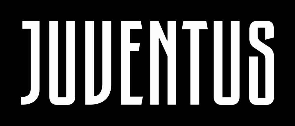
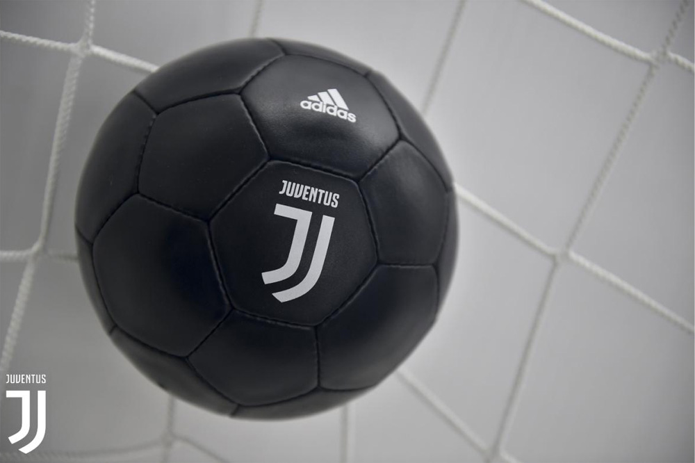
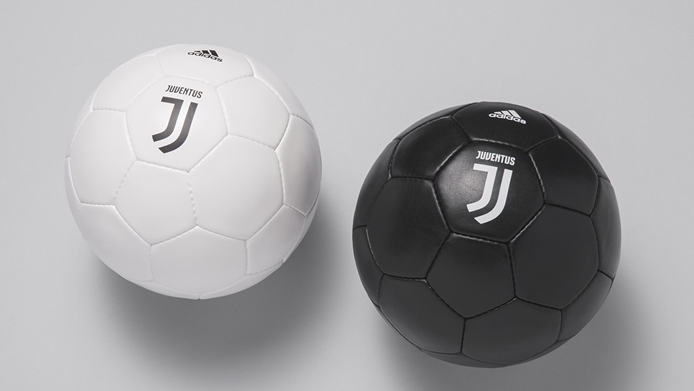
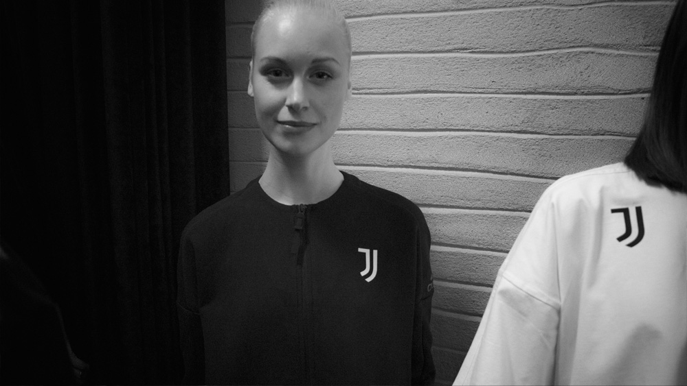
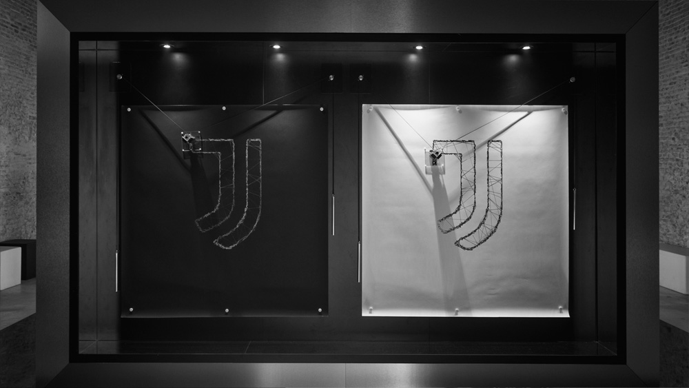
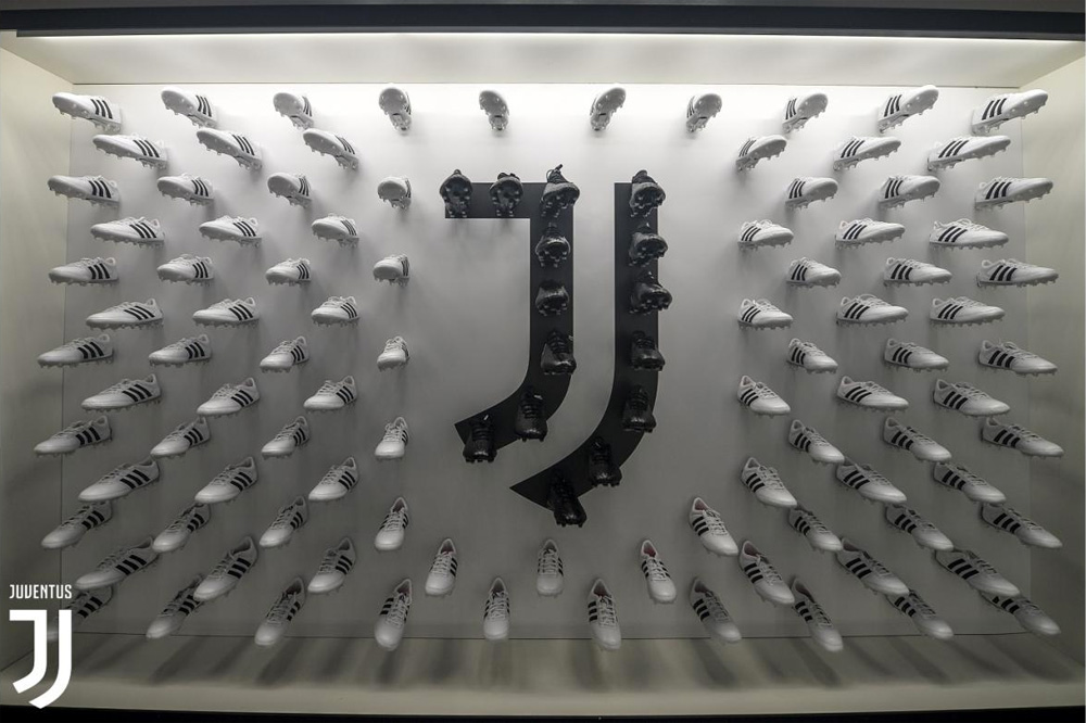
The execution of the new “J” is great, hinting at both the traditional black-and-white stripes of the uniforms and Gestalting the shit out of your brain for it to complete the shape of a shield, which helps anchor the logo in a more traditional soccer symbol. The monogram works great small, large, in black, in white, and can withstand weird stuff like the image below. The wordmark condensed and industrial-esque wordmark also hints at the uniform stripes and even in its simplicity it has plenty of personality, mostly thanks to the initial “J”.
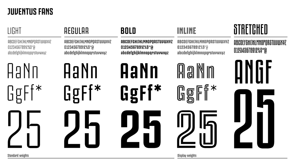
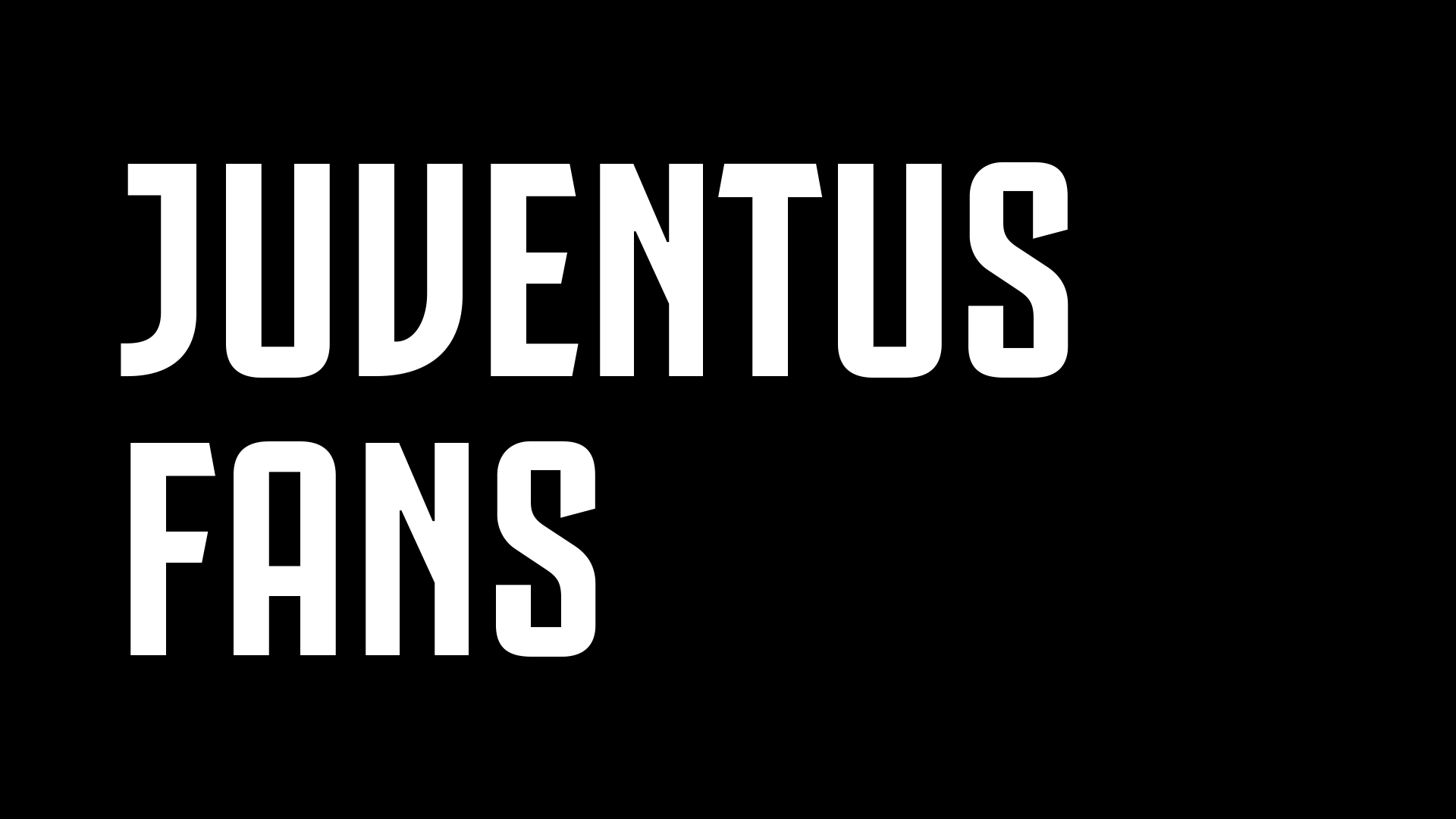
The custom type family is quite nice and successfully executed across multiple weights. I know I regularly bring up the typographic work of the Nike Graphic Identity Group as examples of not-the-best and I think the Juventus fonts work as a counter example of doing it right. Those numerals are stunning. I could do without the stretched variation for sure.

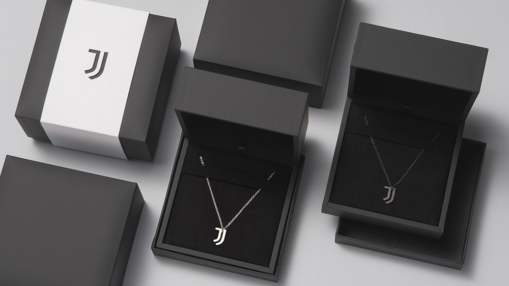
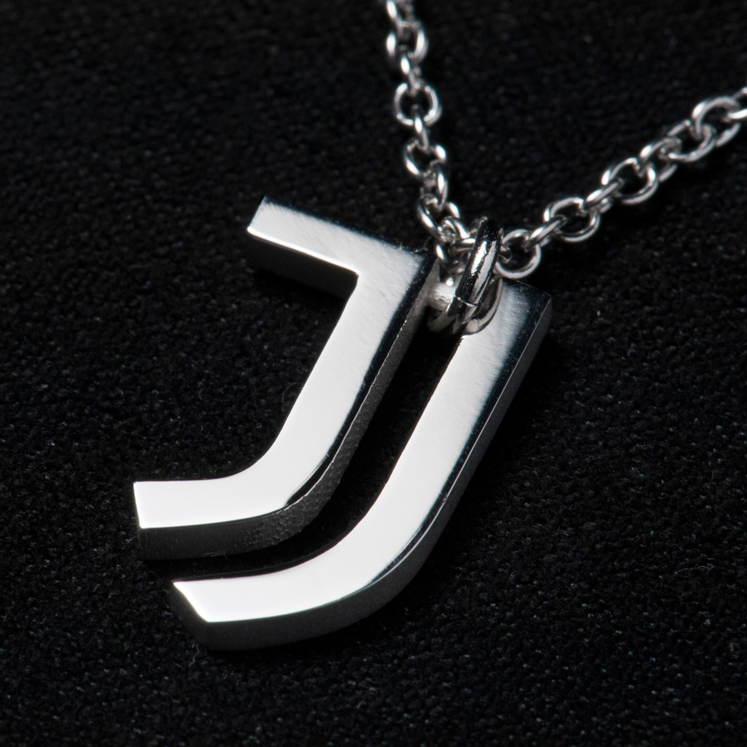
We’ve seen logos fax, cupcake, even ball, but we hadn’t seen one necklace, and the simplicity of this logo allows it to work as one. Despite another eye-rolling moment, this application actually does a great job in showing the ability of the logo to look sporty and premium.
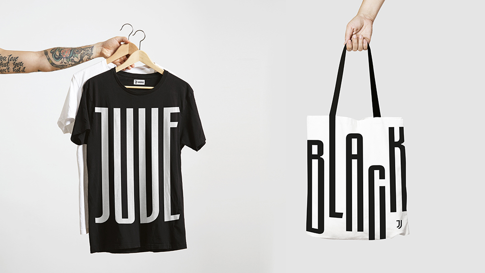
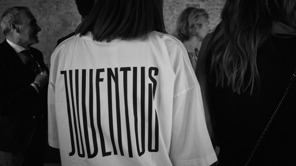
Things get a little wonky in some of these early applications with the elongated letterforms. They already established the uniform relationship and this pushes it too far in an unnecessary way. Except for the “JUVE” t-shirt… that’s pretty cool and I can see fans (men and women) wearing that for a night out at a club.


The launch event falls back on some gaudiness and pretentiousness that feels like it purposely wants to exclude the day-to-day fan but also gets the point across that, from now on, Juventus is as much a soccer brand as it is a premium lifestyle brand. To me, this is where the brand veers off in a bad direction, way more than whatever the logo fails to do for fans, as it takes away (or more like pisses on) the popular (as in of-the-people) appeal of soccer. But, I get it, flash and pomp has its own appeal. Overall, I absolutely like the new logo and commend both the team and Interbrand for pursuing and achieving a rare case of simplicity, boldness, and directness rarely seen in European soccer teams that will help expand the possibilities of how and where Juventus is presented without it being dragged back by what other 100-year-old soccer teams are expected to look like.
Thanks to Daniel Golden for the tip.

 Новости Союза дизайнеров
Все о дизайне в Санкт-Петербурге.
Новости Союза дизайнеров
Все о дизайне в Санкт-Петербурге.