Обзор лучших ресурсов по разработке бренда, разработке упаковки
contact us | ok@ohmycode.ru
contact us | ok@ohmycode.ru
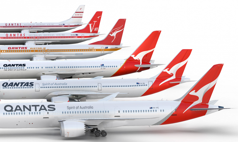
Established in 1920 (originally named Queensland and Northern Territory Aerial Services), Qantas is the flag carrier of Australia and its largest domestic and international airline. With over 30,000 employees and a fleet of close to 120 airplanes, Qantas flies to more than 80 destinations. As it welcomes a Boeing 787 Dreamliner to its fleet, Qantas has introduced a new logo and livery “overseen by Qantas consultant designer, Marc Newson, in partnership with Australian design agency Houston Group”.
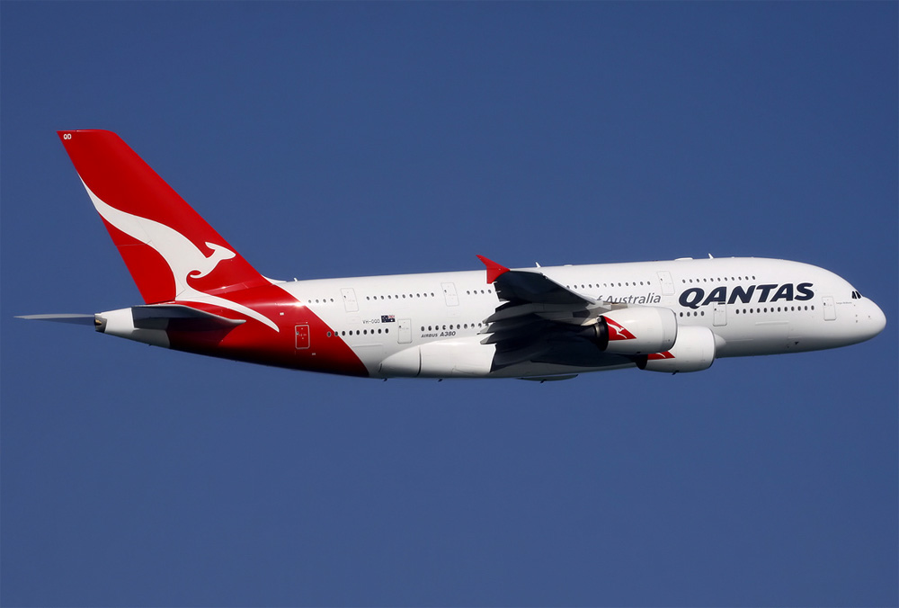
The change is only the fifth time the red-and-white image on the tail of Qantas aircraft has been updated since it was first introduced in 1944. The last update was in 2007 to coincide with the introduction of the Airbus A380 to the national carrier’s fleet.
Marc Newson, who has helped design Qantas’ lounges, the A380 cabin and the iconic Skybed, said:
“Aircraft tails are fantastic canvas to work on and the Qantas logo is one of the most recognisable in the world. This re-design aims to retain the fundamental essence of the flying kangaroo but also move the brand forward.
“This new brand is more streamlined and the shading behind the kangaroo gives a better sense of movement and depth.
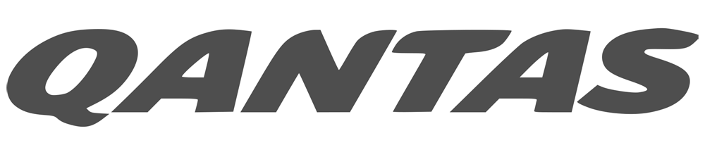
Back in 2007 we wrote about the logo change designed by Hulsbosch and for a moment I questioned my judging abilities of 9 years ago as the review stated that “the new logo is a subtle but beautiful change” and described the wordmark as “improved typography”. Then I realized I didn’t write that review! While I do think the 2007 kangaroo icon was better than its predecessor I wouldn’t call it “beautiful” and I certainly wouldn’t have praised the extra-italic wordmark and its wonky curves nor deem it improved. To summarize: The old kangaroo kept the exaggerated shape of previous ones while making it more readable and having more sweeping and defined curves but the wordmark tried too hard to look aerodynamic with an unnecessarily slanted angle.
Regarding the new… The kangaroo maintains the overall shape and similar motion but has been heavily abstracted by removing its arms and losing definition in the head. The main reason we know it’s a kangaroo it’s because we know Qantas has had a kangaroo forever but it’s questionable whether this looks like a kangaroo anymore. Not that it has to be a literal representation — I can go to a zoo to see a true-to-life one — but if they are still trying to sell me on the idea that this is a kangaroo, I’m not buying it so easily. It’s stuck somewhere between its legacy and wanting to be a signifier for air-travel-of-the-future… it’s almost like a swooshy abstract mark for Virgin Galactic. I would love to say that I love its curves and shading because clearly effort has gone into it but I’m not feeling it at all.
The kangaroo gets more shading in these renderings which, sure, are attractive and provide a kind of sexy, luxurious vibe.
The key opportunity for us was in contemporising the ‘roo. Making it more streamlined, and simplifying the shape. It’s evolved beyond a literal kangaroo - it’s become a unique brand symbol. We spent just as long handcrafting the Qantas logotype. We focussed on making it more streamlined, as if air is pushing across the top.
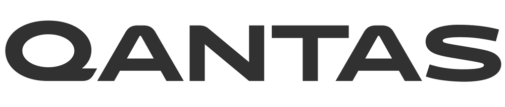

The wordmark, though, that I really like. I love the wide structure and the un-italicizing. The “Q” could use some ink-trapping but I really like the unconventional approach. Yesterday, on the FLOR project, I was mentioning how hard “S”s are to draw and this one almost nails it; the middle part gets too stiff right in the center but it has some nice sweeping curves. I don’t know about no “air is pushing across the top” as mentioned in the project page so I would have settled for “it looks cool.”
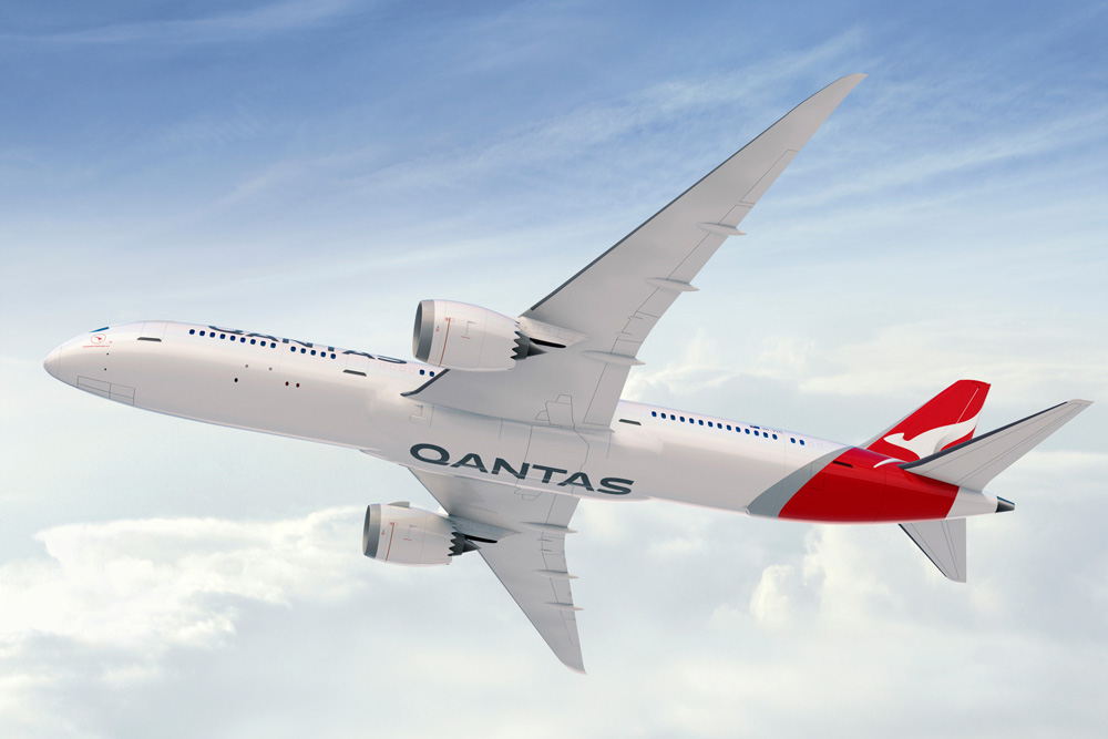
The overall lock-up seems like a part of a slow-burning trend where all icons take the shape of the plane’s tail with the wordmark forming the fuselage. I get it. It’s fine. The extended wordmark in this case works very well with the icon to convey the airplane illusion. The tagline, set in Ciutadella (which becomes the main typeface throughout), feels very disconnected.
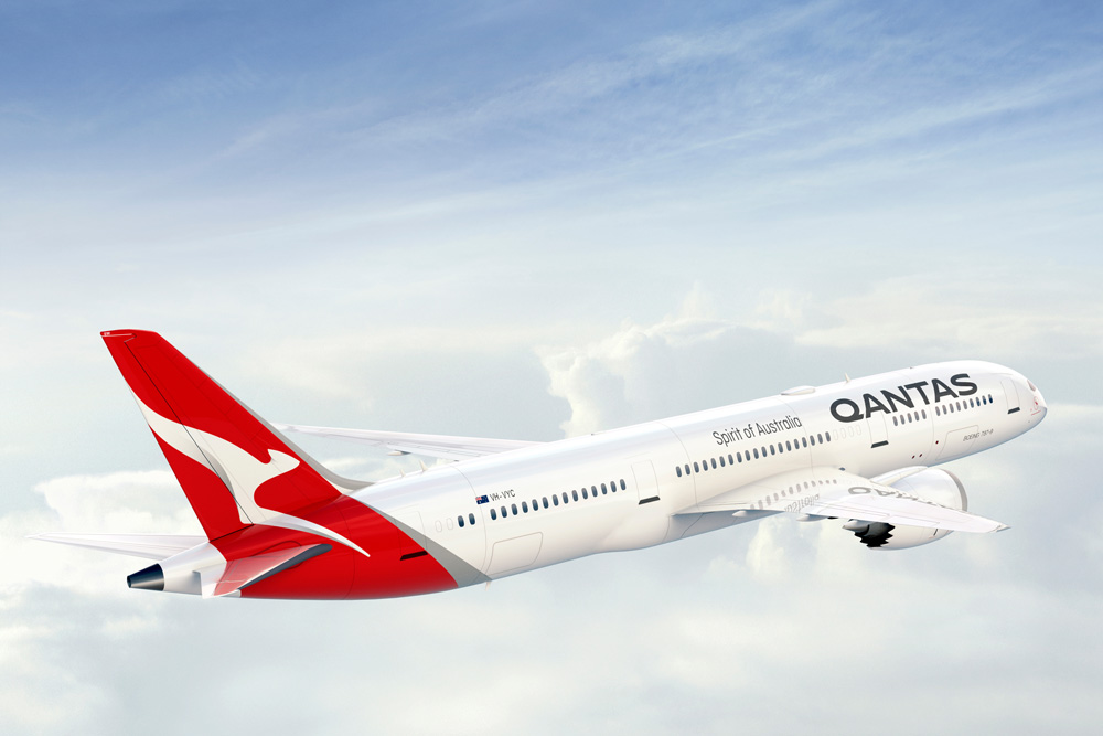
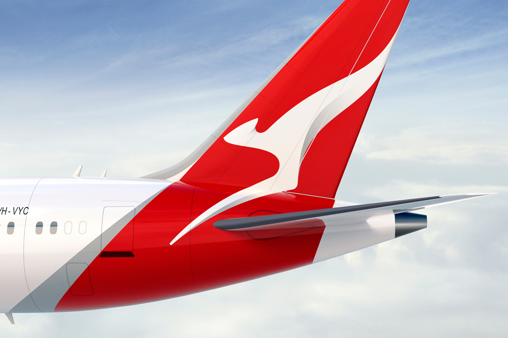
The livery didn’t change much. They simply replaced old kangaroo and wordmark with the new ones. They added a metallic swoosh after the red in the tail that supposedly gives a “a more premium feel”. I’m not saying it doesn’t except that, well, it doesn’t. It’s just an extra detail.
As mentioned before, the identity then defaults to Ciutadella for all the typography. It’s a decent typeface but there is something about it that doesn’t feel ready for the big leagues as a corporate/brand typeface. I’m not trying to be critical just for the sake of it or because I enjoy it (I do but not just to be mean) and bring almost everything about this project down but there is something informal about it or maybe it’s the very vertical aesthetic it has as all round characters are flat on the sides. This might just be a personal caveat as, really, there is nothing offensive about the typeface.
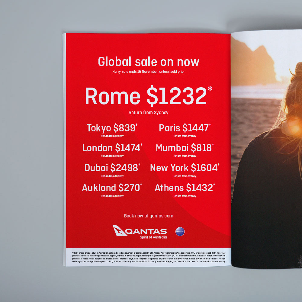
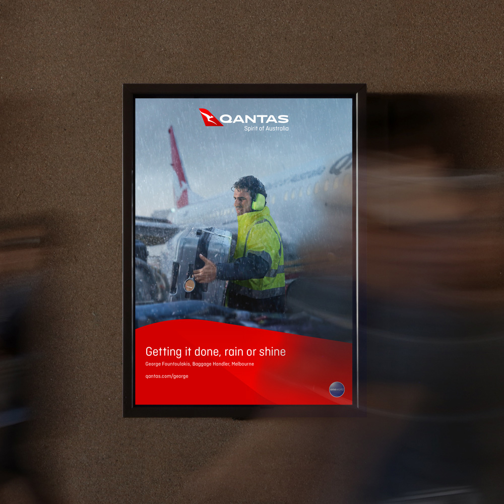
The posters above — and here maybe I AM being mean — are totally random (what’s up with that blob?!) but I guess they are trying to capture the fluidity and grooviness of the new identity. Overall, there is a strong sense of “newness” and new-car-smell while building on the existing equity of the key Qantas elements so, despite any misgivings I have, it’s a successful redesign… it just doesn’t get me hopping with joy.
Thanks to everyone for the tip.

 Новости Союза дизайнеров
Все о дизайне в Санкт-Петербурге.
Новости Союза дизайнеров
Все о дизайне в Санкт-Петербурге.