Обзор лучших ресурсов по разработке бренда, разработке упаковки
contact us | ok@ohmycode.ru
contact us | ok@ohmycode.ru
Established in 2004, Facebook needs little introduction as it’s a name we all recognize… except that it does need a little introduction as it’s easy to forget that Facebook is more than just the mobile and desktop app that’s used on a daily basis by 1.63 billion daily active users (as of September 2019). With more than 43,000 employees in over 60 offices around the world, Facebook, the corporation, owns a number of major products including Instagram, WhatsApp, and Oculus, which have strong brands of their own but that are not always immediately associated with Facebook. Other relevant information about Facebook is that Facebook is currently in the doghouse and they could parachute a golden retriever puppy for every citizen on Earth and we would still hate them. In actual news that happened, Facebook yesterday introduced a new corporate logo designed in-house in collaboration with Dalton Maag and Saffron.
Inspired by how our company builds products, we designed a process to learn, prototype and iterate quickly. We began by building a collective understanding of our company, conducting listening tours with employees and the people and businesses who use our products. We then brought together people from across the company to design and work together. We explored three creative territories, uniting around one final concept inspired by the potential of people when they can come together. We refined the brand system by working with designers across the company to ensure it performs in product, hardware, marketing and physical spaces.
Through the process, three foundational design behaviors that informed our brand system emerged:
Clarity: a brand that simplifies and builds understanding
Empathy: a system that is respectful of context and environment
Creating Space: design that supports people and their stories
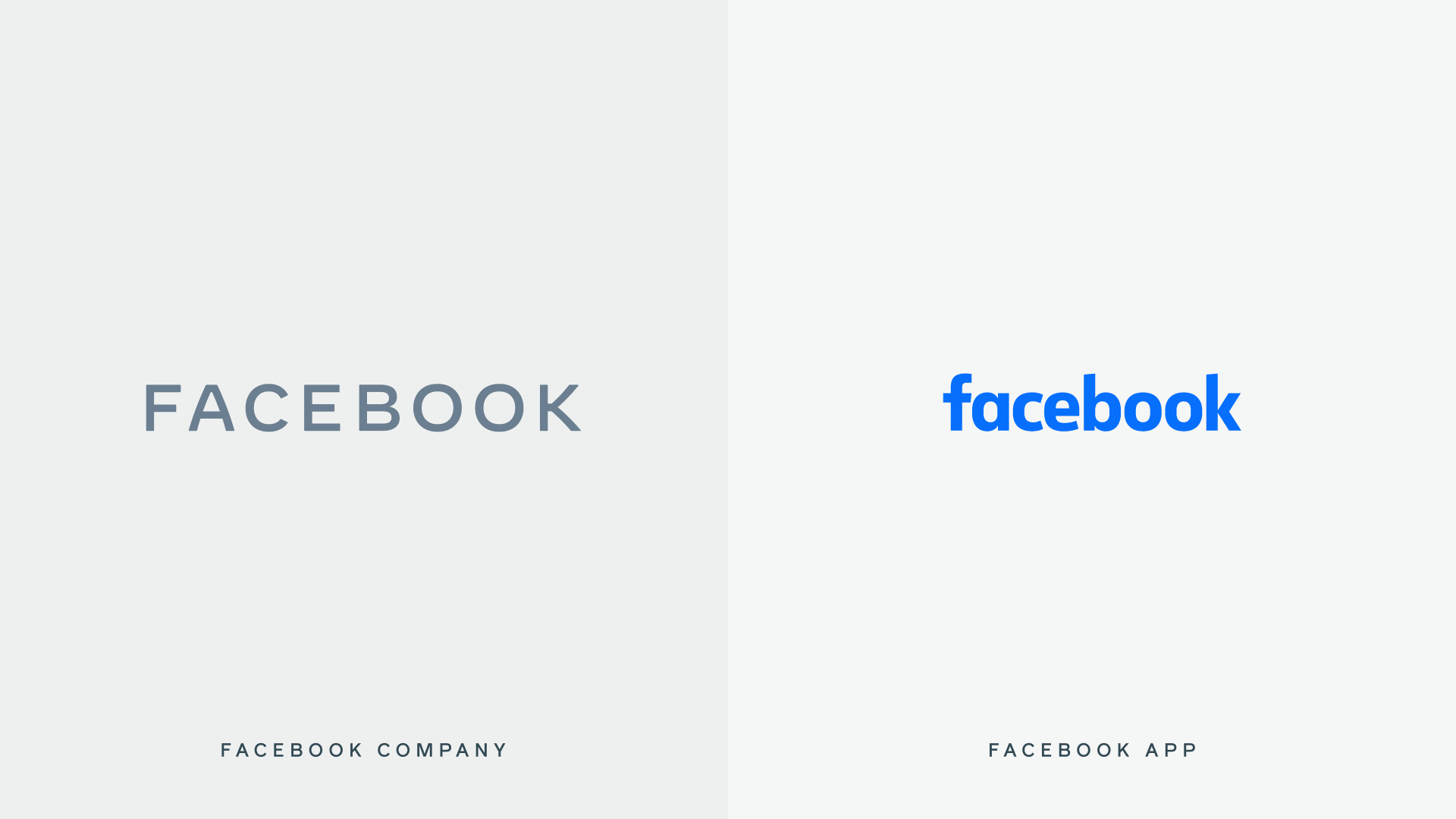
Today, when people hear “Facebook” they think of the Facebook app. This posed a unique design challenge. We needed the wordmark to establish distinction from the Facebook app and allow for a clearer connection to the full family of technologies. The new brand system uses custom typography, rounded corners, open tracking and capitalization to create visual distinction between the company and the app.
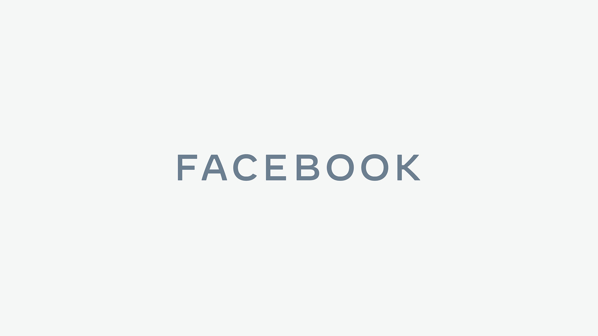
Choosing an all-caps treatment as a way to create distinction from the app made it more important to craft unique letterforms. We designed the new company wordmark with clarity and openness in mind. It’s built on a stable structure through the use of consistent stroke width, harmonized capital letters and a horizontal emphasis. The generous spacing and open letterforms allow clarity at small sizes, and the subtle softening of corners and diagonals adds a sense of optimism.
Visually, there is not a whole lot to this story and I will get to that. Contextually, there is a whole lot going on with Facebook that dramatically affects any objective interpretation of this new corporate logo. In a nutshell, nothing Facebook does right now will be considered positive and will be judged against their ongoing privacy issues, their role in the previous election, and all the other maladies listed at wiki/Facebook#Criticisms_and_controversies. It’s also interesting that at a time when Presidential Candidate Elizabeth Warren is aiming to break up Facebook, Facebook is doubling down and presenting a united front with this logo — she beat me to a review of the logo too. It’s a tough time to be Facebook but I don’t think anyone has any empathy — a word they are throwing around a lot in regards to the new logo — for them.
Shoving all of the heavy, stinky baggage aside, the new logo is very good. It may be boring and it may be unimaginative but this is a corporate parent brand, not a consumer-facing brand. This is what Alphabet is to Google or what PepsiCo is to Pepsi — corporate brands that support a multitude of consumer brands, each with their own identity. The goal of these corporate brands is to be a common denominator and serve as the backbone not to steal the show. So, yes, it’s just a bland corporate wordmark and to most people it’s “just” a font but this is a really nice, very well executed custom wordmark with plenty of novel details to make it unique. The subtle bowing of the “A” and the “K” is quite pleasant; the oblong “O”s have a great proportion; and the very small rounded corners on all the letters create a soft contour. There is a whole lot of bullshit in the quoted text above, and some of it makes sense, but if you ignore most of it, this is, at its most basic, a design exercise solved well. It’s not going to change the logo design world in any way but it gets this job done.
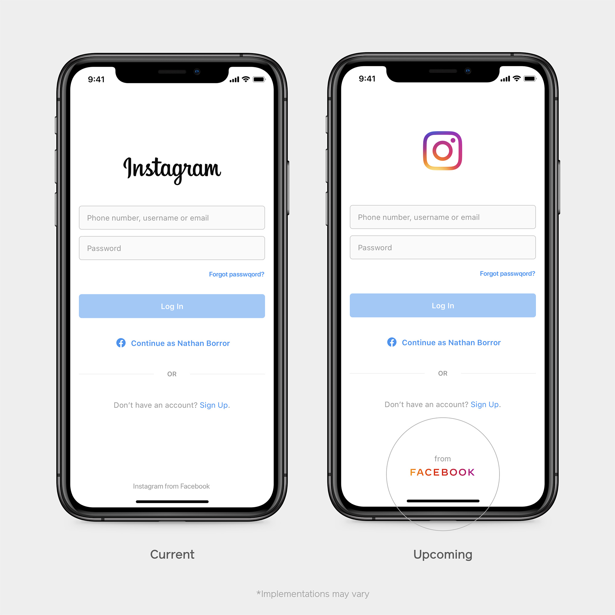
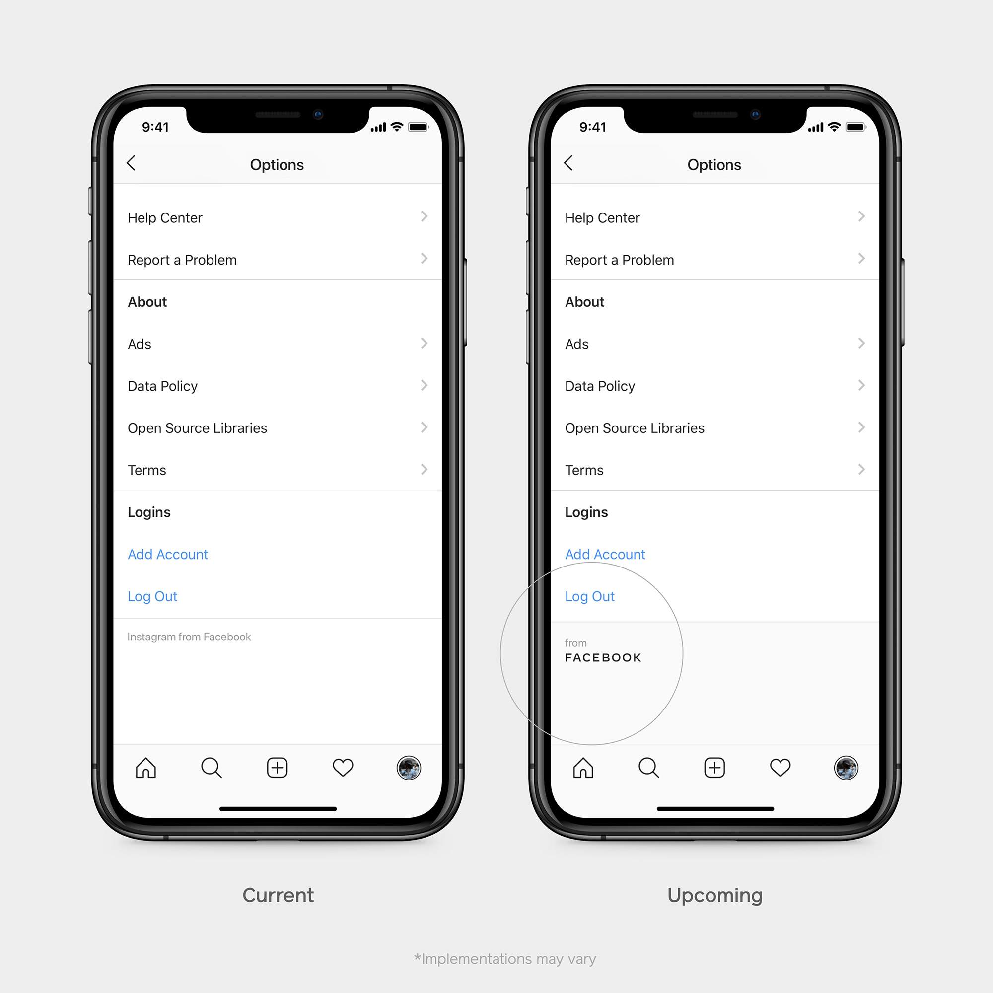
Instead of the company owning a single color, we designed the brand to be responsive to its context and environment. This system allows the wordmark to take on the color of our individual brands, creating a clearer relationship between the company and the products we build.
We wanted the brand to connect thoughtfully with the world and the people in it. The dynamic color system does this by taking on the color of its environment.
The logo can then take on the colors of its products — whether it’s the amazingly recognizable Instagram gradient, Facebook’s bright blue, or WhatsApp’s jarring green. This isn’t groundbreaking in any way but it works and perhaps it could be seen as Facebook, Inc. absorbing some of the better juju of these products by taking on their skin. And while graphically I can get behind the idea I am definitely not immune to letting the context of Facebook influence my opinions: What is somewhat repellent is their continued use of the word “empathy” when describing the color changes… Like, no. Facebook simply does not get to use the word empathy, at least not now.
We use motion in our system to create space for people and their stories. The wordmark itself opens up through tracking and fading, aiming to support and never overshadow.
Meh.
Overall, there is no happy ending here despite any good design executions and intentions. Unlike last year’s Uber redesign that came at the right time with the right solution through a more humble and modest logo, this corporate Facebook logo comes at the wrong time when no one wants to cheer for them and no amount of press releasing or corporate copywriting can make us empathize with them. If anything, they should have quietly rolled this out and kept their heads low instead of trying to use it as a show of good will — no amount of nice kerning can make up for reputation lost.
 each year since publication began in 2006

 Новости Союза дизайнеров
Все о дизайне в Санкт-Петербурге.
Новости Союза дизайнеров
Все о дизайне в Санкт-Петербурге.