Обзор лучших ресурсов по разработке бренда, разработке упаковки
contact us | ok@ohmycode.ru
contact us | ok@ohmycode.ru
Established in 2006, Xenith is a brand of helmets and other supporting equipment for American football. Based in Detroit, MI, Xenith is a newcomer to the industry, competing with leaders Riddell and Schutt (established in 1927 and 1918), but in a short amount of time their helmets have been adopted by hundreds of thousands of players at all levels, including youth, high school, college, and the NFL. At the end of last year, Xenith introduced a new identity designed by Detroit-based Skidmore Studio.
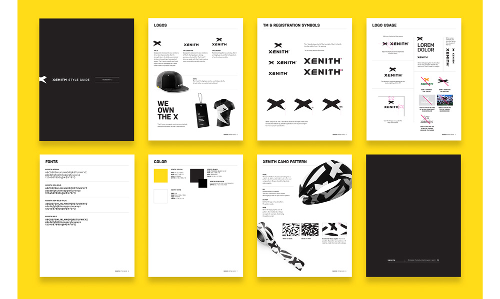
Designed to harness the raw emotions of the brand personality, the X’s strength lies in its bold, asymmetrical strokes intersecting at unexpected angles. It flexes to grow big and bold on packaging, scatters to create an iconic camo pattern and shrinks into a simple, recognizable mark on gear.
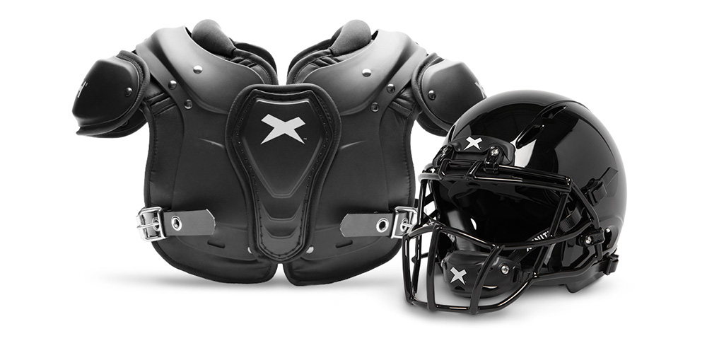
The old logo was bad; not only was the wordmark ugly to look at, hard to read, and weirdly connected but it also looked more like the title treatment for a YA fantasy book series. The new logo is clearly within the sports world as there are plenty of spikes to be seen and while the new wordmark doesn’t change the game, the new “X” icon is great. Its asymmetry and slight awkwardness make it feel dynamic and explosive, looking almost like a mark a helmet would leave in another helmet when they hit — although that may not be a metaphor anyone wants to sell because concussions. Anyway, it’s a really great graphic and in the before/after comparison of the helmets above, the improvement is undeniable, going from a gangly-looking “X” that barely fit in the space allotted to a much more robust, better-fitting, identifiable element. The wordmark is more or less okay but the cuts in the “E” and “T” feel gratuitous. I almost liked the one in the “E” because the bottom-left angle of the icon visually connects to it but then the on the bottom-right where it could have aligned with the cut of the “T” it doesn’t. I understand the inclination to tie the icon with the wordmark but the result feels forced. Still: Bold! Sports! Yeah!
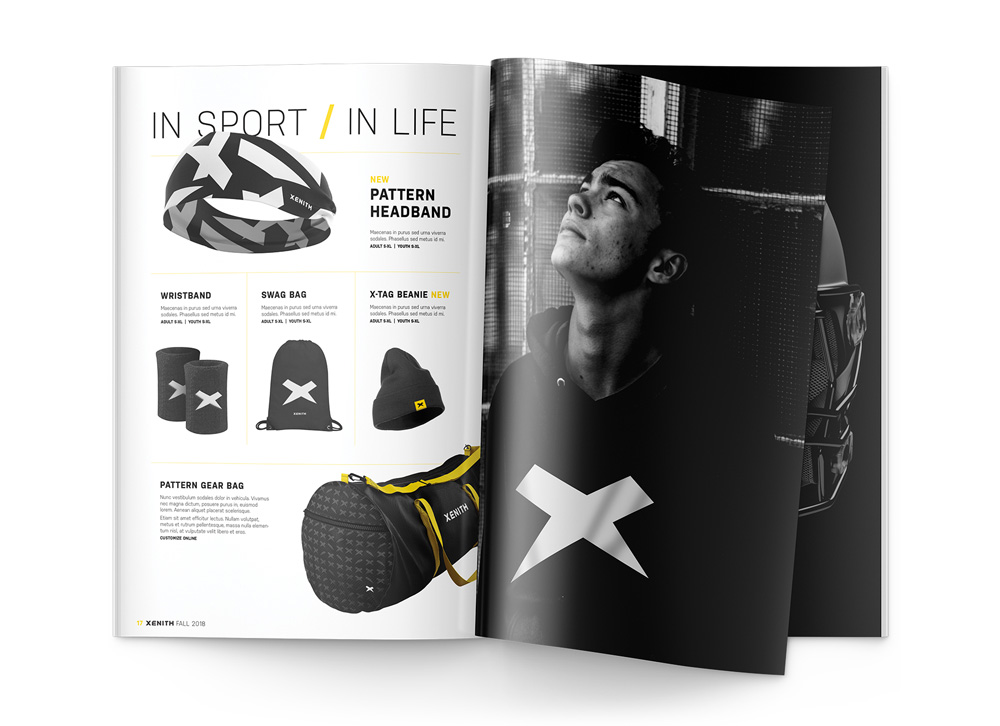
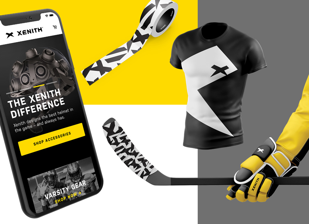
For a football equipment brand this actually makes for a pretty good lifestyle brand as well, almost like a skater or surf brand — something that competitor Riddell could not pull off. The yellow accent color works very well with the logo and the “camo” pattern (more if it below) is… rad.
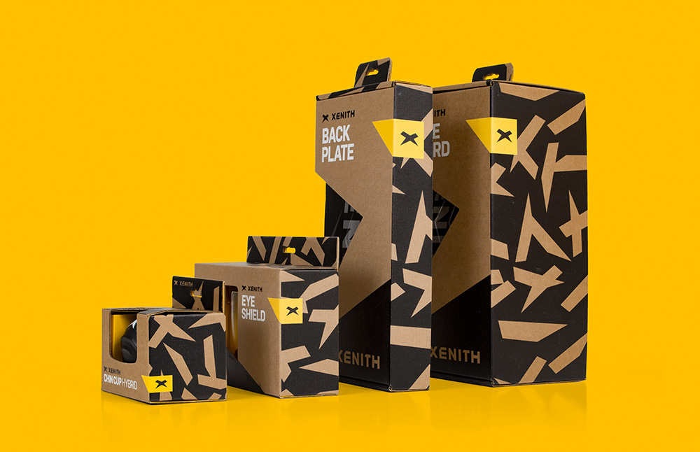
Across the whole product line, we simplified. The strong black-on-craft aesthetic differentiated Xenith’s premium products from its competitors. Messaging focused on moments that athletes could connect with. And a consistent use of camo created a Xenith billboard in every aisle, uniting a wide variety of products across the store.
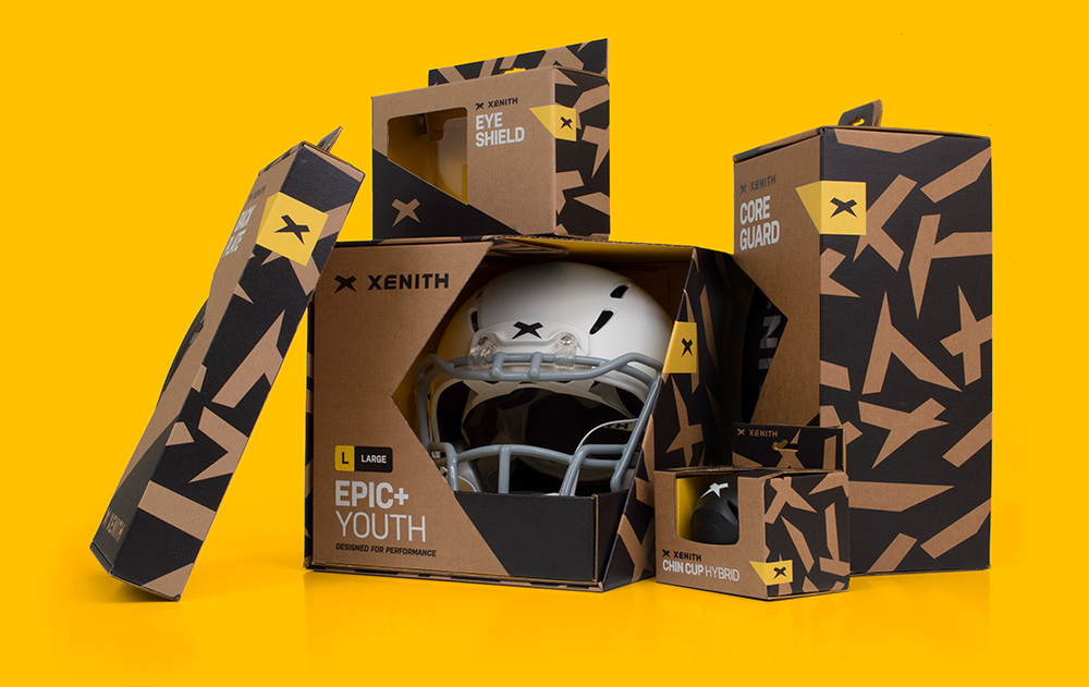
But there is more to a retail experience than looks alone. For Xenith’s flagship product, the football helmet, we created an in-store unboxing moment that encourages young athletes to interact with the product. A mysterious, peek-a-boo corner-cut shows off just enough of the helmet, inviting shoppers to pull it out and get hands-on with a product that is designed for ultimate fit and feel.
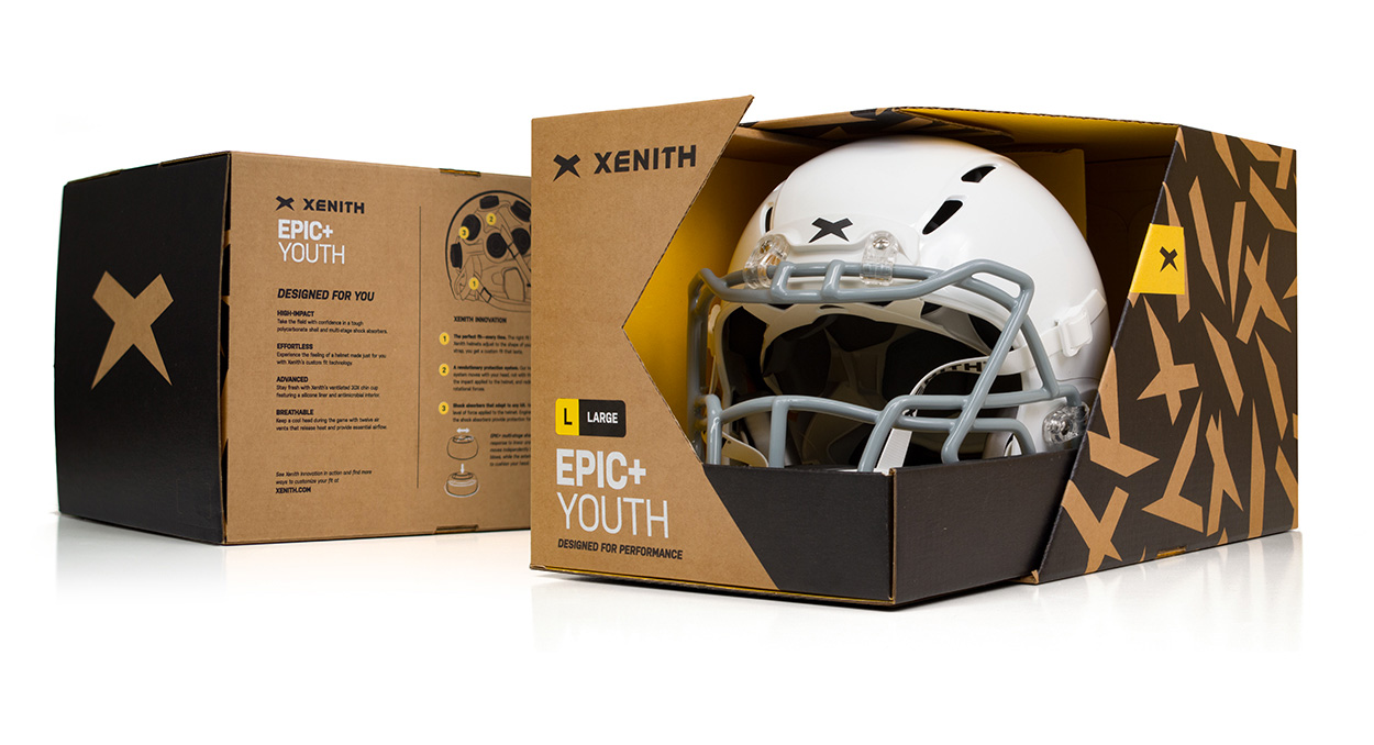
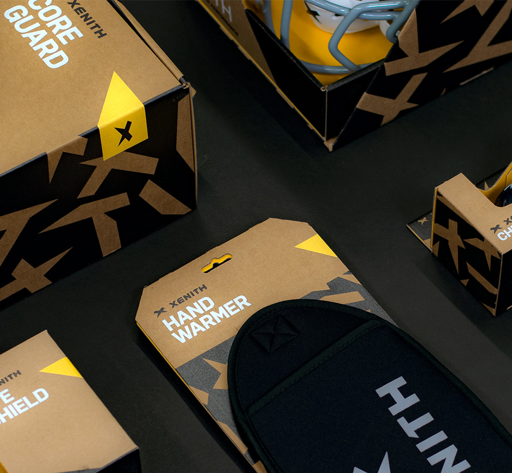
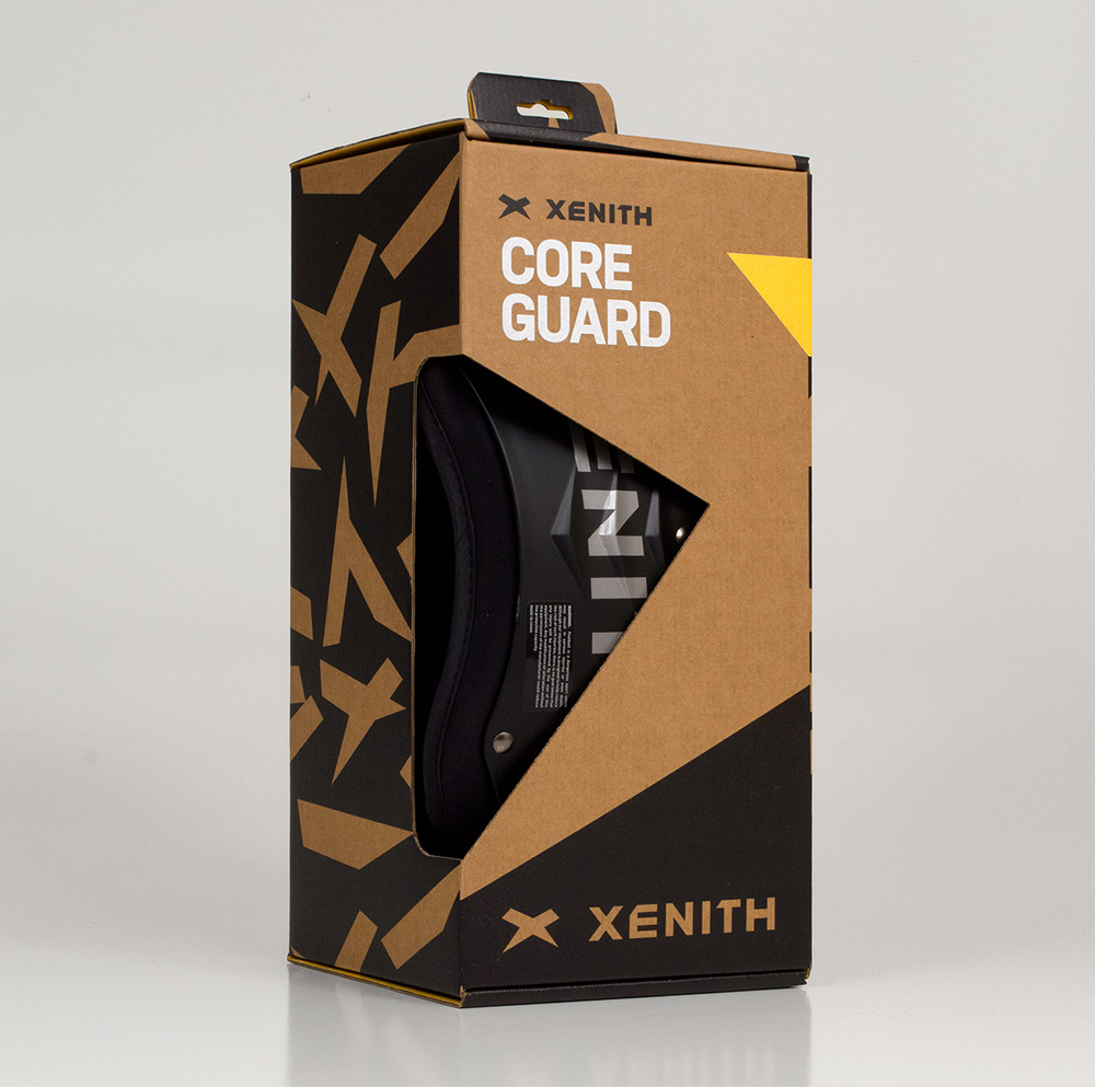
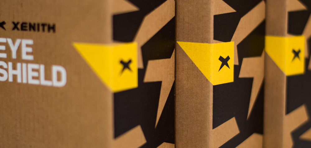
The packaging is bad-ass, with the camo pattern that deconstructs the icon in different ways to generate a fun, active pattern that looks great against the kraft boxes. If they had used gray chipboard of some kind this would have been epic but kraft is a lot more workable so it will definitely do. I like how the “x” icon lives in a yellow box that wraps around the boxes and the use of white silkscreen makes each product name pop clearly. The boxes have a 1990s feel — in a good way.
Overall, I think this is a really great redesign. It operates well within the boundaries of sports aesthetics but it manages to offer a fresh perspective and makes Xenith a much more covetable brand.

 Новости Союза дизайнеров
Все о дизайне в Санкт-Петербурге.
Новости Союза дизайнеров
Все о дизайне в Санкт-Петербурге.