Обзор лучших ресурсов по разработке бренда, разработке упаковки
contact us | ok@ohmycode.ru
contact us | ok@ohmycode.ru
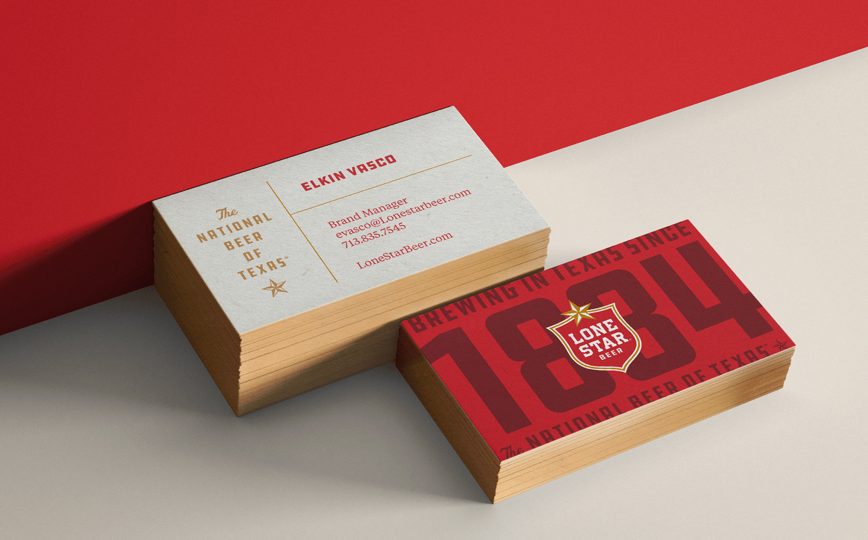
Established in 1884, Lone Star Brewing Company was the first large brewery in Texas, founded in San Antonio by beer OG, Adolphus Busch, of beverage giant Anheuser-Busch fame. Dubbed “The National Beer of Texas”, Lone Star’s brand name is now owned by Pabst Brewing Company and produced by Miller Brewing Company (owned by Molson Coors Brewing Company) offering a lager, simply named Lone Star, as well as a light version of it, and, recently they introduced 24/7, an even lighter lager. Along with the introduction of the new beer, Lone Star recently also introduced a new identity and packaging designed by Dallas, TX- and Oklahoma City, OK-based Switch.
As one of the oldest breweries in America, brewing since 1884, there is no shortage of history to draw from. The brand evolution focused on retaining elements of the brand that had strong iconic recognition, stripping away aspects that had been superfluously added in recent redesigns, and bringing back historical details through a modern lens.
The outcome is a comprehensive rebrand that encompassed evolutions of logos and secondary marks, color and type hierarchy, brand messaging, audience profiles, packaging design, new product launches, and out-of-home campaigns.
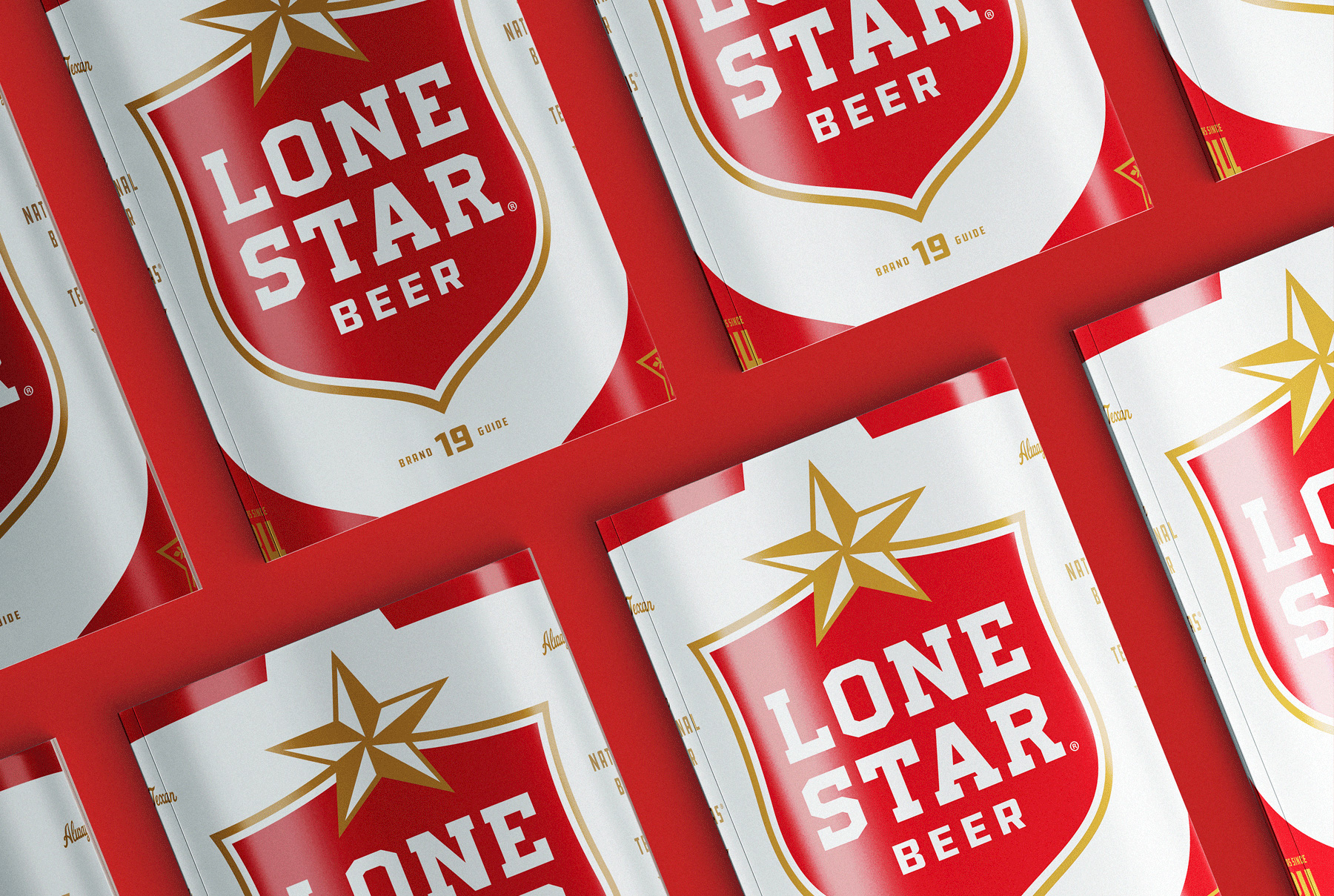
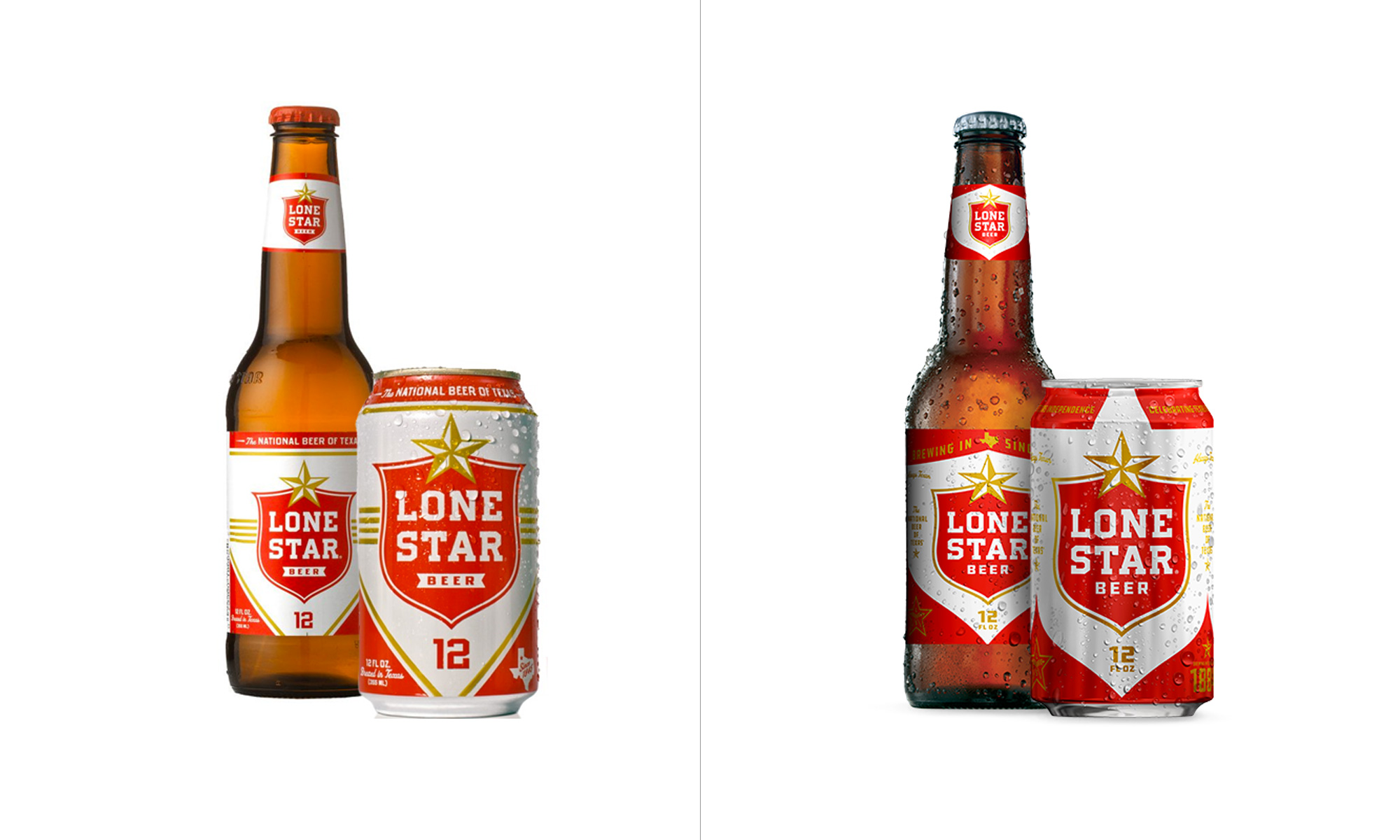
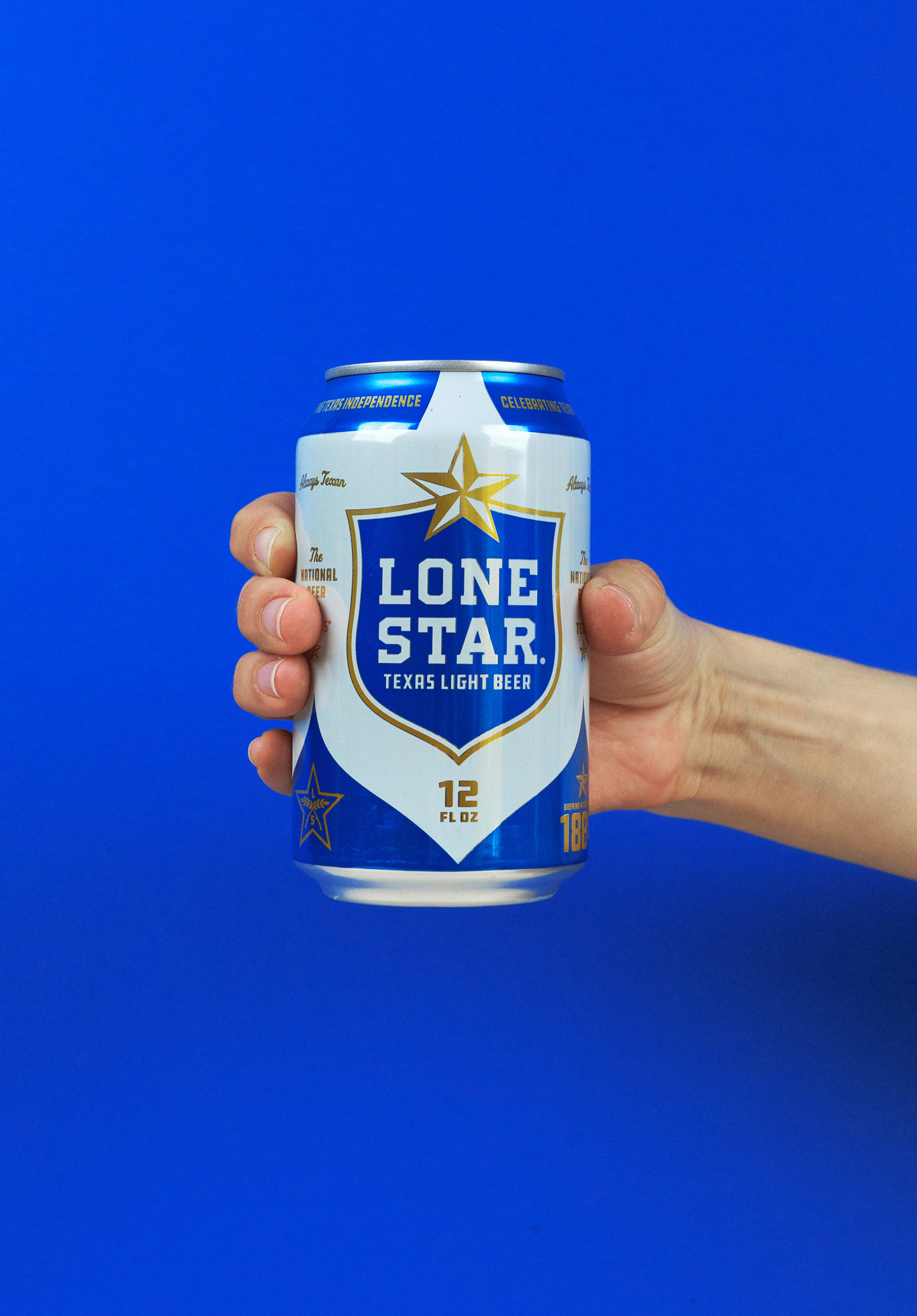
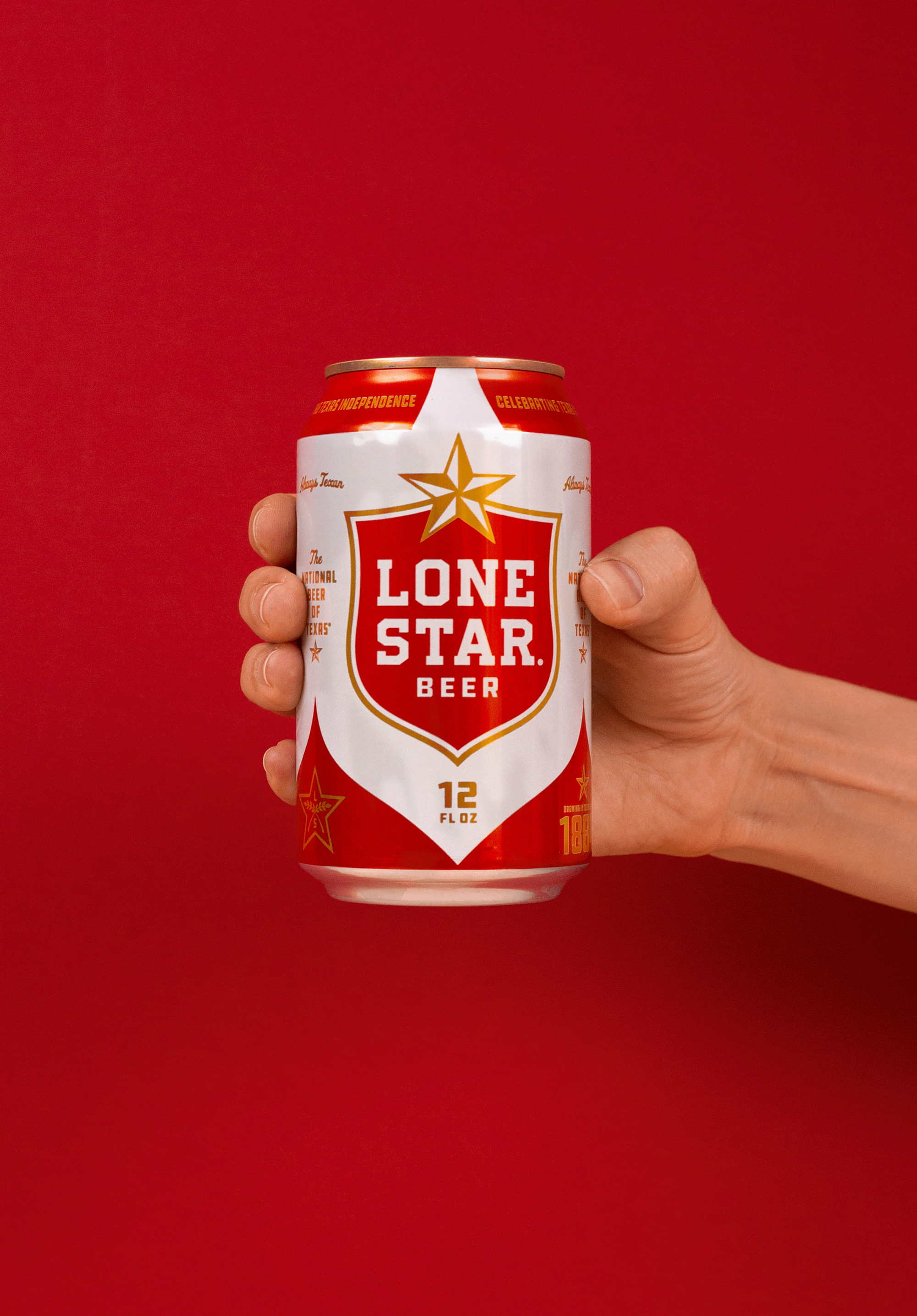
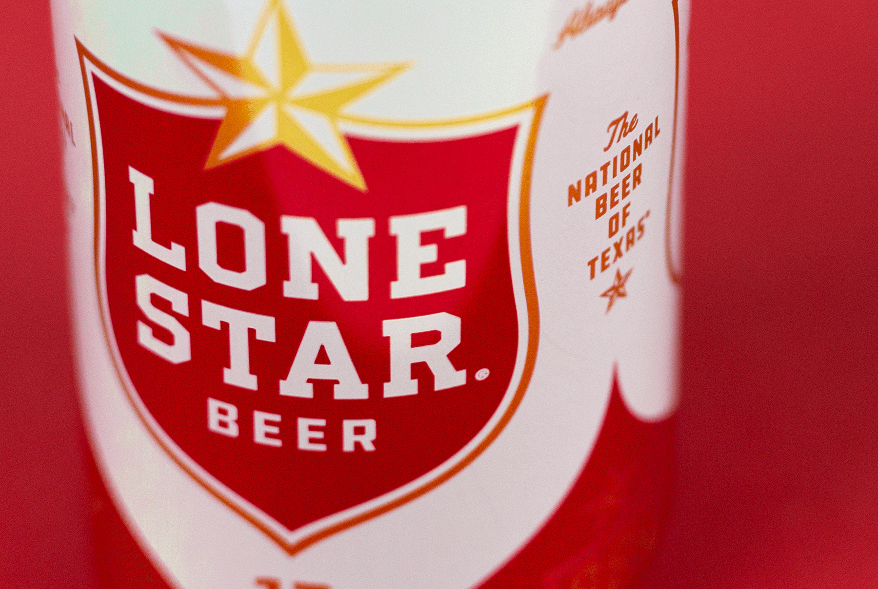
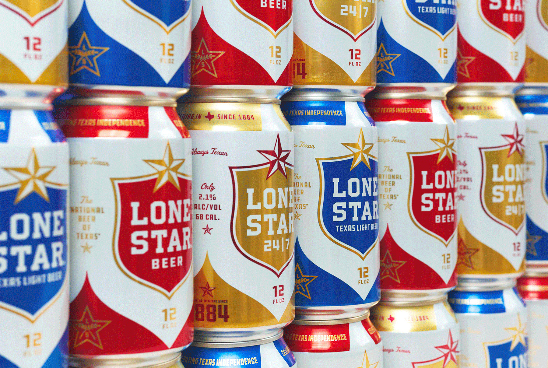
The logo evolution is subtle but effective with the biggest change being the shape of the shield that is now less dramatic on the flaring at the top, which accentuates the curves on the lower end. Removing “BEER” from an extra holding shape allows the word to be bigger. The gold color has been muted, which makes it a tad more sophisticated. While these changes may not be instantly evident to consumers they are beneficial to the refreshed identity and provide a stronger core logo for the packaging.
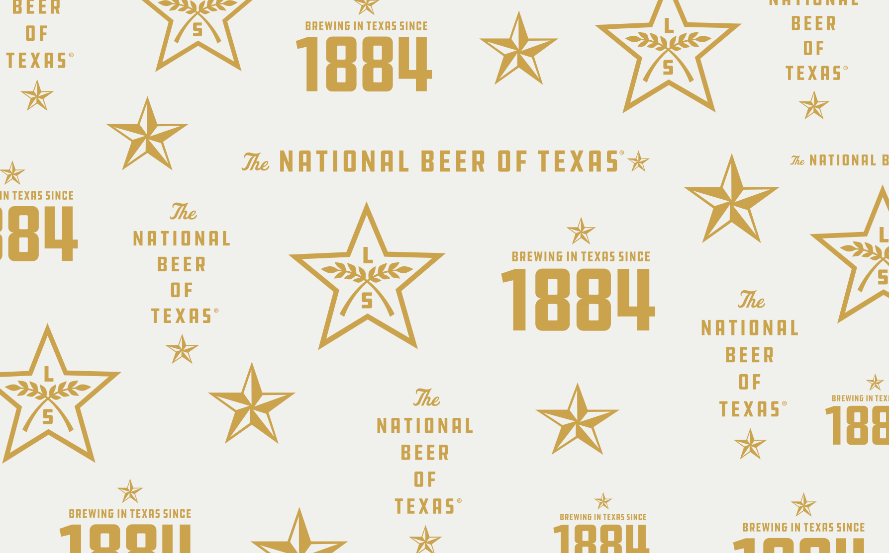
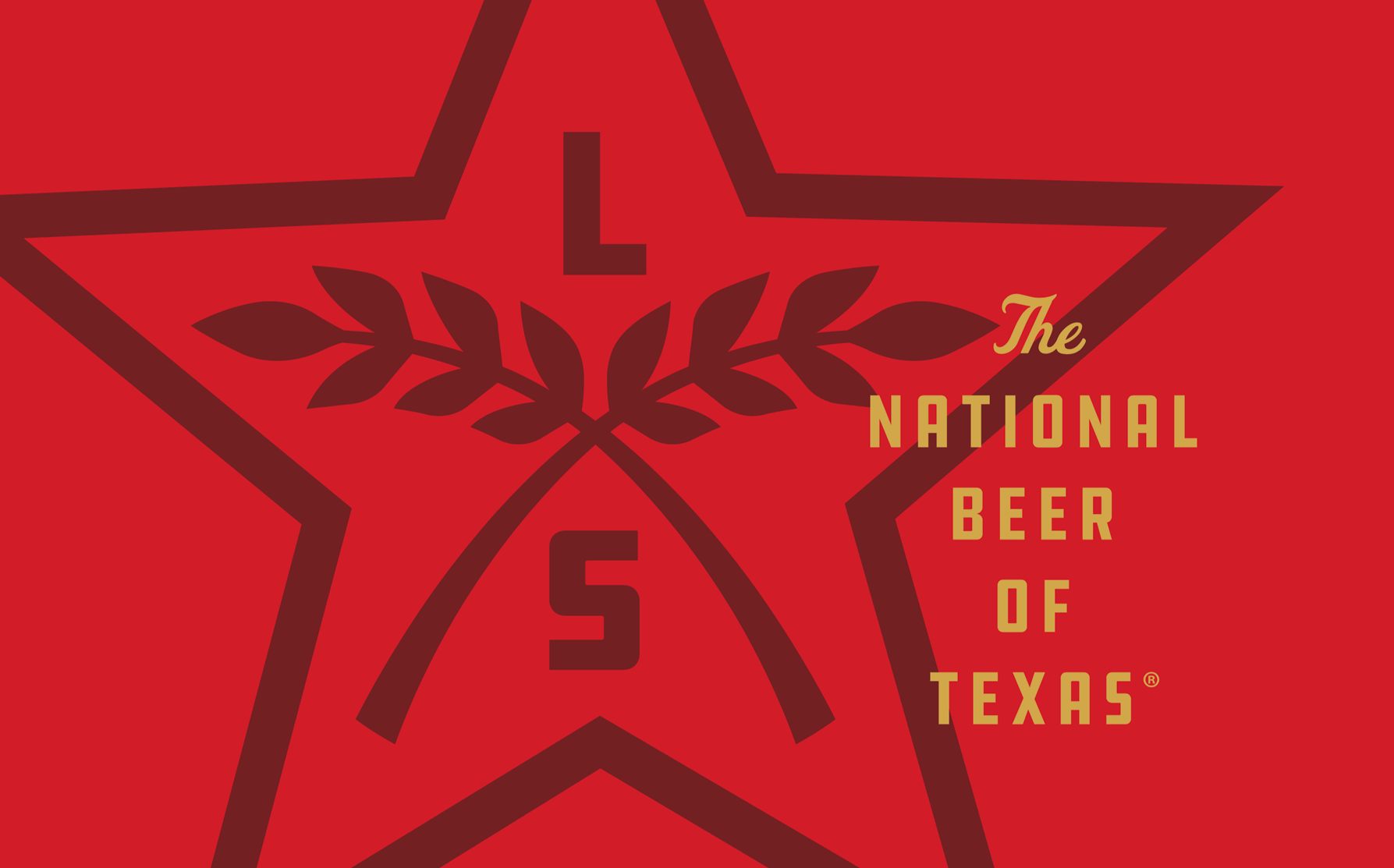
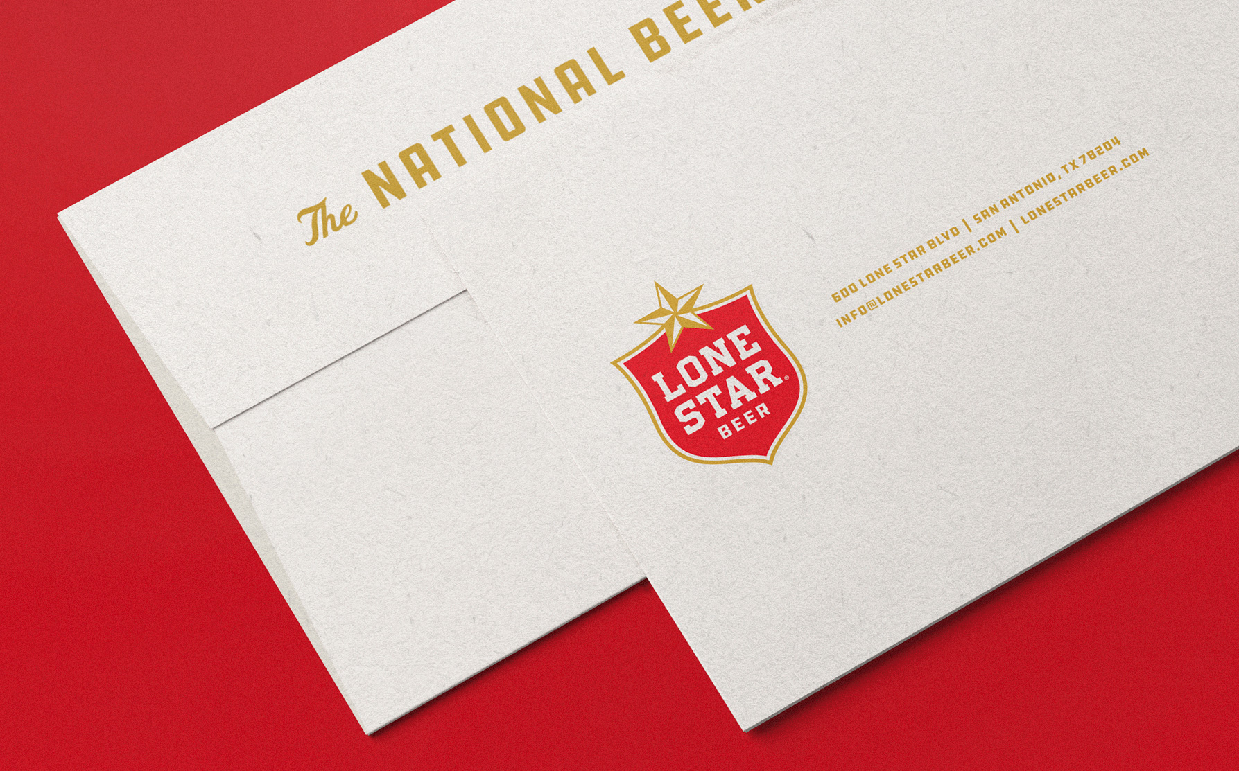
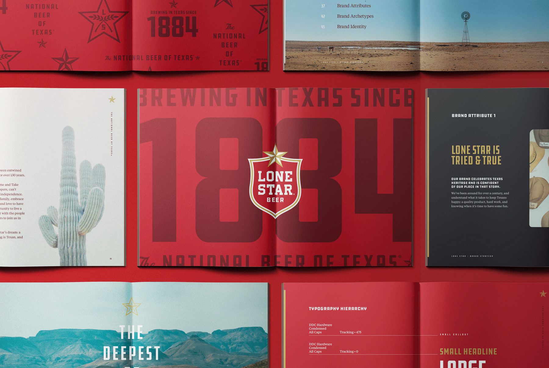
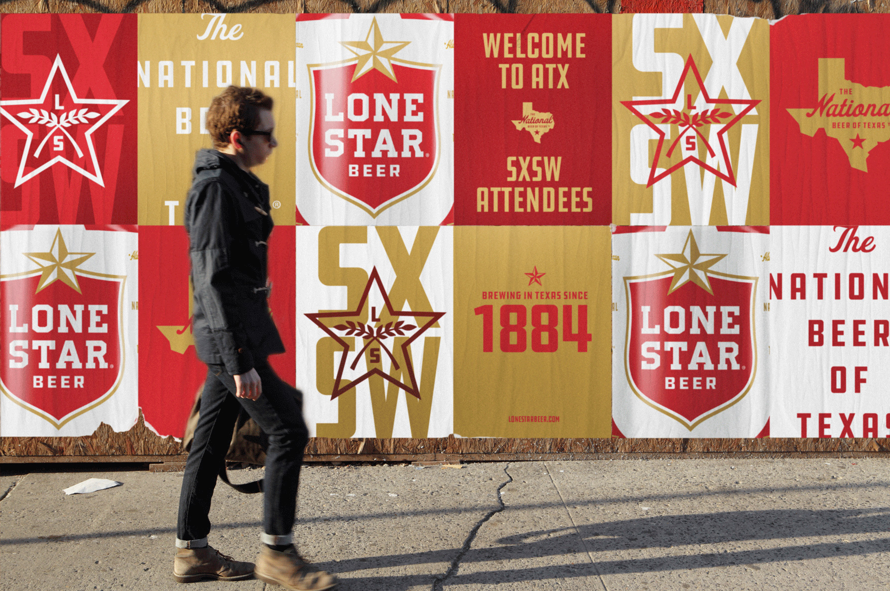
The visual language and print applications are quite enjoyable. Everything operates within a comfortable mix of beer and Texas aesthetics without it being too heavy-handed on either one. There is a slight micro-brewery hipsterness to the typography — especially as seen in the pattern image more towards the top — but it still feels like a large, mainstream beer brand. The condensed industrial typeface (DDC Hardware, I think, although the “1” is different) pairs nicely with the script “The” and works well as a primary brand typeface. The color combination of the logo extends well into applications and the addition of a dark red makes for a bold complement.
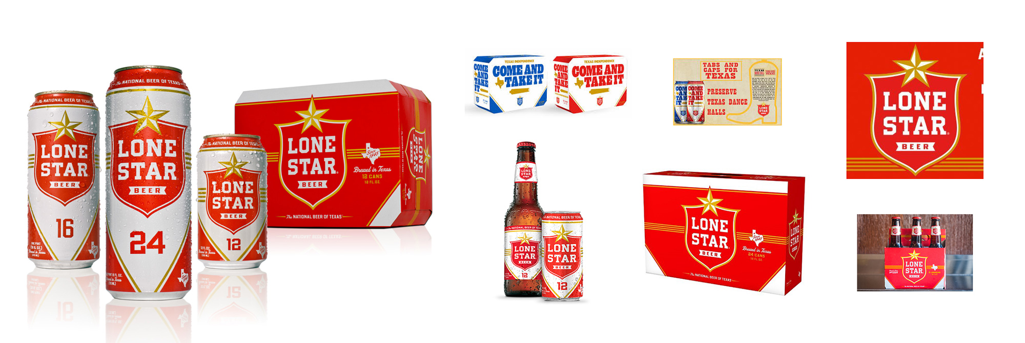
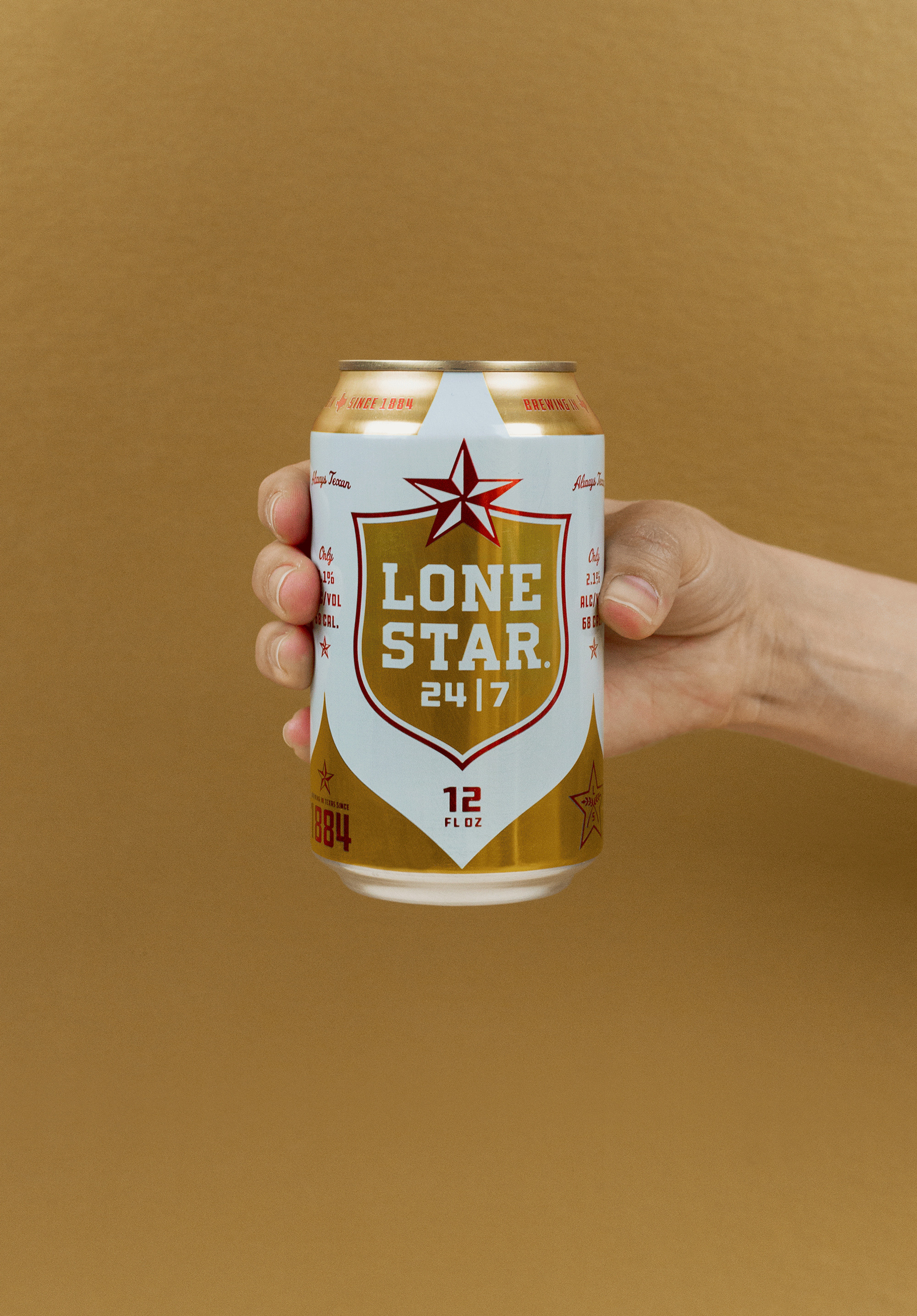
Beyond the core brand DNA, the scope extended into a redesign of all Lone Star packaging, including 6,12, and 24 packs for bottles and cans. This exercise lead to the design of Lone Star’s newest member of the brand family, Lone Star 24/7. Switch lead the naming, art direction, messaging, and advertising efforts for the product launch to ensure brand consistency across all products.
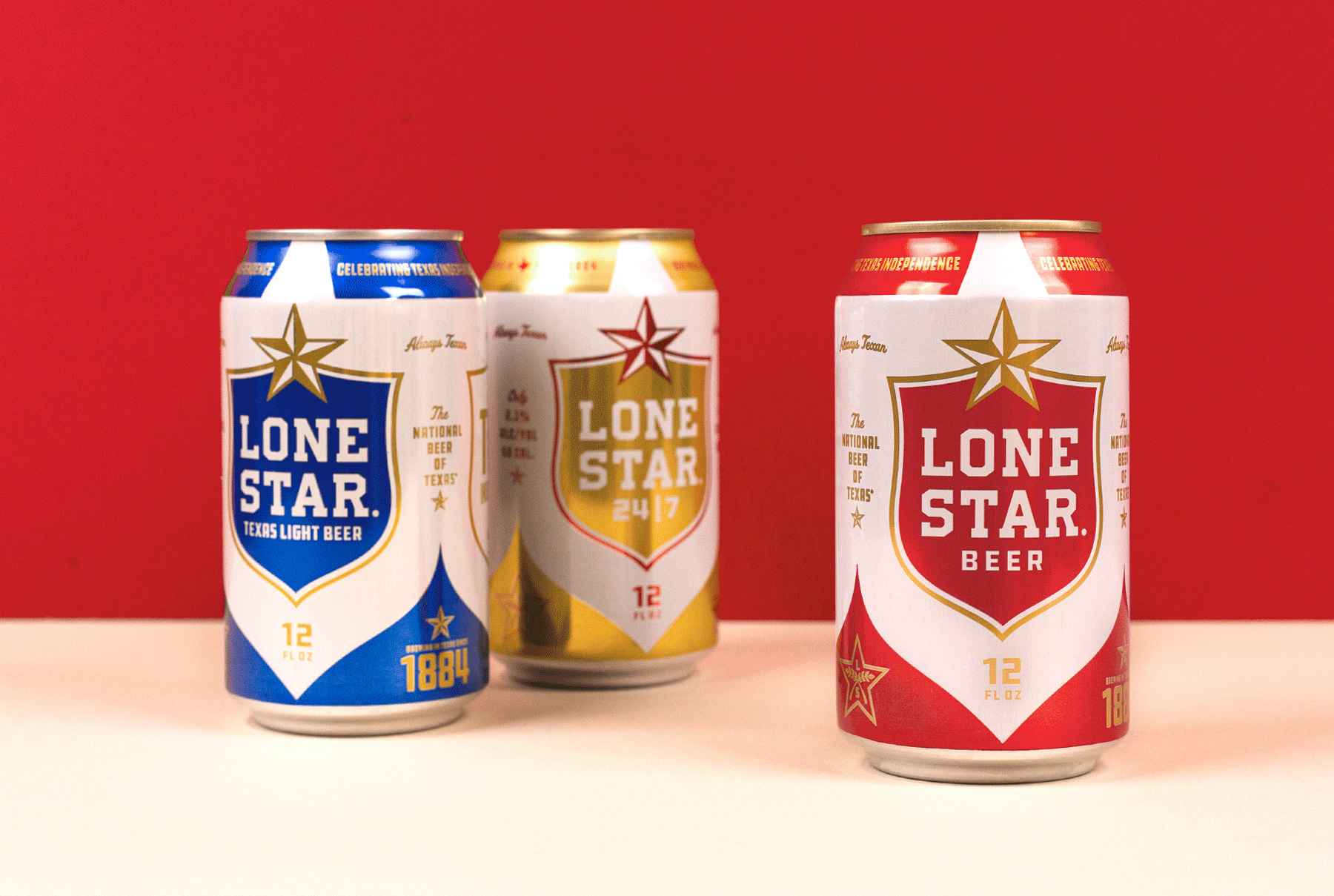
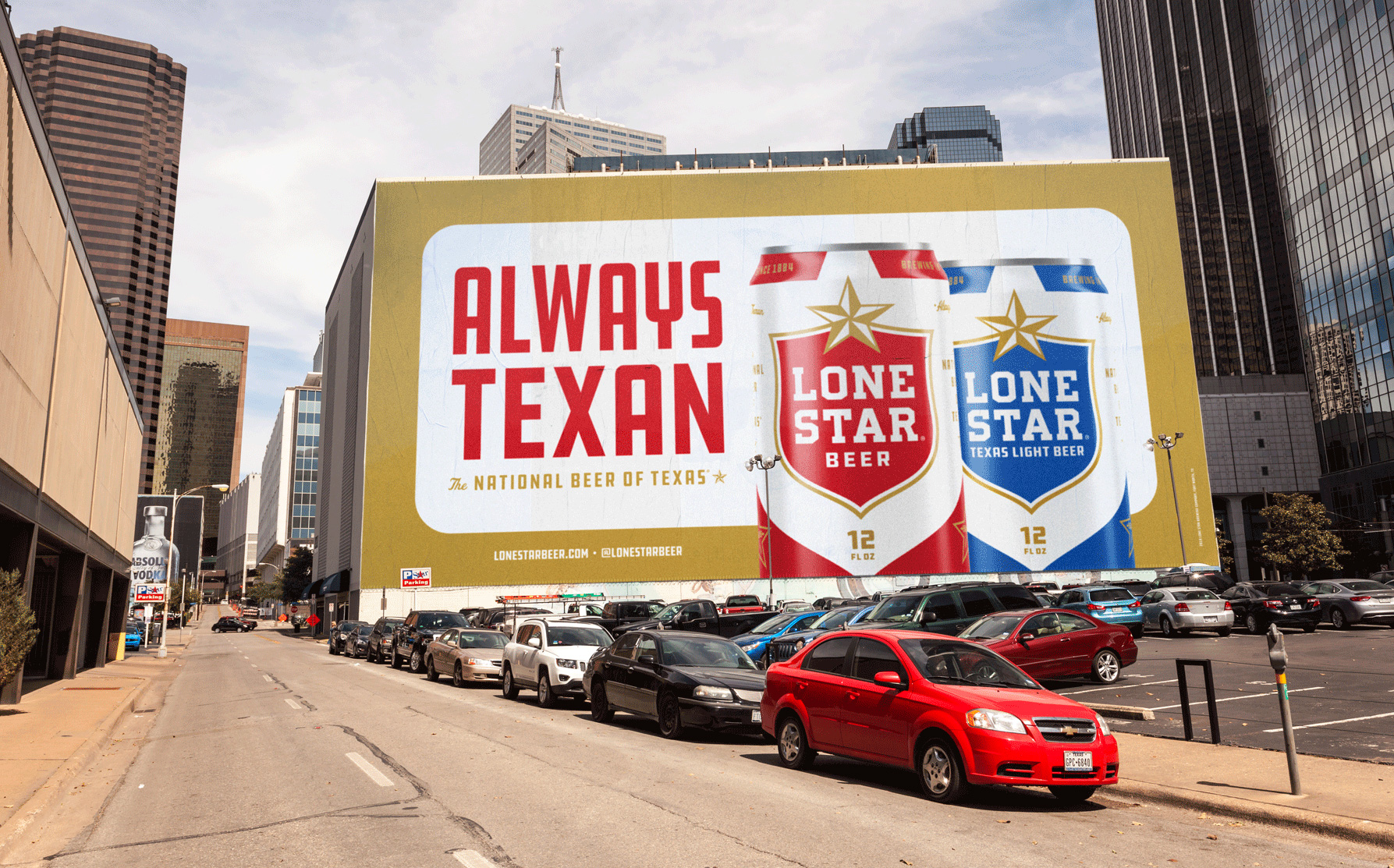
In principle, the old packaging was fine — nothing offensive or ugly — but in contrast to the new packaging the old one starts to look cheesier and cheaper. The new packaging is crisp and very good-looking. With the logo at the center, the shape of the shield and the apex of the star get blown up to create a striking white holding shape device that creates some really nice counterspaces in the bottom of the can as well as on the angled part at the top of the can (is there a technical term for this part of the anatomy of the can?). The type looks good, the colors look good, the graphic and typographic doo-dads look good. For a larger beer brand, this turned out really nice.
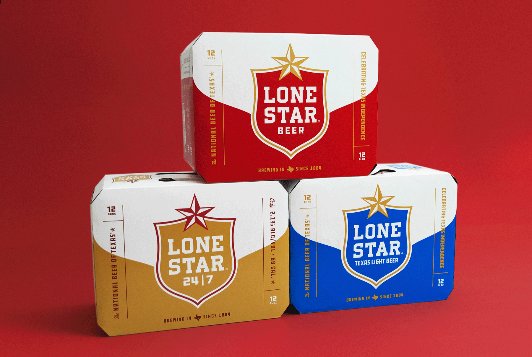
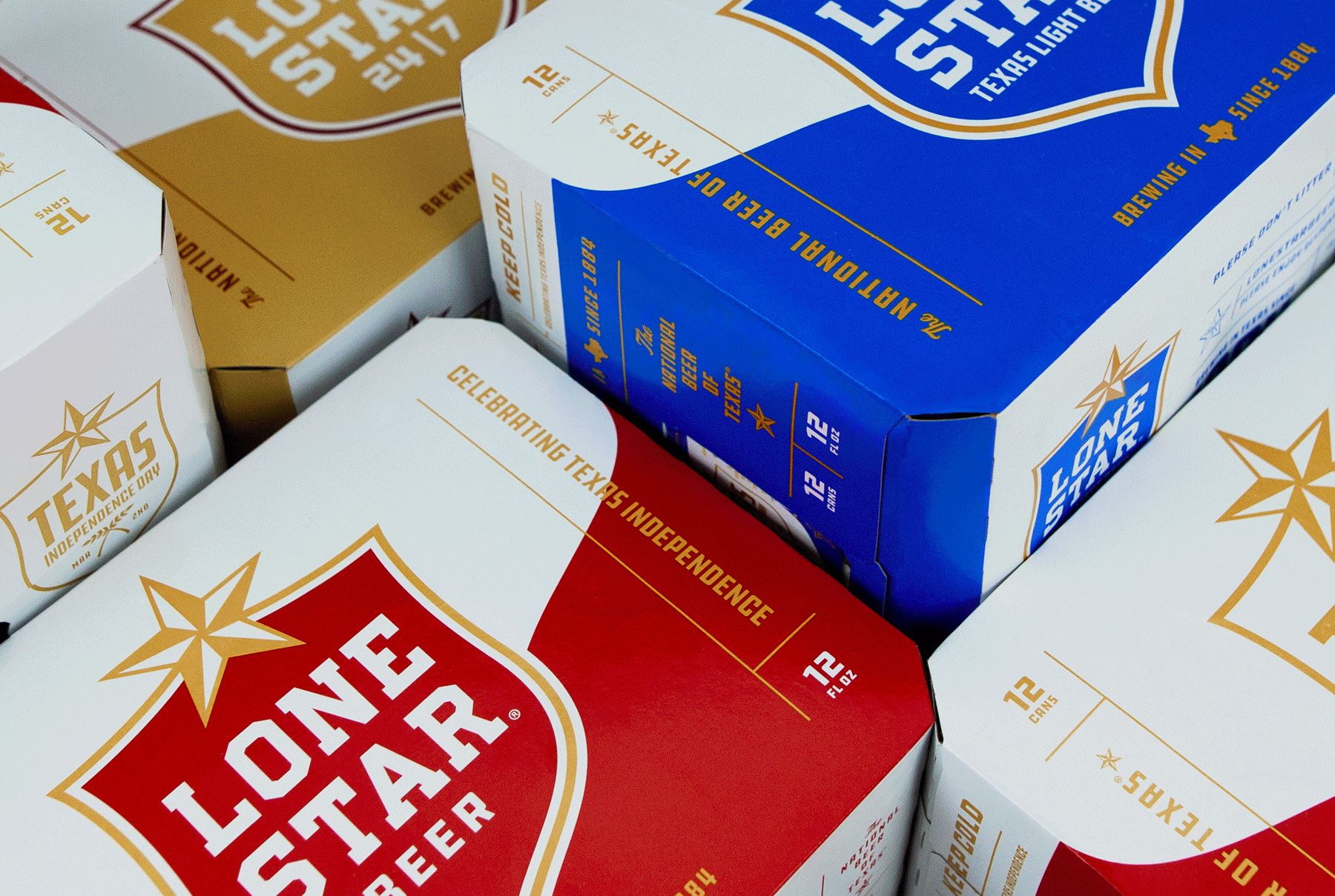
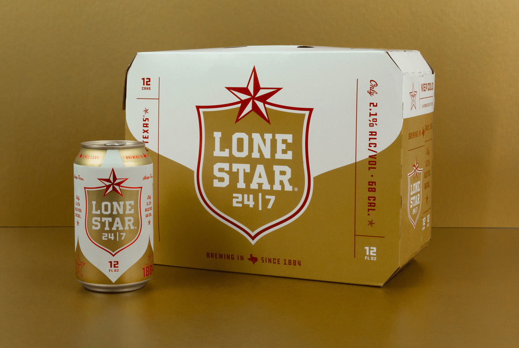
The 12-packs are great as well, nicely modifying the can treatment to cover a larger canvas with the bottom shape of the can moving up and framing the stroke of the logo.
Overall, this is a great update that gives Lone Star a slightly more sophisticated look but without becoming too high-end or pretentious and without losing its easy-drinking Texan-ness.

 Новости Союза дизайнеров
Все о дизайне в Санкт-Петербурге.
Новости Союза дизайнеров
Все о дизайне в Санкт-Петербурге.