Обзор лучших ресурсов по разработке бренда, разработке упаковки
contact us | ok@ohmycode.ru
contact us | ok@ohmycode.ru
Established in 2012, Girls Who Code is an international non-profit organization with the mission to “close the gender gap in technology and change the image of what a programmer looks like and does”. Based in New York, NY, the organization offers various programs to reach as many girls as possible, from after-school clubs for 3rd to 12th grade kids, to college programs to help their alumni, to intensive 2- and 7-week Summer immersions. Over the years, they have taught more than 300,000 girls through their in-person programming and reached over 500 million through their online resources, campaigns, books, and advocacy work — 50% of the kids they serve come from historically underrepresented groups, including girls who are Black, Latinx, or from low-income backgrounds. Earlier this month, Girls Who Code introduced a new identity designed by Brooklyn, NY-based Hyperakt.
Hyperakt’s challenge was to update their branding to speak directly to Generation Z and redesign their website to make it as easy as possible for new girls to sign up and get involved in coding.
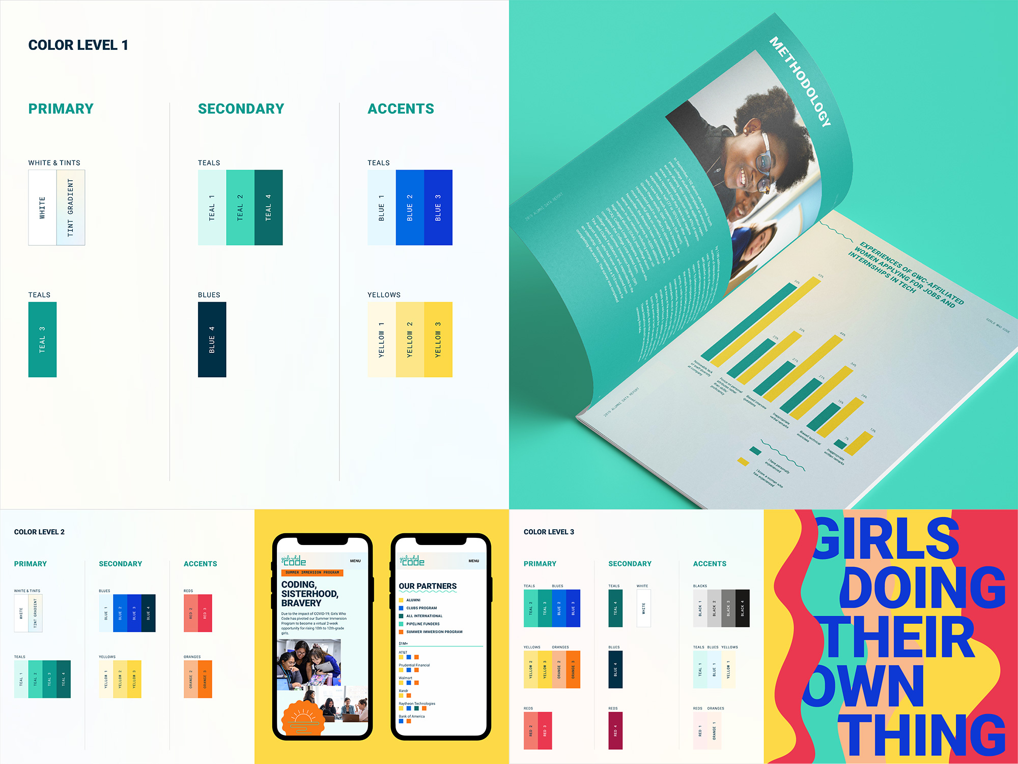
The Girls Who Code brand is now unified in its visual language—a dynamic and user-friendly design system comprised of accessible typography, flexible design elements, and color combinations chosen in careful adherence to visual web standards—and equipped with tools to modulate its voice for different audiences — Corporate partners & Investors, Parents & Girls, Girls — while maintaining a thread of visual resonance throughout.
The quirky and easily recognizable GWC logo carried notable brand equity, but lacked versatility at scale. We redrew the logo to make it more visually balanced and web-friendly, and introduced a superhero “G” icon. The G is optimized for social media accounts, building even more momentum on platforms where GWC has substantial followings.
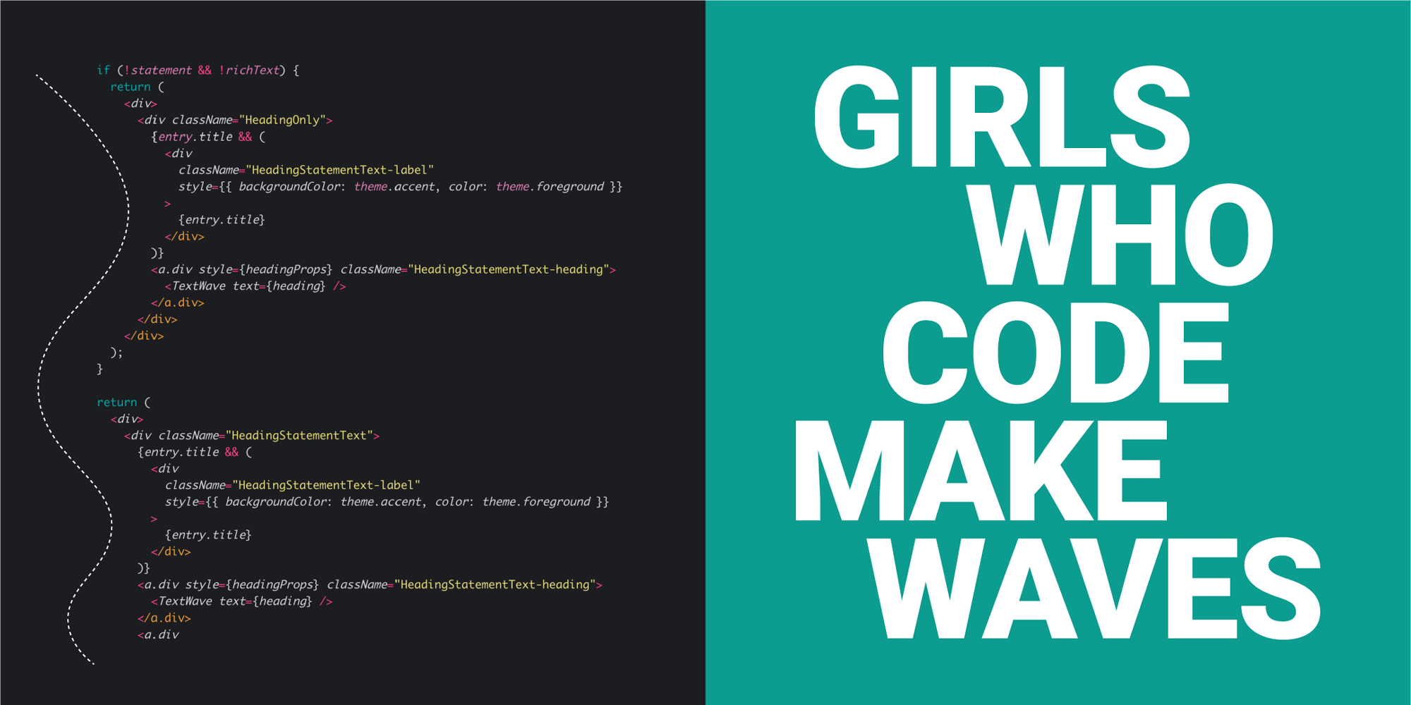
With the understanding that the old logo could only be evolved — although arguably it would have benefited from a more radical change to ditch the stereotypes that girls equal frilly script type and code equals squared computer-y type — most of the issues of the old logo are well resolved in the evolution. The script lettering is bolder for better readability at small sizes and improved visual integration with the blockier, thicker letters for “code”. Spacing and alignment between the two elements is much better as well and golf clap for aligning the “i” in “girls” to the “c” in “code” — I would have given a standing ovation if the “h” aligned with the “d” underneath, and it was close, but I can see how, mathematically, it was not possible. Fixing the “e” in “code” is possibly the best thing that could happen to this logo, with the fixed “d” in close second — extending its ascender was a great move to. Overall, a technical improvement for sure but not necessarily a great logo. Nonetheless, in this case, it’s really not about the logo but the name of the organization, which does all the heavy lifting on its own with so much clarity that it’s almost unfair: Girls Who Code. Any questions? No, of course not.
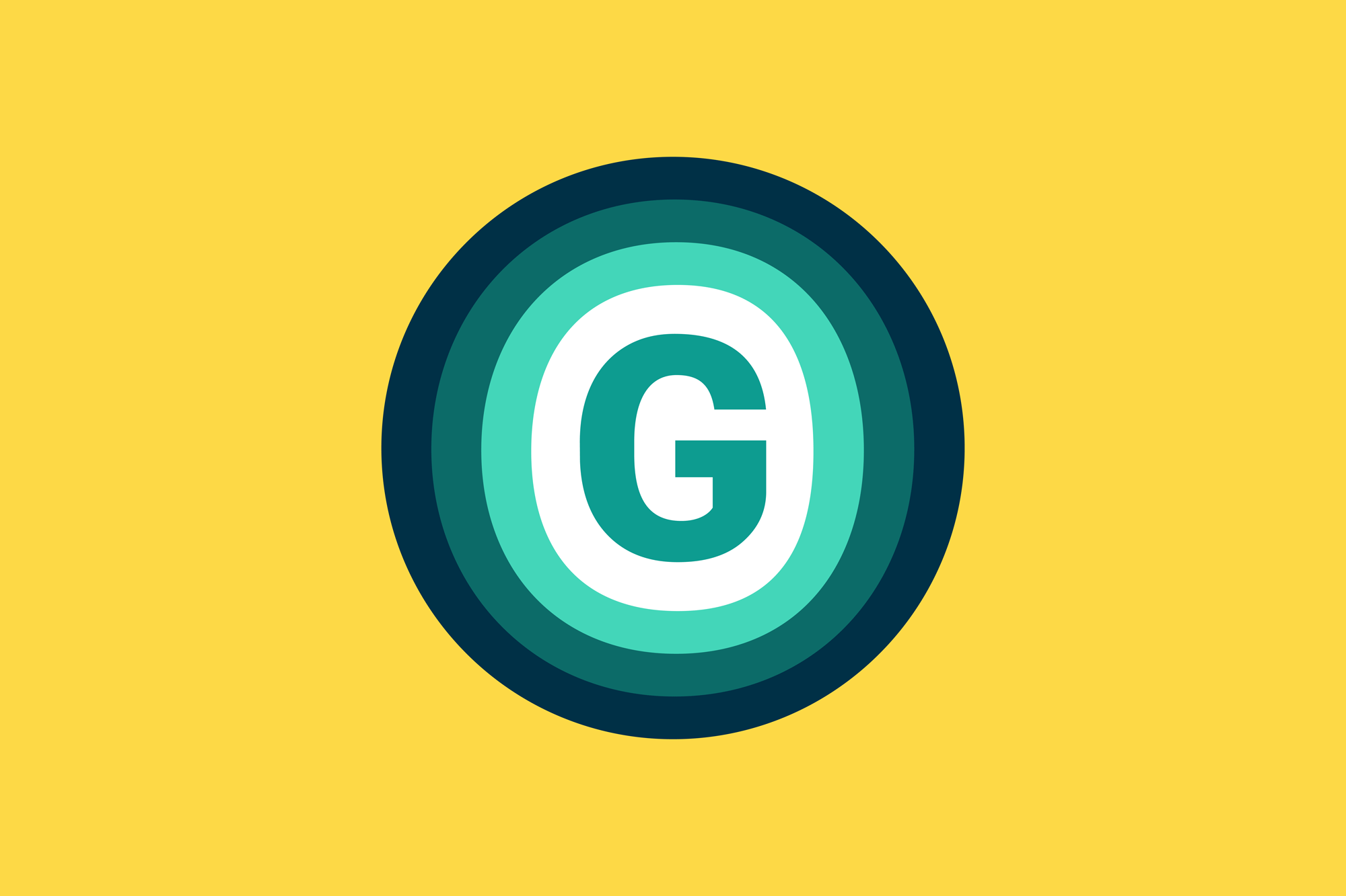
As a new element in the identity, they have introduced a “G” monogram and although I like it visually (on its own and in application as you’ll see below) it feels somewhat random. The “G” itself comes from the brand type family, Roboto, but it has zero relationship with the primary logo that, as a shorthand for use in social media or other places, there is no evident tie-in. I would have loved to see the contrast found in the logo in this monogram, perhaps with a blocky “G” morphing into the curvy rings. Maybe, maybe not. I do like the energy this carries.
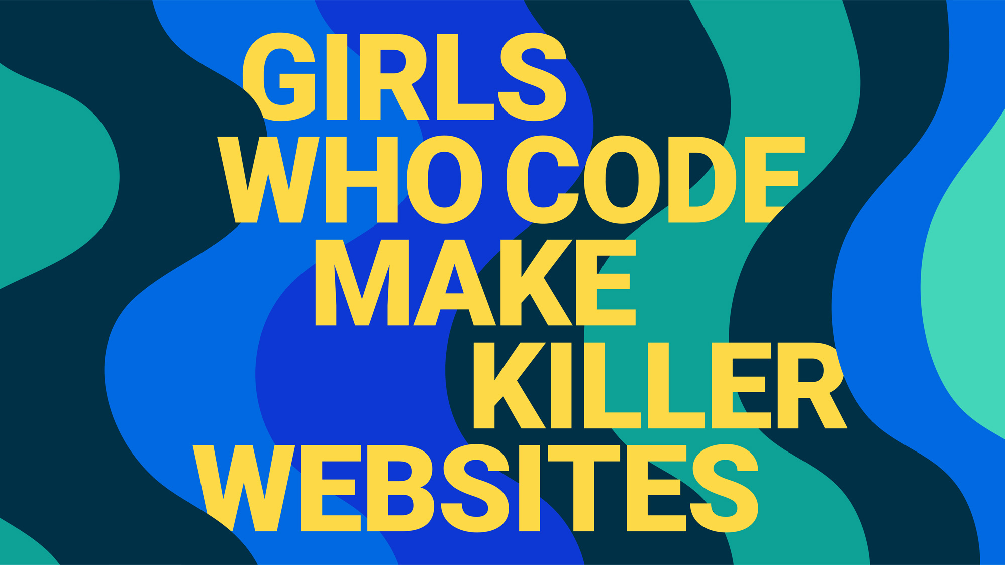
We anchored the visual system in a narrative that speaks to the core goals and values of Girls Who Code: waves of momentum, waves of progress, waves of change. A visual interpretation of the shape of code lines written in a scripting window, it is also a metaphor for the power, strength, and resilience of a new generation of young women and girls coming together to effect positive change in the world.
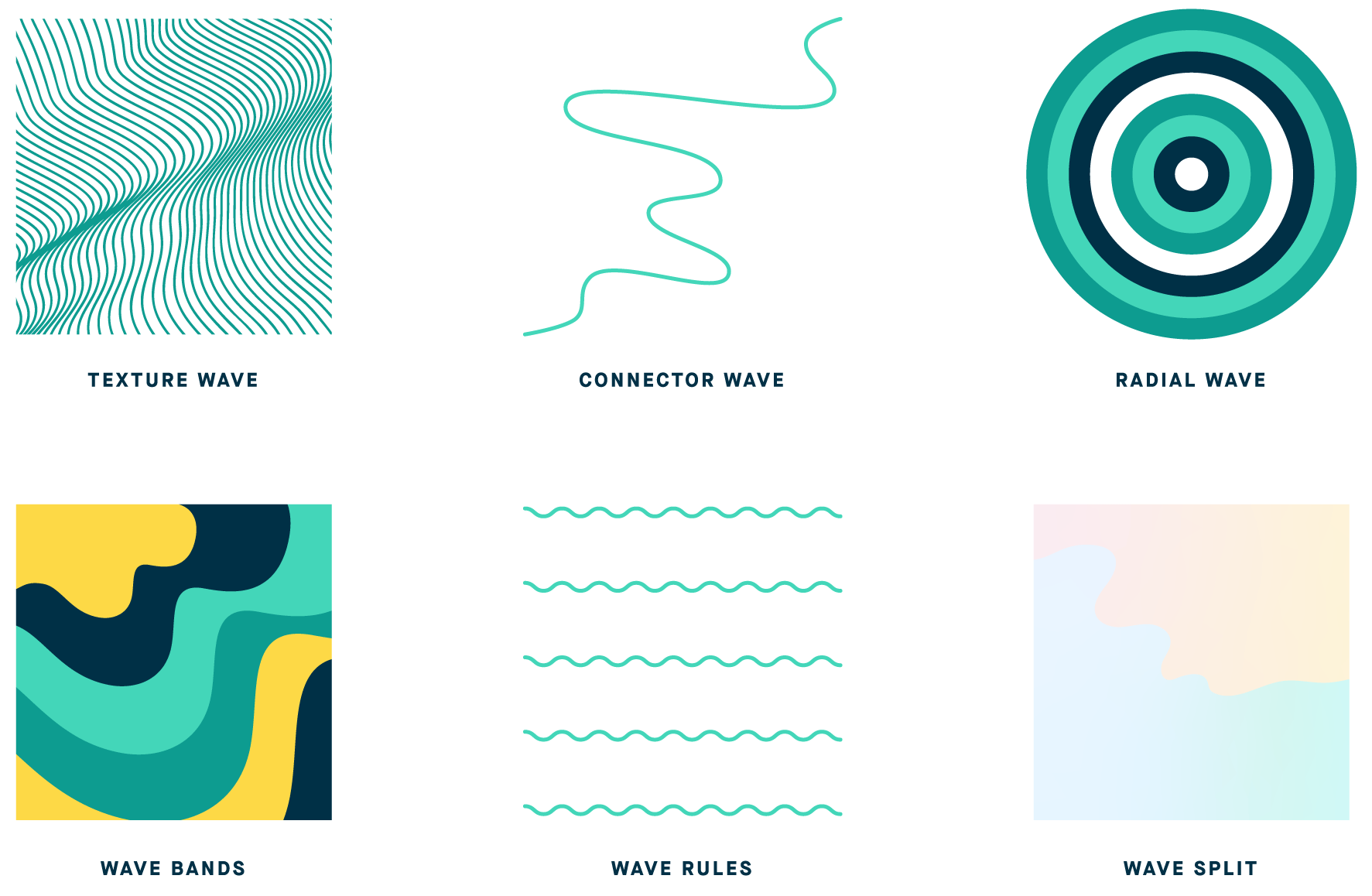
The identity revolves around a series of wave visuals based on the invisible curves that result from nesting code. I really like the starting point of this and how it was interpreted in not just one single graphic treatment but six different ones, giving the identity a lot of flexibility all while building on a single, core idea. Not to give Hyperakt a free pass on everything: The “Radial Wave”, yeah, that’s not a wave, y’all.
The icon set is pretty great. The image doesn’t do it as much justice as their application on the website. Check the Programs and About Us pages for some good usage.
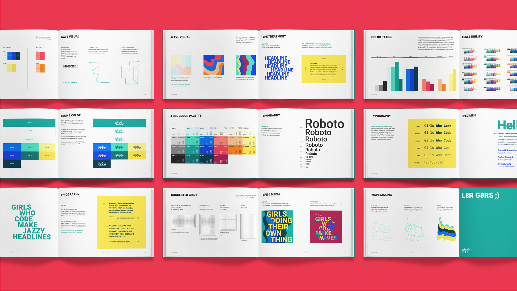
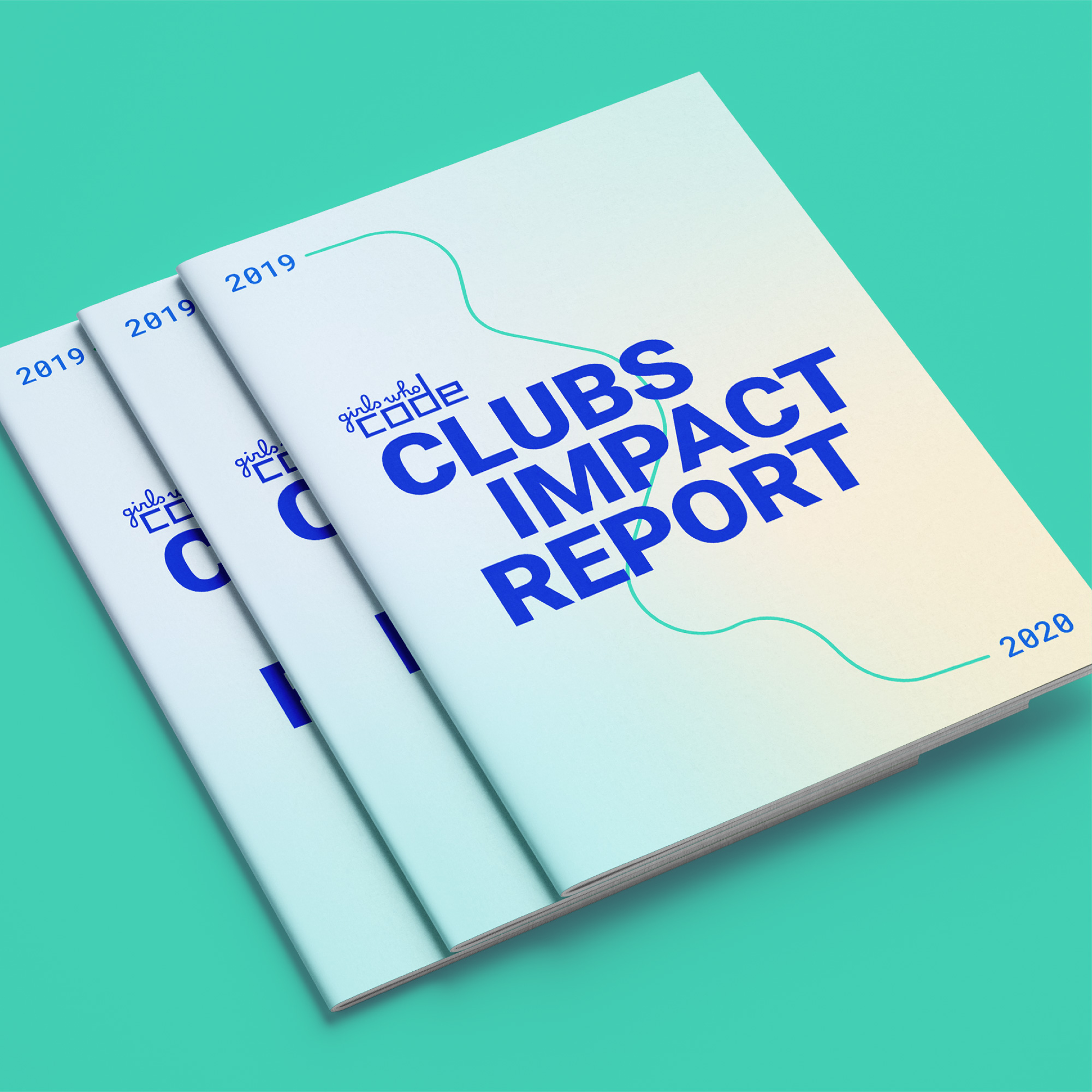
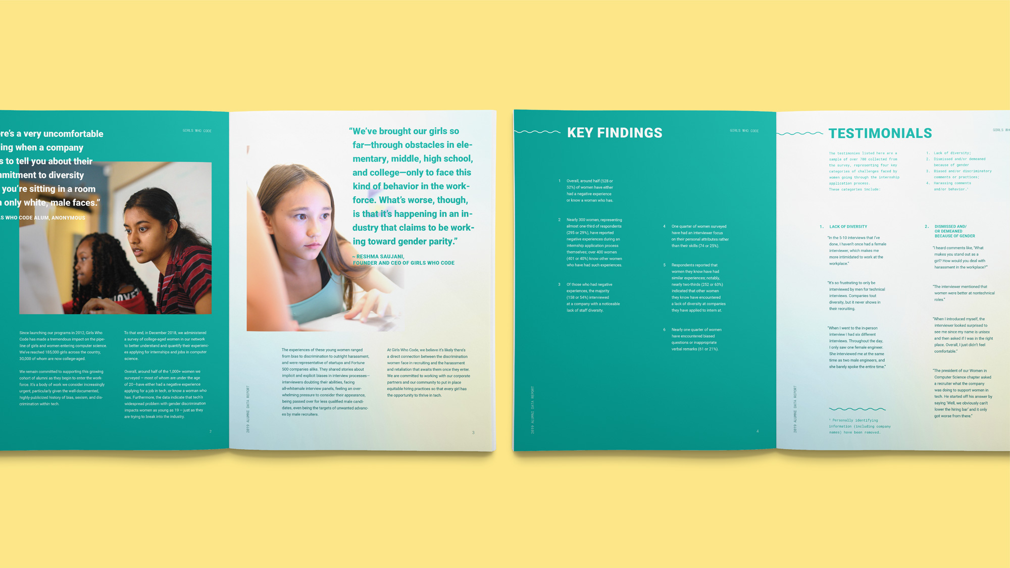
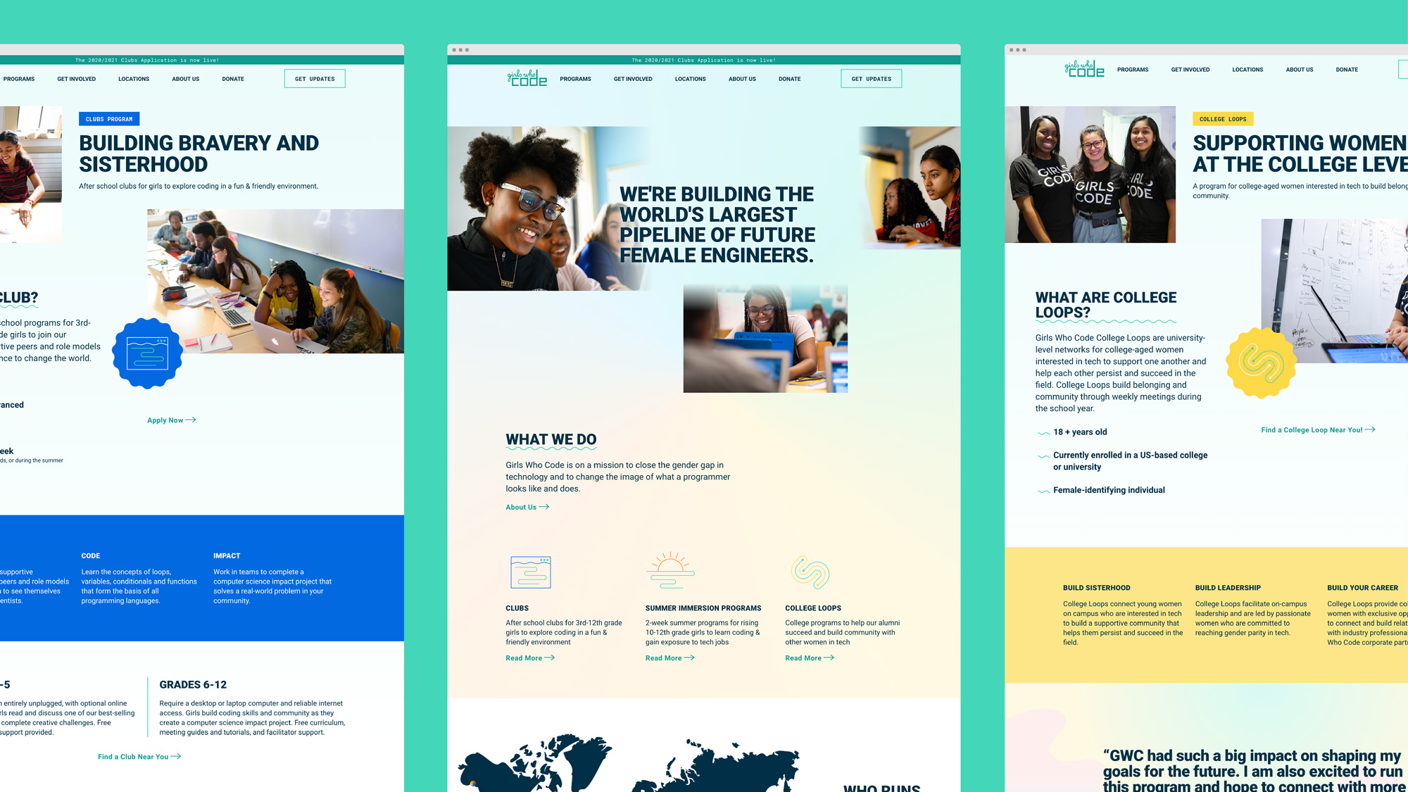
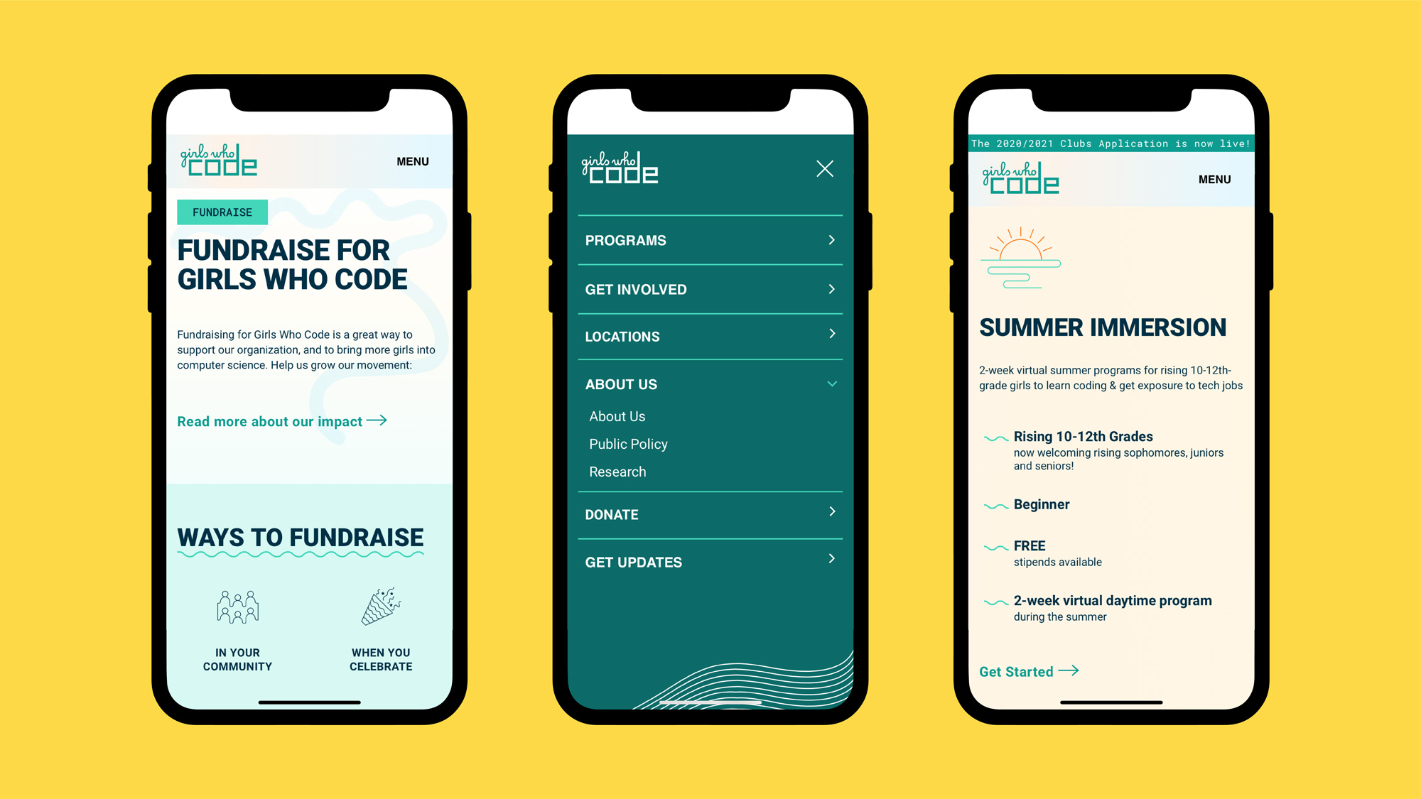
The applications are okay. Everything is very well done — particularly the website — but there is perhaps one too many ingredients and they haven’t figured out how to mix them across mediums. I realized I praised the flexibility of the curves a few paragraphs above and I still do think there is a good foundation there but it hasn’t quite gelled. Seeing the business cards in contrast to the report cover, those feel like two different things, while the website has yet another vibe, all while the logo is off doing its own thing, standing out oddly in most applications. The overall presentation of everything is fine but I feel like there are too many visual triggers all demanding a different reaction.
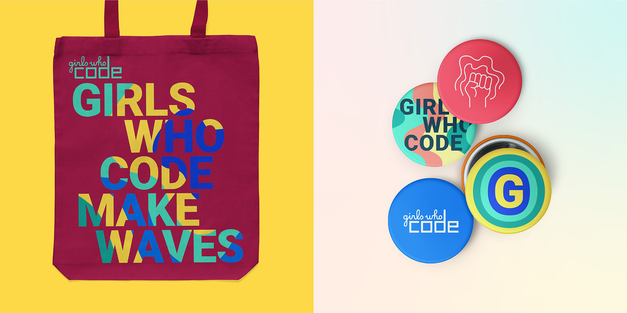
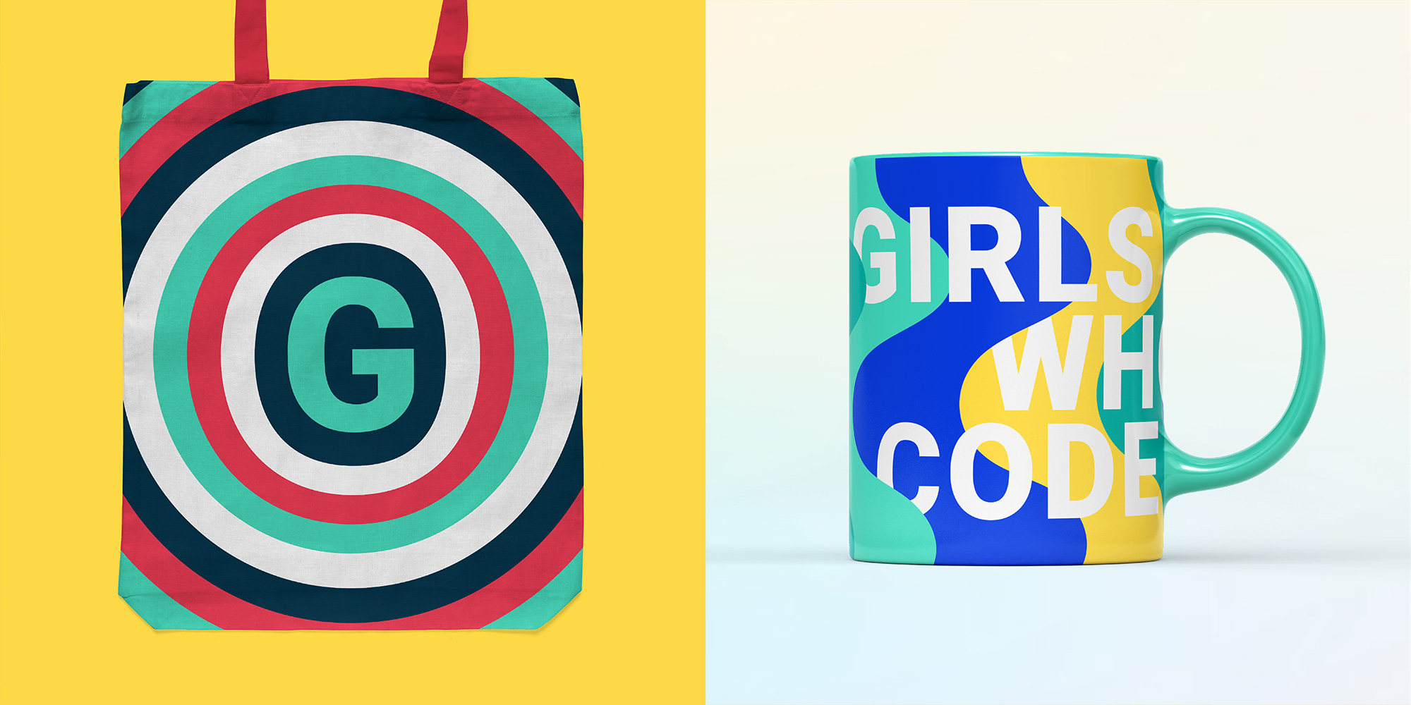
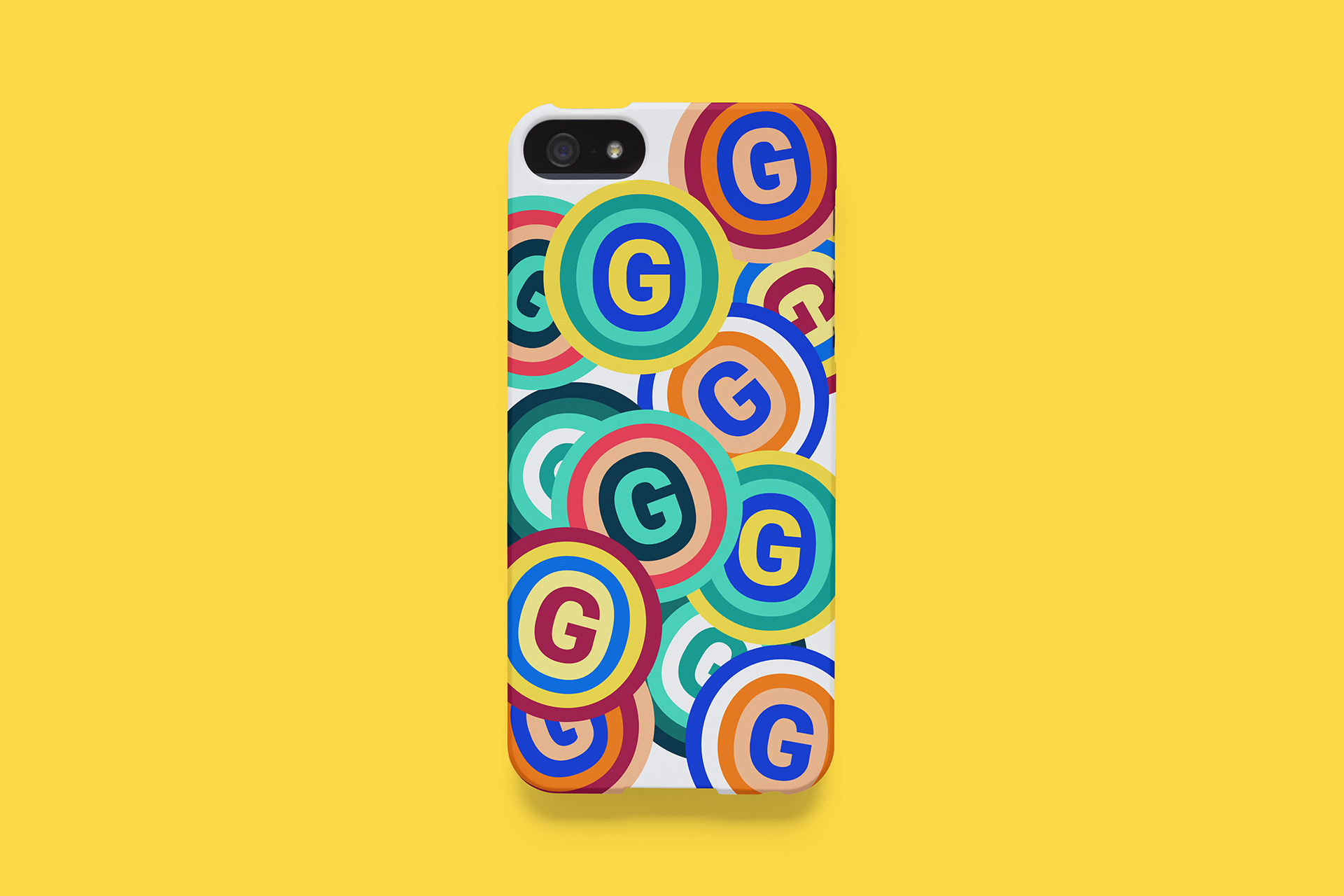
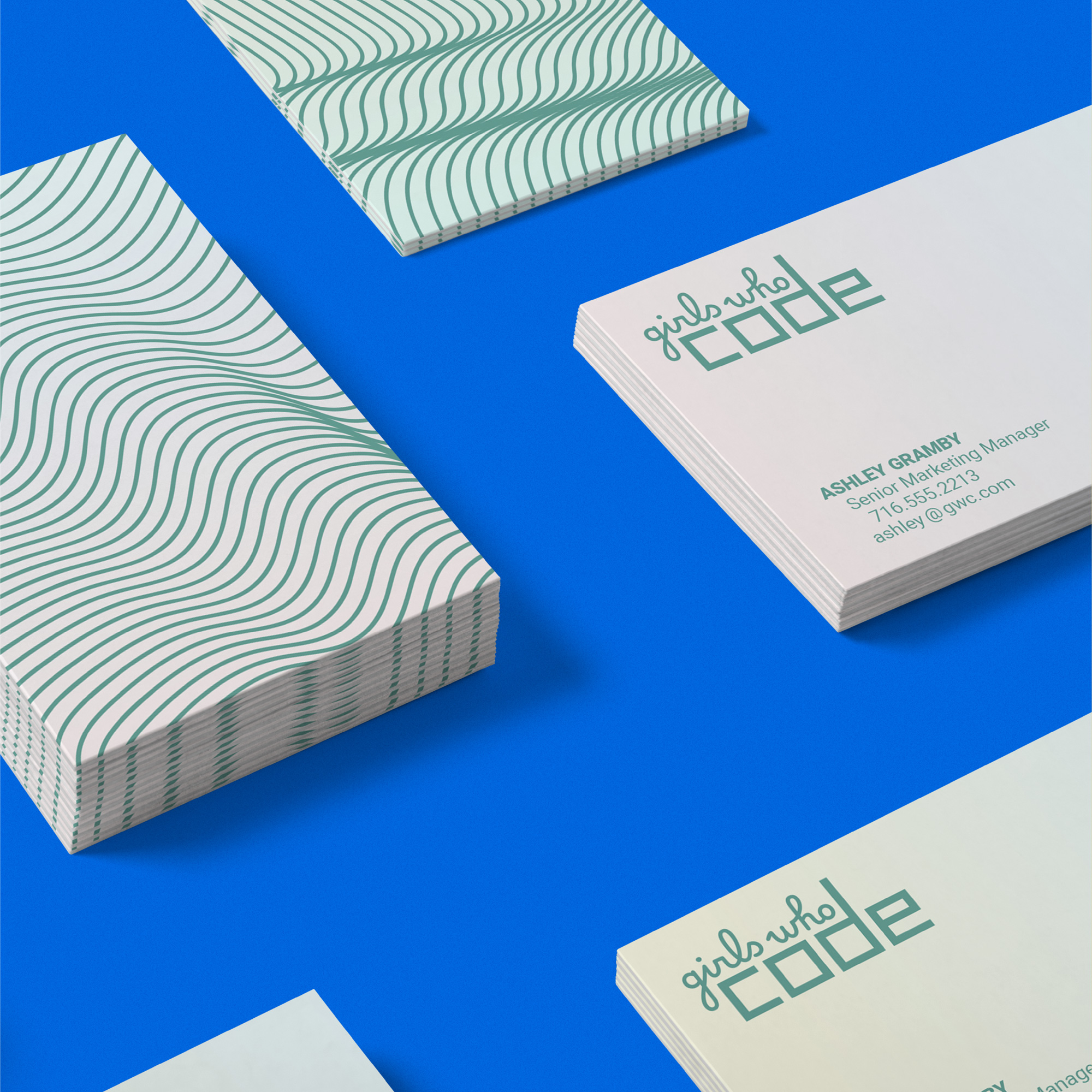
The swag-y stuff is fun and, as mentioned earlier, the “G” icon has a great presence, especially when layered like in the image above. I also really like the thick wave pattern with the tagline… so I think I’m liking all the bolder interpretations of the waves, whereas all the thin elements, for me, feel forced. Overall, I think this gets the job done on the strength of the organization and its messaging, but could use some tightening to amplify that message in a more straightforward way.
 each year since publication began in 2006

 Новости Союза дизайнеров
Все о дизайне в Санкт-Петербурге.
Новости Союза дизайнеров
Все о дизайне в Санкт-Петербурге.