Обзор лучших ресурсов по разработке бренда, разработке упаковки
contact us | ok@ohmycode.ru
contact us | ok@ohmycode.ru
Established in 1974, Foot Locker is a sportswear and footwear retailer with a global presence. For any of our international readers unfamiliar with Foot Locker, one of its key visual aspects are the referee-like shirts worn by its employees and the black and white stripes on the facade of their stores. It’s the flagship brand of Foot Locker, Inc., which also owns Lady Foot Locker, Kids Foot Locker, Champs Sports, Eastbay, Footaction, Runners Point, and Sidestep, adding up to a total of 3,113 retail stores in 27 countries across North America, Europe, Asia, Australia, and New Zealand. While the Foot Locker brand’s Men’s and Kid’s businesses have done well, the U.S. Women’s business was lacking the ability to connect with women that love sneaker culture and over the last year, Foot Locker has been rolling out a new identity that stemmed from that challenge, designed by the New York, NY, office of Jones Knowles Ritchie.
We gave the iconic mascot a ‘fresh set of stripes’, simplifying the style while maintaining the personality, allowing for better use across digital channels.
While the bulk of the work on this project was the identity and messaging, the long-standing icon of the employee wearing the referee shirt has been given a substantially positive evolution. Before, the guy looked as if his shirt just came out of the dryer all wrinkly and auto-traced. The new drawing is crisper, simpler, and more… heroic. He looks proud! If I had one negative criticism it would be the eyes… there is something about them, like he looks pissed off — I guess I would be too if I had to wear that shirt.
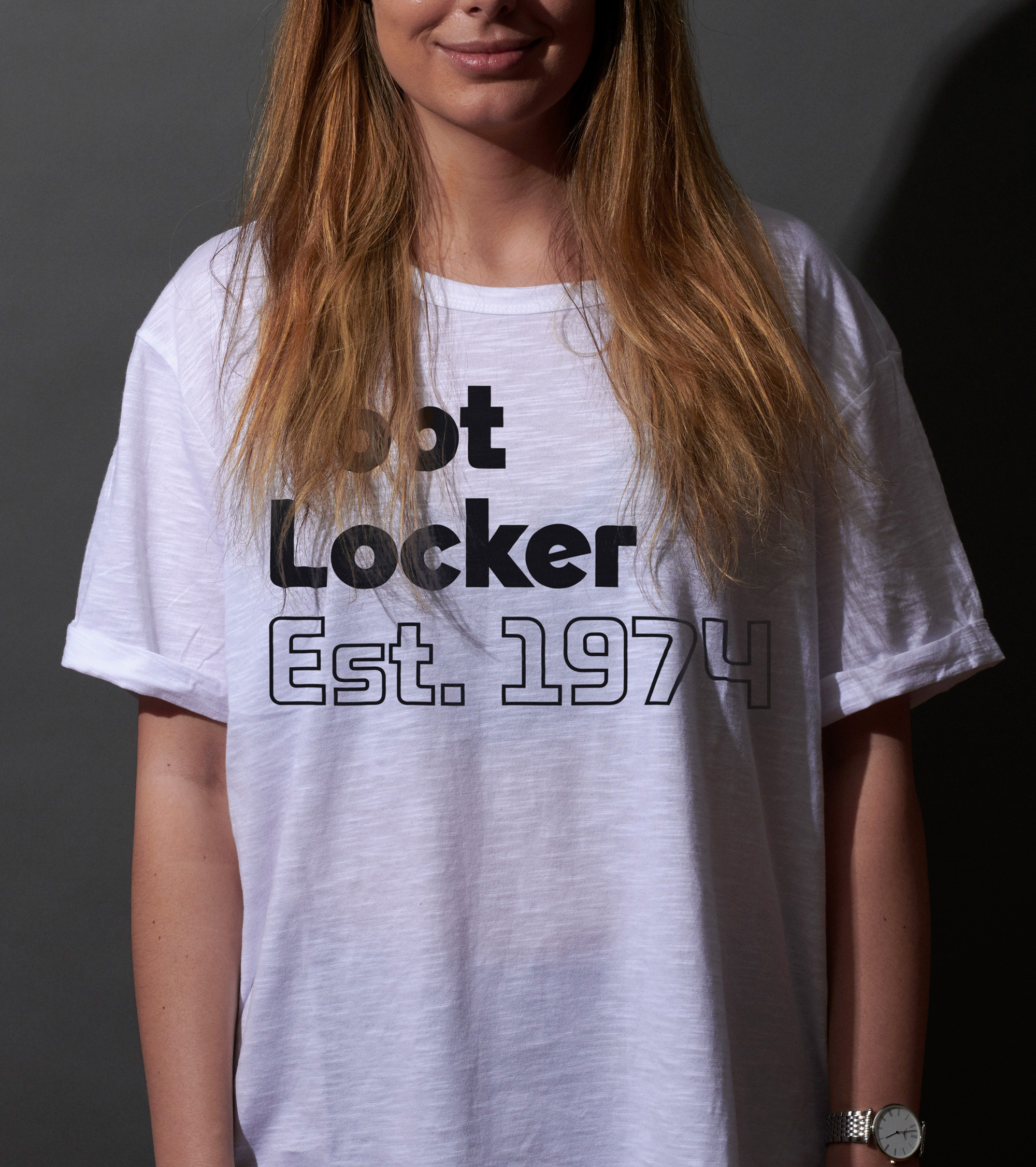
The Foot Locker wordmark remains the same but is now used inside a white rectangle. More on the wordmark later.
Our work began with the dazzle camouflage ships of World War I. These ships used dynamic patterns intended-not to conceal-but to make them difficult to pin-point; a visual metaphor we found very fitting for our female sneakerheads. We remixed the iconic footlocker stripes to create a dynamic visual language, undefined, and never recognizable.

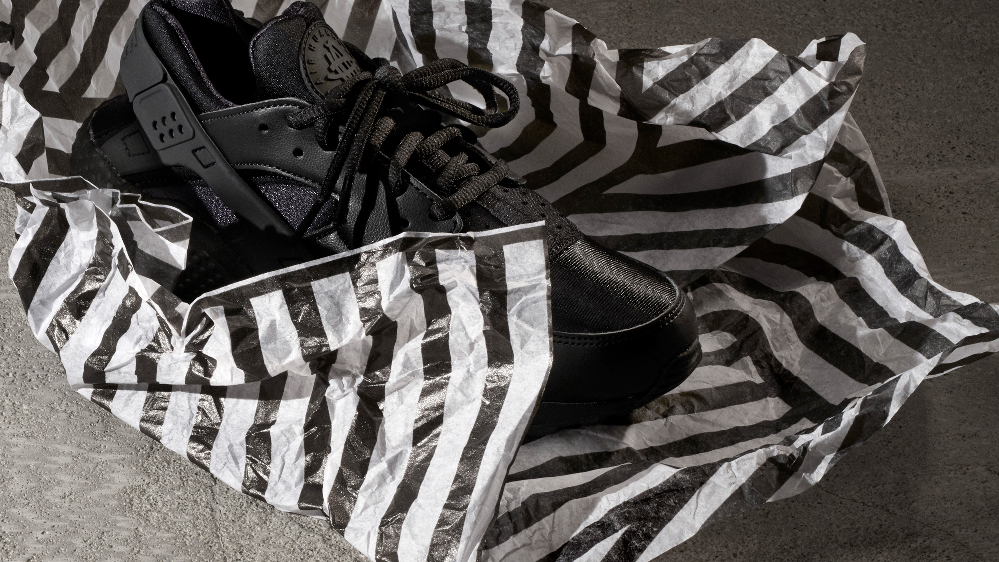
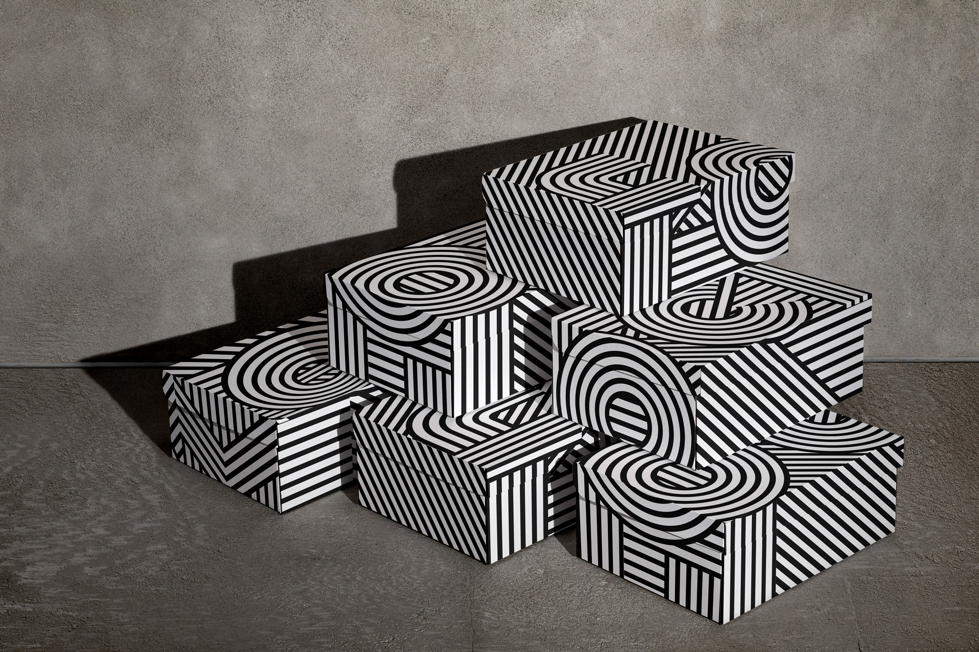
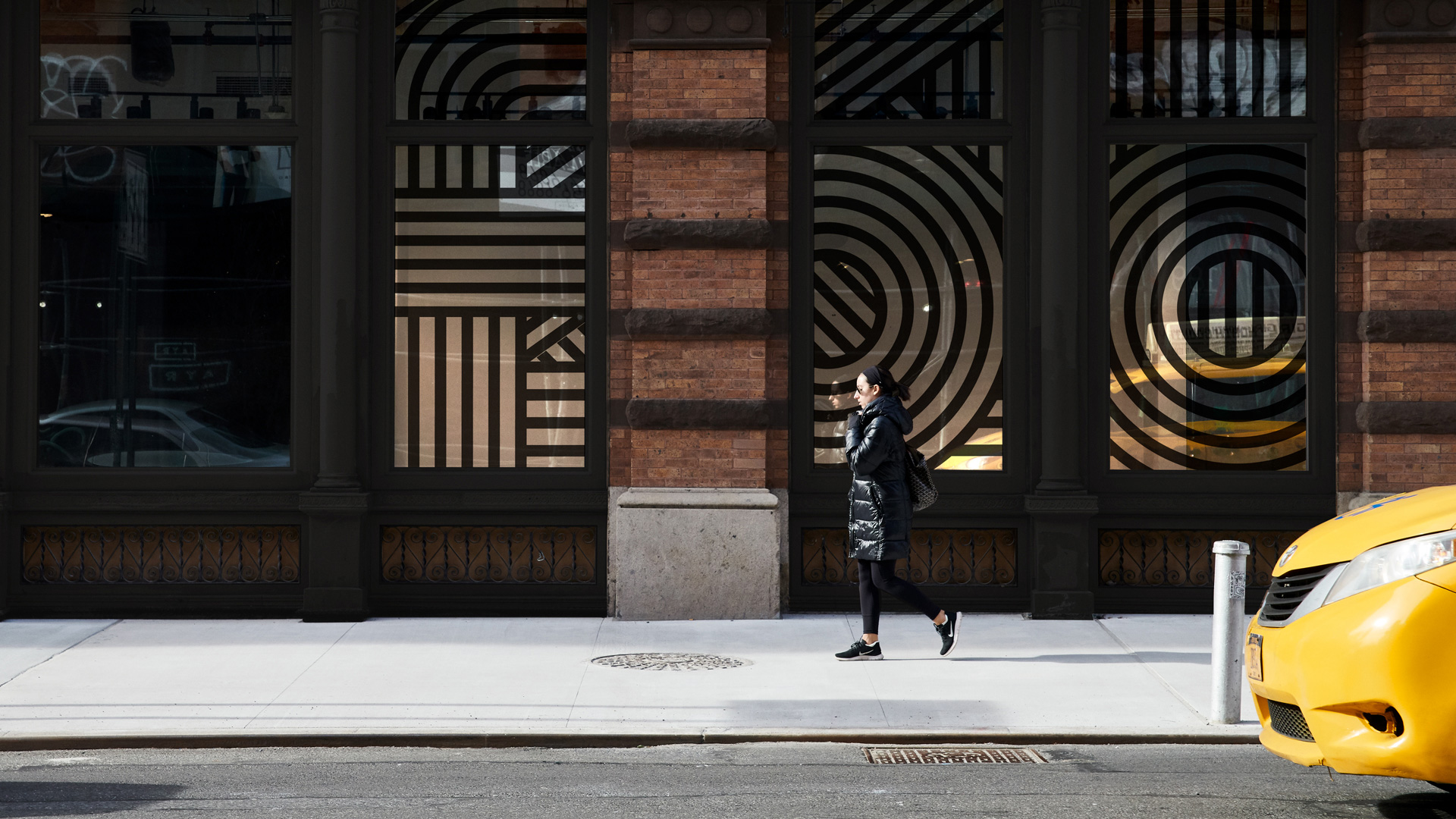
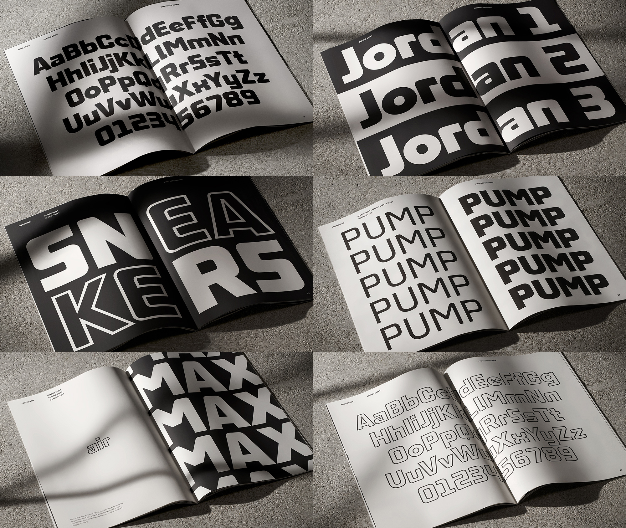
The first highlight of the project is a new set of patterns modeled after dazzle camouflage, bringing together blocks of stripes at different angles to create a, well, dazzling effect. The main application of this embeds the wordmark, recreated in concentric stripes, on the pattern for a double-the-dazzle effect. If you stare at it not that long it will mess with your eyes. That composition can then be blown up and put to use across a variety of applications, creating a unique and recognizable texture that always carries with it some subtle Foot-Locker-ness. Needless to say, it looks great.
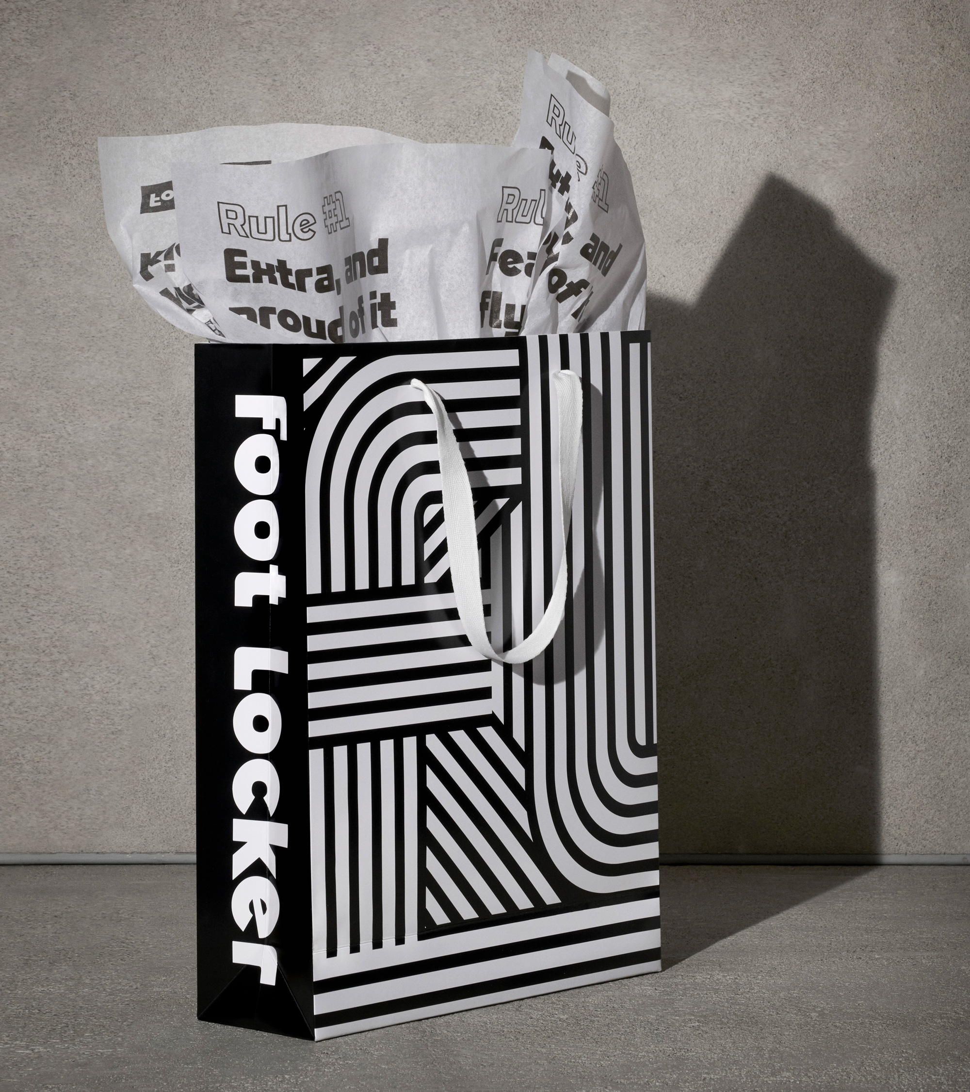
The Foot Locker logotype is iconic globally, instantly recognisable, but until now, always underleveraged. Working alongside the F37 team, we were able to unpack its unique personality, most notably the acute radius’s on the ‘f’ and ‘r’, dramatic variation in width, and rotation of the ‘e’. The custom typeface ‘Foot Locker Sans,’ allowed us to build upon heritage, amplifying the brand’s equity across a wide range of digital and physical touch-points, without overwhelming our audiences.
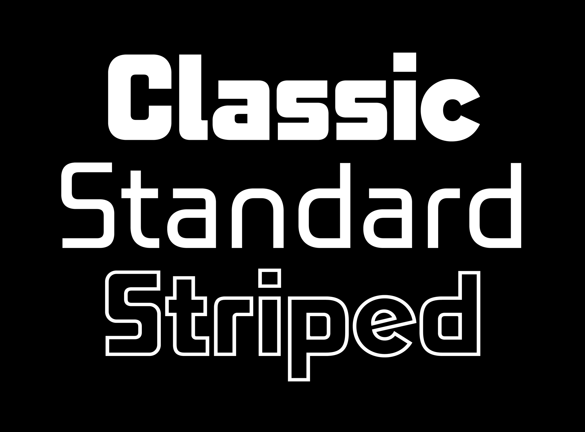

The second highlight of the project is the custom typeface designed in collaboration with F37, that takes the wordmark as the starting point and it’s surprisingly cool, given the slight awkwardness of the wordmark but I love how they extended some of the odd contrasts like the round “e” and “c” vs the squared “a”, which you would expect to be rounder too but it stays true to the contrasts of the wordmark. The striped version ends up being my favorite and I think, overall, the typeface works better when it’s used in upper and lowercase instead of just uppercase as it takes on a different, more techie vibe.
We unveiled the redesign on International Women’s Day with a campaign called “New Rules”, inspired by women who are changing the game in sneaker culture.
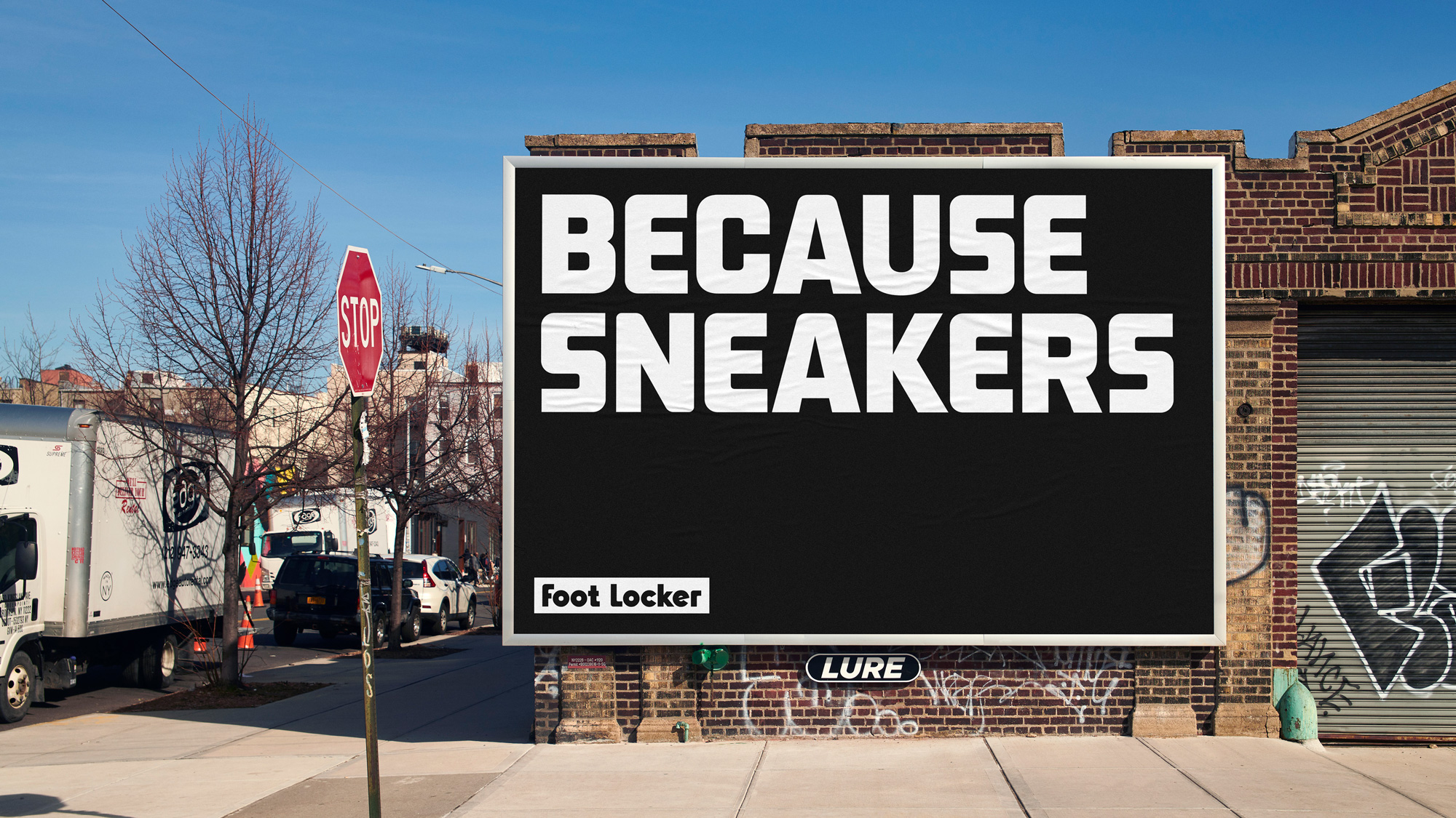
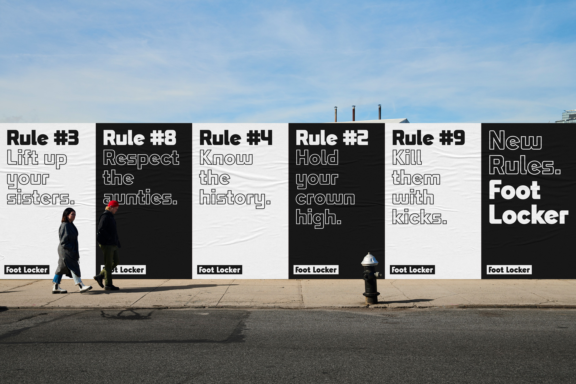
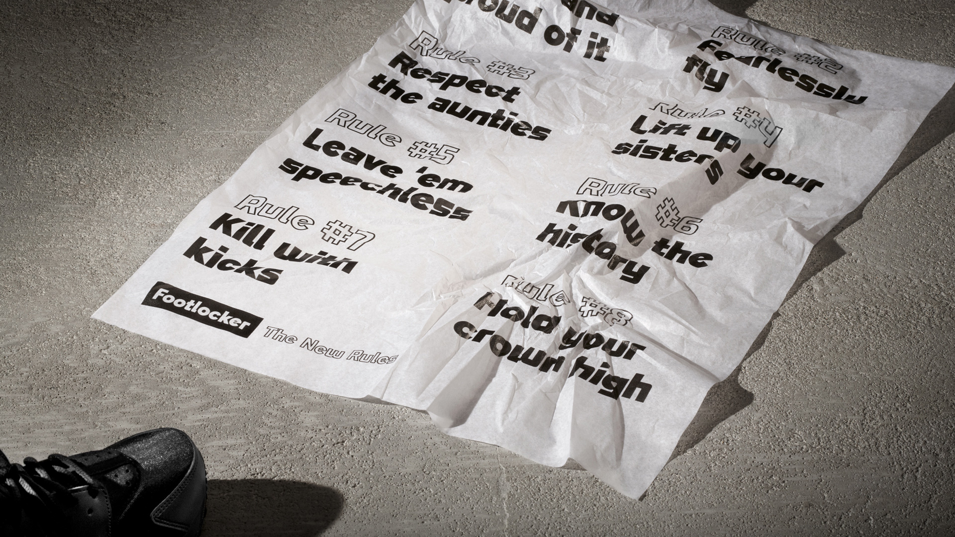
Finally, in this campaign, we get to see the more literal result of Foot Locker trying to connect with women and it’s interesting (and encouraging) that this never resorts to visual clichés. It would be easy (and tempting) to turn the stripes pink or show models looking all athletic. Instead, it’s just bold, relevant language through the new bold, visual language of Foot Locker — not MEN’s Foot Locker or WOMEN’S Foot Locker, just Foot Locker. Now, as a guy, I’m not sure how this lands for women, so I’m eager to hear in the comments about it.
Semi-side note, if you are wondering, Lady Foot Locker still exists as a separate brand/store and lo and behold they do use the stripes in pink — told ya it was tempting and easy! — so what you see here mostly applies to the flagship brand that sells to both men and women.
Overall, the initial ask to better connect with women was beneficial for Foot Locker as a whole, giving it a vibrant new identity that was hugely needed as I feel that Foot Locker has been stuck in a kind of 1990s shopping mall bubble and this new approach may finally pop it.
Thanks to Justen Hong for the tip.
 each year since publication began in 2006

 Новости Союза дизайнеров
Все о дизайне в Санкт-Петербурге.
Новости Союза дизайнеров
Все о дизайне в Санкт-Петербурге.