Обзор лучших ресурсов по разработке бренда, разработке упаковки
contact us | ok@ohmycode.ru
contact us | ok@ohmycode.ru
Established in 2010, Skyeng is an online English language school that contracts over 11,000 teachers to help people in Russia and Eastern Europe learn the language through short, engaging lessons. It sounds a little like Duolingo but with an actual person teaching you in real time instead of a green owl. As the largest online language school in Eastern Europe with almost 100,000 students, Skyeng is listed among the top 20 “RuNet” (Russian Internet) companies by Forbes. Recently, Skyeng introduced a new identity designed by Moscow, Russia-based Shuka.
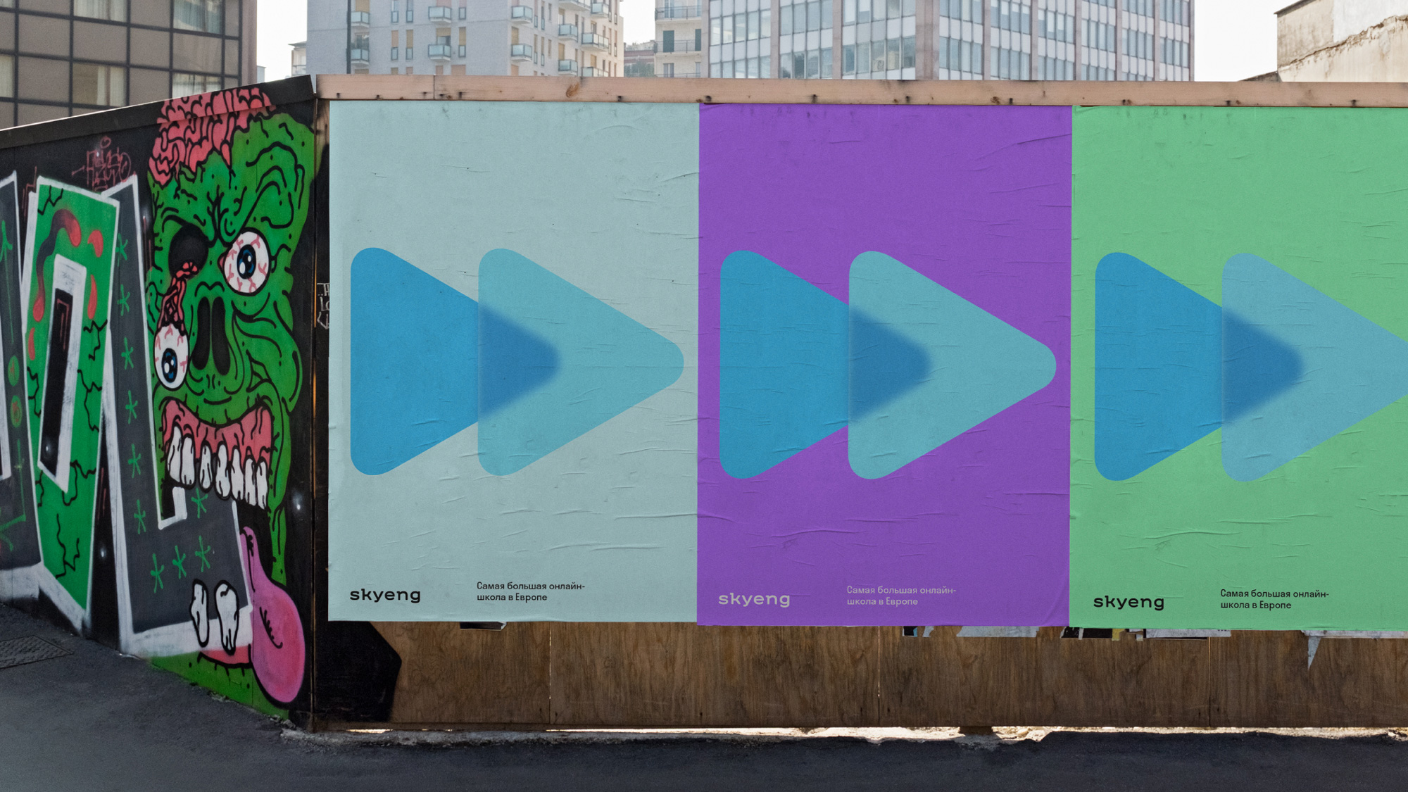
It’s easy to start studying when you know what it’s for. “What it’s for” is the goal, and the movement towards it is best represented by a triangle. It’s both an arrow pointing the way, an icon of the “play” button, and an acceleration itself. The path is a line: who knows which tracery the route’s gonna turn, but no doubt the road will not be boring.
Why two arrows? Why not three? We study when we simultaneously turn on cognitive and sensory neural groups: when we hear (sensory) and think (cognitive); read (sensory) and remember (cognitive); look (sensory) and analyze (cognitive). Connecting the neurons of these two groups is development, and development is acceleration.
Skyeng is attentive to the goal of your studying, it does everything to carry you there: cling to it like a wagon. Godspeed and fast forward.
The old logo was typeset in one of my archnemesis fonts, Museo Slab, so my predisposition to dislike it is off the charts and I do dislike it but as my older kid likes to say, “That sounds like a you problem”, which I accept because there was nothing really wrong with the old logo… other than using Museo Slab. The new logo introduces a fast-forward icon that becomes more interesting thanks to its transparency and blurred effect — it has been a while since we’ve seen a logo with a blur — and while I get the fast-forward metaphor my brain keeps linking the logo to a streaming service more than a language school and it’s hard to see the common icon as an ownable graphic device. Still, I really like the blur effect and how it adds depth to the icon. The new wordmark is a valiant evolution of Museo Slab, keeping the off-kilter slabs; I don’t think I’m a fan either but there is a good bone structure to it — the combination of the seldom slabs and wide letterspacing doesn’t fully convince me. In the end, anything is better than Museo Slab on its own and this definitely feels more polished.
The past seems monochrome. But the future can be whatever you want. The colorful palette of the design system is a promise of a future in which the student has already achieved the goal.
The logo inherits the two-part nature of the previous Skyeng inscription. In the old logo, it was expressed by the contrast of the thickness of the component parts of the word. In the new logo, the arrows are in charge of that — the left one is always blue. Thus, Sky is a static element of the logo’s morphology, while products and brands are variable, each painted in a unique corporate color, and each has a contrasting background color.
The font “Shuka” drew for Skyeng borrows and develops the recognizable features of the previous logo. Serifs pick up and strengthen the idea of acceleration. It’s located all on one side, and though it’s called slab-squared, but when the letters with such serifs form wordmark, it almost feels like it’s ready to soar.
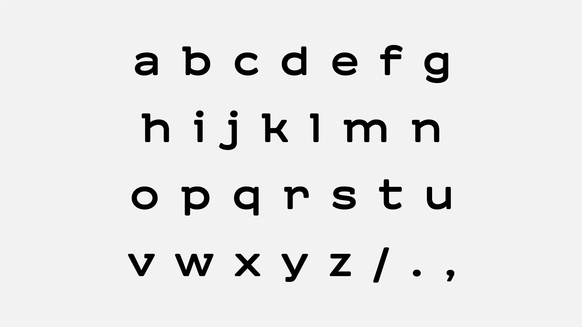
The extra colorful icon combinations can be a little jarring but they certainly add liveliness to the brand. The wordmark is extended into a custom typeface and the more I see it, the more I could do without the slabs but I can understand why they are there so I’ll leave that alone now.
Skyeng aims to make education more attractive than TV series and competes for the time that customers spend on social networks. Each social network has an Emoji, and now Skyeng does too. It is soft, energetic and attractive as caramels. It is as if sunlight passes through them and reveals a plastic effect that is common with other elements of identity.
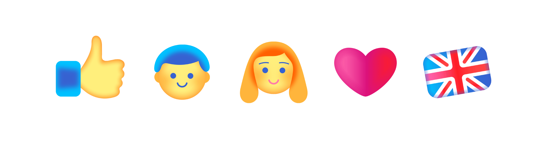
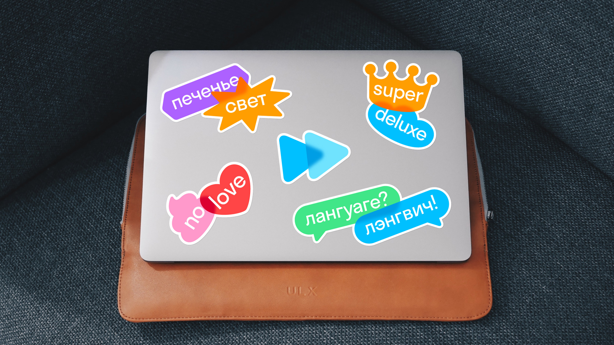
A set of custom emojis extend the transparent/blurriness effect and they are lots of fun, especially with the brand’s blue key color as the accent for the faces. The custom emojis haven’t quite made it to Skyeng’s website and they don’t appear again in the renders/applications below, which is sad because they are enjoyable and a cool extension of the visual cues established by the icon.
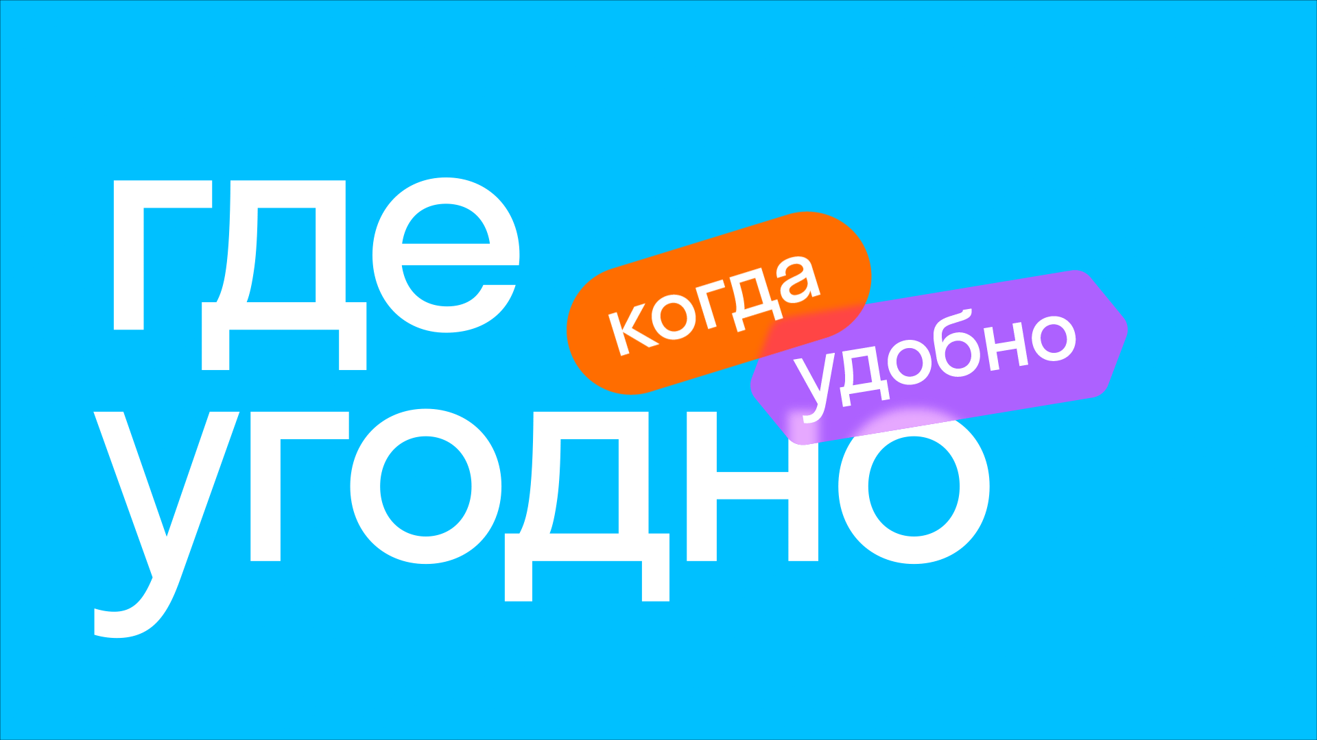
Lines complete the typographic assemblies. Zigzags and loops are drawings of rapid movement, a trace of a personal studying trajectory. The main point is strongly emphasized, and the secondary is foggy.
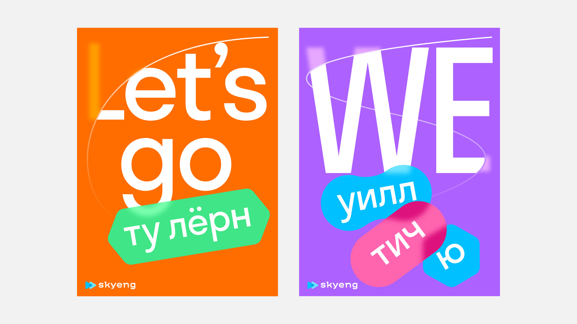
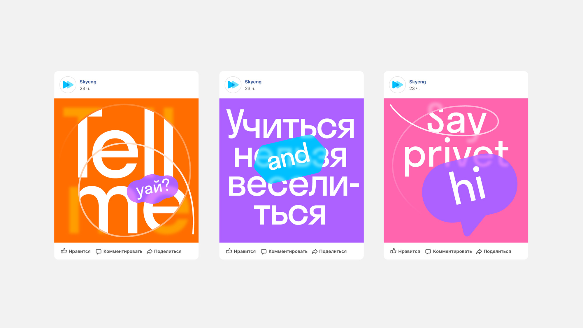
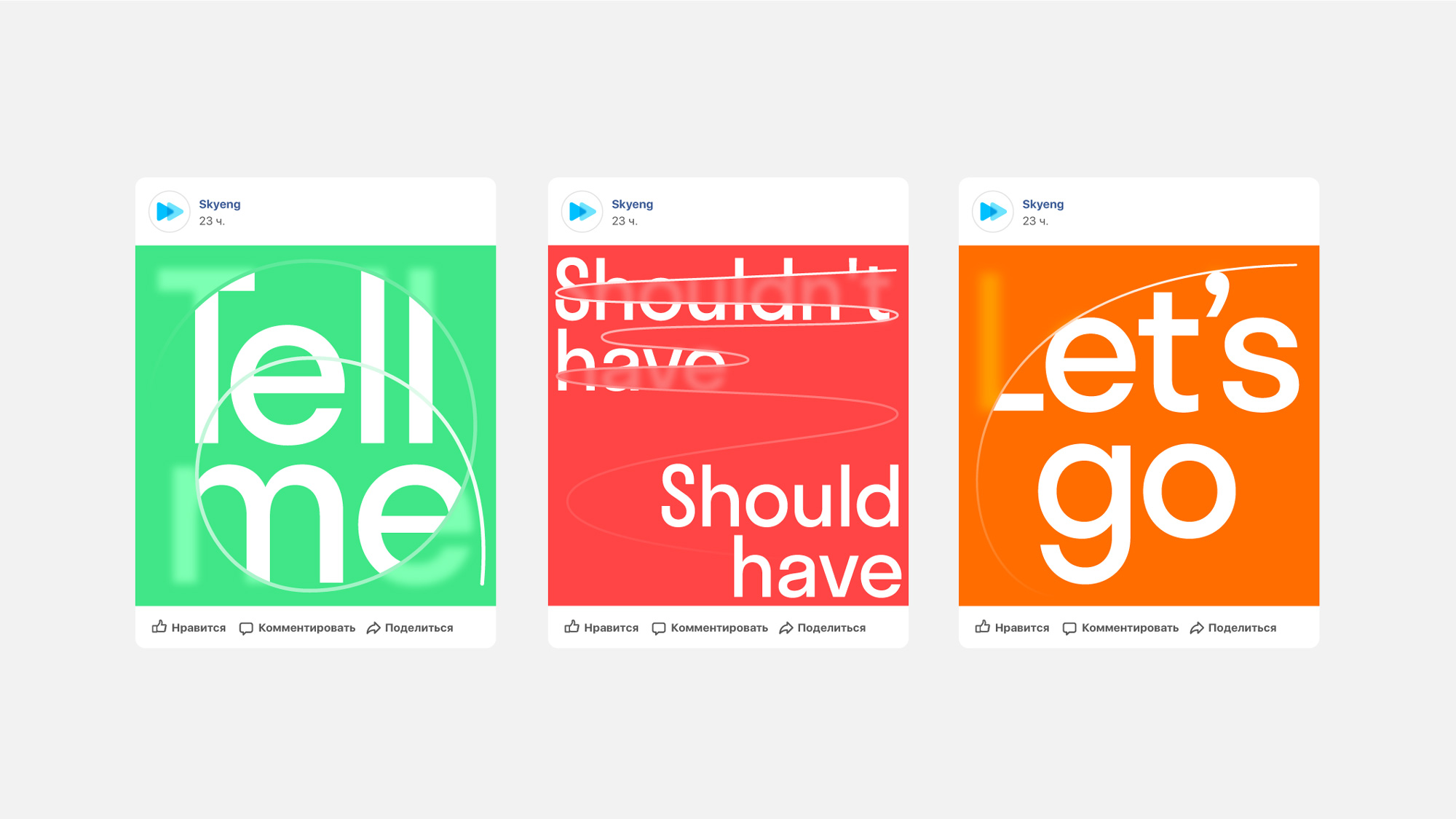
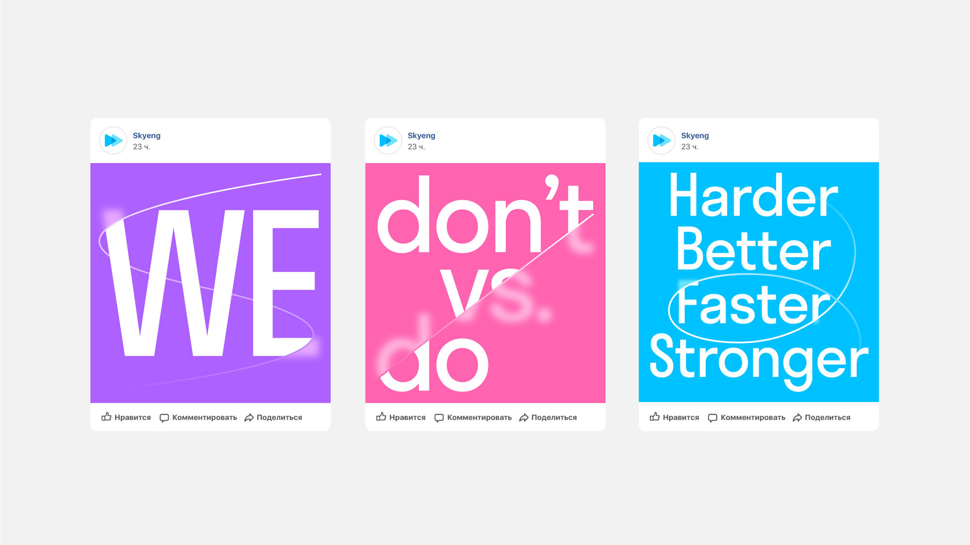
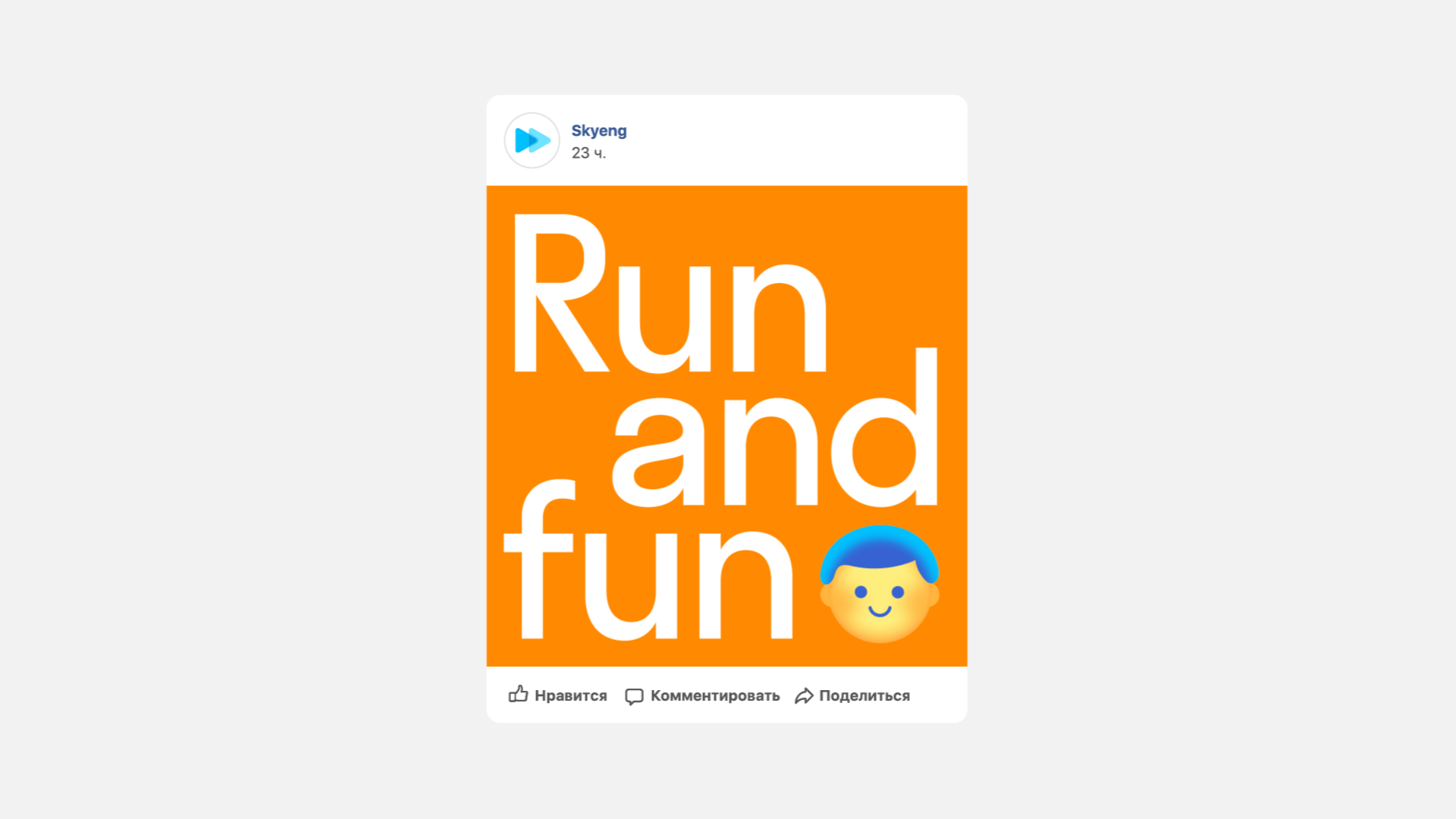
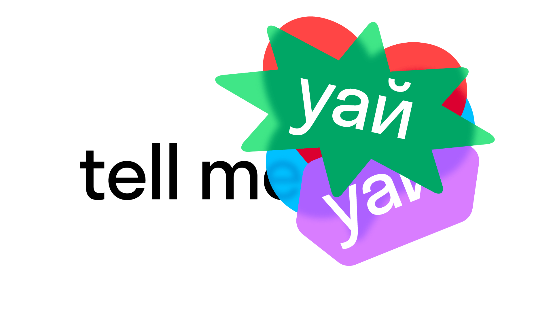
In application, the visual language consists of “stickers”, which is an approach we’ve seen some of recently, but here we have the added visual twist of the transparency and blur effect when the stickers overlay, which becomes more interesting in combination with the funky sticker shapes. Another element is a squiggly line that runs across headlines and blurs the type in different places. It’s a cool effect as well and it creates a light, fuzzy feeling in the communications that, along with the color palette, feels like cotton candy visualized in typography.
Not much else in other kinds of applications but I guess since this is a purely online platform there don’t need to be that many other applications. Overall, I feel like there is a lack of cohesiveness from logo to visual language despite the recurring transparency and blur effects and I think it might have to do mostly with the wordmark and custom type that don’t really feel integrated with the softer elements but there is definitely a sense of optimism about the whole thing and seems like a fun platform to learn the language.
 each year since publication began in 2006

 Новости Союза дизайнеров
Все о дизайне в Санкт-Петербурге.
Новости Союза дизайнеров
Все о дизайне в Санкт-Петербурге.