contact us | ok@ohmycode.ru
contact us | ok@ohmycode.ru
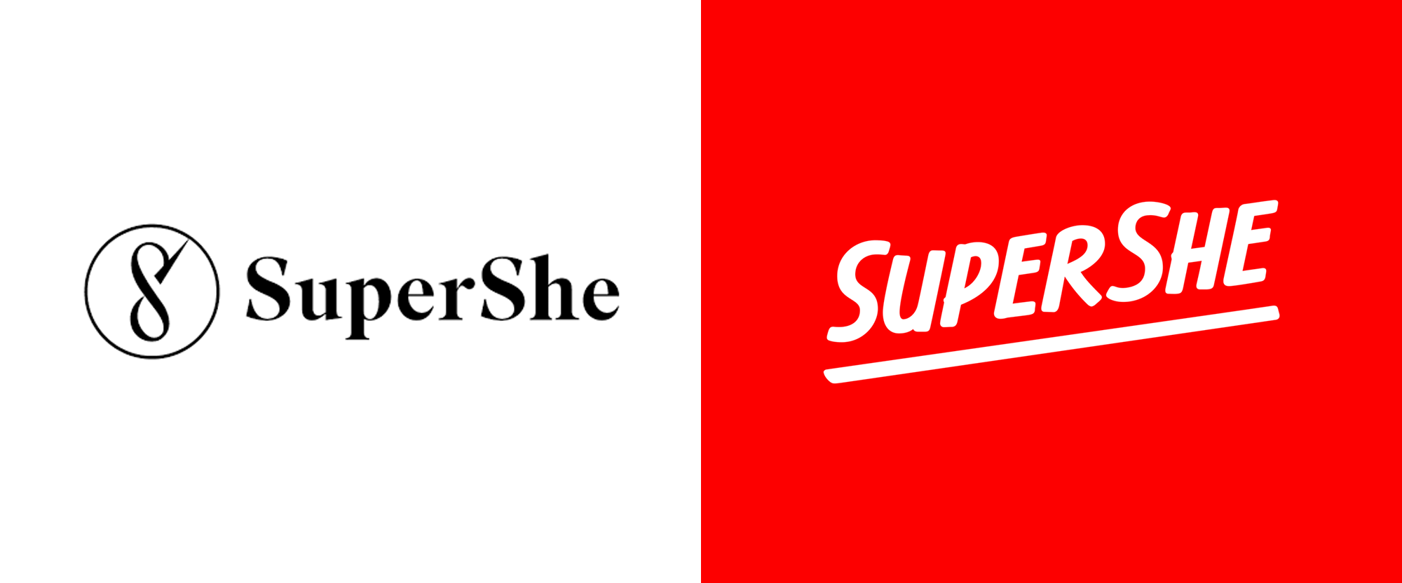
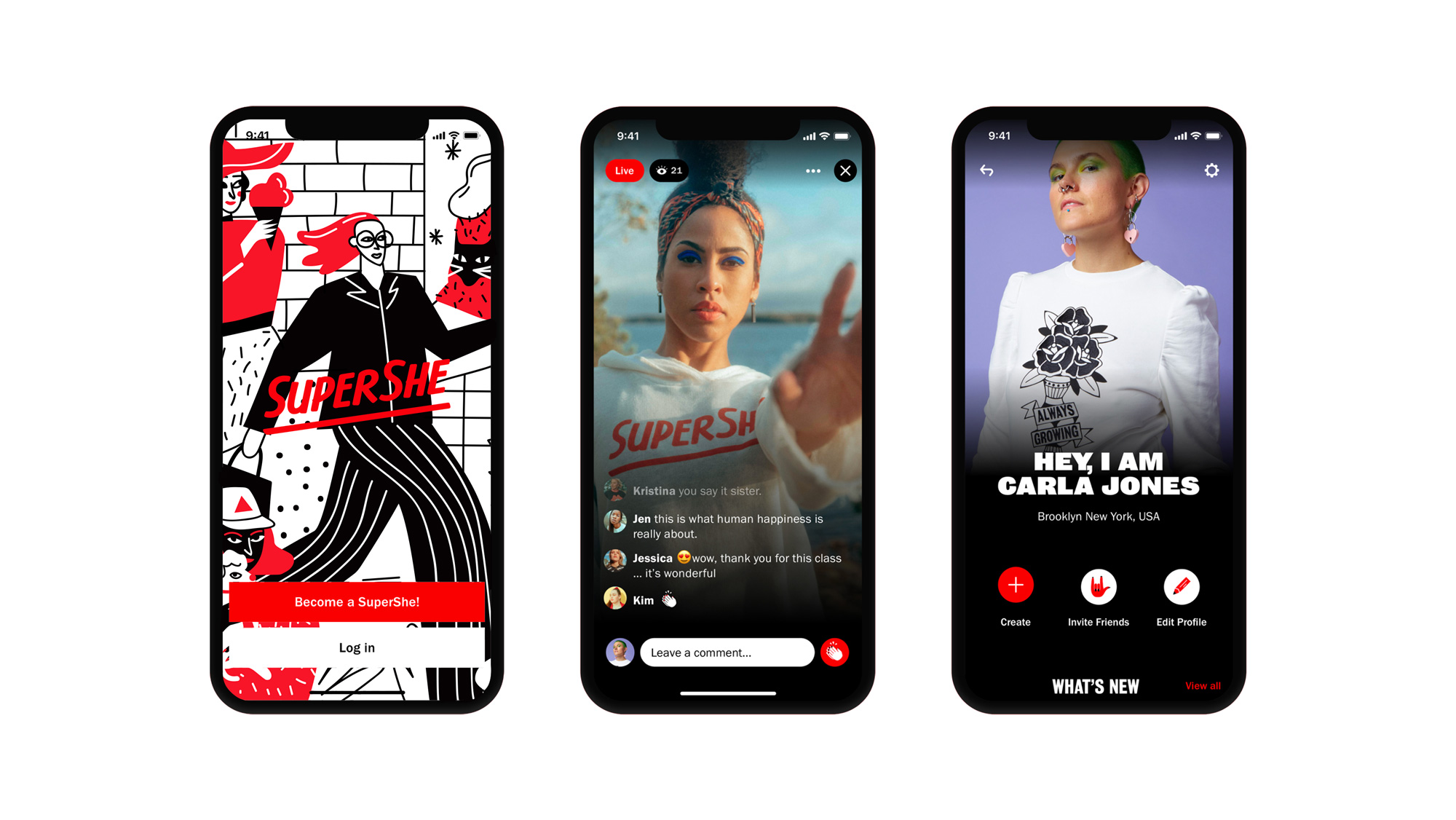
Established in 2018, SuperShe is a community for people who identify as she, providing a bevy of content, products, and connections to empower and inspire. The community is now based around a newly launched app but its origin is as an island — nope, not a metaphor — for women only. The 8.4-acre island in the Baltic Sea, accessible off the coast of Raseborg, Finland, was purchased by entrepreneur Kristina Roth after she sold her tech consulting company and has served as a women-only luxury retreat — cost of the week-long stay is around $5,000 — since then. For those that can’t afford going to the island, the next best thing is the app and the community around it where members can meet, chat, and enjoy the content exclusive to the app. Late last year, SuperShe introduced a new identity designed by New York, NY-based &Walsh.
When looking at other women’s communities, we realized that many of them were overly prescribing the way women in that community “should be”. Be a girl boss, travel the world & wear your nightly face masks. There was no one in the space allowing women to claim their own version of themselves. That’s where SuperShe comes in.
Inspired by the protest posters from women’s marches throughout history, we developed a custom brush font designed for SuperShe. The brush font is paired with Panamera & Bureau Grot.
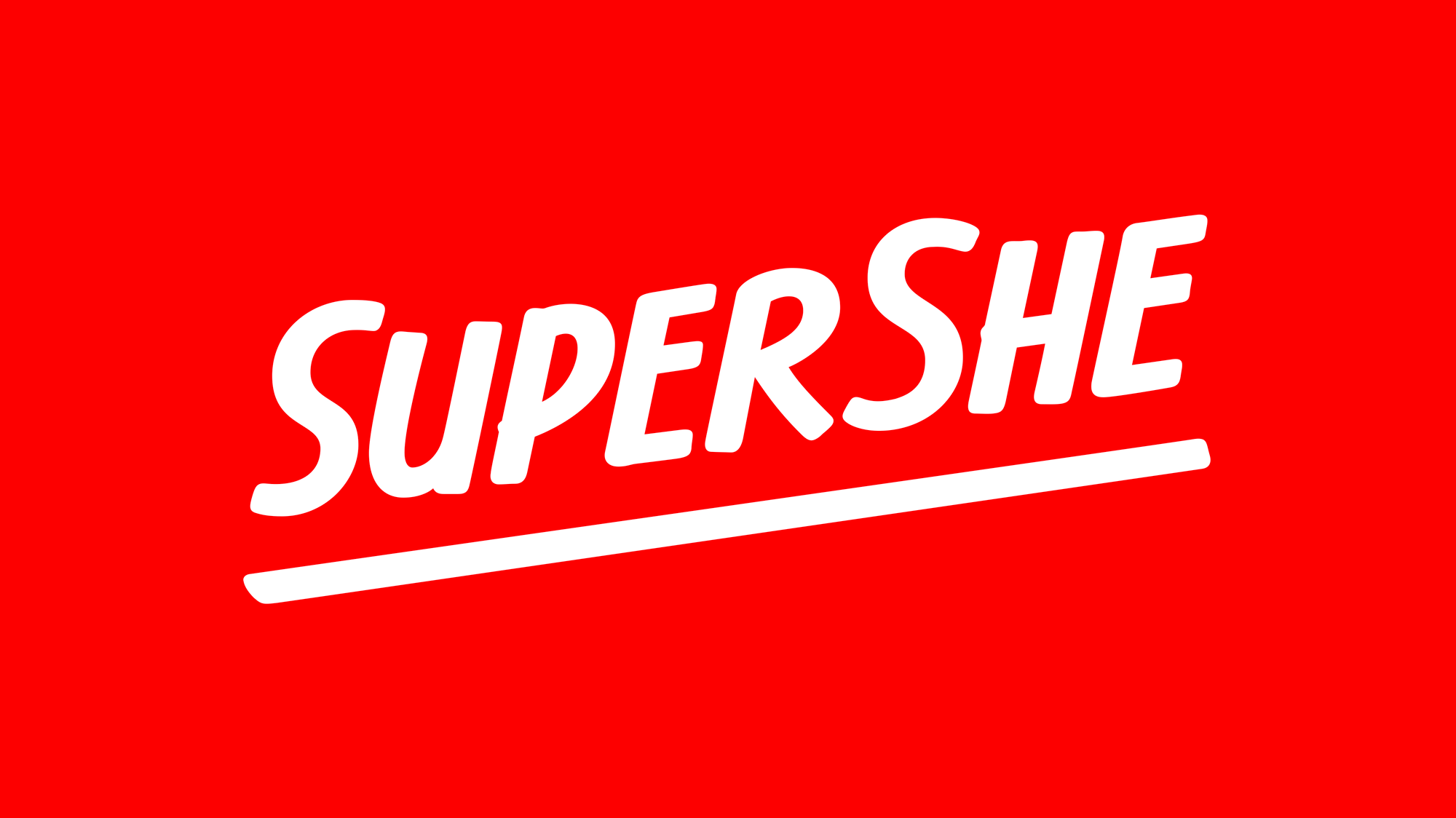
The old logo was not great but it wasn’t terrible. The monogram was sort of interesting but perhaps felt a little aggressive with that shard-looking thing coming off of the “S” and the wordmark looked like the logo of a business of a magazine. The new logo is far more approachable and embraceable by a larger swath of people. It’s like an elegant comic book font which, along with the upward angle, gives it a superhero vibe but, most importantly, I think it just feels welcoming and unpretentious. The gap between “Super” and “She” perhaps could have been resolved in an interesting way, as a ligature or some kind of swash treatment but other than that, it’s solid and it pairs really well with the woodtype-esque sans serif used throughout the identity (best case example being the navigation on the website).
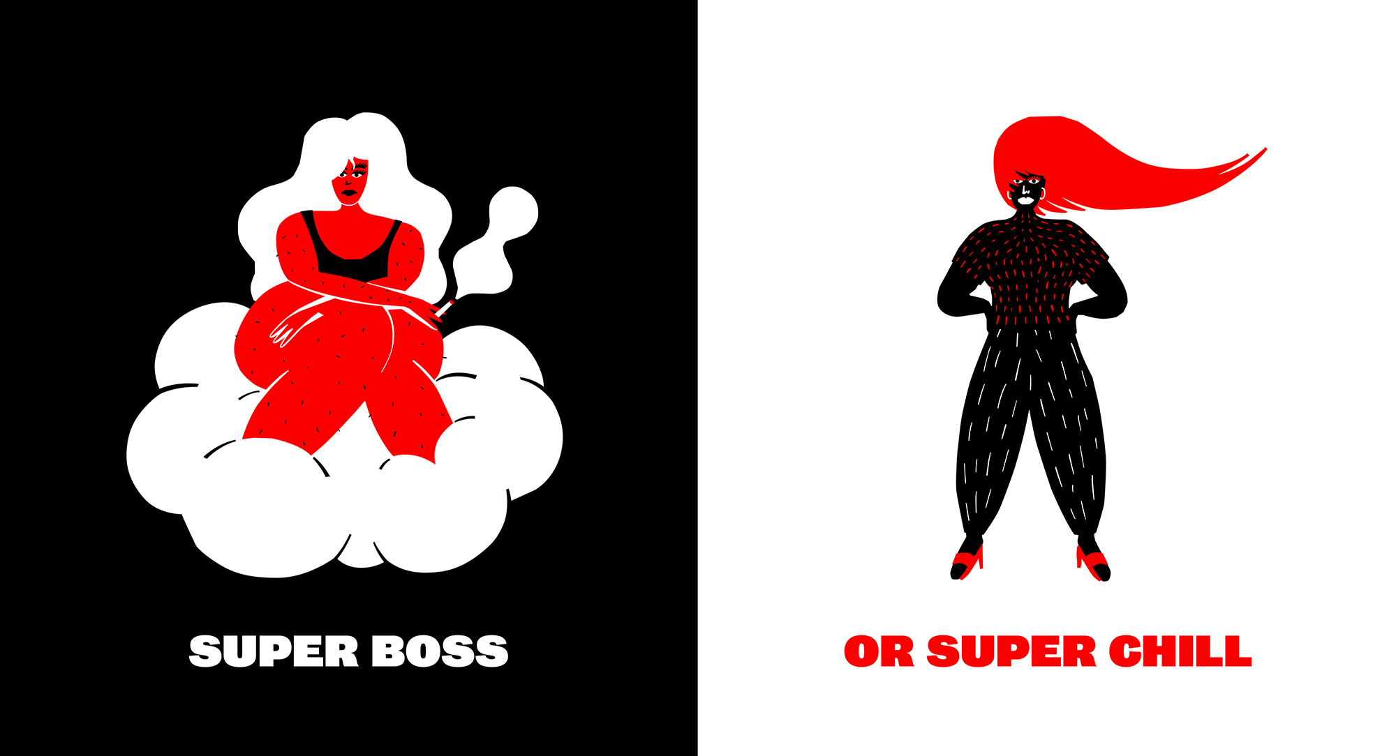
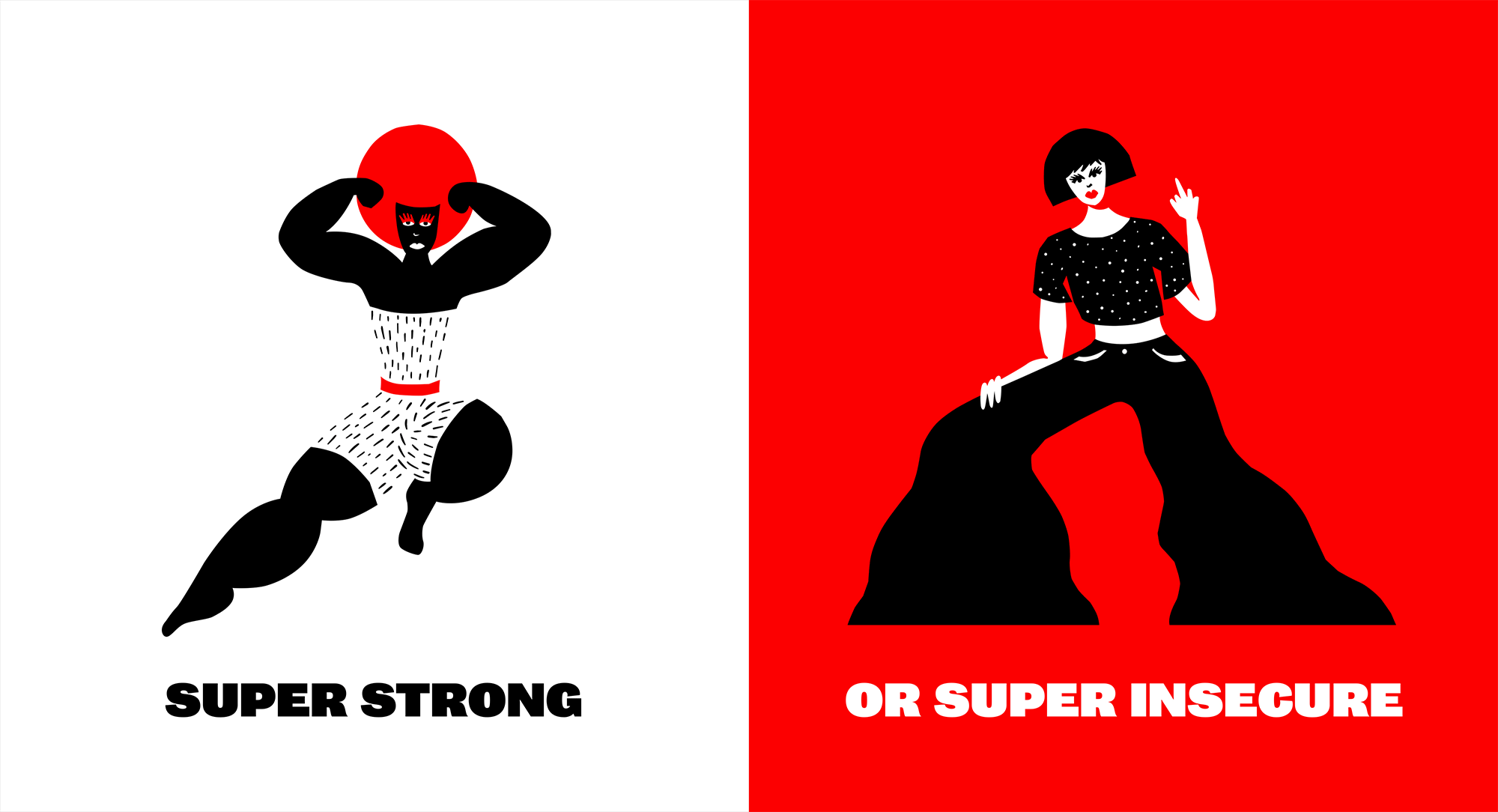
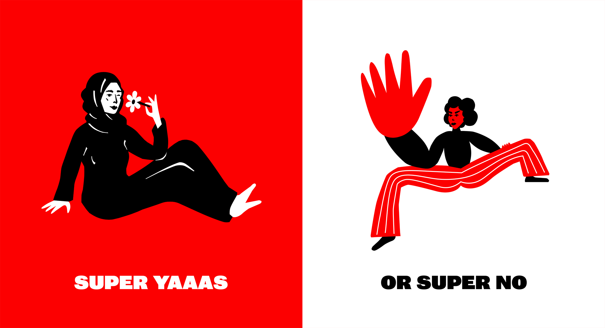
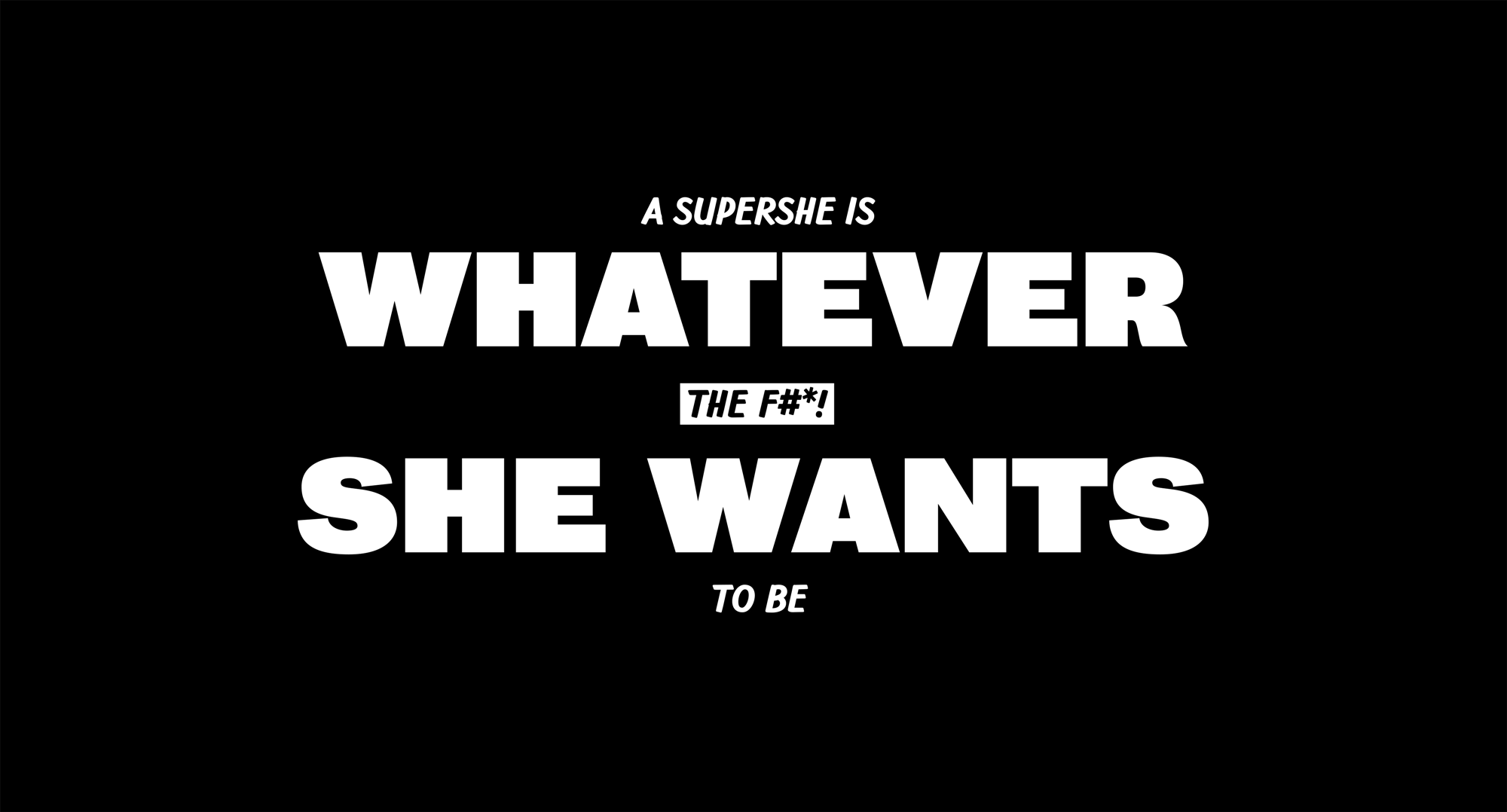
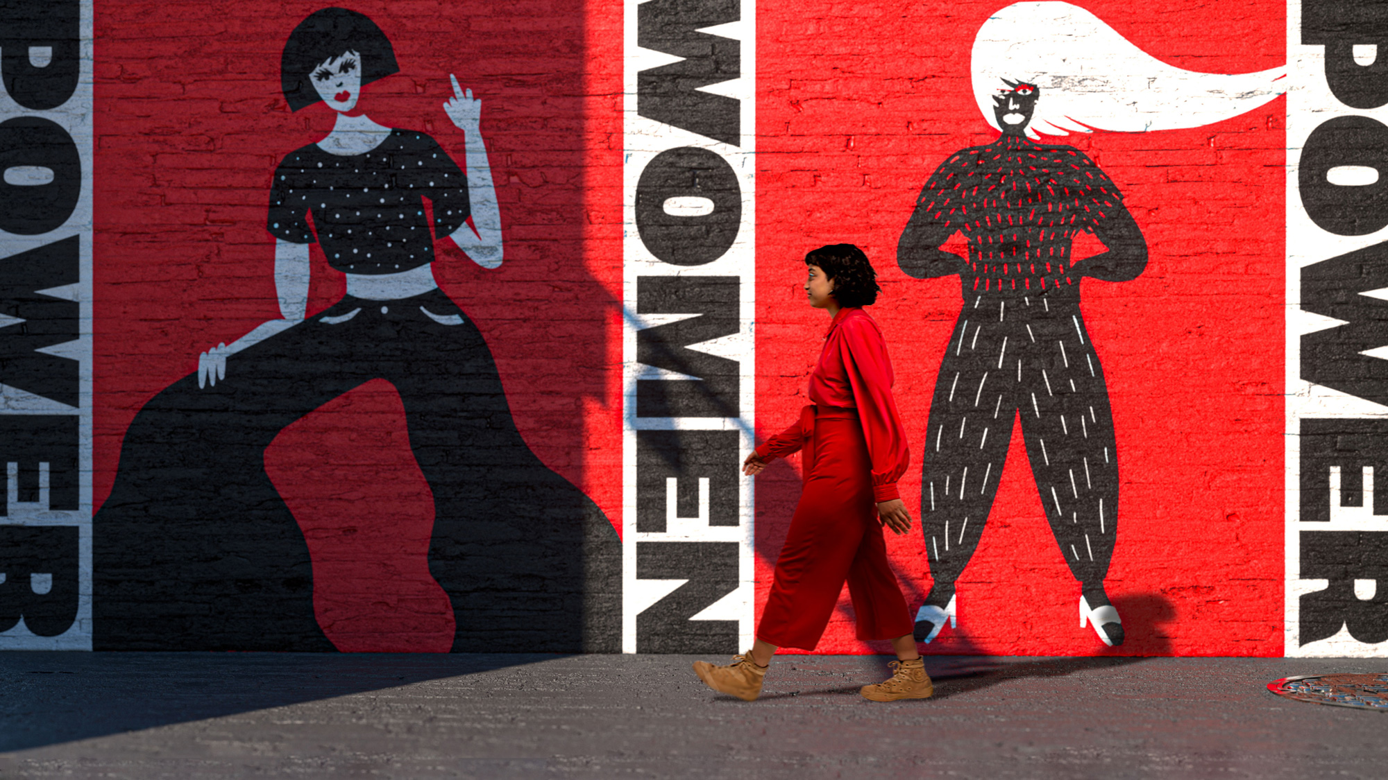
As is usually the case with &Walsh projects, there is a lot of illustration and it’s pretty cool mostly in part because unlike the rest of the illustrations we see on Brand New these figures have faces! And personalities. While the illustration style is similar overall, I like that they are not overly formulaic and are instead more diverse and loose.
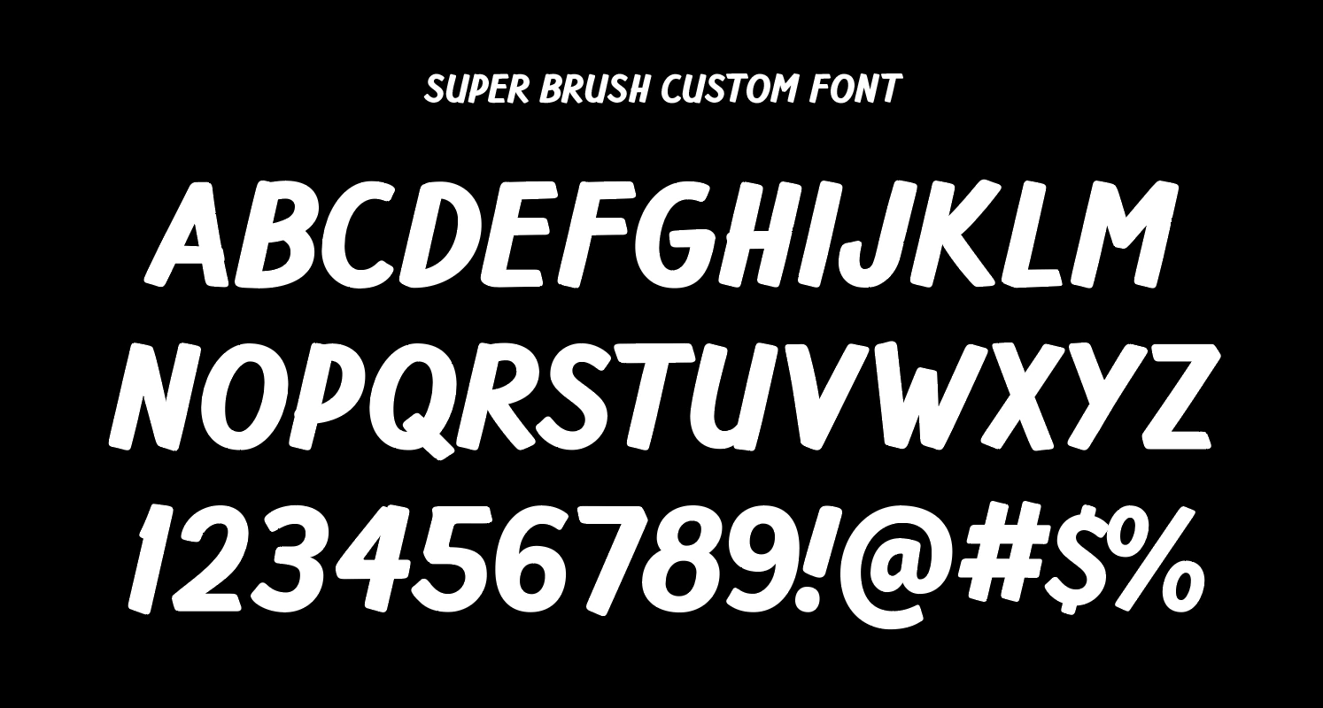
The custom typeface doesn’t appear much in the identity as it takes on a supporting role but it’s definitely fun and adds a welcome hand-drawn contrast to the heavy sans serif.
To align with our strategy, the brand always displays merch in pairs, including two different messages on each item. We wanted to express the idea that women do not have to be defined one way. The strategy invites women to embrace the many versions of themselves, without ever prescribing one way to be.
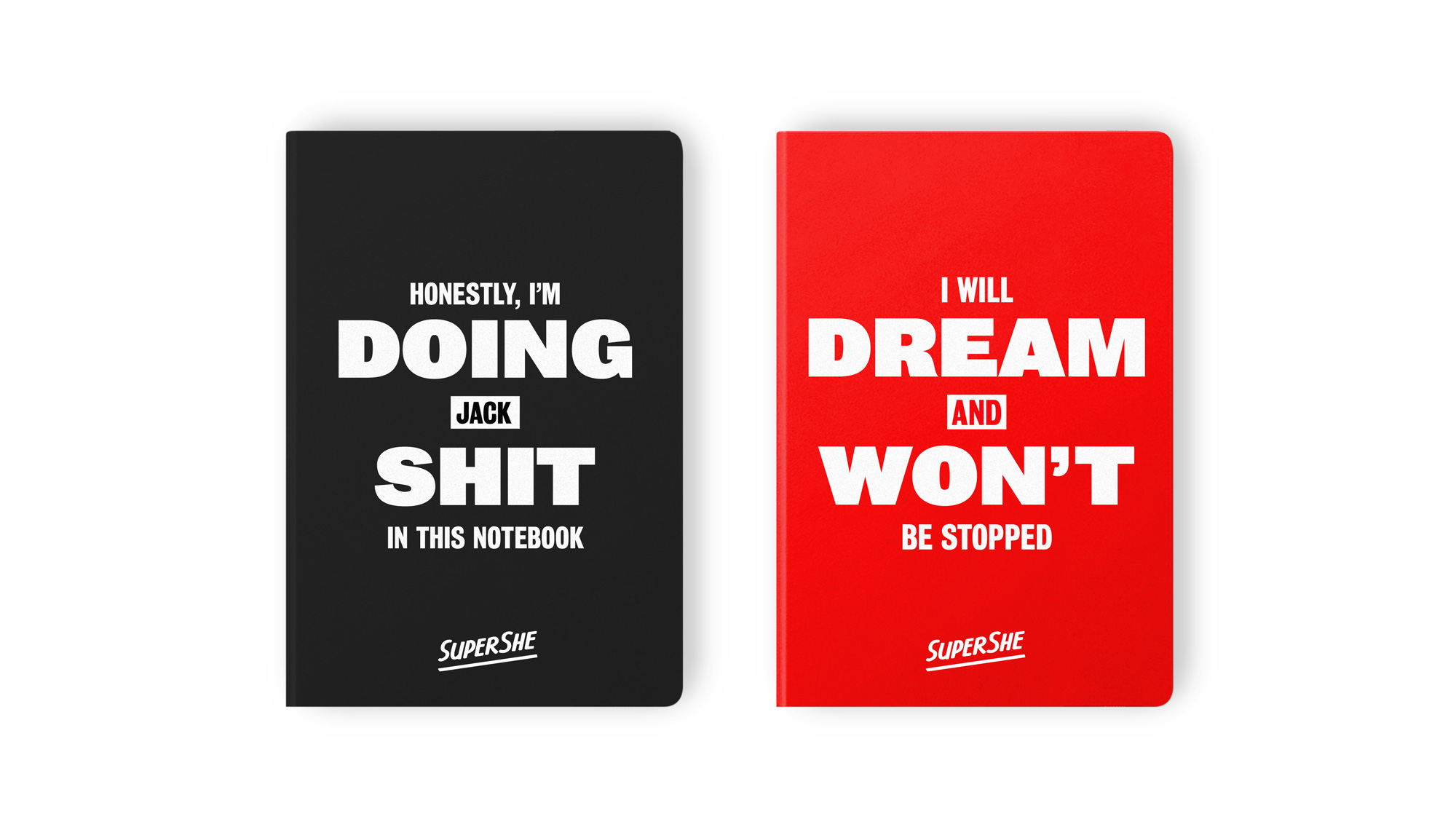
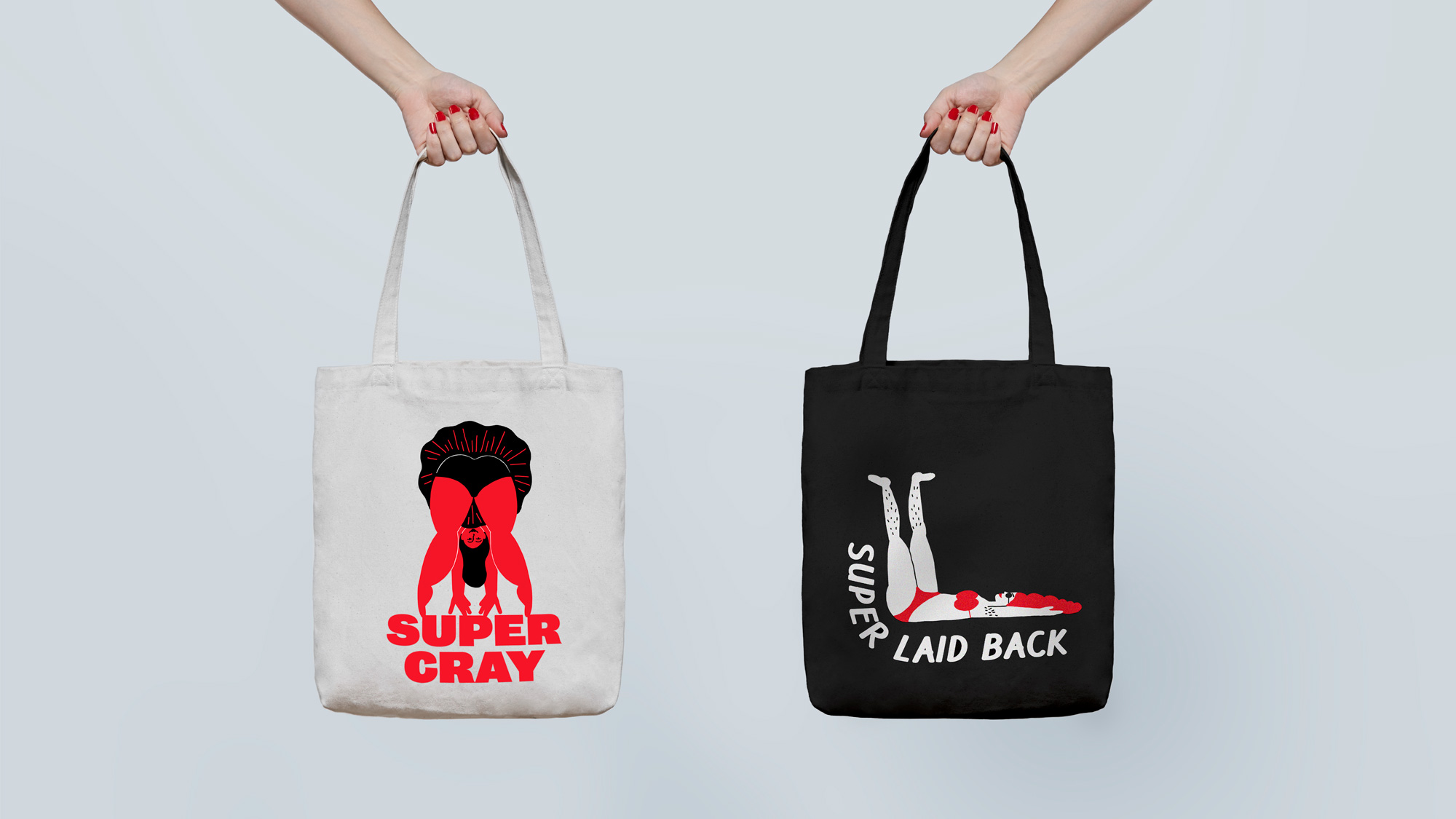
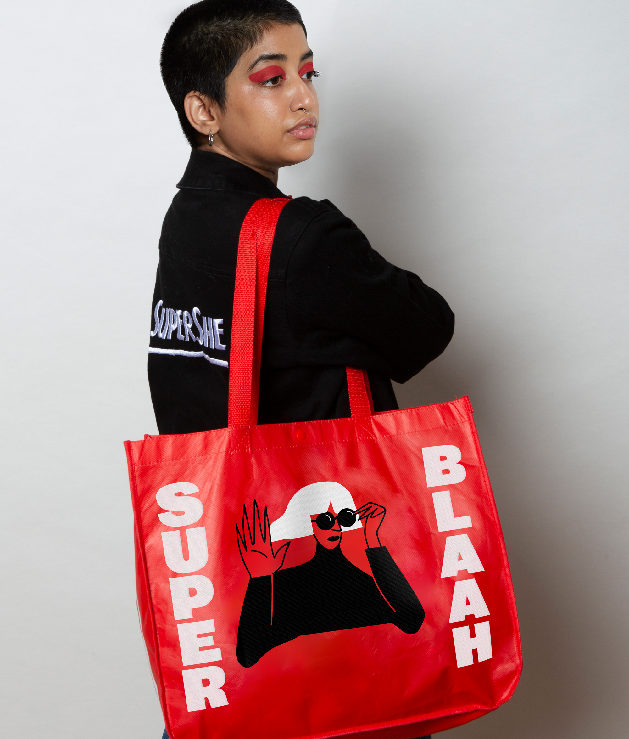
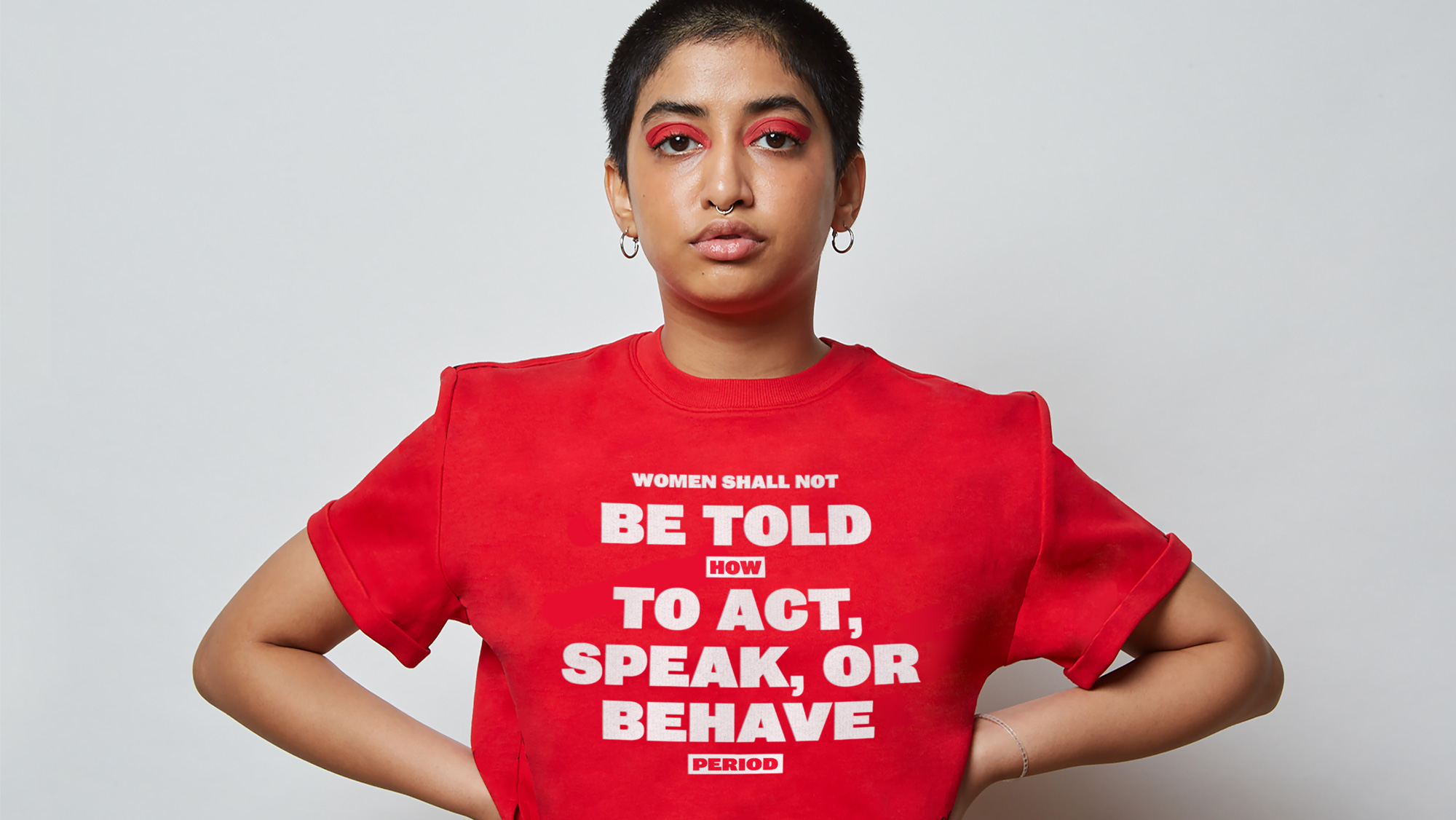
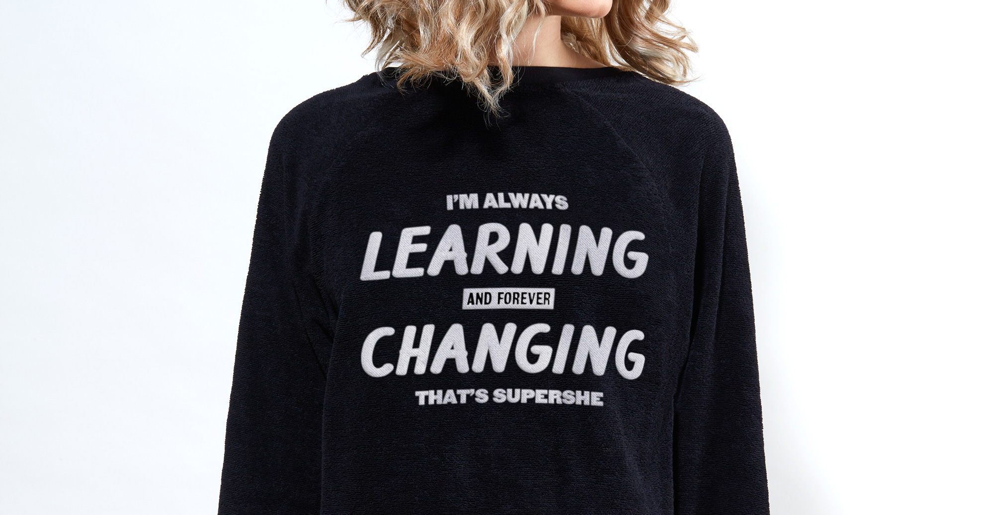
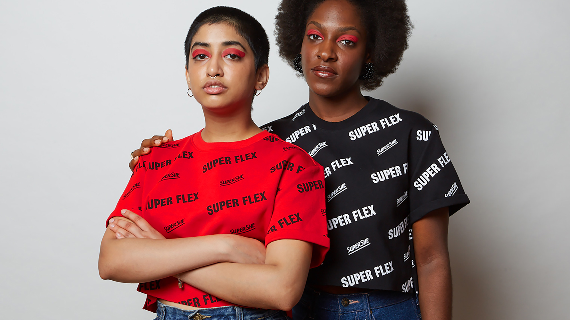
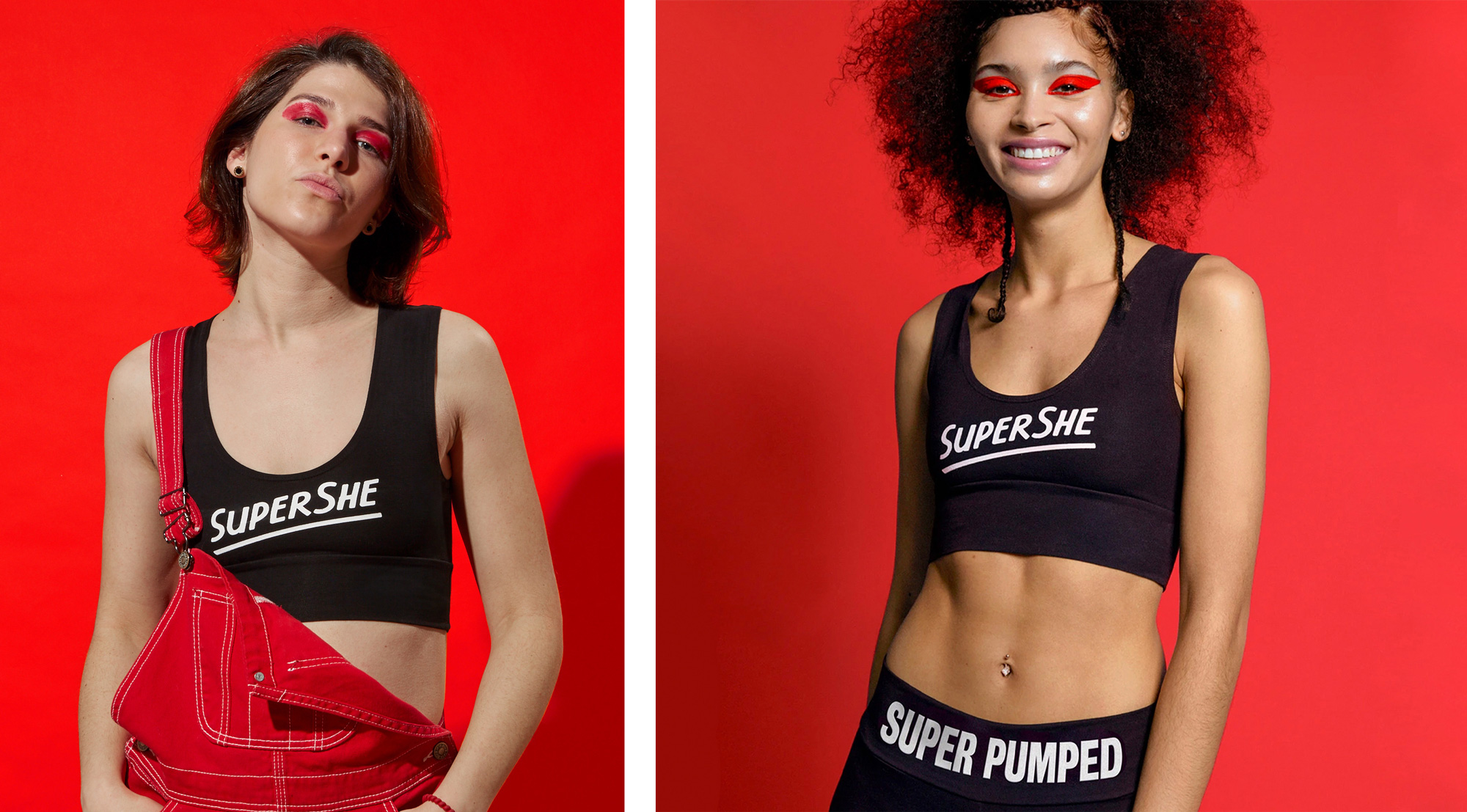
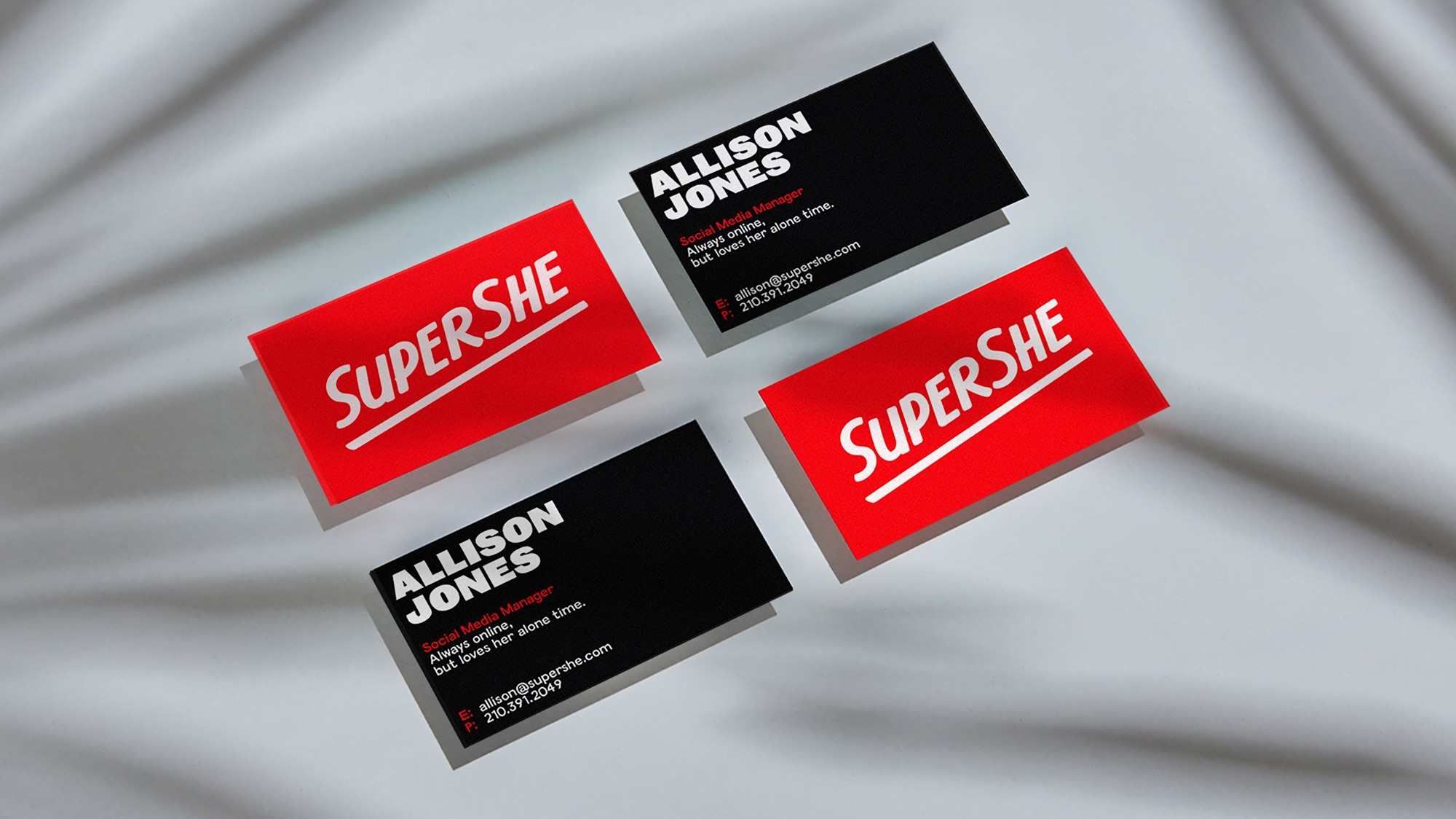
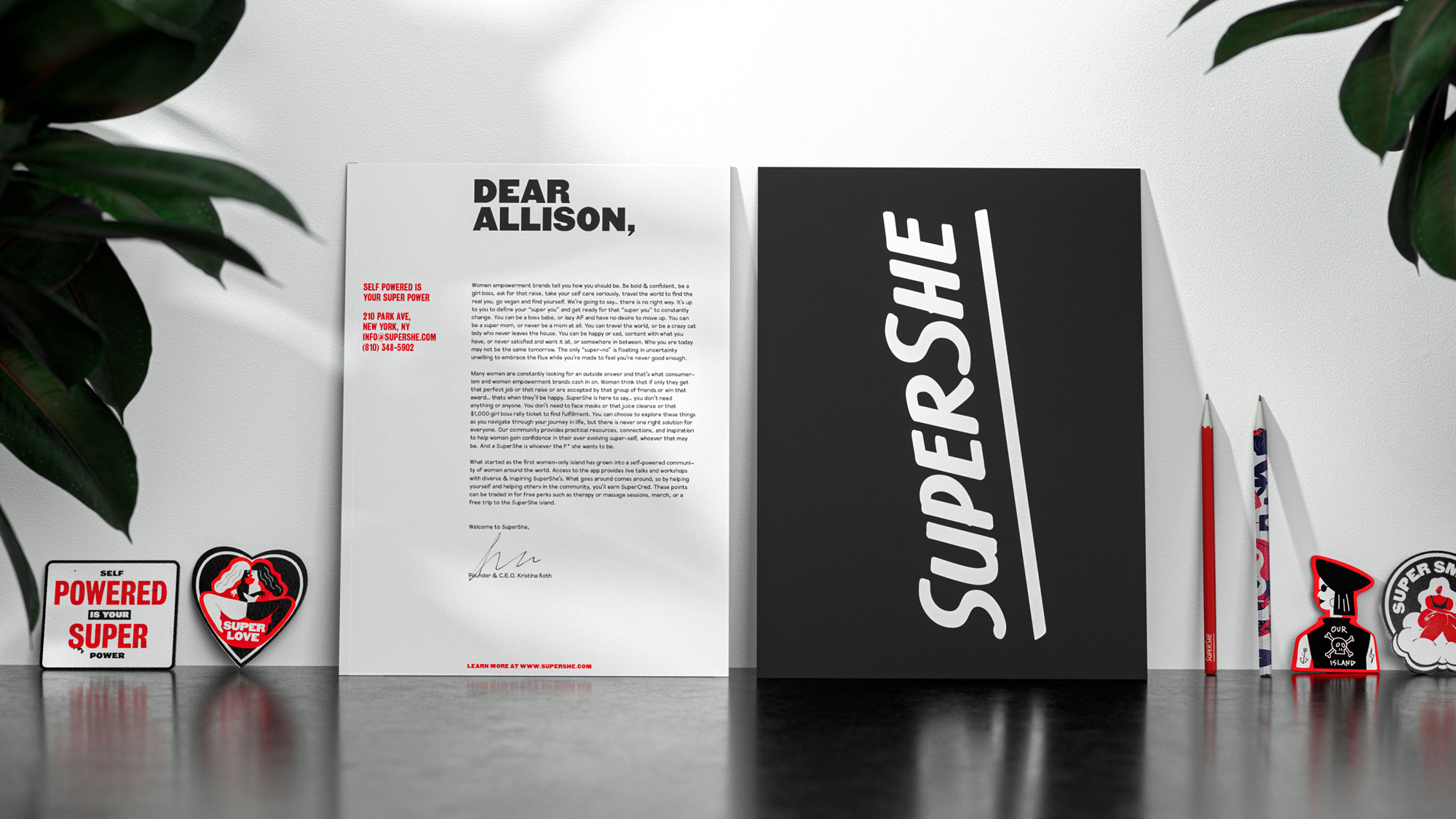
The applications, from business card to merch, have a fairly straightforward approach of big centered type that mixes and matches the sans serif with the brush font and can be used with or without illustrations. The design, on its own, is fine but when paired with the copywriting — which I feel like you either love or hate — it becomes more powerful and engaging for the SuperShe community. I don’t respond well to empowering messages, whether it’s for men, women, or puppies, but I can definitely see the appeal and impact that this can have.
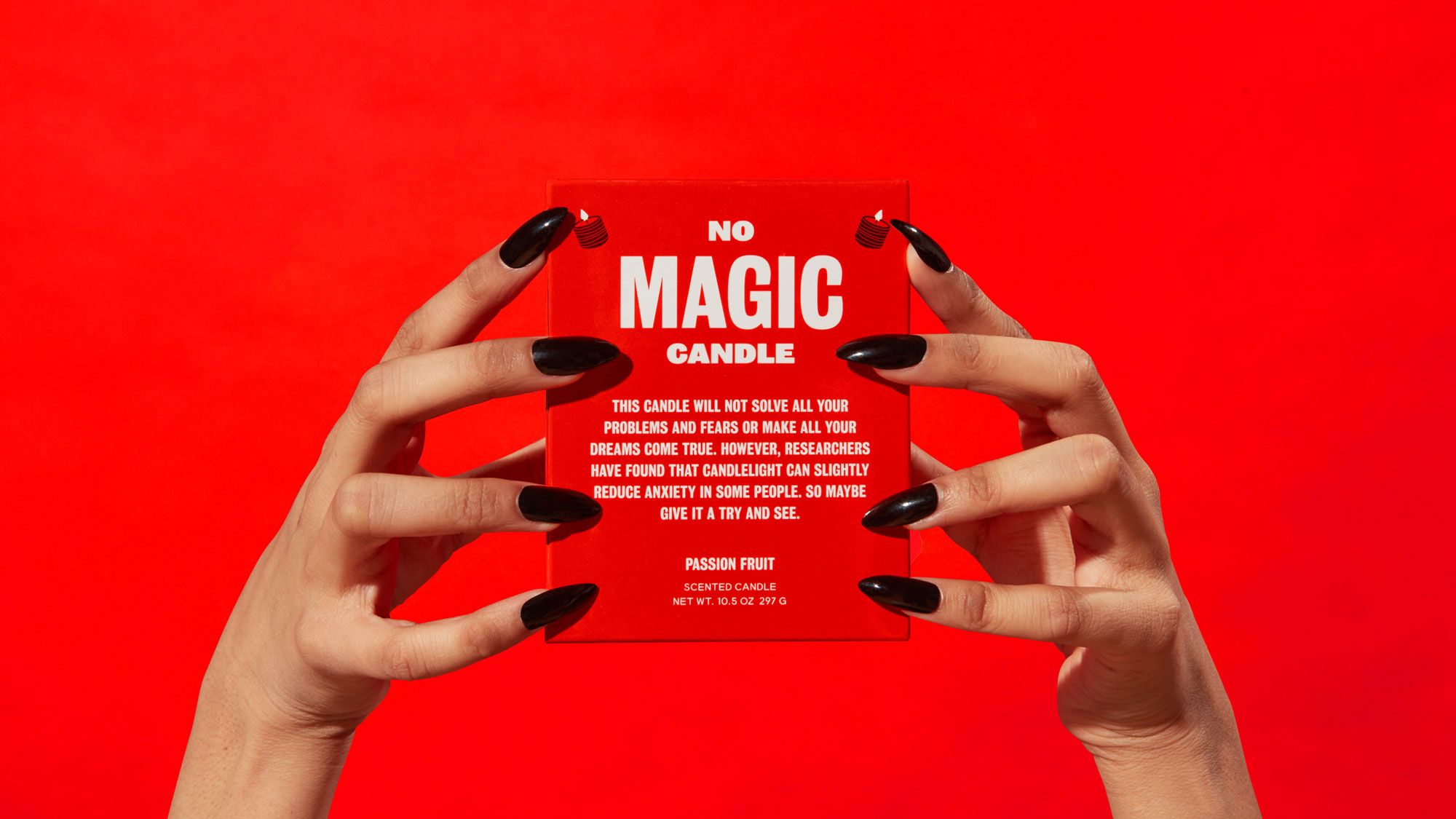
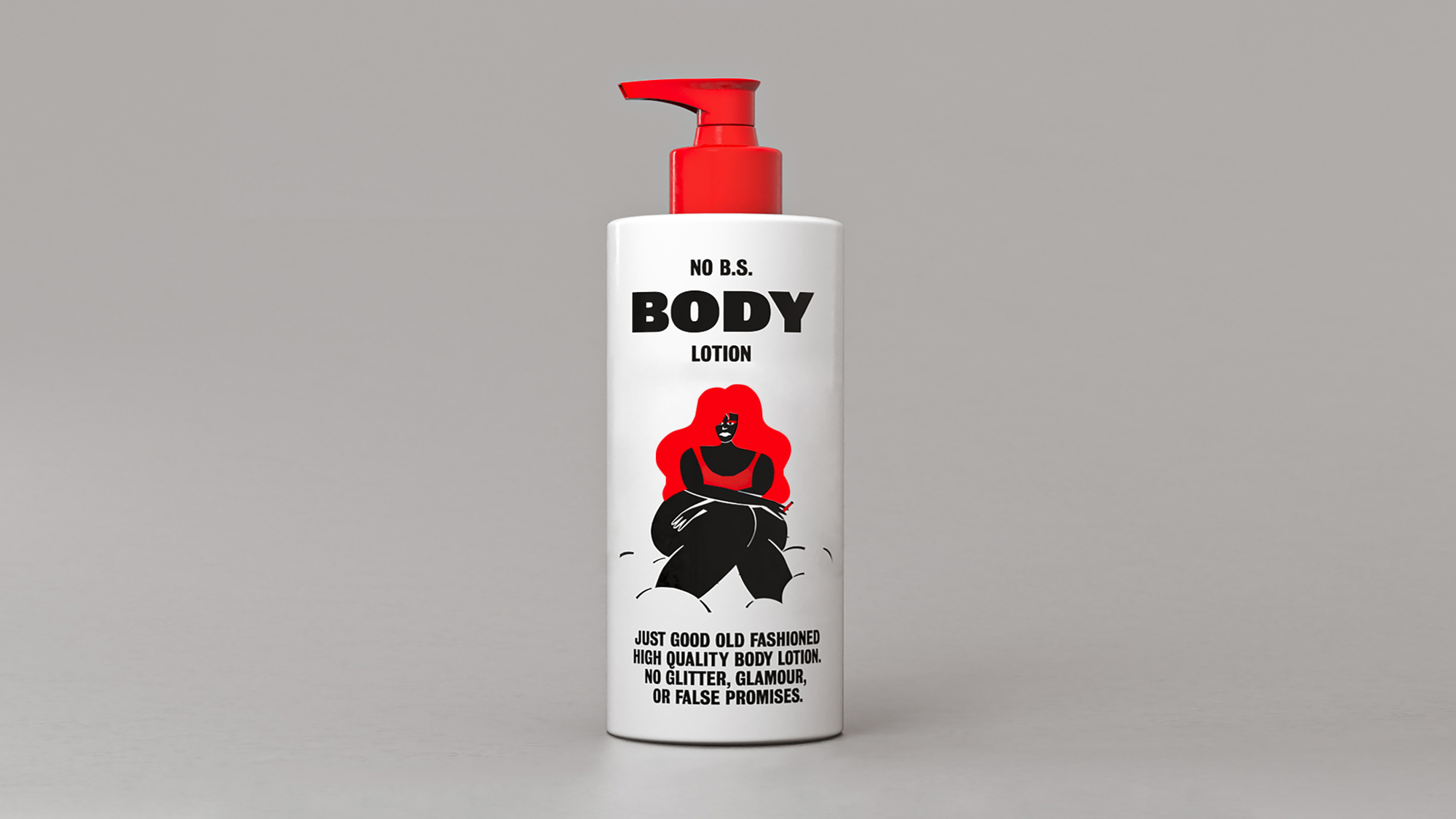
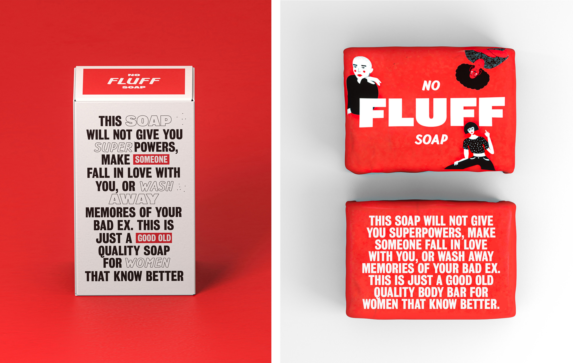
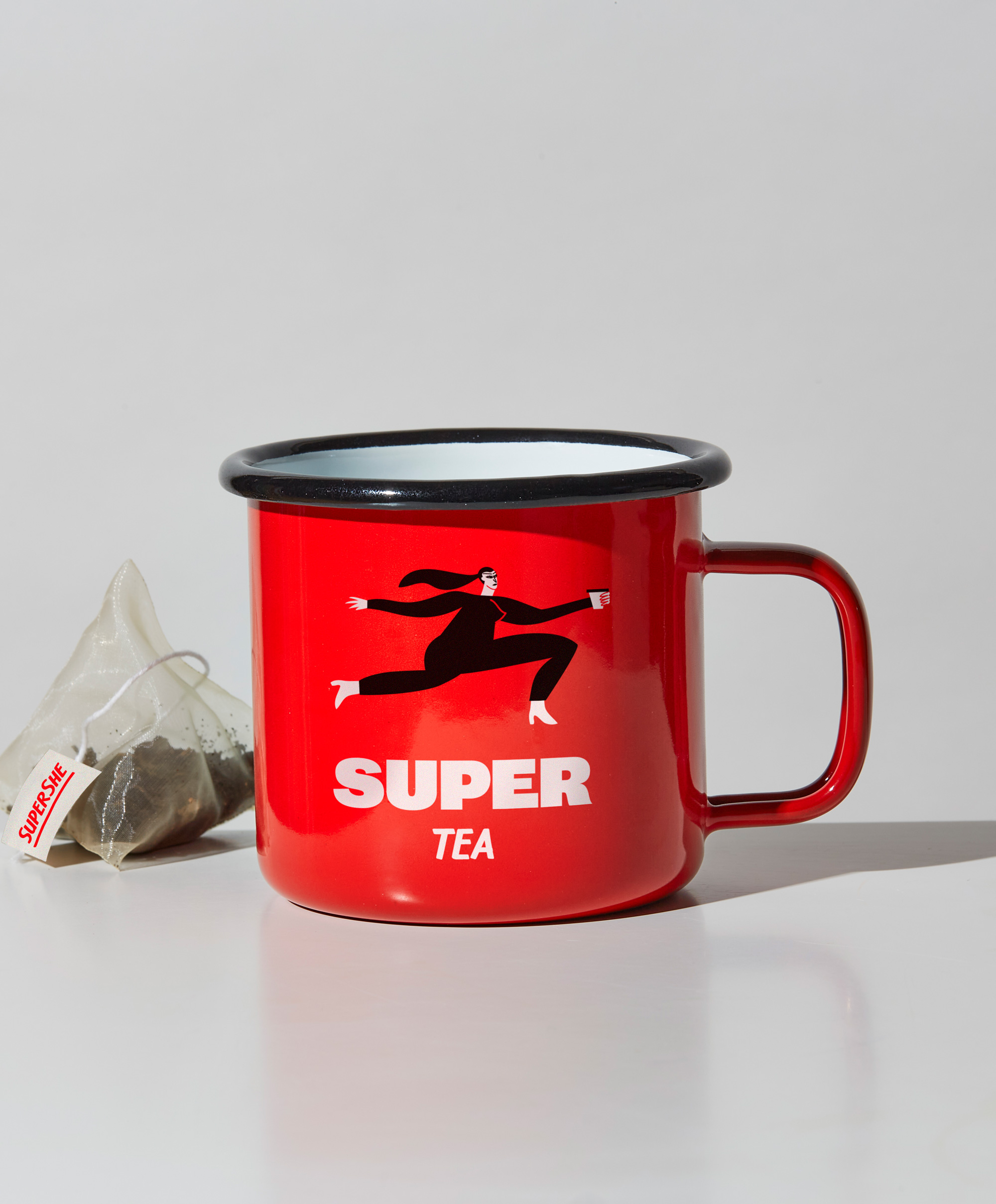
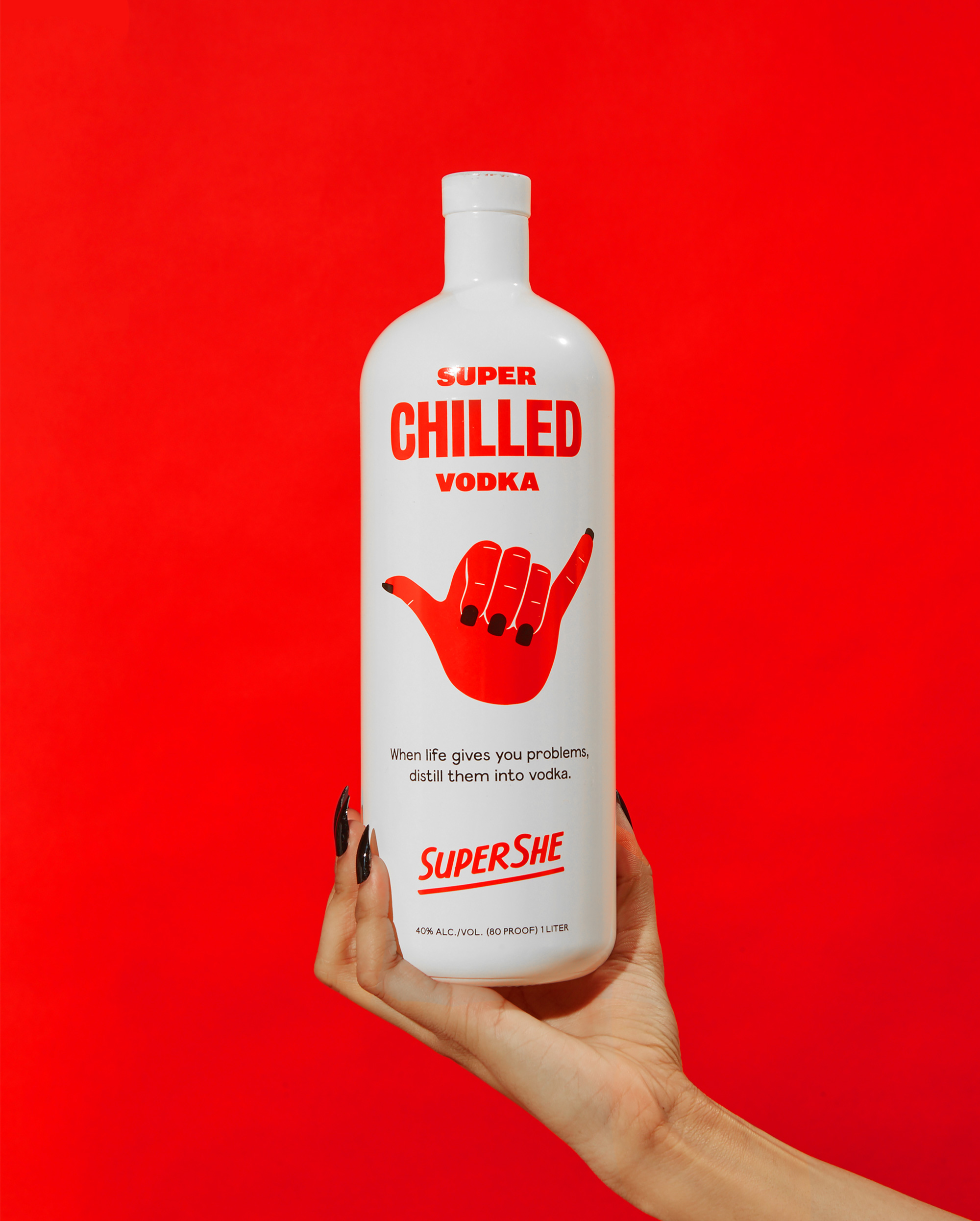
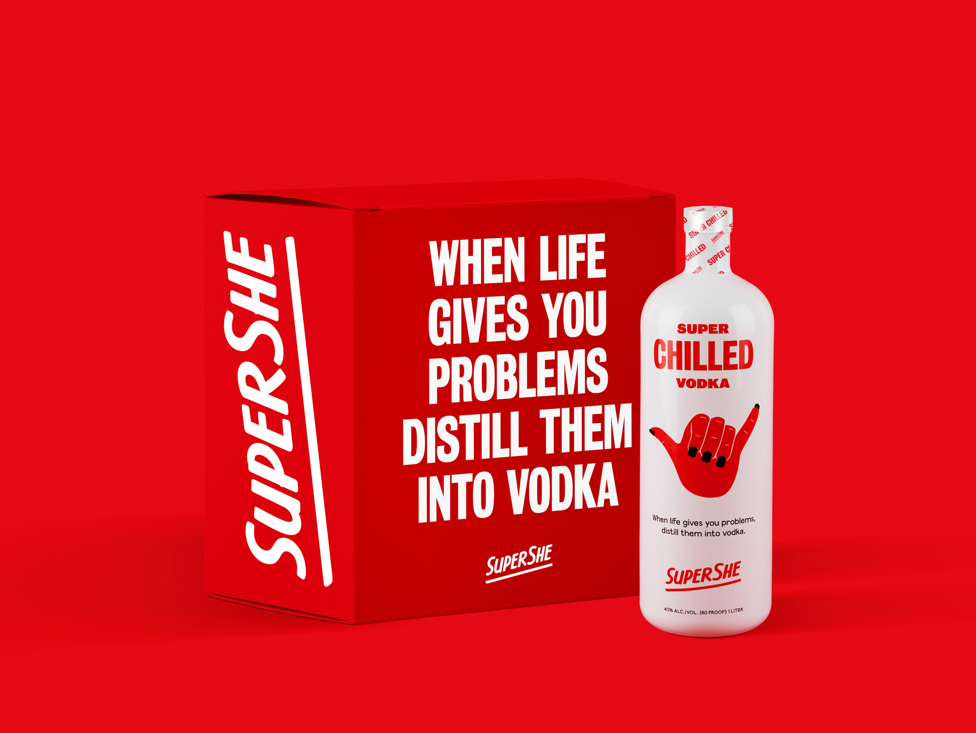
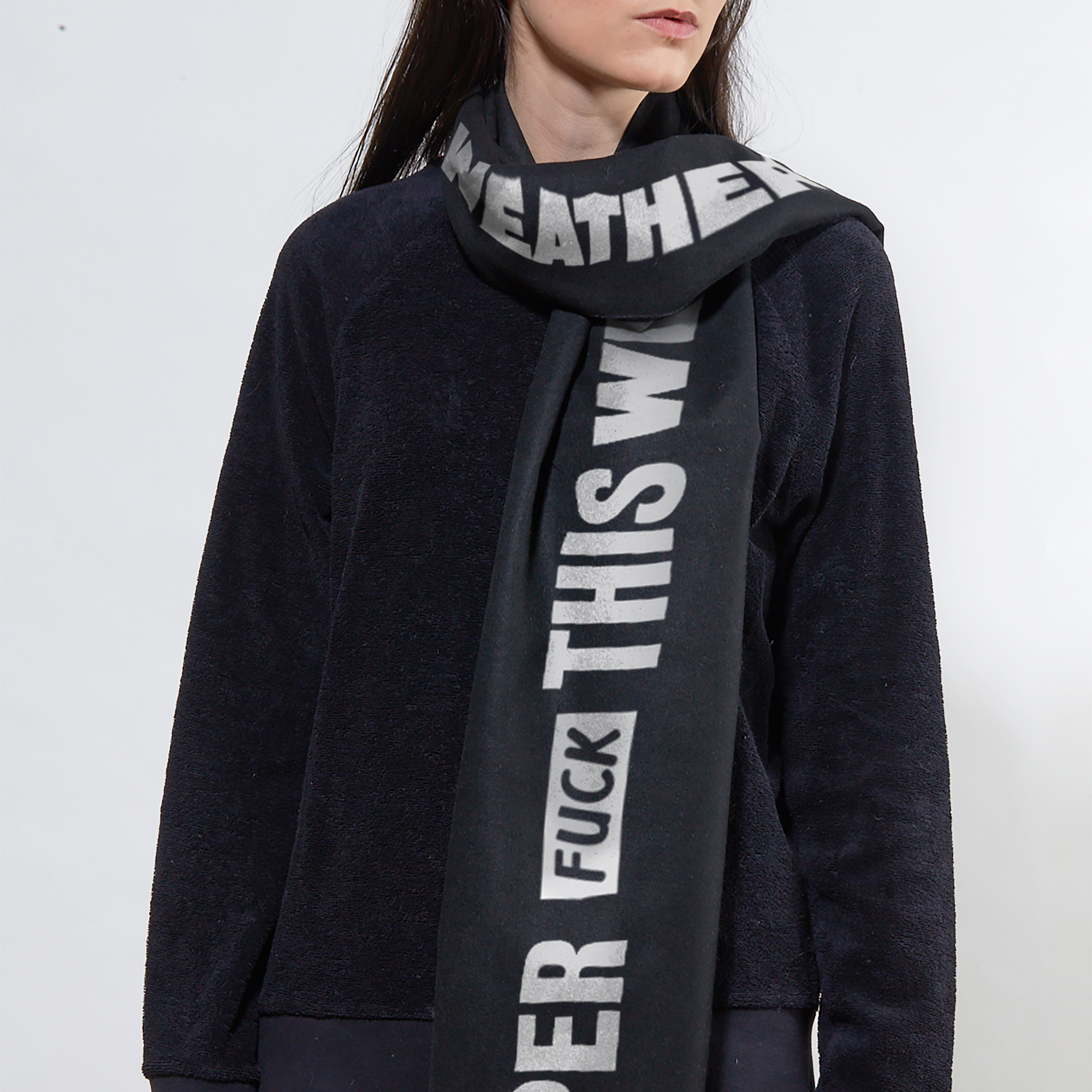
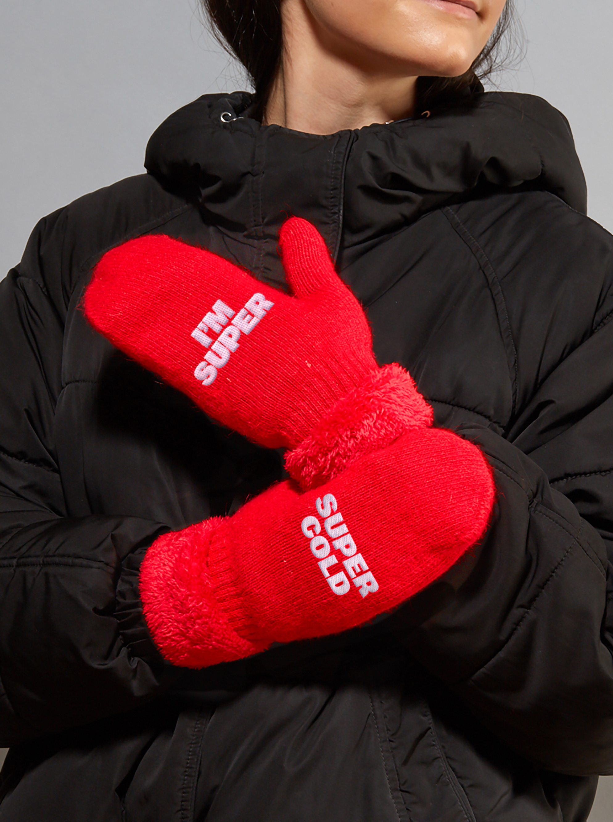
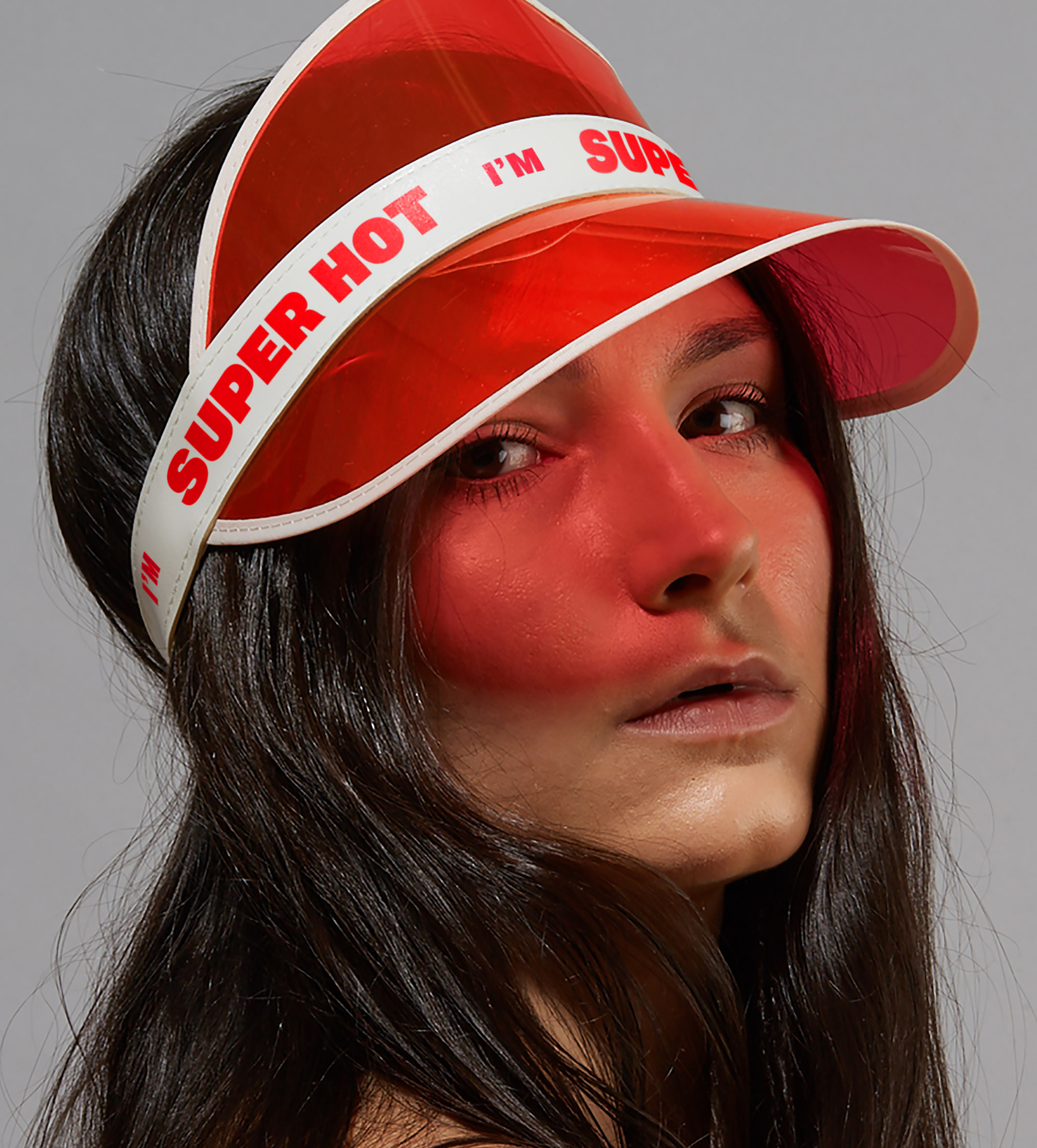
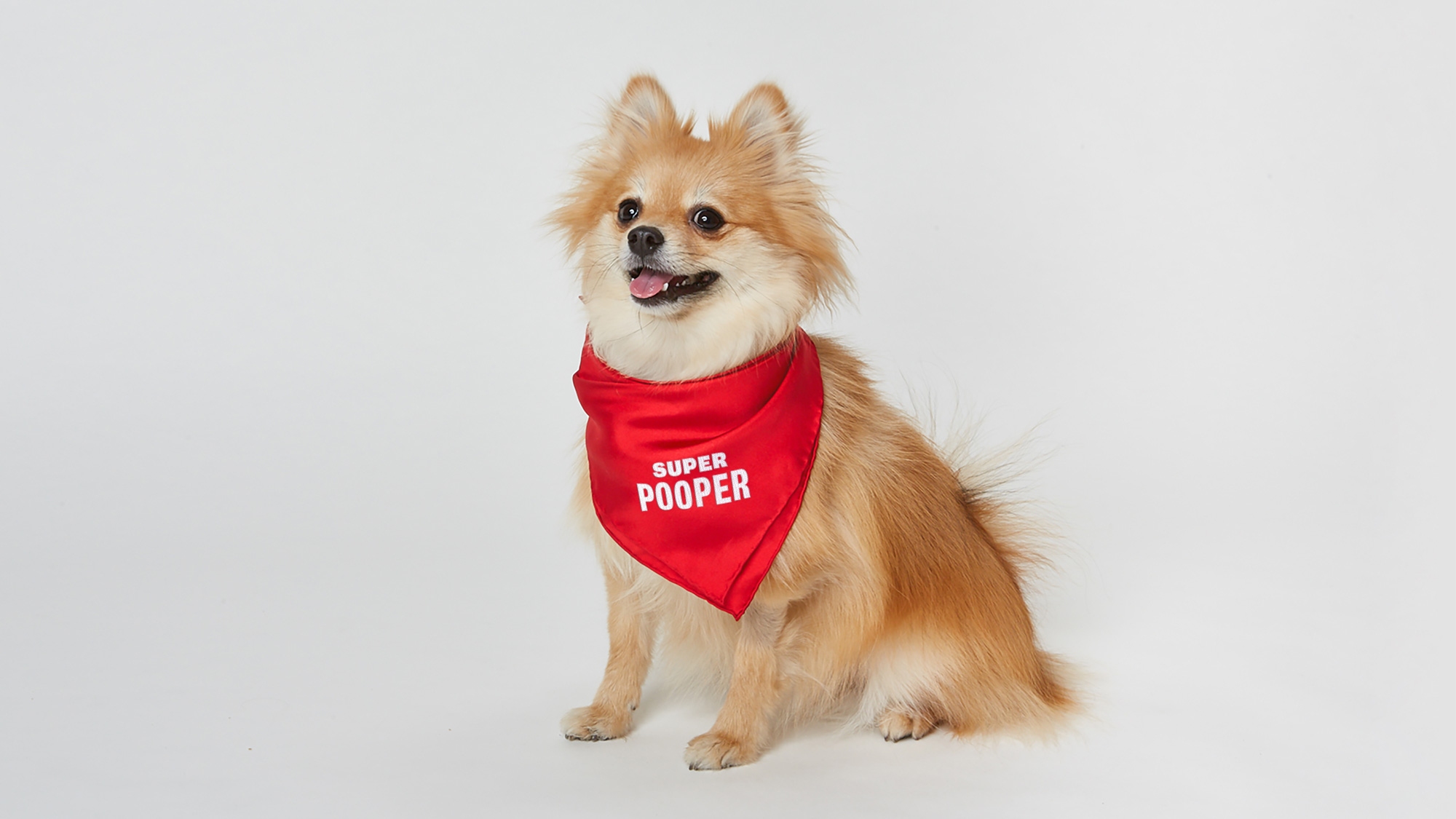
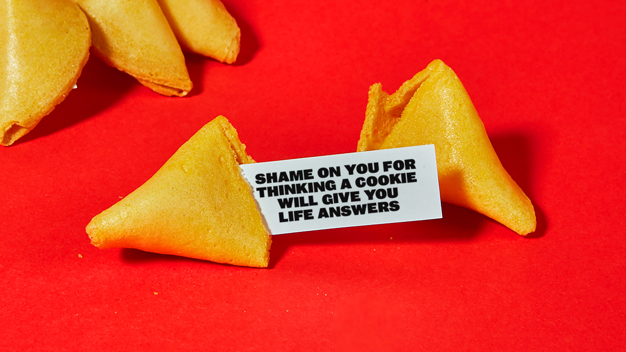
Overall, I think this captures the spirit of the community SuperShe is trying to attract and does so in a bold, engaging, empowering way that doesn’t rely or abide by clichés of what a women-centric community should look, feel, or act like.

 Новости Союза дизайнеров
Все о дизайне в Санкт-Петербурге.