Обзор лучших ресурсов по разработке бренда, разработке упаковки
contact us | ok@ohmycode.ru
contact us | ok@ohmycode.ru
(Est. 1996) Host is the student facing brand for Victoria Hall Management Ltd. “Victoria Hall is a company providing Student Accommodation in the UK. It is part of the O’Flynn Group, a privately owned property and construction company. Using a model developed in Cork over 15 years ago, Victoria Hall was formed in 1996 to develop the student accommodation branch of the company and export this part of the business from Ireland, into the UK. Since then Victoria Hall has grown to have a presence in 11 major cities in the UK and on mainland Europe [and is home to almost 7,000 students].” (Wikipedia)
Mr B & Friends (Bath, UK)
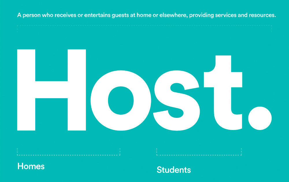
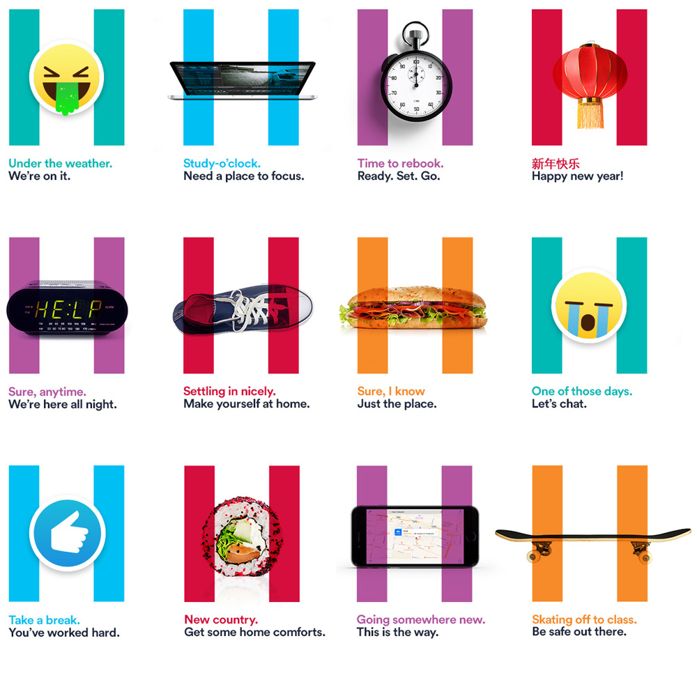
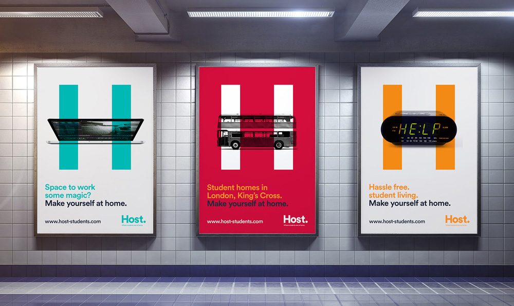
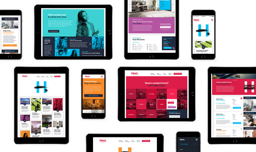
The new brand positioning is centred around ease and hassle free customer experience while the new name Host – which perfectly describes the brand purpose - is derived from a functional idea: homes for students. This, along with the new logo has been registered as a trademark. […] The visual identity system, guidelines and website was led by Senior Designer Tom Shenton: “We created an iconic branding system using the H ‘pause’ device with playful imagery and key messages. Tone of voice and language play a huge part in creating cut-through to an often hard to engage audience consisting of domestic and international students. We’re really delighted with the client’s open-mindedness to where next thinking.”
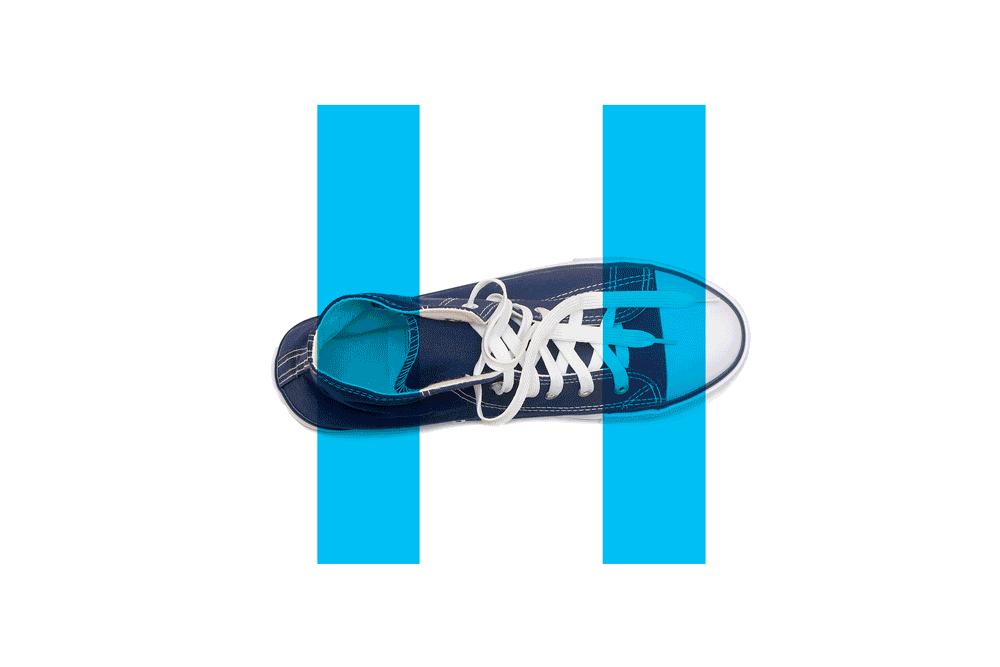
The old logo was unappealing through a poor collection of bad decisions: a wispy script "V" inside a heavy-handed red circle, a robotic typeface for the name, and a tiny descriptor of what this all actually is. As a piece of marketing to entice to students to room with them it wasn't the most exciting or audience-friendly. The new logo is a wordmark in straight-up Lineto Circular. Period. As unimaginative as it is, what it does right is shift the emphasis to the name that's a relatively clever portmanteau of "home" and "student" that also happens to resolve into a word that relates to the service of the company. I'm not saying the logo is a great solution but at least there is some conceptual merit to it. The supporting element of the identity is an "H" where the crossbar is replaced by different objects that then have a punchline at the bottom. Possibly a good idea on paper, these are unfortunately trying too hard to connect with the kidz and the construction of the sentences is very inconsistent while the two colors create emphasis in the wrong part of the sentence half the time. What this identity has is that it looks appealing — I would definitely stop to look at those ads — but it's a little crumbly if you pick at it.

 Новости Союза дизайнеров
Все о дизайне в Санкт-Петербурге.
Новости Союза дизайнеров
Все о дизайне в Санкт-Петербурге.