Обзор лучших ресурсов по разработке бренда, разработке упаковки
contact us | ok@ohmycode.ru
contact us | ok@ohmycode.ru
Established in 1790, originally as Henry Wood & Company, later Sands, Taylor, & Wood Company, followed by The King Arthur Flour Company, and, as of this week, the King Arthur Baking Company is the oldest flour brand in the United States and one of the most used today. Headquartered in Norwich, VT, a certified B Corp, and 100% employee-owned, King Arthur Baking Company got its name in 1896 when Sands, Taylor, & Wood Company introduced its own flour — it had previously been imported from England — named after founder Henry Wood saw a production of King Arthur and the Knights of the Round Table and saw in his flour the same Arthurian attributes: “purity, loyalty, honesty, superior strength, and a dedication to a higher purpose”. Today, King Arthur Baking Company is sold in retailers nationwide and online, offering over a dozen kind of flours as well as baking items, mixes, and gluten-free products. With the introduction of the new name this week, King Arthur Baking Company also introduced a new identity, designed by Minneapolis, MN-based Little.
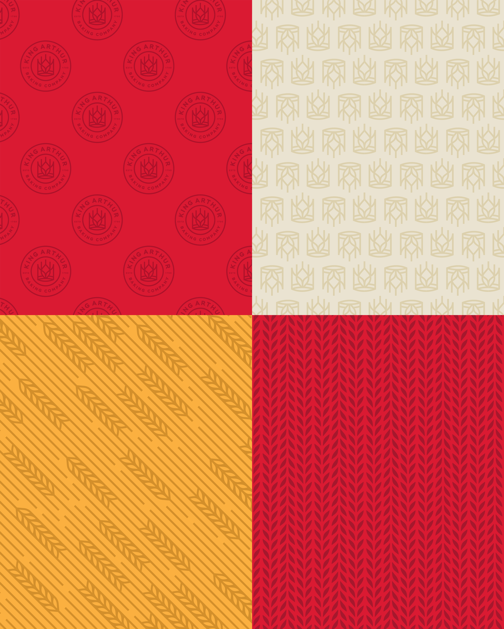
The rebrand of King Arthur Flour reflects what the company has always been: a company of bakers who believe in the power of baking to forge community and bring joy. The new logo, which features a wheat crown, celebrates the brand’s commitment to baking.
“King Arthur has always been a baking company at heart. The rebrand reaffirms our belief in the power of baking, and our commitment to inspiring bakers through every single touchpoint including our teaching and our products,” said Karen Colberg, King Arthur Baking Company’s Co-CEO. “Our mission is rooted in building stronger communities, fostering the connections that come from baking and sharing. The new positioning as a baking company will enable us to continue to grow and welcome all bakers, from passionate life-long bakers to beginners.”
The King Arthur Baking Company rebrand is the product of a rigorous 18-month brand research and creative strategy process, centered on our commitment to sharing the love and joy of baking.
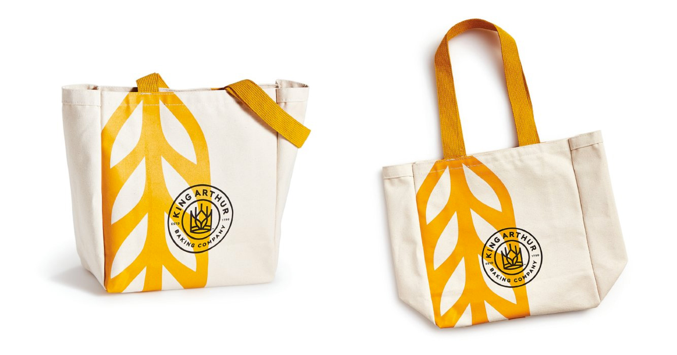
First of all I want to acknowledge all the bakers in the house as I got more tips in my inbox about King Arthur than Nissan last week, so there is clearly a solid intersection at the Venn diagram of baking and branding. The old logo was fairly literal, showing King Arthur on his horse but stopping short of having him hold a sack of flour. Aside from the reproduction limitations of such a detailed illustration and finicky wordmark, the logo was not bake-y enough and, for a U.S. product, perhaps it was too England-y with King Arthur featuring not just one but two Saint George’s Cross marks. The new logo goes for a much simpler and clever interpretation by only using a crown and integrating a stalk of wheat at its center, making it more about the product than the historic figure that inspired the name more than 120 years ago. The execution is quite nice and a reminder of how satisfying the thick-line aesthetic is when done well. Mixing a crown and a stalk of wheat is no easy task so having achieved such an easy read is quite commendable. If I had one minor complaint it would be about the bottom of the crown where the opening looks more like a slit than an area where you could fit a head — it’s hard to explain and, to be honest, I’m not sure how I would fix it, but my eye keeps getting drawn to that spot. The typography around it is fine and pleasantly typeset on a curve, doing a good job of breaking down the long name and emphasizing the “King Arthur” part.
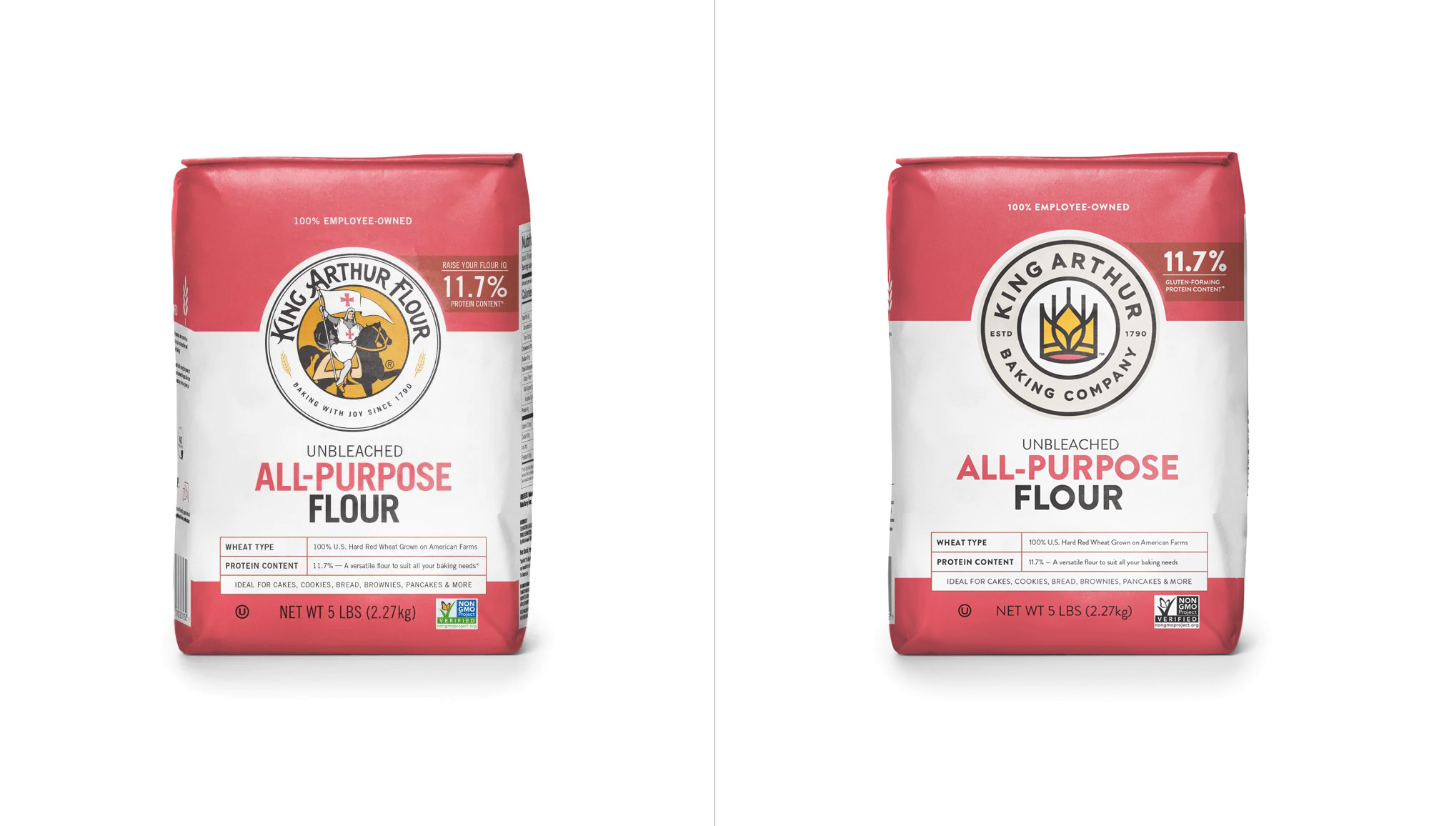
As you can see, the packaging hasn’t really changed much. They simply filled in the big circle area of the old logo with the new logo and updated the typography. But even with that limited shift, the packaging has a much clearer and crisp presence where the logo and the name of the company stand out a lot more.
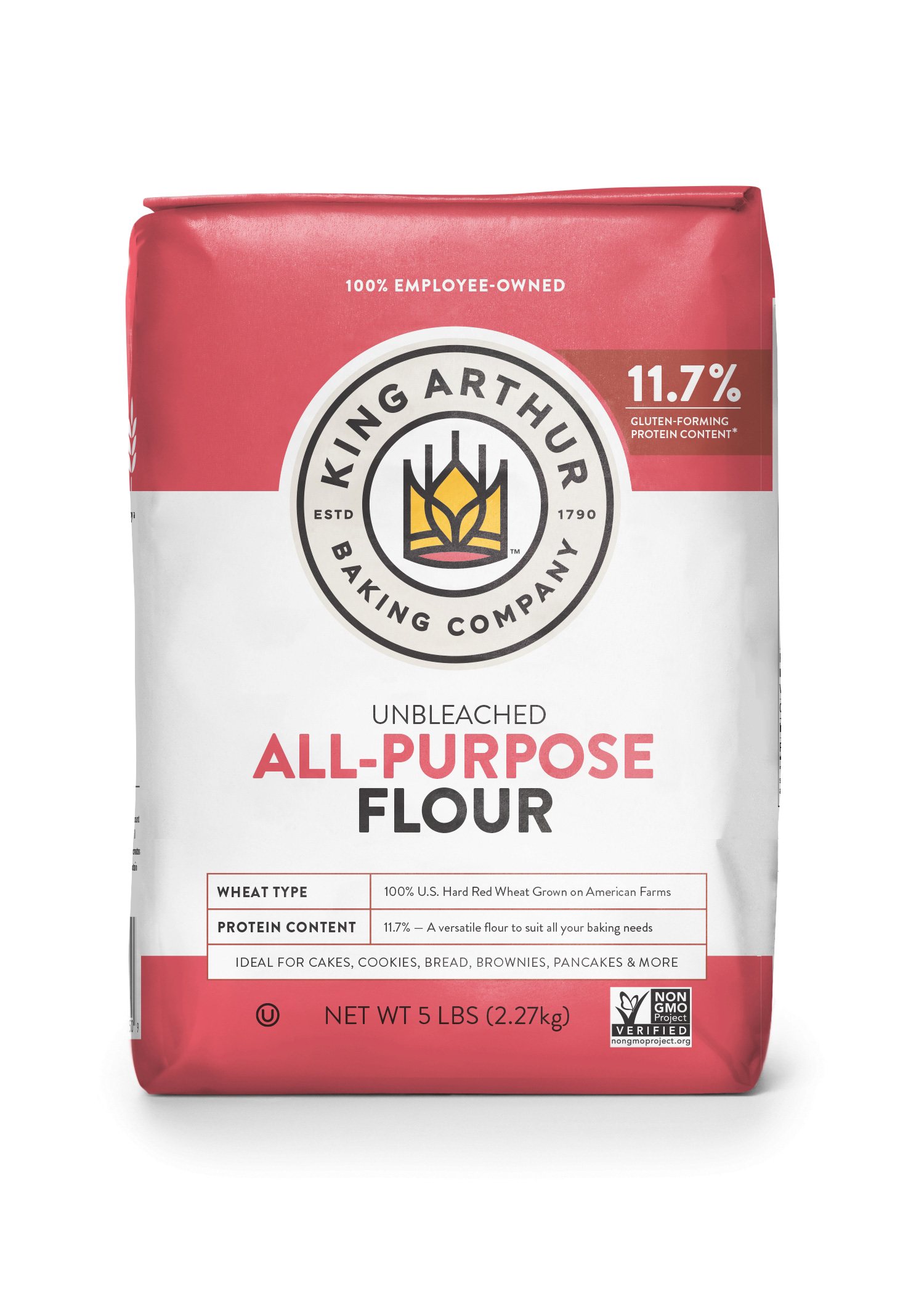
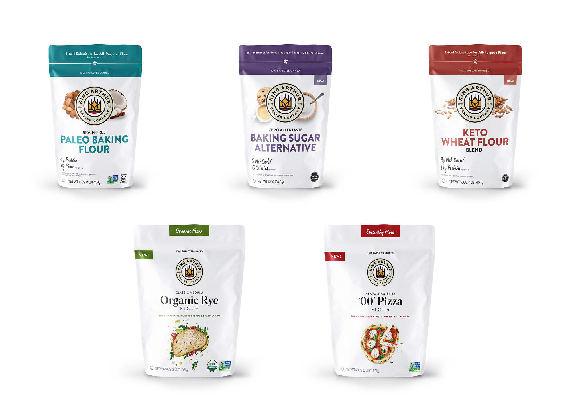
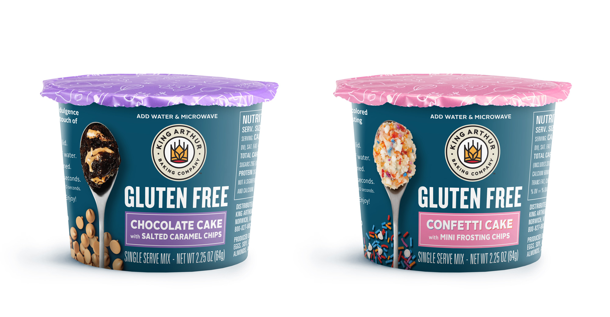
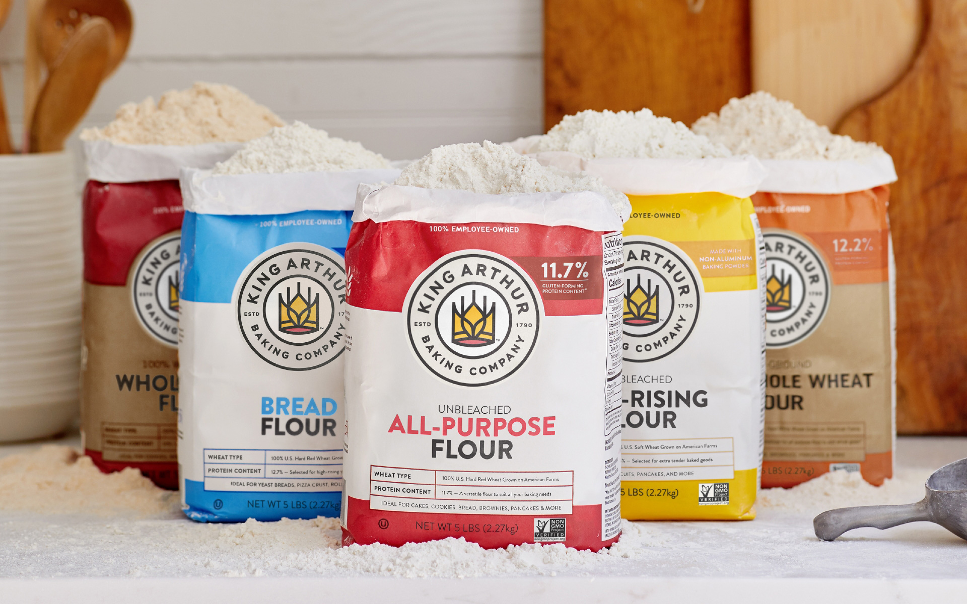

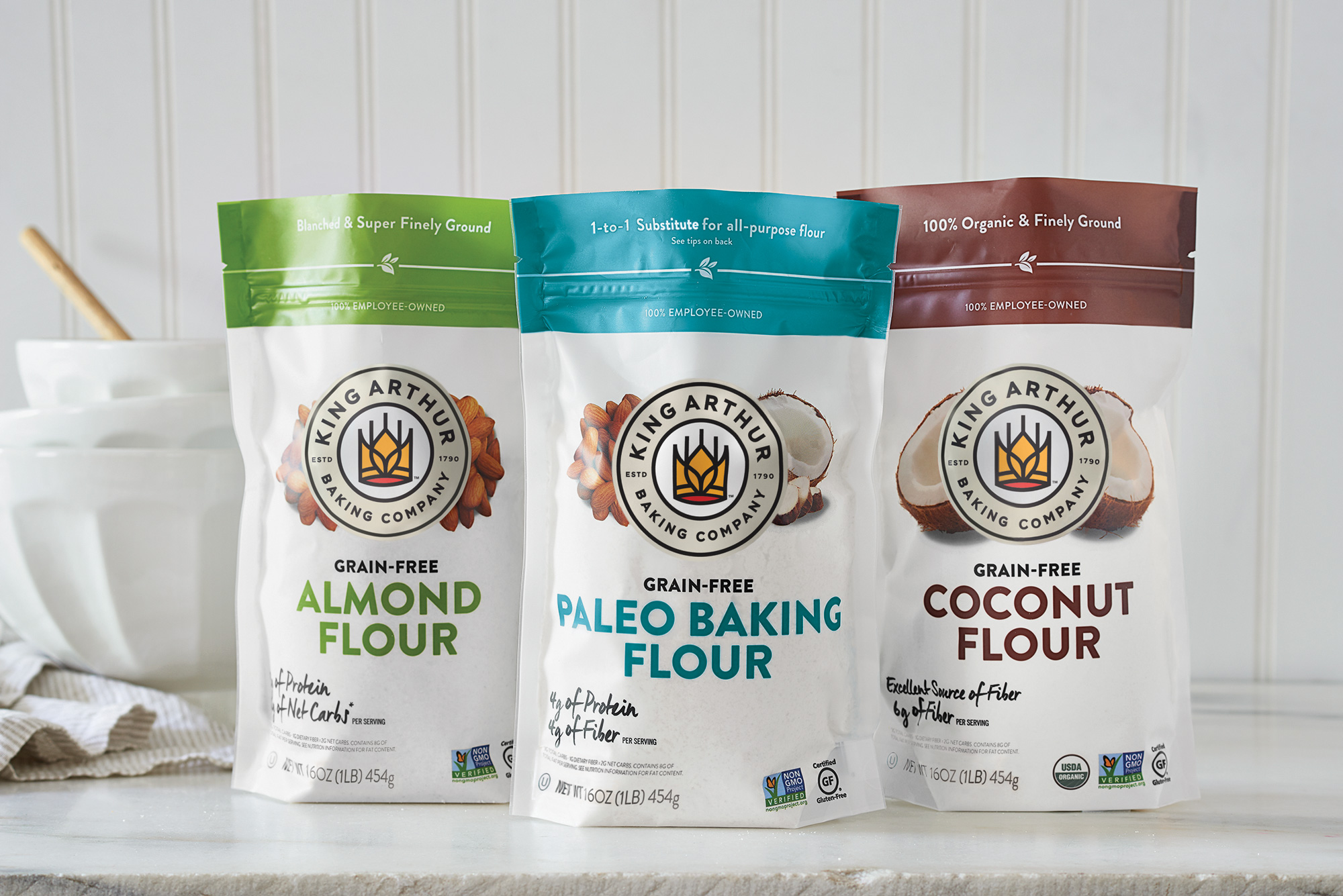
Again, pretty much everything you see here is the same as it was before except for the new logo and type. I hope that down the road they also tackle a new packaging approach — there is nothing wrong with this, but they have laid the groundwork for a bolder, brighter, more impactful design language that would expand very nicely into new packaging.
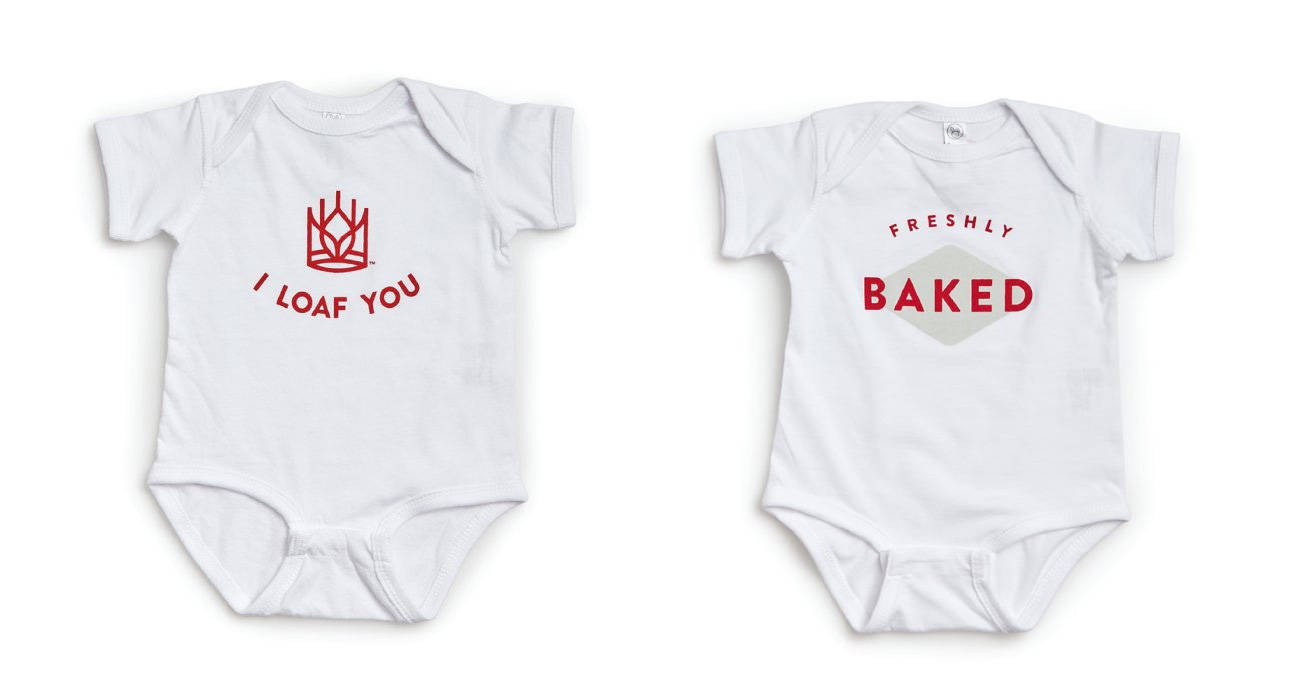

Overall, this, along with the name change, is great, mostly because it removes some subconscious limitations. Changing the name from “Flour Company” to “Baking Company” acknowledges that this brand is not just about flour but about the whole experience of baking, allowing it to sell other products and tell other stories while the logo change is not just about a white dude on a horse but about everyone that bakes because even though it’s a crown for a male king, the design is relatively delicate so it doesn’t feel oppressive. Anyway… long way of saying: well done on many levels!
Thanks to Adam Kranitz for the tip.
 each year since publication began in 2006

 Новости Союза дизайнеров
Все о дизайне в Санкт-Петербурге.
Новости Союза дизайнеров
Все о дизайне в Санкт-Петербурге.