Обзор лучших ресурсов по разработке бренда, разработке упаковки
contact us | ok@ohmycode.ru
contact us | ok@ohmycode.ru
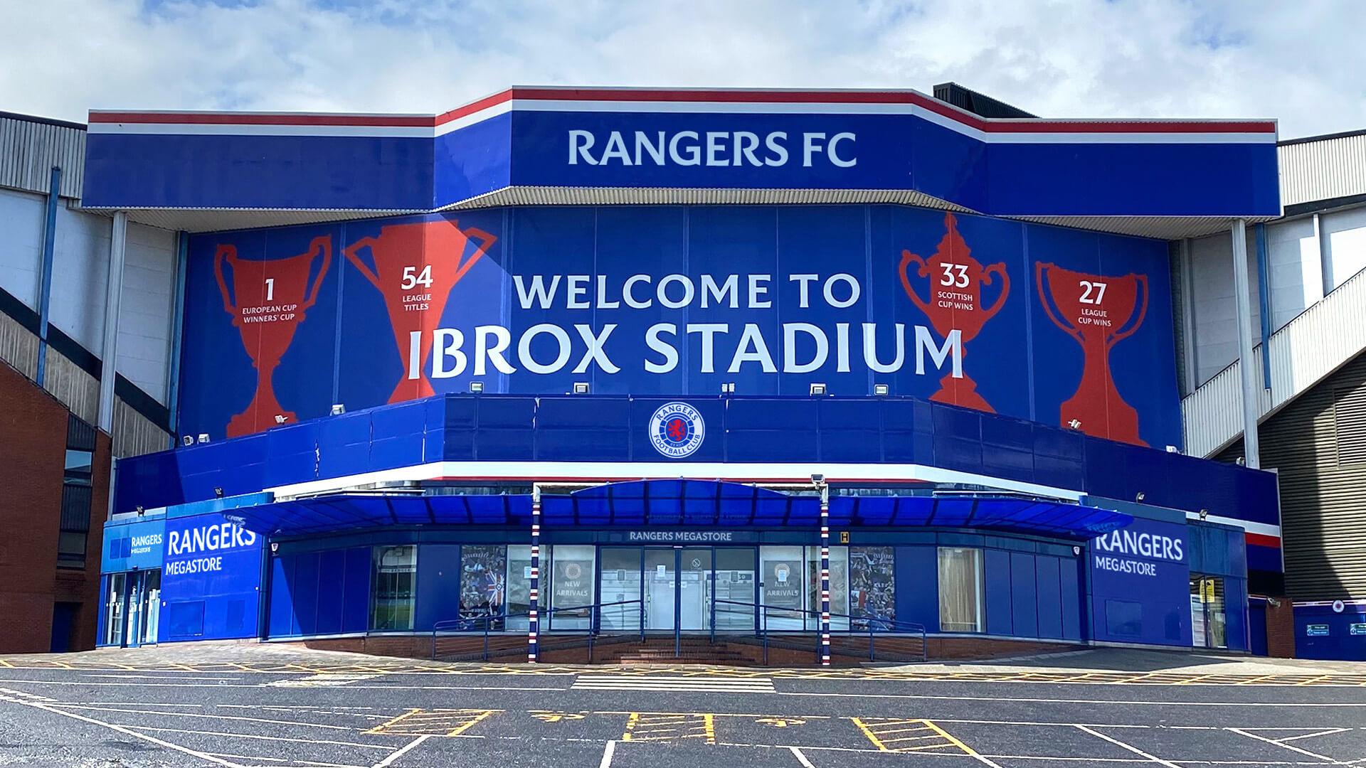
Established in 1872, Rangers Football Club is a Scottish professional football club based in Glasgow, Scotland, playing in the Scottish Premiership, the top division of the Scottish Professional Football League. The Rangers are one of the most successful clubs in world football in terms of trophies won, including the Scottish League title 54 times, the Scottish Cup 33 times, the Scottish League Cup a record 27 times, and the European Cup Winners’ Cup once. The Rangers’ home games are played at Ibrox Stadium, with a capacity of 50,000+ fans. As it approaches its 150th anniversary in 2022, Rangers Football Club has introduced a new identity designed by Kilmarnock, Scotland-based See Saw Creative.
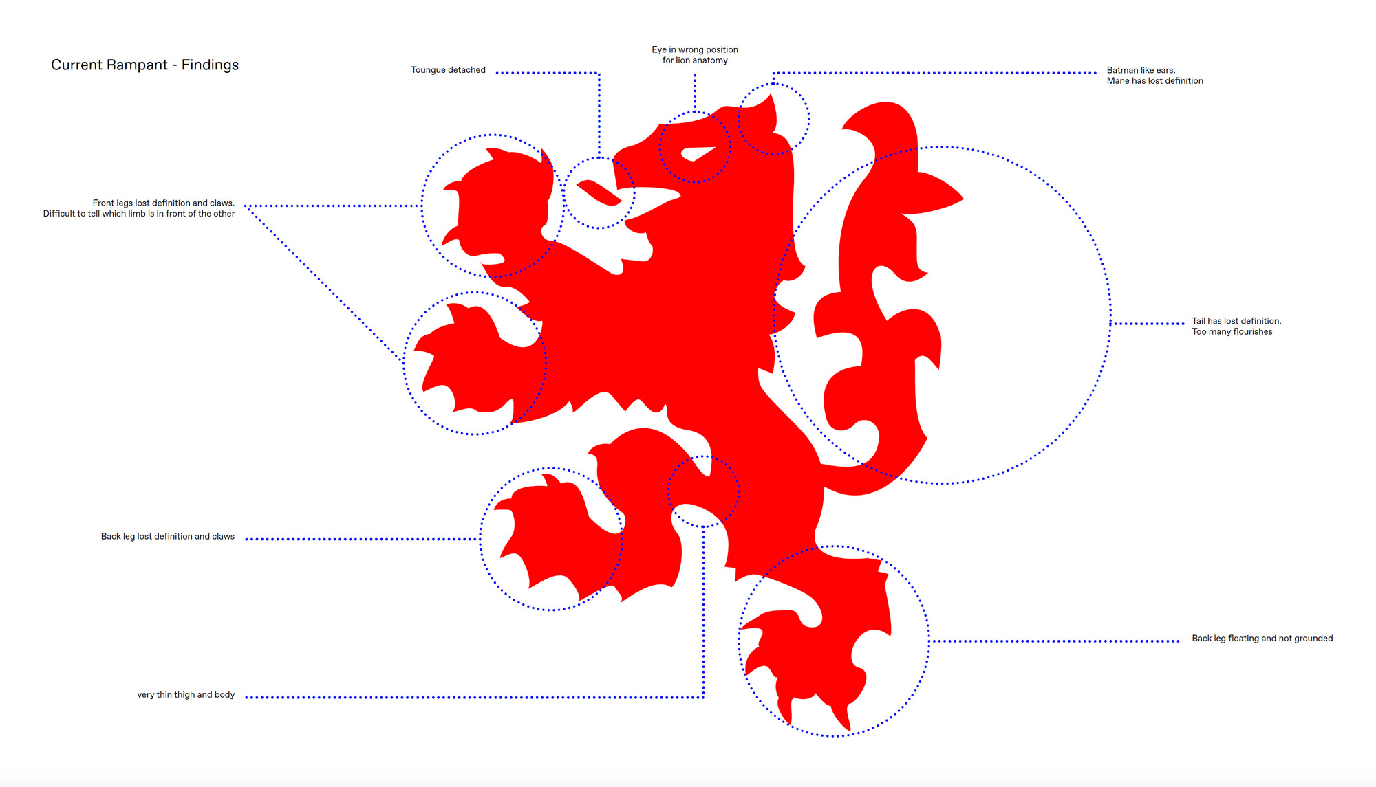
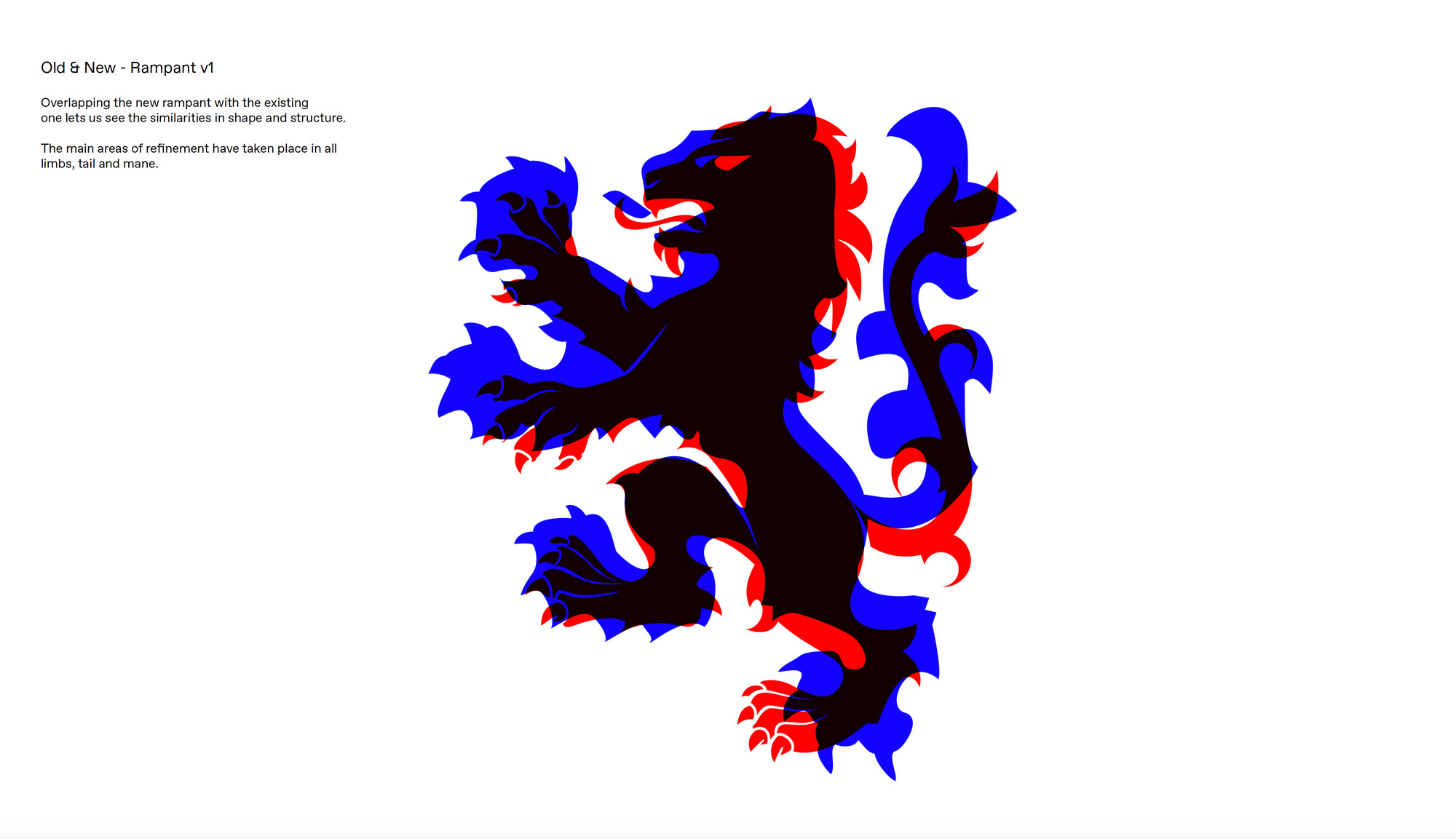
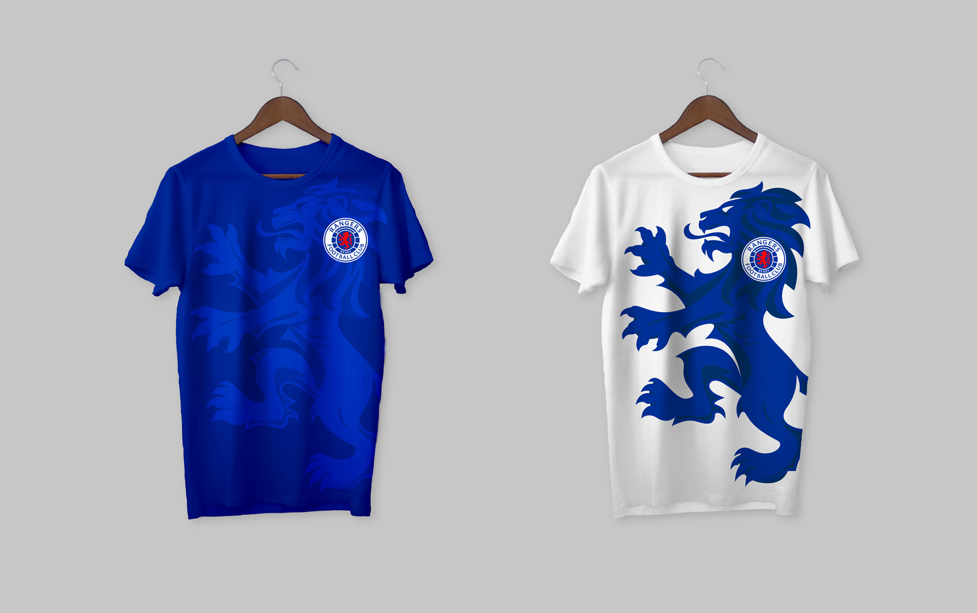
We kicked-off the project by restoring precision to the Club’s main ‘Ready’ crest (the ‘Scroll’ crest being exclusive to kits). We redrew the Lion Rampant in his existing position to support Rangers’ ‘Ready’ motto, yet with heightened artistic precision and detail to present a far more fierce and relentless quality.
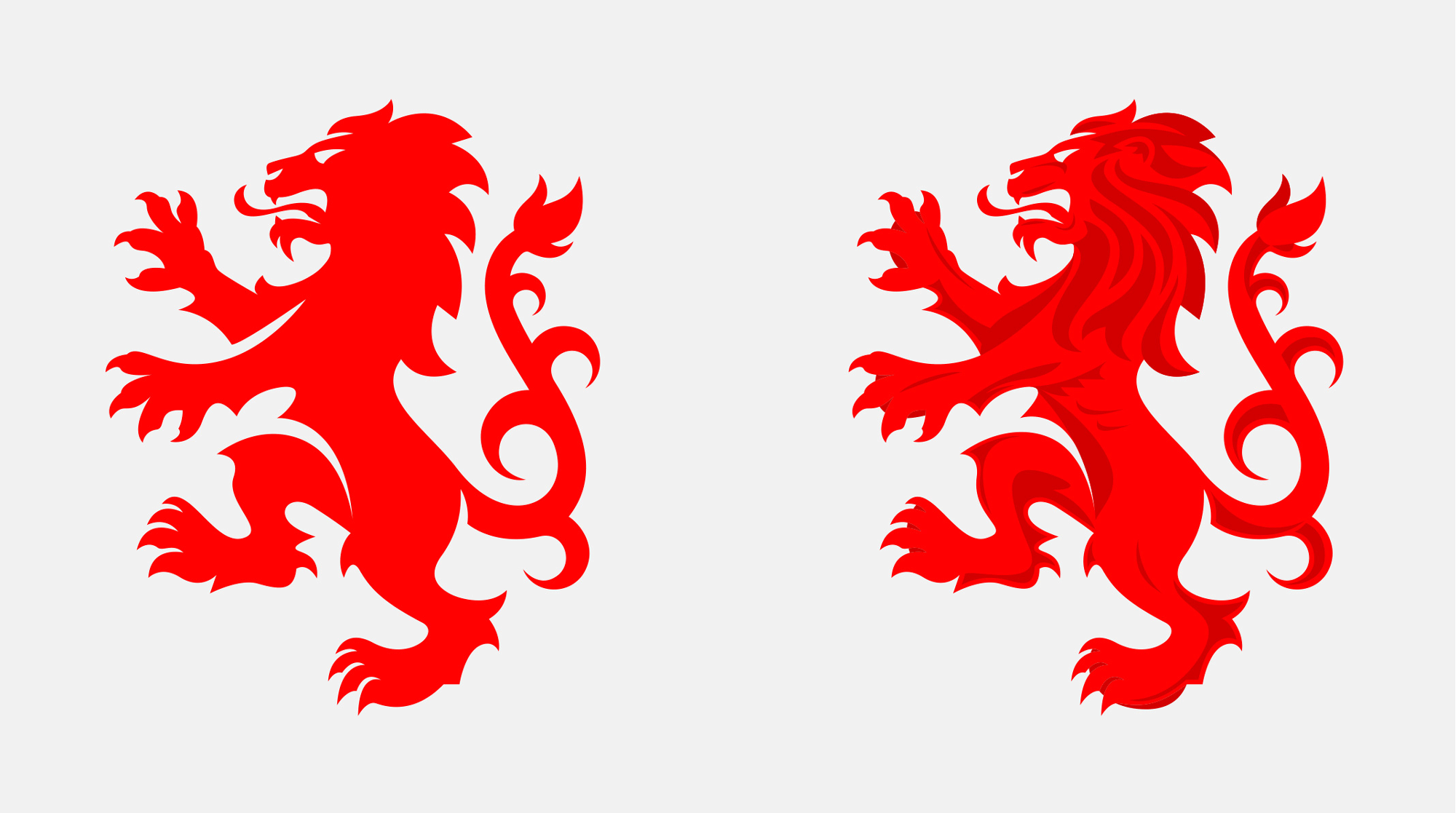
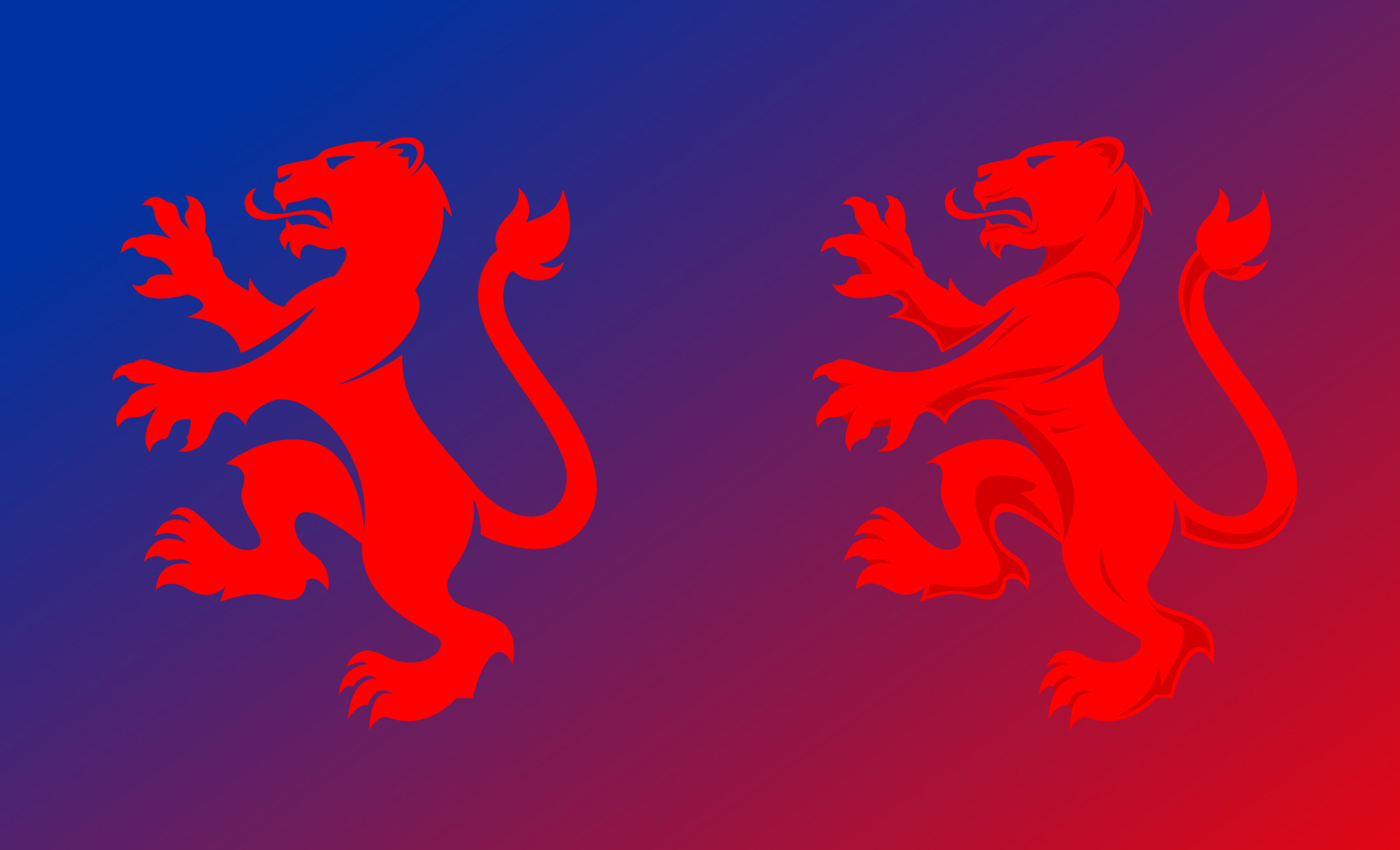
We extended further by developing three versions of the Lion Rampant: a detailed yet flat version to be used within the crest; a larger version using light and shade to introduce texture to be used independently or cropped to extract abstract background shapes to enhance the creativity of marketing collateral; and a Lioness Rampant to provide Rangers Womens’ Team with its own sub-identity for the first time, further supporting Rangers’ brand value of ‘Diversity.’
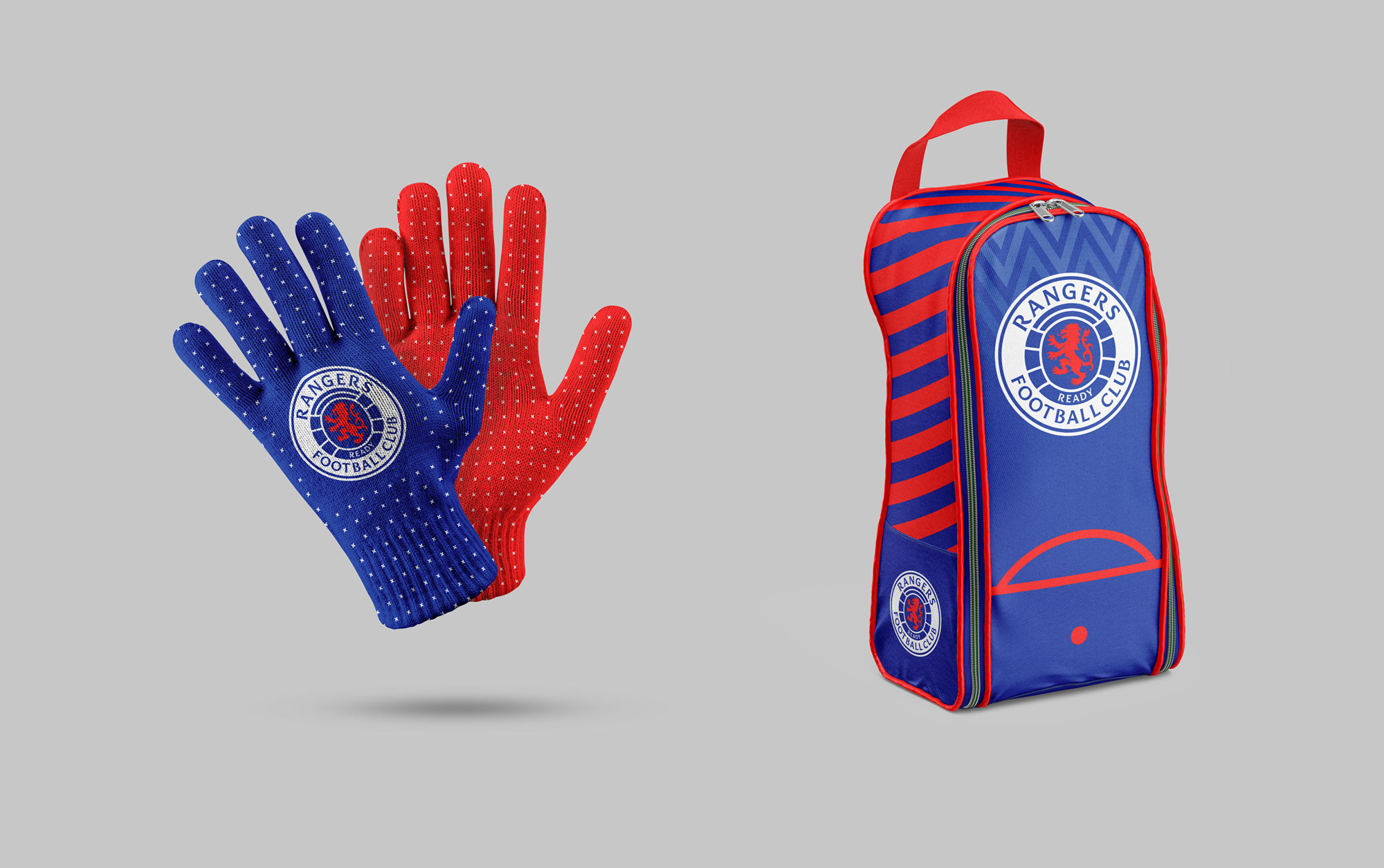
Spacing between ball panels has been made equal, whilst the ball has been enlarged to best house the Lion Rampant and ‘Ready’ text. We also slightly ‘inflated’ the ball to capture a sense of personality and fun, centring proportionately to make the strongest visual impact. The word ‘Rangers’ now sits proud at the top of the crest in its own custom font for ultimate legibility, clarity and confidence.
The old logo — last updated 29 years ago — was a pretty big mess once you stopped and looked at it in detail, from the vertically squished and awfully spaced/kerned Optima going around the crest to the tightness of the blobby lion inside the ball to the contrast-less color combination. The new logo is an amazing evolution that takes everything that was bad about the old one and makes it great. The balance of the elements is infinitely better, starting with the removal of the inner stroke, allowing the ball to be bigger, which in turn allows the lion to be more prominent. Including the club’s motto, “Ready” — which was shortened from “Aye Ready” (meaning “Always Ready” in Scots) — inside the ball was also a great move. The lion itself is great evolution, building in a lot of new detail that improves dramatically on the old — I am not convinced by the shaded version (used outside of the logo) as it adds unnecessary detail and the two marks around its ribs make it look like it hasn’t eaten in some time. The other highlight of the logo (and identity) is the new custom typeface, which is a lovely flared sans serif that fills up the crest quite nicely. The updated red and blue have that aggressive vibration that can often be off-putting but, as a way to make the logo and brand feel more electrifying, it works. The single-color versions of the logo are pretty hot too.
Partnering with internationally renowned typographer and lifelong Rangers’ fan Craig Black, together we explored Ibrox, delving through the archives to craft a custom font, Rangers Display, which perfectly captured Ranger’s heritage and personality. With serif kicks that echo those of the bluebells at Ibrox’s iconic gates, the new typeface also takes cues from Ibrox’s entrance floor mosaic in addition to various letterheads used over the years.
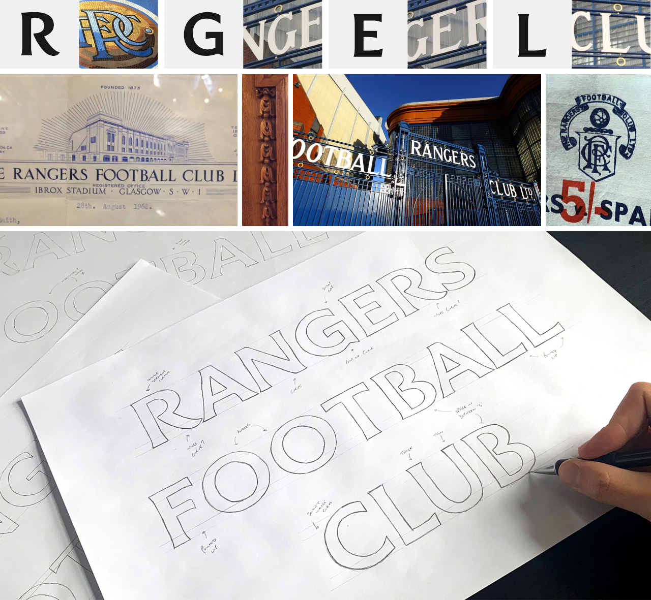
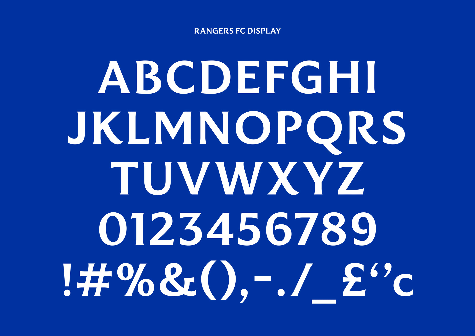
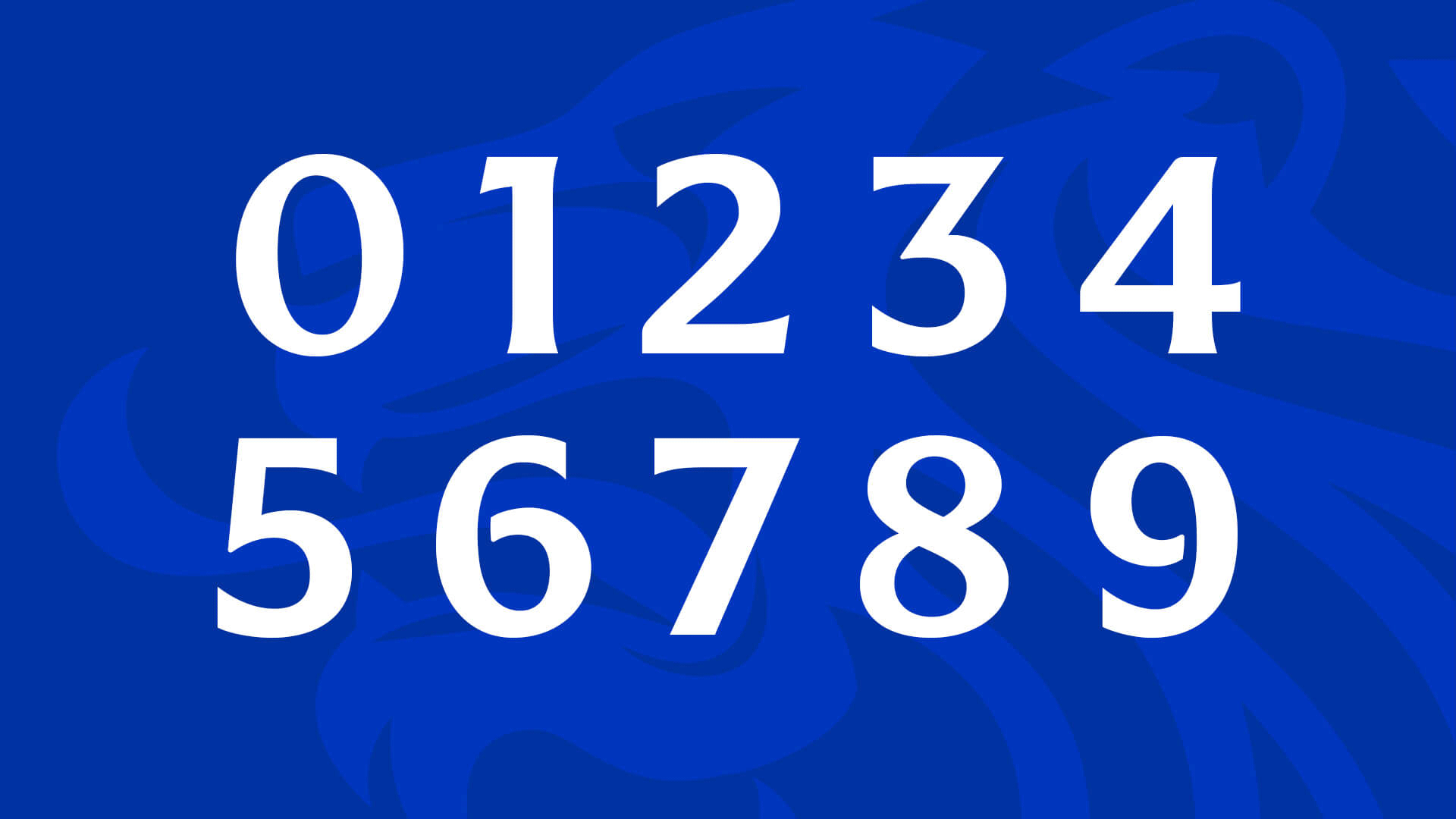
The custom typeface designed in collaboration by Craig Black and Stitzlein Studio is lovely and the numerals are great. Not much else to add, as it’s tight from start to finish.
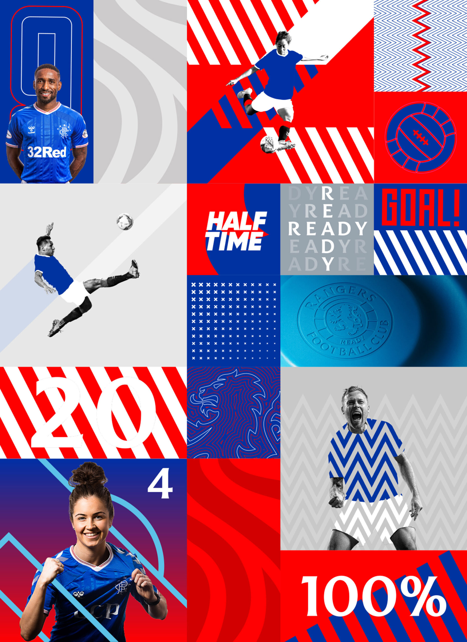
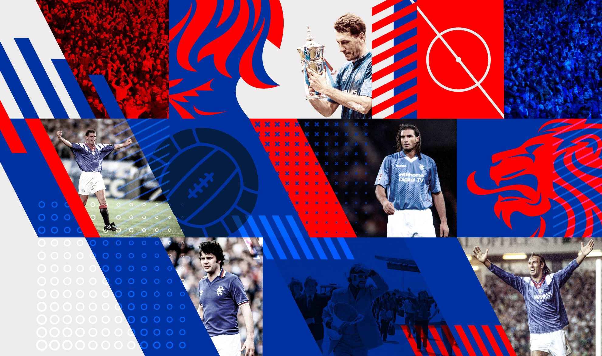
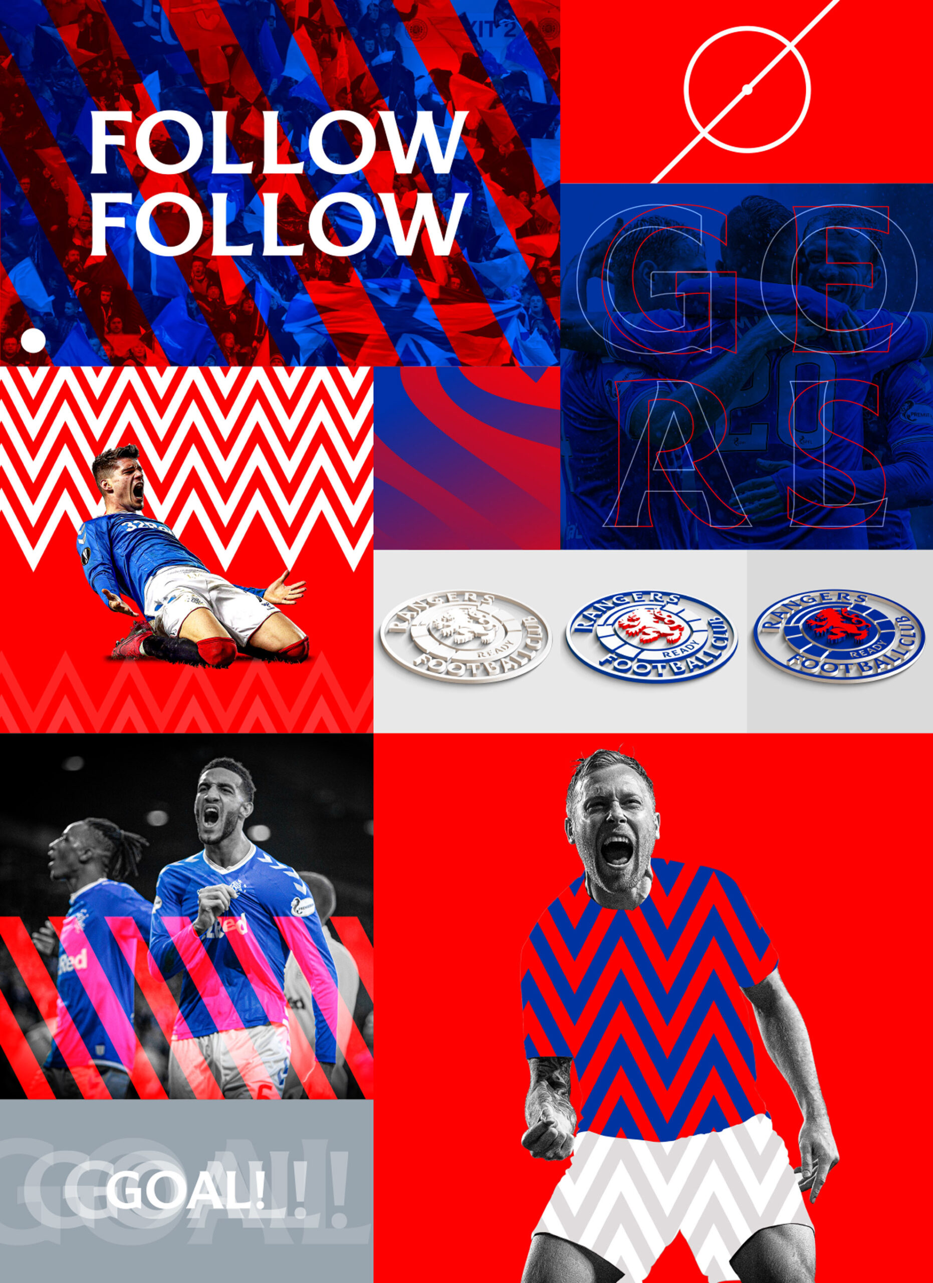
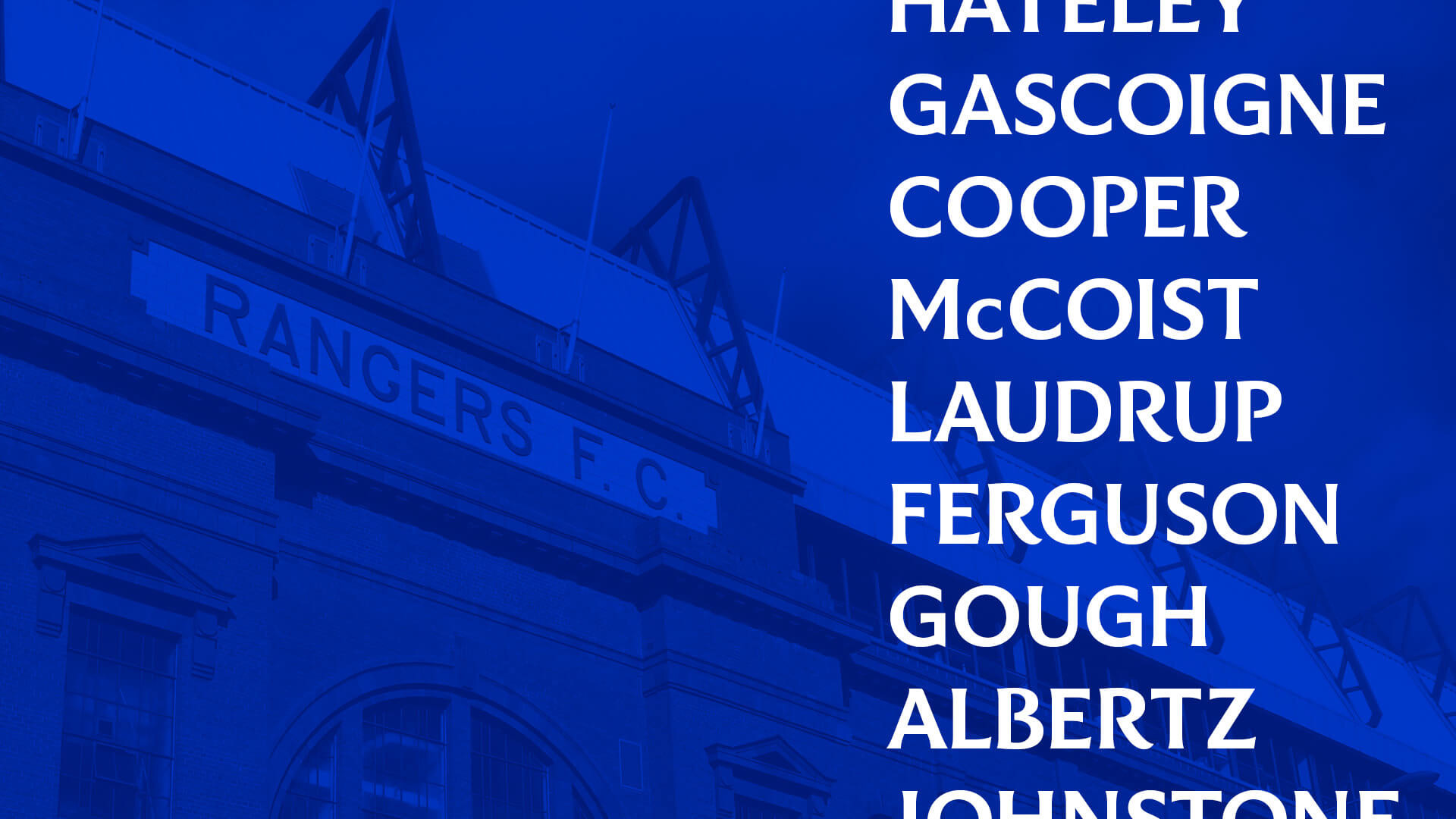
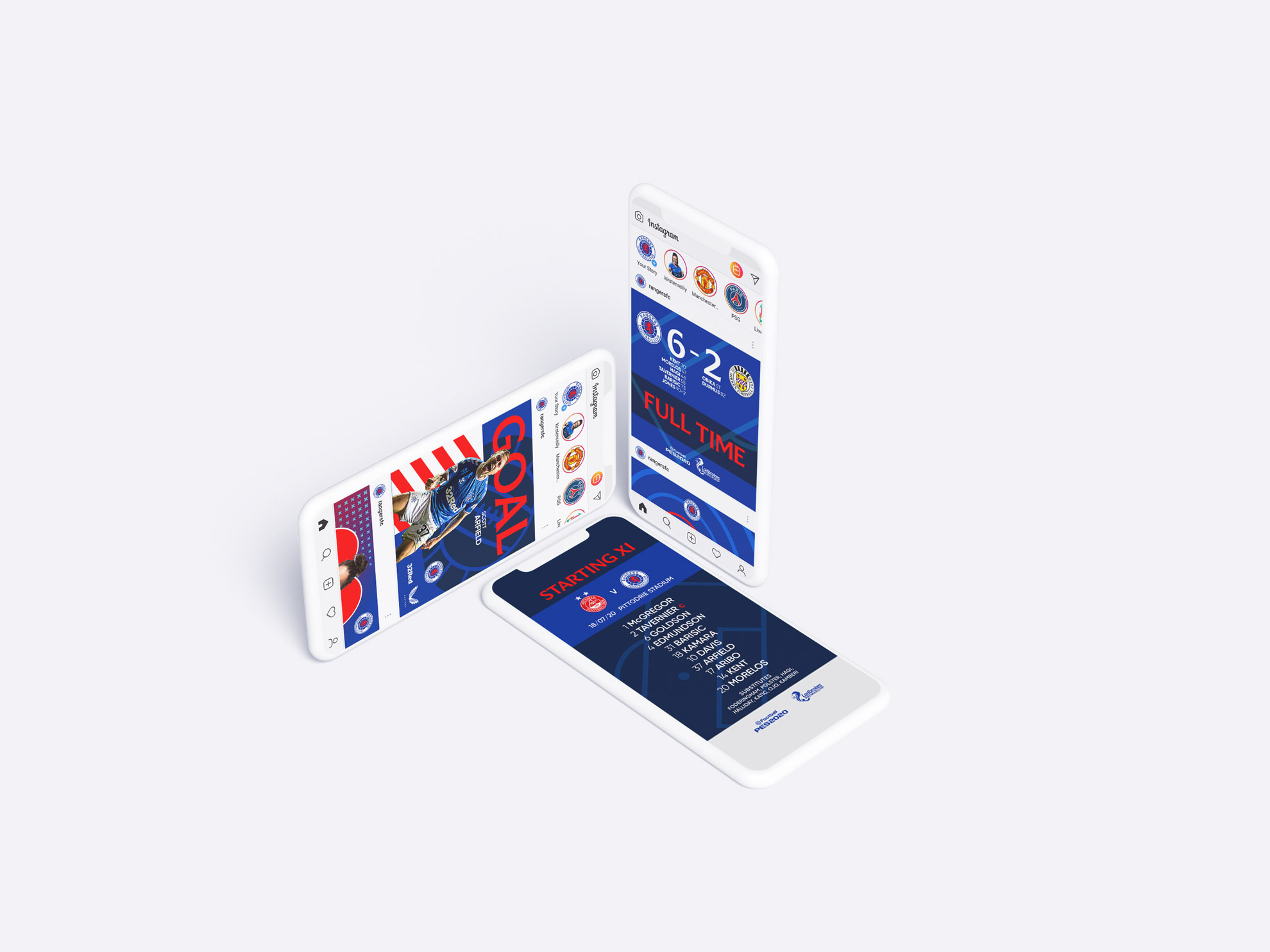
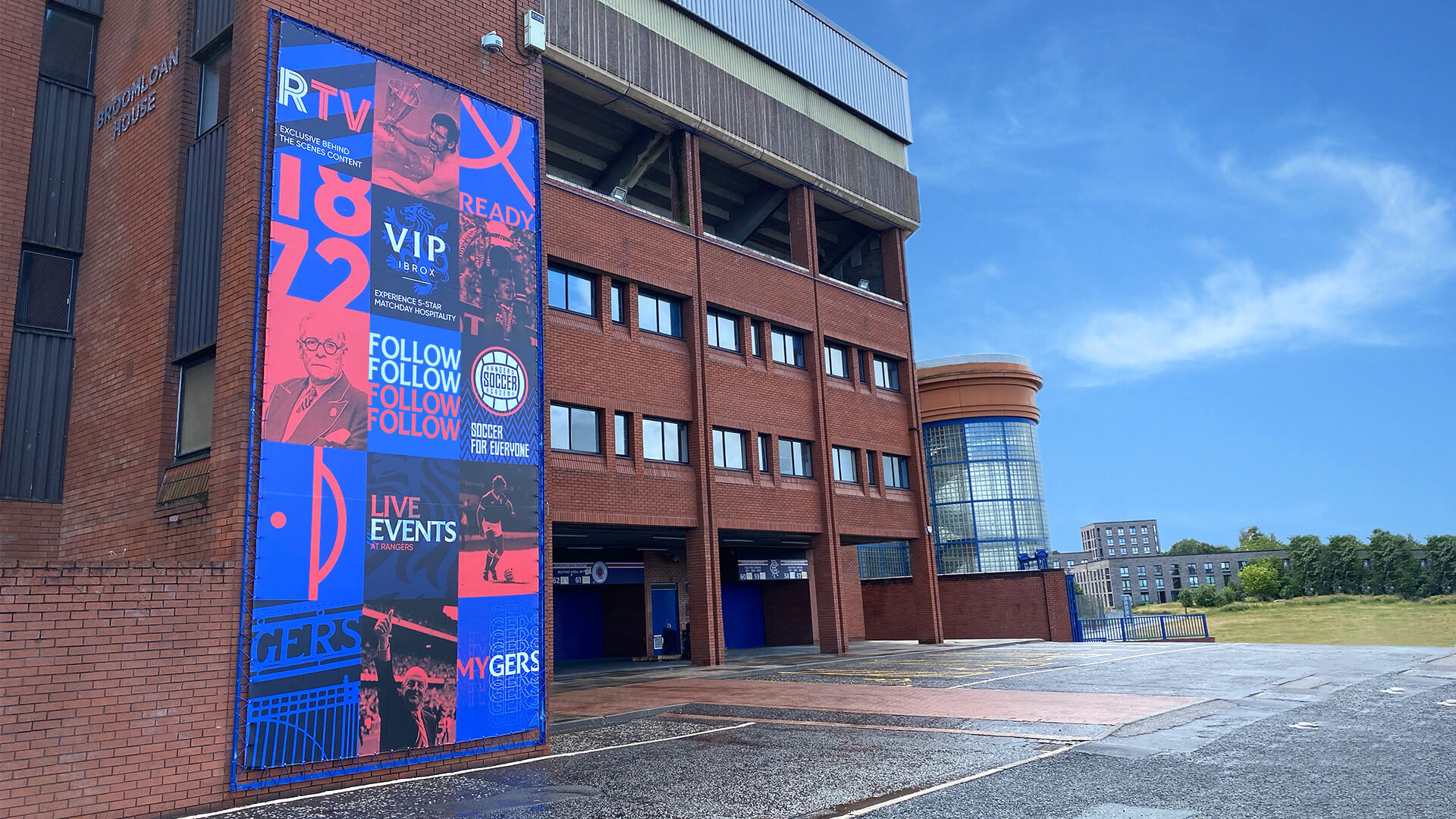
The visual language goes in multiple directions and it’s a little hard to assess what’s going on. The energy is palpable, no question about it, but I feel like maybe it’s all too much? Gradients, close-ups of the lion, thick lines, thin lines, concentric lines, oddly-floating players’ heads. I mean, I appreciate the boldness and Goes-up-to-11 attitude but, at least for now and as presented, it feels overwhelming and a little inconsistent in its looseness. When the visuals get dialed down, as in the stadium images further below (even in the multi-panel banner), the system is more enjoyable.
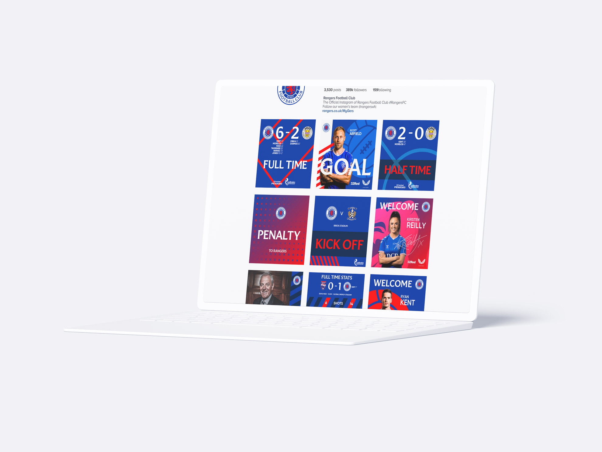
Overall, this is highly energetic and I think once the dust settles and the application of the visual language becomes more controlled and absorbed in lower doses, this is going to be plenty fun all while supporting the fantastic evolution of the crest as it has been primed for use for another 30 years.
Thanks to Steven Paxton for the tip.
 each year since publication began in 2006

 Новости Союза дизайнеров
Все о дизайне в Санкт-Петербурге.
Новости Союза дизайнеров
Все о дизайне в Санкт-Петербурге.