Обзор лучших ресурсов по разработке бренда, разработке упаковки
contact us | ok@ohmycode.ru
contact us | ok@ohmycode.ru
Introduced in 1932, Ricard is a pastis — an anise and licorice-flavored aperitif — originally conceived by Paul Ricard, a student of fine arts, 23 years old at the time. Today, Ricard is the number one best-seller in the French spirits sector and the best-selling anise-based spirit in the world, selling more than 40 million liters annually. Ricard is a brand of Pernod Ricard, a global spirits and wine company that also owns brands like Absolute, Chivas Regal, Martell, and Pastis 51 (the second best-selling pastis originally produced by Pernod). Last year, Ricard introduced a new identity — but not a new bottle (yet) — designed by Paris, France-based Yorgo&Co.
Redesigning a legendary french brand was a delicate task. We revived their historical typefaces, and Yorgo drew a R made of sun rays. A new logo to drink (responsibly) this summer.
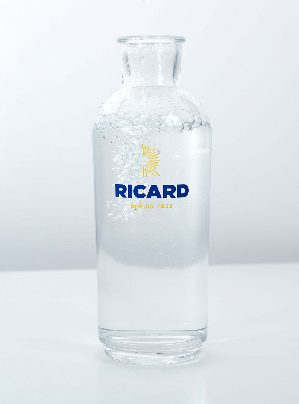
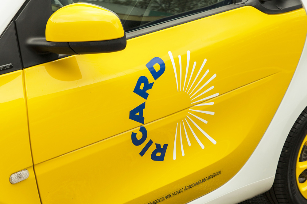
More than 84 years after its creation, Ricard draws on its roots to reinterpret its logo with a simple and modern style. This new logo is accompanied by a solar sign that echoes the origins of the brand, born under the sign of the sun in Marseille in 1932.

I had posted the logo redesign a year ago but it didn’t get much traction and there wasn’t a lot of information or imagery available. Given the popularity of the brand and the additional imagery, I figured a proper follow-up was in order.
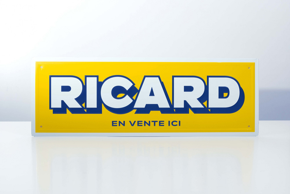
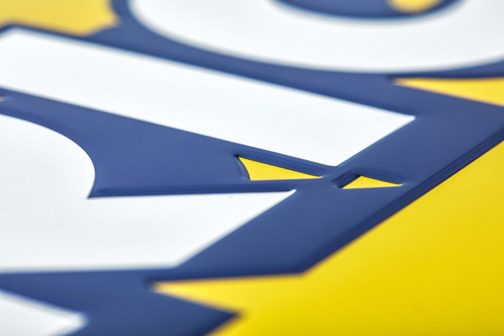
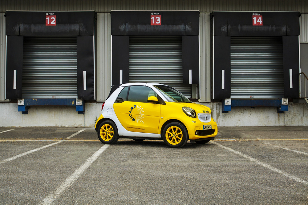
The old logo — which, unfortunately will remain in the market for the foreseeable future on the packaging of the primary product, and create some confusion — was decent. Its half-there, half-not-there slabs were quirky in both good and bad ways, making it unique but also kind of weird. Its holding shape was fine but a little old-fashioned, which made sense since, this is an old-fashioned brand. The new logo attempts to change that and, even though it’s drawn from the brand’s vintage posters, introduces a more contemporary vibe with a bold, extended wordmark. The sun motif has been cut in half and modified slightly to yield an “R” shape, which is kind of interesting but I wonder if it’s too subtle.
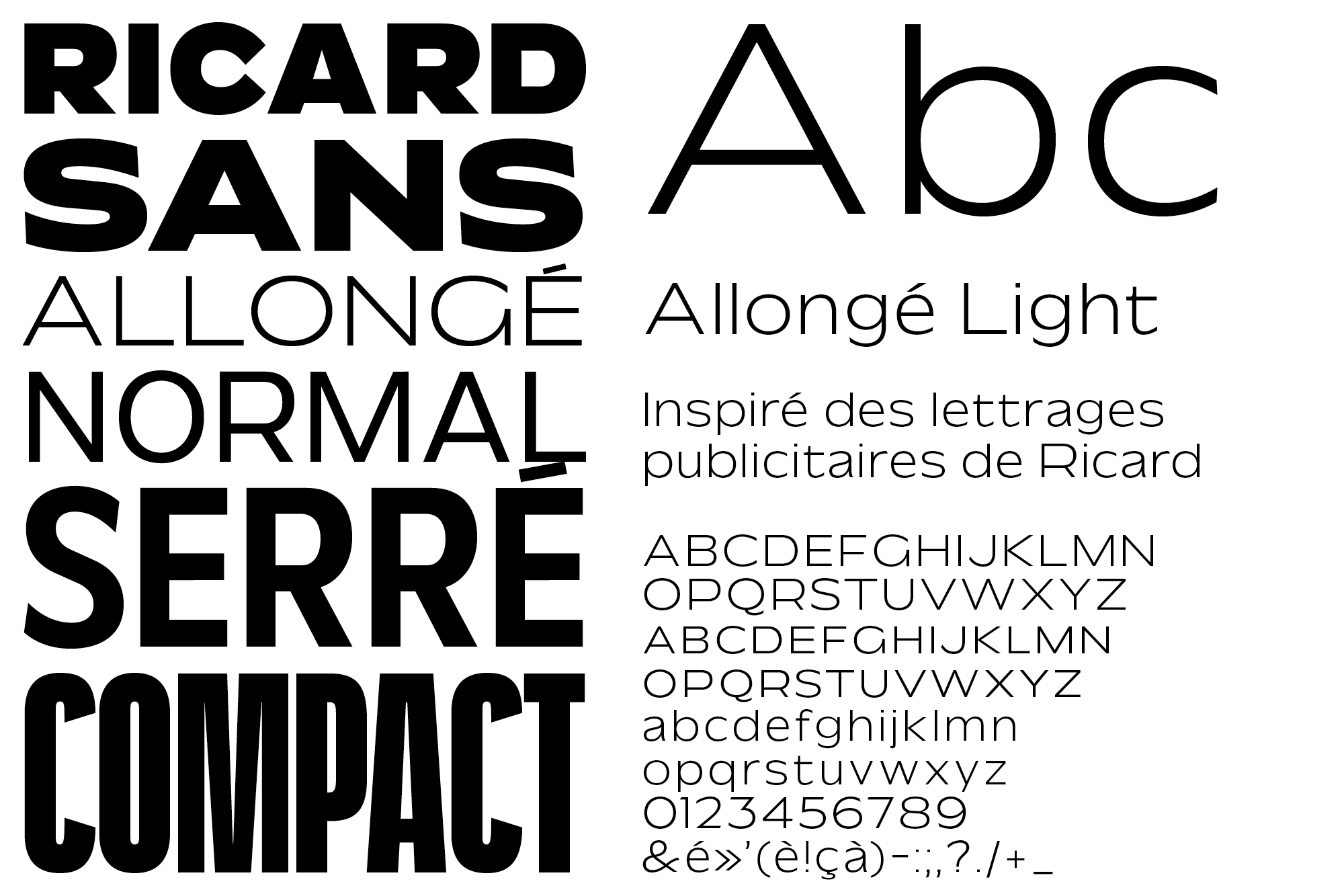
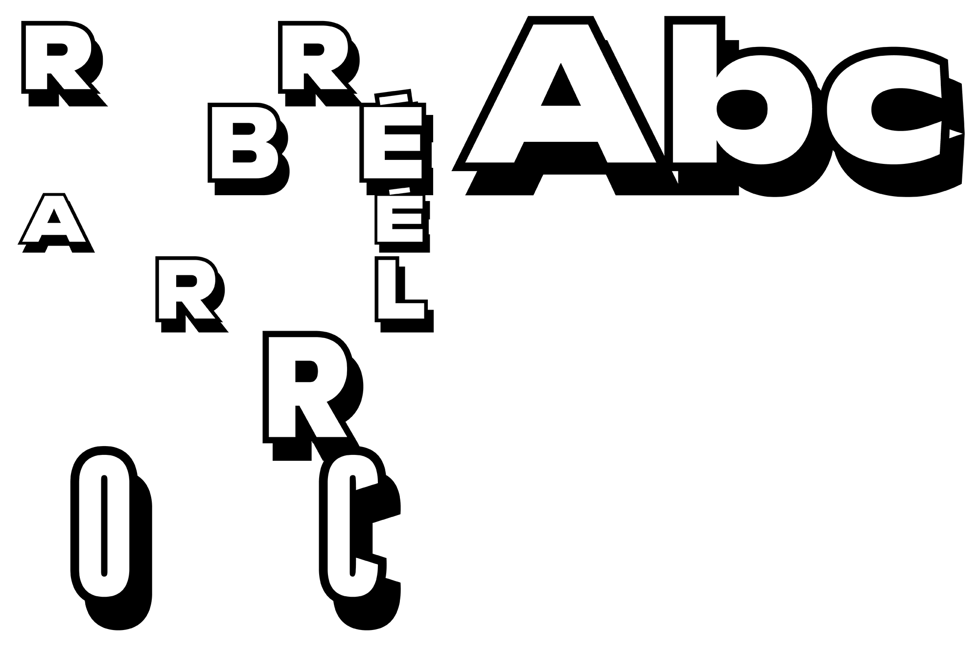
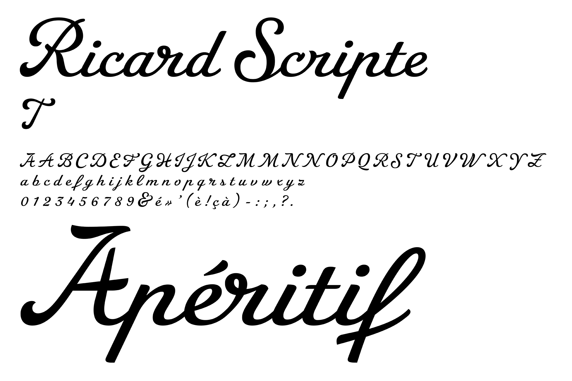
The identity also brings back to life type treatments from the past through a large type family of extended and condensed sans serifs with a matching shadow version for each width and a complementary script. On their own they are nice enough but when they come together in the posters (towards the end of the post) they are quite great, creating a nostalgic yet contemporary aesthetic that’s very pleasing.
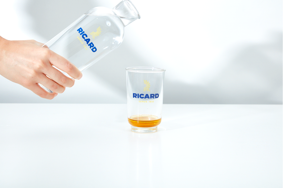
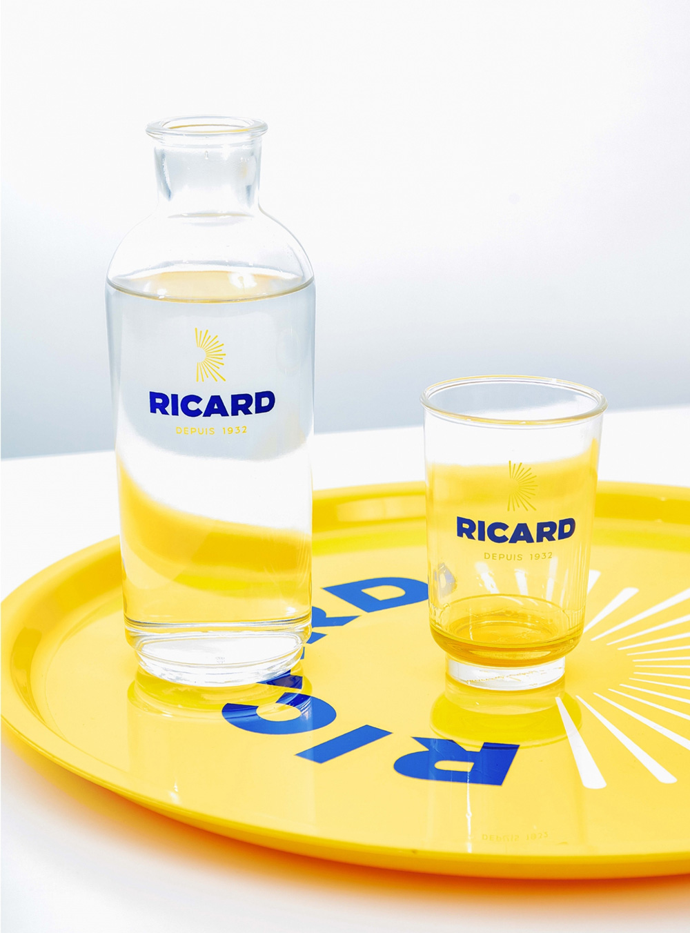
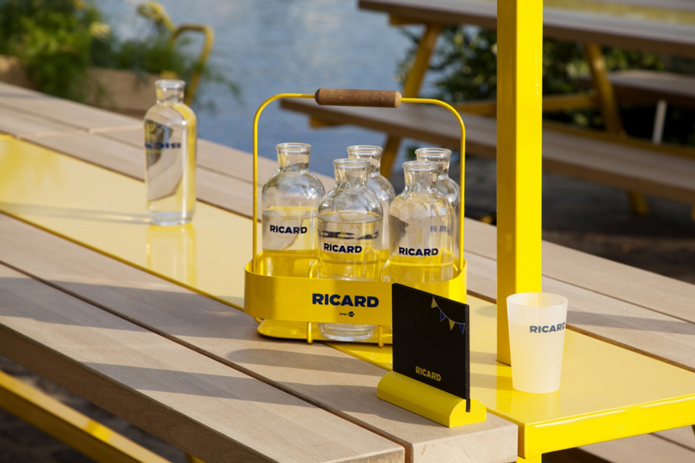
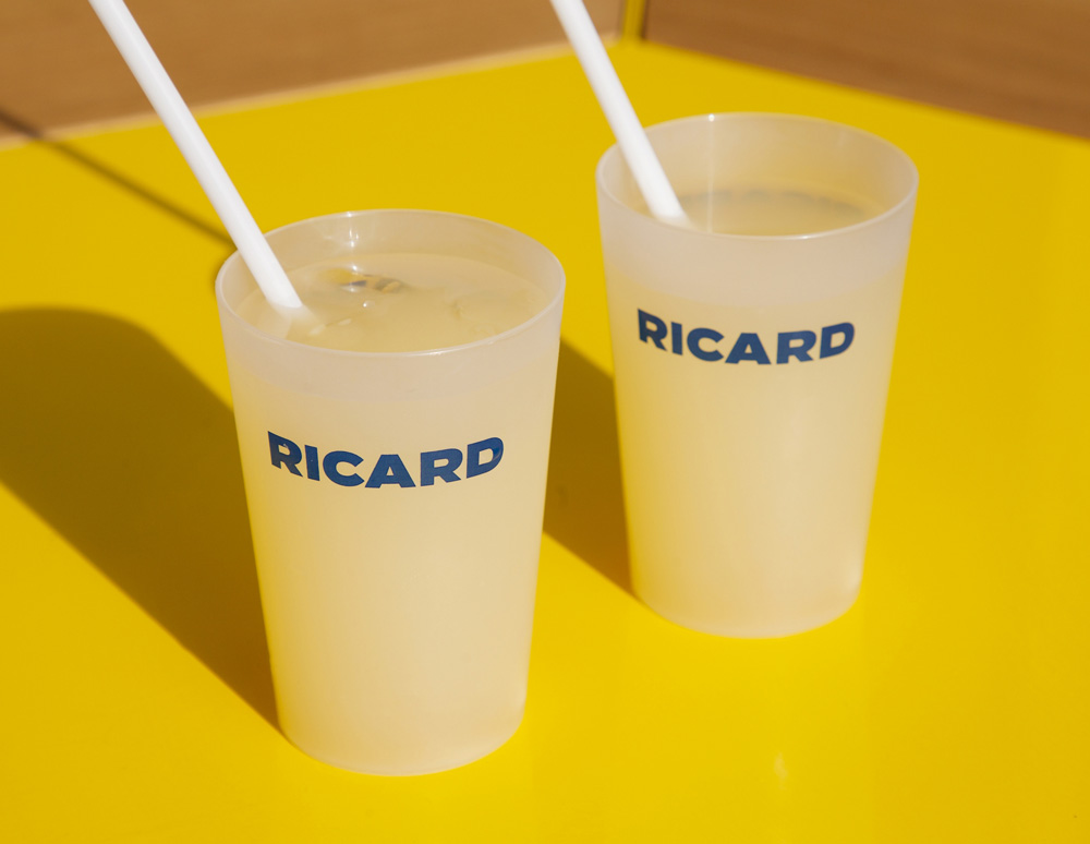
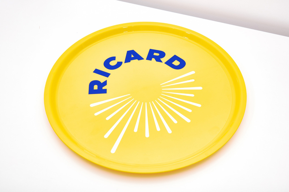
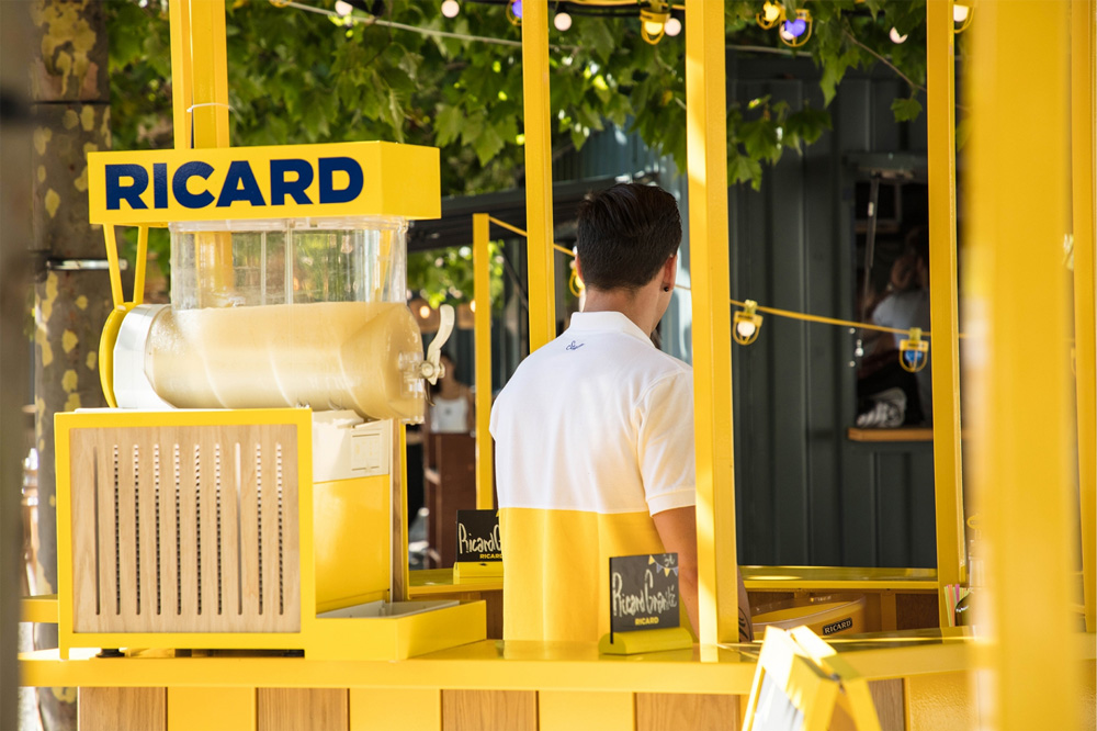
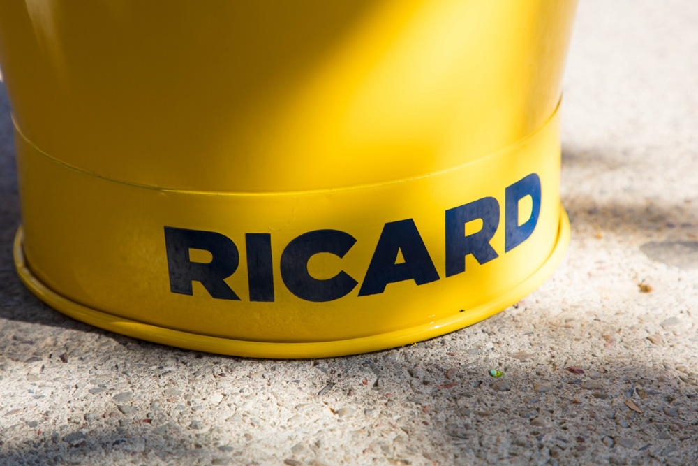
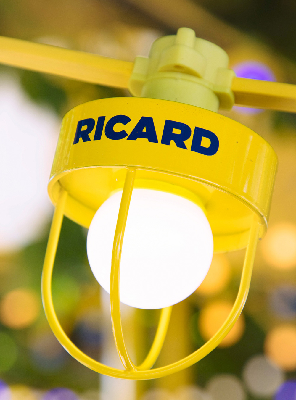
For now, the main use of the new identity is in the carafes, glasses, trays, buckets, pitchers, and other serving accoutrements the pastis-lover might enjoy. All the products have a fun, summery vibe. The circular variation of the logo in the tray above is a nice twist too.
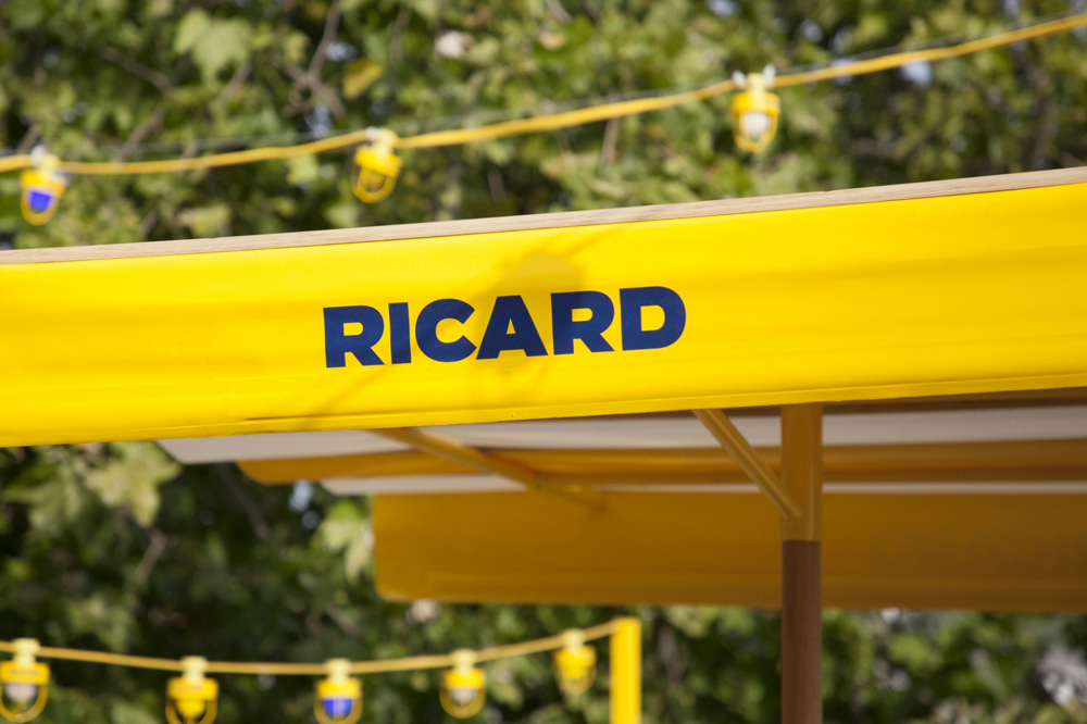
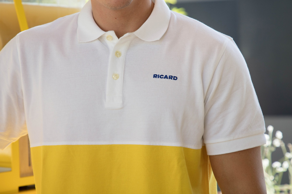
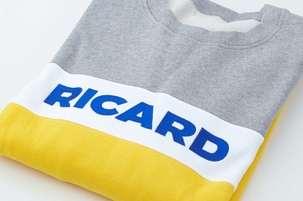
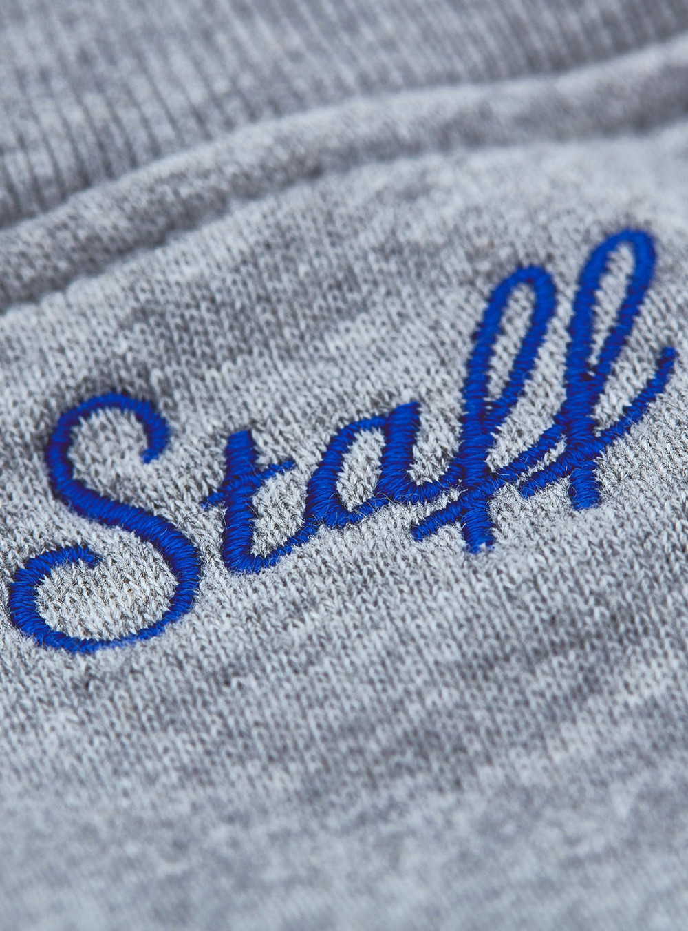
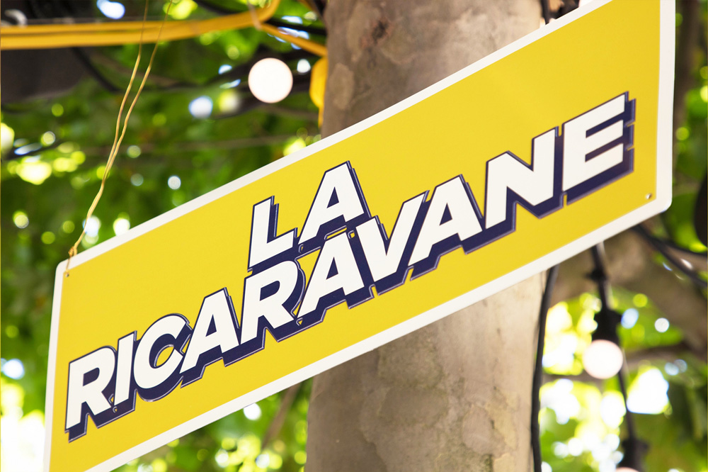
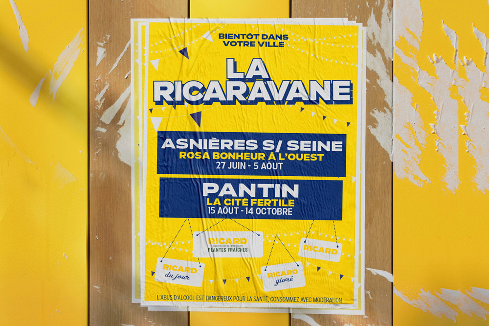
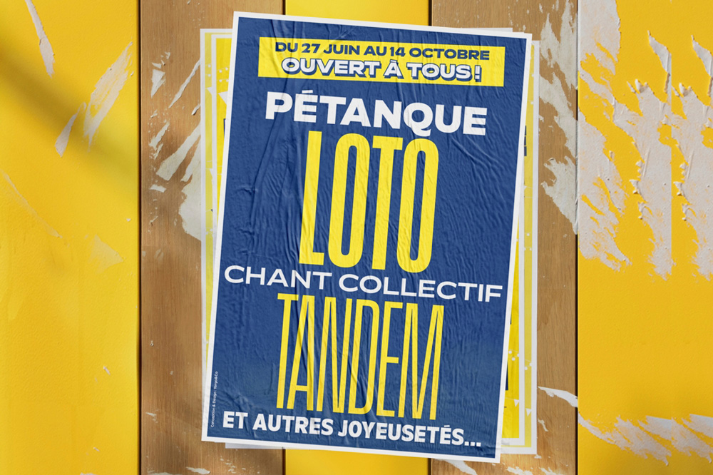
Some of the other applications are great too, particularly the posters that mix and match the typefaces in fun arrangements and are limited to the yellow-blue-white color palette, which extends quite well to the apparel — I could see that sweatshirt picking up some steam as a trendy piece of clothing. It’s too bad that a new bottle wasn’t part of this launch because that would have made this transformation much more impactful. Overall, to me — someone that doesn’t drink the product and isn’t as familiar with its history or existing identity — this seems like a great evolution that takes the brand from a traditional-looking old spirit to something more youthful and engaging without going the full Let’s-Attract-Millennials approach.

 Новости Союза дизайнеров
Все о дизайне в Санкт-Петербурге.
Новости Союза дизайнеров
Все о дизайне в Санкт-Петербурге.