Обзор лучших ресурсов по разработке бренда, разработке упаковки
contact us | ok@ohmycode.ru
contact us | ok@ohmycode.ru
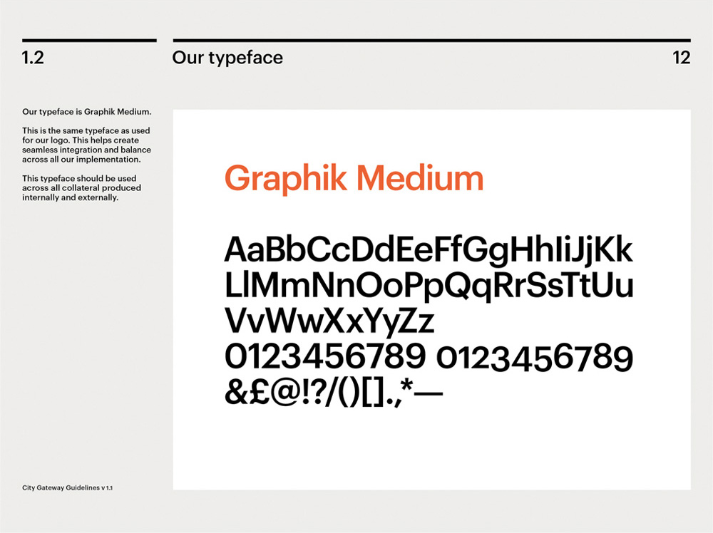
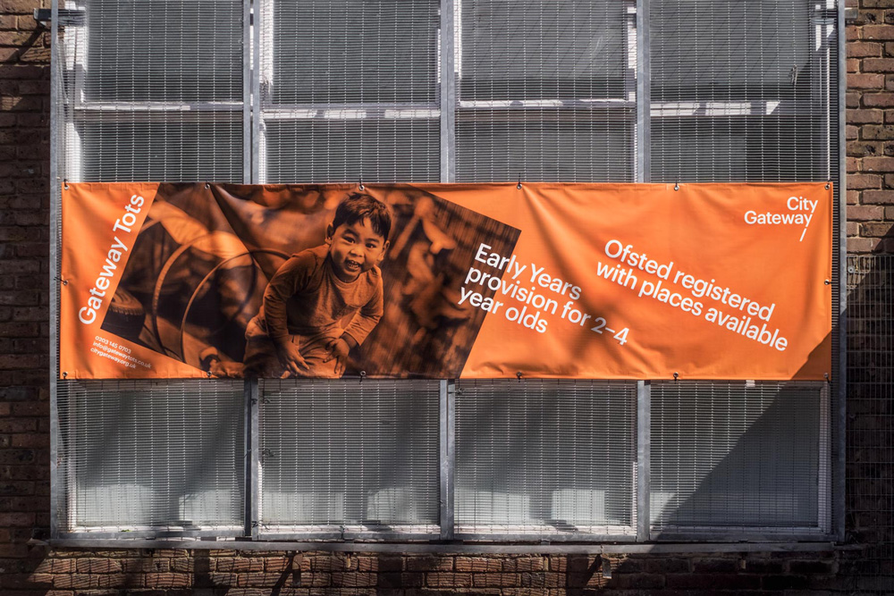
Established in 1999, City Gateway is a charity based in London, UK, that partners with young people, women, and families in communities impacted by social and economic inequality in the city, particularly in the multi-ethnic borough of Tower Hamlets where they have three sites. Their goal is to help everyone reach their full potential, working with three primary groups: young people aged 16-24, providing them programs to make them ready for the workplace as well as internships and apprenticeships; women of all ages, partnering with them to build confidence and skills; and children ages 2 to 4, with their Gateway Tots program. Recently, to strengthen their reputation and build brand perception, City Gateway introduced a new identity designed by London-based Paul Belford Ltd.
The brief was to create an identity that would bring City Gateway’s services to life in print and online, dramatising a vision to create ‘a society where everyone can achieve their full potential’. A unique challenge was the diversity of the charity’s different audience groups, including young people (aged 19-24), local women and mothers, corporate organisations, funders, community referral partners and individual givers.
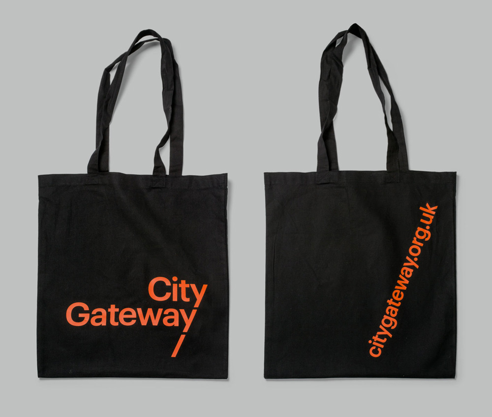
The logo developed by the award-winning studio uses typography to tell the story of the charity’s role in society. It features two ‘y’s that represent the different paths a person might take in life. Together they create a line that demonstrates how City Gateway helps individuals to stay on the path to realising their true potential. The trajectory points upward and forwards, symbolising opportunity.
The old logo wasn’t good but it wasn’t terrible either for what was clearly an effort done without the help of a professional graphic designer. The type and icon were clunky but it had the right message of providing direction in a tough city. The new logo isn’t as clear in its concept (unless you see the animation) but it does hint at following a path with the “y”s establishing a clear visual line and a sense of consistency and repetition (which, as boring as they sound, are key elements of being a reliable person in society). The new logo now looks more professional and gives the charity a much more sophisticated and put-together presence that will help with their fundraising efforts. At times, in the applications, it feels like something should happen after the lone slash in the third line; like it’s begging for a sub-brand.
This same angle plays a wider role across City Gateway materials to create a nuanced brand language. It can be seen in the use of angled type, rotated imagery and asymmetrical grid structures. In other applications, there is also balance to this playfulness where a straighter, more serious approach can be seen.
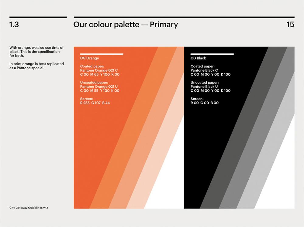
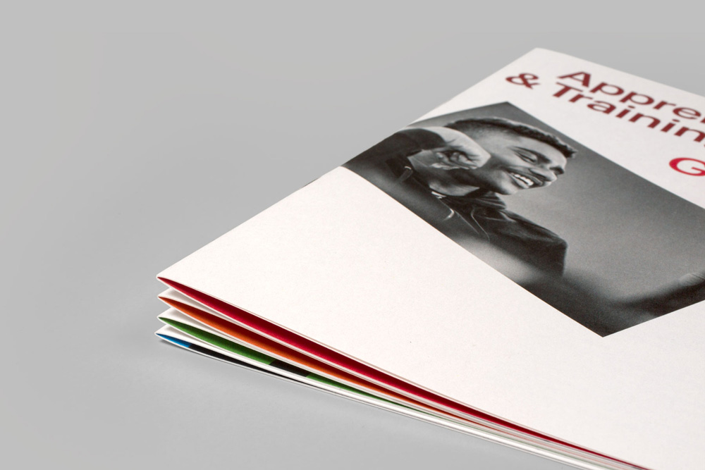
The brand colour is orange (Pantone Orange 021), selected for its ability to represent different meanings across City Gateway’s services, including warmth and optimism. These areas are further differentiated by the use of a secondary colour palette that adds versatility.
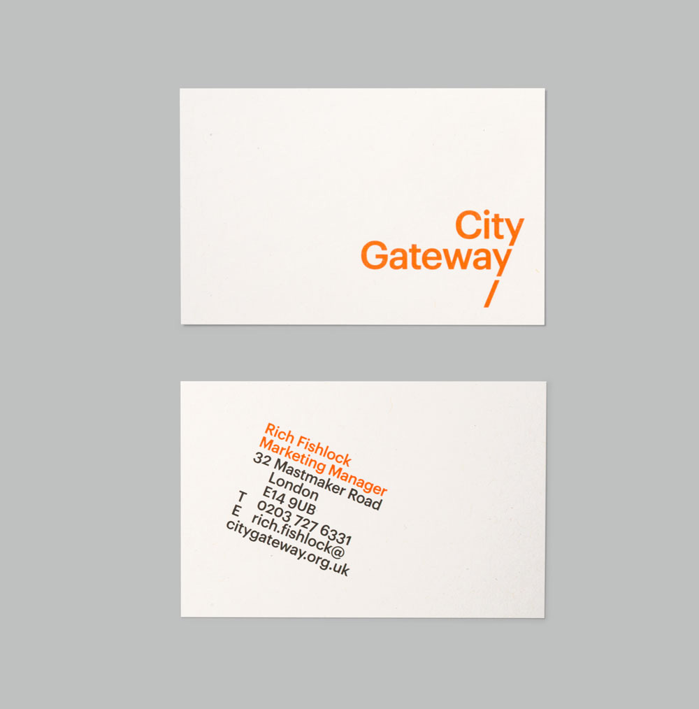
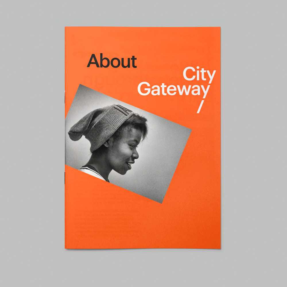
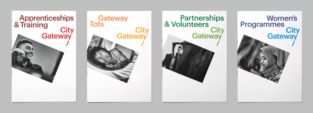
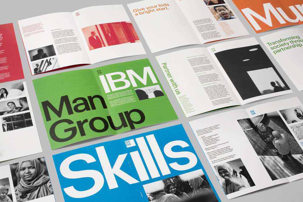
The applications make a strong statement with the rotated photos or text that match the angle of the logo. That small gesture adds a lot of tension visually and even conceptually as it frames the people they help in a way that demands attention and consideration.
Overall, this is a strong redesign and it’s always great to see a charity get the identity they deserve to help them do their best work possible.

 Новости Союза дизайнеров
Все о дизайне в Санкт-Петербурге.
Новости Союза дизайнеров
Все о дизайне в Санкт-Петербурге.