contact us | ok@ohmycode.ru
contact us | ok@ohmycode.ru
Established in 1996, TP-Link is a manufacturer and provider of networking devices and accessories. The most common of which are wireless network routers but their offering gets more techie and nerdy from there. Based in Shenzhen, Guangdong, China, and with a U.S. presence since 2008, TP-Link competes with more well-known router brands — if you are into routers, which I know you totally are — like NETGEAR, Belkin, and Linksys. (I mean, how many password-protected Linksys-named Wi-Fi networks have you wished you could join?). With new products in the smart home, smart phone, and smart accessory categories, and looking to expand its presence and notoriety, TP-Link has introduced a new identity designed by the New York, NY, office of Futurebrand.
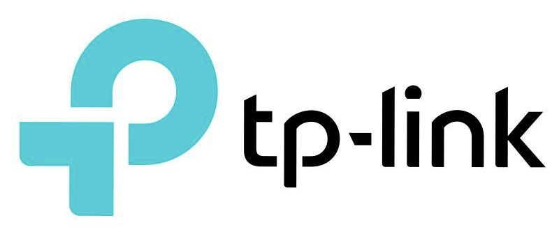
To align with this new corporate strategy, TP-Link is making a number of updates to its corporate identity and the visual representation of its brand. The company’s new tagline, “Reliably Smart,” follows the heritage of the former tagline, while emphasizing TP-Link’s move into smart products. The new company logo features an arrow pointing to the center, indicating the company’s commitment to a customer-centric culture that align with the needs of today’s modern customer.
The company has also updated the logo design to all lowercase and the spelling of its name to TP-Link, instead of TP-LINK, bringing it in line with a simpler, more approachable persona. The company will also be releasing new product packaging that improves shopability and a refreshed website for enhanced product clarity. Finally, the new color palette of the brand has been updated to become energizing and inviting, synchronizing with the brand’s new tone.

The old logo was okay; a little clunky but the extended, thick-thin structure was decently drawn. Its main drawback was that it looked like it belonged on a piece of equipment not meant to be handled by general consumers but by IT people, which is the main purpose of the new logo, to gain consumer appeal and recognition. The new icon doubles as a monogram with a “T” and “P” hinted at in the combined shapes of the arrow and circle, which is a good approach but, unfortunately, in trying to play it both ways neither read is exactly clear or convincing. If it’s meant to be an arrow, it feels somewhat static and it’s hard to tell what it’s arrow-ing at… the consumer? And as a monogram, the “P” would be overwhelmingly out of proportion to the “T”. But maybe it’s just me trying to see the monogram.
The wordmark suffers from far too much customization and features: cut-angle here, here, and here; rounded corners here and here but not here; truncated tittle here; angled hyphen here. It’s one too many moves that kind of chip away at the strength of each letter. On a positive note, the wordmark matches the look of the icon, so they look like they belong together.
These few attempts at bringing some added meaning and value to the logo are commendable but ultimately unnecessary and don’t support any kind of concept or establish an identity behavior.


The print materials begin to show some signs of life with the pattern made out of varying sizes of the arrow. They shyly begin to use a pattern in their social media graphics but then goes missing from the packaging. The mint and yellow color palette freshen up the brand and it fits gently within the world of tech products.


The packaging lacks finesse and looks easily like something that could be the old packaging and getting a replacement with this redesign. The old packaging wasn’t great but somehow feels like it has more personality than this new one where the boxes and strokes and basic product photography don’t make the most positive of impacts.


Overall, yes, this feels contemporary — the booth above paints a nice picture when the identity is in a very controlled environment — and is more consumer friendly but it feels like in an effort to create something unique and distinct and in trying to establish it as a fun brand that can render its logo on the foam of a cup of coffee, the brand is trying too hard to appeal to the mainstream consumer and never quite establishes a clear position of what we are supposed to take away from it, other than a new router.

 Новости Союза дизайнеров
Все о дизайне в Санкт-Петербурге.