Обзор лучших ресурсов по разработке бренда, разработке упаковки
contact us | ok@ohmycode.ru
contact us | ok@ohmycode.ru
Oslo, capital of Norway, is the country’s largest city with a population of over 650,000 and is politically/geographically/governmentally defined as Oslo Kommune (Oslo Municipality) with its city council in charge of pretty much everything: elementary school and pre-school education, cultural institutions and events, health care services, social services, child protection services, housing and urban renewal, local roads, local transport for people and goods, parks and green areas, environmental issues, land use, and urban planning. Oslo Kommune employs approximately 50,000 people. Earlier this month, it announced that, in 2019, it will introduce a new administrative and city-wide identity designed by the Oslo office of Creuna.
The reason for the proposal is a clear need to emerge more clearly and uniformly. The municipality operates many types of businesses and communicates with many different audiences. The identity as it has looked into now gives a fragmented and unclear image. There are over 200 logos in use of businesses that are part of the municipality. Therefore, it is unclear to many what the municipality does. Many also do not know that the municipality of Oslo stands behind initiatives and offers that the people appreciate. In addition, today’s identity is outdated. It is not adapted to digital channels, where more and more dialogue between the municipality and the inhabitants will take place. Nor does it meet the requirements for universal design, which will ensure that it can be used by everyone. In the solution there is also a goal of efficiency. It is estimated that today’s fragmentation costs the municipality NOK 40 million a year. With the new solution, the goal is that all businesses in Oslo municipality will be gathered under one common identity.
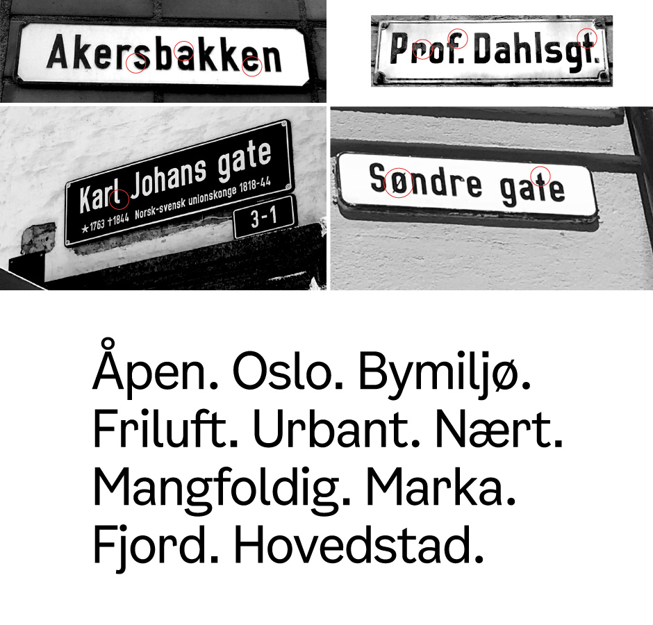
In a new design manual, all businesses in Oslo municipality will be gathered under a common visual identity. Items from the coat of arms; the millstone, the crown and arrowhead, form the basis for the new visual identity. The color palette is taken from Oslo’s cityscape, and the font has been drawn from the city’s old signs. Today’s coat of arms for Oslo will still be used on historic and solemn occasions with strong links to tradition. The municipality of Oslo has been very keen to take care of the history of coat of armss in the process. In order to make the logo proposal more recognizable, St. Hallvard is enlarged, which is also the weapon of the city weapon. The circle form with the castle crown is unique to Oslo and the same applies to the attributes of St. Hallvard; three arrows and the millstone. The proposal for renewed coat of armss has taken into account heraldic guides about a clear and simple coat of arms. A thorough assessment of the level of detail and single elements has been made.
As many cities are wont to do, Oslo used its coat of arms as its logo and as many cities are wont to find out: it’s not a good idea in the long run nor do they make good social media avatars. The coat of arms is not disappearing and it will still be used for official circumstances but, as a logo, it’s giving way to a new, minimalist interpretation better suited for vast reproduction and usage. The new icon keeps all the key elements of the coat of arms — the crown, the millstone on the right hand, the three arrows on the left, and even the cape because work it — rendered in the always popular thick-line approach. My one big complaint about the icon is that the large circle and crown are slightly thicker than the dude and his accoutrements but not enough to be clearly different. A smaller complaint would be the three arrows that without their fletching — I had to Google what the tail part of the arrow is called — and at strict 45-degree increment rotation look weird. As a unit, though, to be used over and over and recall the coat of arms, it’s pretty good. The wordmark comes from a custom font based on city signage; on their own, the “Oslo” characters are not that interesting but the font has a cool, quirky aesthetic.
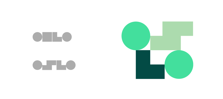
From the new icon, three shapes are expanded into a graphic system that permeates (or will permeate) the applications. A circle from the millstone, a corner frame from the arrowheads, and a square from the crown (that sometimes splits into two rectangles) serve as a very abstract “OSLO” pattern to be used in flexible compositions. It’s an interesting concept and it works great in motion. The square as an “S” requires a very open mind to read as such but since the logo will always say Oslo the shapes don’t have to be so literal (or taken so literally).
Overall, this has both a serious side with the pared down logo and a fun side with the shapes and animation, allowing the city to brand everything from garbage trucks to family events at the park. A follow-up in 2020 with actual applications of this system will be very interesting to wait for.
Thanks to Håkon Stuler for the tip.

 Новости Союза дизайнеров
Все о дизайне в Санкт-Петербурге.
Новости Союза дизайнеров
Все о дизайне в Санкт-Петербурге.