Обзор лучших ресурсов по разработке бренда, разработке упаковки
contact us | ok@ohmycode.ru
contact us | ok@ohmycode.ru
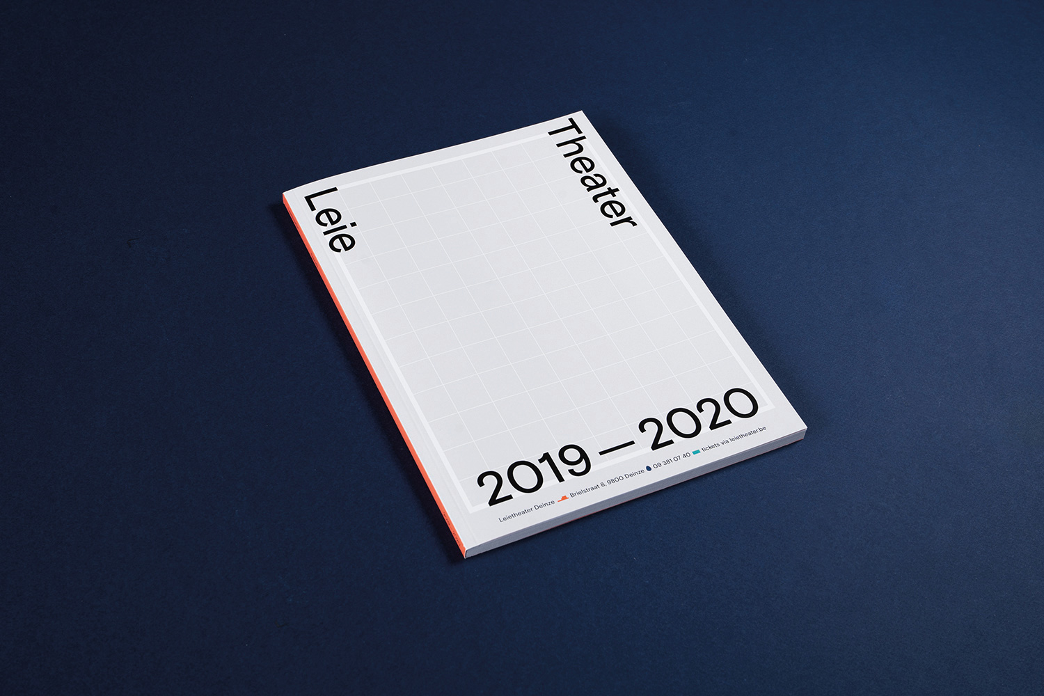
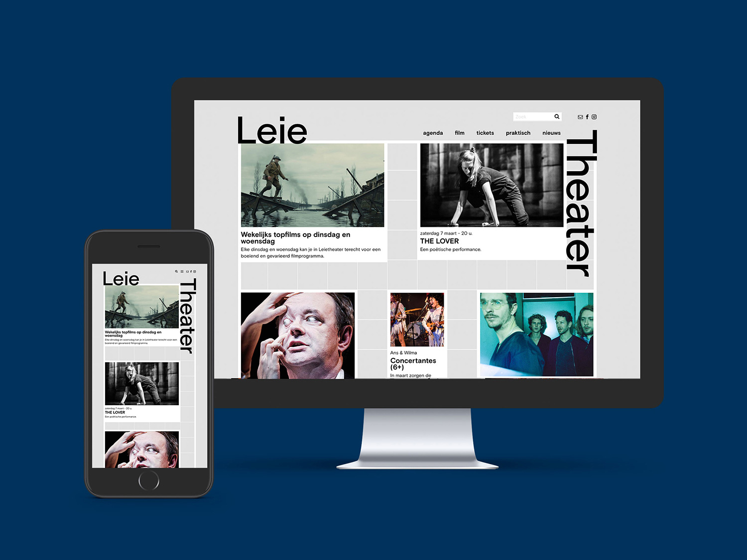
Opened in 2019, Leietheater is a cultural center in Deinze, Belgium, that hosts a variety of events: theater, music, movies, readings, dance, comedy, and even things under a “circus” category. The theater’s main hall seats 450 people while a smaller one seats 150 and in addition there are multiple multi-purpose rooms that are accessible to other organizations. The building opened in September of last year — after a process that began in 2011 with a call for architecture proposals — and introduced a new identity designed by Ghent, Belgium-based DIFT.
Our concept brought together several layers, starting with the idea that a new centre is a blank page. That’s why we choose to start off with a grid on which everyone could make their own branding of Leietheater.
The logo on its own and in its primary configuration (above) is not much to look at or get excited by but it’s a very good foundation for the flexibility and playfulness it has in application. Part of what makes the logo and its flexibility work is how neatly the capital “L” and capital “T” fall in the corners of the expandable grid element, framing whatever appears within it and allowing the two words to snap to any of the four corners. When the logo is on its own, the tagline sits quite well in what otherwise would be very awkward empty space. So it’s not super exciting but it’s certainly effective.
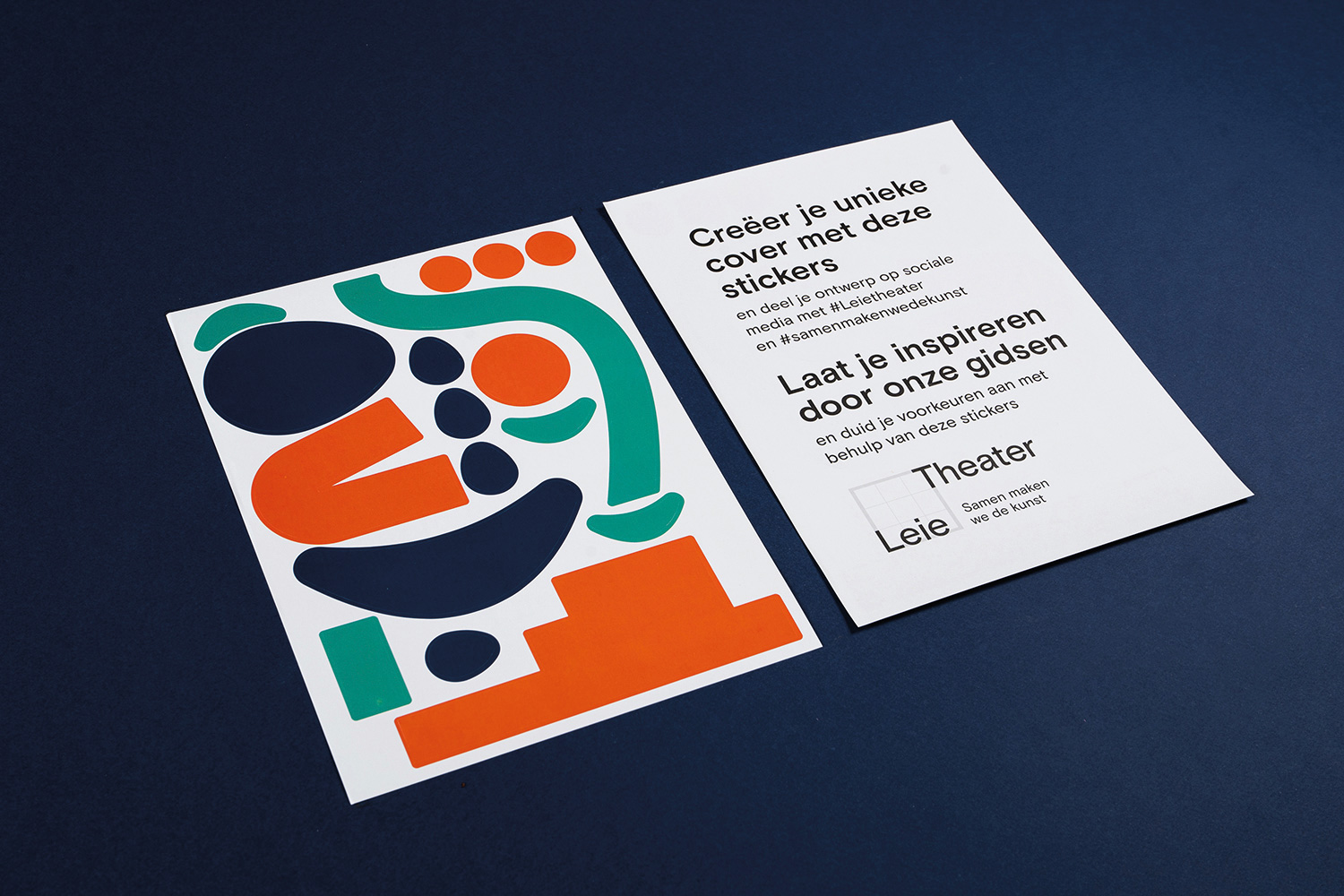
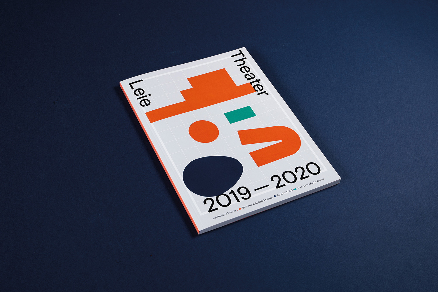
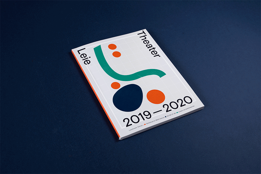
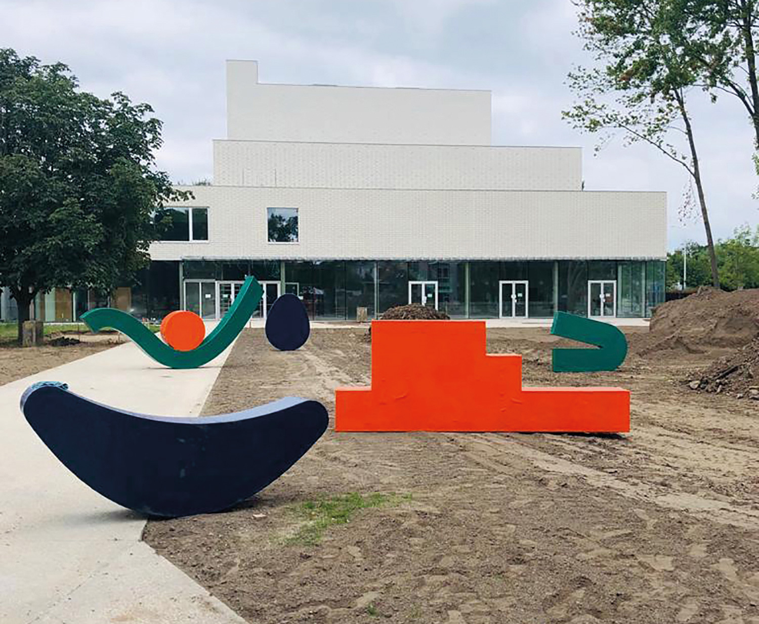
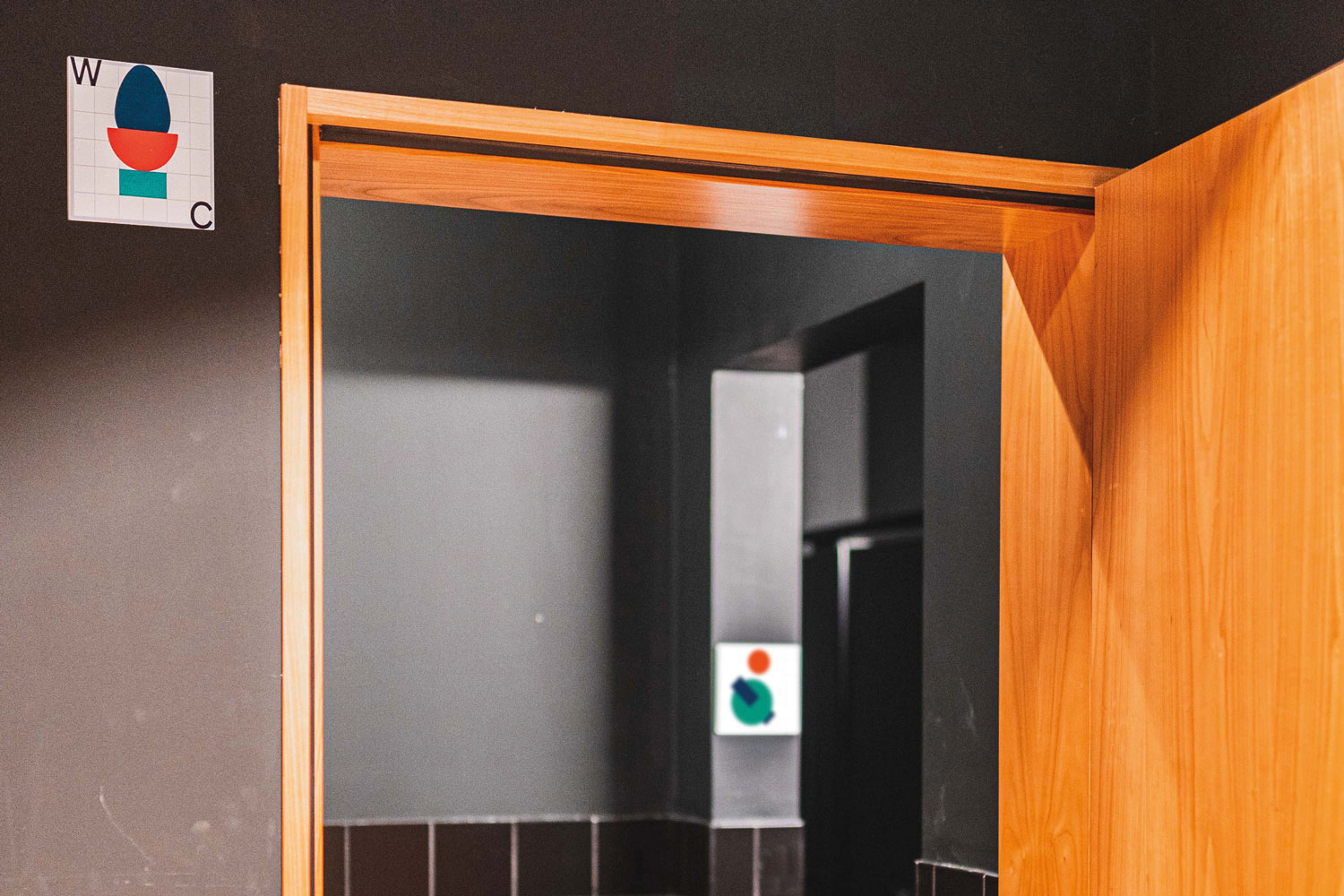
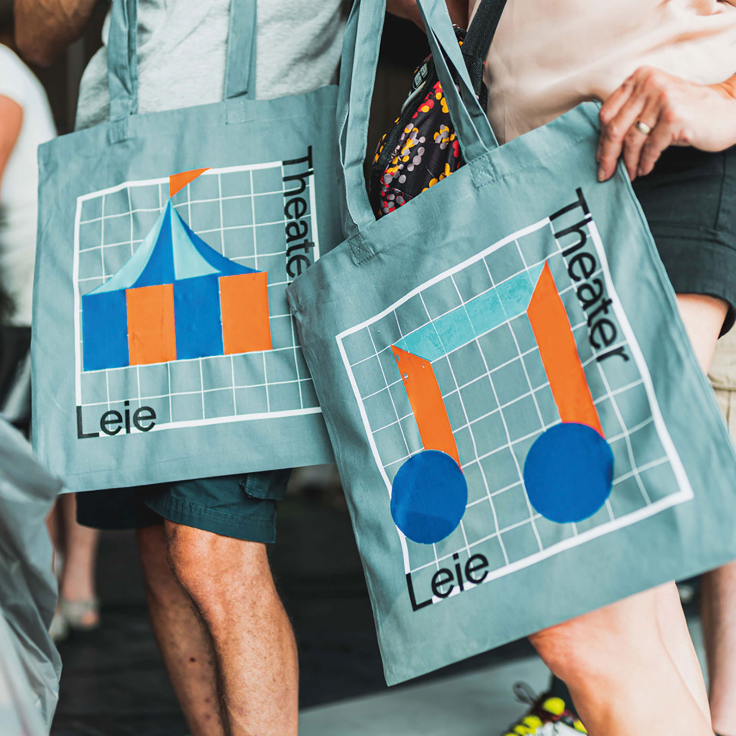
What got my attention about the project were these funky shapes and how they are freely applied in weird ways. The only literal shape is the wide orange step-like figure that reflects the silhouette of the new building but other than that, the rest are squiggles, egg-shaped thingies, and flat boomerang-like bits and pieces. They are meant to refer the “surroundings of the building” but I gladly also accept that they are simply fun. The shapes come alive in the season brochure that comes with a sheet of stickers that allows patrons to customize their own covers. It’s charming and it sends a subtle, romantic and philosophical message that this new center is for them.
The shapes also come together into icons for each of the event categories and while they are not perfect they make up for it in personality.
[We] asked Deinze’s citizens to play with these shapes - be it on a human scale. That gave them the opportunity to experience the brand even before the centre opened.
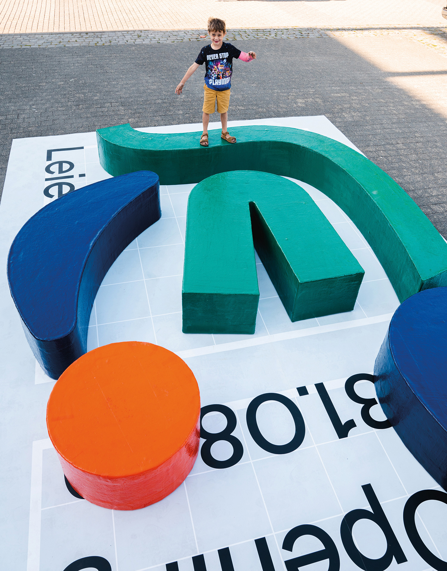
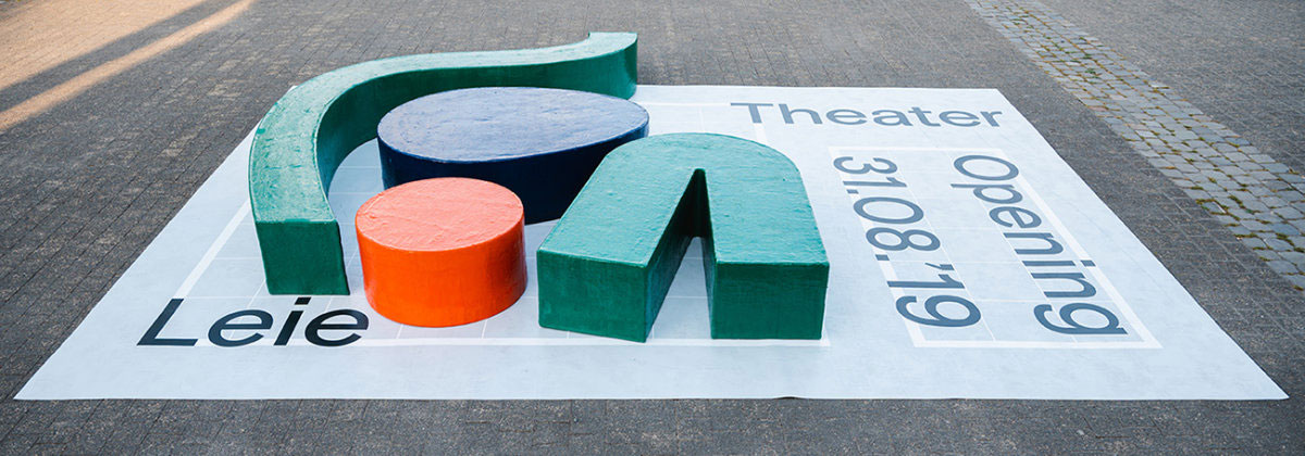
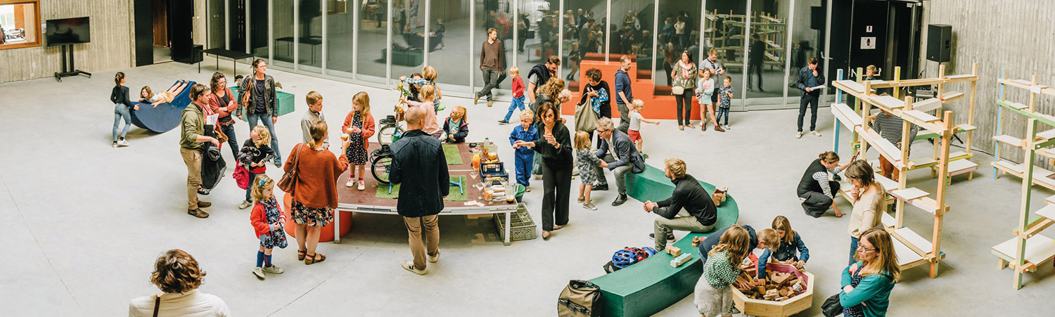
As if I didn’t like the shapes enough already, this application is all kinds of pleasing. It’s something that we would usually see as a render and that is never actually made so it’s wonderful to see the shapes built for humans and getting climbed on, stepped on, and sat on.
Overall, this isn’t the most sophisticated identity but there is something infinitely charming in its simplicity and lack of over-designing that is a perfect fit for a cultural center in a small city with events that fall under a circus category.
 each year since publication began in 2006

 Новости Союза дизайнеров
Все о дизайне в Санкт-Петербурге.
Новости Союза дизайнеров
Все о дизайне в Санкт-Петербурге.