Обзор лучших ресурсов по разработке бренда, разработке упаковки
contact us | ok@ohmycode.ru
contact us | ok@ohmycode.ru
Opened in 1926, Konserthuset Stockholm (Stockholm Concert Hall) is an iconic music venue in Stockholm, Sweden, that has been host to the Royal Stockholm Philharmonic Orchestra (founded 1902) since the beginning, establishing a strong tie to classical and chamber music, programming over 300 concerts each year. It also hosts the Nobel Prize awards ceremony annually. Recently, the cultural venue introduced a new identity designed by local firm Kurppa Hosk.
The starting point for the design was to convey the great variety of the orchestra’s musical and artistic expressions as well as the variety of activities in Konserthuset - but also its iconic architecture. At center stage of the identity stands an ever changing organic symbol that represents and unites both Konserthuset Stockholm and the Royal Stockholm Philharmonic Orchestra - a “musical signature” that conveys the movement and energy of music.
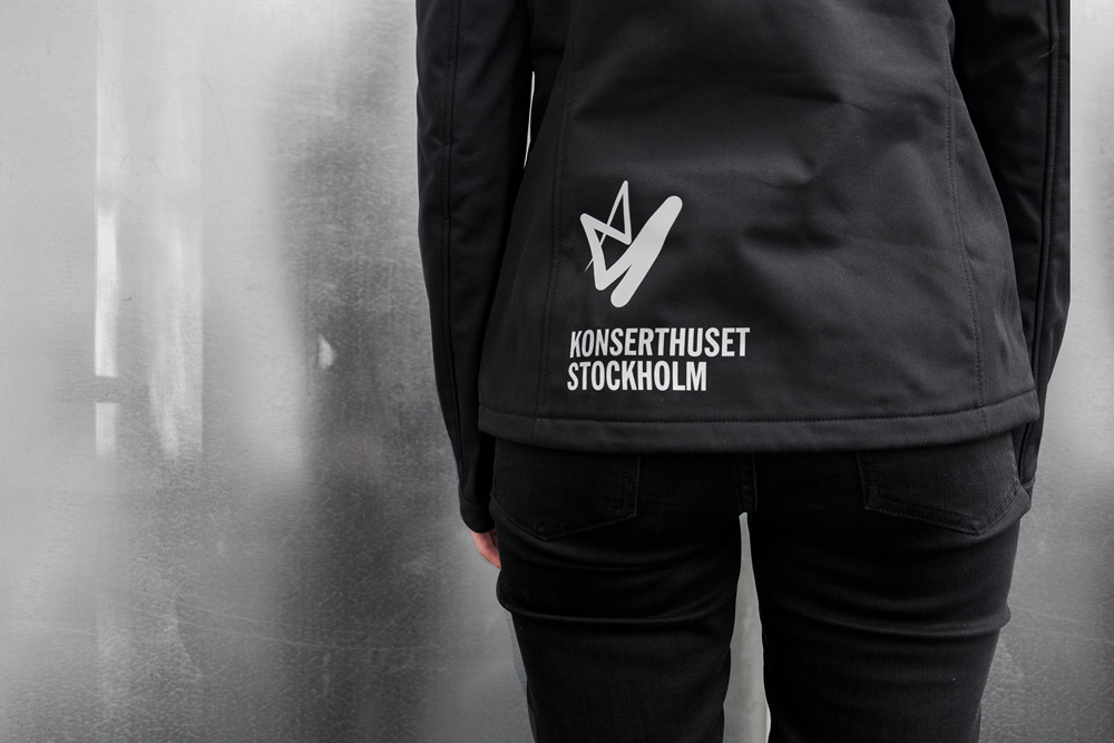
The previous logo was fairly decent, with some Gotham-esque wordmark supporting a nice “f” icon that perhaps looked like the long, hold-y part of a violin or cello (I’m sure there is a proper term for it). That logo could have easily been used for the rest of time and no one would have complained (or noticed it). The new logo — like other European orchestras — is opting for a more contemporary and less tuxedo-clad vibe. A variable icon that adheres to a hexagonal grid emulates the conductor’s baton movements through a trailing structure that’s akin to light painting in the dark. It’s a solid concept and the result is intriguing if, perhaps, a little aggressive… not that it hurts my feelings or makes me feel scared but that it looks almost like a defying graffiti tag.
This is not bad but, just like yesterday’s London Symphony Orchestra post, there is a relatively large leap needed to be made in order to make a successful connection between classical music and graphic devices and imagery more common to, say, EDM. Along with the other orchestra projects linked to, these are collectively changing the visual expectations of what the identity of an orchestra looks like and maybe in five years, anything that doesn’t look like these will be the outlier. Anyway…
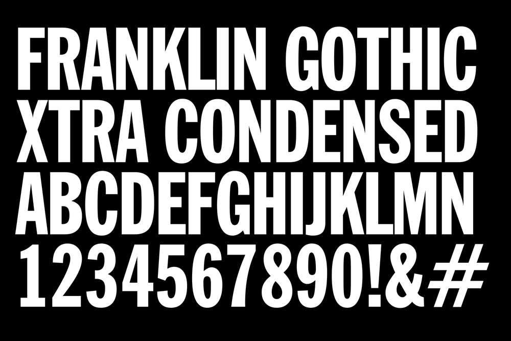
As a flexible icon, it’s a solid one, and its motion captures effectively the motions of a baton. (When set to music and with color, as you’ll see in the closing video, it’s almost like watching a segment of Fantasia.) The accompanying wordmark, typeset in Franklin Gothic Condensed is cool in a deadpan way.
One thing to clarify is that this new logo applies to both the venue and the Royal Stockholm Philharmonic Orchestra.

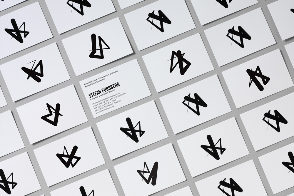


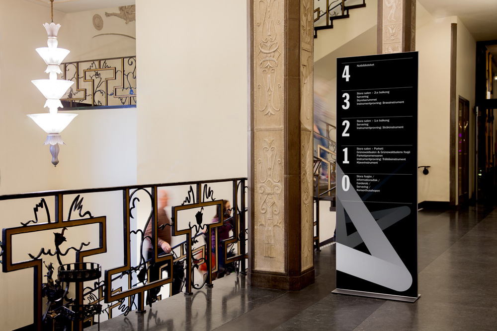
The applications are quite attractive, especially when the icon is made extra large and given a gradient that amplifies its depth and motion in static form. I would buy something from their shop just to get a sample of that plastic bag. The more institutional stuff like business cards and letterhead feels a little blunt but not in the best way. It’s like it is 10 degrees colder than it should be; if that metaphor makes any sense. It looks almost clinical because of how black and white it all is.
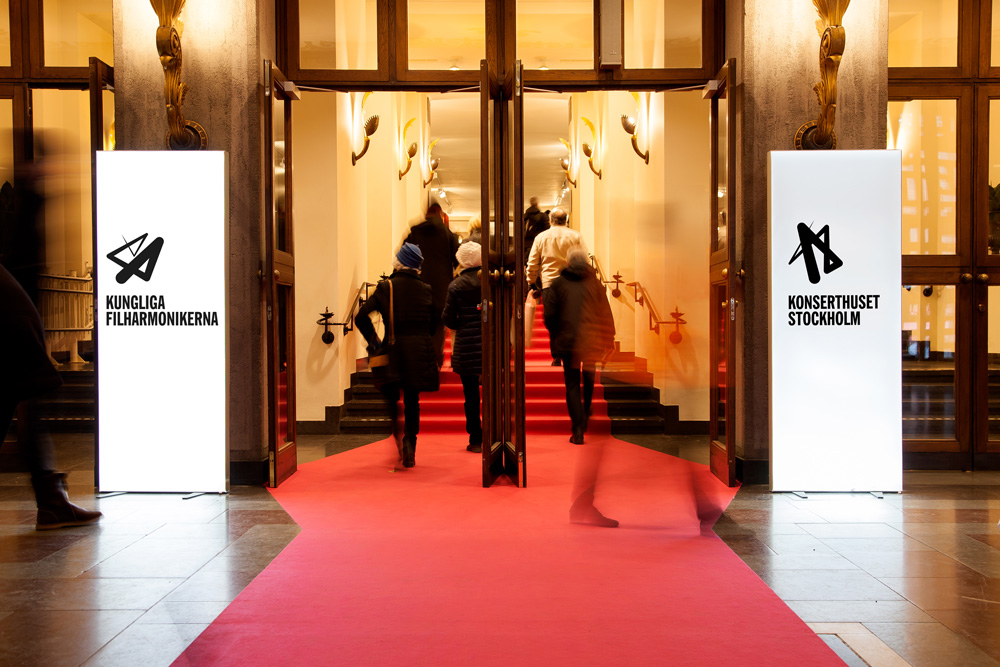
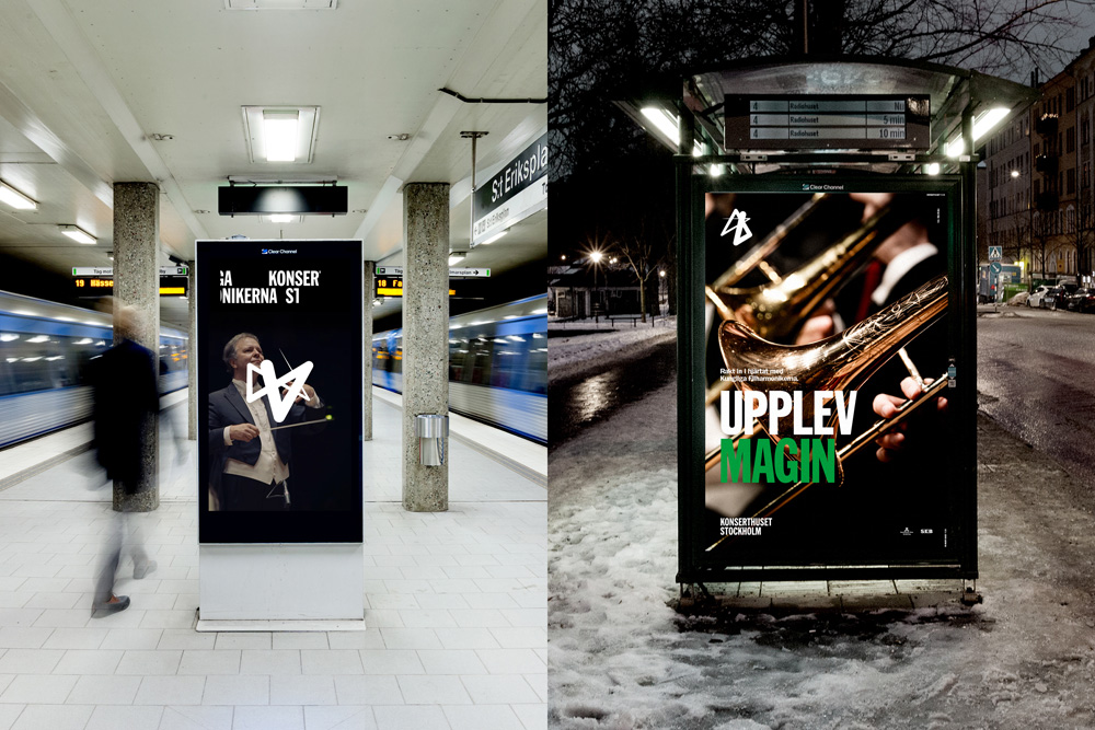
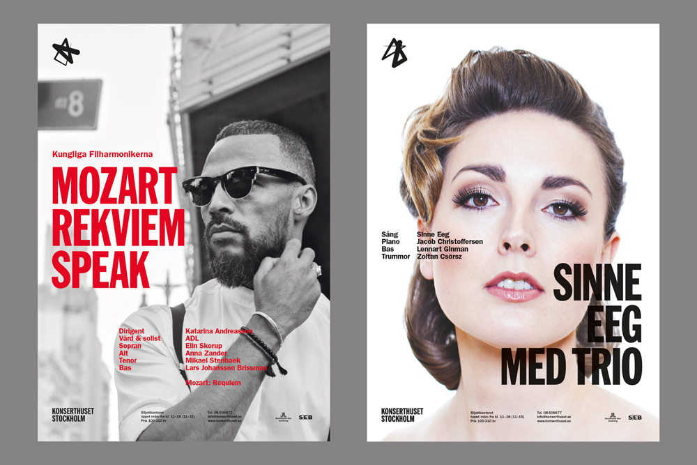
When color is introduced for advertising, and even more so when there are pictures of non-orchestra types, it looks like it’s almost a whole other project. Which may sound like a negative criticism but it’s not entirely as it helps the venue show that it’s not just classical music on display and that it’s not your parents venue anymore.
Overall, I like the project because it has some engaging ideas, the execution is spot on, and it very visibly communicates to the audience that this is meant to be a contemporary venue where cool things happen… maybe what we need now is a headbanger conductor to help support the more edgy logos and identities orchestras are adopting.

 Новости Союза дизайнеров
Все о дизайне в Санкт-Петербурге.
Новости Союза дизайнеров
Все о дизайне в Санкт-Петербурге.