Обзор лучших ресурсов по разработке бренда, разработке упаковки
contact us | ok@ohmycode.ru
contact us | ok@ohmycode.ru
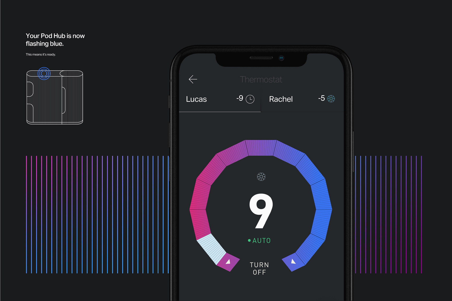
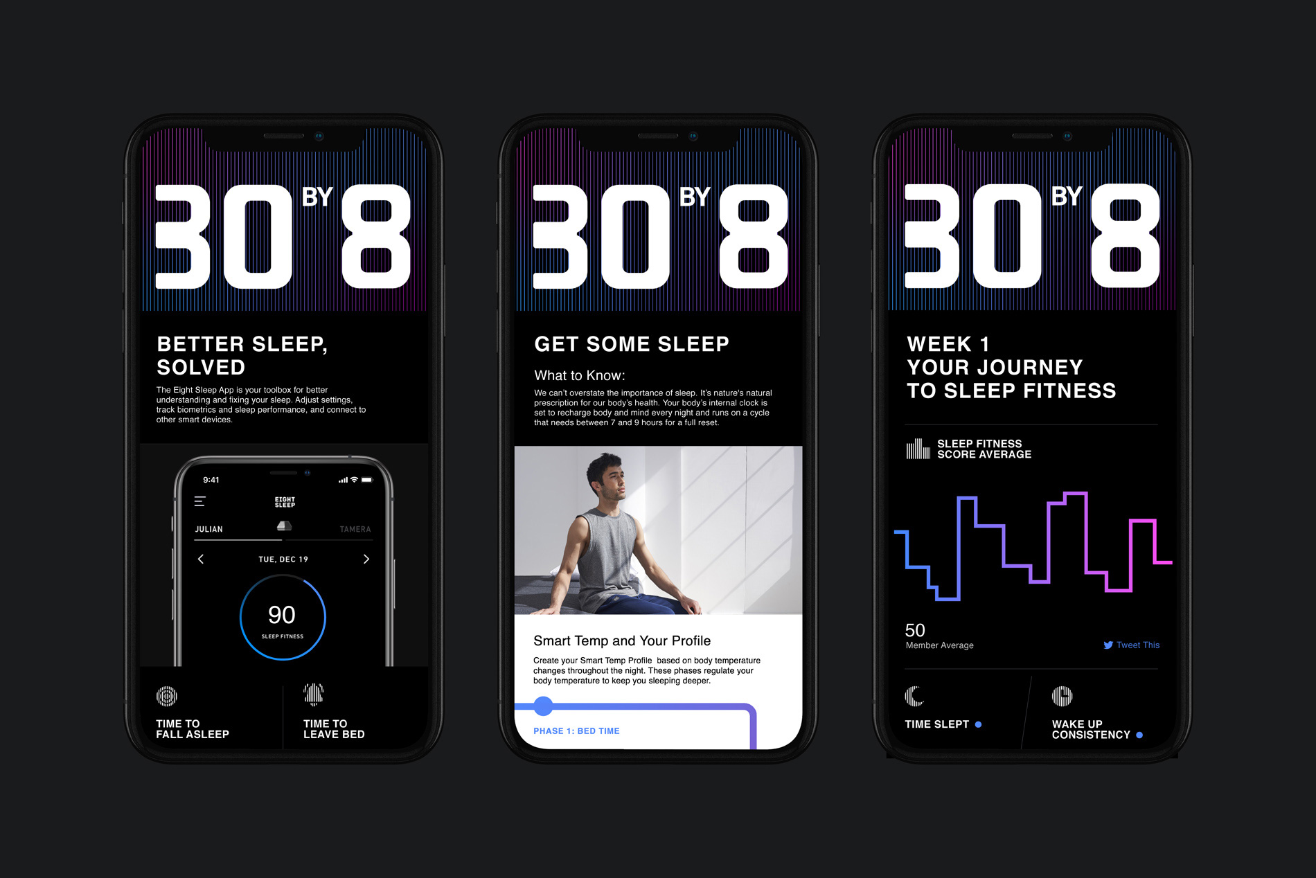
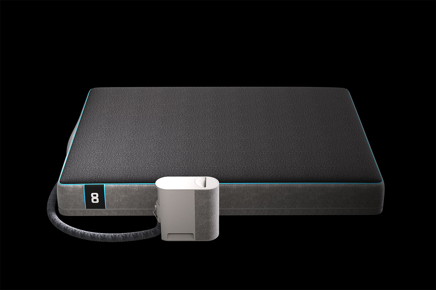
Established in 2014, Eight Sleep is a “sleep fitness company” that designs products, content, and tools to help people sleep better for optimum performance each day. Their first product, a smart bed called, well, Smart Bed, allows users to track their sleep patterns and biometric signals and has an integrated heater and smart alarm that can wake you up at the optimal point in your sleep cycle. Their newest product, The Pod, takes things up to 11 with personalized temperature regulation, deeper analytics, and more — earning a mention in this year’s best inventions according to TIME. Earlier this year, Eight Sleep introduced a new identity designed by New York, NY-based Interesting Development.
A complete refresh, including a new logo, website, packaging, and advertising, moved Eight Sleep from mattress company to sleep fitness company. Borrowing cues from athletic brands, the new identity stands in stark contrast to the predominately cute and simple voice of the mattress category, and creates a whole new category unto itself. Immediately following the relaunch, Eight Sleep secured an additional 40 million in funding and received recognition from TIME magazine as one of the Best Inventions of 2019.
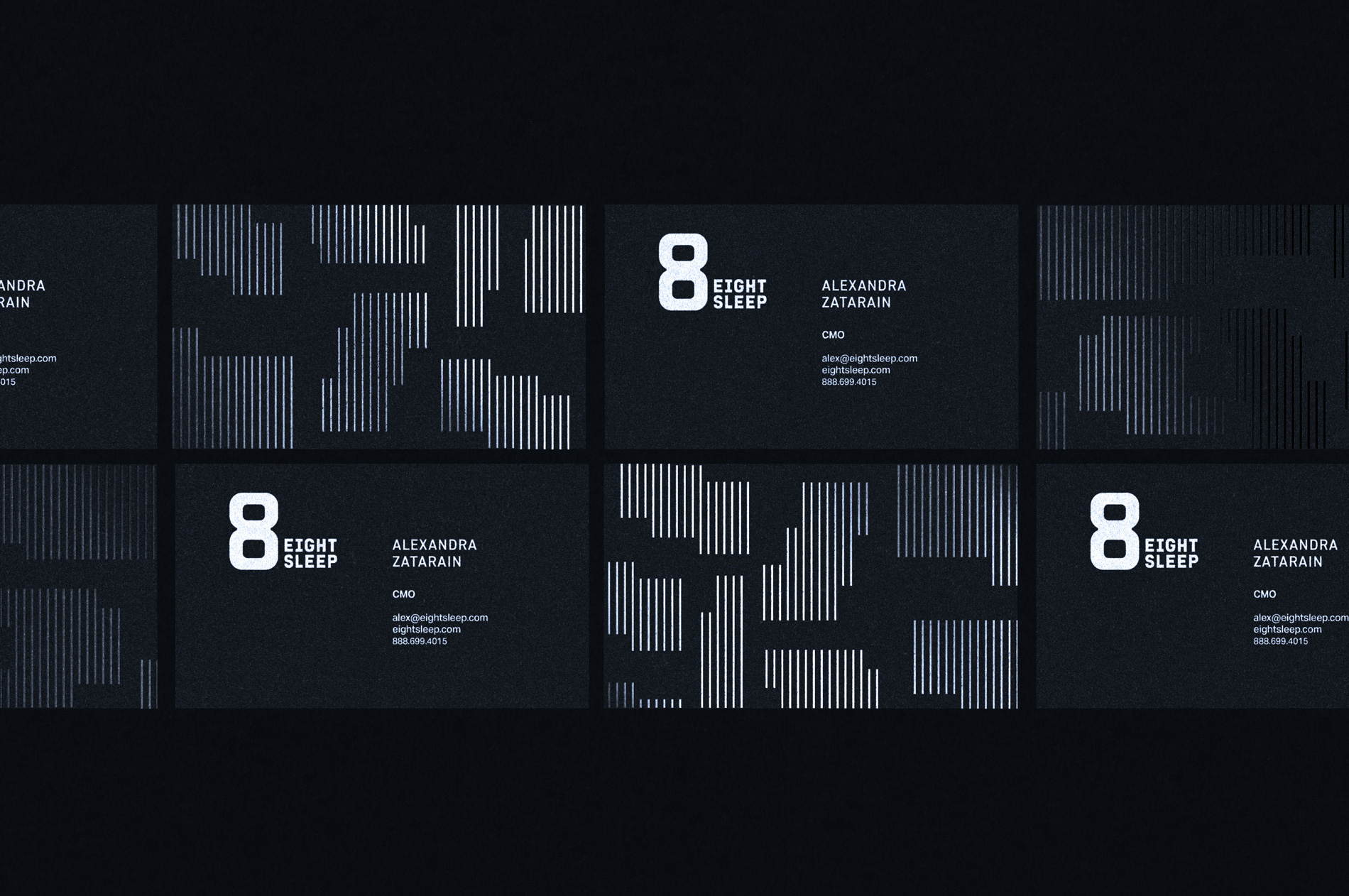
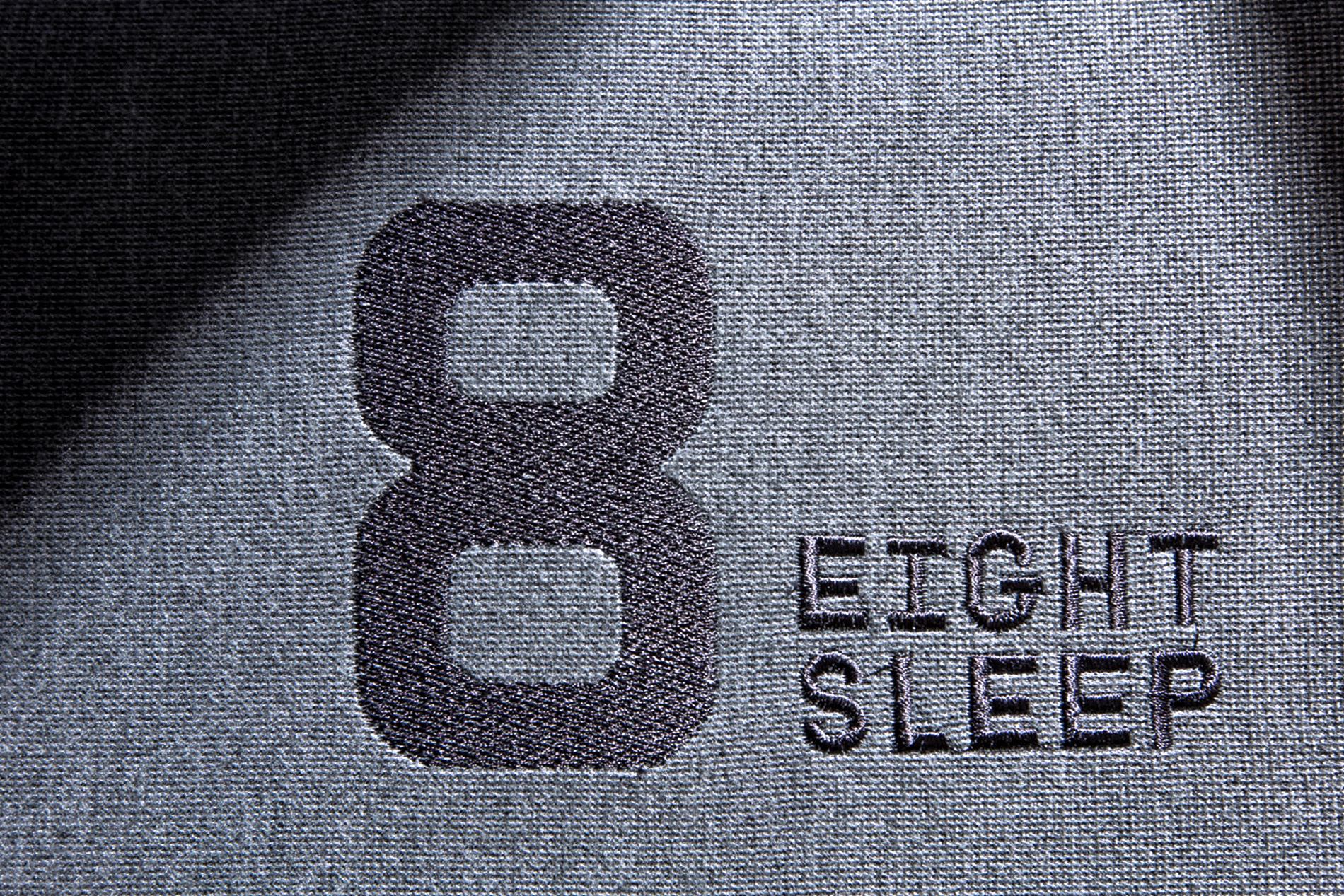
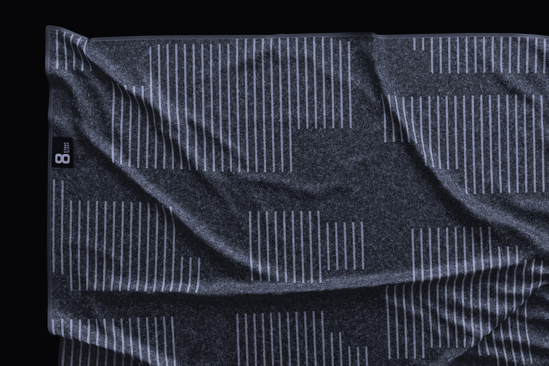
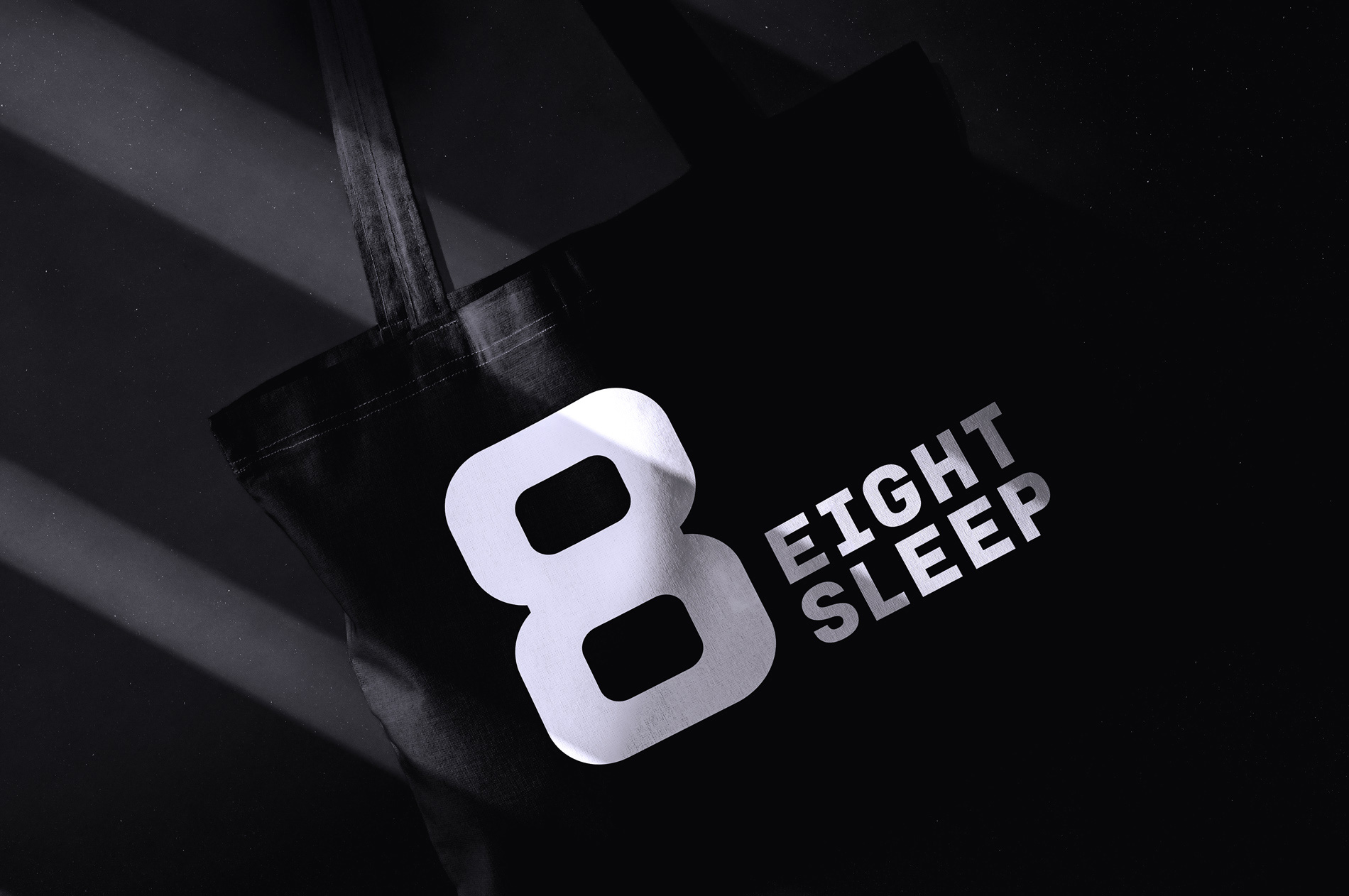
The old logo was fairly good, with eight phases of the moon arranged in a circle, perhaps even looking like a clock, and with a decent wordmark. Certainly nothing wrong with it but as the company shifted its positioning to align itself more with the notion of fitness, the old logo didn’t convey the kind of hardcore approach to sleep that the new logo does more effectively. The bold, industrious “8” looks like something that belongs in a CrossFit gym with its thick construction and looking almost like a double kettlebell of hell. I dig it. I keep debating whether I like the extra thick middle or not — mainly because that’s not how “8”s are drawn as that middle part should visually be the same thickness as the top and bottom strokes but perhaps that’s what gives it some additional distinction. The wordmark benefits so much from the name having equal amount of characters in each word, allowing it to be typeset in a neat monospace approach that looks great and creates a tight lock-up with the “8”. The different lock-ups and the striped version of the logo are nice extensions for a more varied look — I would have loved to see a more concise IBM-ish striped approach, perhaps in variations with increments of 8 stripes at a time, for a more sort of mechanical vibe.
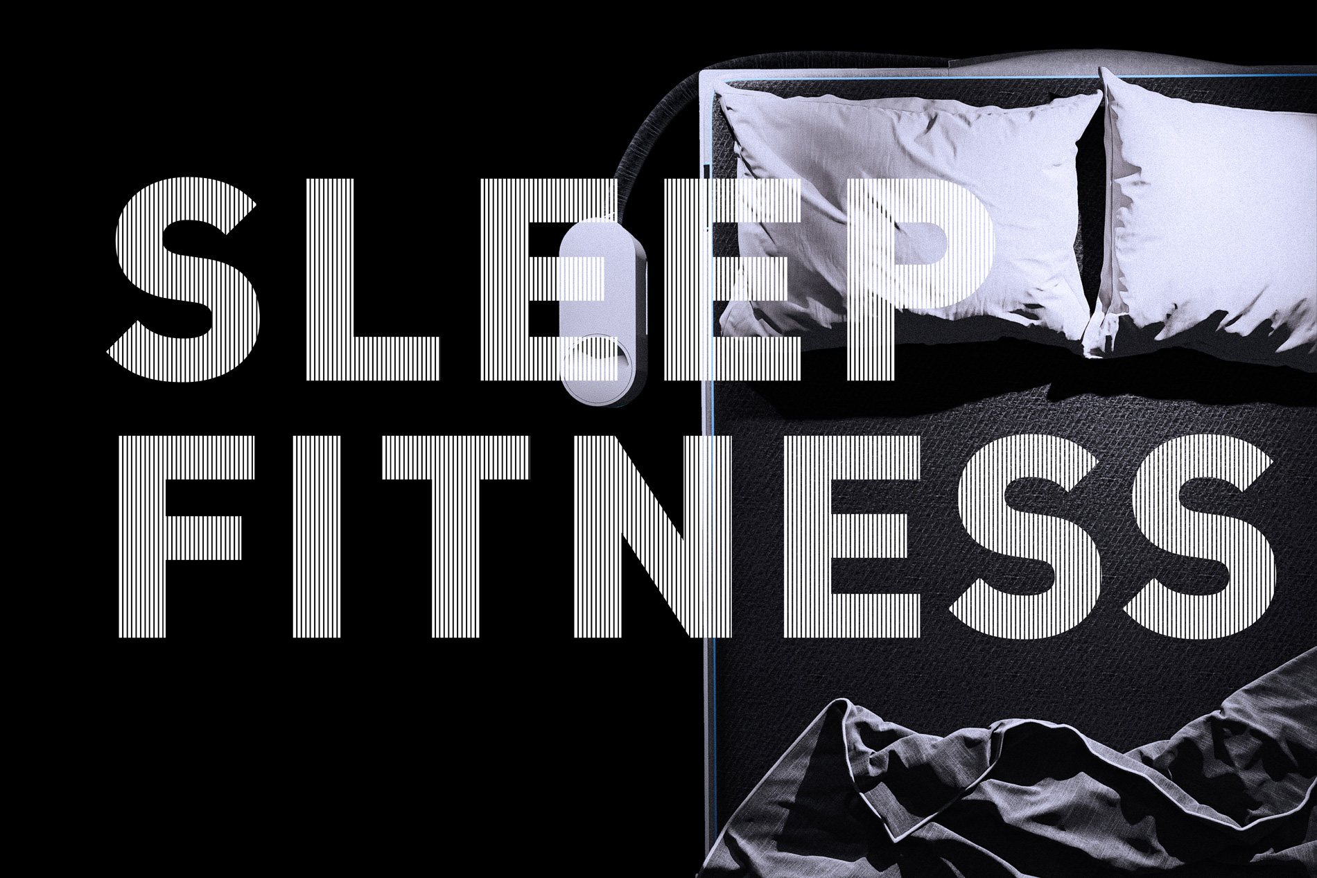
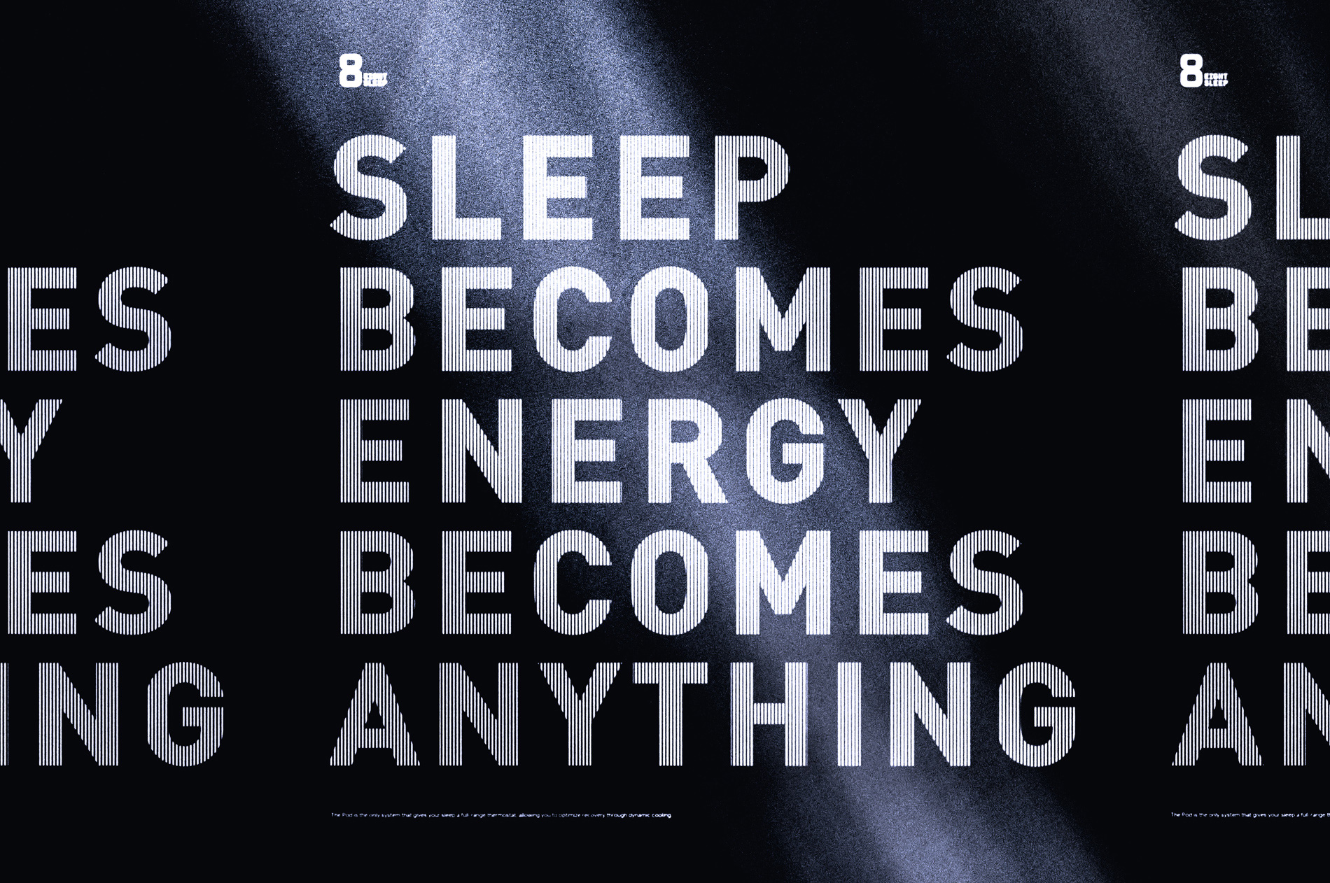
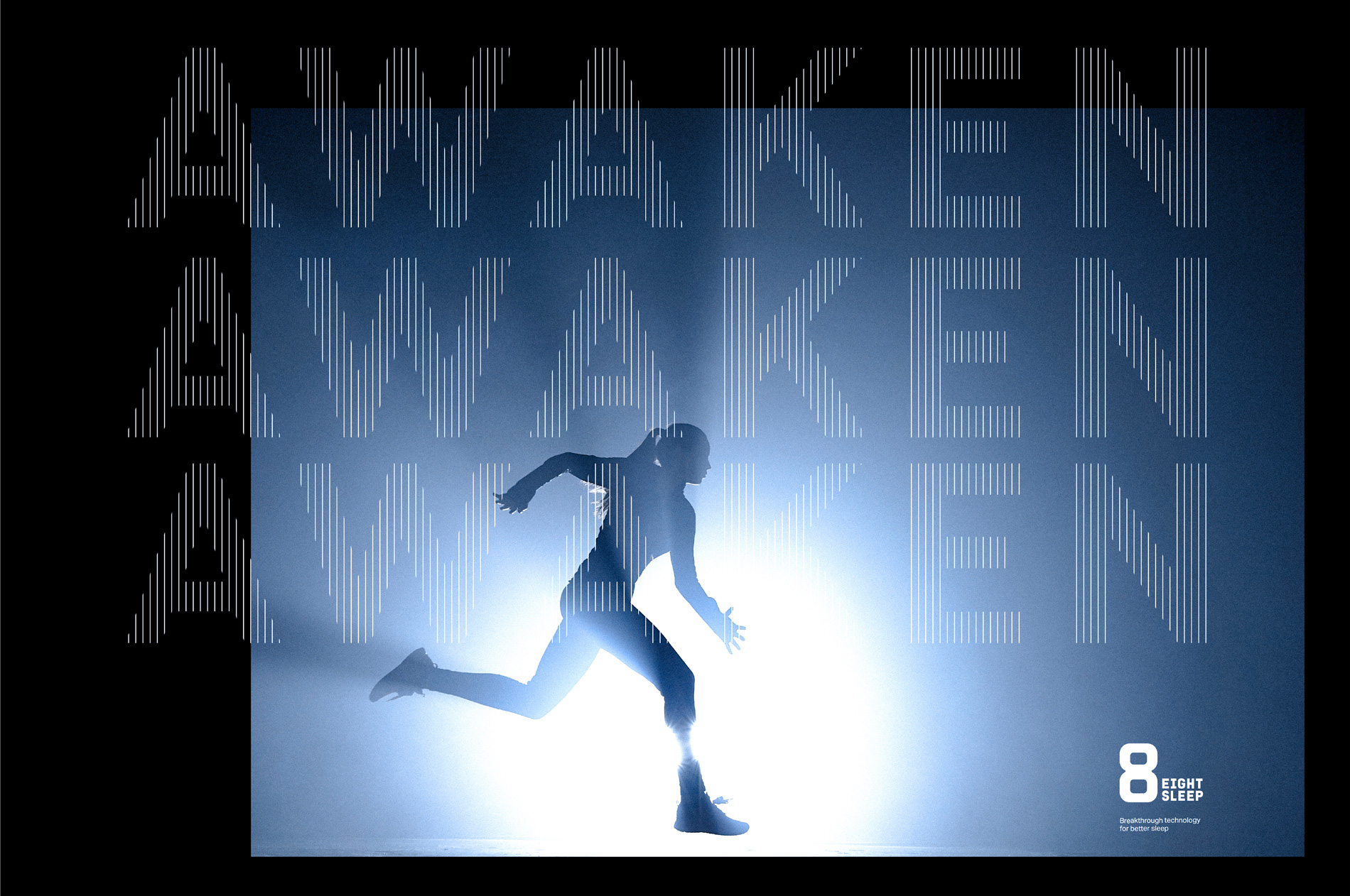
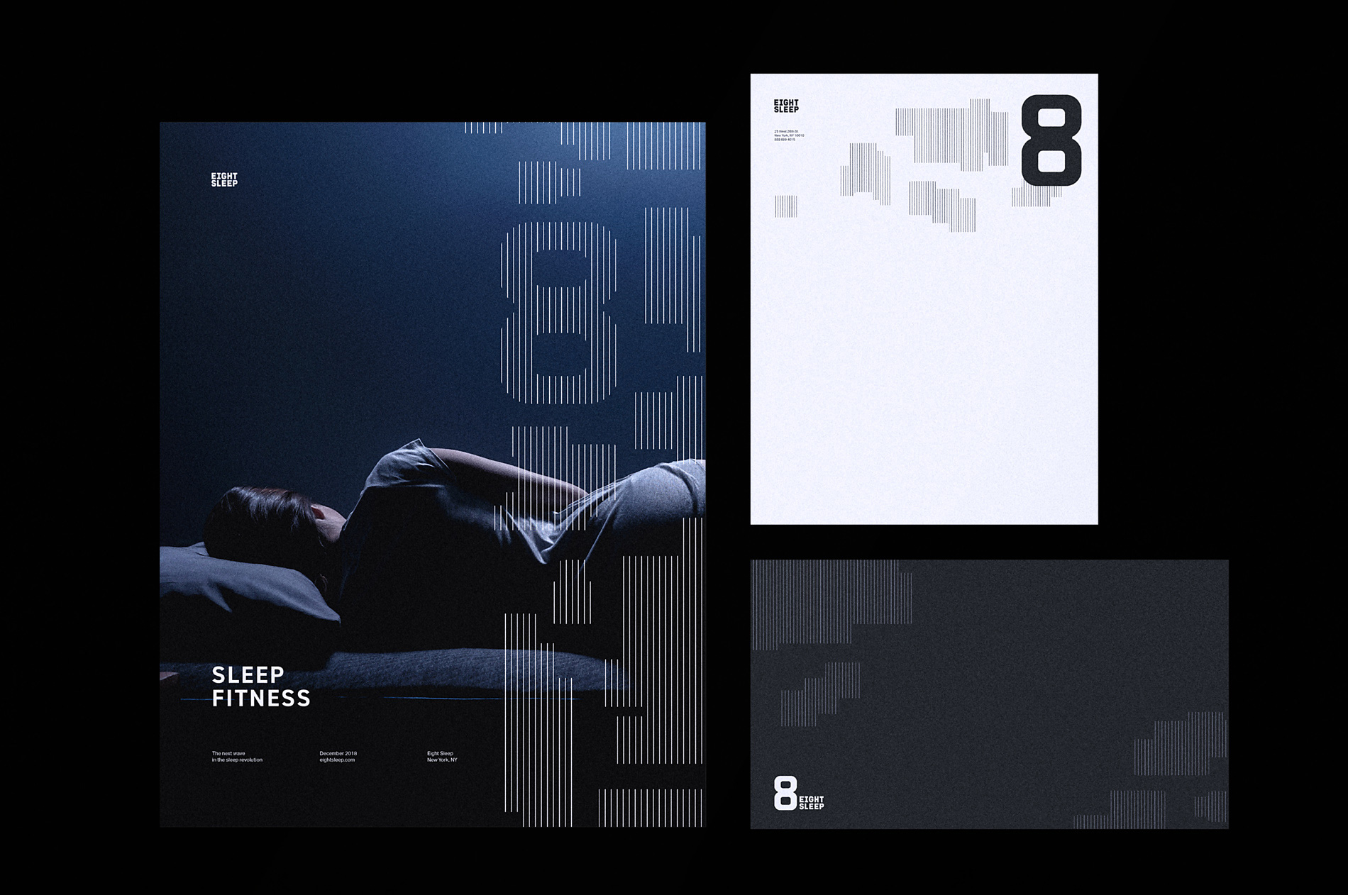
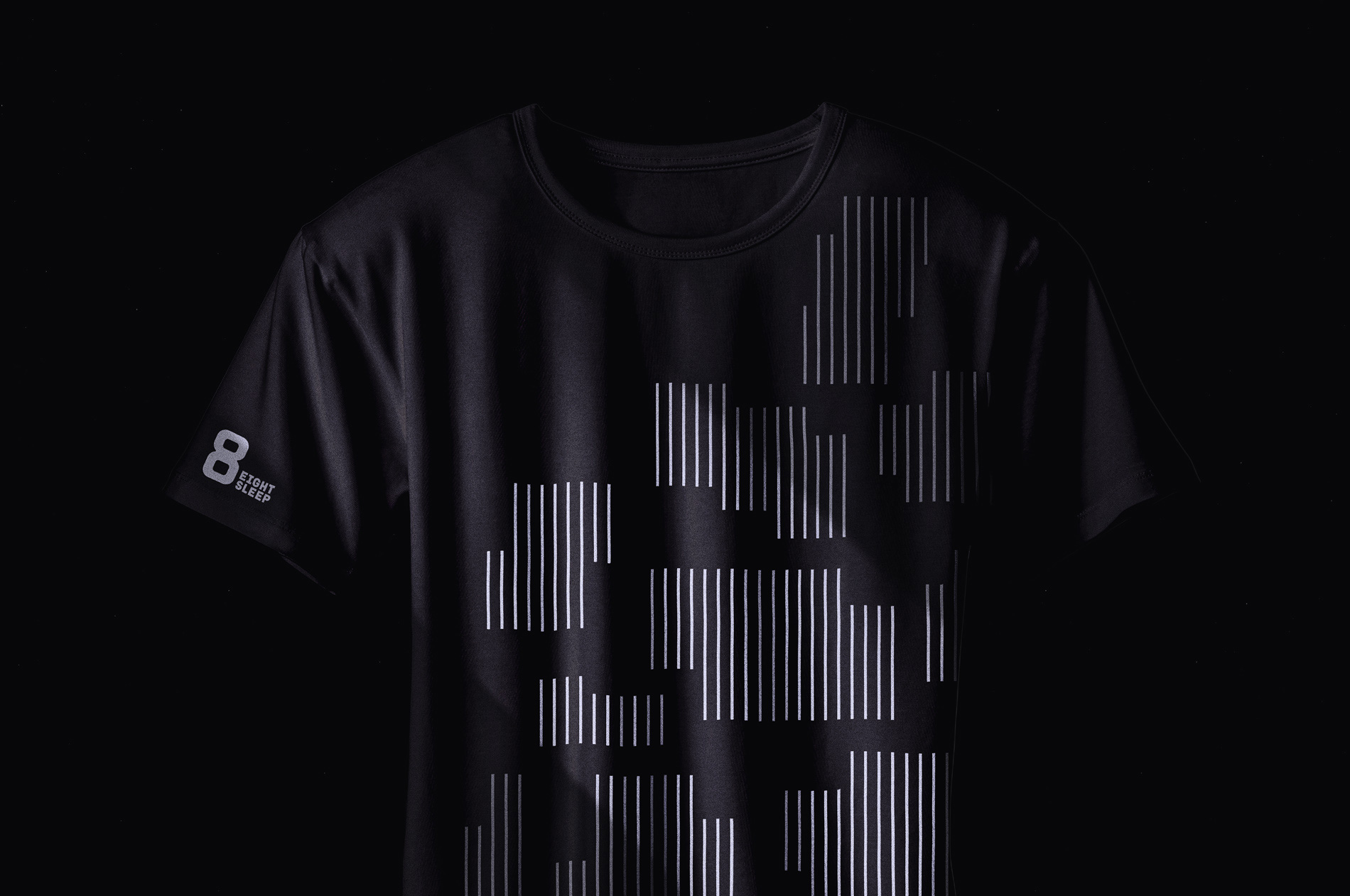
In application, there is a lot of stripes and it starts to get a little confusing and disparate, especially in their use on typography, varying from too thick and close to each other to too thin and separate from each other — they are both interesting but they have such different vibes that I think sticking to one or the other would be beneficial. There are also abstract, Tetris-like stripe fragments throughout the identity that I kind of like but also kind of don’t. It’s a good design element but there is something about its deployment that isn’t quite right in some places. Nonetheless, it all does perhaps communicate the idea of data and progress, almost like bar graphs on treadmills and stationary bikes.
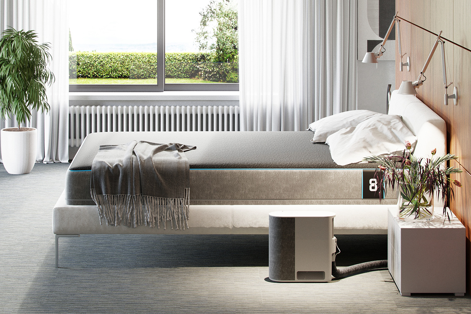
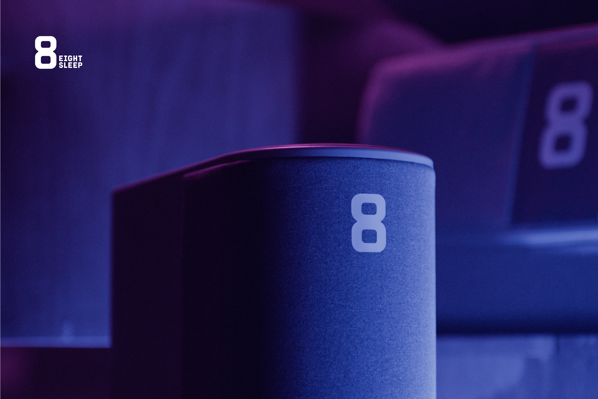
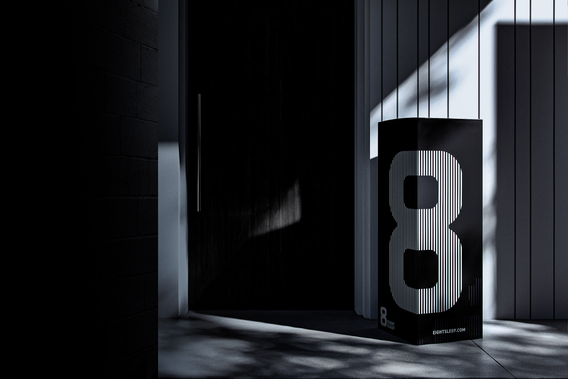
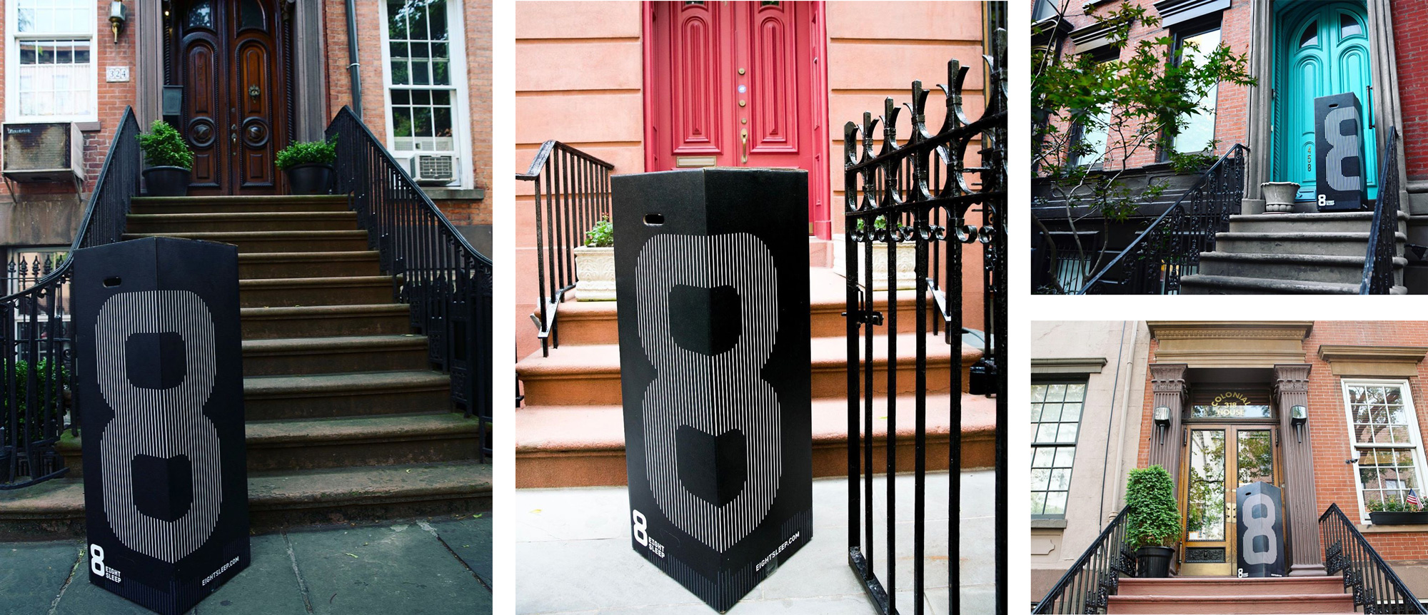
That black box with the big “8” is quite bad-ass and as part of their whole black-background, high-contrast, bold aesthetic, it establishes a very strong point of distinction from the recently saturated mail-order mattress market with competitors like Casper and Purple, by aiming for the health-conscious and fitness-obsessed crowd for which this identity is primed for.
 each year since publication began in 2006

 Новости Союза дизайнеров
Все о дизайне в Санкт-Петербурге.
Новости Союза дизайнеров
Все о дизайне в Санкт-Петербурге.